Notability is an application for note-taking and PDF annotation which is available on iPhone, iPad and Mac. Provided with multimedia tools, users can take notes, add images, draw sketches, or even record audio. This design critique will focus on the basic features of the iPad version of the app through a scenario where a user imports a lecture’s reading file from Canvas and reviews it on the Notability app.
1. Sending a pdf file to Notability
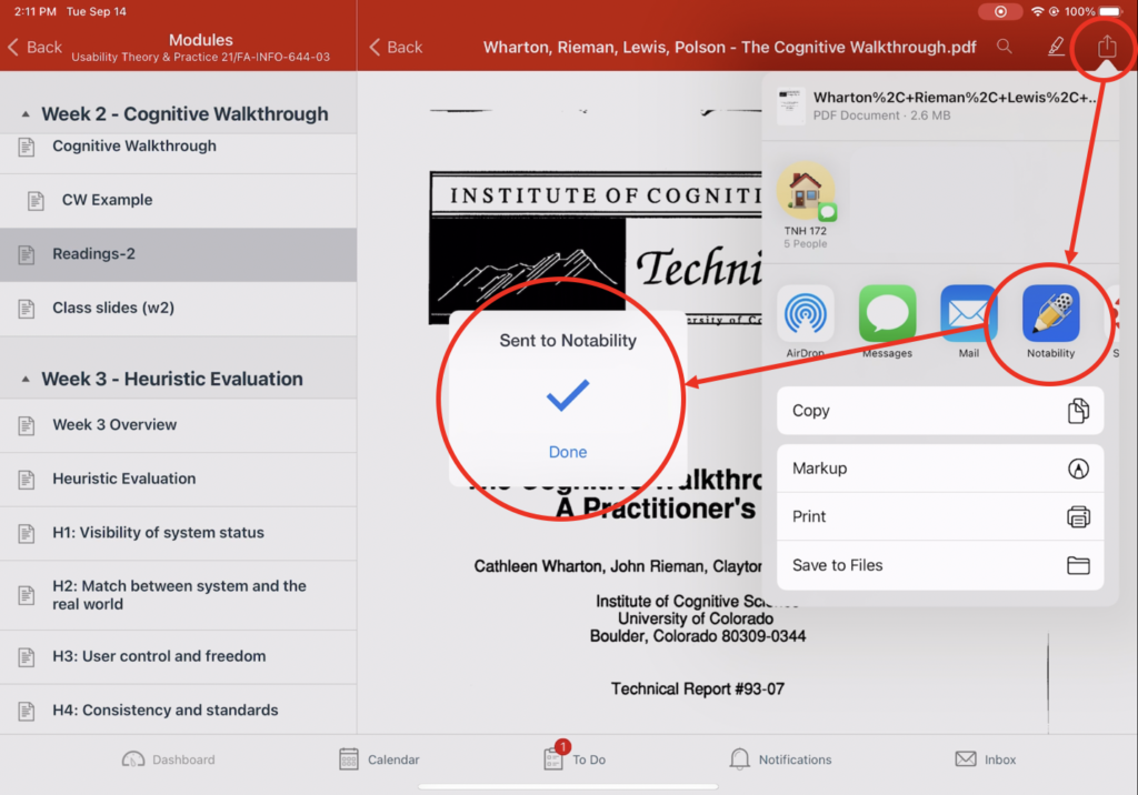
In order to bring documents into the app, the user may first visit a Canvas page where the file is uploaded. When the user tabs the export icon on the top right side of the screen, the Notability icon is easily discovered there. Not only that, if the user is already familiar with using the iOS interface, this method of sending a file to Notability would be considered as a good conceptual model since it follows the exact same process when sharing files to any other apps including Mail, Messages or Airdrop. Once the user tabs the Notability icon, a notification immediately shows up to give feedback that it has been successfully sent to the app.
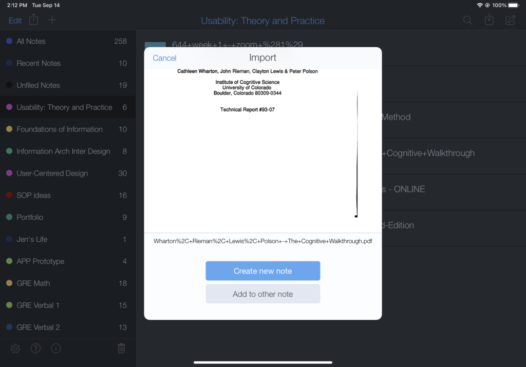
When the user opens the Notability app, the pop-up window also indicates that the file has been successfully imported and asks the user whether to create a new note. The blue-colored “Create a new note” button is a good physical constraint by catching more attention to a certain option since in most cases newly imported documents are saved in a newly created note.
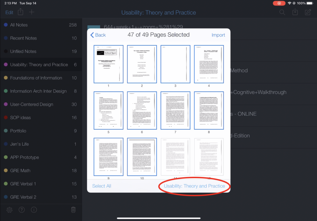
Then a page selection window follows, showing a natural mapping since it directly indicates which page to include or not. As a final step, the user can designate a folder where the note will be saved. However, only the title of the folder (“Usability: Theory and Practice”) is indicated on the lower right corner of the window. The feature could have a stronger signifier if a folder icon was added next to the title of the folder.
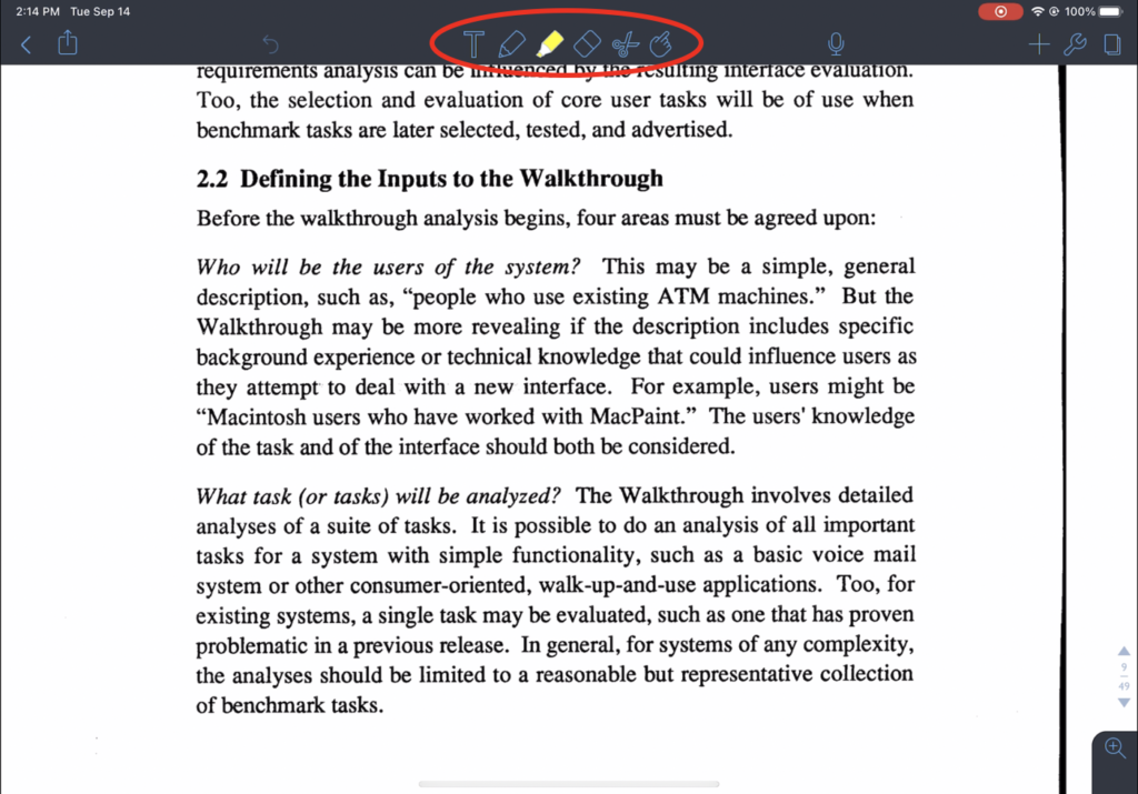
2. Making notes and searching for a word
While reading the article, the user may want to highlight key sentences and make notes on the document. The drawing tools are discoverable as they are located on the top middle section of the screen. Also they have a strong signifier as each of the tools shows corresponding icons such as pen, highlighter and eraser. Therefore, the user may easily tab the icons in order to use each of them.
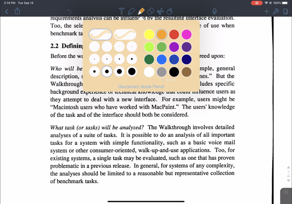
Then, a pop-up window that allows the user to select a color or to adjust the thickness of stroke appears. Once the user selects a color, the highlighter or pen icon reflects the exact color. This is a good example of feedback as it immediately and intuitively indicates which color has been selected. Not only that, only the activated tool shows the selected color or a blue shade which indicates the activation. This is a great method which prevents the user’s memory-lapse slips since the user can clearly have a knowledge of the type or the color of the tool that has been activated.
3. Note Switcher and Multi-Note
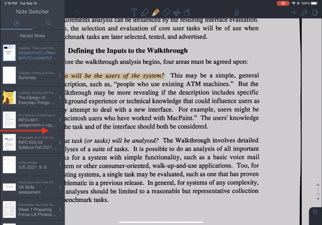
Notability has a unique feature called “Note Switcher” which enables the user to easily switch between different notes. In order to use the feature, the user needs to swipe from the left edge, which however lacks discoverability. Even though the app affords such a feature, the lack of discoverability makes it difficult to be recognized by the users. Therefore, in order to bridge the Gulf of Execution, there should be a visual element such as an indication bar on the left edge that clearly signifies the existence of the Note Switcher. Once the user swipes from the left edge, the user can find a note to switch from the list of recent notes or from the search result. The app provides feedback by immediately switching to the other note that the user has selected.
The user can also use a feature called “Multi-Note” from the Note Switcher. With this feature, the user can open two notes simultaneously. This enables the user to, for example, read an article while summarizing it on a separate note. However, Multi-Note has an inefficient signifier. From the Note Switcher, the user can discover a three dots icon located right next to the titles of each note. The icon is discoverable yet weak to deliver what it signifies. Rather, it would be better to use alternative icons such as a window or an eye icon to add clarity.
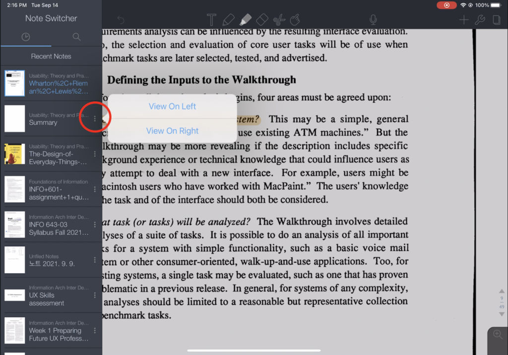
The user then gets to choose whether to view on left or right. Once the option is selected, the app immediately shows the multi-view mode of the two notes. The user can adjust the size of the each notes by moving the vertical line on the center.
Despite several design elements that do not comply with Norman’s design principles, most of them were solvable with simple improvements. Overall, iPad version of Notability is a good hybrid of both analog and digital experience of taking notes that generally has intuitive features that empower the user to make their own creative notes.