Poshmark is an e-commerce app that allows users to sell new or used fashion, home decor, beauty supplies and more in a social media like setting. It is available to users in the United States, Canada and Australia.
This critique focuses on a Poshmark user looking to buy and sell items specifically on Poshmark’s iPhone App.
Logging in to Poshmark
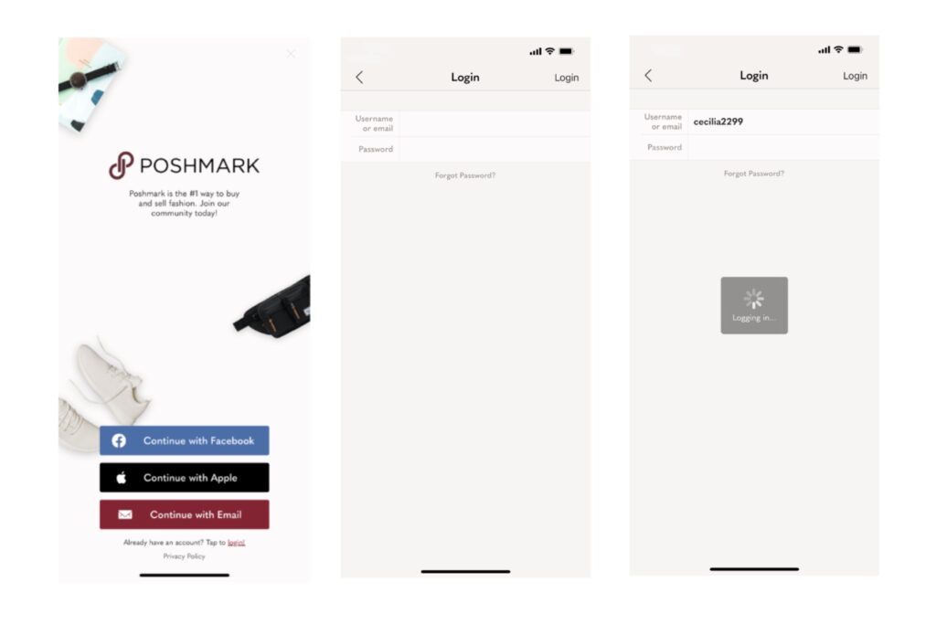
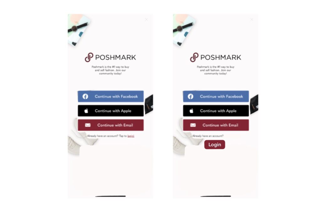
Poshmark’s login page addresses the user with a brief explanation of what they will be able to do once they sign into the application. The user will know that they will be able to buy or sell fashion and are given 3 options to open an account (Facebook, Apple and Email). If they have already activated an account they can follow the “Tap to login!” located in small print at the bottom of the screen.
The login page provides an adequate amount of information to properly understand the goal of an account and to access the application. It provides alternatives to logging on besides the standard email. The buttons for Facebook, Apple and Email login are simple, but serve as affordances to the user, without needing a signifier to indicate how to use. “Already have an account? Tap to login” signifies to the user, by specifically saying to “Tap”, that they must tap the word login in order to sign on.
After tapping login the user is prompted to fill out their information. Once submitted the user receives immediate feedback that the app is “Logging in” the user. Although Poshmark’s login is user friendly, competitor Mercari uses a more straight forward approach to the login page by centering the buttons and having a button in the top right hand corner for returning users, instead of needing to use a “Tap here” signifier.
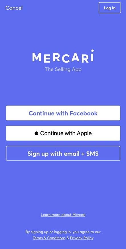
I would recommend Poshmark center the 3 login buttons under the app’s description, to eliminate the blank space and bring immediate attention to logging in. They could leave the signifier to tap to login, since it clarifies that this option is for those who already have an account or add a Login button to the set, but still include the “Already have an Account?” text to let the user know that the button is specifically for previous users. Mercari’s login button doesn’t provide that same clarification for the user.
Selling Clothing on Poshmark
The process
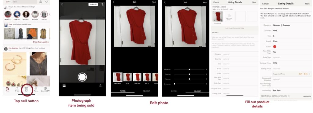
Poshmark sets up the user to be able to post clothes they would like to sell in a similar style to an older version of Instagram. The Sell Button, indicated by a camera and the word “Sell”, is located in the bottom center of the home screen. This immediately launches the User into a camera to photograph their item. The photograph is limited to a square picture, making it difficult to take full pictures of a long pants or maxi-dresses, requiring the user to find another app to crop the full picture down to square size. This once again similar to Instagram’s older interface that only allowed User’s to post square photos.
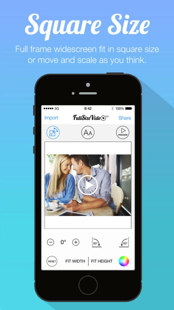
To allow users on the selling side to share full photos of their products Poshmark should integrate a feature to allow the seller to fit the photo into a square shape within the application or allow the user to post a wider range of photograph sizes on the app. Even if the item would appear in a square on the user’s profile page, buyers could click on the item to enlarge the photo to see full effect.
Since the products are all offered virtually it is important to give the seller the opportunity to best showcase their item. User’s might feel stuck worrying with the photograph, trying to fit a full length dress into a square photo. If the User isn’t aware of options such as Square Size, or other similar apps, the entire product might be cut off and only partially visible to the buyer.
after posting the product for sale
Within the sellers settings the option is given to toggle on/off a bundle discount. If a bundle discount is available the buyer will see the discount reflected when they put multiple items together and begin to check out, however when on the profile of the seller there is no indication of a discount. This fails to encourage bundling of multiple products.
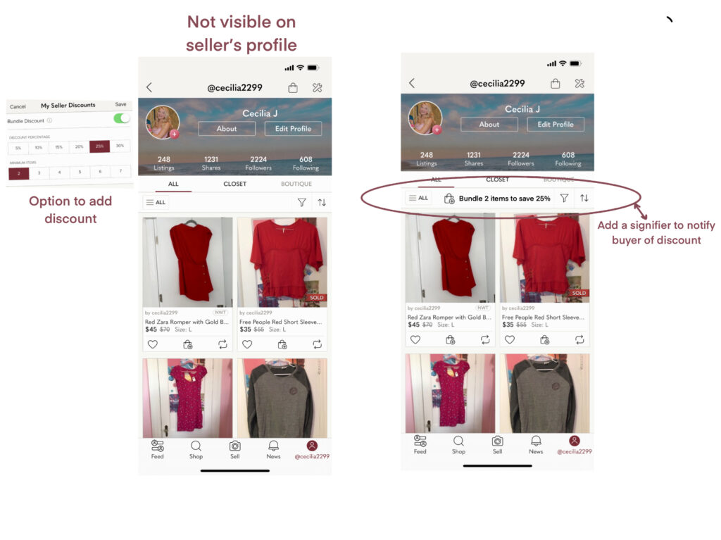
To solve this Poshmark should add the discount information to the top of the seller’s page, that way buyers are notified of the benefits of purchasing multiple items. This also will explain what the bag and plus button icon means. Without this sort of signifying text, the user might think they are adding an item to their cart. On Poshmark there is no cart and every transaction is between two users, so you may not combine items from different sellers into one purchase.
Buying on Poshmark
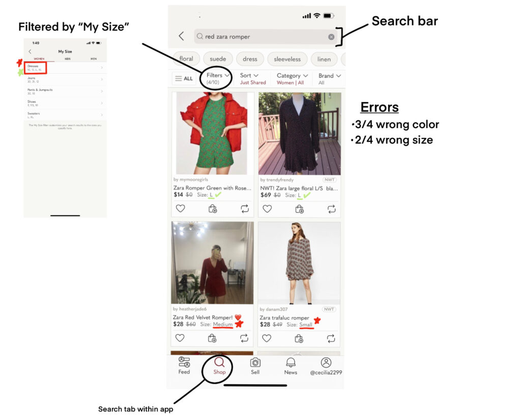
Let’s Try and find our post: Red Zara Romper
Poshmark provides user’s with a search bar to locate their future purchases on. Here I use the example of searching for the Red Zara Romper shown in the selling process. Pictured below are the top 4 results from Poshmark. The discoverability of products the user wants to buy feels lacking based on the search results. Poshmark immediately filters the results by the users size (provided within the profile). This provides the user the opportunity to see only the results for their size, however in the search results we see that only 2 are within the correct size range. This is most likely because the sellers of the 2 marked “Medium” and “Small” filled out a custom size for their product. Looking back at the seller’s options when filling out product details, rompers were not an option. In addition to adding a romper category, Poshmark should allow products in the “other” category to follow custom sizing (Small, Medium, Large, etc) instead of only allowing a One Size or custom option.
In order for the search to be successful for the buyer Poshmark can improve upon the sellers options when posting the item. Making sure sizing is selectable for every item of clothes is important, even if the clothes don’t fall into a specific category.
The colors of the products from this search result are also problematic. Only 1 is a true red romper, the rest are different colors with red accents. Since sellers are allowed to select two colors, they should be able to indicate the primary color of the item when posting. This would allow buyers to locate the item they specifically want.
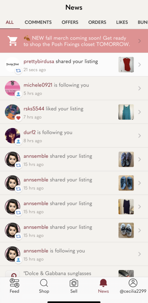
News Tab: Everything is Combined
Within the news tab the user can cycle through many options: comments, offers, orders, likes, bundles, etc, but a user is unable to switch between looking at each category as a buyer or a seller.
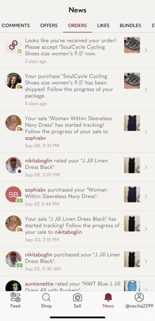
Highlighted to the right below is the orders page under the News tab. The items that you have purchased and the sales you have made are all combined into one section. In order to separate out the user’s role as a buyer or seller I recommend Poshmark add an ability to filter the tabs by items sold and items purchased. That way a seller can quickly access an order’s shipment label or a buyer can go directly to track a package, instead of having to scroll through sales and purchases together.
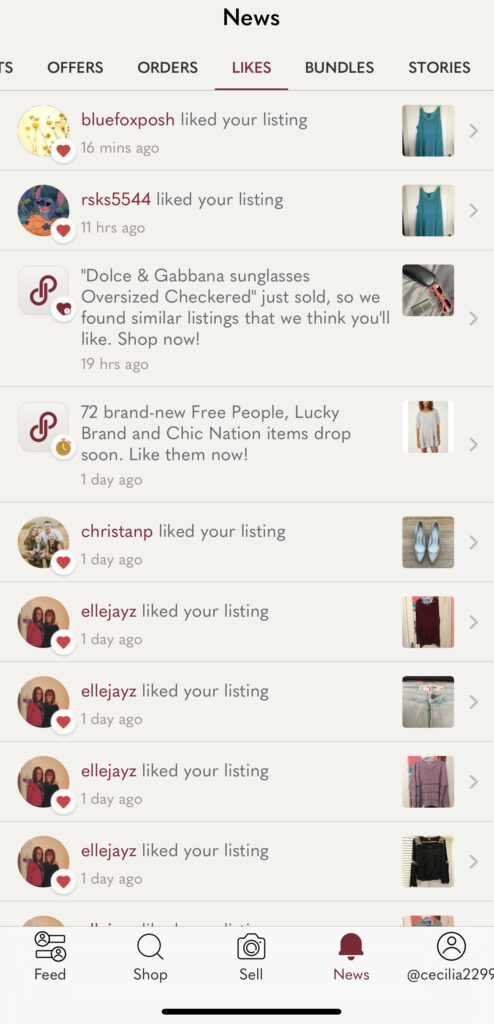
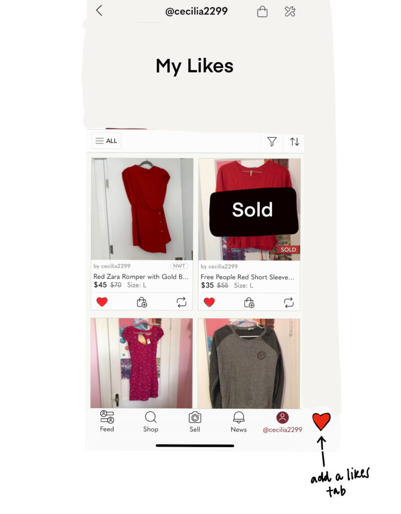
The likes page is set up in a similar way. The user is able to see which of their items that other users have liked, but are unable to see what they have liked while shopping on Poshmark. Without seeing products that the user has liked, they may struggle to return to purchase an item. I would suggest Poshmark go beyond filtering and separate the “My Likes” and “Likes” into separate tabs. under “My Likes” could be a page similar to the profile page that shows the user pictures and prices.