By Sara Almai
Randonautica is a mobile phone application intended to be used as an aid for exploration. The application generates a random or pseudorandom set of coordinates, called a “point”, for the user, called a “randonaut”, to venture to. The point is generated based on a descriptor selected by the user on the homepage. The user is invited to set an intention mentally before their adventure and the creators claim that the point generated depends on the intention set.
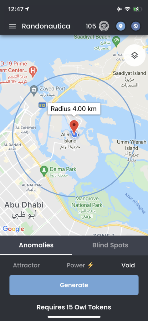
My first critique pertains to the constraints principal. This shortcoming manifests in a very straightforward way. The generated point will sometimes end up being in the middle of a body of water. To avoid “water points”, the user must opt into a paid upgrade.
I think you would be hard-pressed to find a user willing to take their phone swimming with them in order to reach a point, much less a user able to take a boat to reach a point. My suggestion would be to remove the water points entirely. In the unlikely chance Randonautica does find one of these users, they could potentially be putting them at risk of an accident and themselves at risk of a lawsuit. This is an example of a machine prompting users to act in the way it wishes, as opposed to acting in the way users wish. This is a prime example, in a way, because for users to actually act in the way the machine prompts would require extreme measures.
My second critique involves feedback. The application does not provide an indication that you have reached your point beyond inviting you to set a new point. This critique is twofold. One, I have personally been in the position of reaching my point and not knowing exactly what my point is. This is especially as, while the creators claim the points are randomly generated, in my experience, there is usually a landmark that serves as your point. Sometimes these landmarks are unofficial or even insignificant. While a hint while en route could potentially give the destination away, a hint upon arrival could help the user know what they are looking for. This hint could be a picture or some text. Second, some feedback would enrich the experience. Reaching your point is unceremonious. Something as small as a congratulatory message or a cute loading screen would make the adventure more rewarding. While this may seem silly, Norman talks about “enjoyment of total experience” as a critical point of usability.
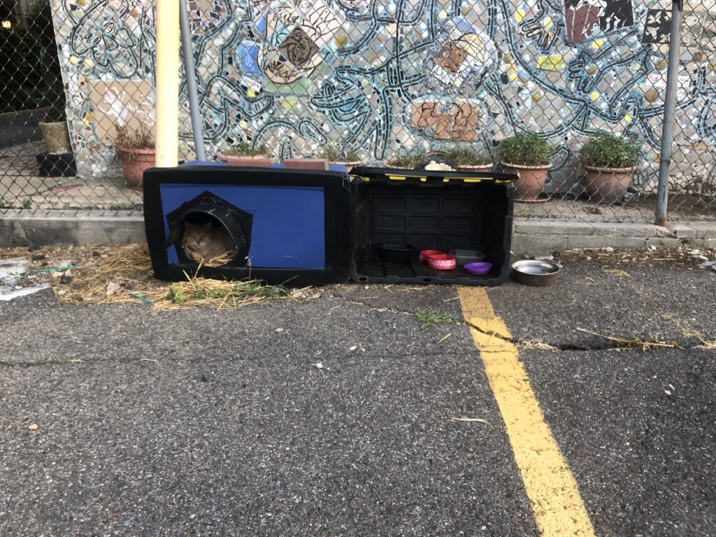
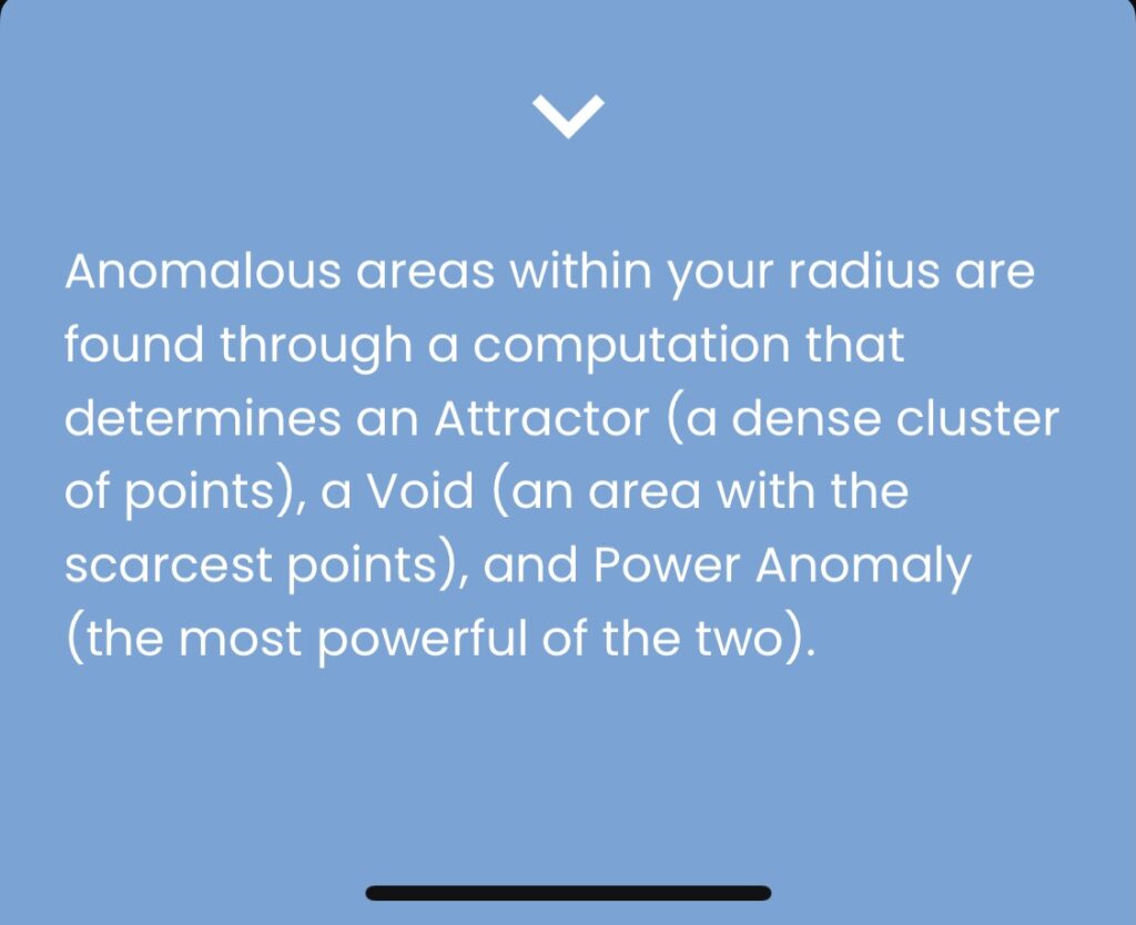
My third critique takes affordances into consideration. The homepage invites users to select a descriptor for their point. The point descriptors fall into two categories, “Anomalies” and “Blind Spots”. Within the Anomalies category are three subcategories, “Attractor”, “Power”, and “Void”. Within the Blind Spots category are two subcategories, “Quantum” and “Pseudo”.
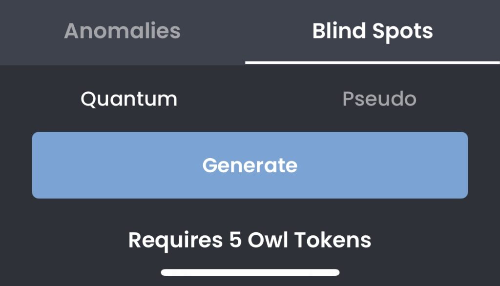
The FAQs page talking about the Anomalies subcategories is insufficient and the FAQs page talking about the Blind Spots categories is nonexistent. The answers to these questions are impossible to find within the application and difficult to find elsewhere being such a niche interest. This is a facet of learnability and this facet is one that is not solved with increased usage. It facilitates taught helplessness as, not only are the options within the application hard to understand, users are not given a route to understanding. My suggestion would be to provide a sufficient FAQs page on the categories and subcategories so that the user knows what they are doing and why. Even better would be to link it beneath the options themselves.
While my points are highly critical, I am a longtime fan of Randonautica. In my opinion, the creators do their due diligence to make a potentially dangerous experience as safe as possible. They give users multiple warnings when using the application, such as to adventure with a friend and adventure during the day. The application is mostly easy to use and provides a unique experience that I think will only be improved over time. You can use it both to be more spontaneous in a new city as well as to give new life to your own city.
As a bonus, here is a picture from a Randonautica trip I did in Philadelphia. I set my intention as “animal”, which surprisingly, although most likely coincidentally, worked.