Introduction
Roze Bunker is a Dutch company that makes and sells fruit juices and syrups primarily intended for use as cocktail mixers. This design critique will examine the English version of the homepage when used on a desktop monitor. In this usage, it will be clear that the website was designed largely without regard to usability principles. It is complex, with little regard to making it less confusing, violates the user’s conceptual model of a brand website and storefront, and has poor signifiers, mapping, and feedback that will frequently lead to errors of navigation and frustration as a result. Let’s dive in.
Splash & Home Page
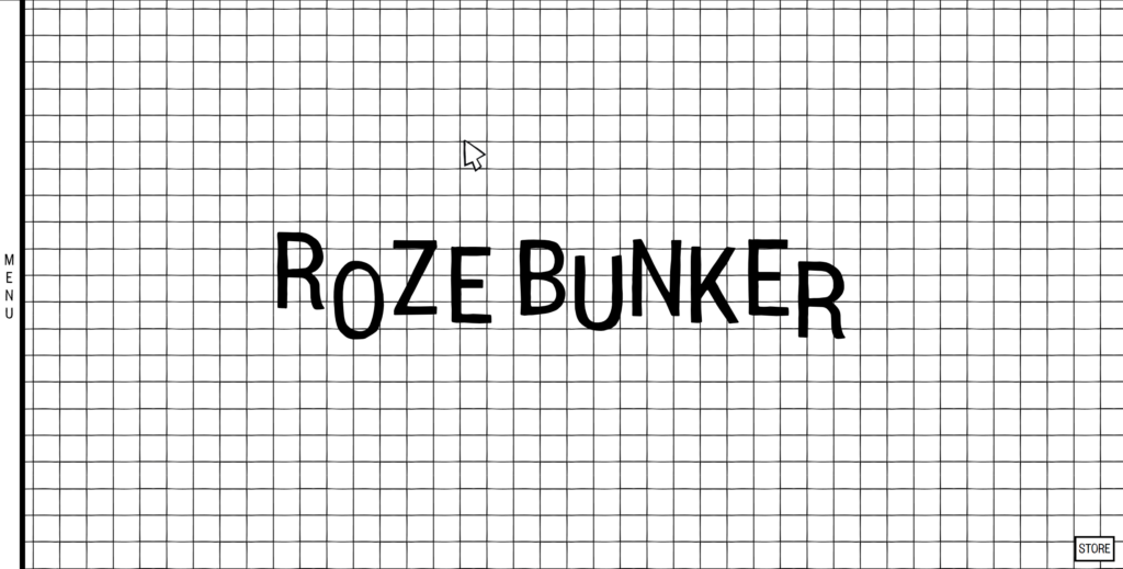
Pictured above is the initial load of the splash page. Right away, we have begun to see some of the flaws of the design. There are a few seconds before the “bottle rain” effect (discussed below) begins, during which the letters of “Roze Bunker” move up and down slightly, alternating up and down. This draws the eye to the center, as it appears to be a signifier that something can be done, perhaps by clicking the words- that this is an affordance on the website. However, this is potentially a minor capture slip as there is no action that can be performed; this animation is simply a permanent part of the background, and clicking on the words does nothing.
The standard conceptual model of an online brand or storefront for the modern internet user is that there will be either an expandable menu to select pages or clickable windows on the page. As there are no obvious clickable objects (though we will not have to be in suspense for long), let us say that the next desired sub-goal is to find this menu or store to see what Roze Bunker has to offer. If one is looking for either the site menu or the store, the eye is drawn away from the respective icons on the left-center edge and lower right corner, respectively. The discoverability of the available actions is so low as to seem almost hidden. Look back at the screenshot of the initial login. Did you see those buttons? I didn’t at first. Firstly, these both violate the standard conceptual model of an online brand, as we would expect these icons to be near the top or center of the page. Perhaps in one of the top corners, but certainly not in the bottom right. This is not a natural mapping for those signifiers. This is made worse by how they blend into the grid background, as the text is not highlighted in a different color and “menu” is spelled vertically, adding complexity and confusion to the page. Complexity is not inherently a bad thing, but confusion breeds errors and frustration. Unfortunately, it is about to become more so.
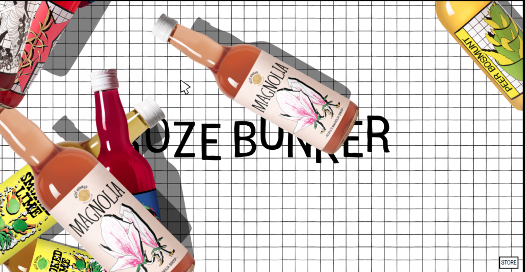
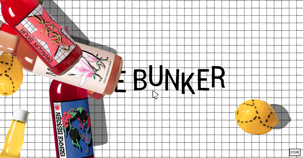
Here, we see the page a few seconds after the bottle rain I mentioned earlier has begun. The visual clutter this creates and how it can be a bit overwhelming hopefully comes through with still images. This starts on its own, without any input from the user. The speed can be increased and decreased by scrolling the mouse wheel or reversed to fall “up,” but cannot be stopped as far as I have been able to tell with experimentation. There are also no signifiers that this slow down and reverse feature is an affordance at all, and I discovered it by accident when I scrolled the mouse wheel, expecting to scroll the page- an entirely different mapping expectation than the one present!
I will note that this pattern is not random, and will loop after 10-12 seconds. These bottles are clickable and will bring the user to the page for that flavor. Thankfully, a signifier is provided if one hovers the cursor over a bottle, which changes the cursor to a pointing hand. This feature can be rather frustrating, as it can be difficult to find a particular flavor, the scroll speed can be rather fast, and there is a significant overlap of the bottles making them hard to distinguish. In addition, I would consider this design element very noninclusive and nonuniversal, as these issues are even more compounded for those with disabilities or simply slower reaction times.
Included among the bottles is a clickable version of the dotted-line lemon logo. Can you determine what mapping this signifies? It is in fact a link to the “Our Mission” section of the website, something which is a logical leap I don’t think most people would grasp intuitively. Likely, the only way to determine what it does is to click it, which for most people would be a knowledge-based mistake unless they truly just wished for their curiosity to be sated.
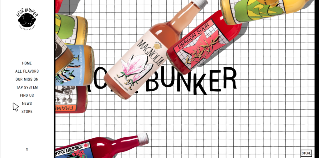
We have made it to the pop-out menu. Despite the flaws in design making it difficult to reach, I think this is a perfectly fine menu and is a bit of a saving grace in terms of usability design for a website that otherwise functions better as a drink mixer-themed screensaver than a practical website. The text is clean, well-spaced, and intuitively signifies what each selection leads to, assuming the user can read English or the original Dutch.