SHEIN is a cross-border e-commerce platform mainly aimed at young women aged 15-30 and provides attractive products at a reasonable price. Including clothing, accessories, etc. This design critique focuses on the IOS version of SHEIN.
I evaluated some features of this version through a cognitive walkthrough. My task is to buy a pair of pants. The whole process is divided into three steps: searching, liking, and finally adding to the shopping cart.
Searching product
The search function is located at the top of the home page and displays the amplifier-like icon, which is easy to understand. After clicking the search box, users will go to the search page. They can see recently searched, hot search, and trending search. These terms can guide users to explore different types of products, such as Halloween-related decorations and costumes. Also, the search result page will display the search box and the content text by the user, providing feedback. However, as far as signifier is concerned, the search feature can be done better. For example, when the user searches trousers, the list of recommended entries will change during the input process. Sometimes, the recommended entries are classified into categories and popular, but sometimes titles disappear and it confuses new users. At the same time, too many choices will prevent users from making quick decisions.
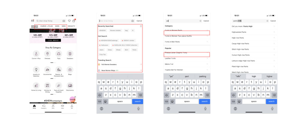
Solution: The list of recommended entries can be as concise and intuitive as possible, showing 10-15 entries. The entries can be sorted according to the relevance and the click tendency of the public.
Liking Product
There are two ways to like a product. The first method is to click on the heart-shaped icon on the product details page. Another way is to click the icon while browsing the feed. After clicking on the icon, it will change from hollow to solid. Therefore, in terms of mapping, I think the feature does a good job. However, both methods have a common problem, that is, they do not give timely feedback. For new users, they do not know where to view these products after clicking the heart-shaped icon.
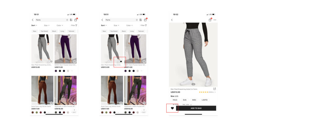
Solution: Pop up a toast to confirm the operation’s completion and tells users where to find the products they like when they click for the first time.
Shopping Bag
After adding merchandise to the shopping bag, the icon in the upper right corner will have a red circle with the number of shopping bags added. The feedback of deleting products is very intuitive. The user can adjust the number of pieces. When the quantity is 1, if the user clicks “-“, the app will prompt a popup window and ask whether to delete the product. In the design of this function, possible cases are fully considered, and corresponding constraints are set to help users avoid slips.
The second finding is that many places on the shopping bag page display coupons to boost consumption. However, the location and style of these coupons are inconsistent, which will lead users to think that the usage rules of commodity vouchers are complicated.
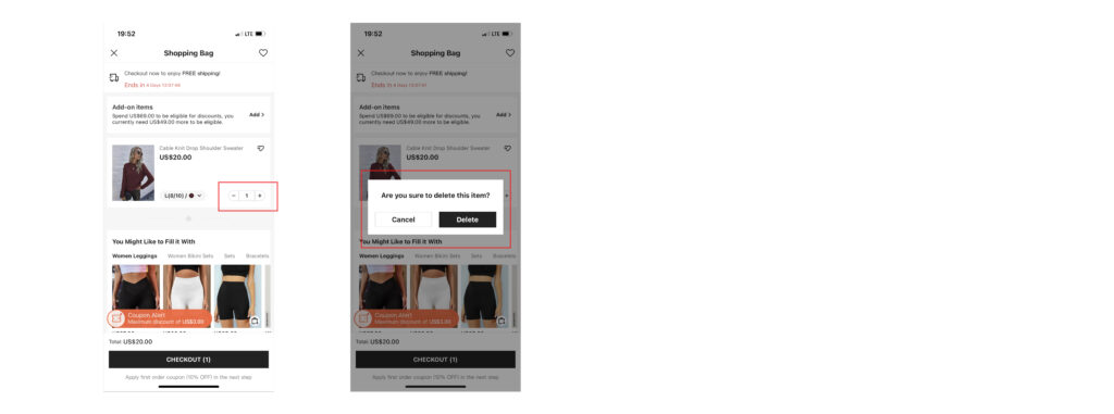
Solution: Showing coupons with applicable products in the shopping bags.
In conclusion, the whole shopping process is very smooth, and if some details can be optimized, it will be good for the user and platform.