Signal is a free cross-platform messaging application with features such as sending and receiving high fidelity messages, attachments, and participating in HD video calls and voice messages. Signal is a non-profit with a core focus on Data privacy and security, with no advertisement, and no trackers. In this assignment, I will apply concepts discussed in The Design of Everyday Things by Don Norman on a critique of Signal application.
Messaging
Signal messaging screen uses similar signifiers to WhatsApp (the most popular mobile messenger app worldwide with approximately two billion active users) giving the user easy cues to successfully achieve their desired task.
With affordances such as one-to-one messaging, sending media, file transfers, voice and video calls, users are immersed in a WhatsApp-like environment. Through these similarities, Signal leverages knowledge in the head to minimize learnability and maximized discoverability for the users.
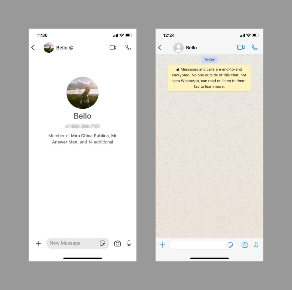
Figure 1B (right): WhatsApp message screen
Creating PIN
When signing up to the Signal app for the first time, users are asked to create a 4-digit PIN. This PIN is one characteristic that highlights data privacy and security. If a user loses or changes a device the PIN will allow them to recover their settings, chats, and contact information.
When creating their PIN, users are specified with only a single rule: “PIN must be at least 4 digits“, Figure 2A. However, if a user puts a simple PIN such as “1111” the following error message will be prompted: “Choose a stronger PIN”, as shown in Figure 2B. The error made by the user in this situation is a rule-based mistake. The application doesn’t provide any guidance on what caused the error, nor on how the user can fix it. Here the user is faced with a gulf of evaluation, which can be bridged by feedback and creation of a good conceptual model.
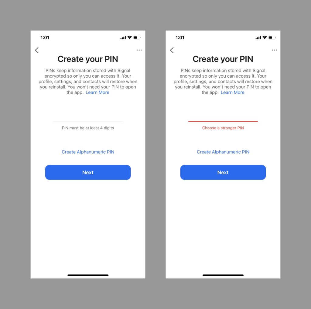
Figure 2B (right): Error message indicating the pin needs to be stronger
Solution:
- Provide a list of rules that the user must comply with when creating their PIN. For instance, “PIN must not be a series of the same 4 digits”. Additionally, the application can provide a link to teach the user on how to create a strong password.
- Provide feedback to the user who created an incorrect PIN with the specific reason for their PIN being incorrect.
Verifying your PIN
Every few days, Signal will remind the user to verify their PIN. As shown in Figure 3A, a prompt message appears at the bottom of the screen. By doing so, Signal enforces repetitive action for the user’s PIN to move into their long term memory.
If the user forgets their PIN, Signal would not be able to reset it. By putting users in the process of verifying their PIN, designers are emphasizing privacy with a clear system image (with presence of affordances, signifiers, feedback,etc), thus forming an accurate conceptual model for the users.
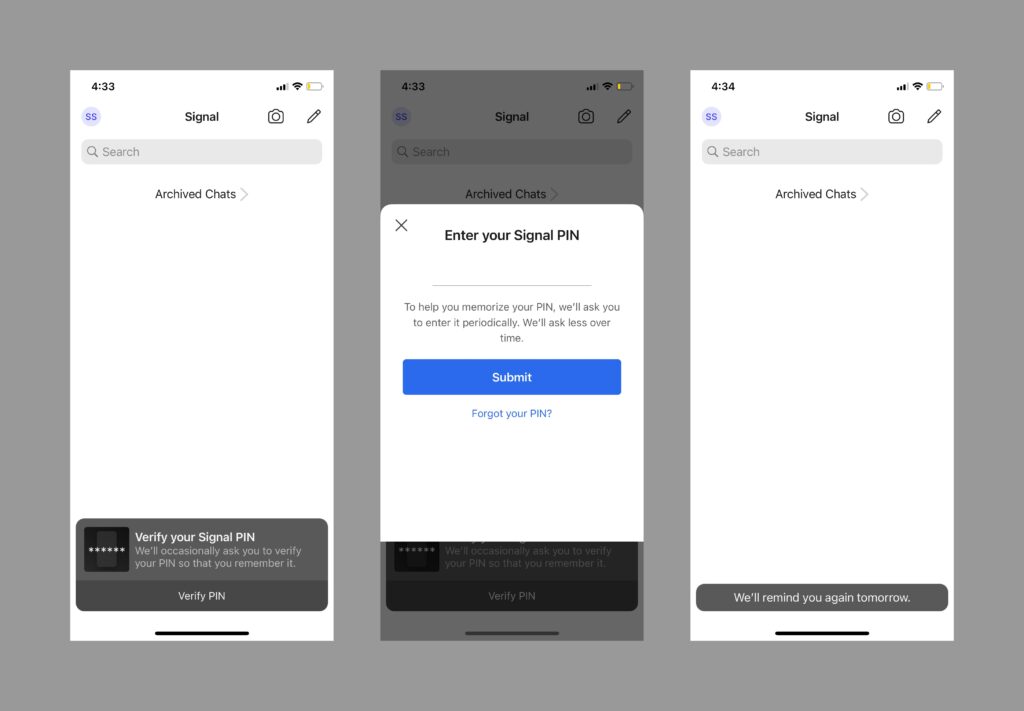
Figure 3A (left): Notification for verifying your pin
Figure 3B (middle): Screen to enter you pin
Figure 3C (right): Feedback after pin is inserted correctly
Conclusion
Signal has done a great job at leveraging existing user models to minimize learnability. This allowed Signal to gather millions of new users when news broke about WhatsApp’s updated privacy policy. The design team at Signal was therefore able to focus on communicating a clear message around their security and privacy methods. However, it still has room in some areas for improvement on the usability front.