Soundcloud is an “artist-first” open music platform for both listeners and music creators. With a global community of over 100 million users, SoundCloud focuses on emerging artists and less on mainstream music featured on apps like Spotify. The subscription based app become a popular platform for emerging and underground musicians to share their music or mixes and connect with a vast community of creators and listeners. The design critique will focus on Soundcloud’s app for iOS.
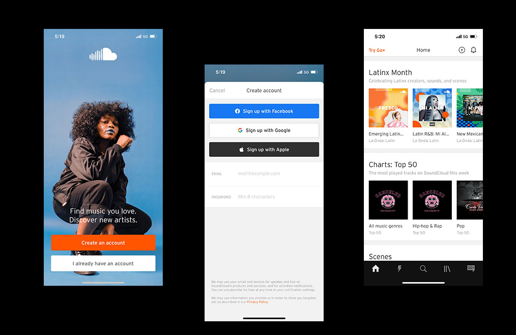
Figure 1B (Middle) – Creating an account screen 2
Figure 1C (Right) – Home screen after completing signing up process
Signing up for SoundCloud
The process of signing up for SoundCloud is pretty standard in terms of steps. The process begins with a visually appealing opening screen featuring a large image of an artist with 2 simple options: create account or login to an existing account. Although the onboarding process is clear and simple, there is very little offered in terms of discoverability of what features the app offers and what sets SoundCloud apart from other music streaming apps.
Solution
The onboarding process should include a step by step introduction to the various features of the app and introduce the user to the community of Soundcloud users.
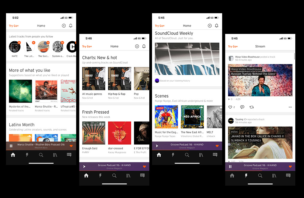
Figure 2B (Left) Scrolling further down the home screen you will find “new” suggestions
Figure 2C (Right) Continuation of scroll on home screen
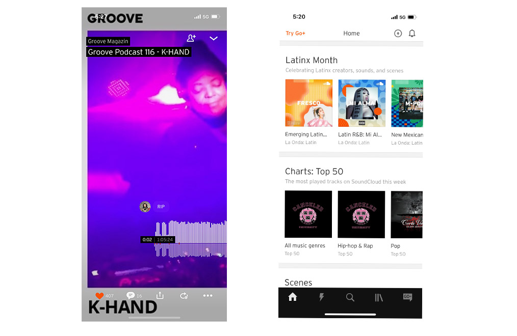
Figure 2D (Far Right) The stream icon on the bottom menu takes you to this screen featuring new tracks posted by artist you follow
Discovering new music
The home screen follows a simple, clean minimalistic grid layout that is both visually pleasing and not overly cluttered. The top row allows users to scroll horizontally to view the latest tracks from people you follow which is signified by a circular icons instead of a square icon to represent people. The next row provides the user with suggested tracks based on your likes and play history. The following row titled “Scenes” provides the user with algorithmic suggestions which appear to be unrelated to previous listening history. Scrolling downward we come to “Artists You Should Follow”.
Each row of categories displays the last icon half way off the screen which affords to the user that there is more to look at and scrolling to the side will reveal more tracks, artist or playlists.
Although the app affords users many different options for discovering music, the overall discoverability lacks coherence and leaves new users confused as to where they should begin searching for new music akin to their own tastes.
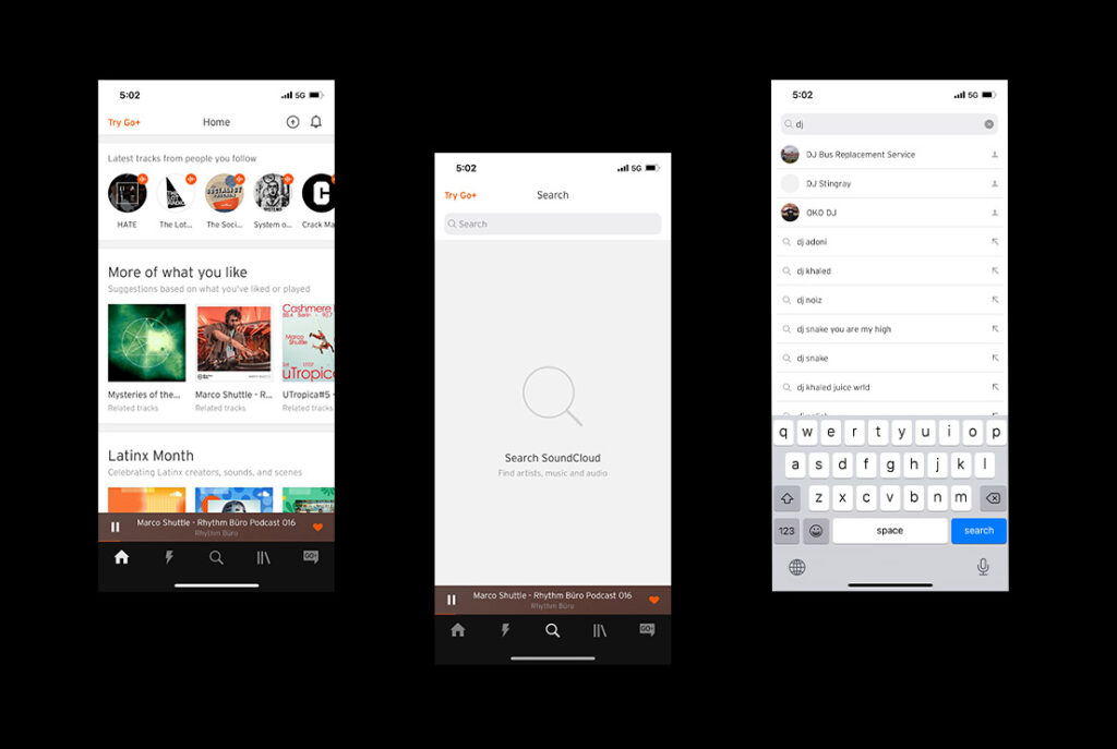
Searching and Sorting music
Finding new music on Soundcloud is a relatively easy task, they use a magnifying glass at the bottom as a clear signifier for searching new music. Once the user taps on the magnifying glass icon it takes you to another screen with a large horizontal search bar at the top. The search tool includes an automatic word search predictor, with the top suggestions being artists who you already follow, which is a helpful tool for returning users.
However, new users will will experience difficulty figuring out how to search and navigate through new music that is fitting with their tastes. The search bar lacks filters, leaving the user confused as to how to discover new music. There is a general lack of consistency
Solution
Add more filtering and sorting options with different categories: Artists, Songs, Playlist, Genres. This could be added as a filtering icon on the top right. The unused white space below the search bar could be used for a grid of different categories of music genres arranged in a grid layout.
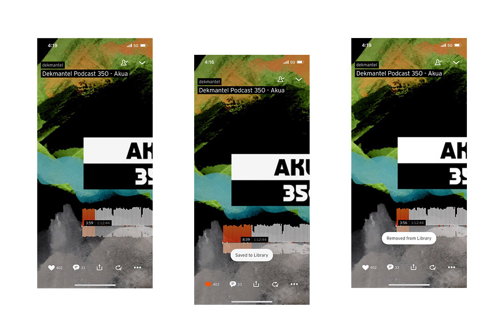
Figure 3B (Middle) – view of feedback indicating a track has been liked
Figure 3C (Right) – view of screen when a track has been unliked & removed from your library
Liking music
SoundCloud affords a few different methods for “liking” tracks. One is to tap the heart icon on the bottom lefthand side of the screen. Once you have tapped the heart the user is given feedback that the action is complete when the heart changes from grey to orange and a small bubble pops that says “Saved to Library”. If you click the heart again it will change back to grey and say “Removed from Library” another clear and immediate indication that the reverse action of “Unliking” the track has been completed.
Solution
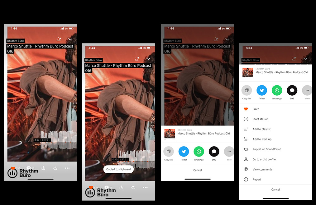
Figure 3A (Left) – the sharing icon located in the middle of the bottom menu
Figure 3B (Middle) – once tapped the user is given feedback to indicate it is copied
Figure 3C (Right) – view of screen when a track has been unliked & removed from your library
Sharing Music
Soundcloud affords a few different methods for sharing music with friends via text (sms), Twitter and What’s App. From a discoverability standpoint, the sharing icon located in the middle of the bottom menu signifies to the user how to share a track with someone. Once you have a reached the sharing screen it is easy to accidentally share a link to the wrong person or on the wrong platform due to a lack of defined physical constraints.
Solution
There should be more options for sharing that are more intuitive and there should be more platform sharing options. The sharing options should be limited by more physical constraints to guide and inform the user by only offering a set number of sharing options.
SoundCloud is an app designed for both musicians and music fans, it seeks to provide a platform for emerging artists to showcase their music and connect with other creators. Overall, the design aesthetic is both visually pleasing and minimalistic, however it falls short from a usability standpoint and lacks clarity for new users.