
Spare Room is a roommate website for tenants to find roommates & rooms and hosts to rent out rooms in the UK and US. Its romantic target is to meet potential friends by sharing life. But in most cases, someone like a college student who can’t afford whole studios & apartments uses it for the purpose of cost-saving, especially when they live in big cities with high rent.
This critique follows its mobile interface in the iOS system and focuses on the workflow of searching a room in the US by the following functions.
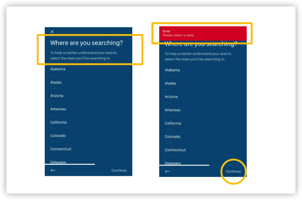
Selecting a specific state is a mandatory step once the user creates a Spare Room account. It has a clear signifier: a header formed by a close-ended question “where are you searching” with a list of state options.
Selecting a state is a constraint. Thereby the continue button in the lower right corner remains grayed-out until the user selects a state. Grayed-out is a common UI design, indicating the function is disabled currently. If the user clicks the grayed-out continue button with mistake, the button will vibrate shortly, giving intensive feedback for its unavailability. Furthermore, a red alert bar signifiers with written text warning Error and direct command “please select a state”.

By clear signifier and constraint, it helps to avoid potential mistake. However, the color of the scroll bar on the right is close to the background(Figure2). The design might be based on the knowledge in the world: the US has a fixed number of states and usually list in alphabetical order, but it still increases the difficulty of discoveriablity.
To improve it, brighter colors like white and orange can apply to the scroll bar.

There is a typical example of Mistake. After selecting a state, the user automatically drops to the next step: selecting a city. But once the user just wants to go back to the previous page to reselect another state and mistakenly tap on the cross icon on the left of the screen, they will suddenly go back to the initial page at the very beginning and lose all the sign-up progress, which means they have to fill in the name, email, password again.
The correct function to go back to the previous page is clicking the arrow in the bottom left corner, though the user has been used to afford a cross button for turning off this page rather than the whole progress, which causes confusion.
The solution is to simply delete the cross button as well as its feature to avoid misleading users.
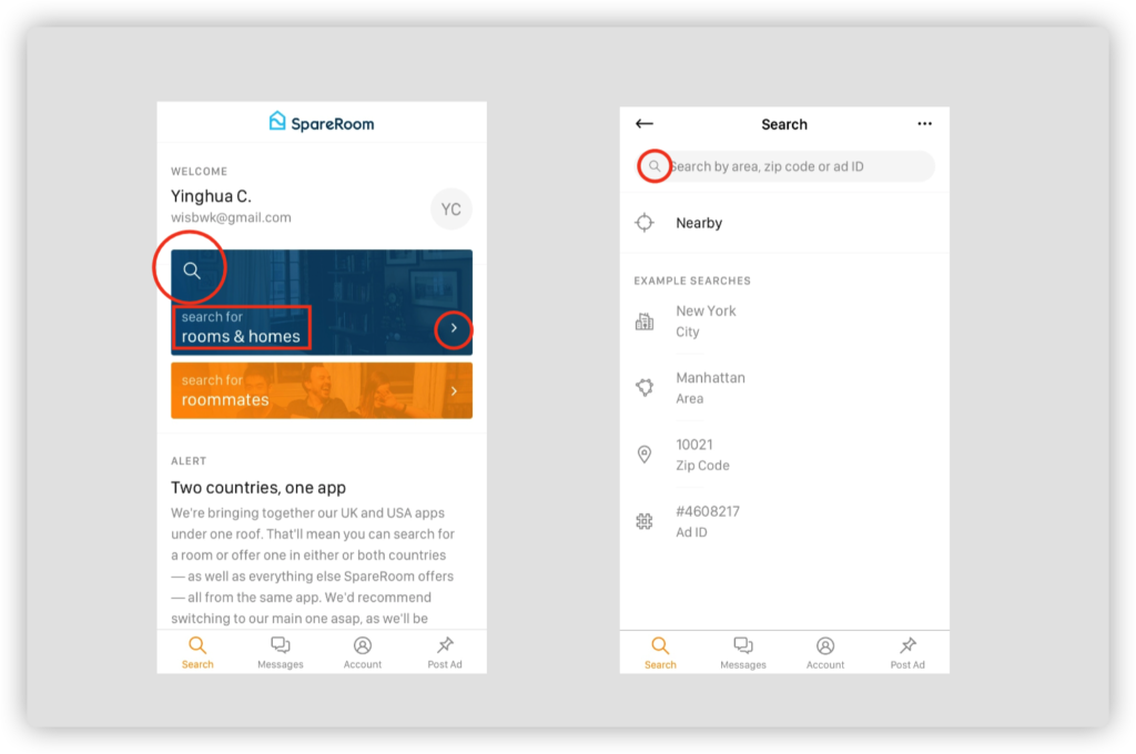
After selecting a city, users still need to set their preference as searching for roommates/tenants or for a room. Finally, we finished the process of creating an account and enter its homepage. Two buttons of the search for room & roommate use eye-catching contrasting colors, span the width of the page, and signifier with a leading icon of magnifier&arrow as well as the text “search for.”
Clicking searching for rooms, the input field as a clear affordance customizes the user’s destination. The text “search by area, zip, code, and ID” and the concrete example below prompt the user what to search for, efficiently eases the gulf of evaluation.

Though when we review the whole search workflow, we will find the system image is not clear. In the initial setup, spare room forces users to select a state, then a city, which dismatch my Conceptual Model. For example, though pratt institute locates in New York, many students live in the nearby state of New Jersey and commute by path train. This function forbids these users to search for and compare with house recourses from two states.
It is less understandable that after we gradually narrow down our search to a city, the search pattern turns to zip code & address but doesn’t limit range at all, which abroad the map again to the whole U.S. For example, even though I have narrowed down my search to New York City, I can get tons of house recourse by just entering a California Zip Code. So the well-designed constraints for narrowing the search grid make no sense but only increase users’ gulf of execution.
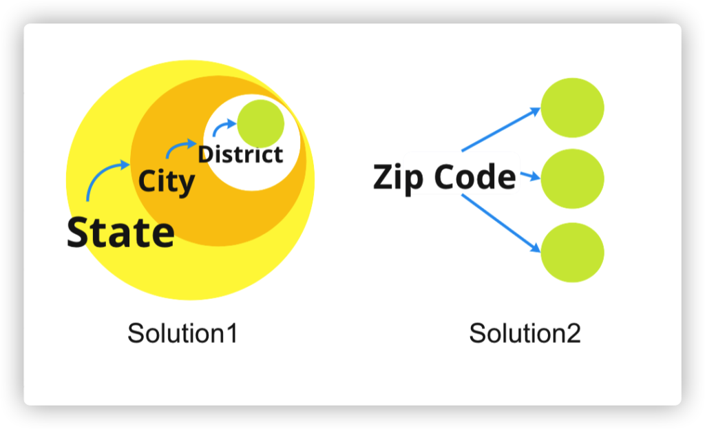
To improve it, the search method should follow the natural mapping to continue narrowing the search to areas (figure6, Solution1 ) or simply delete the whole constraints in order to improve the user experience(figure6, Solution2).