Uber Eats is an online Food Ordering and Delivery Platform, Launched by Uber in 2014. Its platform enables users to browse menus, reviews and ratings, order, and pay for food from participating restaurants using an application on the iOS or Android platforms, or through a web browser. Applying Don Norman’s design principles from his publication “The Design of Everyday Things”, I will provide a heuristic evaluation of the Uber Eats mobile iOS application.
Search Functionality on Homepage
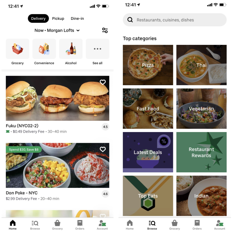
The placement of the app’s search function compromises its flexibility and ease of use. The App’s Search Bar is difficult to find, especially for first time users. The “Browse” icon at the bottom of the home screen directs you to another page, which houses the search bar at the top. To improve discoverability, I would recommend moving the search bar to the home page, so that this is more consistent with other applications.
Filter Option
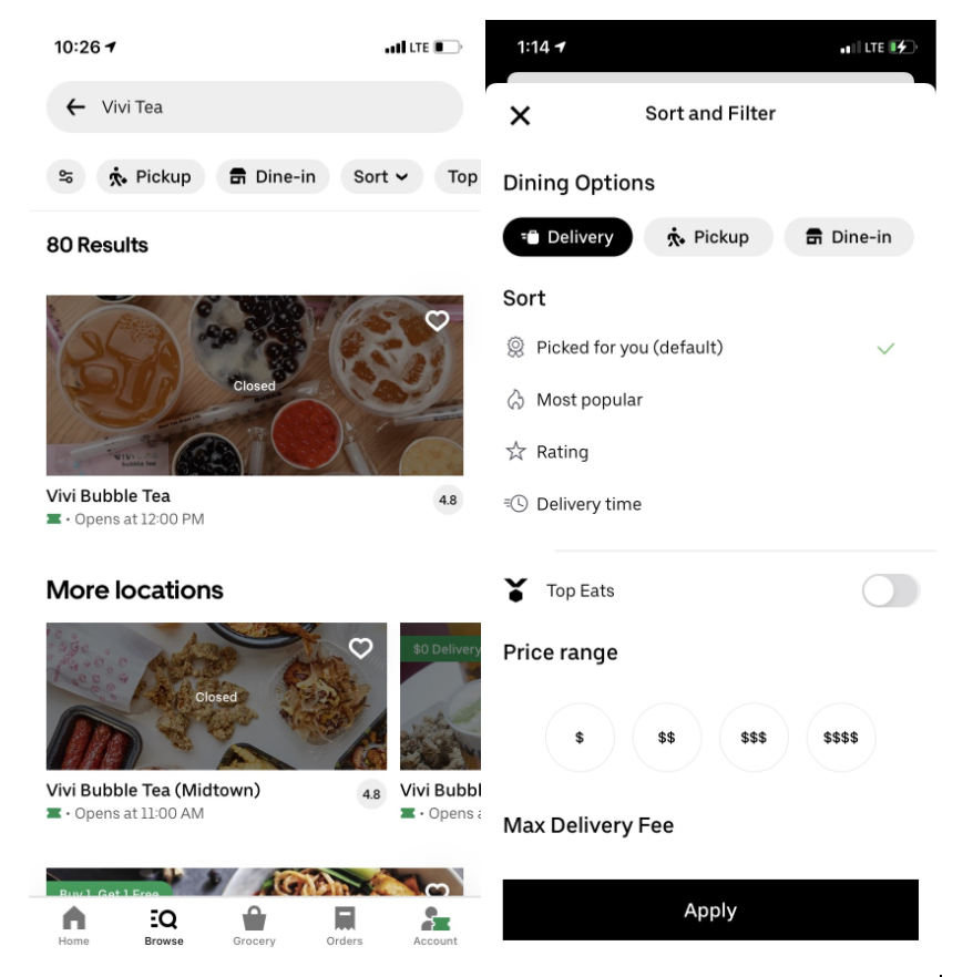
Additionally, it is unclear what the filter button on the home page signifies. This icon also appears on the “browse” tab, but is smaller in size and is located in a different place. This might be difficult for a first time user who is looking to refine their search. I would aim to change this icon to one that is more recognizable (three lines or filter cone), and ensure that the location and size are consistent on both pages. To simplify further, I’d also remove select items on the top menu, as it is already accessible within the filter (price, dietary options, delivery fee). This would ensure that the user is able to focus on the task of ordering seamlessly.
Alterations to an Existing Order
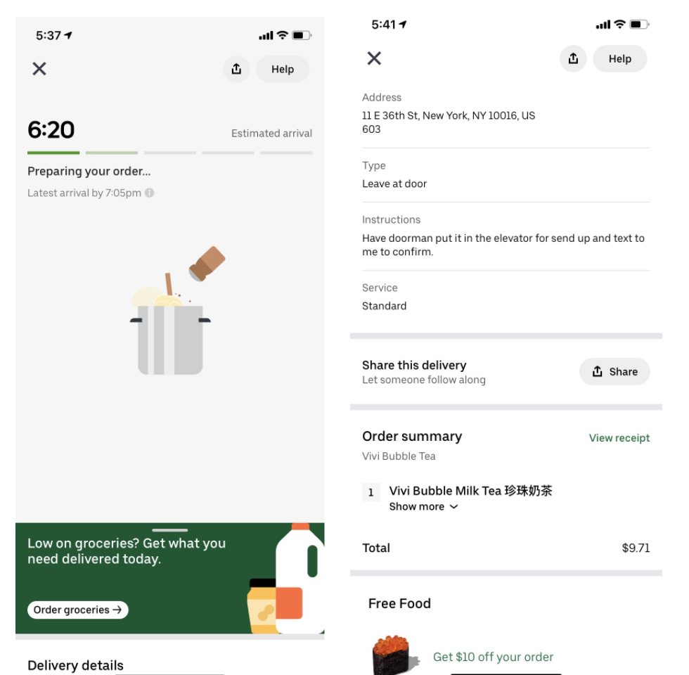
Uber Eats does not allow the user to alter order details or their delivery address once the order has been placed. The user would have to first cancel their order, and redo their entire order under the revised delivery address. Alternatively, the user can call the driver to see if they will deliver to the revised address.
I would recommend displaying the order receipt, and an edit option directly under the tracking on the order tracking bar on the tracking page. Constraints can be placed at different phases of the order process where the option to edit is no longer possible. I.e. Users shouldn’t be able to alter their order once the food has started being prepared, and shouldn’t be able to alter their address once it has been picked up by the driver. The user would then be notified if there are any changes in cost, or limitations on delivery after they have tried to change this.
Cancelling an Existing Order
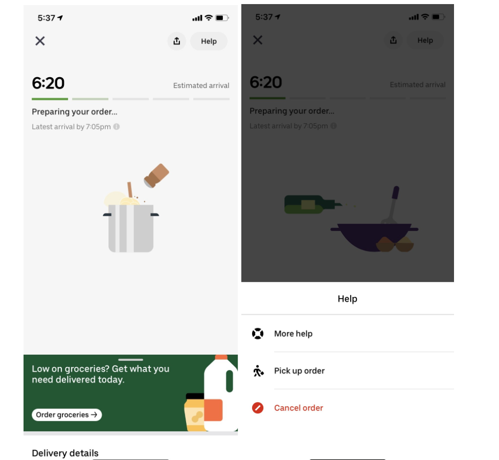
Once the user has placed their order, the option to cancel is not directly apparent. The cancellation option is hidden under the “help” menu at the top right. This would take the user quite some time to figure out, as they may only discover this by accident after searching in multiple areas.
One could reason that the cancellation button was hidden strategically, as a constraint to prevent hasty cancellations. Making this more difficult to find gives the user time to think about whether they still wish to cancel. The option to confirm their cancellation serves as a constraint to prevent the user from cancelling by accident or from making a rash decision. I would move the cancellation option to the order tracking page, and keep the constraint which requires there confirmation before moving on to the final step.
Items You’ve Ordered Before
(Flow 1, Orders Tab)
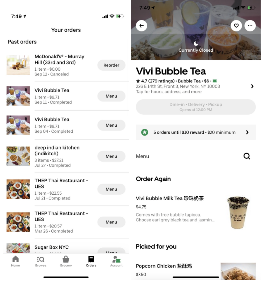
The existing application allows you to view your previous orders through the “orders” button on the bottom navigation. Users can view the menus for items that they previously ordered, but can only reorder their latest order directly from this tab. Once they have selected the menu for a previous restaurant, their latest order appears at the top of the menu’s page.
There are too many steps for the user to find their previous order, and reorder this. To simplify their task, I would recommend adding a reorder option to all of their previous orders on the “orders” tab.
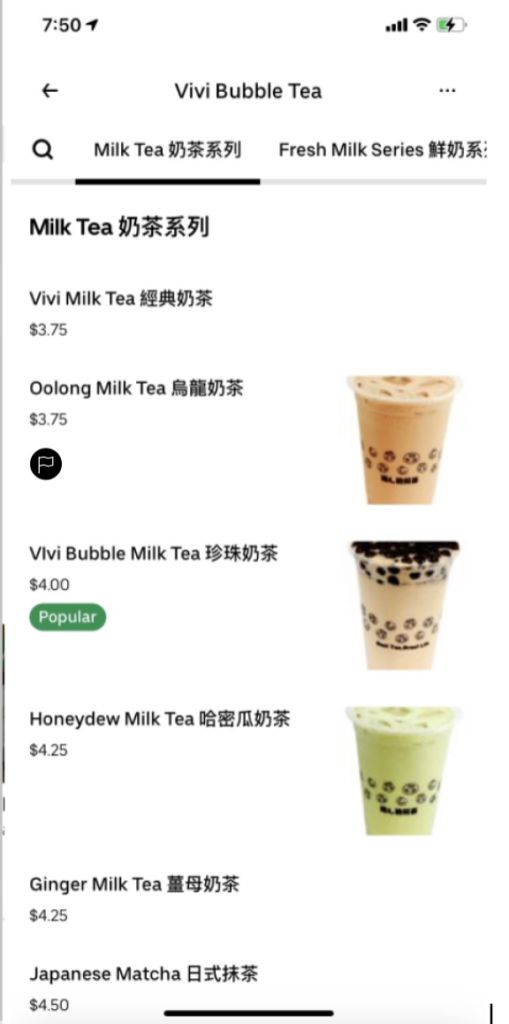
(Flow 2, Orders Tab)
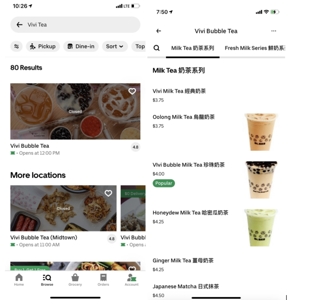
When viewing menus from establishments they have rediscovered through the “home” or “browse” options, the user lacks the signifier which indicates items they previously ordered.
My suggestion is to add an icon that looks like a flag to signify which item a user has ordered from places they have rediscovered when browsing. This would help them to identify their previous order, to make the right decision in selecting this or a different one if they were unhappy with what they received before.
(Revised Orders Tab)
Conclusion
The Uber Eats Application provides the user with great feedback. The order tracking page, for example, provides the user with visual feedback to demonstrate where their order lies in the preparation and delivery process with the estimated time for arrival. Overall, I noticed significant room for improvement with respect to discoverability throughout the ordering process.