What is venmo?
Venmo is a mobile application that helps you to pay and request money from your friends. At its core, Venmo provides a social way to pay your friends when you owe them money and don’t want to deal with cash.
mY GOAL
The goal was to pay $100 to Lillian Yang. I solely focused on the payment process and the related interfaces, but nothing else. As this is an obvious and short process, I deep-dived into each design component on the screen rather than generally skimming the entire flow.
How can I pay?
The left is the current Venmo app, and the right is my design suggestion.
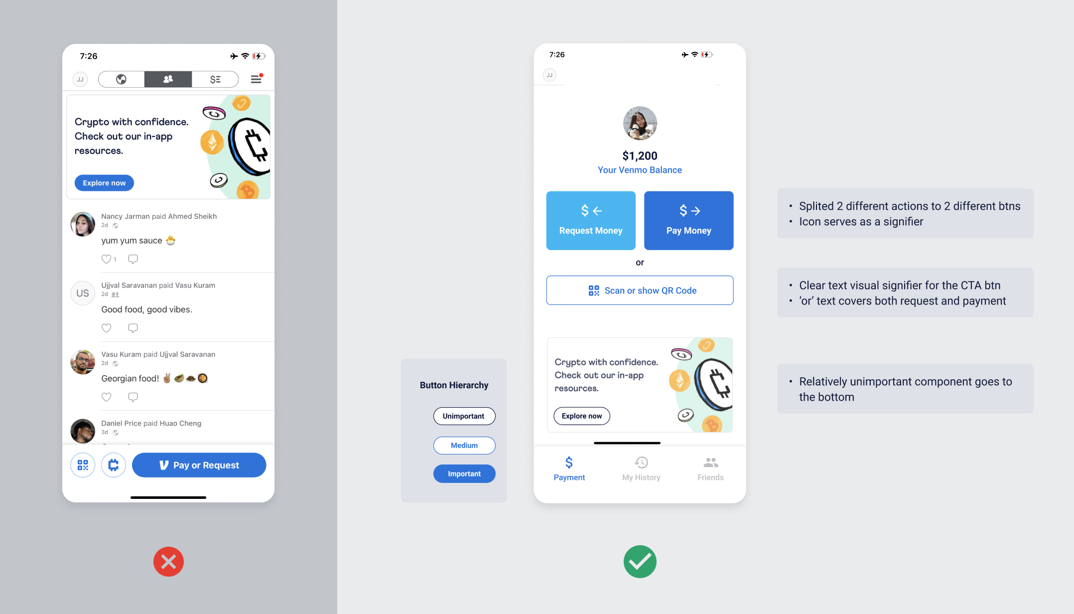
The first impression of the main page of VENMO was that there are too many components on the screen. However, having many elements in one screen isn’t always necessarily bad and sometimes it’s inevitable. Then, why does this interface particularly look distractive?
1. POOR discoverability
In this case, finding how to pay was the only goal in my mind. Probably, a long-time user would already know where to look at.
However, to a novice user like me, it took some time for me to find where the payment button is. The right answer is the big round-cornered ‘Pay or Request’ button on the bottom. The color and the design of the button clearly shows the perceived affordance of clickability. The filling of Venmo’s primary blue color presents that this button is enabled and important. The text label serves as an obvious signifier of ‘payment’. Then, why was it hard for me to find this button?
The culprit might be the poor discoverability. According to Norman, good discoverability includes clear focal points (calls to action, images, and headers), visual hierarchy (content structured in order of priority), and obvious navigation systems. In this case, the Payment CTA button is located on the bottom-right of the screen. Considering that people start scanning a mobile page from the top-left and end on the bottom-left, the payment button should be on the top of other elements as it is the most important button.
Another issue is that the top app navigation is not following the industry standard. Users are familiar to navigations on the bottom, so they might be confused of the affordance of the top menus or even overlook them.
Lastly, the buttons and texts have wrong hierarchy. In this page, the crypto coin advertisement banner looks the most important because of its location, big heading, and the blue ‘Explore Now’ button. The advertisement might be really important for a business-wise goal, but in term of usability, it only distracts users from reaching their payment goal. I suggest not only changing the position of the banner, but also setting a clear hierarchy for buttons and texts. (See my suggestion.)
Simplicity is not always the best
Last but not least, did you know that there are 2 more ways to pay other than clicking the blue button? I didn’t until I clicked the 2 circular buttons next to the payment button and figure out they actually are ‘Pay by scanning the QR code’ and ‘Pay with Crypto’ buttons. Skipping a text label might make the button design look simpler, but it doesn’t work as a good signifer. I’d rather use text signifiers to clearly show the button’s affordance.
Who to pay?
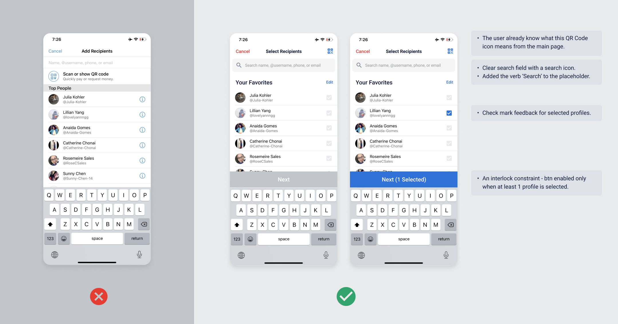
Search Field LACKING BOTH AFFORDANCE AND SIGNIFIERS.
The search field design lacks both affordance and signifiers. It lacks affordance because it doesn’t look like a touch field. The white background of the search field isn’t distinguishable from the screen’s background, which doesn’t deliver that it affords a touch action. Plus, the placeholder text doesn’t clearly show what action is available here. I would put a verb ‘search’ to indicate that a searching action is possible here. In addition, adding a search icon would be a great signifier for a search action.
fRIEND LIST lacking of feedback
Once I clicked a profile, it immediately took me to the next payment screen. Showing no feedback of whom I selected a second ago can be convenient as it shortens the time and effort of clicking the next button. However, one thing that designers should bare in mind is that users make slips, which means the action performed is not the intended action. I accidentally clicked the top profile when what I was intending to select Lillian Yang. Sending money to the wrong person can be a huge problem, hurting their overall experience.
I suggest putting an interlock constraint to make sure the user selected the right profile and then proceed to payment. In my visual mockup, I placed Next button that enables only when at least 1 profile is selected so the user can ensure who they selected before they proceed.
Additionally, I placed checkboxes to help users recognize whom they selected, rather than trying to use their Knowledge in the Head to recall.
How much to pay?
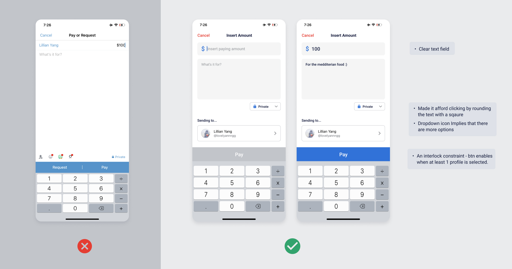
Once the user enters this page, the numeric keyboard shows up automatically as a good feedback that shows they’re on a page where they can insert numbers. However, the input field still doesn’t clearly show that it’s a ‘field’, and the text placeholder still lacks a verb of needed action.
Most importantly, this screen has simplicity, but lacks ‘understandability.’ For a first-time user like me, we need a clear conceptual model which maps the recipient of the money and the amount of money paying. On this screen, there is no description or an instruction that lets the user ‘Lillian Yang’ is the receiver. In the visual mockup, I added the title ‘Sending to…’ to instruct the user that the profile below is the recipient.
Another problem here is that the Pay button looks always active, even before the user fills up the required information. It might need an interlock constraint that forces operations to take place in proper sequence. As in my visual mockup, when any of the required fields are empty, the pay button should be greyed, showing it’s disabled. This way, the user can know that something is missing.
Did I… pay?
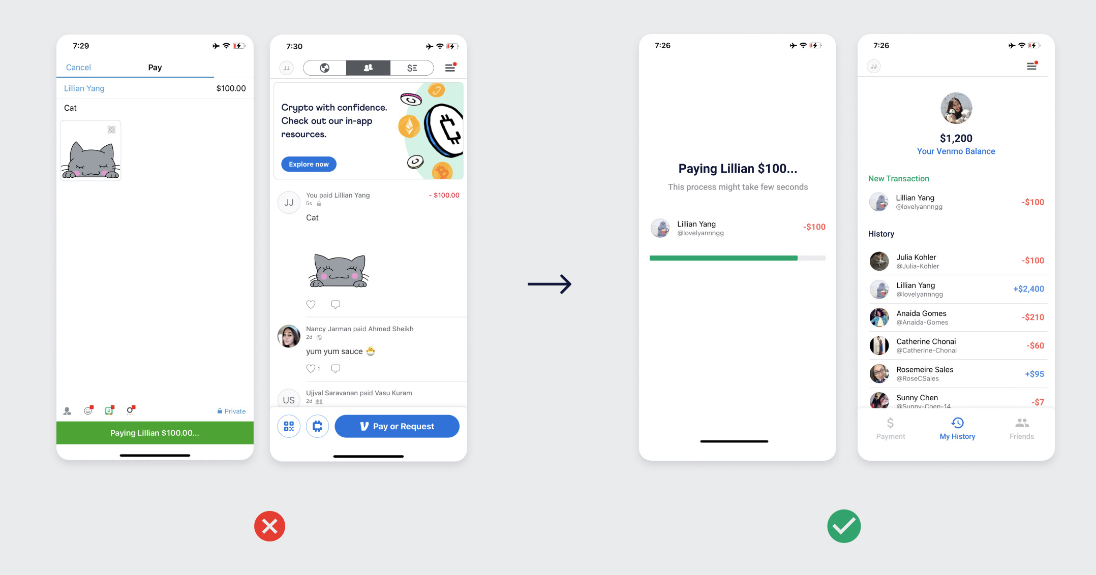
Finally, it’s time to pay! When the user taps the pay button, it changes to green, showing some feedback that the payment is happening. It’s not bad, but there is a seperate blue progress bar on the top that serves exactly the same as the green progress bar on the bottom. How about merging them into one single bar? Plus, why would we make the user stays on the previous screen when they can’t make any changes anymore? Why not taking the user to a different loading screen to show more clear feedback?
More importantly, after the payment, the app doesn’t show us any feedback of whether the payment was successful or not. The users have to look at the payment list and find their last payment. Even though putting the latest transaction at the top is a good mapping, users might need an extra popup or toast popup as feedback.
Summary
This report evaluates Venmo’s usability using Don Norman’s Design Fundamentals, including Affordance, Signifiers, Mapping, Feedback, Conceptual Model, Constraints, and Discoverability. The findings and insights were discovered while one usability expert, in this case the writer of this report, following a task flow of payment process as a novice user of Venmo.
To summarize the results, the app has decent usability with a basic level of Affordance, Signifiers, and Mapping. However, even though the evaluator succeeded reaching the goal of the payment, it took loger time than expected. Also, several rooms for improvement were detected, especially in Discoverability, Affordance, Feedback, and Constraints. By setting a clear visual hierarchy, adding constraints to prevent user’s slips, making feedback clear, and placing more signifiers, Venmo can could expect significant enhancement in its user experience for the novice users.
references
Norman, D. A. (2013). The design of everyday things. New York: Basic Books.
Batterbee, I. (2021). Don Norman’s seven fundamental design principles. Retrieved 19 December 2021, from https://uxdesign.cc/ux-psychology-principles-seven-fundamental-design-principles-39c420a05f84