Sonos revolutionized the way people listen to music by introducing to the market high-quality speakers that can stream music and connect to each other through wifi. The sonos.com website is where fans and newcomers alike can purchase products, look up answers when troubleshooting, and learn more about the company. This critique will focus on the main landing page and the “Shop” section of the website.
The Landing Page Menu Labels
At the top of the landing page, there is a horizontal menu on the left side of the page, and three icons – one to sign in, one for a search feature and one that leads to the shopping cart – on the right.
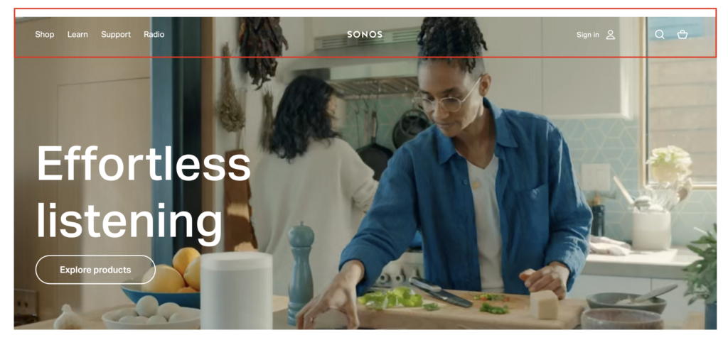
From a purely aesthetic perspective, the white font and and small size of the menu makes it easy to miss, especially since the background is a moving video that draws a lot more attention. However, since the menu bar is at the top of the page like most websites, I don’t expect this to be a big issue.
In terms of the menu labels, “Shop” is pretty obvious – this is where users can purchase products. “Support” is also fairly obvious for users who are web-savvy and they will understand that this is where the customer support section lives. However, this label could also be confused as a place where one can offer support to Sonos (especially for those new to the website) which is why updating the label to something more obvious such as “Get Help” or “Customer Support” could be a more effective strategy at eliminating any potential confusion. Good labels should be representative of the content that follows, and should not use jargon that not everyone will understand.
On a similar note, “Learn” and “Radio” are also not the most intuitive labels. In terms of “Learn”, it’s not clear whether the user will learn more about the company, the products, both, or something else altogether. Updating the label to “About”, which can then be further divided into “About Us”, “About Our Products”, “About Our Philosophies” etc. might be more intuitive since most websites have an “About” section in the main menu bar. This will also make it more obvious what all users can learn about.
The meaning of “Radio” is not clear at all from the label itself – the user learns that the label refers to Sonos’ radio subscription program only after clicking on it and being redirected to the “Radio” page. This is also the only label that is a noun while all other labels in the main menu are verbs, making it inconsistent. Updating the label to something like “Listen” for consistency or “Sonos Radio” for more clarity could potentially be better alternatives.
The Architecture of the Shop Tab
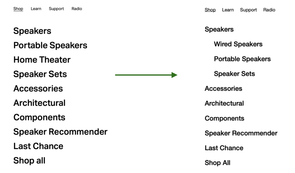
Clicking on the “Shop” label opens up a sub-menu where multiple categories of products are listed. However, there are a couple issues:
1. Speakers can fall into multiple categories at the moment – products under the “Speakers” label are also found on the “Portable Speakers” page. It will make more sense to make “Speakers” a crucial category and then list “Portable Speakers”, “Home Theater” and “Accessories” as optional categories under “Speakers” to make the hierarchy of the categories clearer. Adding an optional category of “Wired Speakers” also makes sense to encompass all the other speakers that don’t fall under any of the the other optional categories.
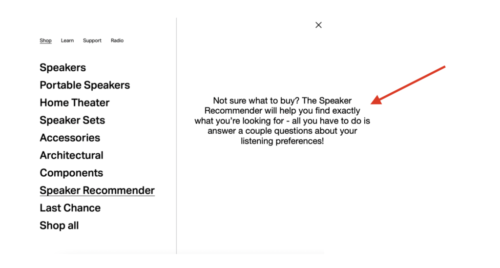
2. While the labels “Architectural” and “Components” don’t make a lot of sense, Sonos overcomes this ambiguity by displaying images of products in those categories on the right of the sub-menu. However, the images don’t necessarily match the products that fall into each category – the same product images are shown for the “Components” label and the “Speaker Recommender” label, even though the Speaker Recommender is not a product like the Amp, but rather a tool users can use to find Sonos products.
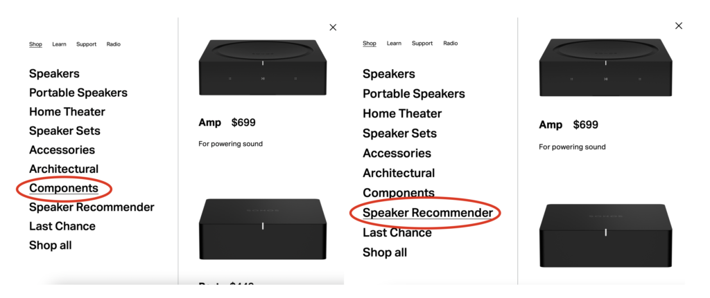
This then, defeats the purpose of displaying the images on the right of the sub-menu for certain categories because it’s not representing accurate information. In the case of the speaker recommender, instead of an image that applies to another category, a small blurb that describes the functionality of the tool might provide more clarity to users and eliminate any unnecessary confusion.
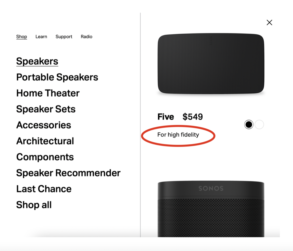
3. For the “Speakers” image menu that pops up on the right, I like how the website lists what a speaker specializes in with the help of descriptions such as “For high fidelity” in the case of the Five. This specificity will make it easier for users to browse when they are visiting the website, especially for the first time. However, just having a label like “Five” might not be the most obvious way (particularly for those new to Sonos products) to indicate the name of a particular speaker. This is an example of a corporation’s categorization that isn’t explained well and makes information less intuitive. Changing the label to “Sonos Generative Five”, “Sonos Series Five” or even just “Sonos: Five” could help mitigate such confusion and make it clearer that the “Five” refers to the name of the speaker and not just a random number.
is good for adds specificity when browsing.
Icons, Navigation, and Labels on a Product Page
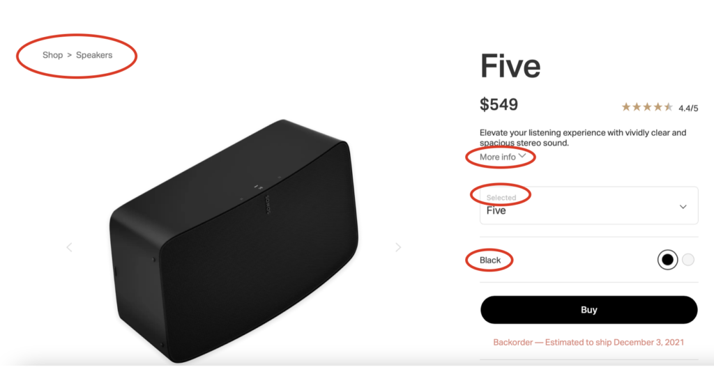
The website incorporates several design best practices to facilitate easy navigation and comprehension of information and functionality. On the top right of a product page, the navigation pathway is described with the help of breadcrumbs so that users are aware of how they got to the particular page and the categories that the product falls under. There is ample use of labels such as “More info”, “Selected”, and “Black” to ensure that the user knows what actions to take or what actions have been taken throughout the page. I particularly like the “Black” label because that makes it very clear that the black and white circles refer to the colour of the product.
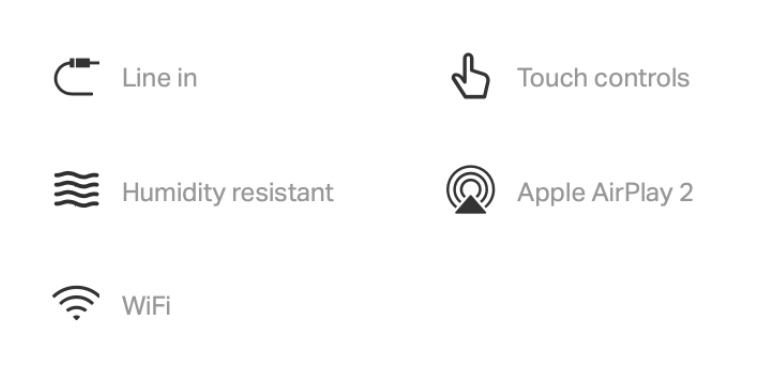
There is also an example of the use of icons with labels on the page to eliminate any confusion caused due to unfamiliar icons which I liked a lot.
Searching on sonos.com
Clicking on the search icon opens up a search section with a search bar on the top and examples of popular searches on the left.
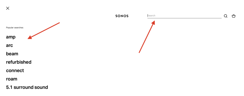
While the popular searches could be useful to some, this feature might be more useful for the UX team (to see what terms users are searching for most often) than for the actual users themselves, which is why the popular searches are an example of irrelevant categories. In addition, the search bar operates by either suggesting search results based on what the user types in or based on what best matches predetermined keywords, which is why the popular search feature doesn’t add any value and hence, should be removed to eliminate clutter.
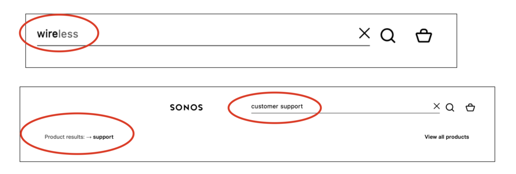
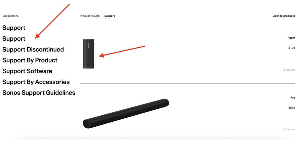
I like how the search results show suggested searches not only as text but also images of products that fit under the keyword users enter. My only critique is that sometimes it’s not clear how certain products fall under certain keywords e.g. how the Roam or the Arc fall under “support”.
Final Thoughts
sonos.com makes creative use of images and menus to organize and display information while also making sure to use ample descriptive labels on product pages to always keep users informed. Minor tweaks that make the language of menu labels more user-centric and reorganizing categories to make the hierarchy clearer will further elevate the user experience on the website.