
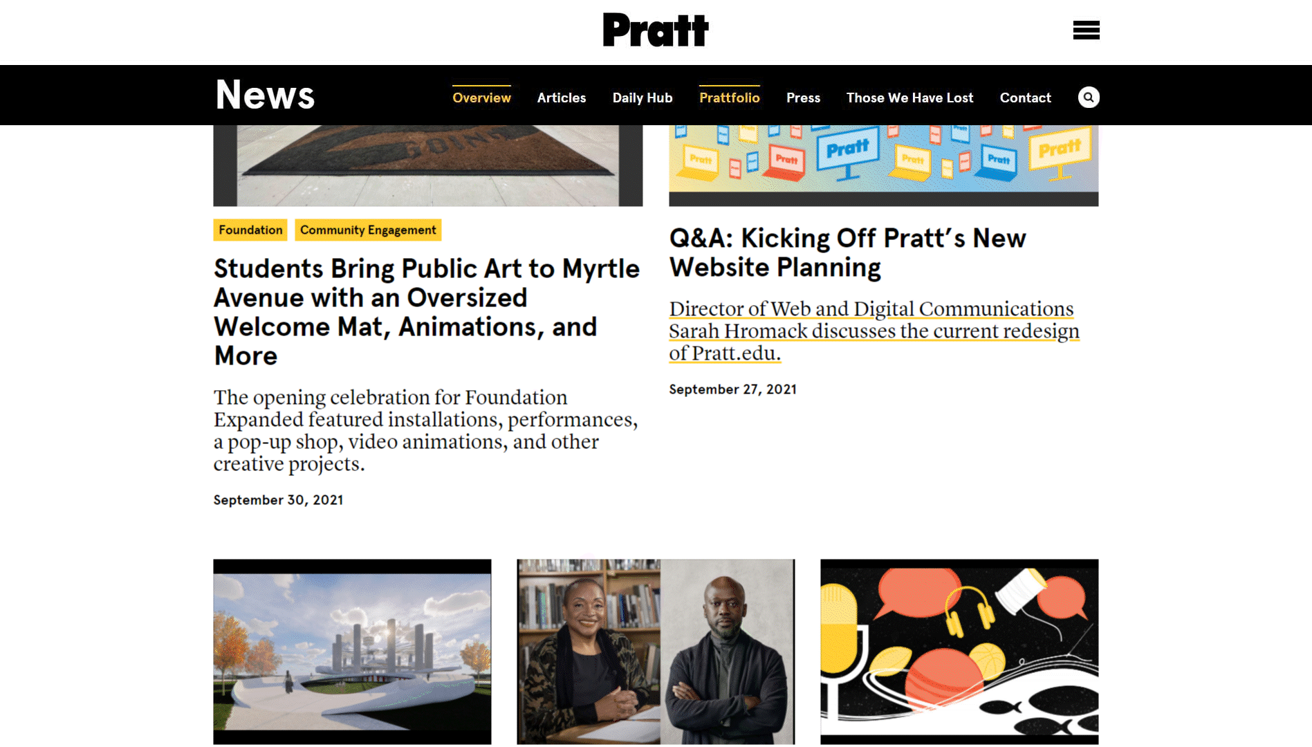
Pratt News is a resource for current events and other content relevant to the Pratt community. It features a unique navigation menu that sets it apart from the rest of the Pratt Institute website. In this project, our team used Google Analytics and HotJar to help users find content and get around the site more easily. Our study addresses the navigation menu, search bar, the suggested content layout, and the call to action buttons.
news.pratt.edu
The Navigators:
Our team was comprised of graduate students within the School of Information: Chris Denney, Verena Tanzil, Mayank Gupta, Raunak Jangid and I. Throughout this two-week project, we collaboratively investigated data trends and branched out to take ownership of specific findings once we determined several directions implicated by our research.
Who is interested in improving Pratt News’ navigation?
Our research question was motivated by an aim to help users locate content that best fits their interests. These presumed users include current students, faculty, alumni, prospective students, and other members of the Pratt community. We looked into various web analytics to capture a comprehensive view of user behavior so that we could better understand what obstacles might prevent visitors from getting around the Pratt News site.
Our clients at Pratt News, Sarah and Sarah Hromack and Alex Weiss Hills from the digital communications team (director and lead developer, respectively), are in the process of redesigning the entire Pratt Institute website. The site we looked into was a recently-updated version, and our usability testing was meant to glean insights to structure the next redesign.
Knowing where to look
Our team relied on Google Analytics to understand how users currently engage with the site, formulating insights from trends discovered in the data. Specifically, We additionally used Hotjar — a tool that allows researchers to visualize user behavior in the form of heat- and scrollmaps. Our team had data available collected between September 24th through September 30, 2021 from which to formulate our study.
To understand how to best help Pratt News users, our team had to first define the priorities and scope of our study to draw meaning out of the data. We limited the study to desktop browsers and looked into most notable aspects of site navigation to identify research topics which we then split up to study individually.
One aspect to note is that, given that Pratt News has its own secondary navigation menu in addition to the primary global navigation bar, our team broadened our project scope to consider how both navigation menus may supplement one another.
We collectively prioritized four main research areas:
- Navigation Menu
- Search Bar
- Suggested Content
- Call to Action Buttons
Users rely on the navigation menu to get around
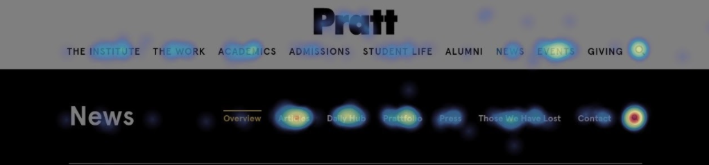
Click heatmap
Recording: User navigating website
Given the scope of our research, we first looked into the two navigation menus and found that 43% of all users use the navigation menu to find their way around the site, and also that a large majority of users were scrolling beneath the fold (83%). To navigate the page, users scroll back up again to the navigation bar.
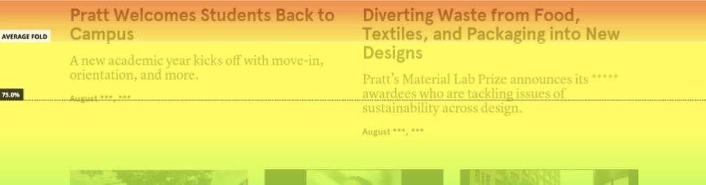
Scroll Heatmap: 83% of users navigating below the average fold
To prevent users from dropping off due to the scroll, we suggest implementing a sticky navigation bar, so that it is always present for users even as they scroll down to read articles. This will keep primary navigation options at their fingertips. To minimize confusion, we suggest converting the global site navigation into a hamburger menu so that it is minimized but still accessible for users.
Recommendation #1: Sticky navigation with hamburger menu
Towards a better search bar

Default navigation menu

Example of search bar covering navigation menu
My individual focus for this stage of research was the search bar functionality. In our initial analysis, we discovered that the navigation menu was popular for users, but we encountered a challenge almost immediately — the Pratt News navigation menu is entirely obscured by users who click on the search icon! This is additionally problematic because the search icon is the single most clicked aspect of the Pratt News page. This meant that the two most engaging areas of the site were in direct conflict with one another.
To solve this issue, the search bar should open beneath the navigation menu as seen here.

Recommendation #2: Search bar dropdown
Furthermore, I found in our initial data analysis using HotJar that 6.6% of all website visitors clicked on the search bar — making it the single most popular aspect of the entire Pratt News page. However, when compared against Google Analytics numbers of completed searches, I noticed that there was a significant dropoff of users who click on the bar — only 1.7% of all visitors actually completed a search.

Movement heatmap demonstrates search icon popularity (red)
To address this issue, Pratt News’ team could implement a suggestive search feature to help users who click on the search icon by offering a list of recent or popular searches.
Empty Space is a Missed Opportunity to Drive Engagement
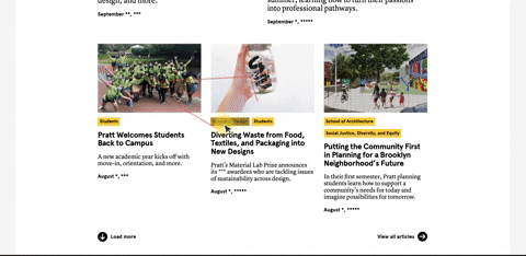
Turning away from the navigation menu and looking further down each page, we found that users are dropping off before reaching important content.
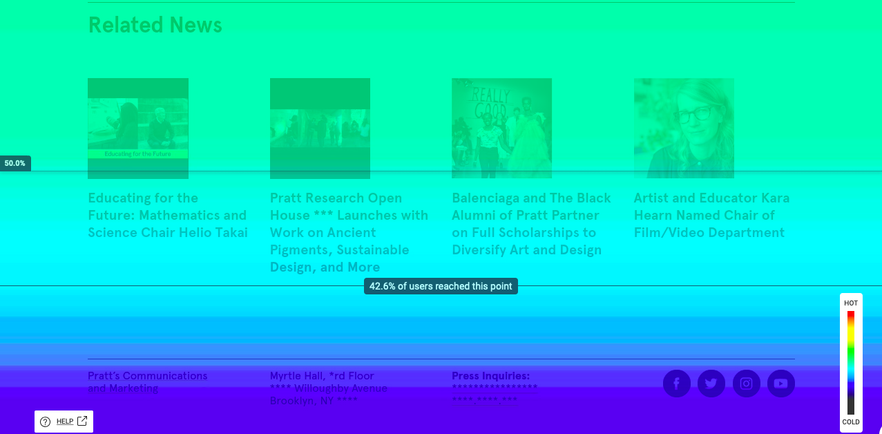
Scrollmap: only 42.6% of users reach “Related News” content
To address this issue, we suggest relocating this content from the bottom of the page to a more prominent position. Site visitors wouldn’t need to scroll to the bottom of each page to find related articles and may be more likely to explore more content this way.
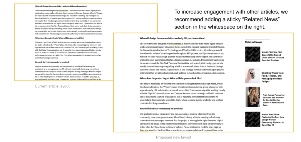
Recommendation #3: Replace blank space with “Related News”
Client Insights and Reflections
After presenting our findings and recommendations to Sarah and Alex from Pratt’s Digital Communications team, they echoed our concerns and confirmed that they would consider these areas when redesigning the site. They did have a question about responsive design — whether our third recommendation would still apply on mobile devices. Although we limited our study to desktop users, it’s straightforward that the recommendation wouldn’t apply in this case; the mobile version of the site doesn’t have blank space in the sidebar. It would be impossible to relocate “Suggested Articles” to this area. Otherwise, our findings hold true for mobile users.
In all, it was a pleasure to put together this research for Pratt’s Digital Communications team on this project. My teammates and I were confronted by several obstacles when using Google Analytics, and had a lot of fun exploring HotJar for heat-mapping and scroll-mapping. Together, these tools will be helpful in future projects to 1. determine the necessary metrics for executing further research and 2. present findings in a persuasive and intuitive way to clients.