The Pratt News website currently provides content for over 2000 users with content ranging topics from the school’s departments to community involvement and current events. Our team set out to conduct an analysis on their newly launched website in order to understand how their users interact with the site and respond to the new design. Through this process, we identified several opportunities to make these interactions more accessible and visible across devices; encouraging in further exploration and engagement of the website’s content.
Team, tools, and methods
Our team of four user experience professionals, which included myself, Preet Gangrade, Grace Guo, Victor Chien, and Xiujie Bi, used four key questions to guide our research:
- Who are our users?
(e.g. new/returning, location, device preferences…etc.) - How effective is the current visual hierarchy on the overview page to engage the users by device?
- What elements get the most engagement by device? Least?
(e.g. Buttons, hyperlinks, layout…etc) - What are people clicking on?
(e.g. button, hyperlinks, etc.) - How does placement and location of these elements affect users’ interaction?
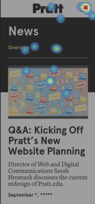
Through these questions, we aimed to understand the typical types of users to focus our attention for recommendations. Analyzing the visual hierarchy and placement of information is essential to understand how well it encourages users to explore the website as a whole. It’s also important that we understand how user behavior differs by device (if it does), to ensure that each experience is optimized. A combination of Google Analytics, Google Data Studio and Hotjar were used based on the timeframe of September 20th to October 2nd of 2021 due to when Hotjar began tracking data about the website. The image below depicts how the tools and metrics were used to measure the website’s effectiveness.
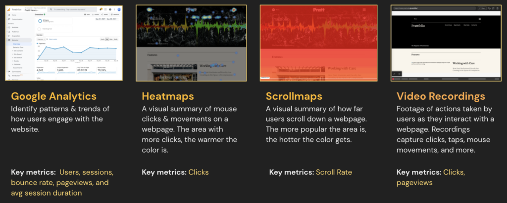
How tools and metrics tell the story
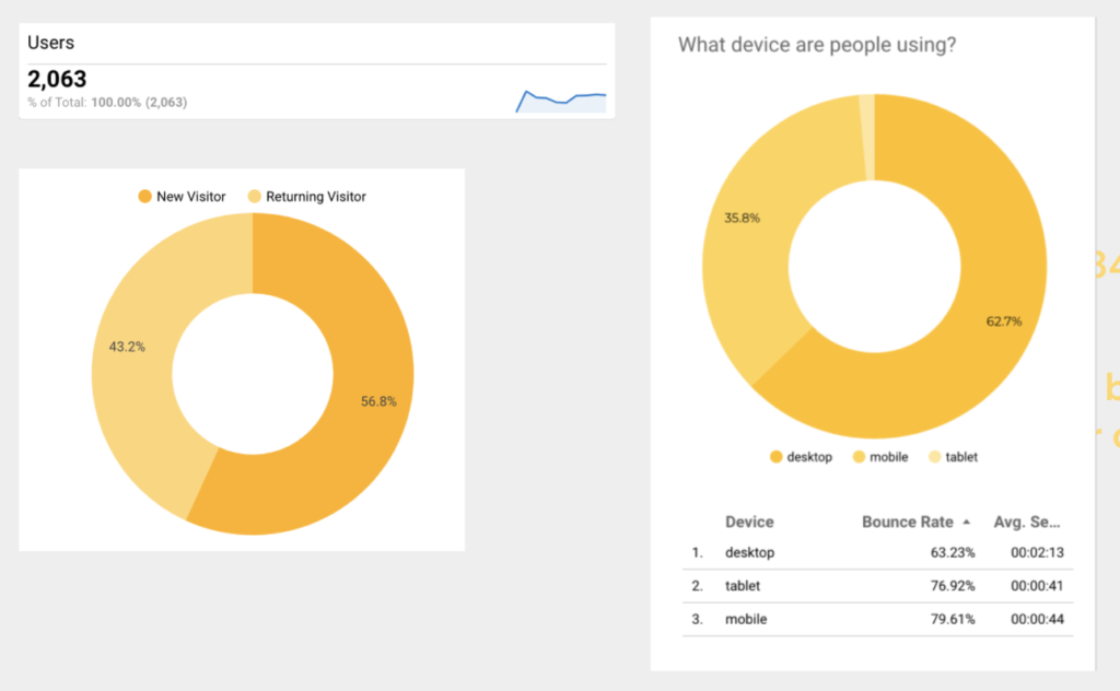
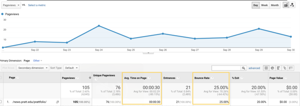
Google analytics offered insight into types of users that visited the website, where they went, and how long they spent on the page. This helped us select which pages to focus on: Overview and Prattfolio. For example, I observed a low bounce rate that coincided with a low average session duration for the Prattfolio page, so I decided to explore the type of information architecture and content on the page to understand why users were behaving this way. Unfortunately the recordings from Hotjar provided little assistance as the data captured was still scarce for this part of the website.
The majority of users to date were new to the Pratt News webpage and accessed it mostly from their desktop.
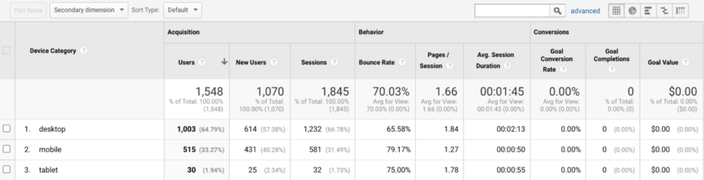
Users spent far less time and left the website 25% more when they accessed it from their mobile device. We used Hotjar scrollmaps to better understand what was driving this behavior.
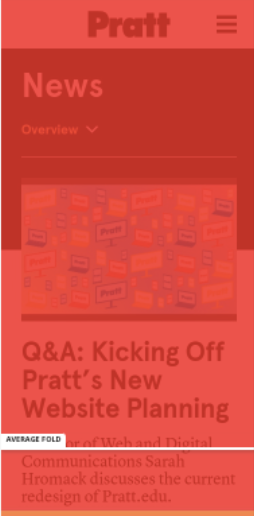
The scrollmap of the mobile experience, as shown to the left, indicated that 75% of users reached the bottom Daily Hub section, and only 50% reached Prattfolio section: the bottom two sections of the page. Users on their desktop were scrolling even less with 50% reaching the Daily Hub section and 25% reaching the Prattfolio sections respectively. This made us wonder, if users weren’t scrolling, why was average session over a minute long on desktop compared to mobile?
Using Hotjar heatmaps for the mobile and desktop experiences we uncovered:
1. The desktop navigation bar is optimized for easy access which attracted more clicks to explore different pages of the website. This is great if you want users spend less time scrolling on the page; using the menu to explore the content instead.
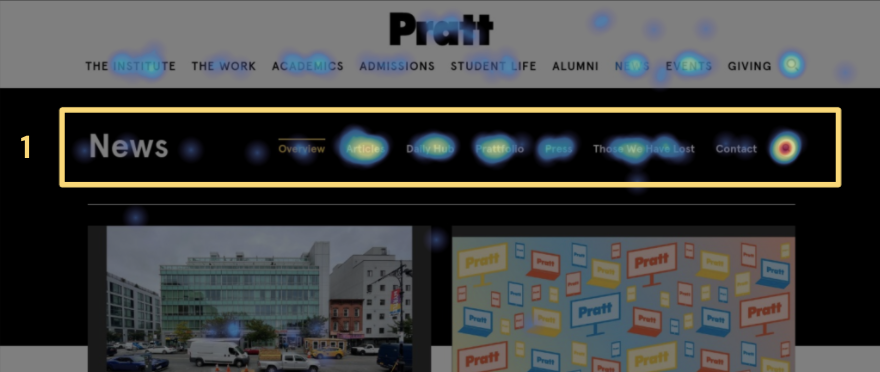
2. The folded navigation bar on mobile received less interaction compared to the Pratt hamburger icon.
3. Pratt website’s main navigation icon distracts users from the News navigation bar.
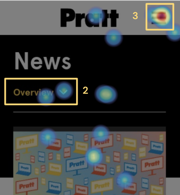
As pictured above and to the left, we observed that most of the clicks were also performed higher on the page for both the mobile and desktop experiences.
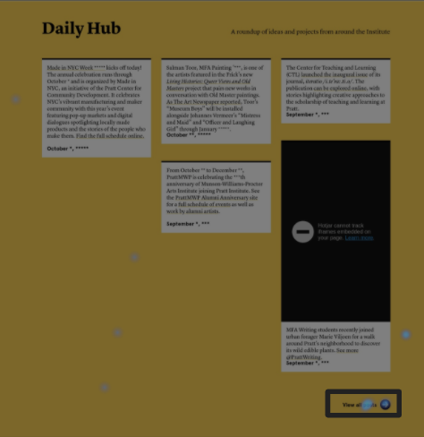
Because users did not scroll down to the bottom of each section to access more information, this resulted in less views and overall clicks for sections lower on the page, like Daily Hub (shown to the left) and Prattfolio.
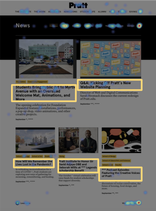
We also found that users click on different elements based on device. The heatmaps of the desktop experience, as shown below, indicates that these users prefer to click on news titles to access articles.
Mobile users preferred to click on icons rather than plain text to perform an action. They also prefer to click pictures rather than titles to access news articles.
Apart from understanding the user demographics, the focus of my efforts was on the Prattfolio page. I was fascinated by how the visual hierarchy and overall information architecture was designed differently from the rest of the website, which made me wonder: How would this affect whether users interacted with the page or quickly navigate back to the home page? Would they be enticed to engage more since it was a unique experience?
Upon initial analysis in Google Analytics, as shown in the screen below, I noticed that Users were exploring pages from the Prattfolio overview fairly quickly. As mentioned previously, there’s a low bounce rate (25%), but a short average time (30s) spent on the page. This made me wonder how users arrived at the page, and where were they going so quickly?
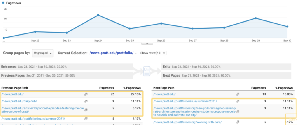
The navigation summary in Google Analytics showed that the page is effectively guiding users to more content. The majority navigate from the main news pages to access the current issue of Prattfolio (the school’s digital magazine) or the 3rd featured article of the current issue. The second most likely action is to navigate back to the Pratt News homepage. This made me wonder how users were navigating to the feature article or the latest issue of the magazine. Without a usability test, it would be hard to ascertain why they were going quickly back to the home page.
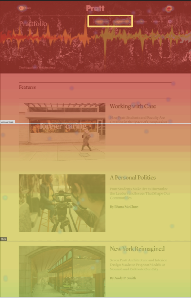
Based on the heatmaps and scrollmaps of the Prattfolio page, it was clear that users were using Prattfolio’s navigation menu to access the current issue or accessing other information from other Departments. 75% of desktop users only reached the 2nd article.
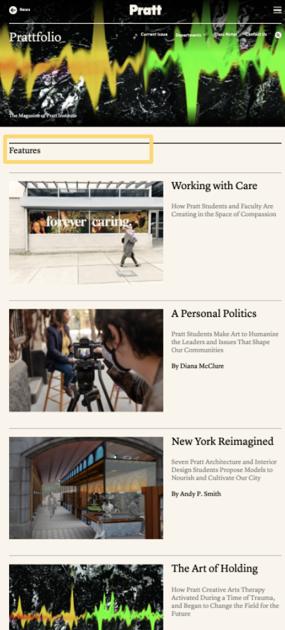
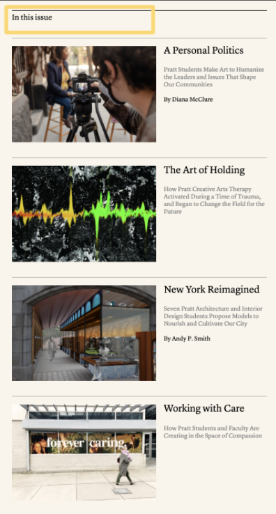
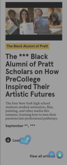
To see what the experience was like for myself, I explored the pages and found that the Prattfolio’s overview page, showcased featured articles which were a re-ordered duplicate of the current issue articles. This may deter users from accessing the latest issue if they could find the same information on the Prattfolio overview.
Solutions for improvements
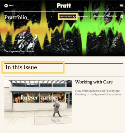
To reduce redundant content, I proposed for Pratt News to combine the overview and current issue of Prattfolio pages to encourage more views and engagement on the latest content. This would streamline the user experience by making it easier to access the latest magazine information. Additionally, I recommend changing the navigation button from Current Issue Previous Issues to shift the focus of the page to be more focused on the latest content and give the older content an added interaction step instead.
Takeaways and suggestions
Limitations
As mentioned above, we experienced a few limitations in this process. Hotjar was setup to begin collecting data on September 22nd, which meant we were working with only about three weeks worth of data. Hotjar also does not offer known way to date to access a heatmap view after a hamburger menu is selected on a page; making it unclear if users truly clicked the icon out of confusion, or selected a navigation option. Hotjar’s recordings also do not capture audio, which made it difficult to understand users’ click and scroll behavior in action. To account for these setbacks, I would suggest conducting a usability test as part of the research approach to support the user behavior observed through the Hotjar.
Reflections
Given more time, I would have explored more pages of the website to determine additional improvements or confirm the current design further. That being said, the best next step would be to perform A/B testing and continue to track engagements on the website in order to support the uncovering of new opportunities to improve.
Client feedback
The Creative Director and Lead Developer from Pratt News were very appreciative of our team’s work. They found that the data driven approach to our recommendations were very helpful and looked forward to incorporating our research into future improvements.