Abstract
The newly designed Pratt New website features news, stories, and arts from Pratt Institute. This project aims to improve the interaction and performance of the website by learning the data and observing the user behaviors from Google Analytics and Hotjar. By collaborating with 4 peers, we made suggestions around improving the navigation, encouraging easier access to content, as well as streamlining content to show hierarchy and prioritization.
Learning the User Behavior
Our Process
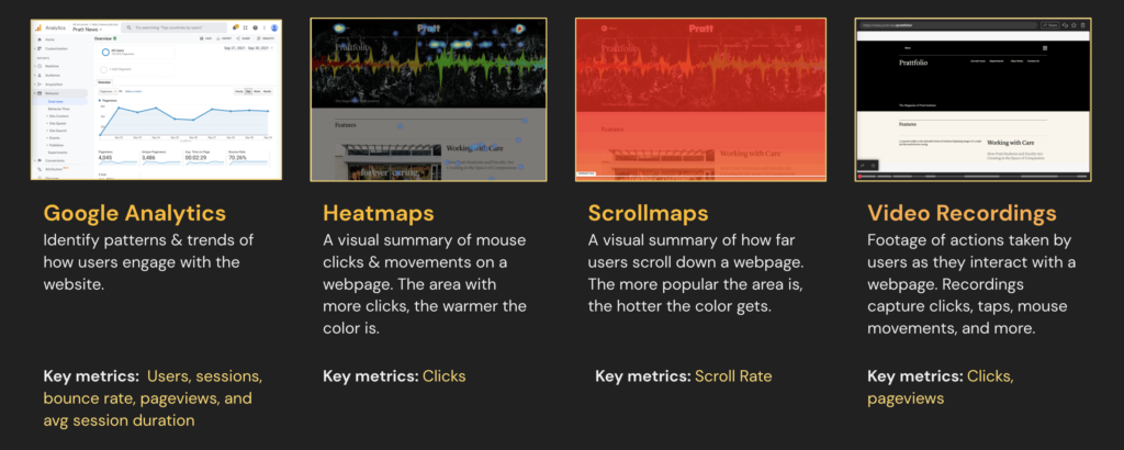
As a group, we analyzed users’ behavior on the newly launched Pratt News website starting from Sept 20 to Oct 2, 2021. Our main focus is on Home and Prattfolio pages, in order to understand how people are interacting with the site and responding to the new design. Some of the technologies we used were Google Analytics and Hotjar where we got to take a deep dive into:
- Who are our users?
- How effective is the current visual hierarchy on the overview page to engage the users by device?
- What elements get the most engagement by device? Least?
- What are people clicking on?
- How does the placement of these elements affect users’ interaction?
We used a combination of metrics from each technology. We found it was helpful to learn the user flows and session details from Google Analytics and to observe where users scroll and click on heatmaps and scrollmaps. Combined, we are able to get a full view of how our users are behaving.
Key Insights of Mobile and Desktop Users
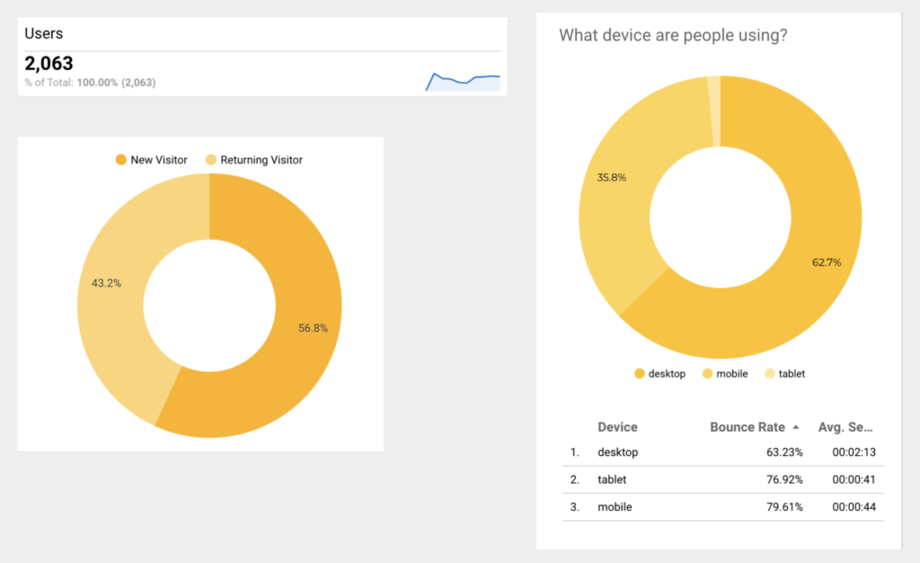
Our users are mostly on desktop (64%) and mobile (34%).
There’re 65% new users and 35% returning users.
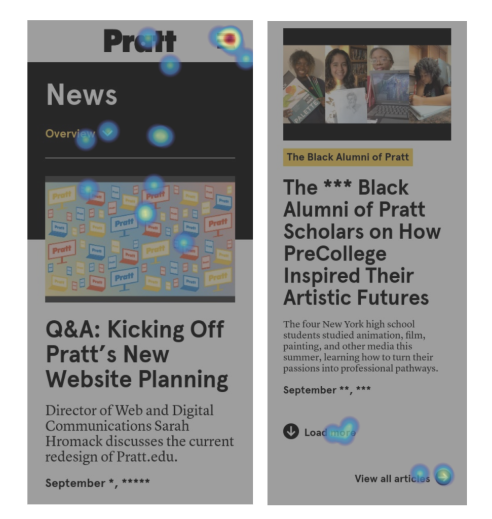
Users tend to interact the most above the average fold. The navigation menus receive the most clicks.
Mobile users access more content than desktop users as they scroll deeper.
On mobile, 75% of users reach Daily Hub, 50% of users reach Prattfolio.
On desktop, 50% of users reach Daily Hub, 25% of users reach Prattfolio.
Optimize Mobile Navigation Experience Without Sacrificing Prime Real Estate
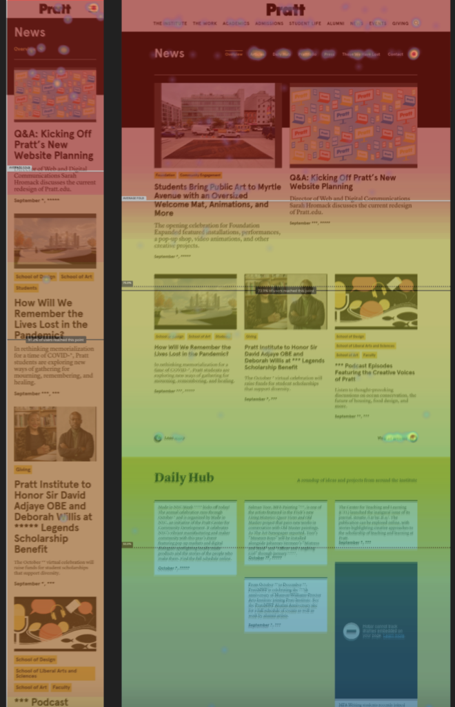
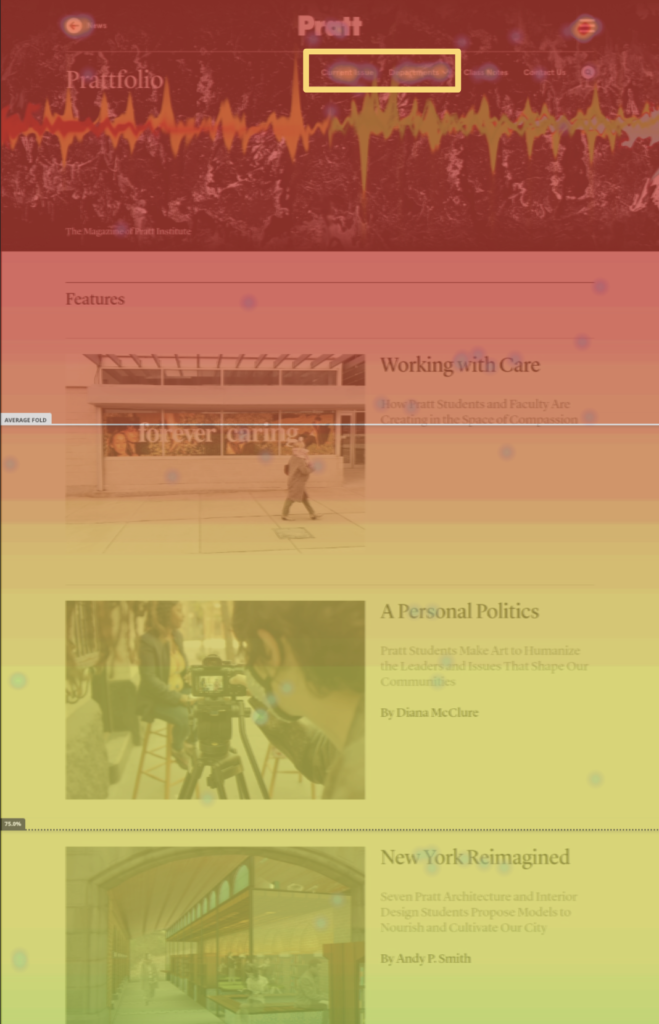
Users interact the most with desktop navigation (1) because it’s straightforward and easily accessible.
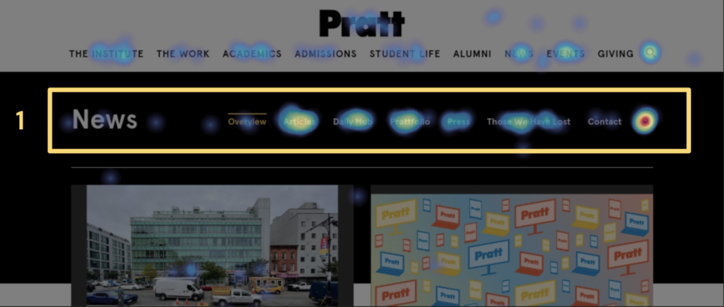
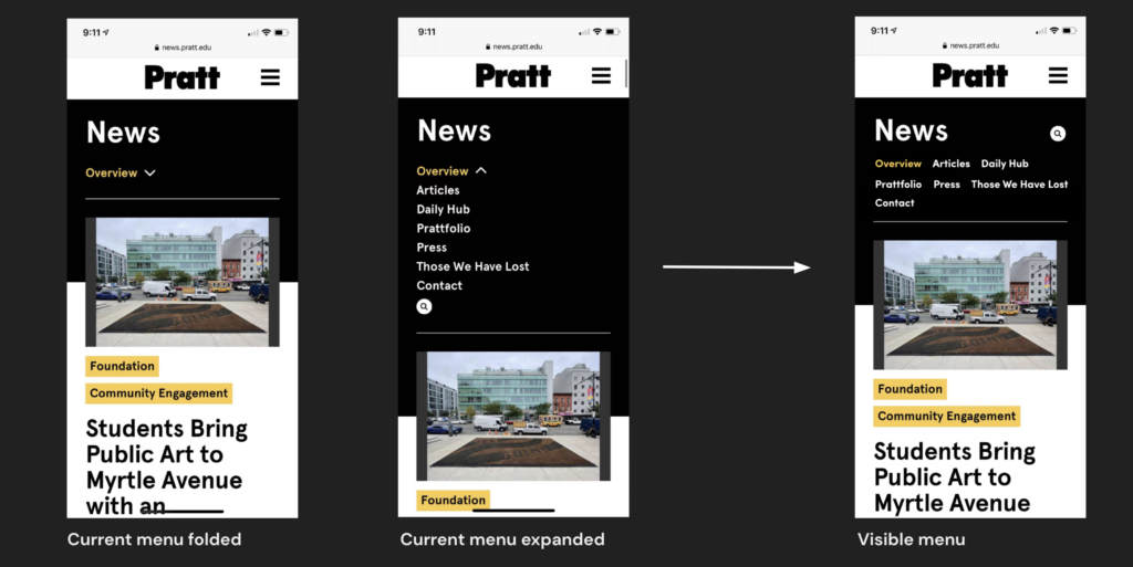
The Pratt News website has two navigation bars: the main one from Pratt and the sub menu for News.
With desktop navigation well laid out in the most common practice, users were able to get a quick grasp of what’s presented within the Pratt News website. From the heatmap, it is clear that the navbar has received the most clicks, with the search icon being the hottest spot for exploration.
Users interact the least with the folded mobile menu (2) as it hides content and prevents users from direct access.

As we are taking a look at the mobile navigation, it appears folded with an arrow indicating more content is hidden. The Pratt main menu (3) on mobile receives the most clicks.
Comparing what worked well and didn’t work well here, the desktop nav has demonstrated that when a menu is more accessible, it results in a lower bounce rate and less effort(endless scrolling) for the user to get to their interested content.
With our goal to make content more accessible and visible, we are suggesting to surface mobile menu items to:
- Show what’s available on this page to users without endless scrolls.
- Differentiate Pratt main menu from Pratt News menu.
- Simplify the user flow by clicking open the menu, preventing false errors and assumptions about the meaning of the arrow icon.
Encourage Further Content Exploration by Prioritizing CTA Buttons
Users are attracted to CTA, however, Daily Hub and Prattfolio’s CTA buttons are too far down to reach on scrolls, preventing users from further explorations.
CTA button is one of the most important elements on the website because it is the gate to more content and more interactions. Without CTA, the website would be a static flow with limited content. As we are exploring the heatmaps, we found that the CTA buttons on both mobile and desktop for Daily Hub and Prattfolio didn’t receive much attention. The reason is that they are currently being placed at the very bottom of modules, which requires users to scroll deeper to find the button. Without initially knowing the existence of the CTA buttons, there will be assumptions that there isn’t more content to explore from the user’s perspective.
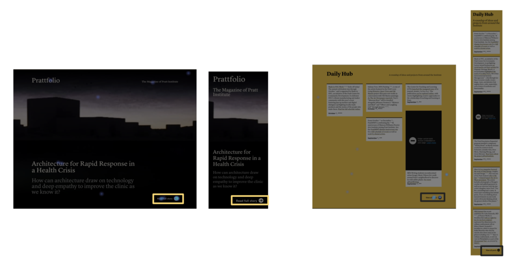
As Daily Hub and Prattfolio are two important pages that our client would want to encourage visits, we suggest prioritizing the CTA buttons within modules and shortening the content for Daily Hub.
By moving CTAs to the top on both desktop and mobile, the user will immediately understand that these two sections have more to explore in separate pages. It saves them from having to finish scrolling the entire section to get to the button, especially on mobile where scrolls can get very long.
We’re also recommending cutting down the content shown on mobile for Daily Hub, as the block with images does get really long on mobile, which will directly affect the bounce rate.
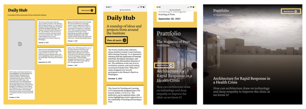
Entice more Interaction by Simplifying Article Previews
When accessing articles on the desktop, users click on titles the most. On mobile, users click on icons and images the most.
As we were investigating which elements drive the most engagement, we found that users tend to click on article titles on desktop as well as icons (40%) and images (20%) on mobile. These are what communicates “Next Step” to users.
To entice more interaction and save real estate on scrolls, we recommend a new way to showcase articles previews — Remove article descriptions for non-featured articles and reduce the image and title size.
By only incorporating icons, images, and titles, this new layout will not only visually differentiate article previews from featured articles, but it also drives more engagement from the most popular elements.
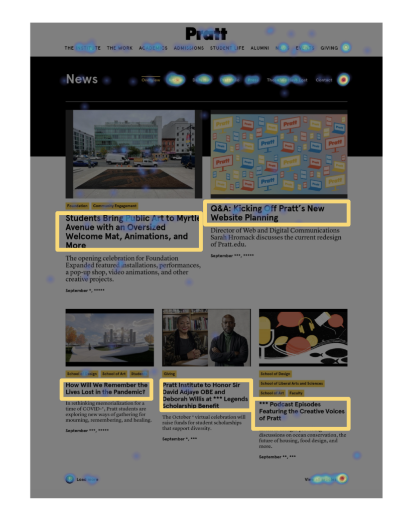
Streamline Content on Prattfolio to Shed Light on the Latest News
Users are the most interested in reading about the latest issues on Prattfolio.
From the heatmap, we found that on the Prattfolio menu, the users had the most engagement on the Current Issues and Department News. They tend to go to these two sections rather than scrolling down to explore content.
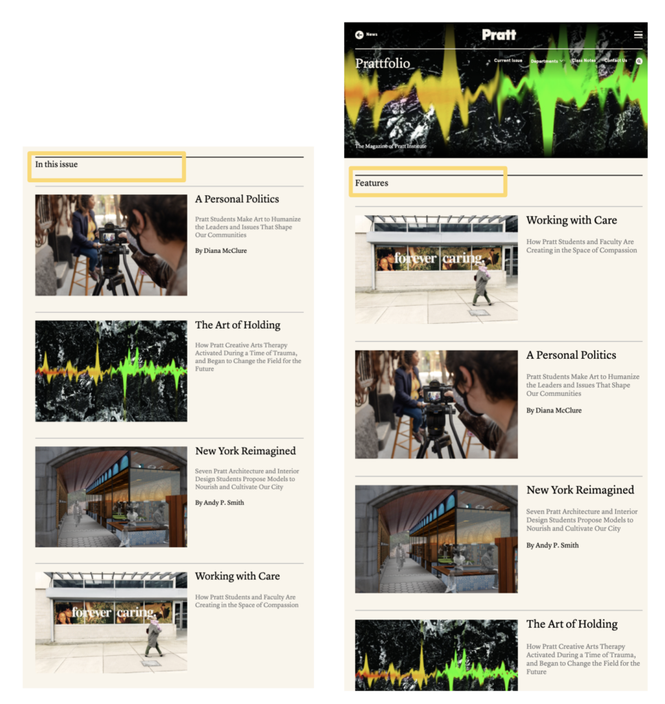
We also found that Current Issues and Featured Articles have the exact same content but different orderings. Duplicated content may cause confusion and affect the experience for the users.
We recommend surfacing Current Issues in place of the Featured Articles and allow users to explore past articles from the menu.
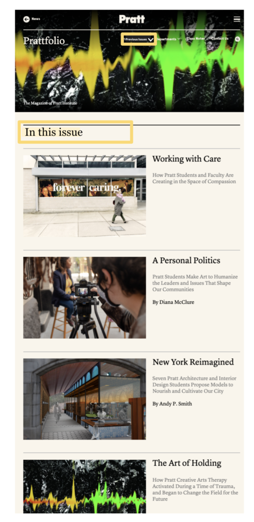
By showcasing what interest the most to the users more upfront and using the popular menu item as an option to explore past issues, it solves two problems:
- Reduce duplicated content and makes room for easier access to the most popular articles
- Increase engagement and exposure of past articles by positioning them in the “hotspot” on the menu
Conclusion
Working on this project with Pratt News client was a great experience as it gave us the exposure and hands-on experience of using Google Analytics and Hotjar. From observing the data as well as user behaviors, we were able to define what design worked well and didn’t work well. When presenting to our client, we were surprised that some of the problems we found were actually what they were also considered when making design decisions. We were glad that our data were able to help showcase the current result which will help them make future decisions.
Client Feedback
Really thourough data analysis and observations with thoughtfull recommendations.
Pratt News Creative Director
One interesting fact that was uncovered after presenting to our client was that they had a lot of design constraints coming from the editorial team. A lot of images aren’t allowed to be cropped and many contents are meant to be presented together. It was helpful to know that when designing, to provide iterations for different scenarios, desktop vs. mobile, cropped vs. full image, hidden vs. expanded, etc. I think in the future when making suggestions to clients, it is really important to understand their constraints first and listen to what problems they have encountered in advance. That way we are able to make more intuitive and effective suggestions.