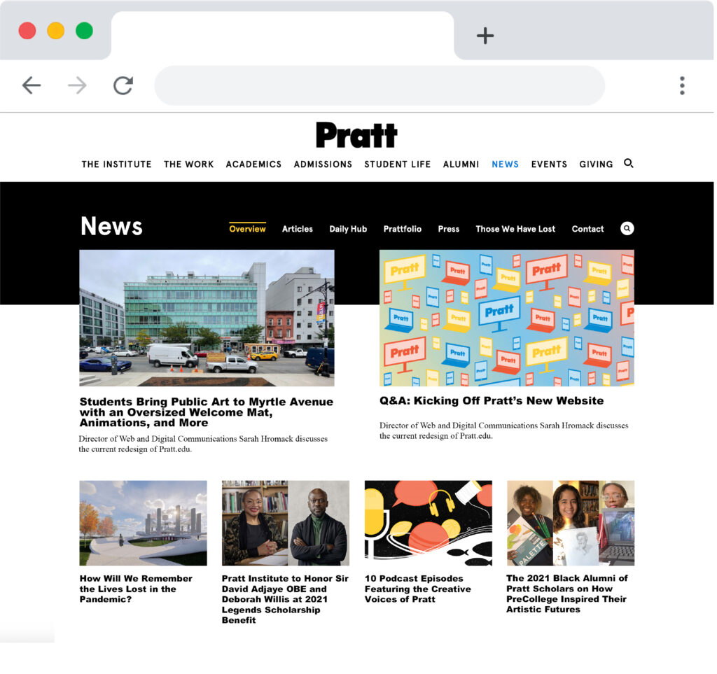
New Pratt News website was officially launched in September which re-designed and re-integrated information, navigation, and interaction. The new website incorporates more distinctive sections such as Articles, Daily Hub, and Prattfolio. The changes also help the communication department and editorial department to figure out a new approach for the Pratt website development. During the project, our team focuses on evaluating website content including headers, keywords, tags, layout, etc. Our goals and perspectives would encourage user’s performance and user engagement on the website interface.
TEAM MEMBERS:
Aimee Shi | Amiya Dewan | Ali Cliff | Alyssa Binda | Wicky Wu
How do we analyze Pratt website data to understand the engagement between users and content?
In order to derive the main objectives and project scope, we use two main tools to collect data and answer our 3 main UX questions: How do users consume the content? How does the content perform on the Pratt News site? How do the content layouts contribute to the user experience?
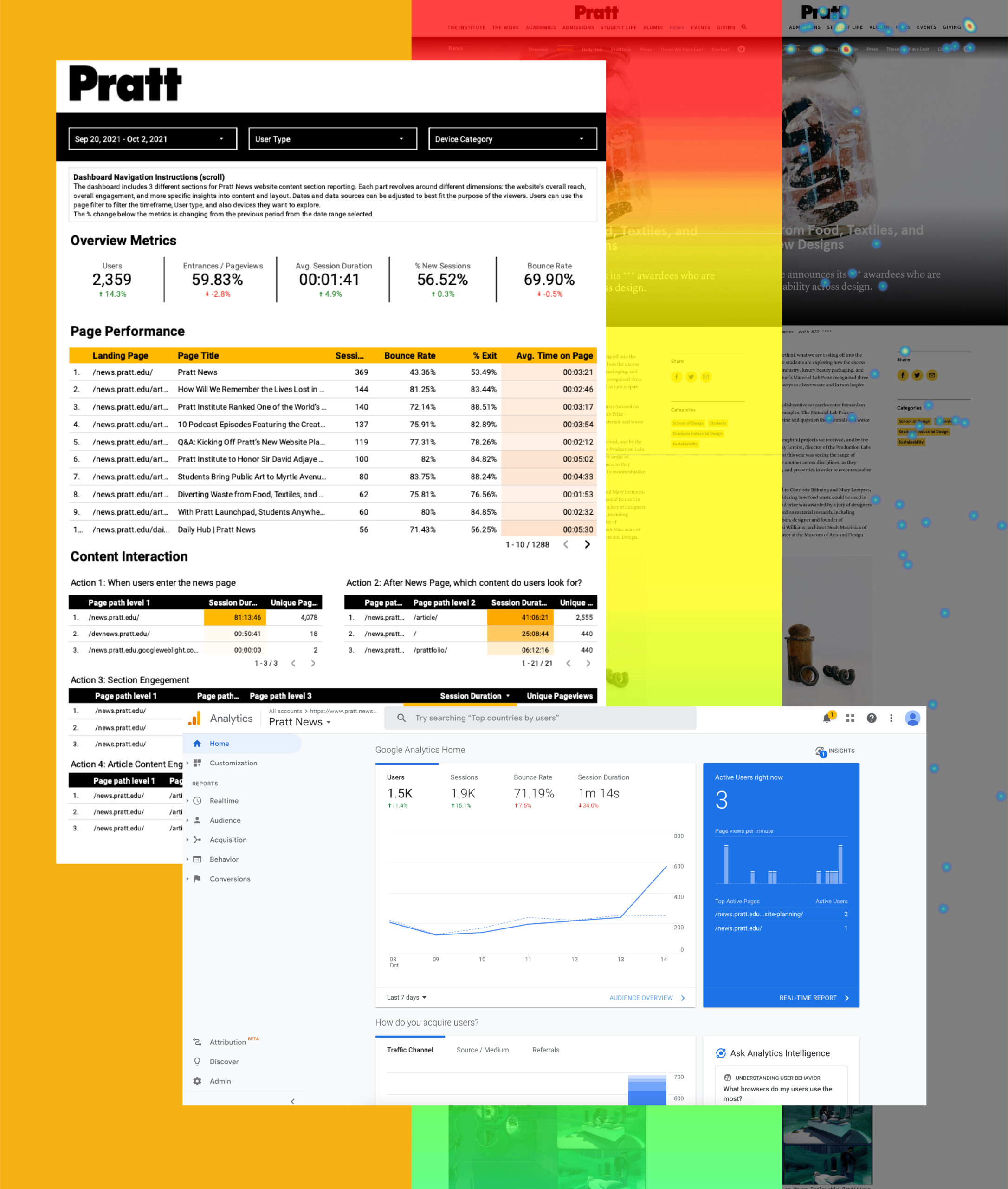
Google Analytics & Google Data studio:
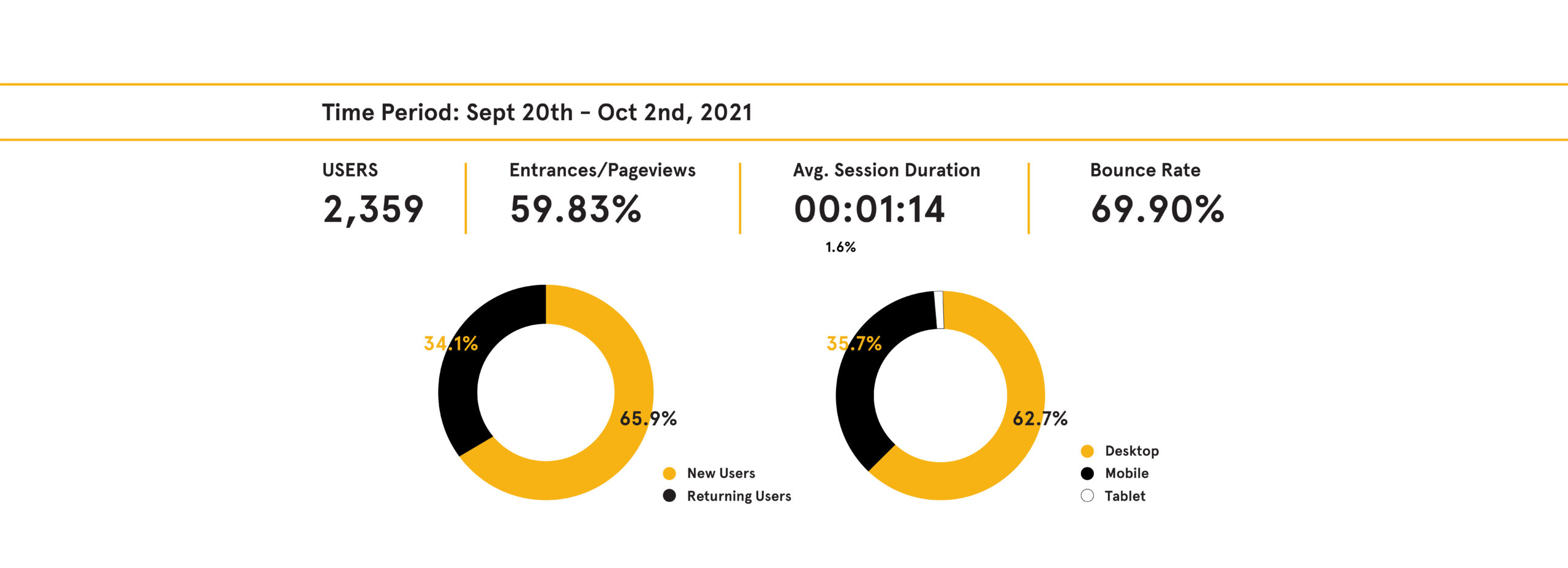
Google Analytics is the main tool that we received the data and found the metrics to get the insights of user’s behavior with new content on the website. For the page performance, we looked at the following metrics: Landing page, Page Title, Session, Bounce Rate, % Exit, and Avg. time on page. Also, we select page path levels, session duration, and Unique pageview to trace users’ interaction with content. After assessment of objectives, it was evident that Google Data Studio, which allows for flexible and efficient switch-around across datasets and interactive drill-downs was more appropriate for dashboard creation than Google Analytics.
Hotjar :
Hotjar is a new method for me to observe more direct visualized data on each page. It provides Clicks data, and Scrolled data to see where users interacted with content and how many percentages of users did it. Hotjar also has video recordings to see users’ behavior. However, it has the challenge to find insights through quantity recording.

The more productive layout design,
The more opportunities to engage users interaction with content
Overall the metric and the observation we analyzed by tools, our team found out that user engagement
and page performance would be caused by website layout design.
The user’s primary behavior pattern is the key point to distribute visual and content space on the website.

Some people who land on the main page scroll down and click either “Load More” or “View All Articles” before reading any articles. Also, upon landing the main page, most of the people see only two article images and a portion of their titles before scrolling. Some of them leave without scrolling.
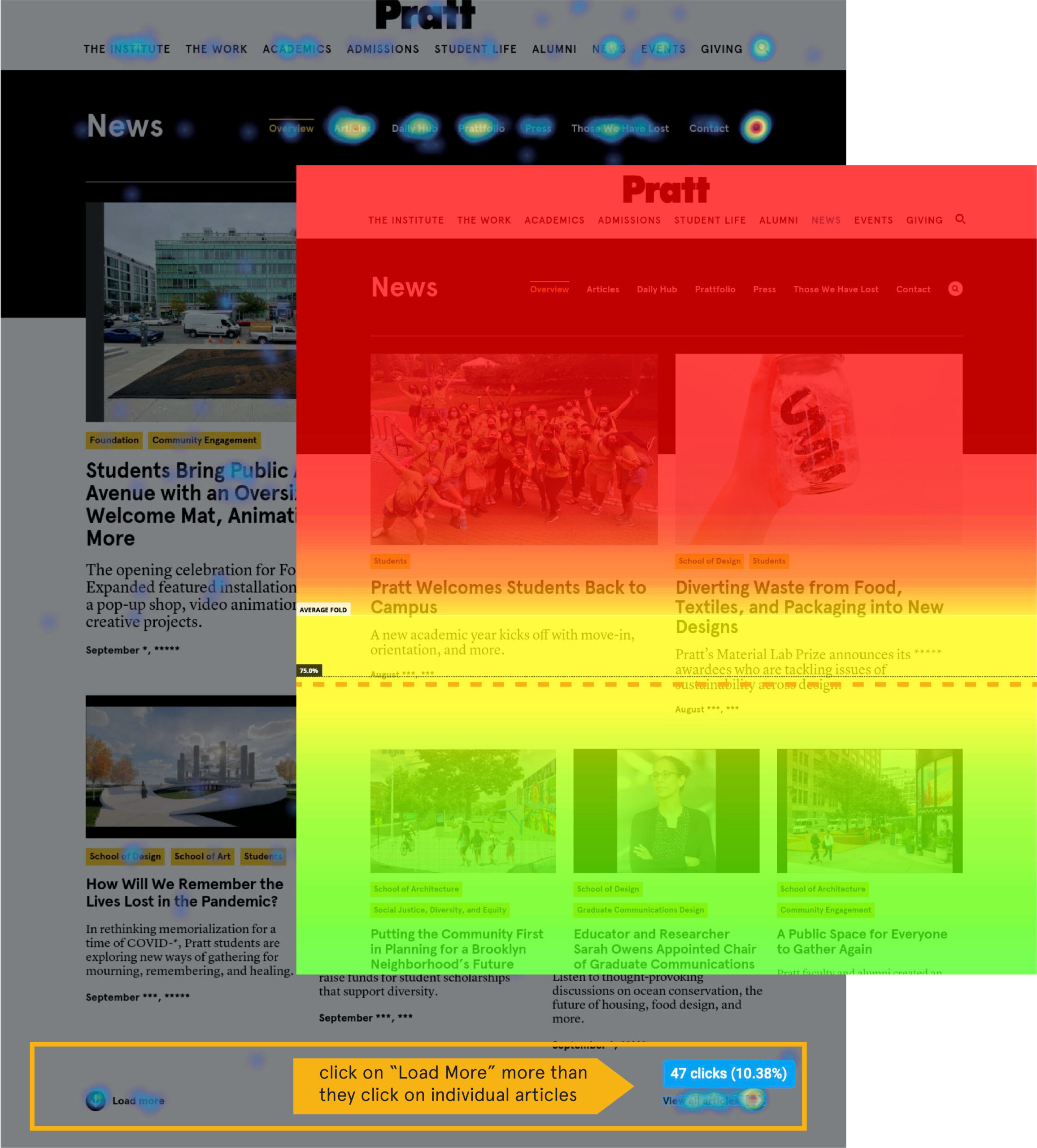
We suggested having a new grid with resized images would address the user’s behavior to look for more articles. It would attract user to find more interests on the main page.

The filtering tool is more familiar to the users. the “filter by school ” or “filter by topic” receives more clicks when compared to the tags located under images.
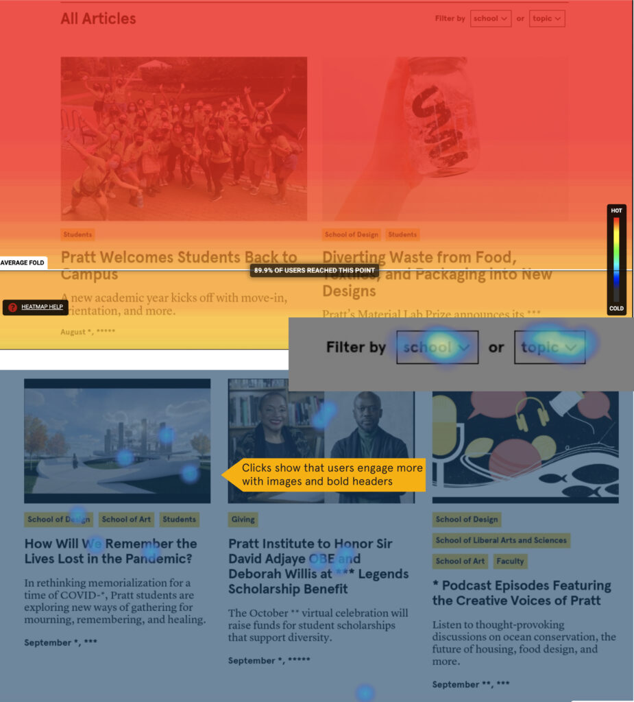
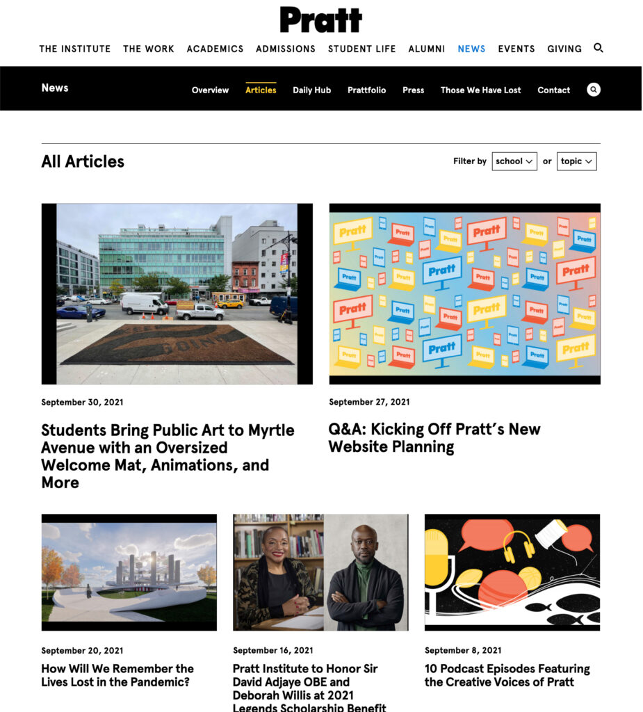
Remove the tags and the contextual texts for the articles will free up space on the Article page so that only more desired and utilized content is being displayed.

Top landing pages are also the top exit pages, meaning users end their journey after one article. Clicks and mouse movements show that users drop off before scrolling to the bottom and that there is negative space that can be utilized.
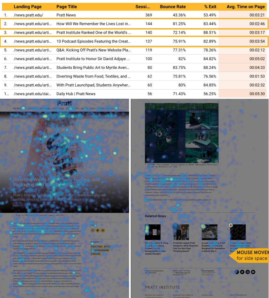
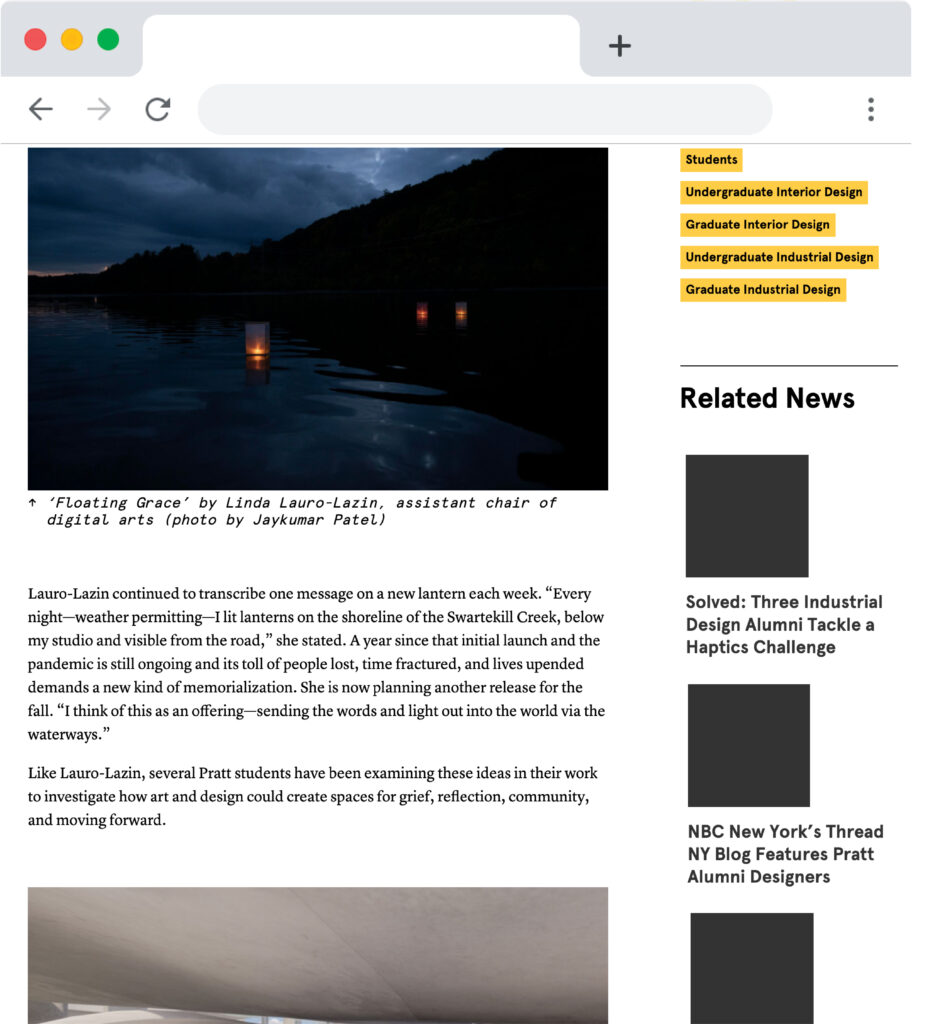
Relocating related articles to the right side negative space may encourage users to click on more related articles, elongating their journey.

The responsible website needs to show more content instead of pictures. Articles’ average fold on Tablet and desktop is above the title for two reasons: Hero image is huge; There are two types of title placement in article pages for the new layout. Also, the image takes up almost the whole screen on tablets and desktops.
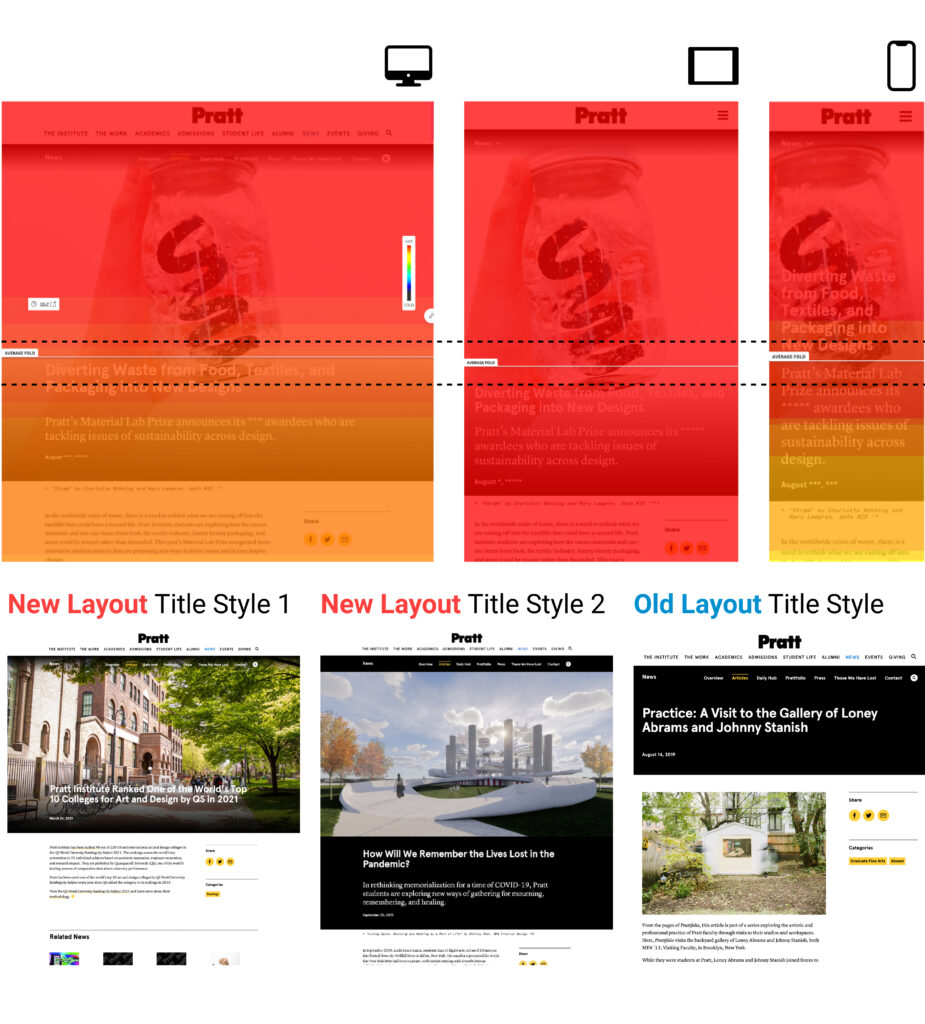
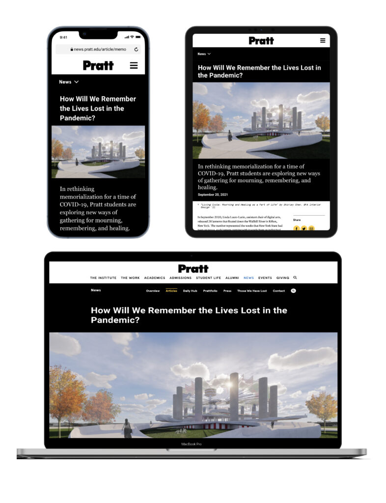
We recommend relocating the title to allow users to read the title immediately. It will be helpful to make the font size smaller for mobile title for better readability.
Conclusion and Inspiration: Confirming some assumptions and clients priority needs
I am glad to present our findings and recommendations for the Pratt Communication Department. Hearing from clients’ thoughts and feedback helps me to deeply understand the purpose of new webpage designs and also prepare for discussing the upcoming decisions and changes. One of the feedback from clients, which is about developing responsive websites on different devices, is meaningful to me. “Although we design the website, we also involved Editorial Department and Graphic Department in developing the News website.” Sarah Hromack, the director of the Communication Department, described it. It shows the data we collected from Google Analytics and Hotjar would be more convinced and helpful for them to communicate with the different departments during the ongoing website layout changes and new layout updating.
This project was also the first time to use a new tool – Hotjar, to analyze data. For the future, as a UX researcher, I would look forward to seeking more comparisons between the different periods of time and also effective recordings.