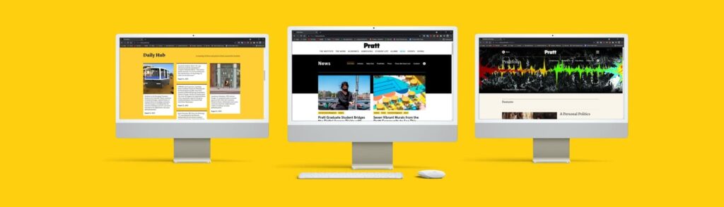
The newly redesigned news website for Pratt Institute provides information, ideas, stories, and updates across all Pratt Institute. This project utilizes Hotjar and Google Analytics to collect user data and understand user behavior to offer potential solutions to enhance and streamline the user flow and navigation on the Pratt News website.
Team members, Tools used, and Timeline
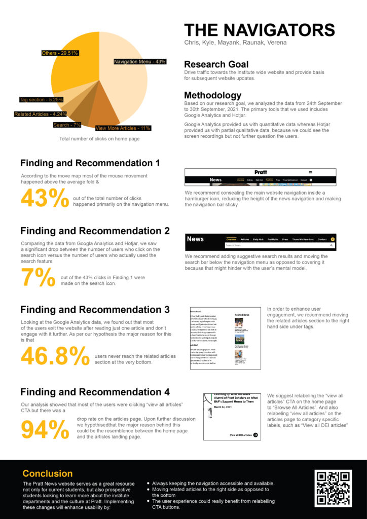
This project was teamwork, and the team members were Chris, Kyle, Mayank, Verena, and myself(Raunak). We worked collaboratively with each other from start to end. In conclusion, each of us provided one possible solution to improve the navigation on the news website for Pratt Institute.
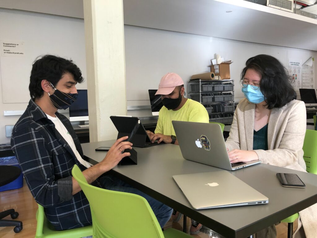
The tools used for this project were Google Analytics and Hotjar. Google Analytics helped us identify trends and patterns in how visitors engage with Pratt News websites. Whereas Hotjar provided us with user recordings, heat maps, scroll maps, and click maps. Both these tools worked well with each other and were beneficial to collect and analyze user data. This project was two-week-long, and within these two weeks, we had to research, set objectives, collect data, analyze data, provide solutions and present them to the client.
Why was the Pratt news website redesigned, and what does the client need now.
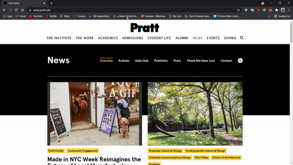
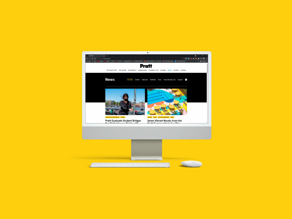
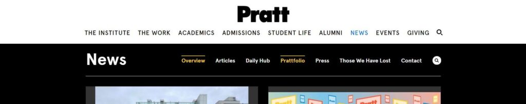
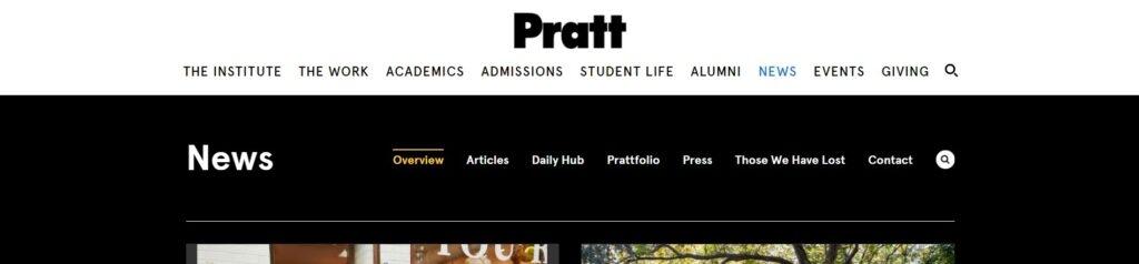
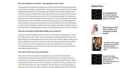
Pratt News provides information, ideas, stories, and updates across all Pratt Institute. It is an intensive and streamlined website that offers Prattfolio, Daily Hub, Press, and more information. Pratt Institute did its news website redesign to enhance the user experience and interface. The redesign was also done to launch a whole new design system for Pratt Institute and kickstart the new Pratt Institute website(coming later next year).
The clients for the project were the digital communications team at Pratt Institute. Sarah Hromack is the director of the digital communications team and the project manager to redesign the news website. Alex Weiss Hills is the Digital Communications team developer, and he developed the entire front and back end for the news website. Now that the Pratt news website has been launched, our responsibility was to collect user data from Google Analytics and Hotjar and provide potential solutions that could help in enhancing the news website’s user experience even more. Not only this, but the solutions will also help the digital communications team to consider the changes while they are redesigning the institute-wide website for Pratt Institute(coming later next year).
Defining project objectives on macro and micro levels
Pratt news has multiple functionalities, and these functionalities offer numerous opportunities to work. But we as a team decided to work on the navigation of the entire Pratt News website. We chose the navigation not only because it defined the user flow but it also helped to drive traffic to the institute-wide website. The other two teams within the class focused on Content and Interaction. Since each group focused on a very particular section, it was beneficial for the client to get the report on a broader scale that covered the entire Pratt News website. The goal for our team was to collect and analyze user data by using Google Analytics/Hotjar, look for impactful findings then providing with potential solutions to improve the user flow and navigation between the different types of content on the Pratt News website.
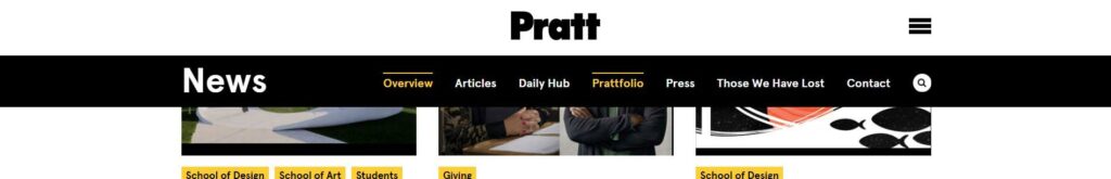
Since navigation was an extensive topic for this project, we had to narrow down our objective and focus on particular things within navigation to work efficiently and have impactful findings and recommendations. To narrow down our project objective and complete the project on deadline, we focused on the Navigation menu, Search functionality, Related articles section, and Labeling of Call to Action buttons.
Redesigning the Navigation menu for better user flow across the news website
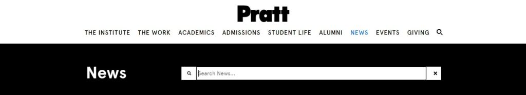
We recommend reducing the height of the navigation menu so that it takes less space. Right now, the navigation menu almost takes 25% space of the screen; reducing the height will be beneficial to accommodate more content and not distract users while they are engaging with the news website.

We also notice how there are two navigation menus on the navigation bar., one that addresses the Institute-wide content and the other addresses the news website content. It can be unclear for the users because there are too many options to select from, and also this might divert them from the news website. We suggest moving the institute-wide navigation menu to a hamburger icon. This way, the users are not presented with too many options, and their main focus remains on the news website.
One last thing that we can do to improve the navigation for the news website is to make the navigation bar sticky. This way, the user can access the navigation menu from anywhere on the screen. We can also make the navigation go while scrolling down and again appearing while scrolling up. This functionality will allow users to read content without any distractions and easily access the navigation bar.
Why are we suggesting these changes to the navigation menu?
In particular, the navigation bar. While collecting user data on the navigation menu, we found out that 43% of users clicked on the main navigation bar to move from one page to the next. We also found out that most movements happened above the fold, particularly on the navigation menu. These data assured how important the navigation menu is to the user and how often they use it.
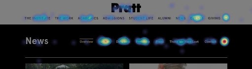
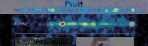
We also got to know that 83% of total users scroll below the average fold. While users are engaging with the content on the news website, they have to scroll to the very bottom to read the full article. Currently, there is no way a user can interact with the navigation menu while at the bottom of the news website. Hence it is hard for the user to access the navigation menu and move across different content on the news website. Therefore we suggest making the recommended changes to the navigation menu mentioned above.
Enhancing the search functionality and interface on the news website.
Search functionality is also one of the significant features on the Pratt news website that we can improve. Currently, the search function covers all the navigation menus when clicked on it. This stops the user from accessing the navigation menu when clicked on search. Given how vital the navigation menu is for visitors, it should not be obscured by the search function. We recommend updating the search bar so that it doesn’t cover the navigation menu. This way, the users can make use of both the search functionality and the navigation menu simultaneously.
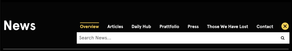
We also learned that users might not know what to look for when they hit the search button. And this can leave them hanging from using the search functionality on the Pratt news website. Adding a suggestive search feature may reduce this drop-off rate between users who click the search icon and those who complete a search. The suggestive search could recommend the most popular search terms, specific tags/categories, or most recent search terms.
Why are we suggesting these changes to the search functionality?
At the very first, we noticed how clicking on the search icon, a search bar appears, covering the entire Pratt News navigation menu. This search user interface was wrong in terms of design and functionality. We also noticed that the search icon is the most popular of all features within the navigation bar, and 6.6% of all site visitors click on the search icon. However, there is a significant drop-off (4.9% visitors) between users that click the search icon and those who complete a search (1.7% visitors). The reason for this could be because not all users might know what they want to search for. That’s why the recommendation we suggested above addresses all these findings and offers an enhanced interface and functionality of search on Pratt news website.
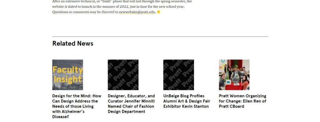
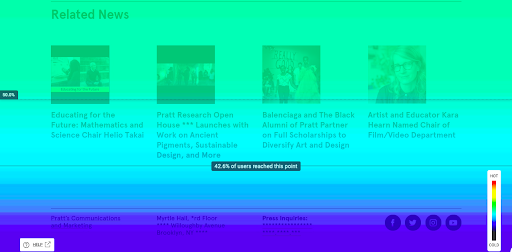
Making the most use of negative space for related articles
While we were going through the Pratt news website, we noticed that the related articles were at the bottom of the page. To increase engagement with other articles, we recommend adding a sticky “Related News” section in the whitespace on the right of articles. The “Related News” would fall right under the tags section on the right side of the news website. Along with increasing the engagement with other articles, this redesign would also make the proper use of white space.
Why are we suggesting these changes to the related articles section?
Through Google Analytics, we learned that An average of 46.8% of Desktop users sees the Related News articles after reading an article. That percentage is relatively low compared to users who land on the articles page. Through Hotjar, we also learned that not every user scrolls to the very bottom of the article. Sometimes, the articles page is so long that it requires multiple scrolls to reach the bottom. Hence the user is not interested in scrolling down to see more related articles. Therefore we suggest the above recommendation, which could help to provide users with a better flow. Hence, they are more likely to continue engaging with the site beyond a single article.
Relabeling call to action buttons for better clarity
Lastly, we recommend relabeling the call to actions buttons on the articles page. These relabeling of call to action buttons will help the user distinguish between different content easily and provide clarity.
Why are we suggesting relabeling the call to action buttons?
11% of the total clicks on the homepage are made on “View all articles”. But more than 94% of the user are likely to drop off from the articles page. As per data, we hypothesized that this is happening because of the redundant information they see on the page. TO reduce the redundancy and confusion, we suggest the above recommendation to provide clarity to the users.
Impact that these recommendations could have on the Pratt news website
The Pratt News website serves as an excellent resource for current students and prospective students looking to learn more about the institute, departments, and culture at Pratt. Implementing these recommendations will significantly improve website usability and user engagement. These changes would also prove valuable for the Pratt website as a whole.
- Always keeping the navigation options accessible and available.
- Moving related articles to the right side rather than the bottom would promote engagement.
- The user experience could benefit from relabelling CTA buttons.
Concluding with excellent feedback from the client and things to consider for the next steps
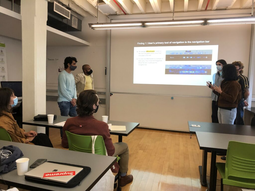
Once we were ready with all the findings and recommendations, we made a short slide deck for Sarah and Alex. This slide deck included all our findings, recommendations, and conclusion. The presentation was about 15 minutes long, where we covered each topic for navigation on the Pratt news website. We also created a single-page summary for our client to glance through every detail quickly and the presentation. We have also linked this single-page summary to our slide deck through QR code so that the client has access to both.
After presenting the findings and recommendations to the client, they thought it was evident and insightful. They were impressed by all our findings and had some questions regarding some recommendations. They were curious about how the navigation menu would work on the mobile devices; would it still be sticky or fixed on top? And we mentioned how keeping it consistent across multiple devices will be better to have a better user flow. They also asked about how would the related articles section show up on mobile devices? We informed about how keeping the related articles section at the bottom for mobile devices makes more sense and how that could be helpful.
There were so many new things I learned not only through this project but also from my teammates. This project provided me with the experience of using Google Analytics, Hotjar, making brief presentations, and presenting them professionally to the client. I feel confident about these skills and can’t wait to implement them in my next project! Overall, it was a great learning and educating experience to work on this project and with the client.