Client
The Henry Ford Foundation
My Role
- Task designer
- Test moderator
- Data analyst
- Recommendations
- Create mockups
Time Frame
6 weeks October 27-December 8th 2021
Overview
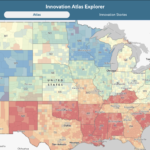
The Henry Ford Foundation’s Innovation Atlas is a data based map that shows how innovative an area is so that programs can be focused in underperforming communities. To prepare for the launch of this site early next year, a moderated user test was preformed which found five significant usability issues with the site and created recommendations to solve these issues.
About The Henry Ford Foundation and the Innovation Atlas
The Henry Ford Foundation is an internationally recognized cultural destination that brings the past forward by immersing visitors in the stories of ingenuity, resourcefulness and innovation that helped shape America. A national historic landmark with an unparalleled collection of artifacts from 300 years of American history, The Henry Ford is a force for sparking curiosity and inspiring tomorrow’s innovators.
To that end the Innovation Atlas is being developed to help identify underperforming areas that are in need of programs and resources to help inspire more innovators.
Designing a Moderated User Test
A moderated user test is one in which a user completes a set of tasks given to them by a moderator who watches over the user to get more in-depth findings. While the user conducts these tasks they are encouraged to think out loud so that the moderator can understand their thought process. Unlike most moderated user tests which are done in person, this one was done virtually due to the current pandemic.
The PROCESS

Developing our tasks
During the first meeting with the representative from the Henry Ford Foundation, the goals of what part of the site they wanted tested were created. To achieve these goals we started by categorizing the different features and the various potential issues that one may come across while trying to use them.
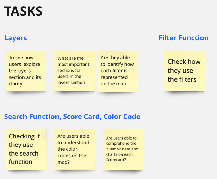
With what we wanted to test in hand, the next step was to create the tasks and word them in a way that a new user could understand. It was here that we ran into our first difficulty as the site uses specific terminology for their menus, so we had to constantly redesign and rephrase the tasks so as to not bias the participants while they preform the tasks. This led to the creation of 4 tasks that would be used to evaluate the usability of the site.
Task 1
Read through the popup windows and familiarize yourself with the features on the Atlas tab.
Task 2
Scenario: You’re a librarian who thinks having more cultural/educational institutions in their state helps the students become innovative.
Try finding meaningful insights or evidence of this hypothesis using this website.
Task 3
Scenario: Invention Convention Worldwide is a global invention education program that teaches students problem-identification, problem-solving, entrepreneurship and creativity skills and builds confidence in invention, innovation and entrepreneurship for life.
Identify counties where the next Invention Convention will likely be held to best serve the counties that are least likely to innovate.
Task 4
Compare the scorecards of Mineral County, Nevada and any other nearby county that has a Different innovation level. From the comparison, what statistics do you think are making the difference in the 2 counties’ innovation level?
Recruiting the Participants
With the tasks in hand our next job was to recruit our participants. Since the intended users were education policy makers and teachers, it would require us to contact local schools to get our 8 participants. Luckily the representative told us that they already had plenty of users in mind to act as our eight participants, or so we thought. This is where we hit our second difficulty that almost turned into a disaster. With 2 weeks left, one of which being Thanksgiving, we had only received 5 names from the representative, of which one never responded. This caused us to scramble to try and get the last 4 participants that we needed. During the last weekend before we were supposed to present our findings, we finally got our last participant who, unbeknownst to us at the time, was actually our 9th participant. This gave us the following breakdown.

- 100% had experience in working towards educating students or were involved in an educational or cultural organization
- 100% had were interested in seeing statistics about different areas innovation levels
Testing
Prior to starting the test all participants were required to sign a consent form to allow us to start recording the session as soon as they joined. As this was a remote test, all of them were done through Google Meets or Zoom depending on which they were most familiar with. From here the moderator would give the participants each task one by one, stopping in-between each of them to ask questions in order to gauge the difficulty of the task and to see if the user liked/disliked how the system works. Finally after they completed the tests they were asked to complete a post test survey.
Issues and Recommendations
After analyzing the 9 moderated user tests, a total of 47 usability issues were discovered with the site and the SUS score came back in the bottom 25 percentile of all SUS scores showing us that there is plenty of room for improvement. We focused our recommendations on the 5 largest issues as to have the larges impact on the usability of the site
Issue 1: Users didn’t know what layers were on and which were off

How layers currently work

Recommended way they should work
Currently there are categories in which the layers are nested within and in order for a layer to be on both the layer and the category needs to be turned on which the majority of users had issues with throughout the test. To fix this we recommend that turning off a category turns off all nested layers and that turning on a layer also turns on its respected category.
Issue 2: the Filters were difficult to notice and find

The current setup with filters on its own away from the rest of the menu

The filter where it should be, next to the rest of the menu
During the tests the filter was all by itself in the top right hand corner which caused it to be missed by many of the users and as participant 4 said “Filter function is really easy to use, but I would have skipped the filters if the moderator had not pointed it out. It might be the location. It should be in a close proximity to the other tools. It would be easier to find it (like that).”
Issue 3: Could not easily compare different locations
Using the map, one could pull up various statistics about different states, counties, and school districts but users could only pull up one location’s statistics at a time making it difficult to compare multiple locations. This caused users to get frustrated by having to constantly pull up the different locations scorecards in order to make a comparison. To rectify this issue we recommend adding the ability to pin a location to the side so that you can pull up a second scorecard and thus simplifying the comparison process.

Issue 4: searching over zooms the intended location

The current level of zoom after searching a location

A more reasonable level of zoom after searching a location
When using the search function, the map zooms in too much on the searched location. This caused some of the participants to get lost as they couldn’t find where the boarders of the searched location were. To solve this issue it is recommended that the search function zoom to fit the location search like what’s shown on the right.
issue 5: The legend was frequently missed and users would prefer it to be displayed permanently


Several users had trouble finding the legend making it hard to understand what the map meant. This was already partially fixed towards the end of our testing but it would be beneficial if the entire legend could be moved and displayed permanently. Moving the legend to be above the permanently displayed “Likelihood to Innovate” key would simplify the interface for the user as it would keep similar items together.
The Clients Response
These findings were presented to our clients over a Zoom call in early December. Overall the representatives of the Henry Ford Foundation loved the findings and hearing our recommendations with one of them saying after our presentation “This was really valuable” and “For some of us who work with this a lot, we can become blind to some of these things so its super helpful to hear this.”
Looking Towards the future
If we were to continue working with the Henry Ford Foundation, the next steps would be to preform another moderated user test on another part of the website call the Innovation Explorer. This would be conducted similarly to how this test was done and would give the developers enough time to implement our current recommendation. Once both of those are done we would probably do another round of moderated user tests on the Innovation Atlas to see how well our recommendation worked on improving the usability of the site and if there are any additional recommendations that we can put forward to further improve the site.