Overview
Introduction
Engram is a website aid for high school students in the AP World History course. This project is a study on the usability of Engram. The evaluators carried out this study utilizing remote moderated user testing. In this study, a total of nineteen usability problems were found. After evaluation, the evaluators summarized three major findings including Navigation, Layout and Interactivity, and then proposed recommended improvements.
About the client
Engram is a website aid for high school students in the AP World History course. It was founded and created by Priscilla Cancar. Cancar, a former AP World History student herself, was frustrated with the resources available to study for the course, and more specifically, prepare for the exam. Engram was born out of a recognition of a gap in the market and an aspiration to fill this gap.
Team Introduction
The four evaluators in this study-Jen Lee, Jichen Zhu, Sara Almai and Wenjing Wu are from the Center for Digital Experience at Pratt Institute. My role:
- Researcher for discovering potential usability issues.
- Designer for proposing actionable recommendations and presenting with mockup.

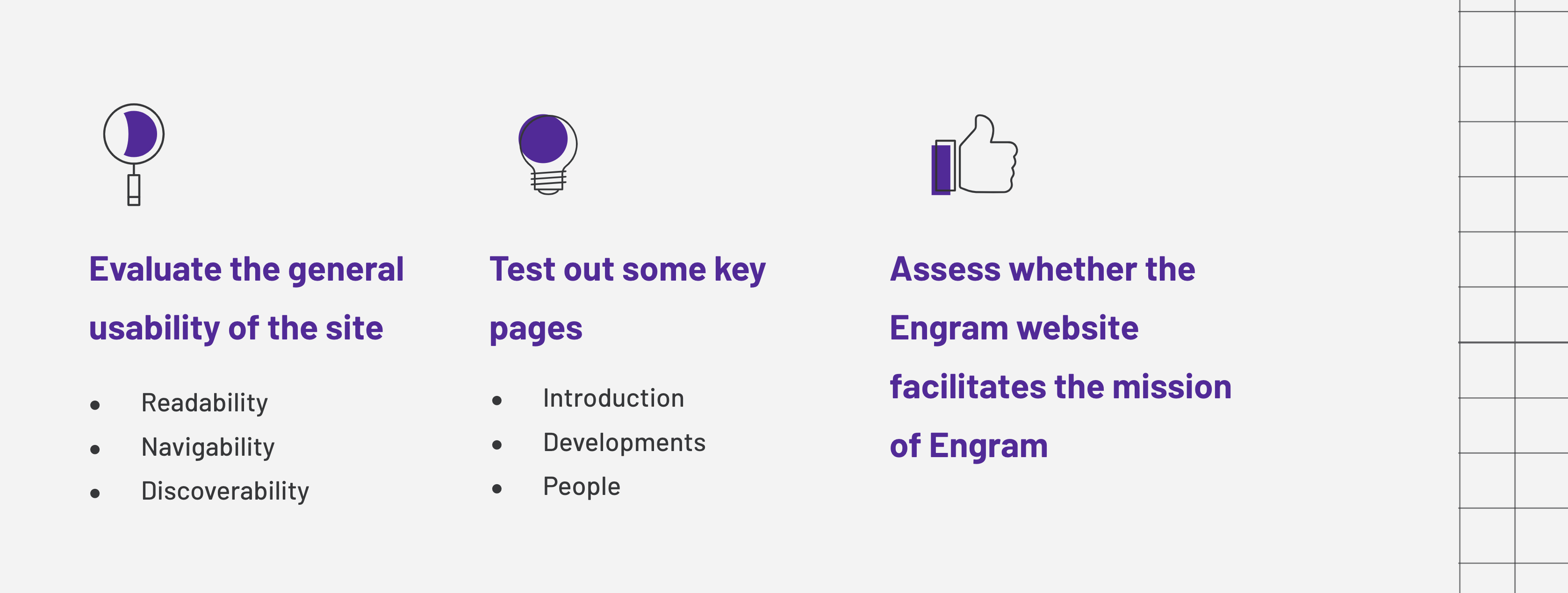
Goals for Usability Testing
Designing the Moderate User Testing
methodology
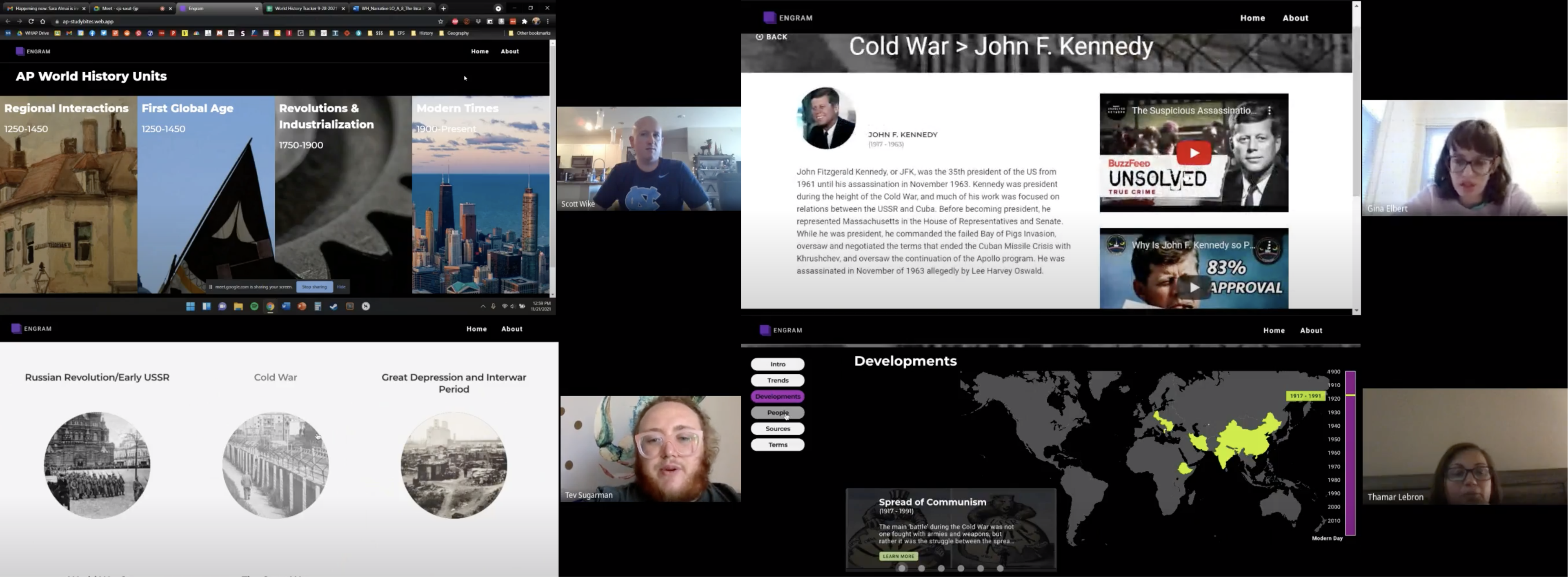
We examined the website through remote moderated user testing, which allowed us to observe, record, and analyze the participants as they engaged with the website on a desktop view. This evaluation method focuses on the participants and their tasks and prioritizes empirical evidence which in turn helped us to pinpoint findings for the overall usability of the website. After participants completed the tasks and provided feedback, the information was consolidated and analyzed to detail usability findings and offer recommendations for improved usability. In addition to the tasks, evaluators also prepared pre-test and post-test questionnaires, one for current teachers and one for former students, to learn more about the demographics of our participants. These questionnaires included questions about educational materials used, teaching and learning styles, and feedback, among other things.
Design process
TARGET audience
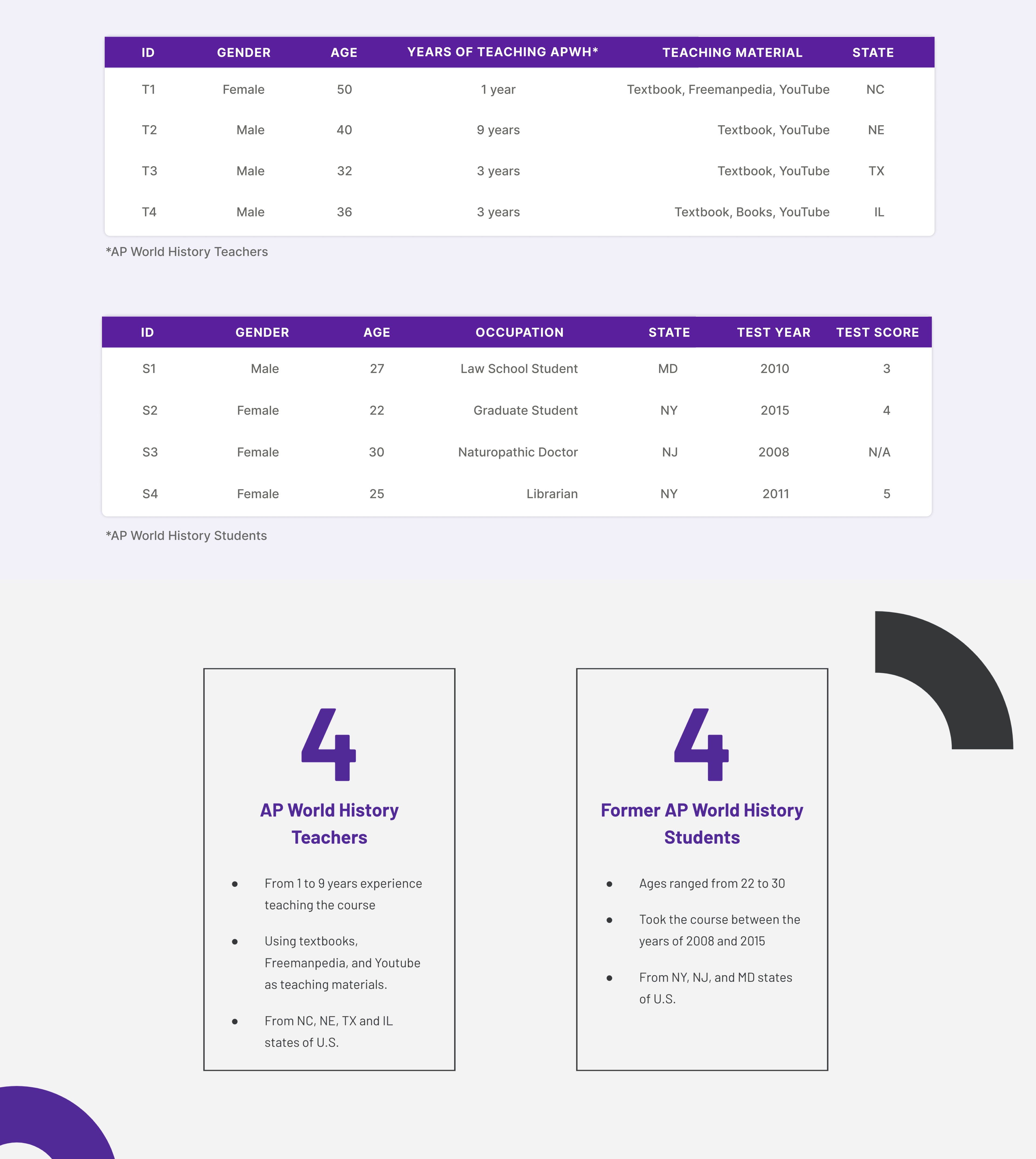
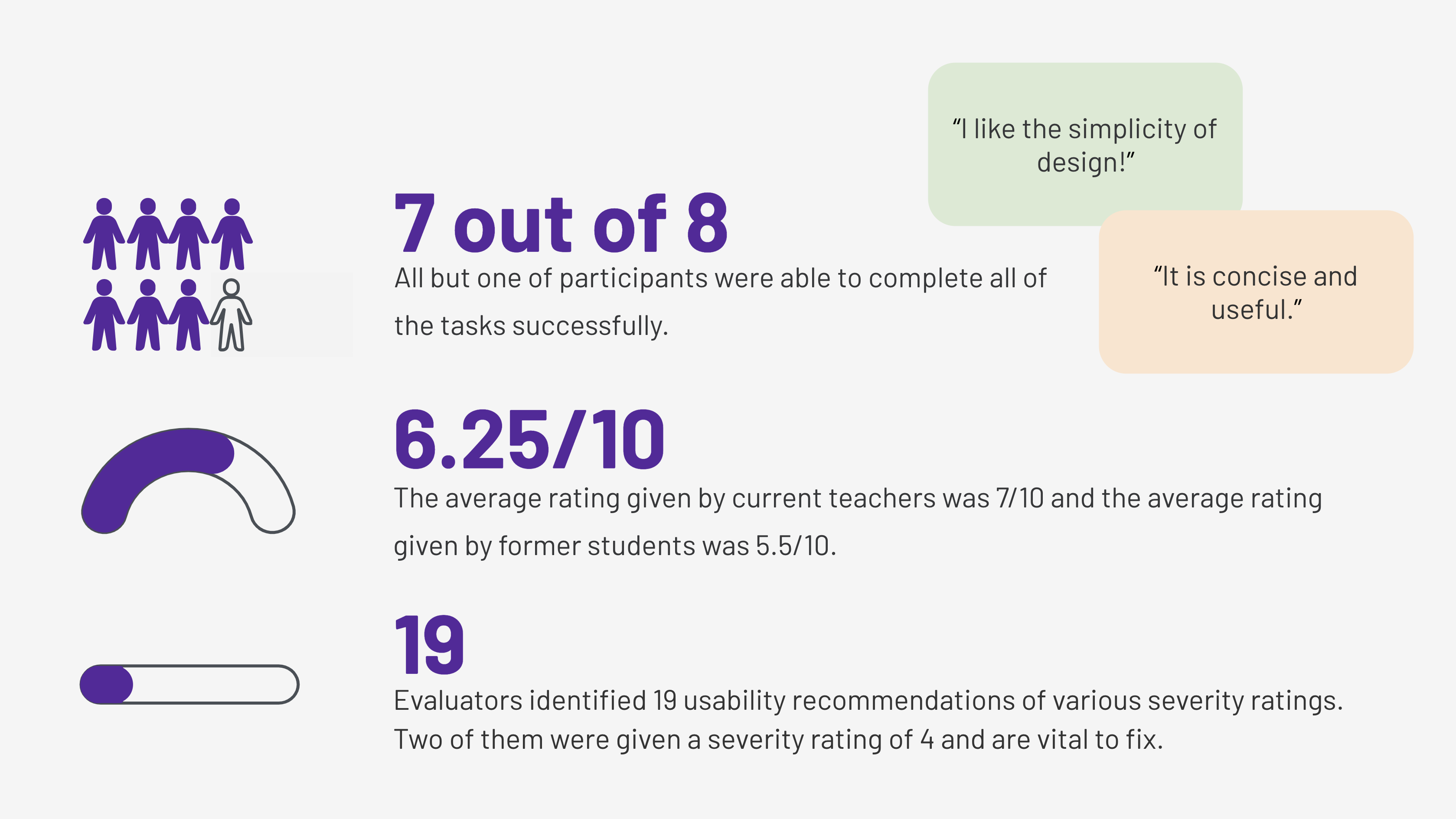
Our target audience is AP World History teachers and former students. We recruited participants through the Pratt Institute School of Information listserv, an AP World History school database, and an AP World History Teacher Facebook group. Those recruited were surveyed and screened and eight participants were ultimately selected.
The eight participants are from various schools and various states within the United States to participate in the study. Four participants were current AP World History teachers. Their ages ranged from 32 to 50 and they had anywhere from 1 to 9 years experience teaching the course. They included textbooks, Freemanpedia, and Youtube among their utilized teaching materials. Four participants were former AP World History students. Their ages ranged from 22 to 30 and they took the course between the years of 2008 and 2015.
questionnaires & Tasks
Pre-test Questionnaire (Current Teachers):
- How long have you been teaching AP World History?
- What kind of educational materials do you use for the class?
- Have you ever used online materials, e.g., YouTube or Wikipedia?
Pre-test Questionnaire (Former Students):
- What kind of educational materials did you use during the class?
- Have you ever used online materials?
- What was the most frustrating part of studying AP World History?
Scenario: Please imagine that you are a high school student who is taking AP World History. This week, you are learning about the Cold War and for additional understanding of the topic, you are going to use Engram.
Tasks:
- Take a couple of minutes to browse the homepage. Explain what you think this website is about and what you can do on this website without clicking on anything yet.
- Find out the three major causes of the Cold War (According to Engram).
- Find what the Space Race is and what its impact was (According to Engram).
- You want to watch a video that further explores the death of John F. Kennedy. Please navigate to this to the best of your ability.
- Find the meaning of Perestroika (According to Engram).
Post-test Questionnaire:
- What frustrated you most about this website and what would you change?
- What did you like about the website?
- How likely are you to recommend this website to your students on a scale of 0-10 and why?
USER TESTING
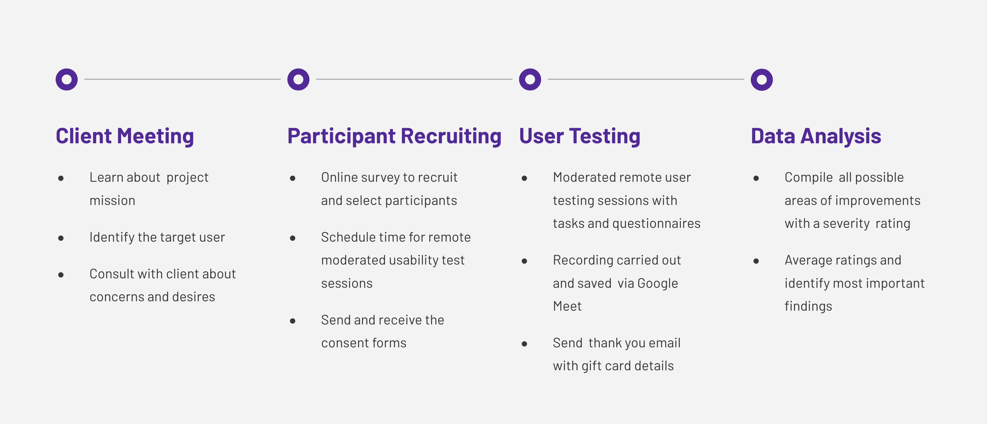
The user testing was conducted through Google Meet, an online software that allows facilitators and moderators to observe the participants’ interaction with a website and to listen to the participants’ comments on their experience via screen sharing. The software allows recording of the testing sessions and includes a notetaking feature which enables collection and analysis of information.
Participants were encouraged by moderators to express and explain their thinking process aloud throughout the testing session. The two common moderation techniques specifically used are referred to as Concurrent Think Aloud (CTA) and Concurrent Probing (CP) (Nielsen, 1993). Once it was determined by moderators,, through observation, that participants had completed a task to the best of their ability, they were prompted to rate the difficulty of the task. Participants were assured throughout their respective sessions that their feedback was very helpful and greatly appreciated.
Data Analysis
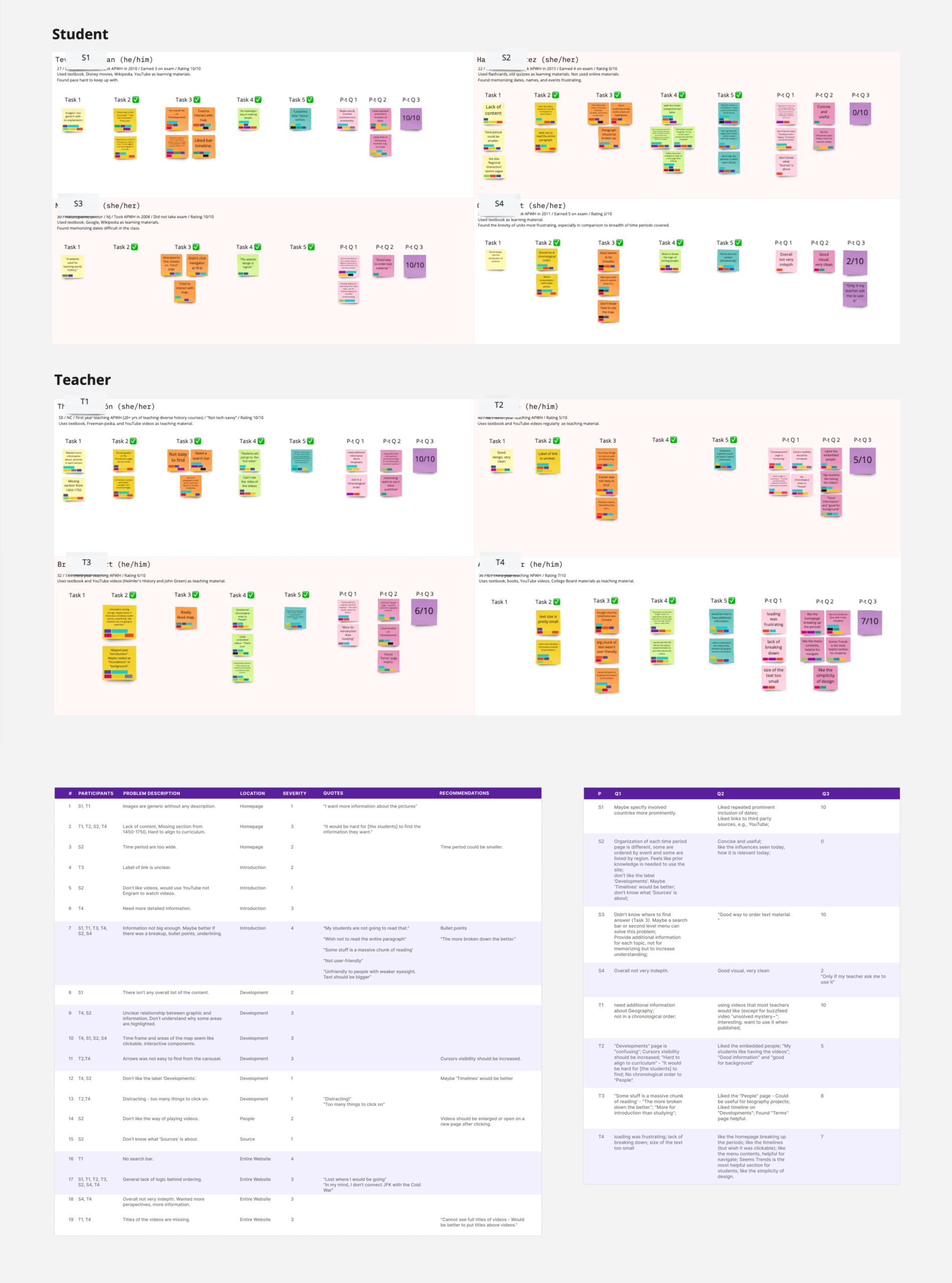
Once all testing sessions were completed, evaluators reviewed the recordings by watching, listening, and notetaking. The findings were then consolidated into a single table, providing a consistent document of qualitative and quantitative data. This allowed evaluators to better assess patterns and trends and effectively pinpoint findings to improve overall usability. In order to prioritize what usability findings were most important, evaluators rated the severity of the findings based on the 4-point scale provided by the Nielsen Norman Group (Nielsen 1994).
0 = I don’t agree that this is a usability problem at all
1 = Cosmetic problem only: need not be fixed unless extra time is available on project
2 = Minor usability problem: fixing this should be given low priority
3 = Major usability problem: important to fix, so should be given high priority
4 = Usability catastrophe: imperative to fix this before product can be released
Evaluator ratings were averaged and the averages were used to discern which findings should take precedence and be highlighted in the report. For the purposes of this report, findings with an average rating of 3 or more were given priority.
Overall Feedback
Findings and Recommendations
Overall findings
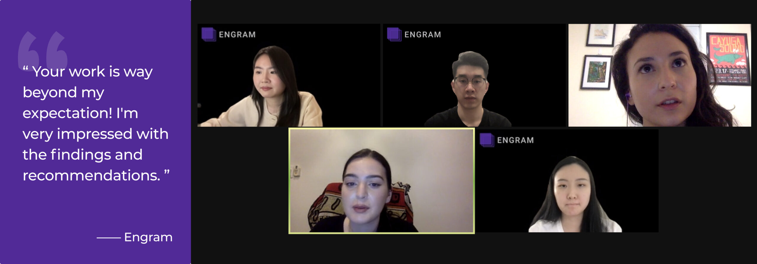
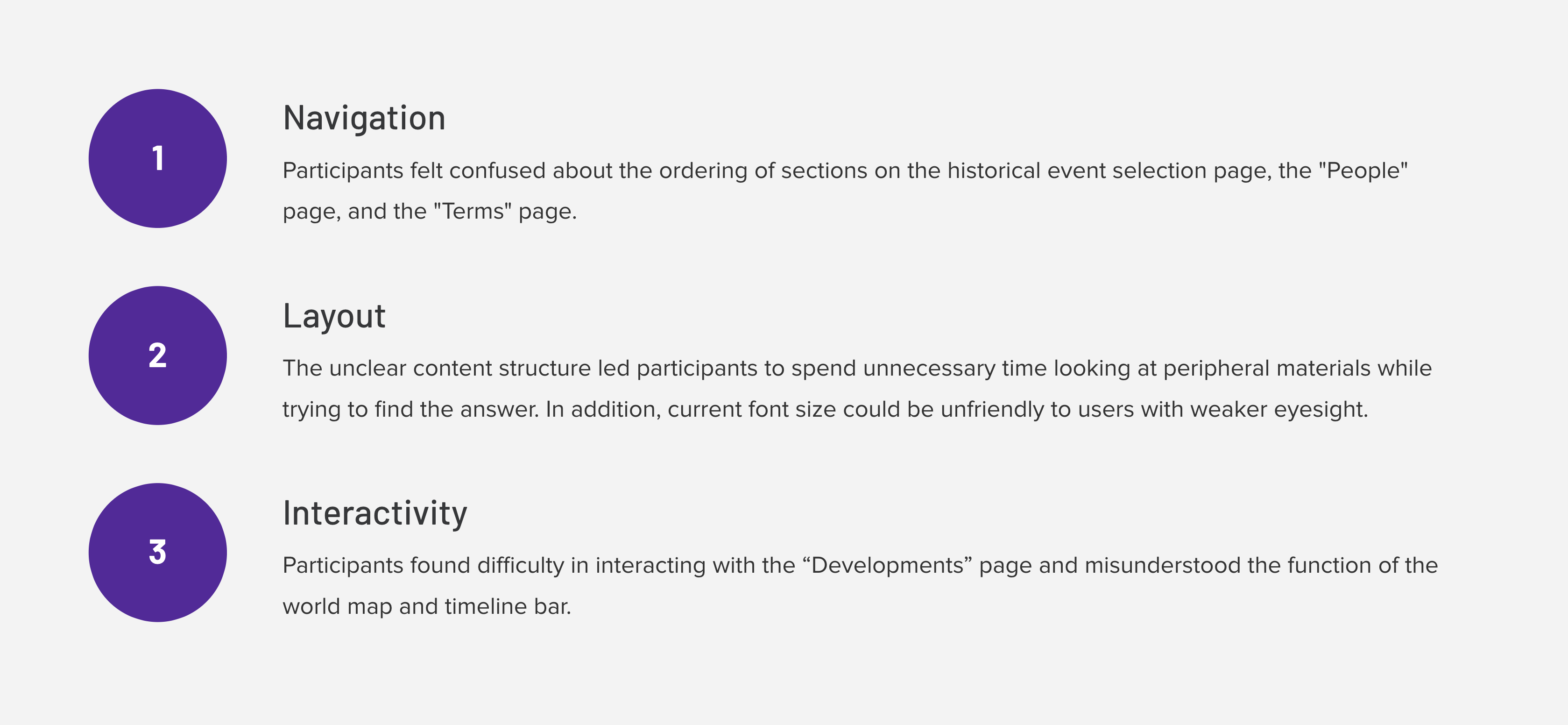
Evaluators identified nineteen usability recommendations of various severity ratings. Three significant recommendations were highlighted in this study. These recommendations encompassed navigation, layout, and interactivity. These recommendations were chosen based on their severity. Recommendation 1, which pertains to navigability, was given a severity rating of 3; Recommendation 2, which pertains to interactivity, was given a severity rating of 4; Recommendation 3, which pertains to layout, was also given a severity rating of 4. Engram is an attractive, engaging, and holistic resource for high school students wanting to succeed in AP World History. Participants complimented the website, saying, “The website has good visuals and it is clean”, “It is concise and useful”, and “I like the simplicity of design”. Improving the usability of Engram will help the website to center its users and therefore hopefully attract users. The recommendations highlighted in this report can be used to improve the usability of Engram. Each recommendation will be further explored and suggestions for improvement offered.
finding & Recommendation #1 -Navigation
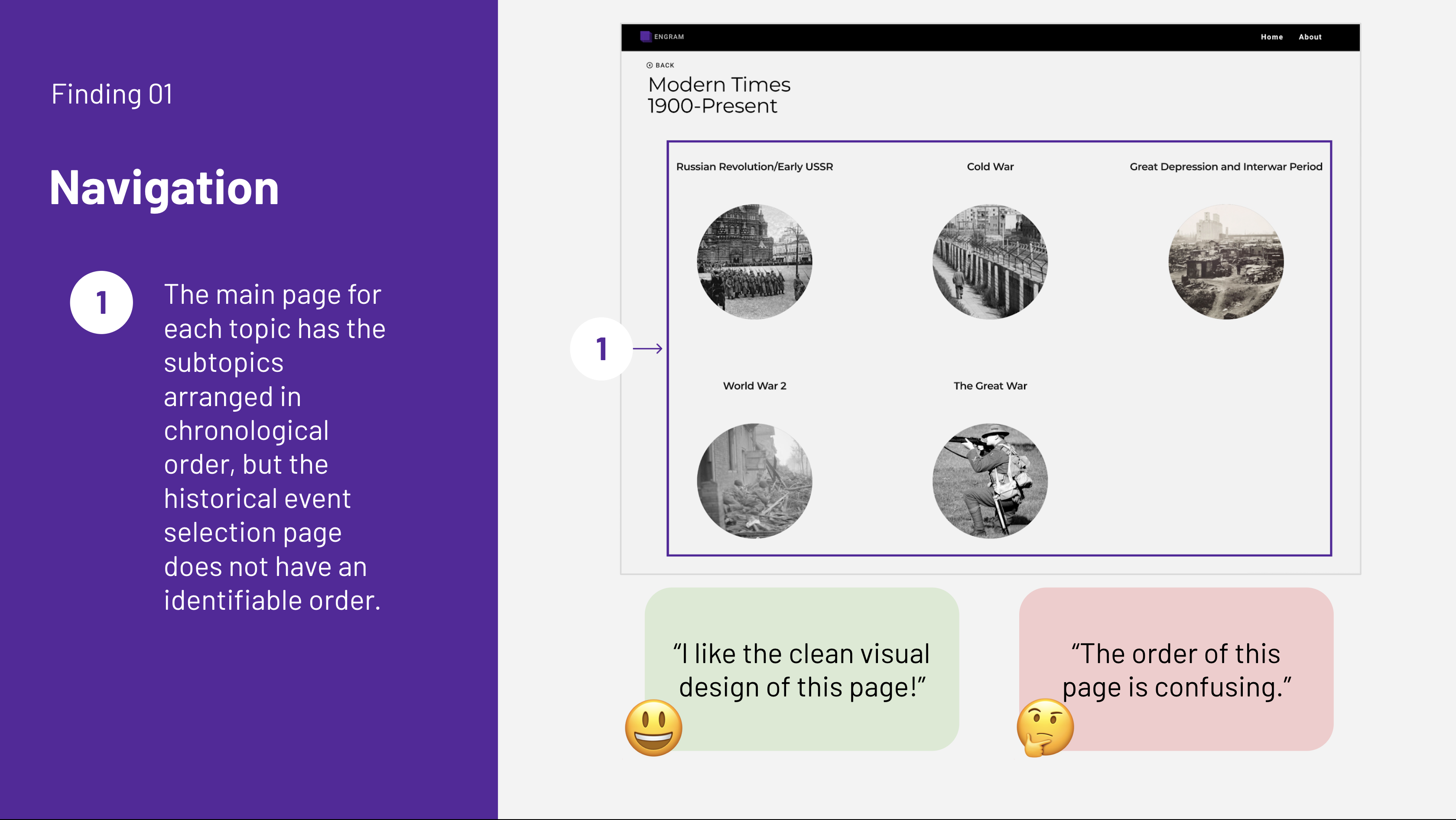
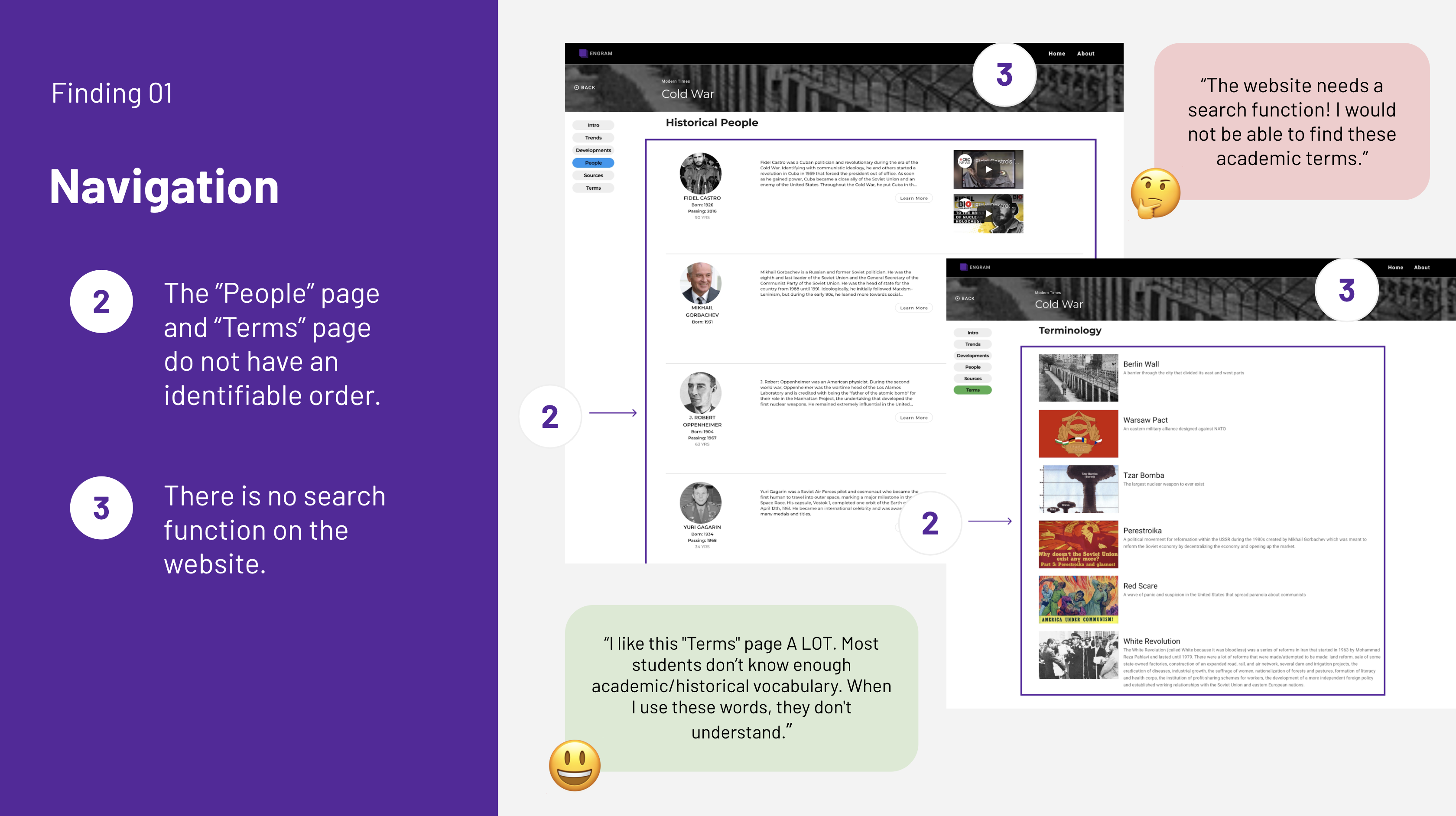
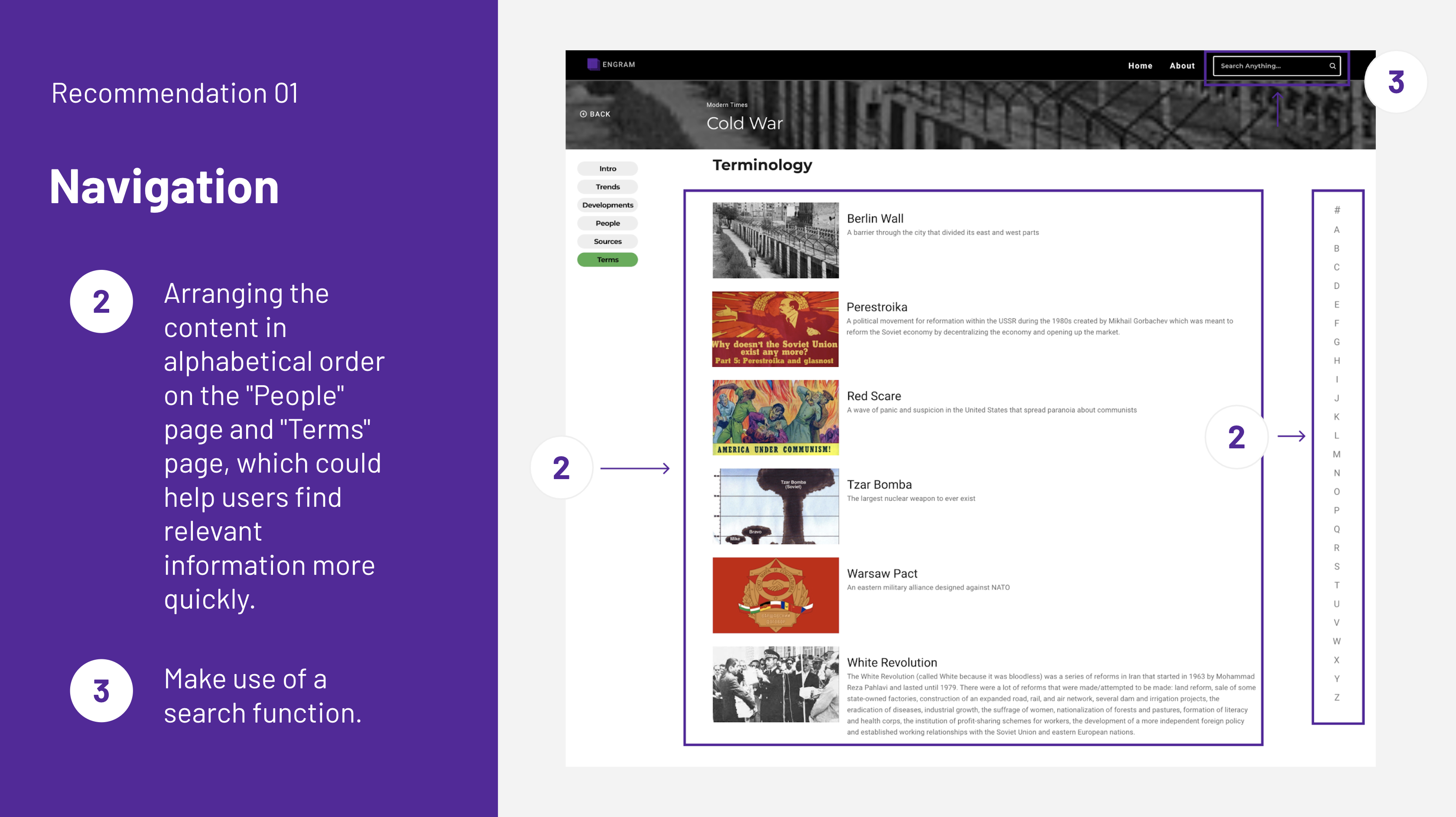
Issue Description: The overall aesthetic of the Engram website is appealing, with clear distribution of operation modules, enabling easy navigation. However, participants pointed out that, while the main page for each topic has the subtopics arranged in chronological order, many pages, such as the “Historical event selection” page, the “People” page, and the “Terms” page, do not have an identifiable order. “Loved these little ‘Terms’ and the ‘People’ sections, but the order doesn’t seem to make sense!” Participants who were current AP World History teachers pointed out that this could be confusing for students who are just beginning to learn about these time periods. At the same time, many participants commented on the lack of a search function available on the website. This could make it challenging for users, especially students who are still unversed in these topics, to find specific content. “The website needs a search function! My students would not be able to find these academic terms.” “My first instinct is to SEARCH it.”
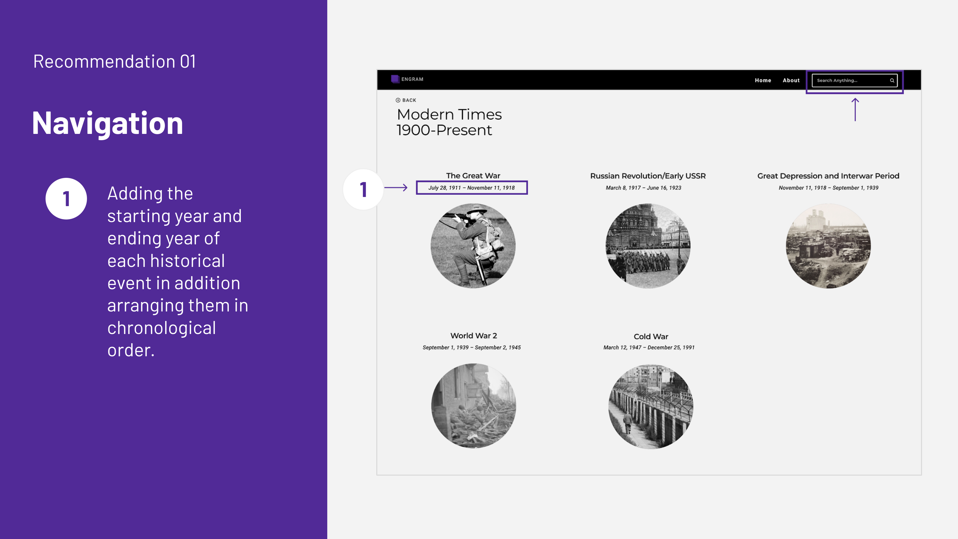
Recommendation: In order to help users find content with ease and efficiency, we compiled a couple of recommendations. Firstly, on the historical event selection page, we recommend adding the starting year and ending year of each historical event, as well as arranging them in chronological order. This change could also make it easier for users to distinguish between historical events and therefore increase understanding. Secondly, we recommend arranging the content in alphabetical order on the “People” page and “Terms” page, which could help users find relevant information more quickly. Lastly, we recommend adding a search function to the navigation bar at the top of the page so that users can use keywords to find specific content quickly and accurately at any time.
finding & Recommendation #2 -layout
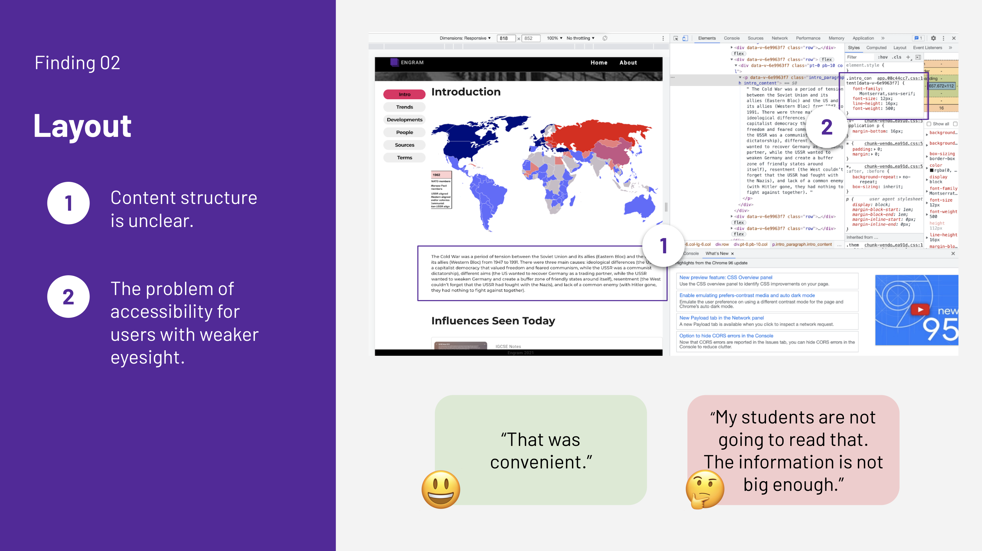
Issue Description: Many participants found it challenging to complete Task 2, “Find out the three major causes of the Cold War (According to Engram).” This information can be found on the “Introduction” page. There is a lot of helpful material available, such as a world map displaying relevant regions and a paragraph detailing lasting impacts. However, the unclear content structure led participants to spend unnecessary time looking at peripheral materials in an effort to find the information they were looking for. One participant who is a current AP World History teacher mentioned, “My students are not going to read that. The information is not big enough.” Moreover, accessibility needs to be taken into consideration concerning the “Introduction” page. A couple participants pointed out that the font size used was too small and therefore potentially unfriendly to users with weaker eyesight. The font size for the body paragraph of Engram was 12px. Based on the guidance from Apple, font size on a webpage for a body paragraph should be at least 16px to be accessible (Apple 2021).
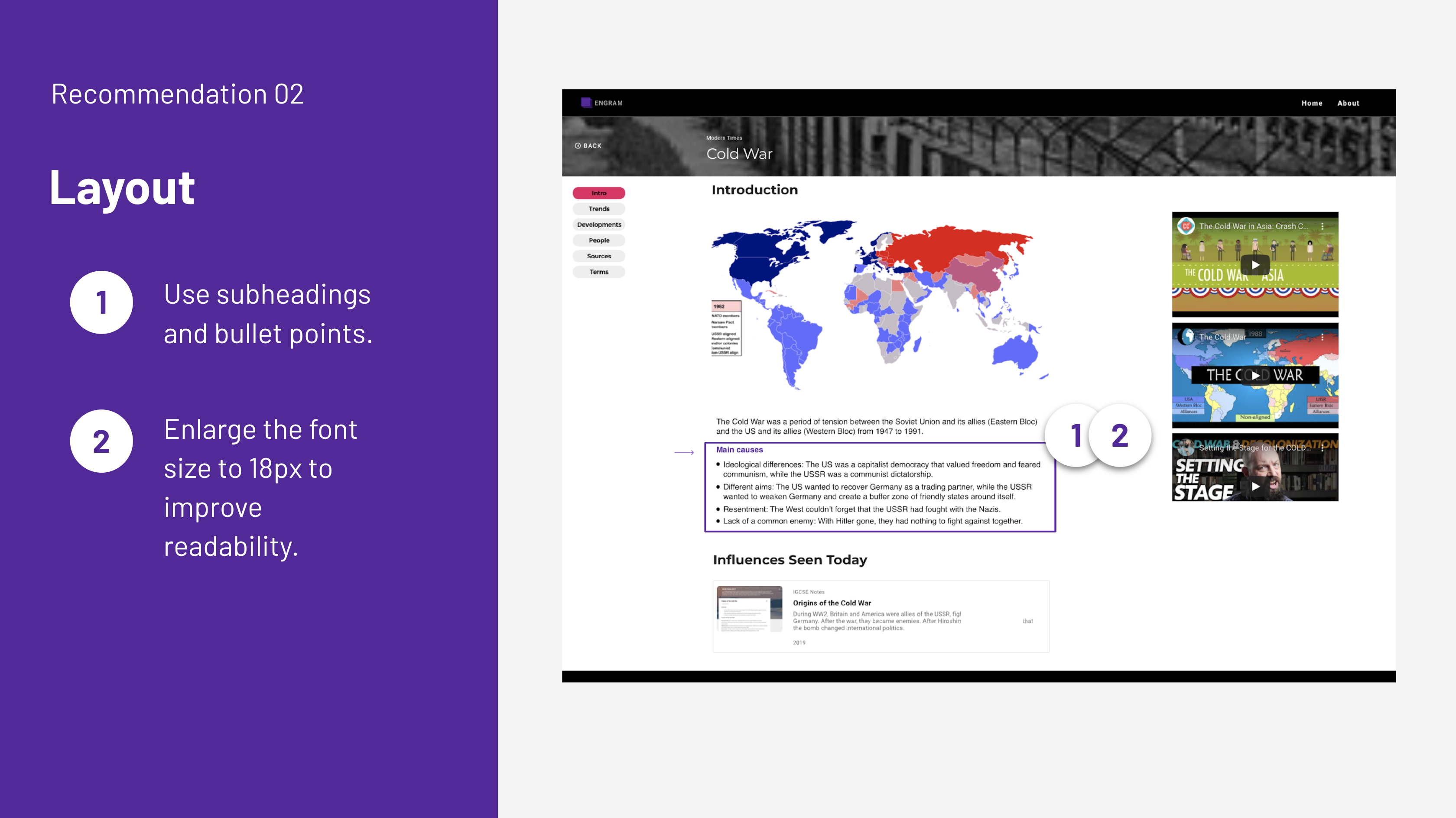
Recommendation: In order to improve the clarity and accessibility of the content structure, we recommend adjusting the font size, reformatting the division of paragraphs, and updating the method of displaying images. These recommendations will help users see the content more intuitively and therefore promote their understanding of the content.
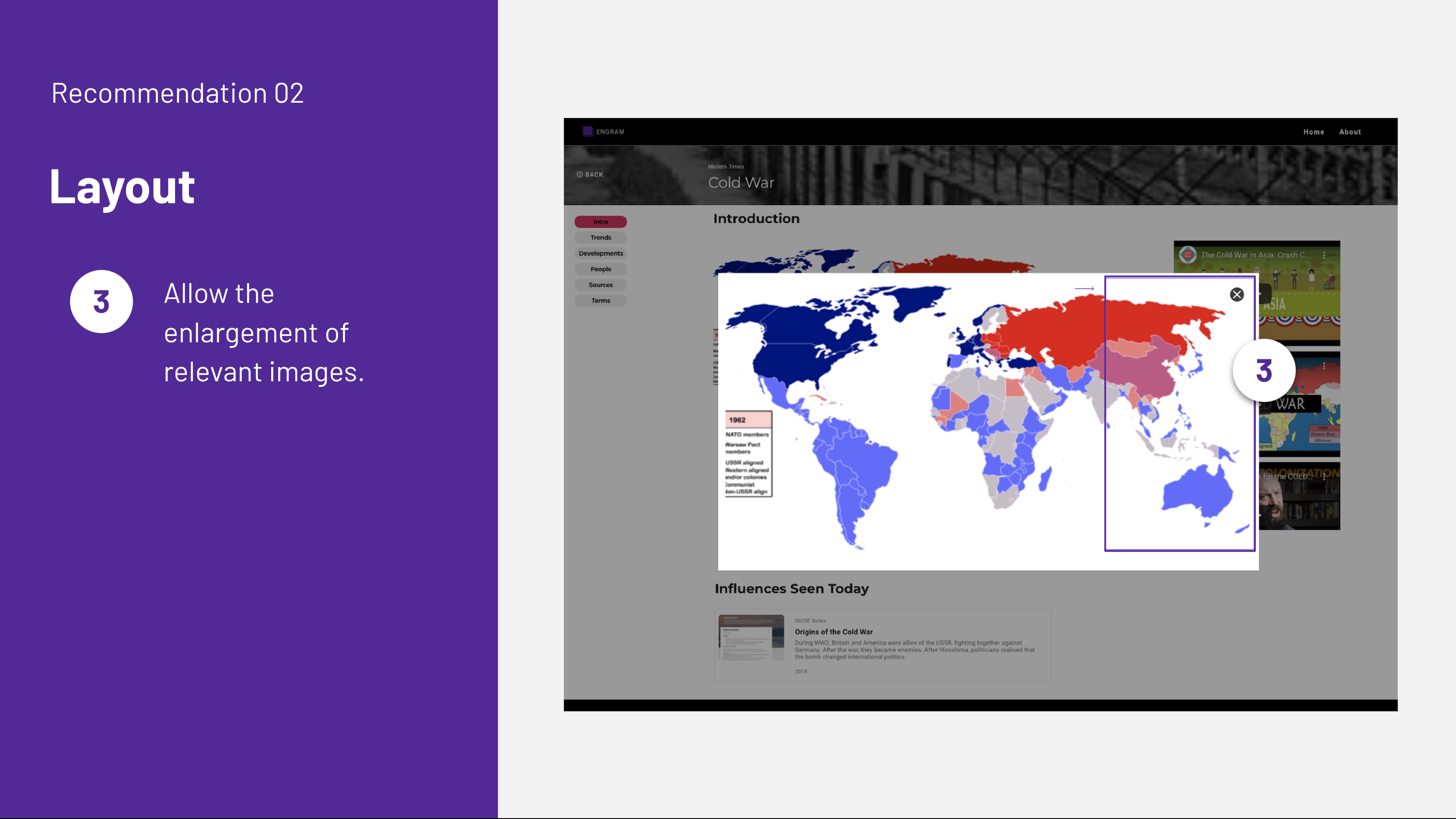
Firstly, we recommend using subheadings and bullet points, which can help users quickly pinpoint information as well as improve overall comprehensibility. One participant who is a current AP World History teacher asserted, “The more broken down, the better.” Secondly, we recommend enlarging the font size to 18px to improve readability. Lastly, we recommend allowing the enlargement of relevant images on the website, enabling users to click to see a larger version if needed.
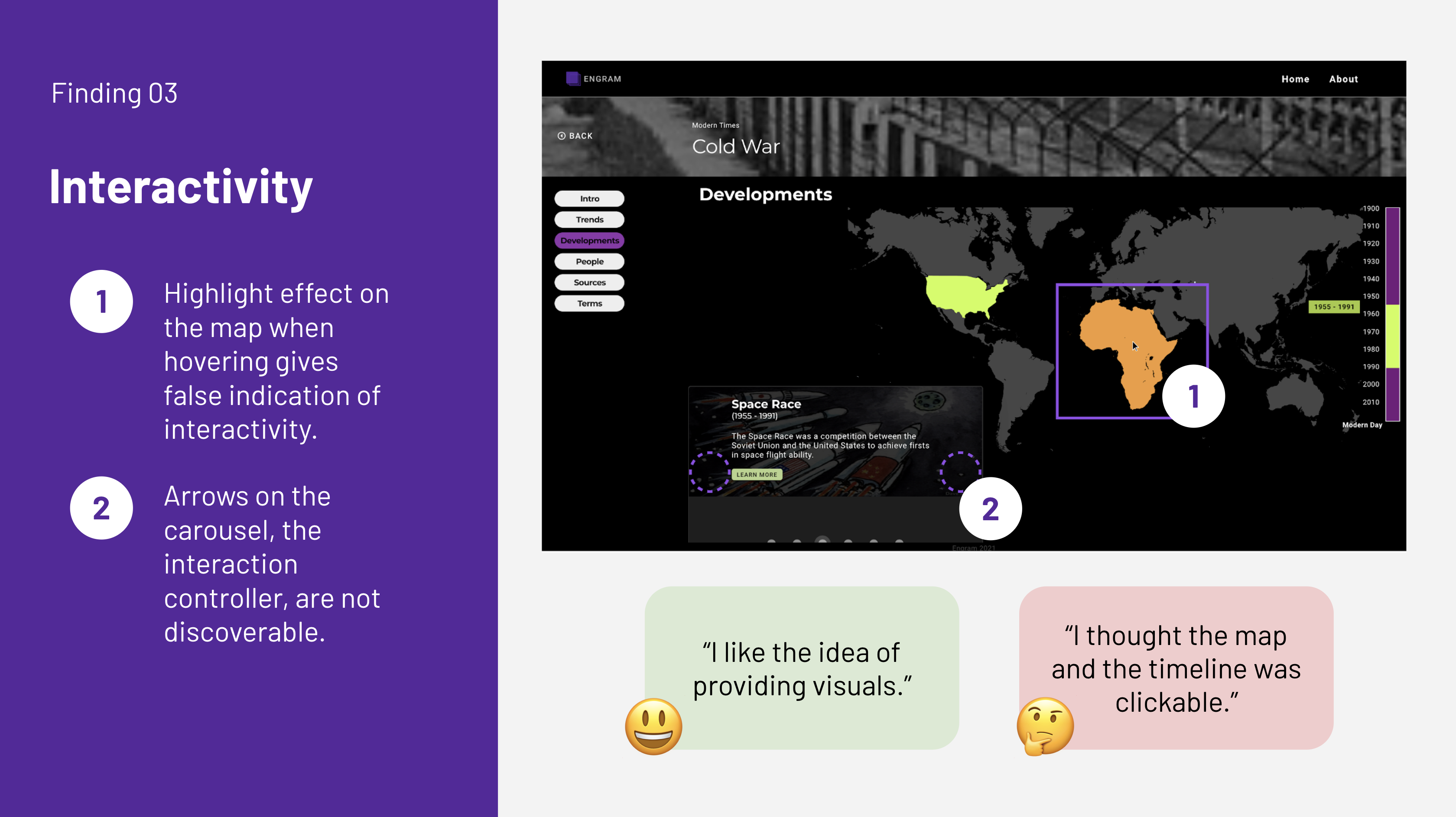
finding & Recommendation #3 -interactivity
Issue Description: The “Developments” page of each topic consists of a world map, a timeline bar, and a carousel. These features highlight important events that took place during each era. Each era includes the location, year, and context of the developments. The world map and the timeline bar received especially positive feedback. Participants who were current AP World History teachers felt that these features could help students retain important information by providing clear visuals. One participant suggested they be implemented into the landing pages of the different topics.
However, seven participants struggled to interact with the “Developments” page as intended and therefore took a lot of time to complete Task 3, “Find what the Space Race is and what its impact was (According to Engram.)” This is because they encountered difficulty navigating the different content offered on the “Developments” page. In addition, the participants assumed that the map and the timeline bar had interactive features and repeatedly attempted to click on them in an effort to find more information. One participant commented, “The areas of the map and the timeline seemed like clickable and interactive components”. Five other participants made similar comments.
The reason for this difficulty seems to be the highlight effect that occurs when hovering over different regions of the world map. This effect gives a false indication of interactivity. More importantly, the actual method to switch between the different developments, the arrows which appear when hovering over the carousel, are not very discoverable. When the arrows are clicked, users can navigate between different events on the “Developments” page and only then does the world map and the timeline bar show the times and places coinciding with the event.
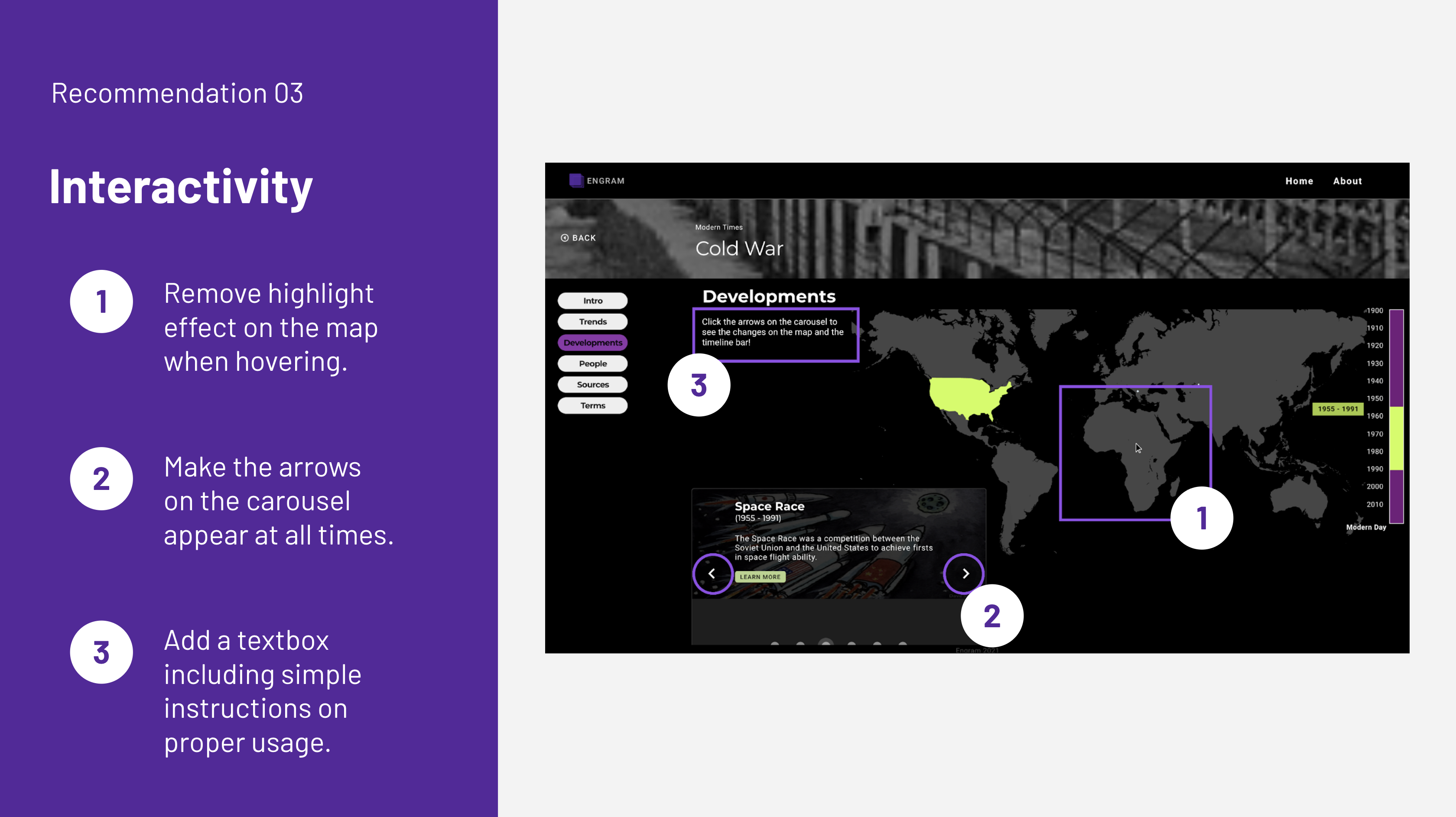
Recommendation: In order to enhance the interactivity of the “Developments” page, evaluators recommend omitting misleading visual cues and enhancing interaction controller discoverability. Firstly, we recommend removing the highlight effect that occurs when hovering over different regions of the world map. The testing sessions suggested it causes misunderstanding. Participants assumed it was clickable and became confused when clicking did not yield an effect. In addition, regions that are not covered in the “Developments page” are highlighted at times. Secondly, we recommend that the arrows of the carousel appear on the screen at all times and not just when being hovered over. This would increase discoverability and be an indication to users that they can interact with this feature in this capacity. This was not immediately clear to many of the participants. Lastly, we recommend adding a text box including simple instructions for how to properly use the “Developments” page.
Conclusion
There was a lot of positive feedback on different features of Engram. One participant said, “I would definitely want to use Engram when it is published” and even asked evaluators to let them know when it is launched. We are confident that, by reviewing the findings of our evaluators and implementing some of our recommendations, the overall usability of Engram can be improved, to center target users and attract prospective users.
Results: The Client Was Impressed!