
Project Brief:
This case study describes a semester-long client project my team and I worked on for Information Architecture and Design, a graduate-level course at Pratt Institute during the Fall 2021 semester. For this project, we were tasked with redesigning Community Board 3’s (CB 3) website as well as coming up with a tool focused on landmarks in CB 3. The main objectives for the website redesign were to:
- Restructure the information architecture of the website
- Reorganize the navigation of the website
- Make the website more accessible
For this project, I took on the role of content writer.
About CB 3:
Community Board 3 refers to the third district in Manhattan, covering Chinatown, the East Village, and the Lower East Side. “It is a community filled with a diversity of cultures, religions, incomes, and languages. Its character, drawn from its heritage as a historic first stop for many immigrants, continues to the present day.” The main roles of Community Board 3, include “dealing with land use and zoning matters, the City budget, municipal service delivery and many other matters relating to their communities’ welfare.”
Process:
Our design process consisted of three main steps:
- Generating user insights
- Developing features
- Structuring content
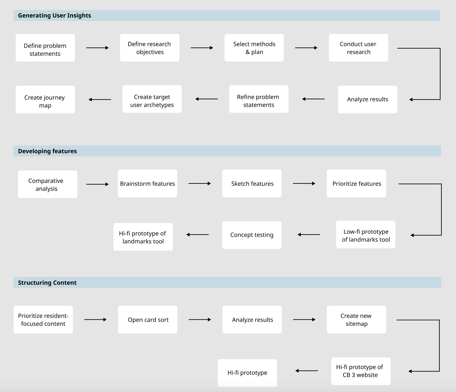
Figure 1. Overview of the different steps of the end-to-end design process
Prior to conducting user research, one of our team members sat in on a couple of CB 3 meetings to gain some additional context. Through the meetings, we learned that the Landmark Preservation Commission’s (LPC) main goal is to protect and preserve buildings of historical and cultural significance by assigning them landmark designations. We requested an in-person meeting to ask some follow-up questions to learn more, but unfortunately, we never heard back. This lack of consistent communication with our stakeholders was a big challenge throughout the project since we were unclear about whether what we were doing was what the client wanted, and whether we were on the right track or not. We had to learn to make executive decisions throughout the project to make up for this lack of communication and clarity.
Problem Statements:
Before starting our user research activities, we brainstormed some problem statements. These problem statements were an important tool we used to guide our design process – whenever we wanted to make or confirm a design decision, we referred to the problem statements to make sure the design decision aligned with our main goals. We came up with two problem statements, one for the CB 3 website redesign, and one for the landmarks tool:
CB 3 website: How can we make navigating the CB 3 website a more seamless and accessible experience for CB 3 residents?
Landmarks tool: How can we increase CB 3 residents’ awareness of landmarks in order to increase preservation of local landmarks?
User Research:
We utilized two user research methods during the discovery phase of our research: 1) contextual inquiries 2) semi-structured user interviews. Our main research objectives were to gain insights into users’:
- impressions of and interactions with the CB 3 website
- community awareness and engagement
- awareness of and behaviours around local historical and cultural landmarks
We conducted 4 contextual inquiries at local landmarks in the East Village during which we observed what people were doing around the landmarks during our contextual inquiries to gain some environmental context.
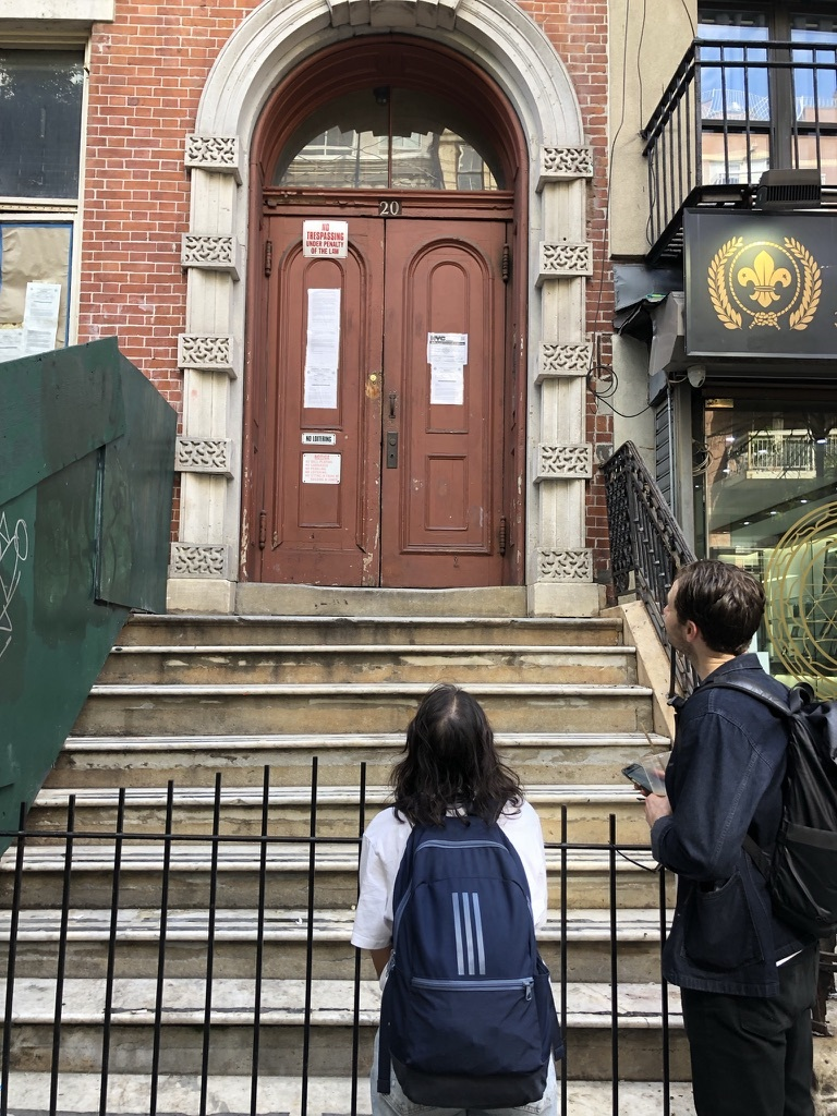
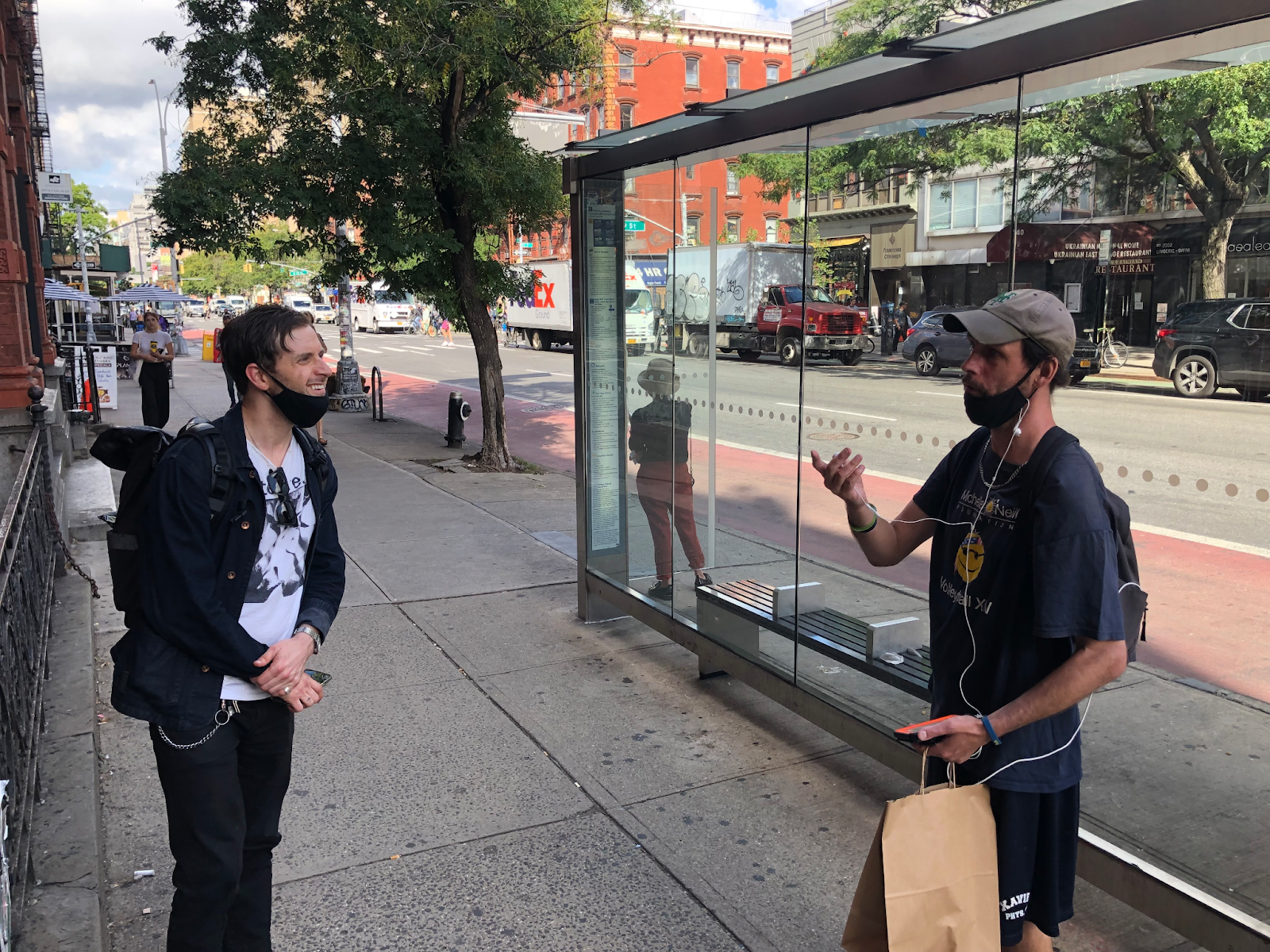
Image 1 (top). Conducting contextual inquiries at landmarks in the East Village & Image 2 (bottom). A man who has lived in the East Village for years started telling us about the history of the New York Public Library when he saw us looking at it
For our user interviews, our target audience was CB 3 residents i.e., NYC residents who live in Chinatown, East Village, or Lower East Side. If we were unable to find participants who fit the criteria (given our tight deadline of just one week to conduct the interviews), we expanded our target audience to include those who lived in other NYC neighborhoods as long as they lived below 14th street since the neighbourhoods below 14th street are close to each other in terms of proximity and are also quite similar to each other. We interviewed 6 participants in total.
Our main insights from the contextual inquiries and user interviews were:
- Barrier to entry in community involvement for younger residents is high since information about the local history and culture, and the ways to get involved in the community is not readily available, especially for newer residents – low involvement is not due to a lack of interest.
- Resources that provide information about landmarks in a concise way while residents are walking around should be a prioritized resource for increasing awareness of CB 3’s local and cultural history, since landmarks are not often sought out by but instead, are encountered by chance.
- Designing the CB 3 website in a way that appeals to residents of all demographics and backgrounds and not just CB 3 committee members is key to improving awareness and usage.
Based on what we discovered during our contextual inquiries and user interviews, we refined our problem statements to the following:
CB 3 website: How might we restructure the information architecture of the CB 3 website such that it is more resident-friendly?
Landmarks tool: How might we provide information about landmarks at the right time in order to make CB 3 residents more interested in local landmarks?
For the landmarks tool, our thought process was that education is a way to promote engagement that would eventually lead to the preservation of landmarks, one of the LPC’s main goals.
Target User Archetypes:
Based on our user research, we came up with two main user archetypes.
- Experts: The first archetype represents the people who are very knowledgeable about landmarks. For example, during our contextual inquiries, we talked to two men who seemed to know a lot about the history and significance of the particular landmark we met them at (see Image 1).
- Curious: The second archetype represents the people that aren’t really aware of landmarks and often encounter them by chance, but are open to learning more. We focused on this archetype when designing the landmarks tool since there is scope for education and encouraging engagement for this group.
Developing Features:
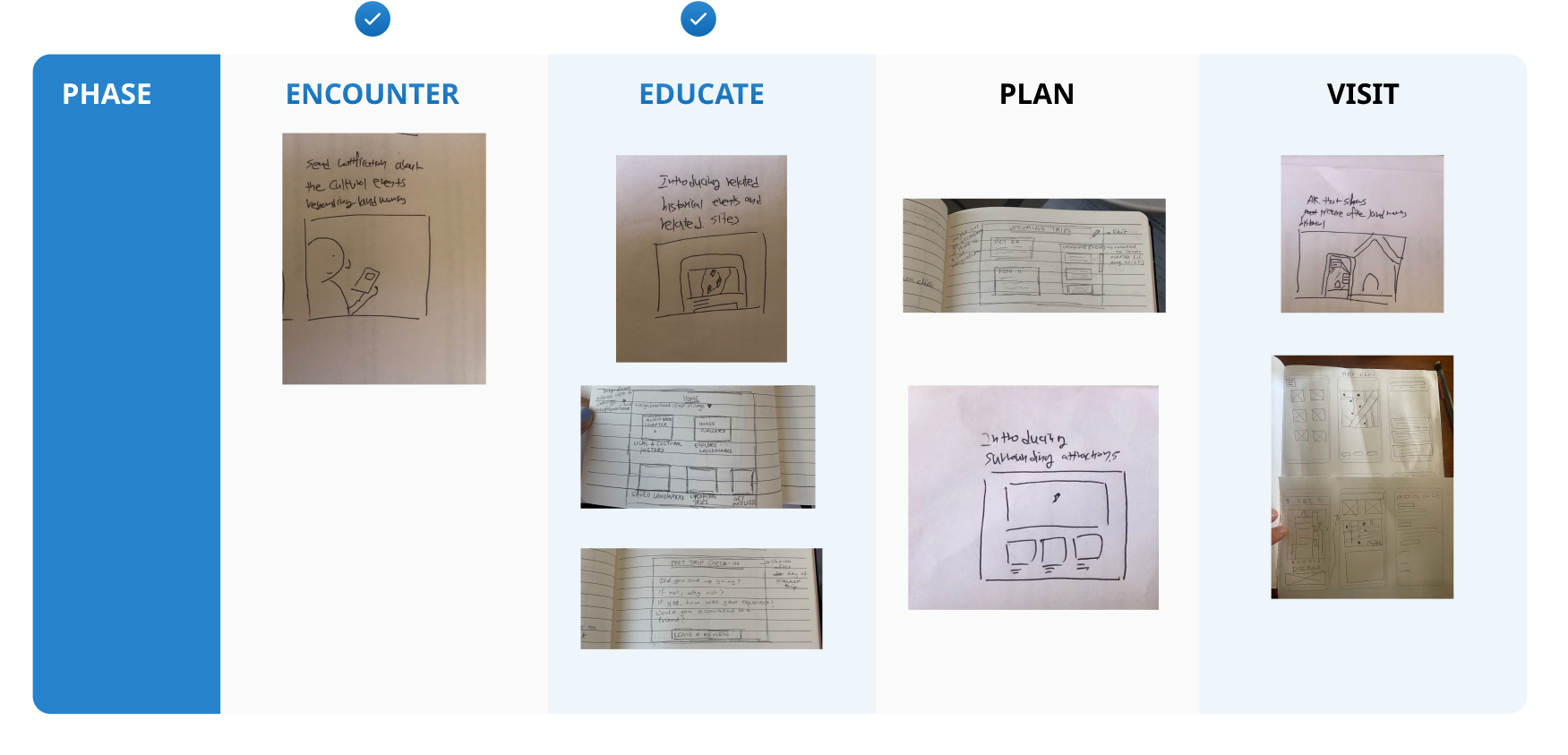
We designed a journey map to map out a typical user journey when visiting landmarks. Next, we conducted a comparative analysis to understand how websites focused on CB 3 neighbourhoods and NYC landmarks prioritize and organize content, as well as which different formats and features they used for communicating content.
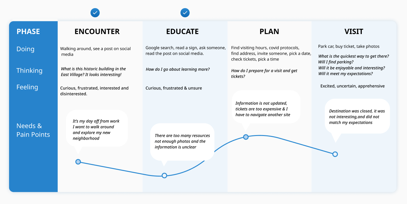
Figure 2. User journey map of visiting a landmark
We then conducted a sketching session where each one of us sketched out feature ideas for each step of the user journey. The findings from our comparative analysis came in handy during this step. We also decided to focus specifically on the “Encounter” and “Educate” steps of the user journey since they aligned most closely with our landmarks tool problem statement.
Once we had all of our feature sketches, we used a feature prioritization chart to pick the main features to focus on. We selected the features which aligned with the landmarks tool problem statement as well as those that had high feasibility and high user value.
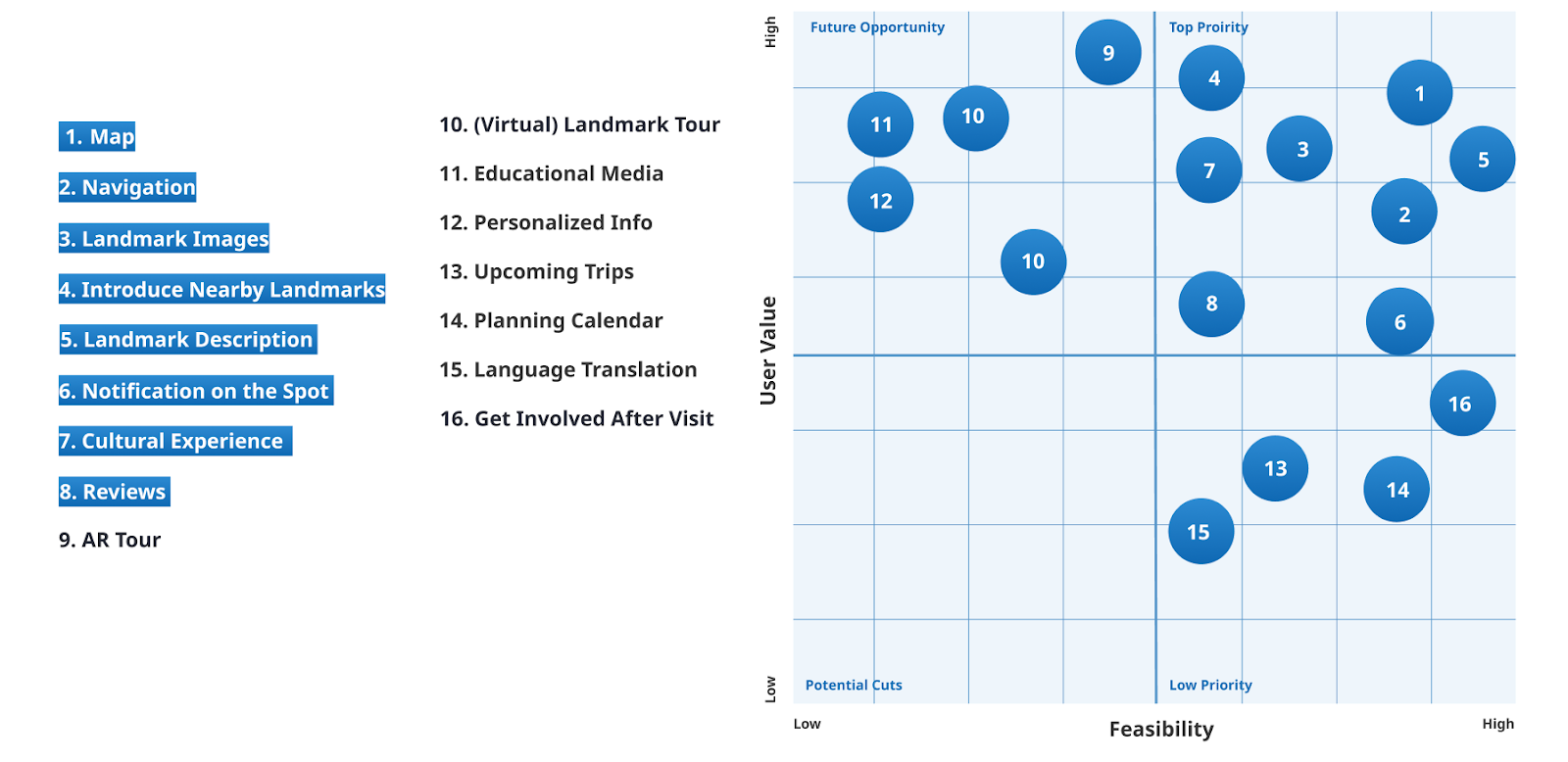
Figure 4. Feature Prioritization Chart
Prototyping the Landmarks Tool:
We created a low-fidelity prototype of the map feature of the landmarks tool and carried out concept testing.
Based on the results of the concept tests, we decided to focus on:
- Showing nearby landmarks on a walking route
- Showing ways to get involved for visited landmarks
- Providing a more immersive experience with an AR tour feature
We then created a high-fidelity prototype with the following final features:
Feature #1: Landmark Education:
When users are using the map to get to their destination, all the nearby landmarks will be denoted by an icon. The colour of the icon is based on the status of the landmark – red if it is in danger of being demolished, blue if the landmark has been safely preserved. In addition, if the landmark icon has a star above it, it means that the landmark has received official landmark designation, if there is no star above the landmark icon, it means that the landmark is pending approval for landmark designation. Users can tap on an icon to learn more about the landmark such as its history, open hours, reviews, events happening at the landmark etc. This feature fulfills the need for educating residents about the situations of local landmarks in their neighbourhood.
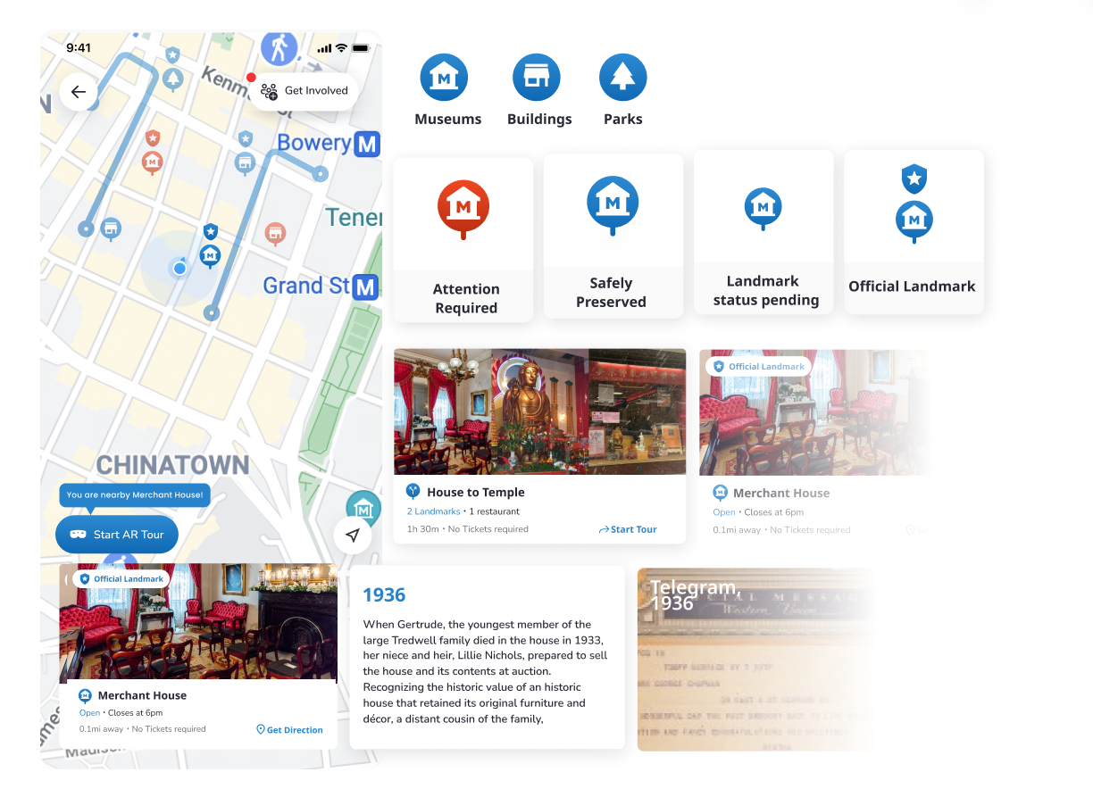
Figure 6. Map feature which shows the status of each nearby landmark as well as information about a landmark.
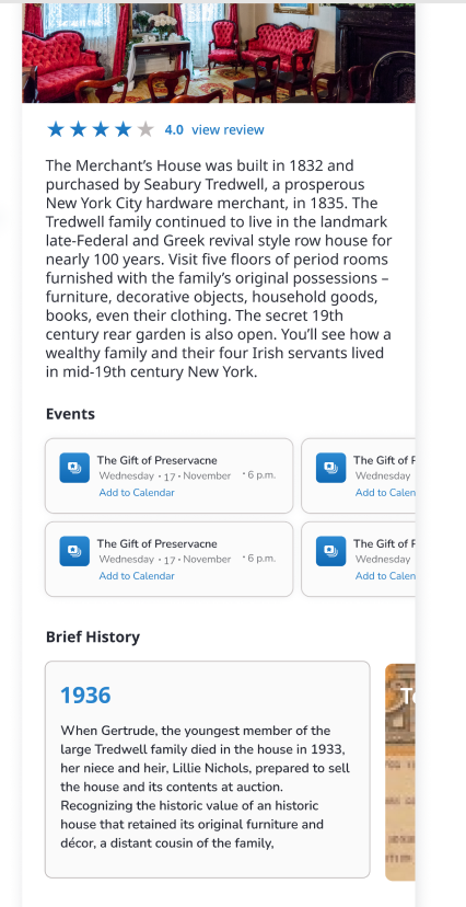
Figure 7. Close up of the information about a landmark
Feature #2 – AR Tour:
When users are walking and they approach a landmark, they will receive a notification to learn more. If users click on the notification, they will be asked to give permission to open their camera. The users can then use their camera to scan the landmark and information about the landmark will pop up on their screens. This feature provides educational content about landmarks in a fun and engaging way.
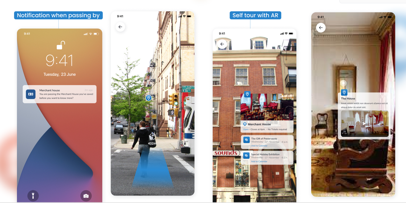
Figure 8. AR tour feature of the landmarks tool
Feature #3 – Get Involved
This section shows all the various on-going campaigns for different landmarks. Users can learn more about each campaign and if they are interested in participating, they can then sign petitions, attend meetings, donate to landmarks etc. This feature is the main call to action feature that would promote engagement in landmark preservation activities, which is the LPC’s main goal.
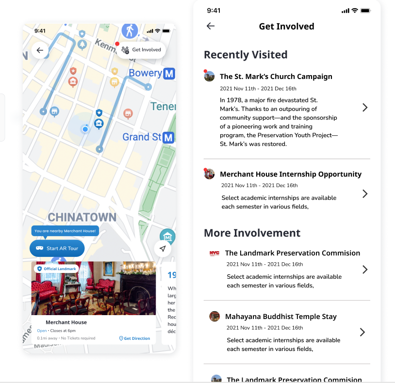
Figure 9. Get Involved feature which shows information about existing campaigns for landmarks
Structuring Content:
The last stage of our project was to redesign the CB 3 website in terms of its information architecture and navigation. We decided to conduct card sorting to facilitate this process. Before conducting the card sorting, we went through the entire hierarchy of the current CB 3 website and made executive decisions in terms of whether to include or not include a heading/sub-heading as a card in the card sorting exercise, based on whether the item is resident-focused or not. Since our goal was to redesign the CB 3 website in such a way that it is more resident-friendly, we decided to eliminate any items that seemed to be more targeted towards CB 3 committee members. In this way, we reduced the number of items from 55 to 29. We then conducted open card sorting exercises with 7 participants. Since the CB 3 neighbourhood is very diverse in terms of cultural demographics, we recruited participants who are older and don’t speak English as their first language for this methodology. We analyzed the card sorting results and had to make executive decisions in the cases where the results did not yield a definitive answer. For example, if one card could fit into two different categories, we made a decision based on our own judgments for the final categorization of the card. In this way, we came up with a new sitemap for the CB 3 website (see Figure 11).
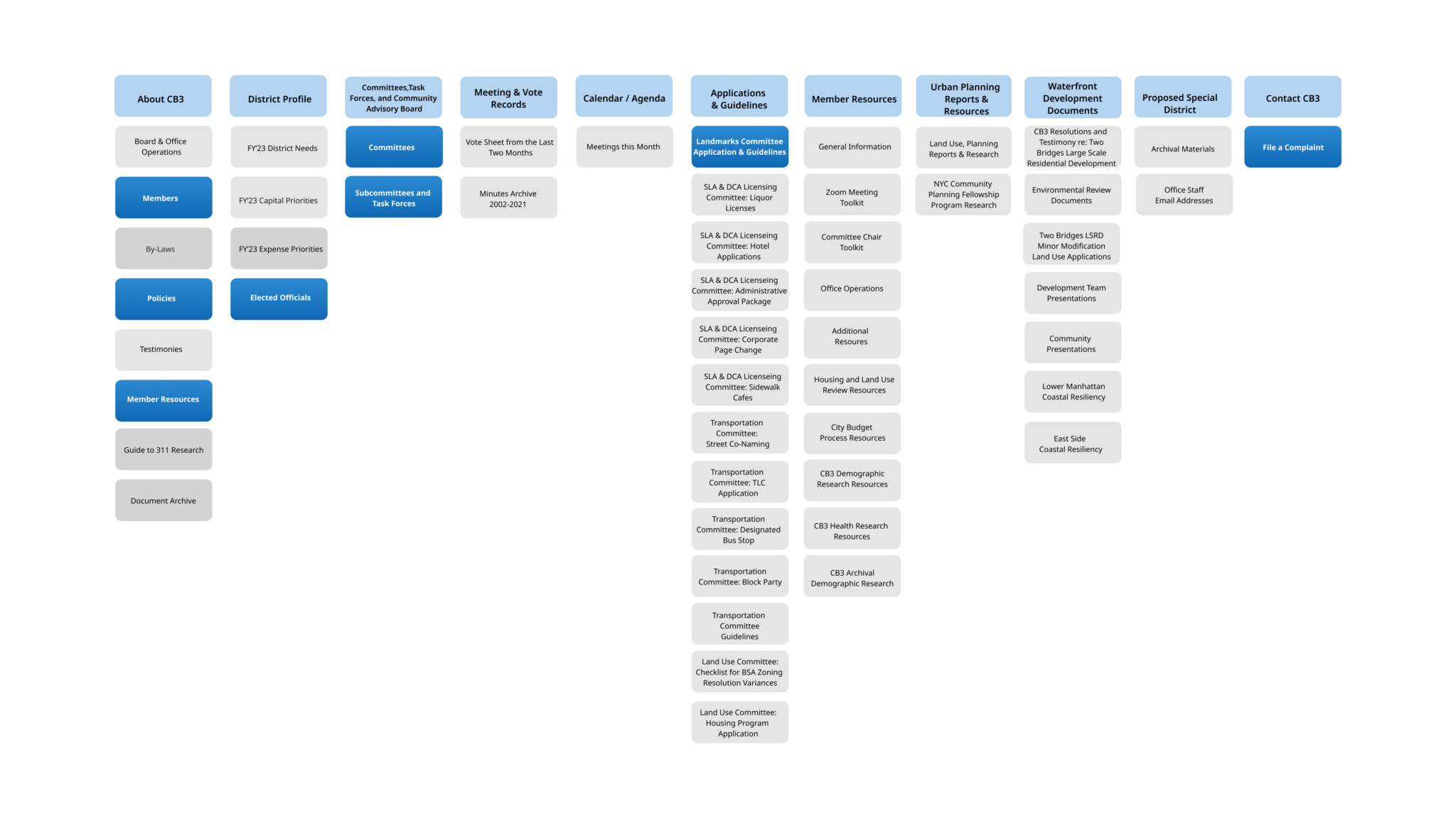
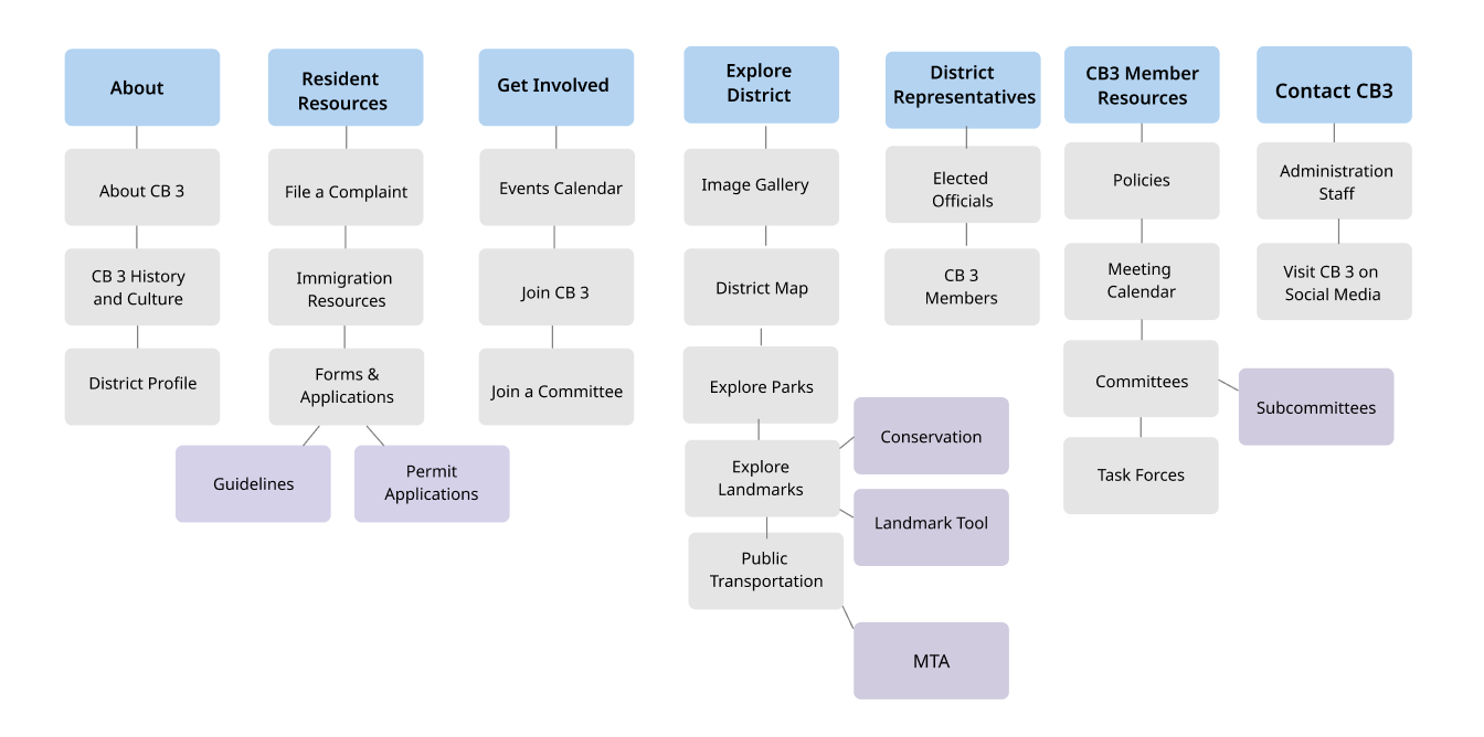
Figure 11. New sitemap of the CB 3 website
We then designed the hi-fidelity prototype of the redesigned home page of the CB 3 website in three breakpoints: desktop, tablet, and mobile. When redesigning the website we were intentional about adding more images since the feedback we received during the user interviews was that the current website looked very outdated and cluttered since it was so text-heavy. We also added more resident-focused sections such as a “What’s Happening” section and an “Upcoming Community Events” section that would provide residents with the information to engage with their community more, as this was also an unmet want that came up during the user interviews.
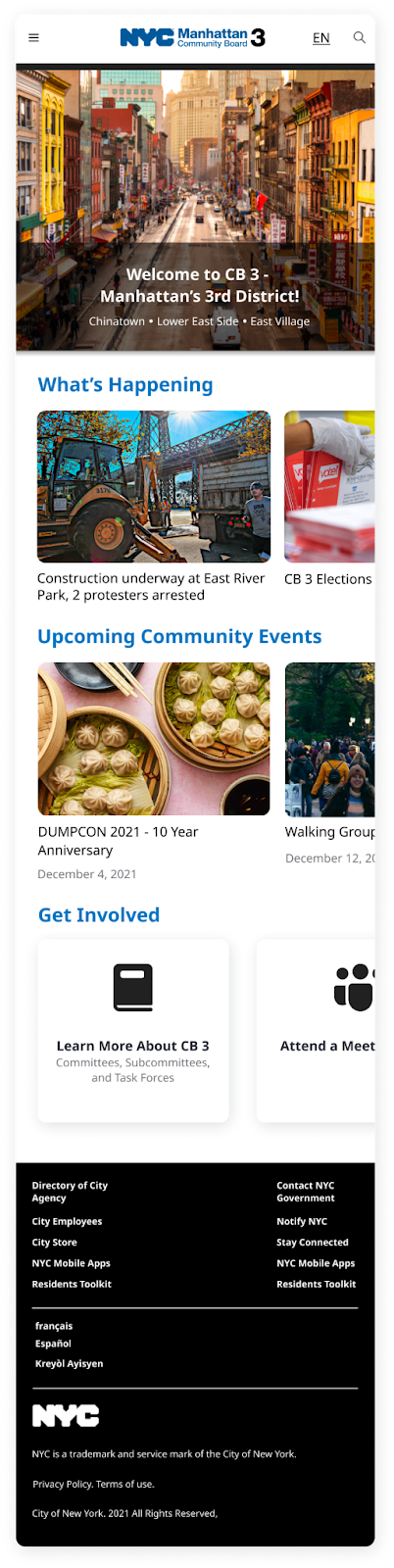
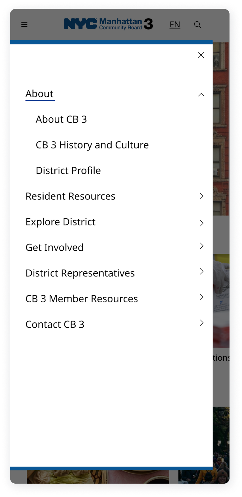
Figure 12. Mobile version of the CB 3 website redesign
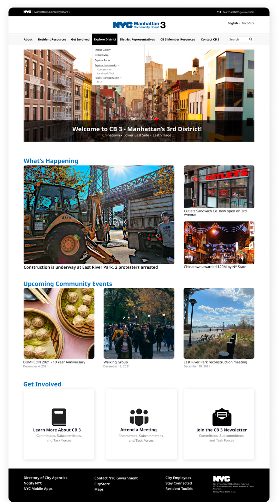
Figure 13. Desktop version of the CB 3 website redesign
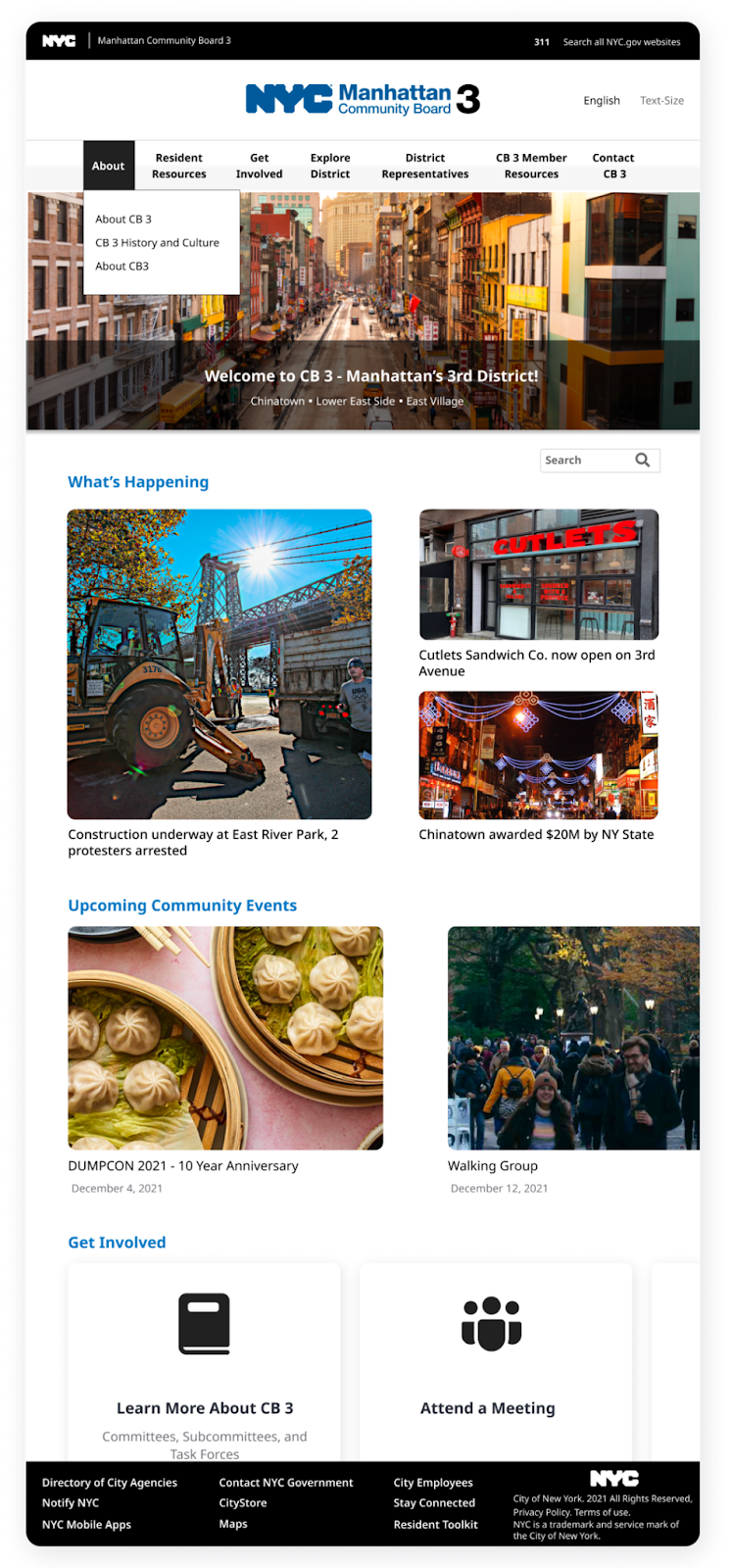
Figure 14. Tablet version of the CB 3 website redesign
Next Steps:
Our prototypes of the CB 3 website and the landmarks tool were met with positive feedback. We were praised for adopting a very user-centric approach throughout the design process and for coming up with an innovative product for the landmarks tool. However, at the moment, the connection between the landmarks tool and the CB 3 website is not very apparent and they seem like two separate entities instead of one integrated unit. The main focus going forward would be to integrate the landmarks tool with the CB 3 website seamlessly so that they don’t feel isolated from each other. We also identified some other opportunities for future work on this project which include:
- Conducting usability tests of the landmarks tool and the redesigned CB 3 website
- Developing the MVP landmarks tool and the redesigned CB 3 website
- Integrating a social media feed on the CB 3 website
- Enhancing the landmarks tool with recommendations for experiences near landmarks, more interactive educational content, planning features, and audio resources for improved accessibility.
Challenges and Learnings:
This was a very challenging project as it was my first time working with a design team to redesign a website. Nevertheless, it was a very rewarding experience and I learned a tremendous amount in a short period of time. Some of the challenges we faced were:
- Learning how to work as part of a design team efficiently
- Lack of ongoing communication with the clients
- Uncertainty about whether we were on the right track
- Making space for everyone’s opinions
My main takeaways from this project were:
- Set clear expectations with team members and keep a strong channel of communication
- Creating and following structured processes is imperative when making decisions
- Divide up tasks instead of trying to be involved in every step when time is limited
- Prioritize the big picture things instead of focusing on minutiae