Braata Productions
Client: Braata Productions
Team: Pratt Institute
Role: User testing, qualitiative data analysis, mock ups, presentation
Timeline: 2 Months
Type: Desktop
Braata Productions came to the Pratt Insititute’s Center for Digital Experiences to redesign their website with a focus on making the experience more consistent and more usable. Since Braata Productions in the past had been a client, we decided to focus on a younger and more diverse audience to help branch out from Braata’s core audience of older Caribbean folk. Our team conducted moderated user testing consisting of 5 tasks total to give a comprehensive look into how our target audience feels about Braata Productions based on their website.
Participant Recruitment
Participants were recruited by using Pratt email lists and craigslist. Three main criteria were used:
Young

All were below 40.
Caribbean

4/10 were of Carribean descent.
Interest in arts & Culture

All were interested in Caribbean arts and culture.
Moderated User Testing
All tests were run in Google Meets with one team member acting as the moderator of the test and another as a note taker. Each team member moderated two sessions. Each test was alloted 60 minutes where they completed a card sort, a pre-test questionaire, 5 tasks each followed by post-task questions, and a post-test questionaire.

Tasks
The moderated user testing consisted of 5 tasks designed to get people to explore the parts of the website Braata had identified as most important.
Explore

We wanted to see participants first impressions of the website and what they were personally interested in.
About

Participants were encouraged to learn more about Braata as an organization and the various programs they offer.
Events

Braata wanted to bring more people into their events so we had participants explore events offered to gauge their interest.
Media

Braata has an active Youtube channel which has clips and past live streams of events which they wanted to highlight.
Support

We wanted to streamline the donation process and other ways to get involved as they are essential for a non-profit group.
Data Analysis
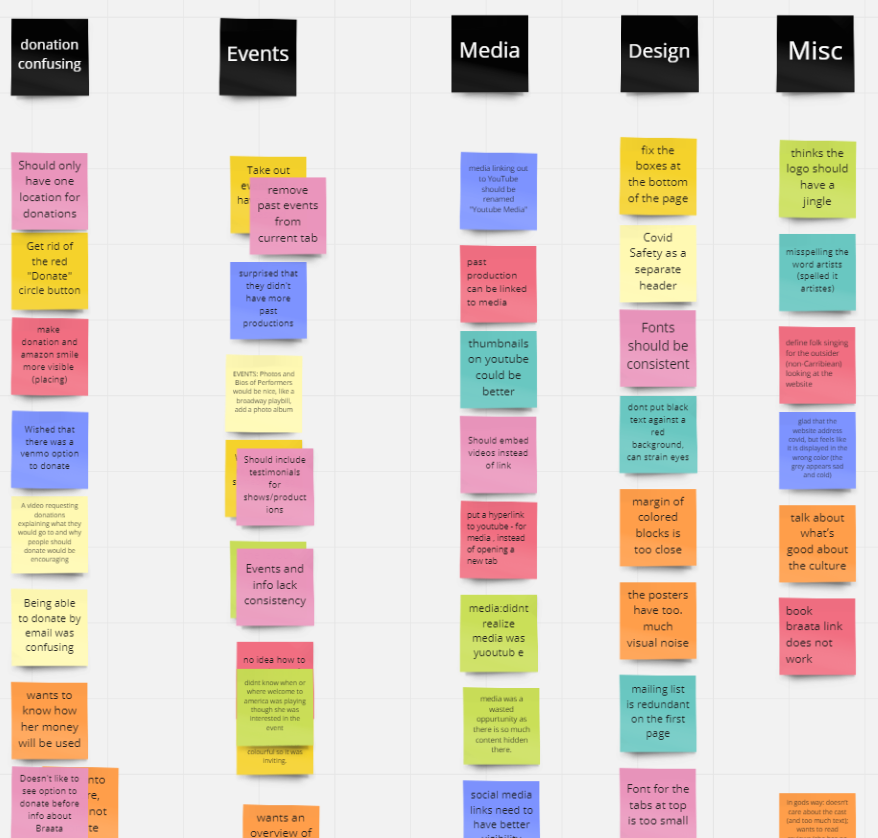
Affinity Mapping
We used affinity mapping to analyze the resulting data from the interviews. Each interviewer wrote their insights into a Miro Board with each color representing a different participant. In a meeting, the team grouped them together to identify painpoints.
Findings & Recommendations
Overall, we found that while participants loved Braata’s mission to promote Caribbean culture, the website experience needed to offer more consistency, more transparency, and easier to use.
Streamlining the Homepage
Users noticed many visual inconsistencies on the homepage and often said that the carousel moved too fast. We fixed the minor visual inconsistencies, made the carousel visually less cluttered, and recommended slowing the carousel down.

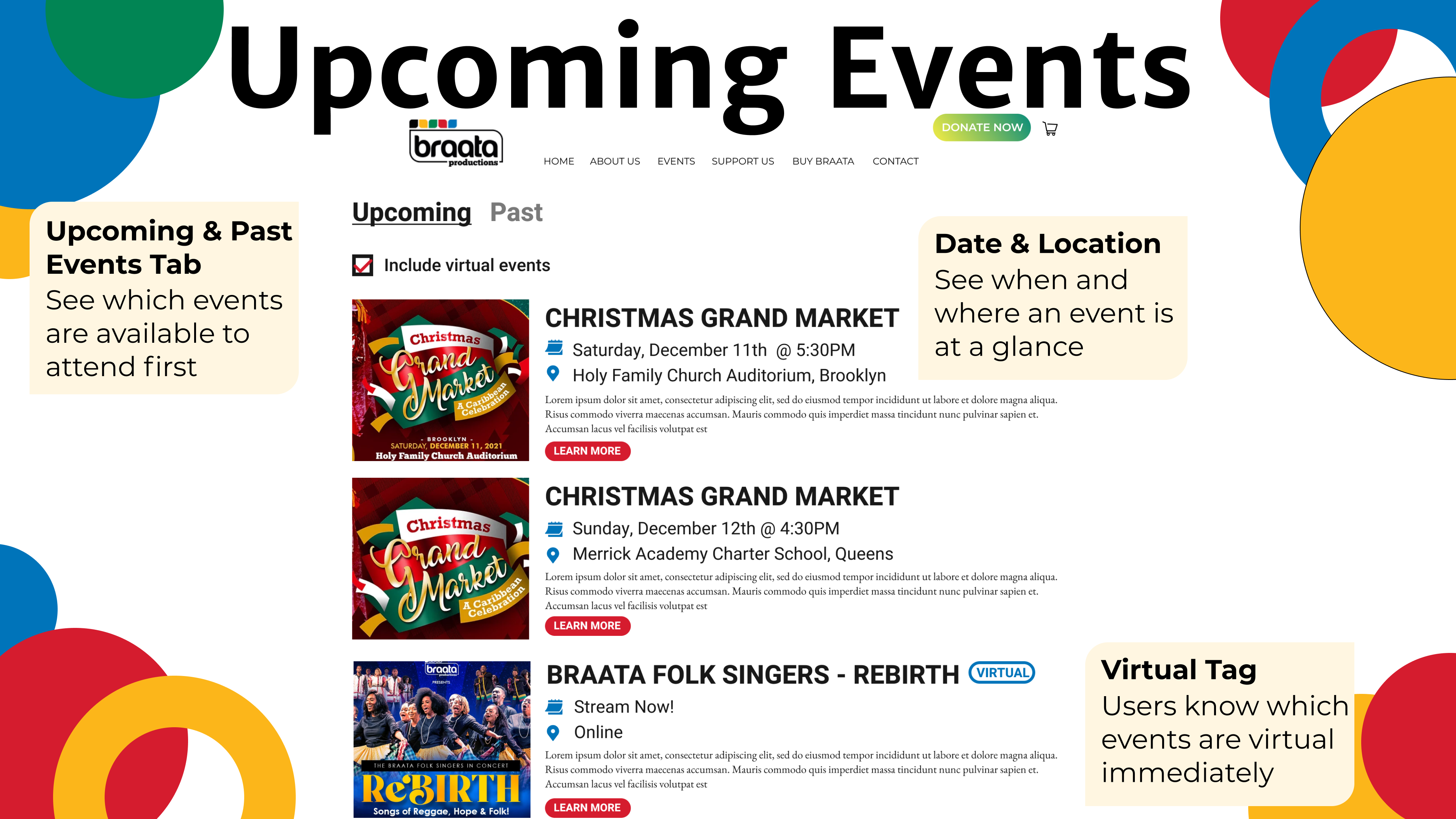
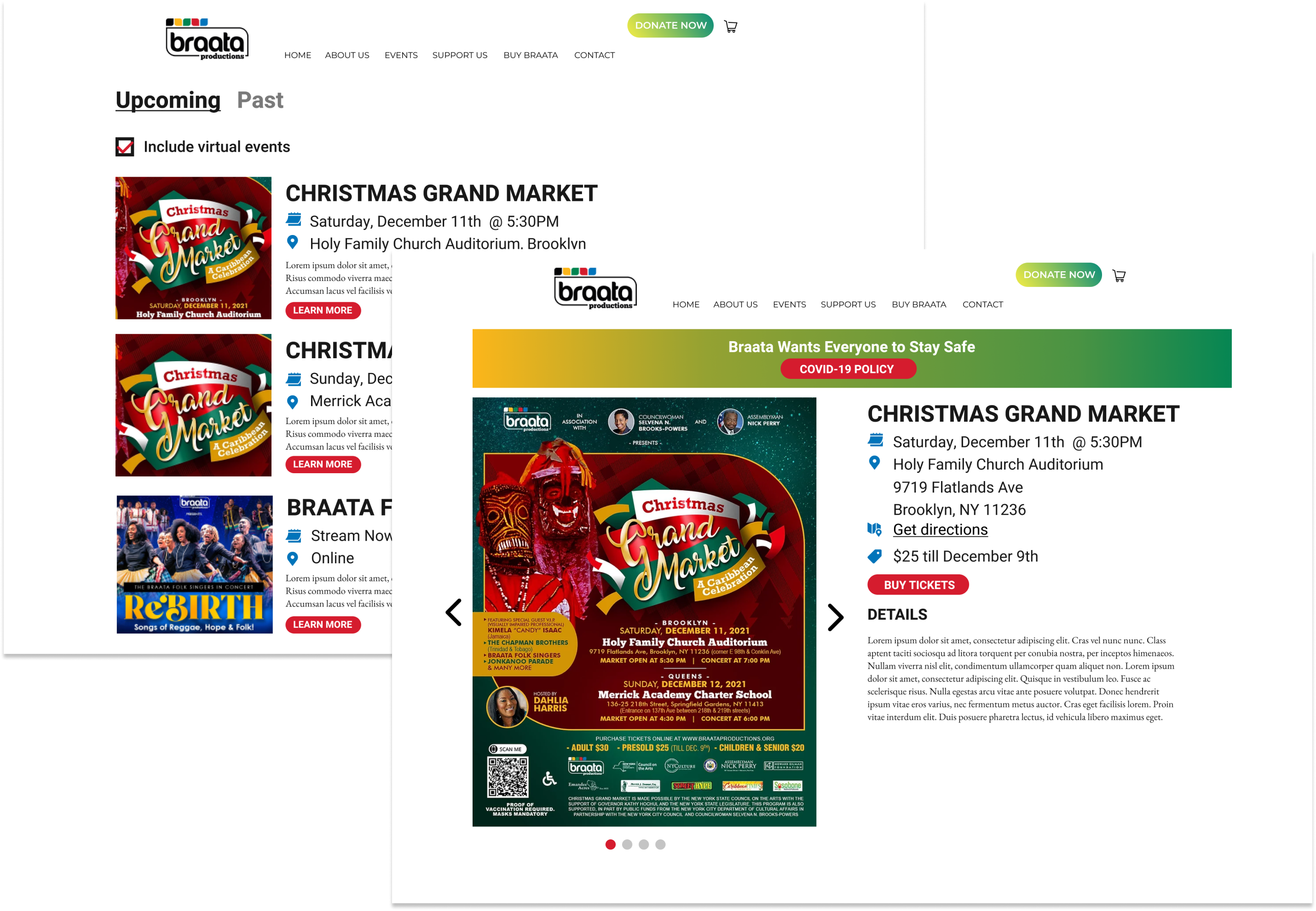
Adding an upcoming events Page
Users were becoming frustrated with Braata’s website because many of the events showcased had already passed and users had to click on each one individually to find out what the event was about. We suggested adding an “Upcoming Events” page to give users an overview of all the events people can attend in the future.
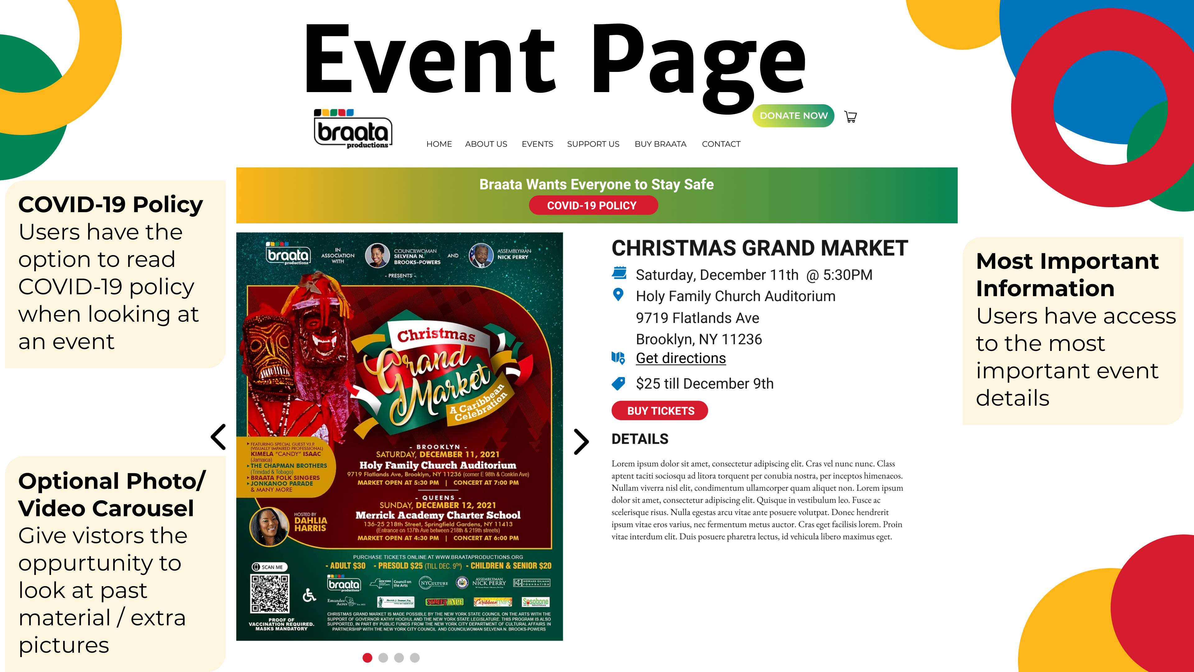
Standardize event pages
While many users loved the fun colors and graphic design the event posters offered, as a trade-off it made finding event details hard. We decided to create a template that Braata could use to standardize the event pages layout that both highlights the fun poster design and make important event details such as date and location easier to find.
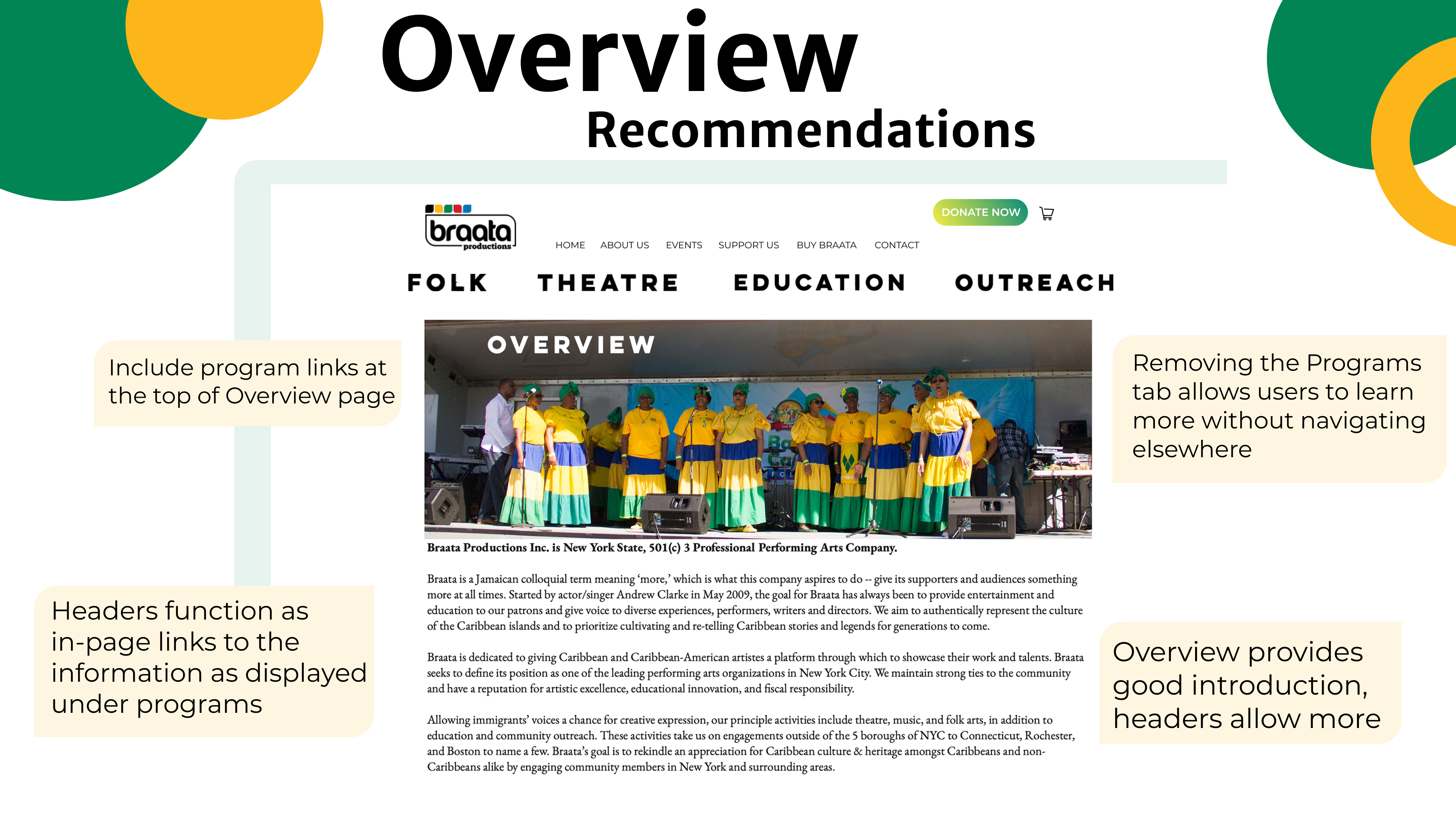
Combining programs & Overview
Braata really wanted to showcase the multiple discplines it was a part of; however, many users never navigated to their programs section without additonal direction. In addtion, a common question asked when users were learning about Braata was “How does Braata promote Caribbean culture?” We decided the best solution was to provide local navigation to each program page so users can learn how Braata works to complete its mission.

Simplifying the donation Page
Users had voiced their confusion and frustration with the multiple ways (some of them “hidden”) there were to donate. It made users feel like it was unsafe or untrustworthy to donate. We suggested making all the ways to donate carefully labeled so users know when they’ll be redirected to another site.
Where is the Media Page?
While the media page was a point of concern for our client, we found that users were not in love with just browsing through videos or photos. They complained that the current YouTube channel link lacked context for what the videos contained. We decided that since most of the videos on the YouTube channel were showcasing past events, embedding the video links on the event pages and forgoing a media page altogther would be the best solution.

Client Impressions

Our client was overall impressed by the breadth and depth of our usability testing!

