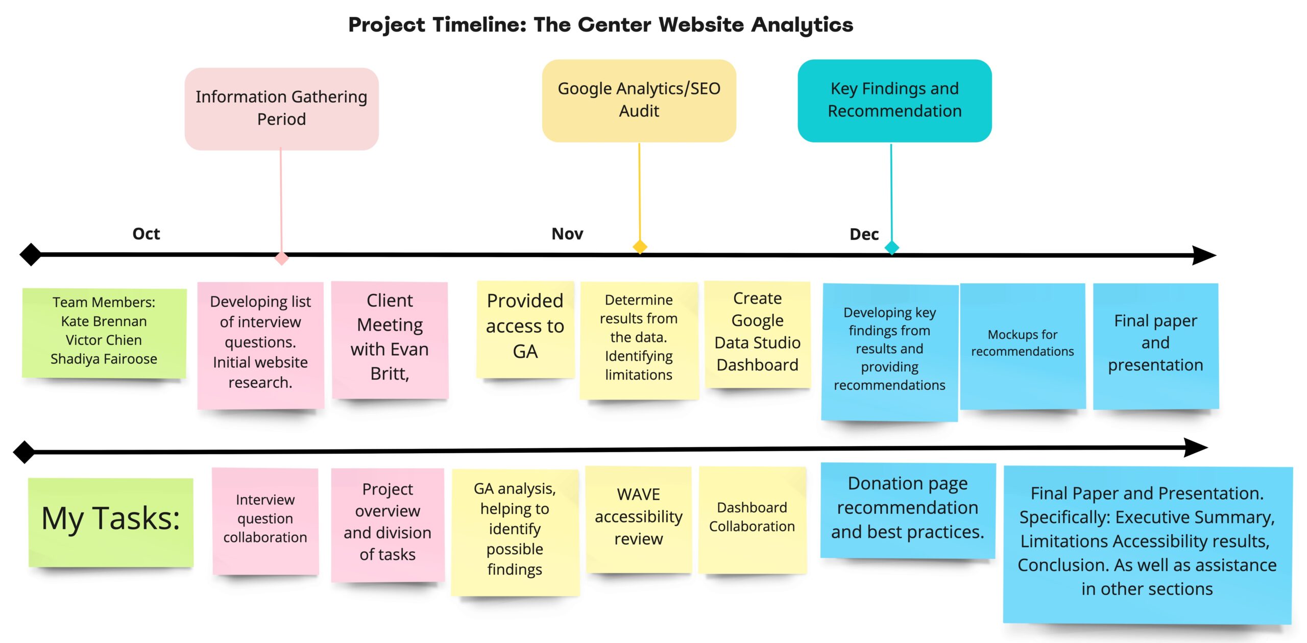
about the project
The Lesbian, Gay, Bisexual & Transgender Community Center (The Center) tasked our group in Digital Analytics to analyze the website as the organization prepares for a website redesign. We met with Evan Britt, Marketing Director, to get an idea of current Google Analytics usage, the primary purpose of the site, and what aspects or pages of the site we should focus on. Based on this meeting we got to work outlining what analysis needed to be completed.
The Center is based in New York’s West Village and fosters a welcoming environment where everyone is celebrated for who they are. We offer the LGBTQ communities of NYC advocacy, health and wellness programs; arts, entertainment and cultural events; recovery, parenthood and family support services. Find out more about The Center here.
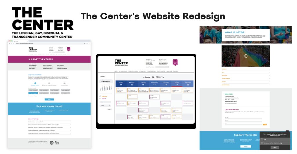
Problem: The Center has an outdated website and needed recommendations of how the site can be improved. A focus was on the donation page section, this is critical for any nonprofit.
Process & method
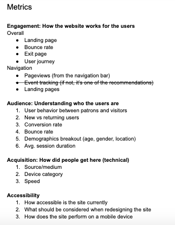
After our meeting with Evan, our group decided on categories and metrics to test the website performance. We used data from January 1, 2020-December 31, 2020. We wanted to get an idea of what areas of the site were performing well, and other details such as particularly popular pages, user behavior on the donation page, and behavior on the calendar page. We also used tools to test the accessibility of the site and completed an SEO audit.
We ran into a couple of challenges that were limitations for our analysis. The donation check-out process is completed through a third-party company so the data on GA is not complete. Another feature in GA, Event Tracking was not set up so we couldn’t test how users interact with the navigation menu.
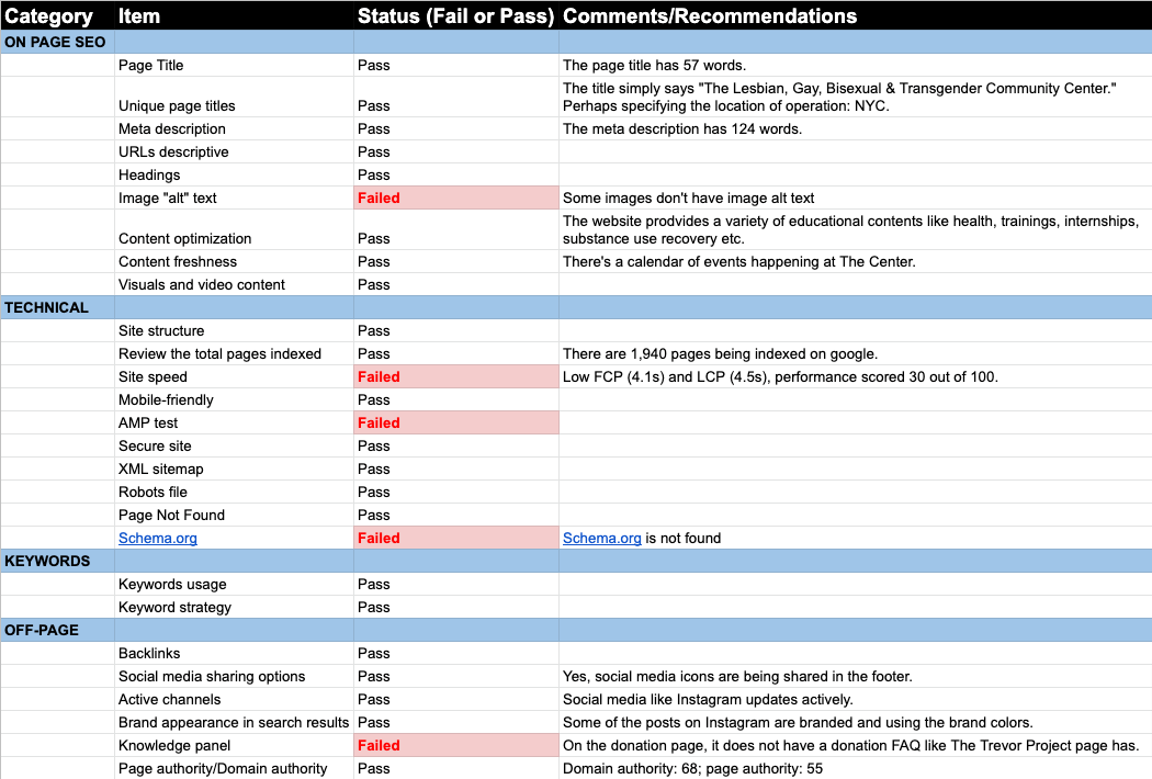
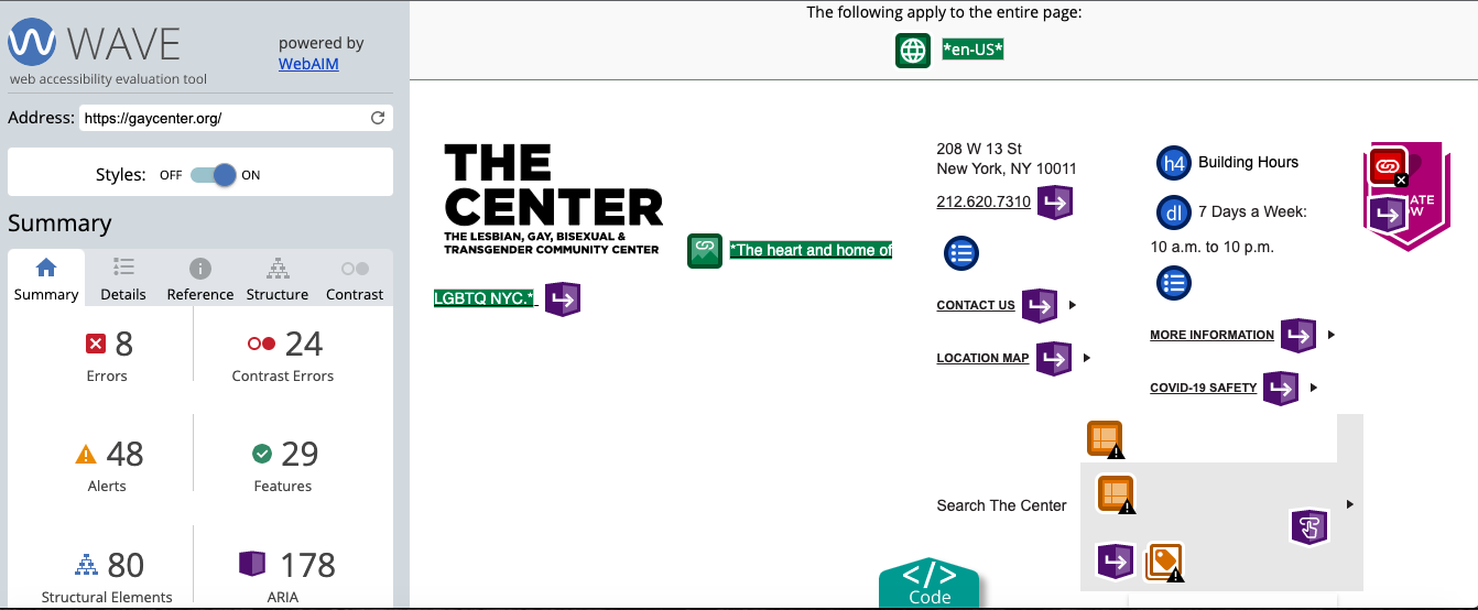
The data in Google Analytics proved to be very informative and we drew conclusions from those results. In order to test site accessibility, I used the WAVE Web Accessibility Evaluation tool. WAVE indicates errors and explains why users would have difficulty navigating the site. The tool is free but can only test one page at a time, the company has a paid service for entire site crawls.
Findings & recommendations
Based on the GA results our group identified 4 key findings and developed recommendations. These concrete recommendations can be utilized in the redesign of the site.
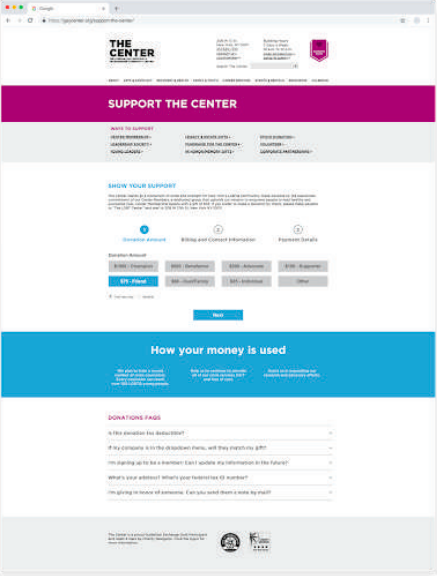
Donation Page
Finding 1: New users engaged less than returning users
69% of people who visited the donation page were new visitors and had a 32% higher chance of leaving the page without engaging. In addition, 99% of the donations coming from the donations page were made by returning users. On average, they spent more time on the page (1:11) than new visitors (47 sec).
Recommendation 1: Provide instant feedback and help users understand the value of their donations.
Best practices suggest adding an FAQ section and information about how donations are used. Currently, the banner of the donation page is very similar to the home page. The banner occupies a majority of the page above the fold and we think new users might not realize they need to scroll to reach the donation page. We created a mock-up of a simplified donation page.
Calendar Page

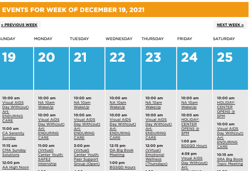
Finding 2: Only 0.5% of users went to an event page from the calendar page
The calendar page enjoys the seventh-highest viewership (19,163 views) among all the pages, with a bounce rate of 52%. 2.5% of all users visited the calendar page, and only 0.5% of all users actually went to an event page. This could mean that people weren’t engaging with the page or not finding the content they were looking for on the page.
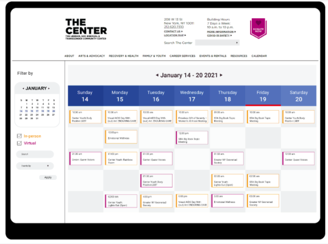
Recommendation 2: Declutter the calendar & curate relevant events to increase sessions
We created a mock-up of a calendar page that would allow for color coding and filtering options. This could increase engagement because users would be able to easily locate the events they would like to attend.
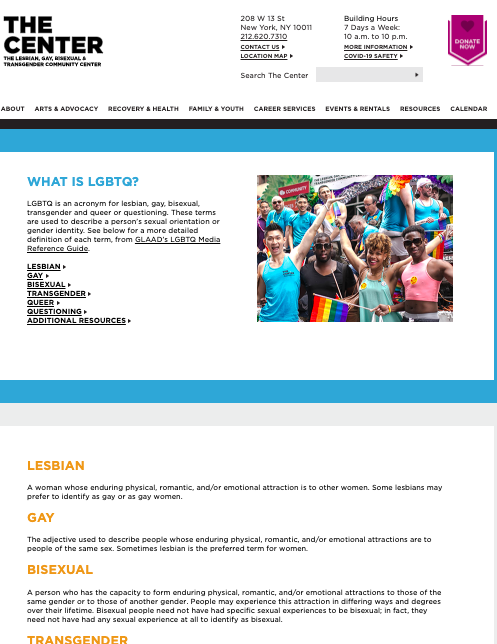
About LGBTQ Page
Finding 3: Highest bounce rate and lowest interaction on About LGBTQ Page
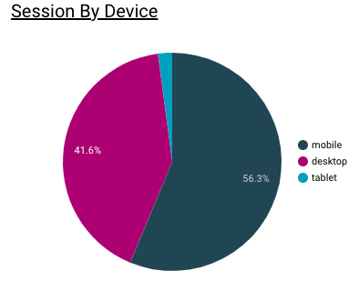
The ‘About LGBTQ’ page held the highest number of sessions and the most-viewed landing page, yet the bounce rate ranked highest (93%). Despite being one of the most popular pages, this page loads 33% slower than the site average, explaining why the About LGBTQ page might have the highest exit percentage (92%). In addition, 63% of users visited the page on mobile, followed by desktop, 34%, and tablet, 2%.
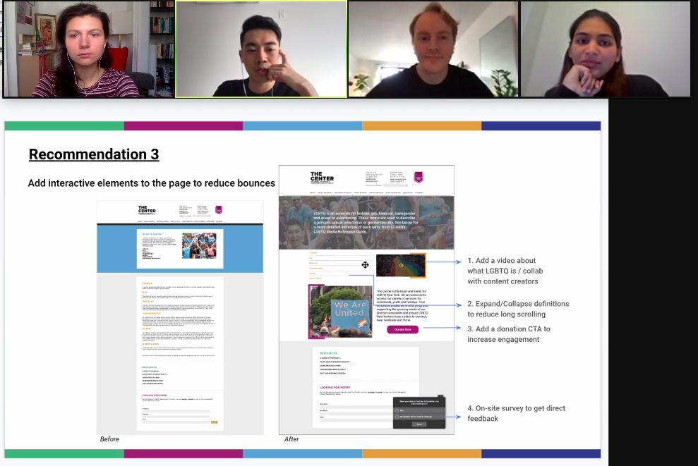
Recommendation 3: Add interactive elements to the page to reduce bounce rate
We recommend adding interactive elements like videos and internal links to the website, such as a dedicated donation Call To Action section, on the page. It encourages users to interact with the content; thus increasing time spent on the page and conversion rate and reducing bounce rate. We also think it would be beneficial to add an on-site survey to see if the users find the content on the page helpful. That way, we are able to get additional feedback from the users directly.
Mobile Site Performance
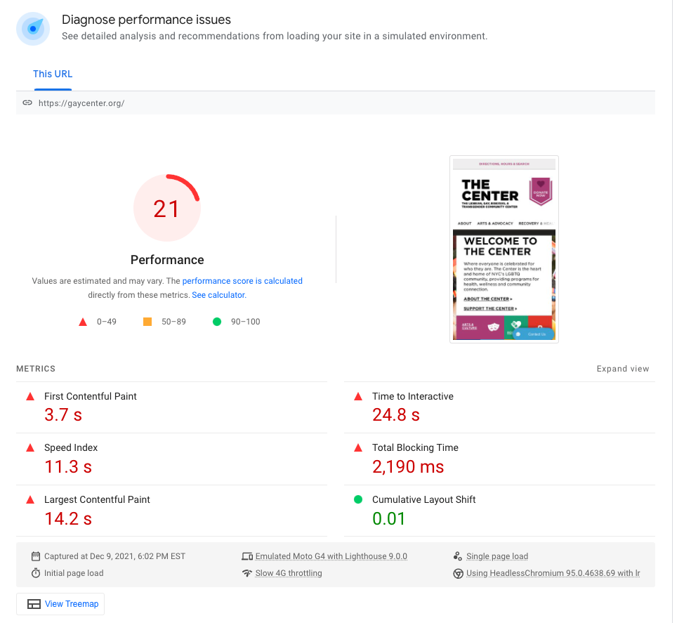
Finding 4: Low website performance on mobile devices
Since more than half of the users (56%) visited the website on mobile devices, we evaluated the performance of mobile experiences. The website scored 21 out of 100 on mobile performance based on Google Pagespeed Insight. 5 out of 6 metrics failed and the average page load time across multiple browsers is high (7.05 sec).
Recommendation 4: Improve website performance on the mobile experience
We recommend reducing unused JavaScript and CSS, eliminating render-blocking resources, improving the webserver to improve performance. Speed and performance go hand in hand with general engagement in the current age. Users have many relevant websites/apps at their fingertips, so their patience would be minimal for slower products. Therefore, improving site performance could help decrease exit rate, increase engagement, and lead to a more enjoyable user experience.
Client Meeting & next steps
The goal of providing concrete examples for The Center’s redesign was successful. Evan said that they are still in the early stages of the redesign and plan on sharing our report with the design agency. Our group looks forward to seeing the new website and if our recommendations increased user engagement.
“…a fresh perspective on things I’ve been looking at.”
Evan Britt, The Center
We did recommend some next steps in preparation for the redesign such as user testing and setting up GA event tracking. This would be helpful since we didn’t have the ability to elicit feedback about user behavior in this project.
A copy of the presentation deck and final paper are available for viewing. Also, check out The Center’s website as they have many programs and helpful resources.