Zara is a world renowned spanish apparel retailer based in Arteixo, A Coruña, Galicia, Spain. The company specializes in fashion products including clothing, accessories, footwear and beauty. Zara has a strong presence in the Middle East, Africa, Turkey, Europe, Latin America and Asia. They launched their website in 2010 and mobile based application in 2017.
Sign-Up
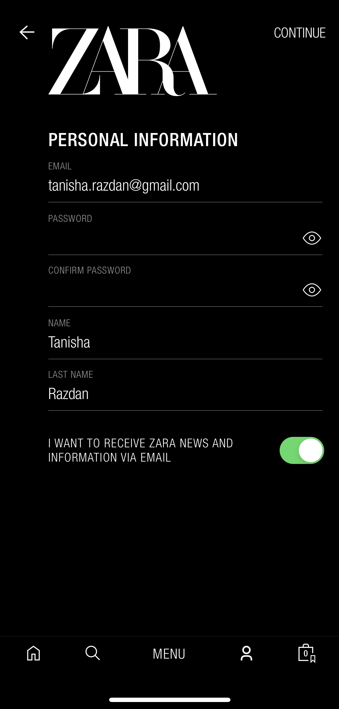
Figure 1. Sign up page

Figure 2. Terms and Conditions
The application follows an usual procedure for signing up a new user. The form consists of field labels which signifies the kind of information to be put in by the user.
However, to proceed further the ‘Continue’ button has been placed on the top most right corner which defeats the instinctive flow of the user to locate the button below the form after filling in the details.
The next step in the process is to agree to the terms and conditions. With the help of ‘Yes’ and ‘Read’ buttons indicate the affordance of being clicked and proceeding further. The emphasis on the ‘Yes’ button by highlighting it drives the user towards instinctively clicking it and completing the sign-up process.
Navigating The Home Page
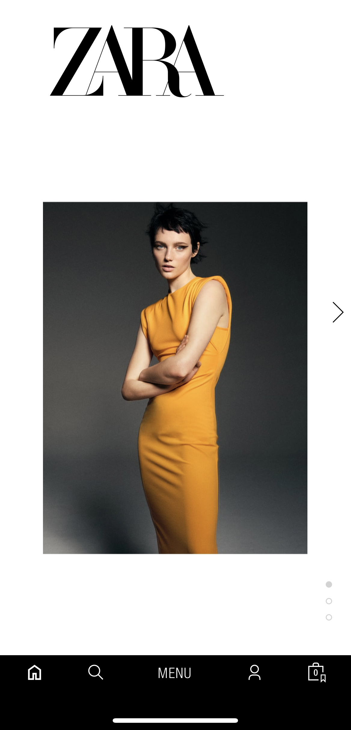
Figure 3. The signifiers indicate a scroll up action
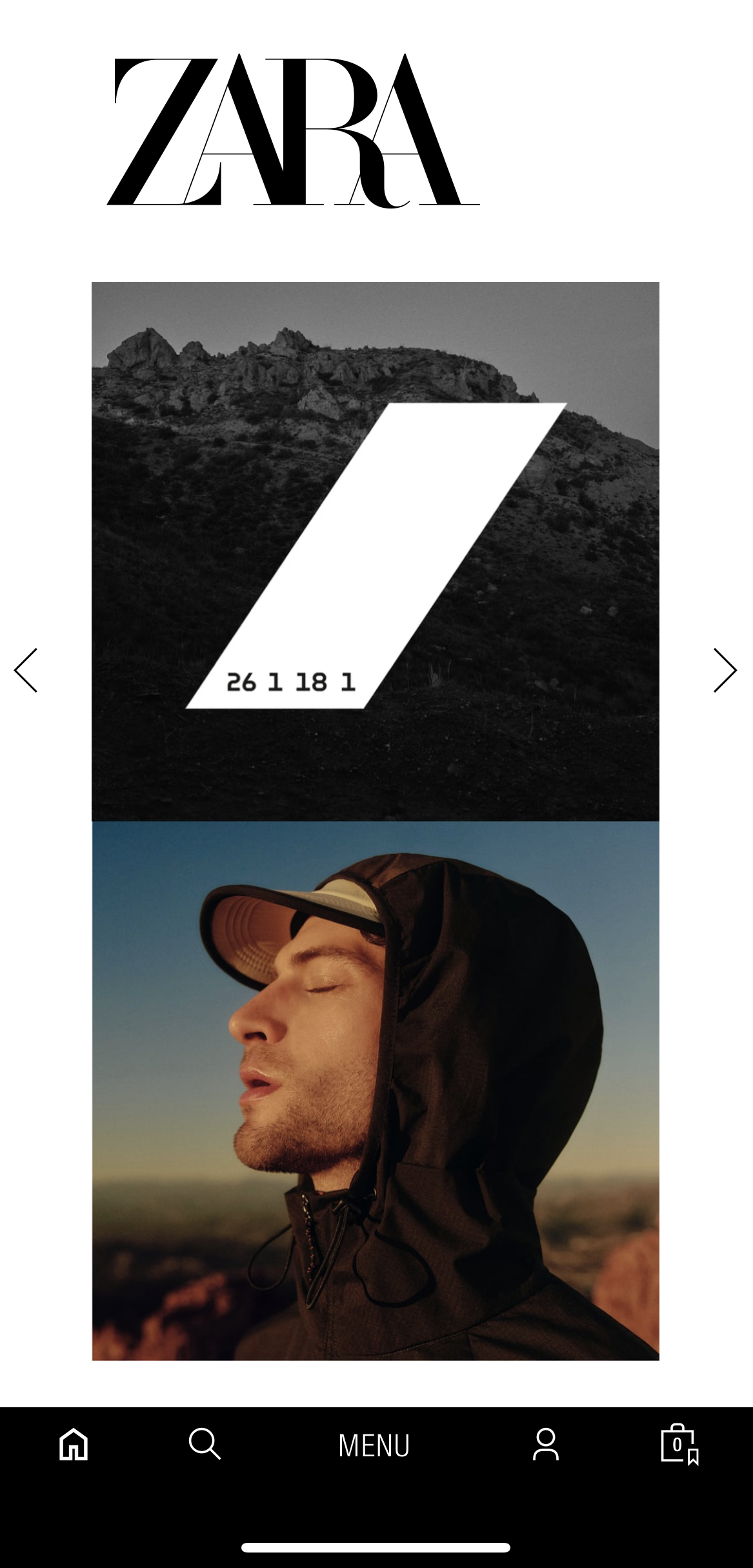
Figure 4. The signifiers are ntot very obvious to the user
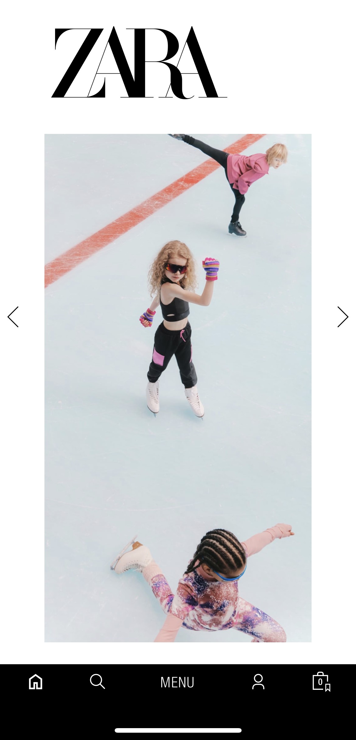
Figure 5. This section specifies the kids category.
This application follows a slightly different approach with respect to layout and scrolling.There are signifiers on the page, but not quite obvious in all cases, that indicate that there is a carousel of images that appear if the user will scroll down. The right arrow acts as a signifier and affords swiping right onto the next image.
When the user first arrives at the Home Page, it is not obvious that they are under a specific category. It is after a couple of swipes, that the user realizes that a section falls under a particular category as they recognize (knowledge in the world), recall (knowledge in the head) and associate the images to a certain classification.

Figure 6. The Bottom Navigation. Currently indicates that the user is present at the home page.
The bottom navigation follows natural mapping to a certain extent. The menu button is placed in the center which is unusual from most of the applications. Following the same, the home button is placed on the extreme left from where the home button is usually placed and accessed. It is initially a bit hard for the user to understand where in the navigation they lie. Zara makes use of a black background color, hence, making the icons white to give contrast. However, the feedback to the user is not quite obvious at first glance.
Exploring The Products
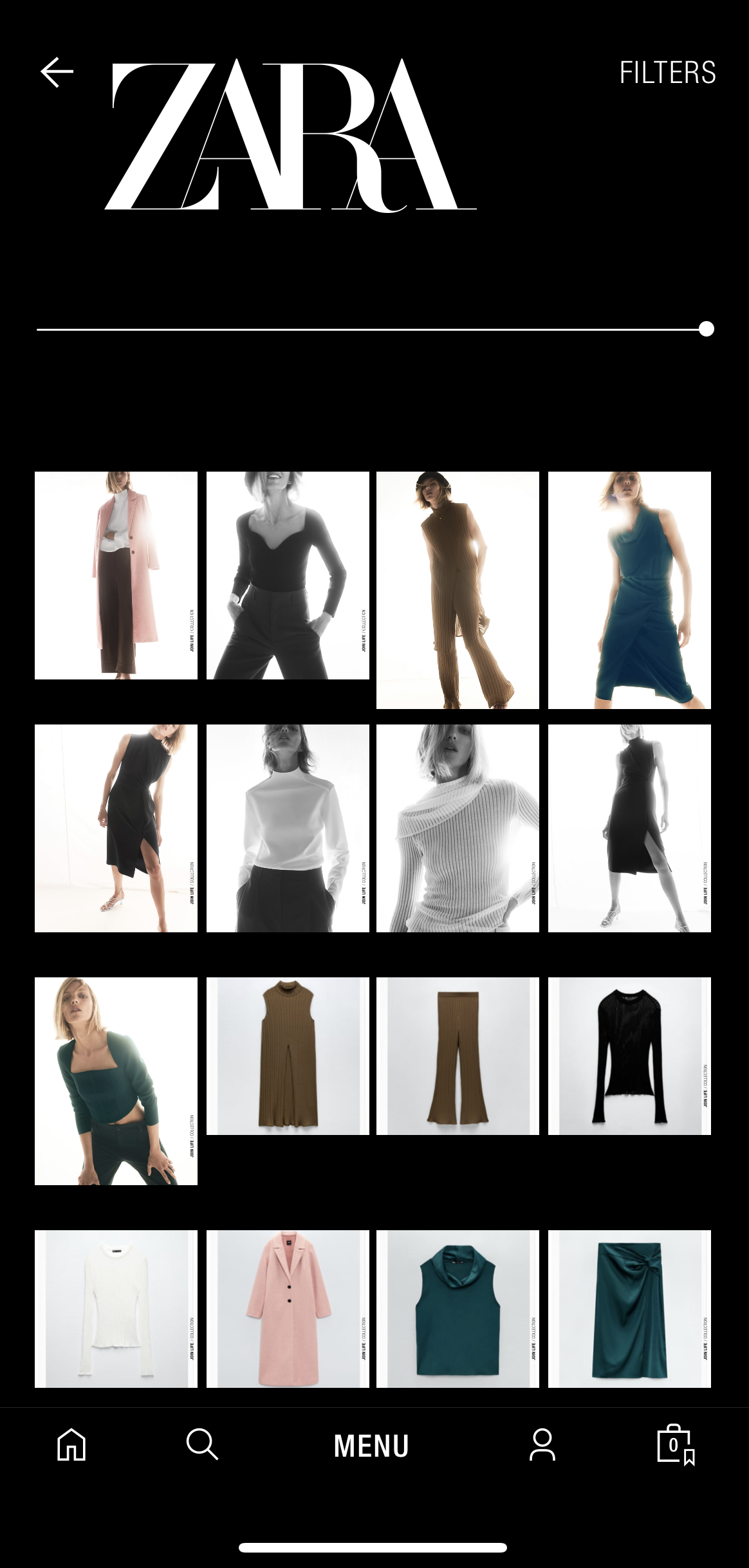
Figure 7. Display of items after scrolling to the right.
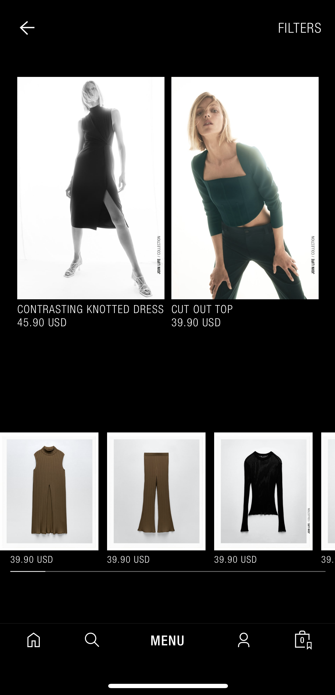
Figure 8. The Products here have to be scrolled uo as well as swiped right.
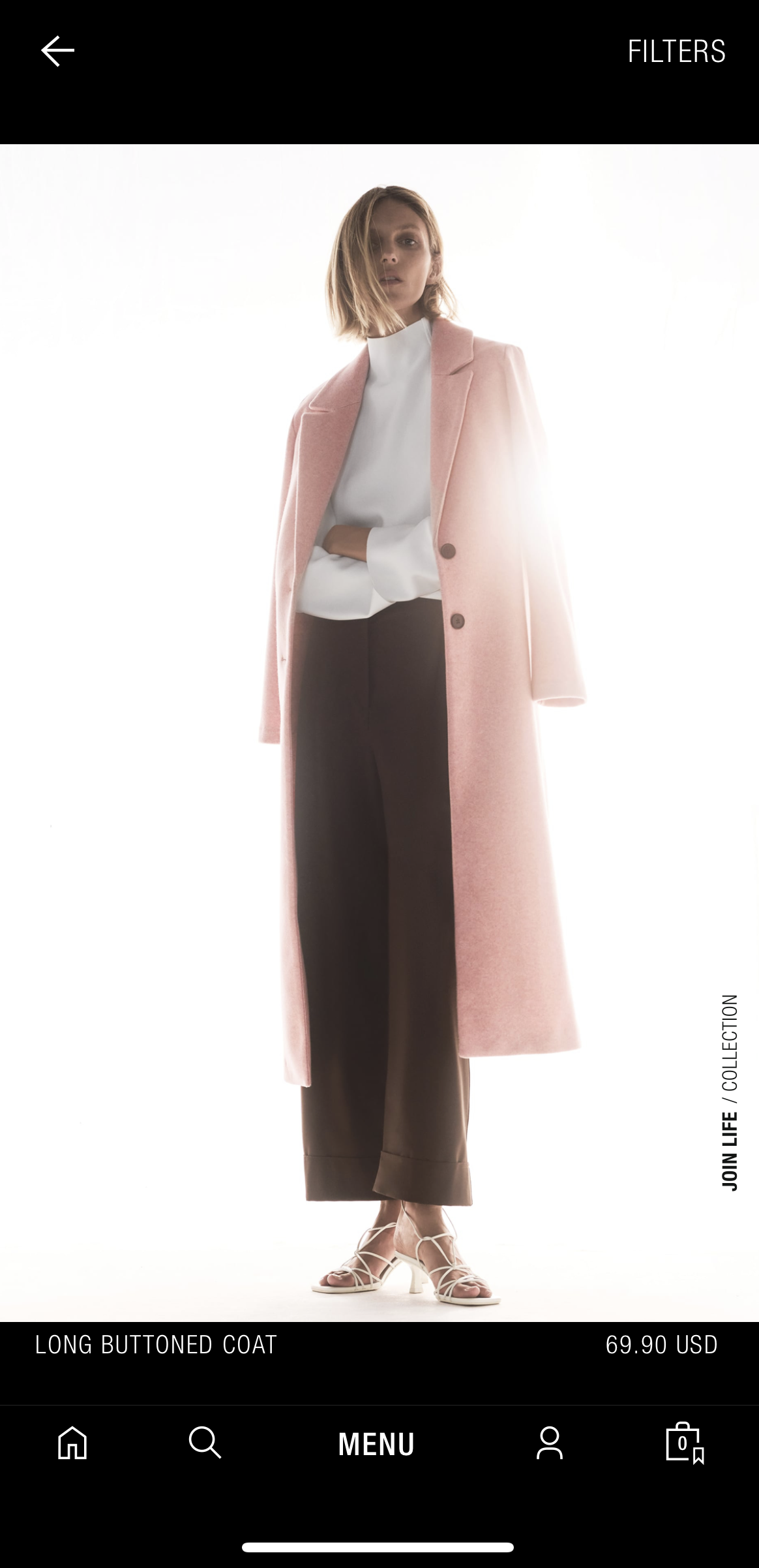
Figure 9. The layout of images is not structured.
Zara’s design of the products attracts users. The photography is stylish, aesthetic and chique. However, at the same time, the layout of the page is not as structured as one would like it to be. Some of the images are large, some are small. Some provide details whereas others do not. Largely, the images have to be scrolled up but at few places, they have to be swiped right. There is no said consistency.
If the user scrolls towards the right on the scroll bar provided on top of the page, the images become smaller, seeming like a collection of image tiles.
A lot of e-commerce websites and applications have the option of adding products to the wishlist or to cart from the product page itself instead of clicking on the item which would then lead to the particular page and then give the users the option to do the said action.
Clicking On Interested Products
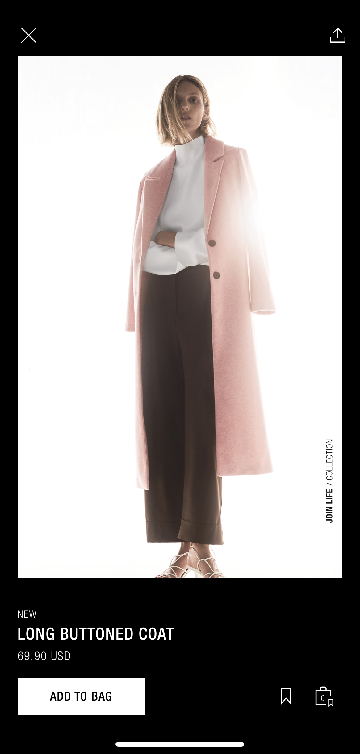
Figure 10. User selects product.
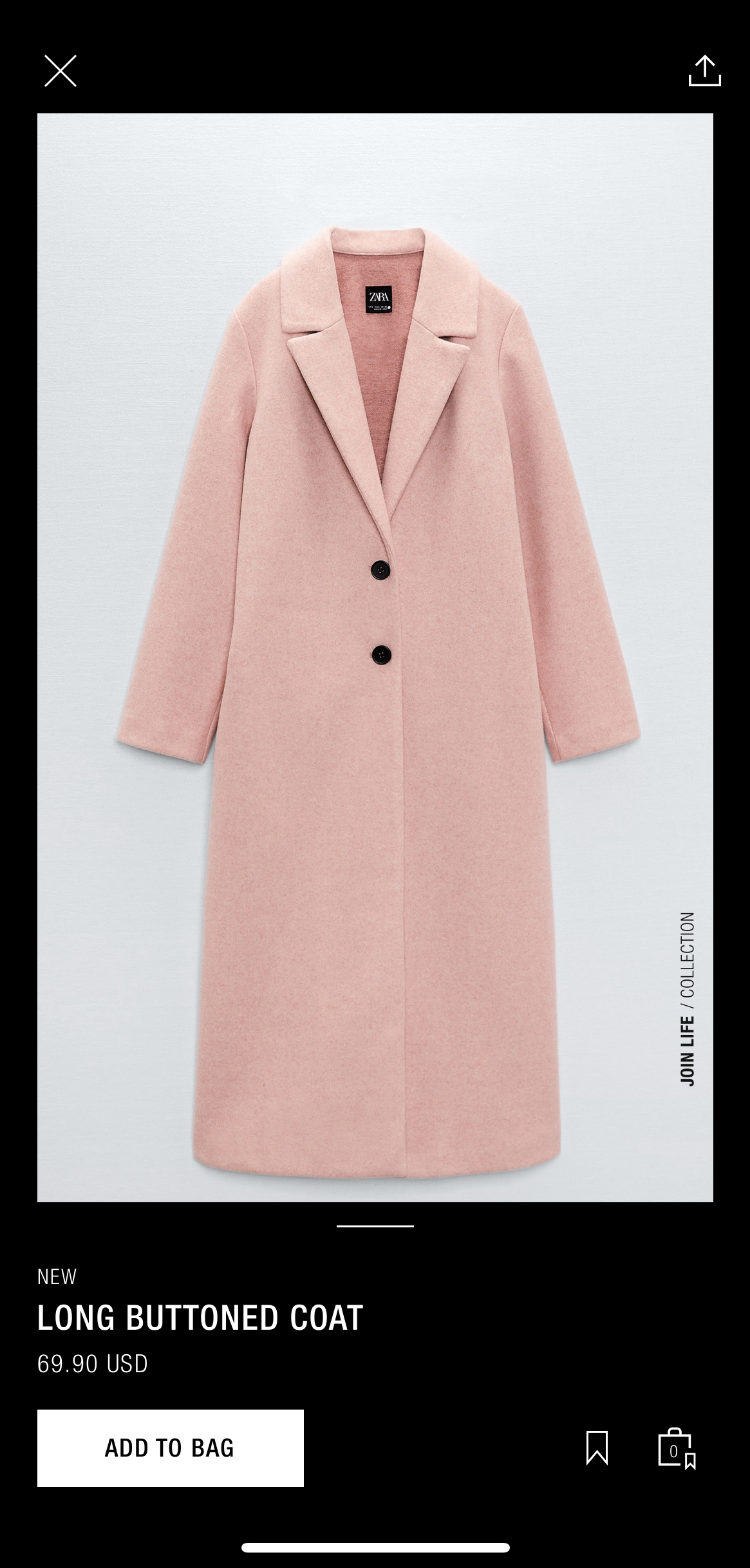
Figure 11. No signifiers indicate a scroll up action to see the next image of the same product.
After exploring, when the user clicks on a product which they are interested in, it leads to the details of the product. Instinctively, the user swipes right to see the next image but in turn has to see the next item in the list instead. In order to see the next image of the same product, the user has to scroll up. It is not quite instinctive at first and neither is it obvious as there are no signifiers which indicate this action is to be performed.
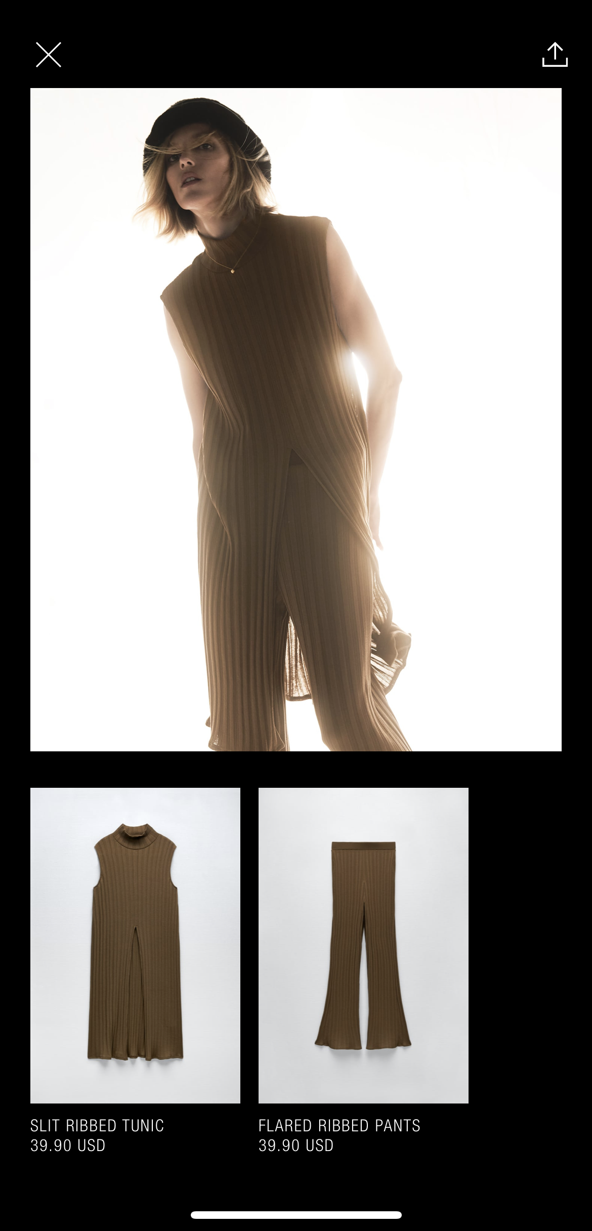
Figure 12. Improper structure. Swiped right to see the next product.
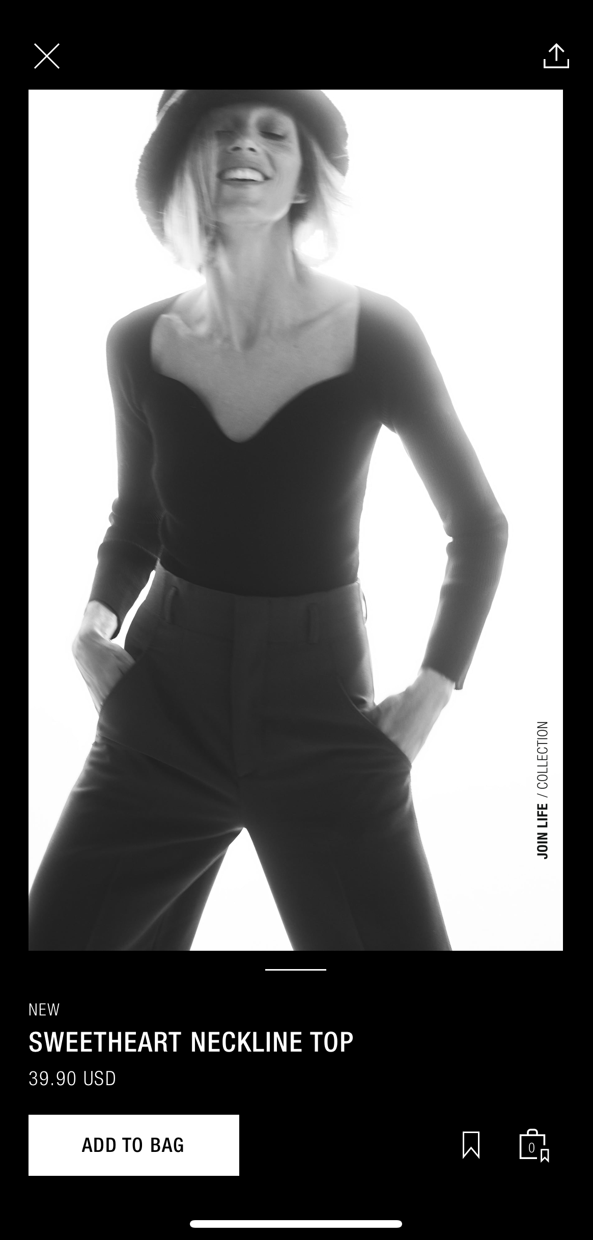
Figure 13. Improper structure. Swiped right to see the next product. No signifiers indictated.
Conclusion
Zara’s design in quite a few ways is definitely unique to the application. They have aimed for a minimalist and sophisticated look which they try to achieve through their collection, models,style of photography etc. However, while aiming for aesthetics, functionality and usability has to be kept in mind as well. The application should be instinctive or at least clear with respect to affordances and signifiers so as to guide the user towards their end goal.