
The Airbnb app gives users access to a variety of places to stay across the globe. Airbnb transitioned from a platform to solely book homestay-esque vacations into an end to end travel platform. I will be focusing on the search function of the app for this critique.
Homepage
A user’s goal when opening the Airbnb app is to find a home. They could be using the app to book a place to stay in the immediate future or create a wish list of homes to book at a later date.
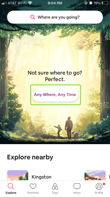
From the get-go the app provides clear affordances to indicate what the app will allow the user to accomplish. These affordances are in the form of a: “Where are you going?” search bar / ”I’m Flexible” button / “Explore Nearby” and “Live Anywhere” headers / ”Explore” tab in the navigation bar. The options provided affords the user an opportunity to begin exploring places to stay.
Additionally, these four options act as signifiers helping inform a user’s feedword. The signifiers make use of common system images indicating a search engine (i.e. search bars, magnifying glass icons). Combining the user goal, signifiers and system images provides a conceptual model for the user of what they can do and how they can do it.
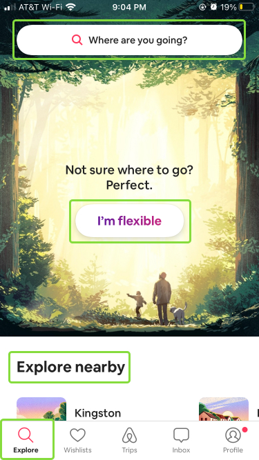
The user is able to cycle through the gulf of execution via the options provided to them. There are many discoverable points on the homepage making the user’s first steps clear.
Search Windows and Filters
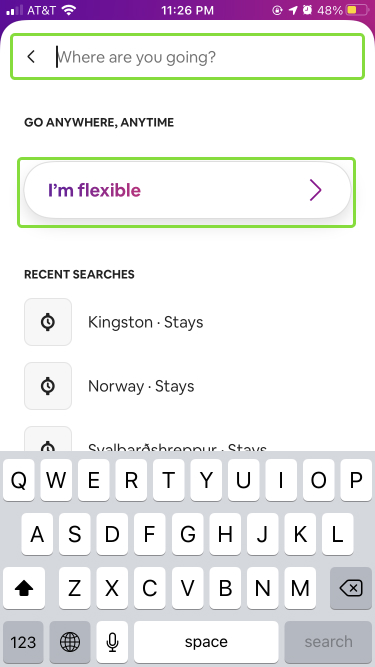
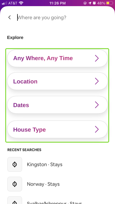
Upon choosing one of the paths towards searching for a home, new screens will appear depending on which access point the user chose. All search options lead the user to the same end goal. Feedback is immediate. One of several new screens noticeably expands, swipes or pops up with a variety of search parameters to choose from.
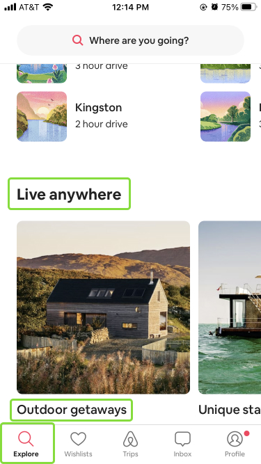
Different windows appear depending upon a user’s access point from the homepage. Each window leads to filter’s the user can choose, or a pre-filtered browsing window. All but the top most access point appear as shortcuts for advanced users. This information would only be gained by Knowledge in the Head. The lack of clear signifiers creates a gap between the gulf of execution and the gulf of evaluation. The only way to remember which shortcut leads to which filter options would be to engage in reflective cognition. A user may have a particular pre-filtered search window they prefer, but due to a memory lapse cannot remember which access point leads them to their preferred search. This action disturbs a user’s transition from the performing stage to perceiving stage.
A possible solution to this issue is to have the top most search bar be a master search window with all possible search options. More specific wording on homepage buttons would signify what a particular search mode affords. With clearer labels, a user could quickly learn the homepage shortcuts and become an advance user. The goal of this update is to help bridge the gap between the gulf of execution and gulf of evaluation.
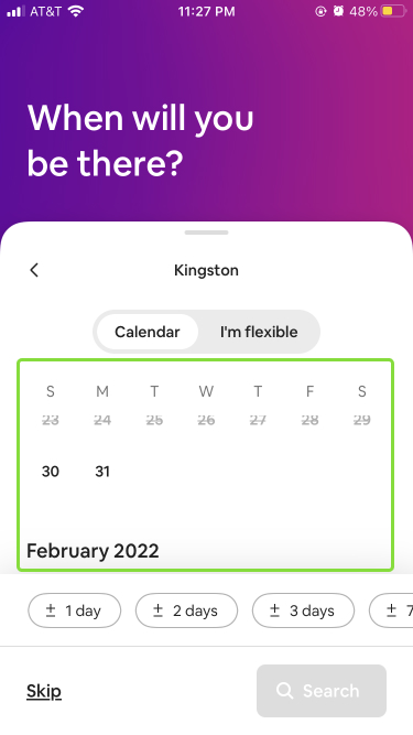
Browsing Homes
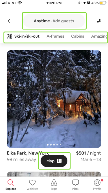
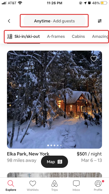
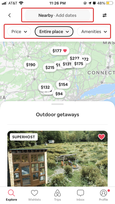
The filtered browsing window has slightly different modes depending on which search path was selected. The entry field at the top of one browsing page has users input a date (“anytime”) and a number of guests (“add guests”). The second entry field from the other search path has users input location (“nearby”) and dates (“add date”), all in the same location and style.
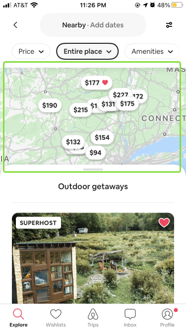
The bar underneath these options are styled differently and perform different functions. Figure 1 filters appear’s as tabs with mapping that allows a user to slide the bar to the left and view more options. Figure 2 filters appear as drop down menus. This bar is also mapped to swipe left to show more filter options, but there is no discoverability to indicate that this action is possible.
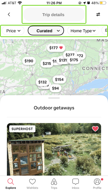
I suggest creating a single style for the various filter functions when a user is in the browsing window. Here I converted them all to drop downs. I also let the right most filter fall off the screen, to make the swiping function more discoverable as well as changed filter labels to add clarity.
Final Thoughts
The Airbnb app provides a clear conceptual model for understanding what the app is used for and provides the needed signifers, constraints and feedback to go about using it. I pointed out several places to improve the app’s usability. I suspect the sheer amount of search options and windows are due to featuritis. Airbnb’s platform is built on searching for homes. The platform needs to accommodate different types of user’s with different goals. Most of my suggestions come down to streamlining the style of signifiers to prevent a user from needing to pull from their knowledge in the head and move from reflective cognition to behavioral.