
Introduction
Audible is an online platform that allows users to purchase and stream audiobooks and other spoken-word content. It is owned by Amazon and is the largest producer and retailer of audiobooks in the United States. Users are allowed to purchase content individually or on a credit-based subscription model. This article is a design critique based on the principles and concepts from Don Norman’s book i.e ‘The Design of Everyday things’ (revised edition, 2013). The app is very extensive but for the purpose of this critique, I will be focusing on the design of the homepage of a logged-in user, media player screen, and the book description page.
1. Homepage
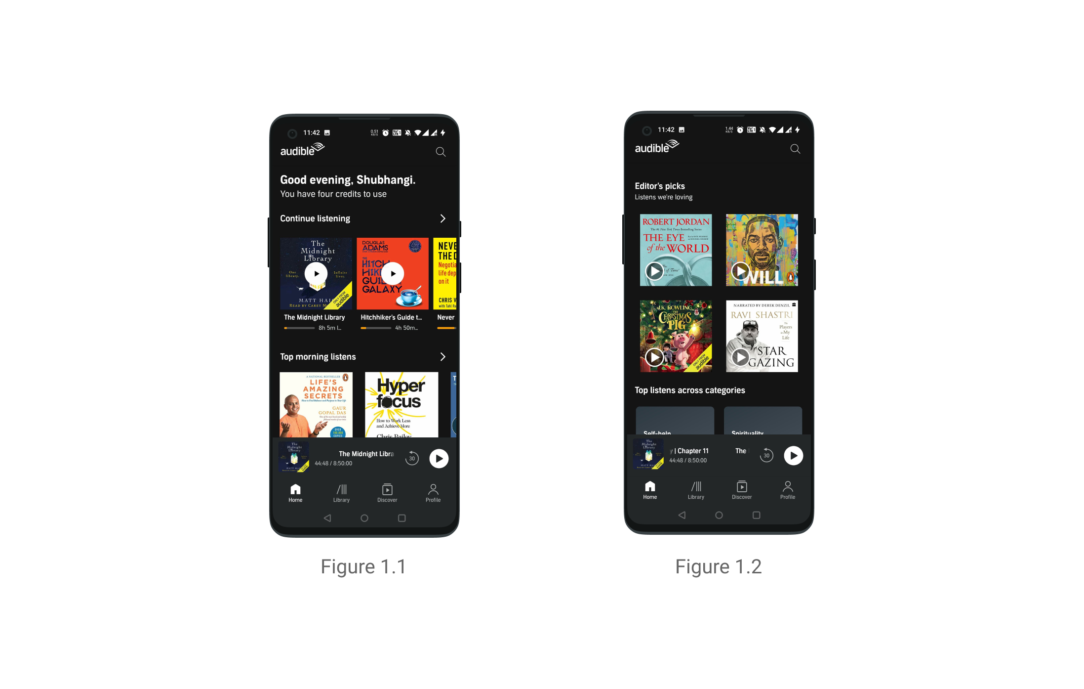
- The homepage is understandable, the user knows they can use this app to browse through and to listen to books {figure 1.1}
- The titles are discoverable through the cover images and the headings which prompt the user to play books
- Books afford being played and the play icon is the signifier
- The half-cut carousel follows the mental model of being able to horizontally scroll through the content
- The narrative elements like the headings promts the user to listen to more books thus creating a system image in the user’s mind {figure 1.2}
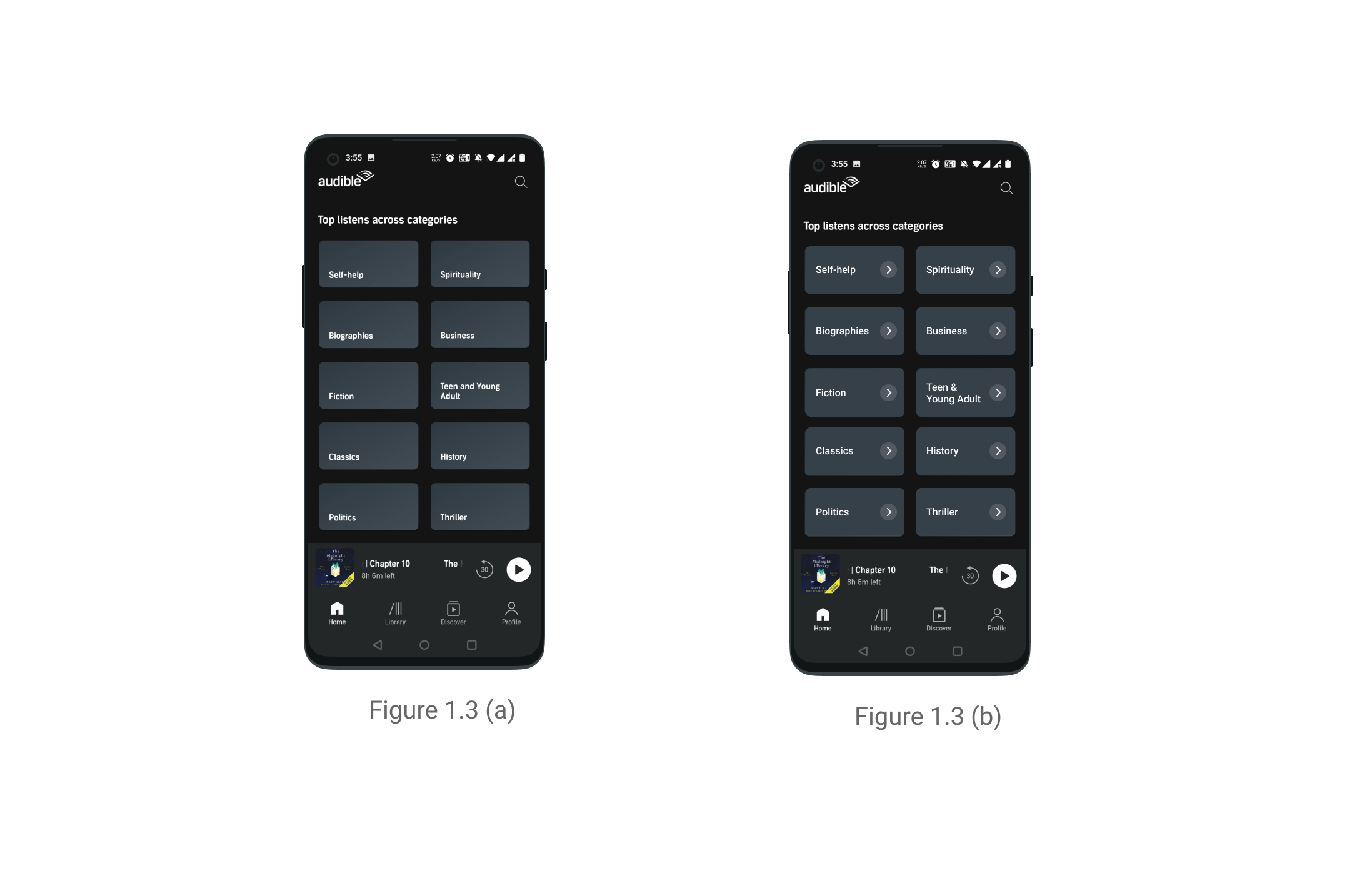
- The categories are represented through tabs which make the various genres of books discoverable however they lack adequate signifiers and rely on users mental model on knowing that they are tappable {figure 1.3 (a)}
- The bottom navigation has clear labels which are based on common conceptual model and feedback to signify the module that the user is currently on
- The latest title is docked above the bottom navigation and has an image of the book and a play button signifier. There is usage of natural mapping principles as the rewind button is on the left side of the play button
2. Playing the Media Content
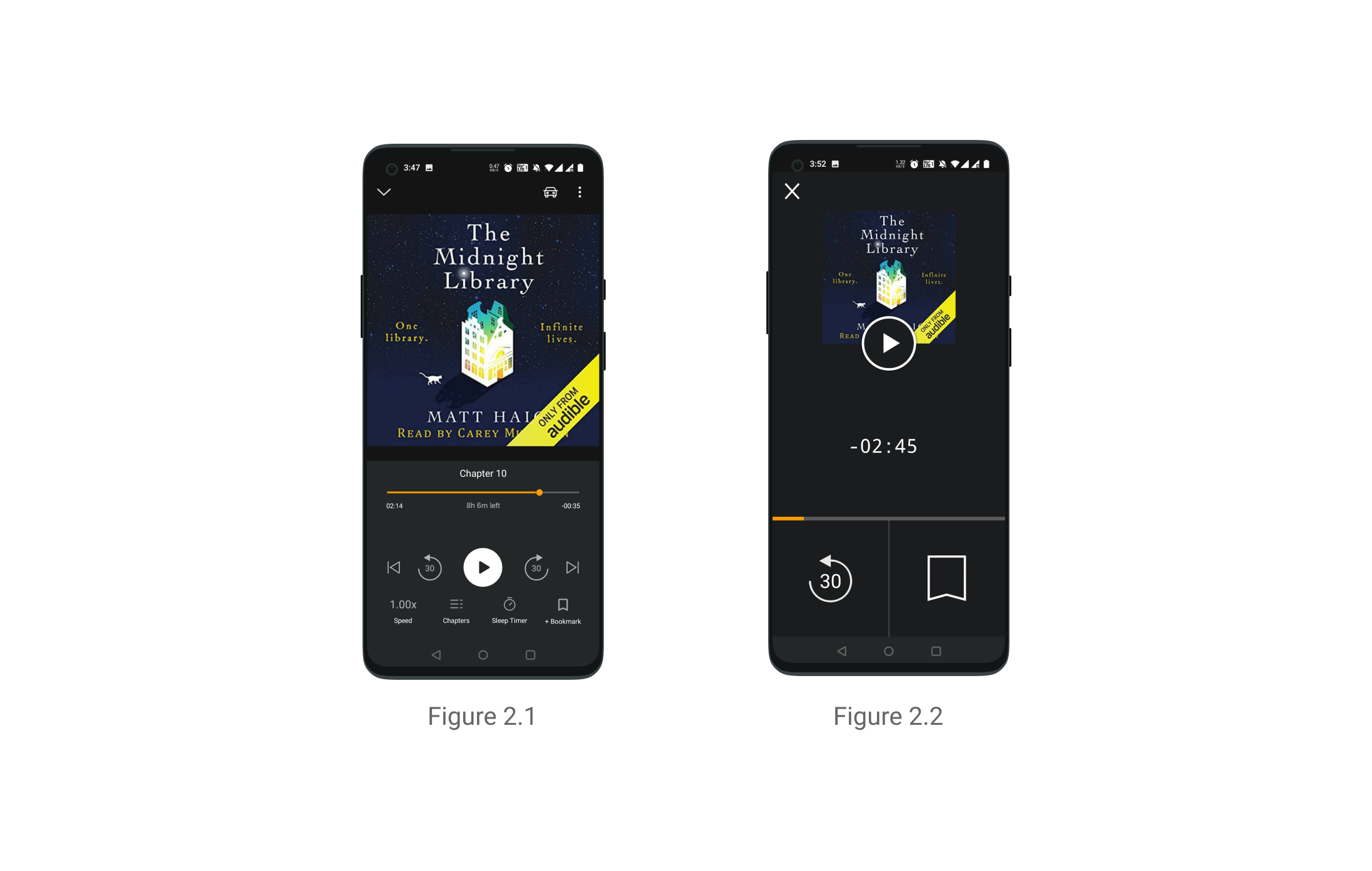
- Natural mapping is universally followed in the app for back & forward buttons. The rewind button is on the left side of the play button and the forward button is on the right side which follows the tendency of going back in time and ahead in time {figure 2.1}
- Once the user plays a title he recieves feedback as the pause button replaces the play button and the user can see the progress bar moving ahead {figure 2.1}
- The drive mode is an interesting example of designing for error by adding constraints. It only allows the user to play/pause, rewind, or bookmark in order to reduce distractions while driving {figure 2.2}
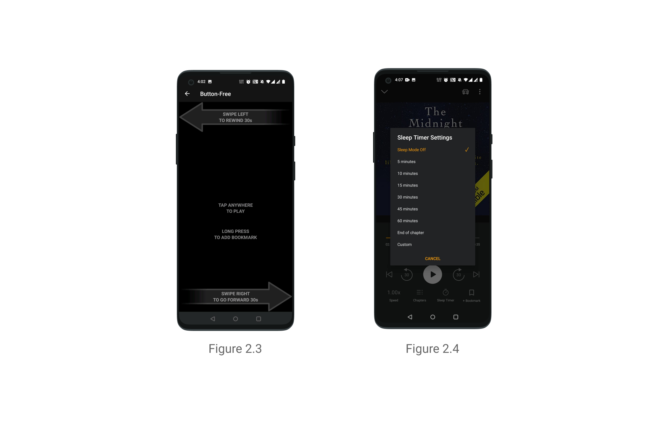
- The Button Free Mode is a feature that allows the user to control the media player using gestures like swiping and tapping. The screen has instructions along with icons to create a system image in user’s mind and it allows them to combine knowledge in their head with that of the world. It is also an example of using natural mapping as it allow users to use gestures like swiping left to rewind and right to forward the content. It allows you to tap to pause and long press to bookmark or emphasize a point that is at a visceral level of human behavior {figure 2.3}
- Many people listen to books in order to fall asleep continuing the childhood tradition. The app recognizes this need and allows users to set a sleep timer in order to fall asleep. They can customize the duration or select from pre-existing options depending on the time it takes for them to fall asleep. It even allows users to listen till the end of the chapter they are on. It is an example of root cause analysis i.e understanding why the user is using the product and what is their real need. It is also human-centred in its approach which keeps the users at the core of the design process {figure 2.4}
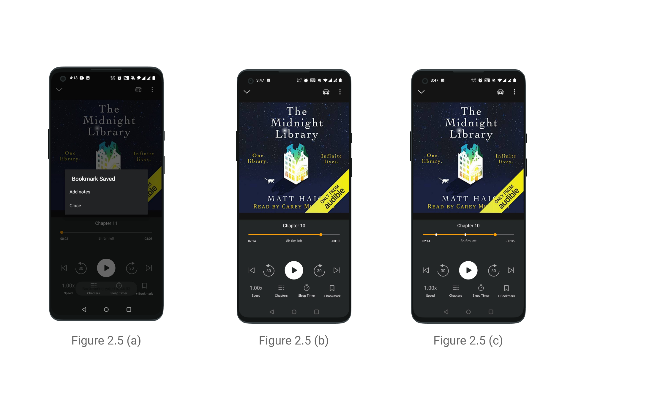
- The bookmark feature allows the user to mark a point in the book which they found interesting along with a note. Currently the feature doesn’t provide adequate user feedback. There is only a momentary flash message {figure 2.5(a)} which vanishes and the point marked is not shown on the progress bar and can only be accessed using the overflow menu on the top right {figure 2.5(b)}. A way of providing more feedback to the user and informing them that their task was accomplished would be by adding markers on the timeline which is the proposed redesign {figure 2.5(c)}
3. Description Page of Content
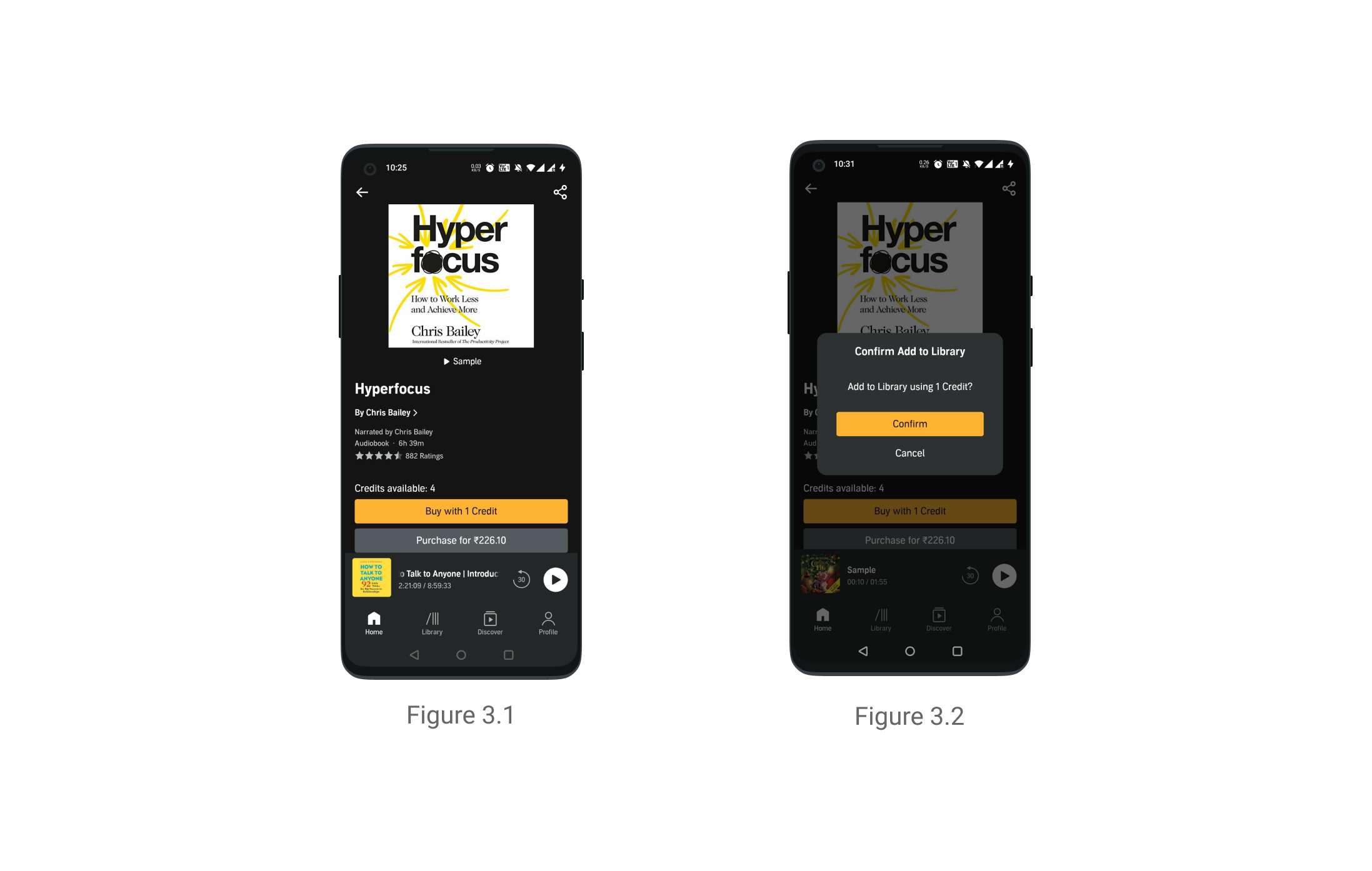
- This screen is understandable as the user based on their procedural knowledge knows that they are here to purchase a book. It is a combination of knowledge in his head which is combined with knowledge of the world {figure 3.1}
- The signifier is the buy now button. It also gives the user the option to purchase the book either paying upfront or by availing credit.
- Another affordance is the ability to listen to a sample prior to purchasing the book and the signifier is the sample button under the book image. The user receives feedback on clicking the sample button by a timestamp in place of the sample button and the bottom docked bar reflecting the new title
- Buying content is designed for error as after clicking on the buy now CTA, a pop up opens up asking the user to confirm the decision or cancel it before goes ahead {figure 3.2}
- The screen allows the user to bridge the gulf of execution i.e buying the book and the gulf of evaluation by giving clear feedback about how to execute that action and whether it was implemented.
Conclusion
After conducting the design critique of Audible, I found that some parts of the app like the media player were very well designed whereas some like homepage and description page could integrate more of Don Norman’s principles. Overall the app was usable and useful and would allow the user to accomplish their task. The app was human-centered and the features that I found innovative were the drive mode, button-free mode, and the sleep timer which all analyzed the root cause of the user’s need. The app is anchored towards incremental innovation as opposed to radical innovation. In terms of future scope, I would like to critique the discovery module of the app as that is another core offering of the app with its large content library.