Behance is a popular platform for showcasing & discovering creative work. It is acquired by Adobe in 2012. It enables users to create an eye-catching portfolio, build a community, and get hired. It also allows businesses to post internships, full-time jobs, and freelance work. The Design critique is on Behance (Android app) based on the concepts discussed by Don Norman in “The Design of Everyday Things.”
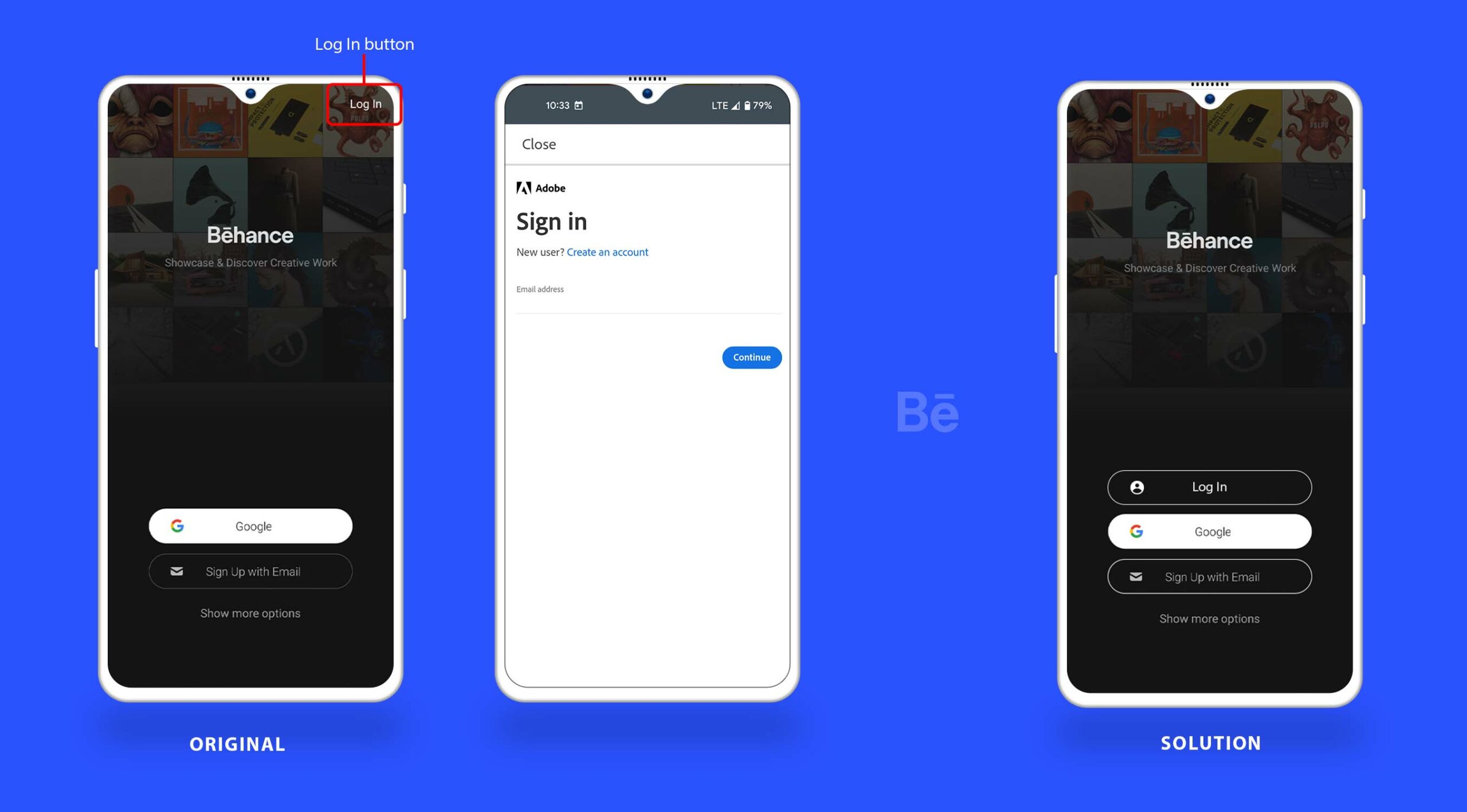
Login on Behance app
The Behance application follows the concept of knowledge in the world, a very standard format in terms of the login process. The effective use of natural mapping allows users to log into the application smoothly. The “Log in” signifier is placed in the top right corner as shown in the image below. The “Log in” here is a bad signifier. The user may be unsure whether it is clickable or not in comparison to the other signifiers available on the page. For instance “sign up with email” button and the “Google” buttons are placed in the center, and have a box around them, which allows them to be more discoverable as compared to the “Log in” button.
Solution: The best solution suggested for this issue is to place the “Log in” with the other buttons to inform the users that the application can afford to log in. In addition to that, we can add a box around it to increase its visibility.
Home screen
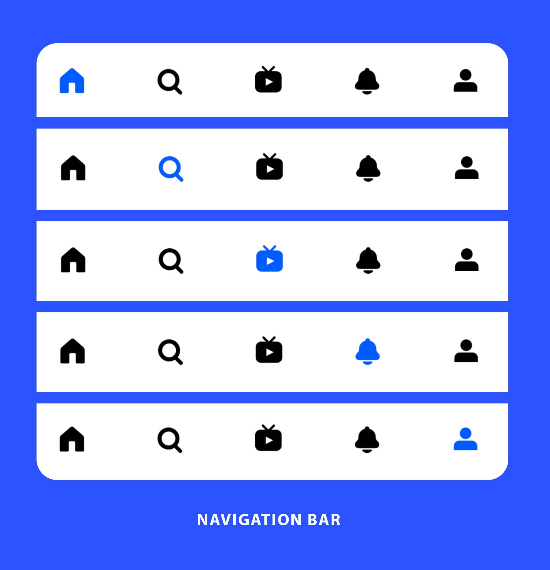
After login, the user will be directed to the homepage. The navigation bar is easily accessible at the bottom of the home page. There are several signifiers (icons) providing users clues to proceed with their required tasks. If the user clicks on any of the signifiers for a particular task the icon is highlighted. This immediate feedback mechanism informs users about the area of the application they are exploring. The user can also navigate to pages other than the home screen such as Livestream, notification, and profile. The bottom navigation bar of the app has a clear signifier(the magnifying glass icon), indicating the app can also afford to search.
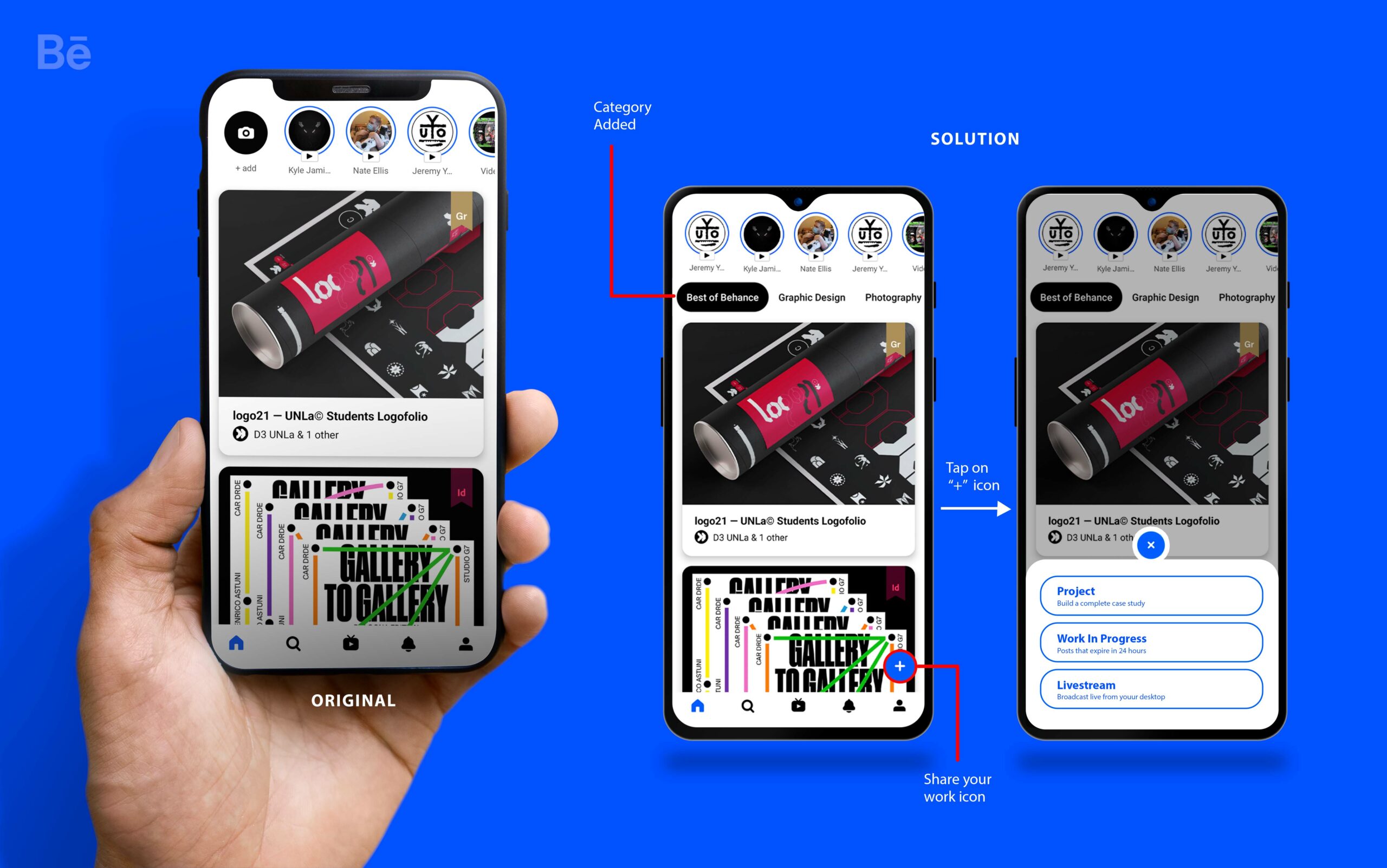
The primary function of this app is to let users discover creative projects and showcase their work. The home screen has great discoverability for exploring new creative projects, but it cannot afford to offer users any category or filter to find exactly what they are looking for. The home screen also fails to provide a signifier indicating “create your first project “ or “share your work”. Hence, the home screen lacks signifiers for the key functions that match the user’s mental model.
Solution: Add a “+” icon that indicates the uses that the application can afford to create a new project with a category such as a project, work in progress, and Livestream. In addition, a category list can be added for exploring new creative projects on the top. This solution improves the discoverability of the homepage and sort features, allowing the user to complete their task more efficiently.
Publish a new project
When the user taps the profile signifier (icon) in the home screen navigation bar, it will take you to the profile page. In profile, You can create your own portfolio. This screen has a minimal interface that prioritizes crucial information like the user name, profile picture, followers, following, and likes. The tabs below the user name area avoid information overload for the users by applying constraints and splitting the overall profile into categories such as about, work, mood boards, appreciations, and draft. In addition, the selected tab has a black box around it that provides feedback and informs users about which category they are exploring.
Let’s see how closely the app adheres to Don Norman’s “Seven Stages of Action”! In the process of publishing a project.
- Goal: To publish a new project.
- Intention to act: Use the Behance app to publish a new project.
- The sequence of actions: Decide what is one of my best works to publish and click + icon to start adding content.
- Execution of the actions: To begin, click the “+” icon, then begin adding content. When you’ve finished uploading your work, proceed to Upload/Select a Cover Image, enter a Project Title, choose a Creative Field, and add Project Tags. After that click “Publish” to publish your project live.
- Perceiving the state of the world: The project will be displayed under your profile’s work section.
- Interpreting the perception: The project displayed under the work category indicates that your project is successfully published.
- Evaluating the outcome: The project is now visible to other users and businesses. There is no need for further action.
Conclusion
The Behance is one of the best platforms for expressing one’s ideas and getting inspired. The best part of the platform is that it’s free of cost. Right from the beginning of “The Design of Everyday Things” Norman puts forward the idea that discoverability and understanding are the two most crucial aspects of good design. I believe that there is some room for improvement in the field of discoverability on the Behance android application.