Clubhouse is a social audio mobile application that allows users to listen, share and observe thoughts of people through topic specific channels that one can host or be a part of. Clubhouse seems to be a radio but with millions of channels (rooms). AN app that connects people through audio-based conversations.
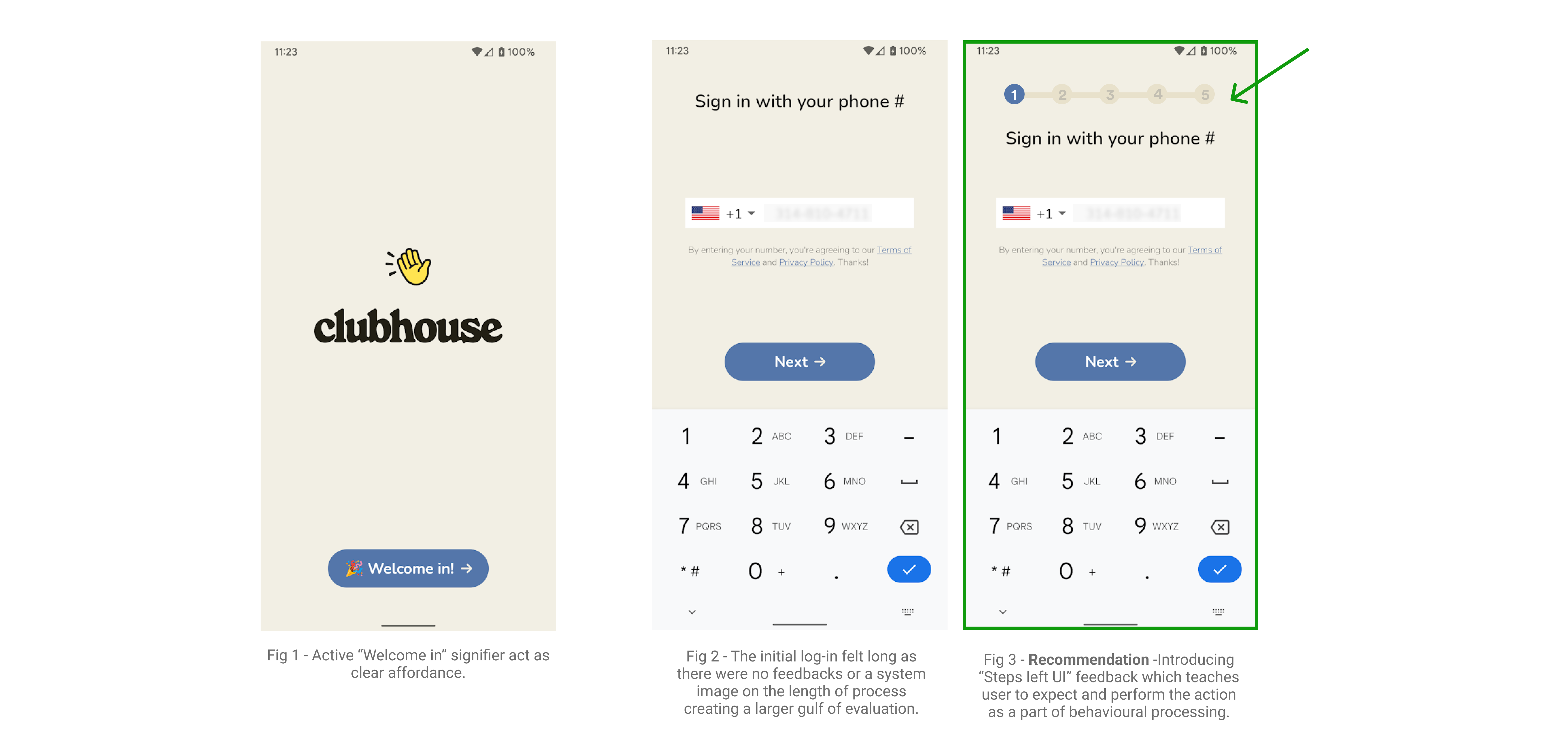
Task – Initial Log in stage 1 : Phone number sign in.
Merit – In Fig 1, Right from the splash screen, every screen has clear affordances using evident signifiers (buttons) and digital constraints. For example – In Fig 1, Active “Welcome in” signifier states clear affordance for users to start the log-in process.
Issue – In Fig 2, The log-in process felt long as there were no feedbacks or a system image on the length of process creating a larger gulf of evaluation.
Recommendation – In Fig 3, Introducing “Steps left UI” feedback which teaches user to expect and perform the action as a part of behavioral processing.
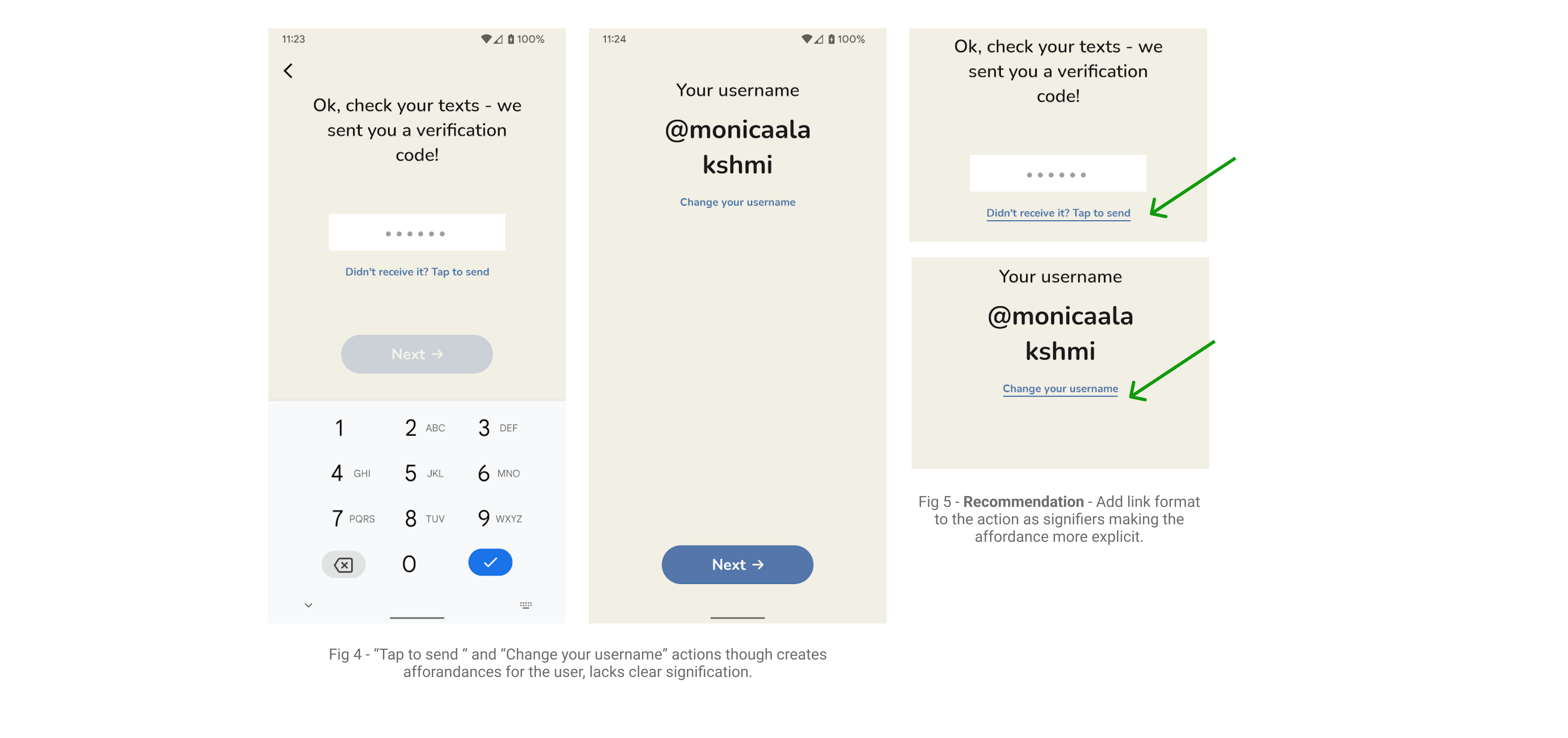
Task – Initial Log in stage 2 : Verification and username.
Issue – In Fig 4, “Tap to send “ and “Change your username” actions, though creating affordances for the user, lacks clear signification.
Recommendation -In Fig 5, Add link format to the action as signifiers making the affordance more explicit.
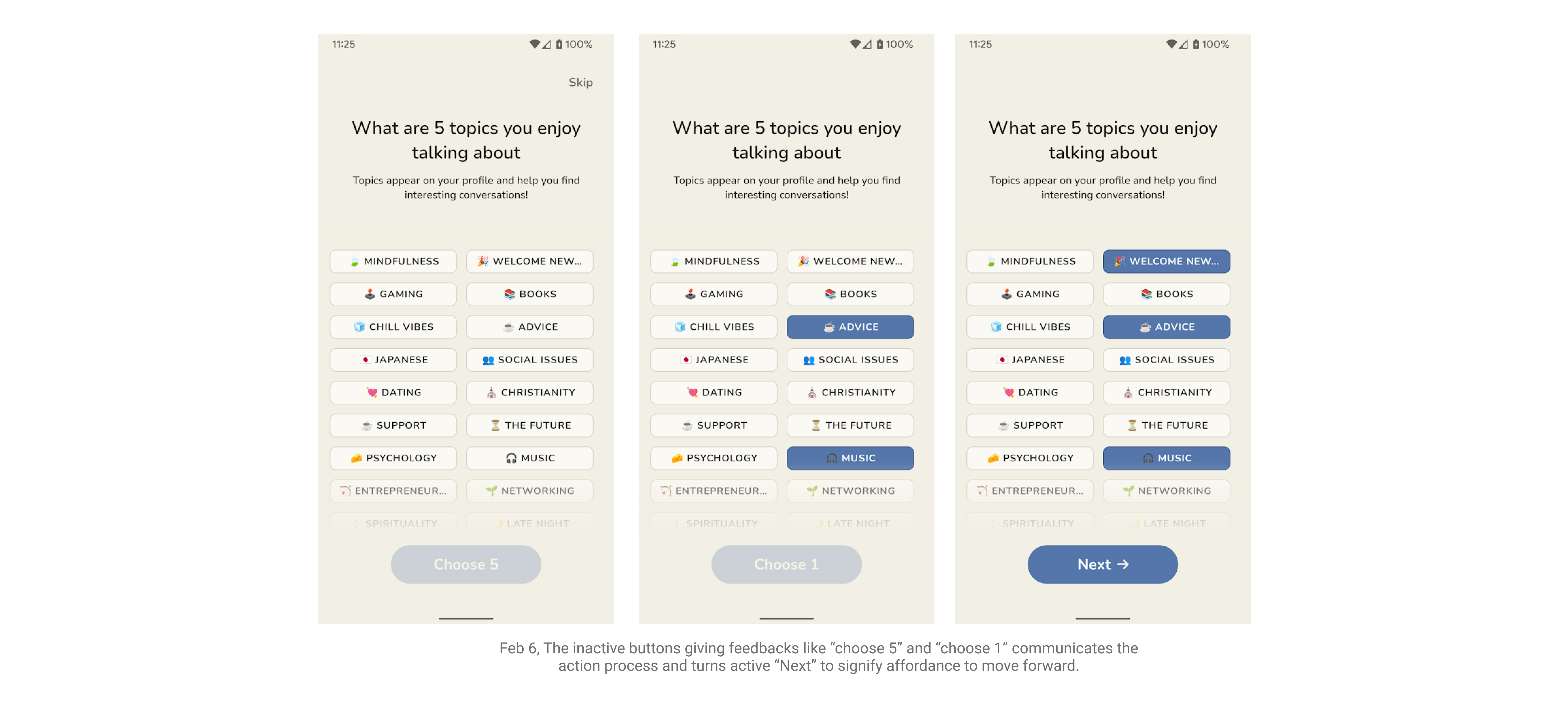
Task – Initial Log in stage 3 : Topic selection.
Merit – In Fig 6, The inactive buttons giving feedback like “choose 5” and “choose 1” communicates the action process and turns active “Next” to signify affordance to move forward.
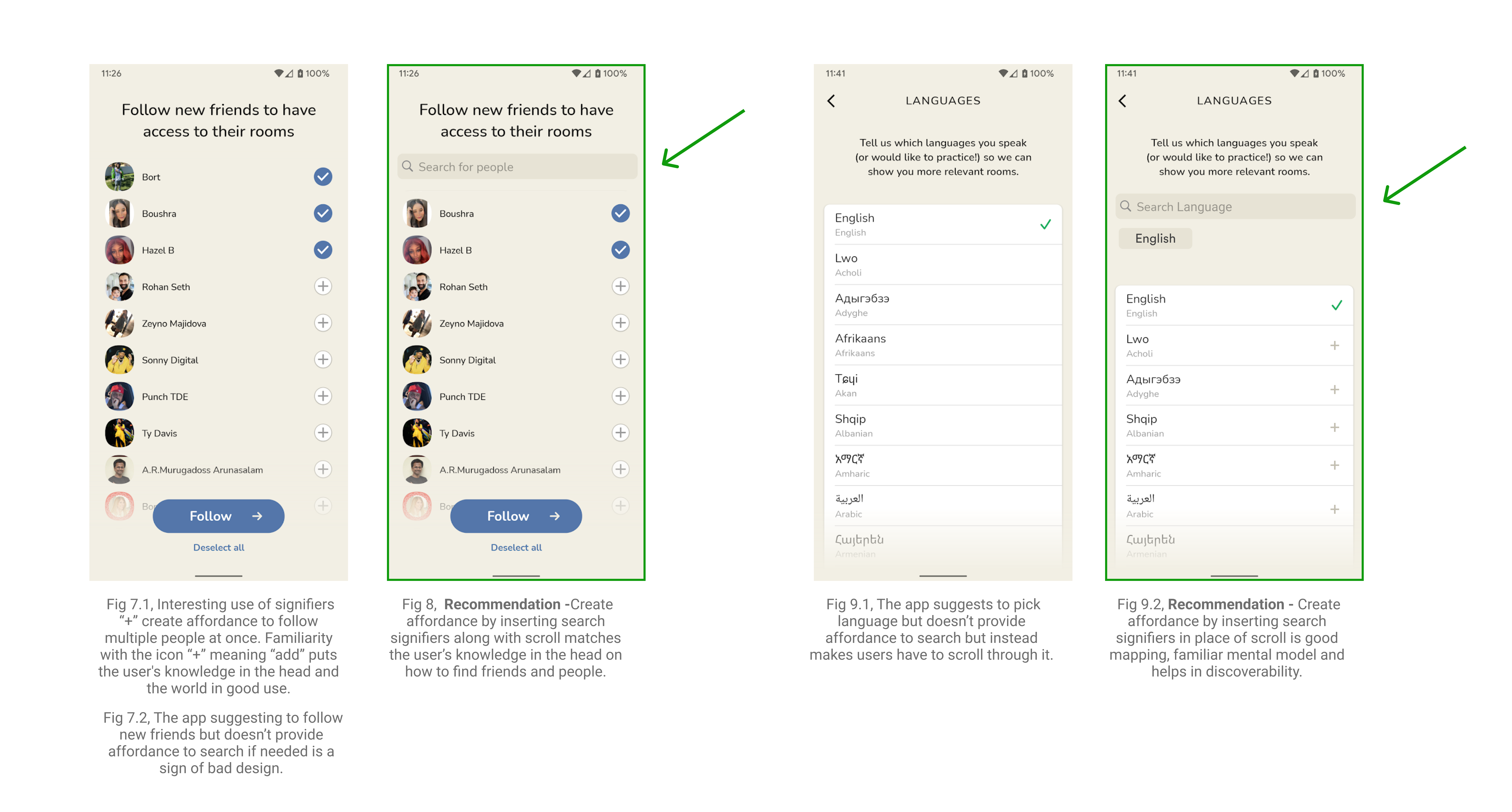
Task – Initial Log in stage 4 : Find friends and choose language.
Merit – In Fig 7.1, Interesting use of signifiers “+” create affordance to follow multiple people at once. Familiarity with the icon “+” meaning “add” puts the user’s knowledge in the head and the world in good use.
Issue – In Fig 7.2, The app suggesting to follow new friends but doesn’t provide affordance to search if needed is a sign of bad design. Also In Fig 9.1, The app suggests to pick language but doesn’t provide affordance to search but instead makes users have to scroll through it.
Recommendation -In Fig 8, Create search affordance by inserting search field signifiers that match the user’s knowledge in the head on how to find friends and people. In Fig 9.2, Create affordance by inserting search signifiers in place of scroll is good mapping, familiar mental model and helps in discoverability.
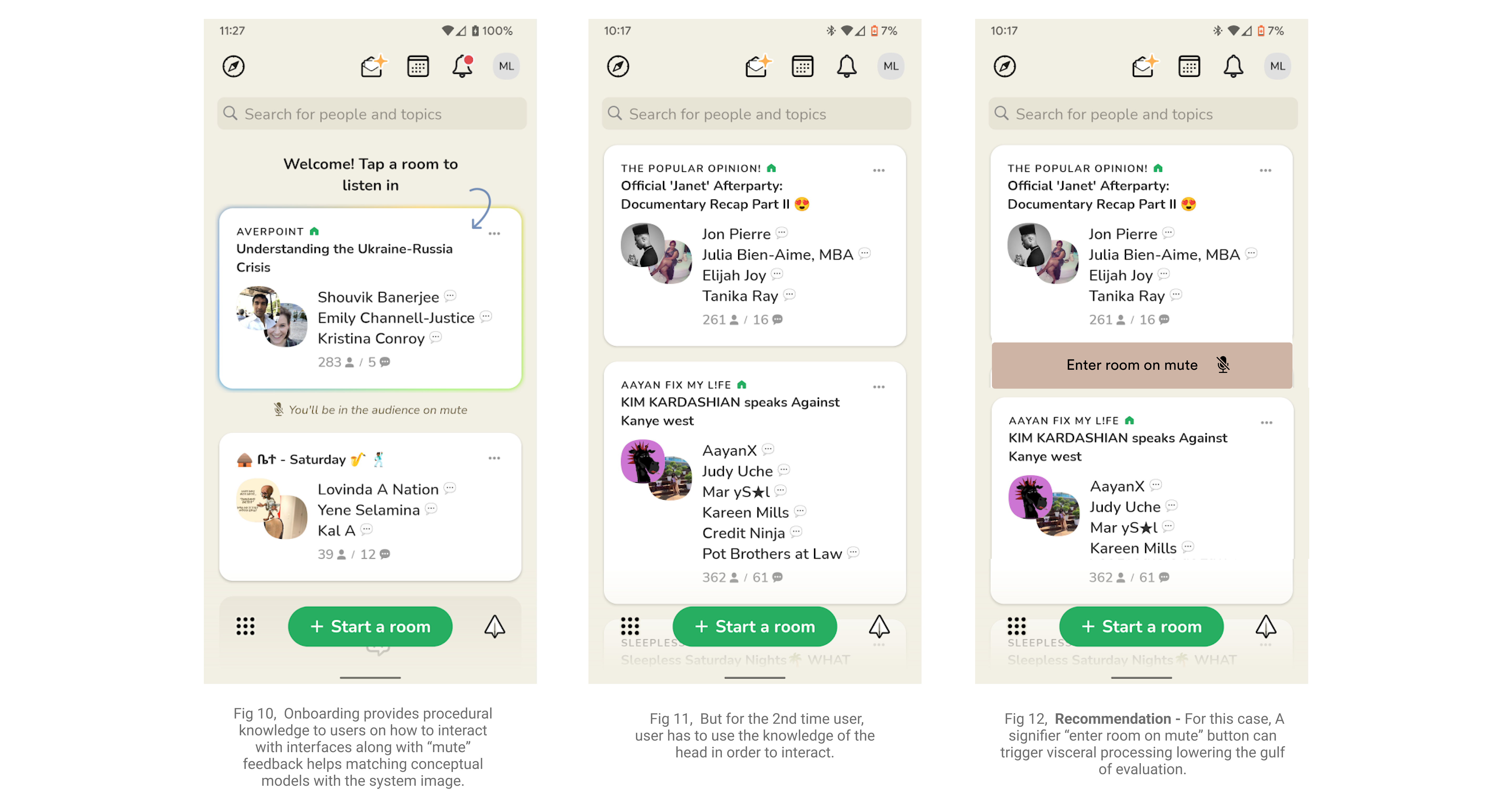
Task – Enter a room, Onboarding and 2nd time user.
Merit – In Fig 10, Onboarding provides procedural knowledge to users on how to interact with interfaces along with “mute” feedback helps matching conceptual models with the system image.
Issue – In Fig 11, But for the 2nd time user, user has to use the knowledge of the head in order to interact.
Recommendation – In Fig 12, For this case, A signifier “enter room on mute” button can trigger visceral processing lowering the gulf of evaluation.
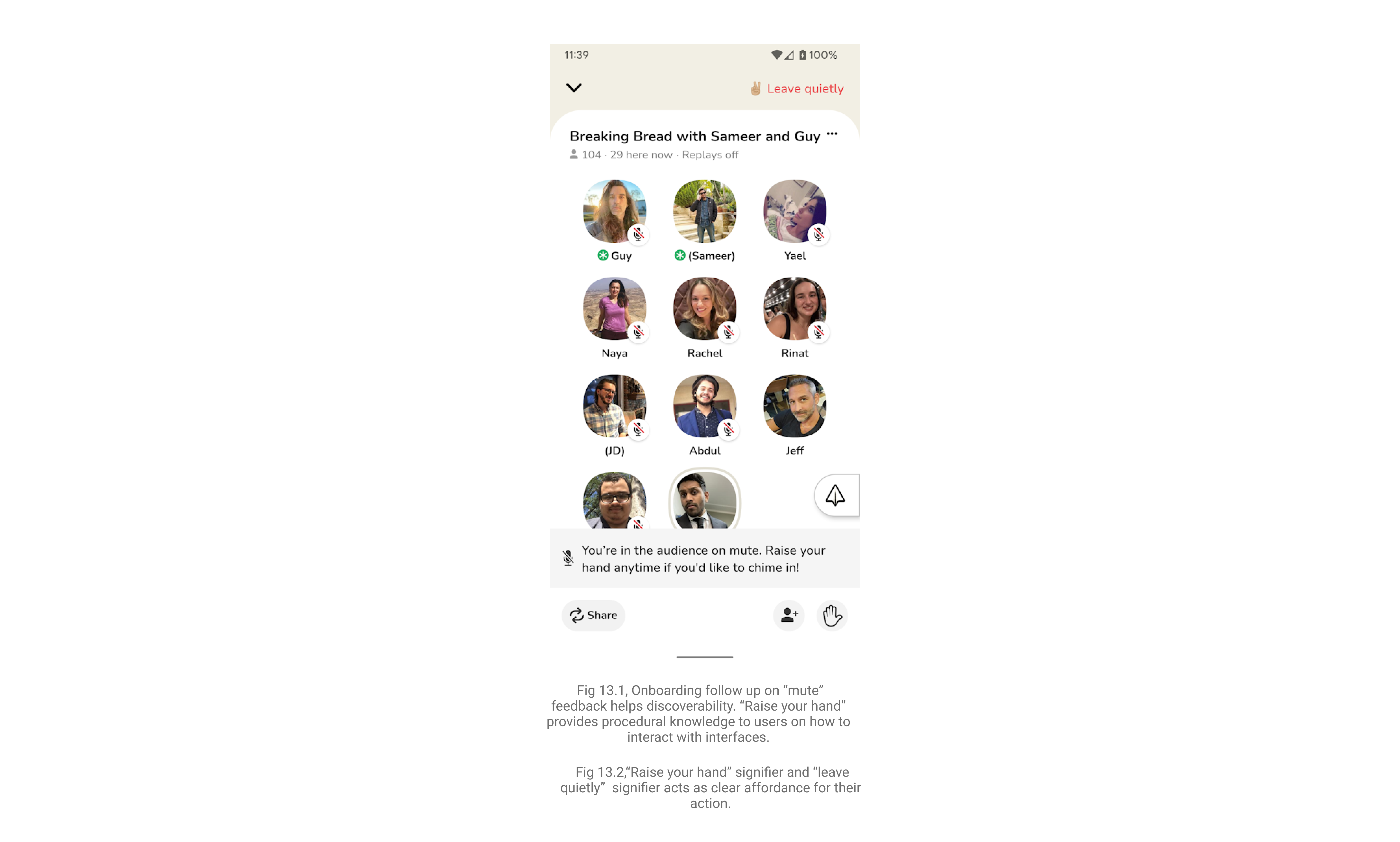
Task – Listening to a room/ Inside a room.
Merit – In Fig 13.1, Onboarding follow up on “mute” feedback helps discoverability. “Raise your hand” provides procedural knowledge to users on how to interact with interfaces. Also In Fig 13.2,“Raise your hand” signifier and “leave quietly” signifier acts as clear affordance for their action.
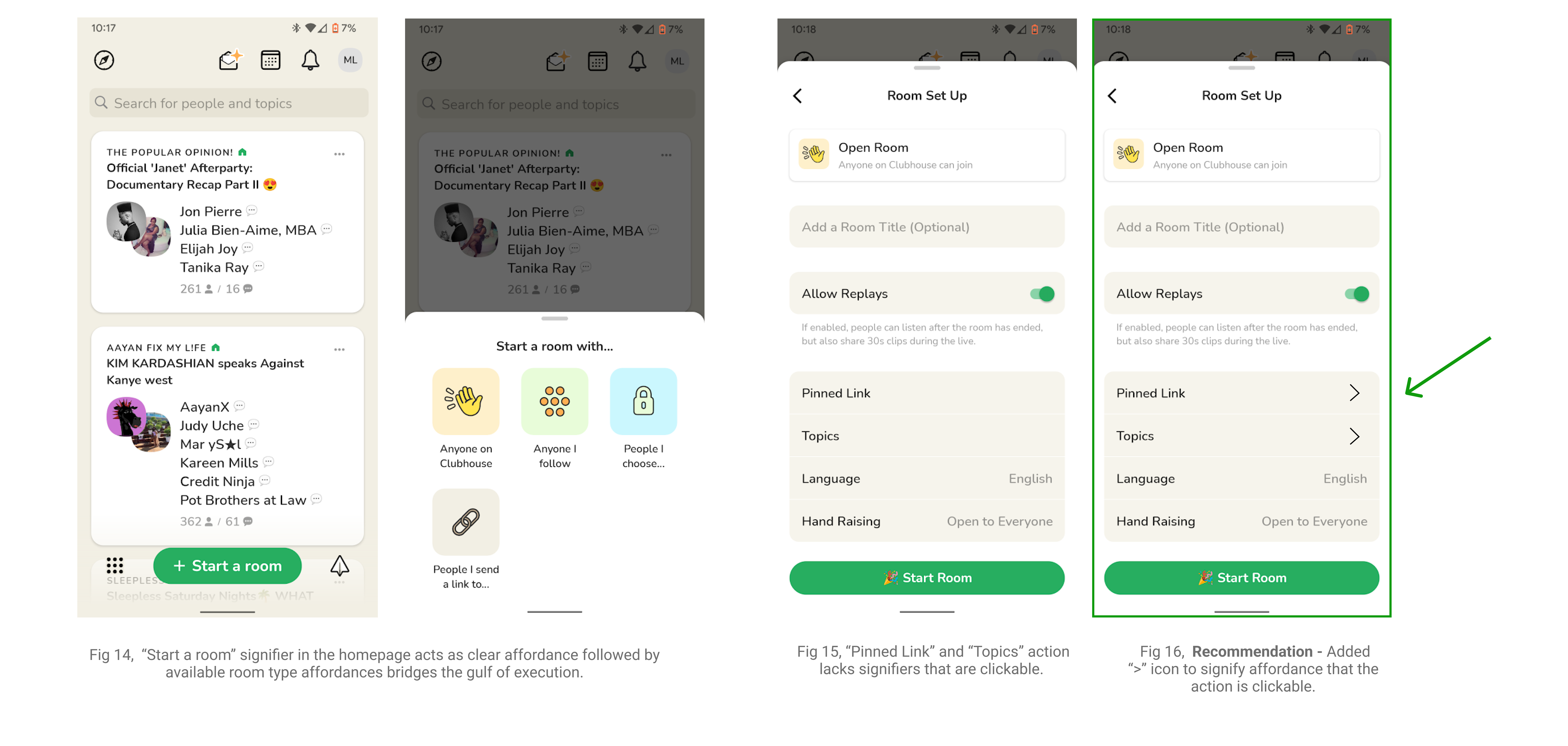
Task – Start a room
Merit – In Fig 14, “Start a room” signifier in the homepage acts as clear affordance followed by available room type affordances bridges the gulf of execution.
Issue – In Fig 15, “Pinned Link” and “Topics” action lacks signifiers that are clickable.
Recommendation – In Fig 16, Recommendation – Added “>” icon to signify affordance that the action is clickable.