For this design critique, I will be reviewing 3 attributes to the Co-Star app in its most current version (iOS version 3.58) using Don Norman’s Principles from The Design of Everyday Things Revised and Expanded.
Home Screen

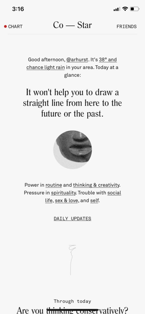
Part of what separates Co-Star from other astrology apps is the modern, chic, black and white design. The home screen is adorned with personalized illustrations and images that connect information to each other or separate and signify different sections of information while scrolling. Although these images are thoughtfully placed within the composition of the screen, the text is aligned centered throughout the whole app, and some of the typefaces, although aesthetically pleasing are not ideal for information absorption. In a way, visibility lends itself to legibility, and since text is the main emphasis on the home screen, I would recommend a slightly heavier weight font for some of the information on the home screen.
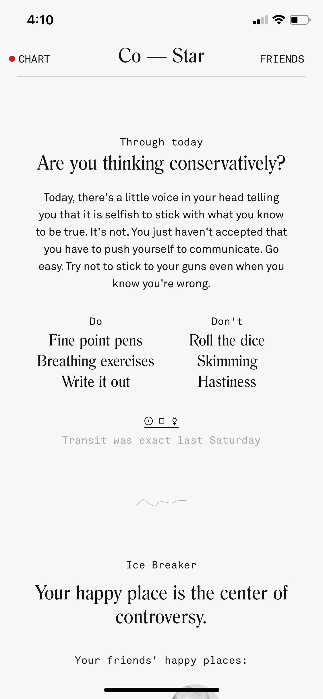
Still on the home screen (img. 2 shown above), there are visibility issues with the spacing and sizing of the font. I understand that not everything on the page should be the same size, because size of the text and placement will determine the hierarchy in which a person absorbs information, but there are elements, such as the columning of “Do” and “Don’t”, which is not only a confusing section to the user, since it is nondescript, but a jumble of words (which are also centered columns on their own!). In short, the home screen’s main element is text, and the text is poorly organized, making the visibility of the information hard to understand easily. To improve the visibility I would suggest starting with a grid system and planning information according to the grid, so that all the information is spaced well and organized, which will make information easier to absorb. If the designer wanted to take it a step further, I would suggest then reviewing what text should be larger or smaller, bold, normal, or light. Additionally, leading of the text should be re-evaluated. For example, the “Do” and “Don’t” section (img. 2 shown above) is not only a confusing element because it is nondescript, but it is organized in an unideal way for the users. The titles “Do” and “Don’t” are light weight, significantly smaller than the information under it, and a different typeface. The use of different typefaces is a good way to separate information and create contrast, but ultimately the title should be larger than the information it encompasses. Some text does not provide proper contrast (example: “transit was exact last Saturday”) and written in a light grey color.
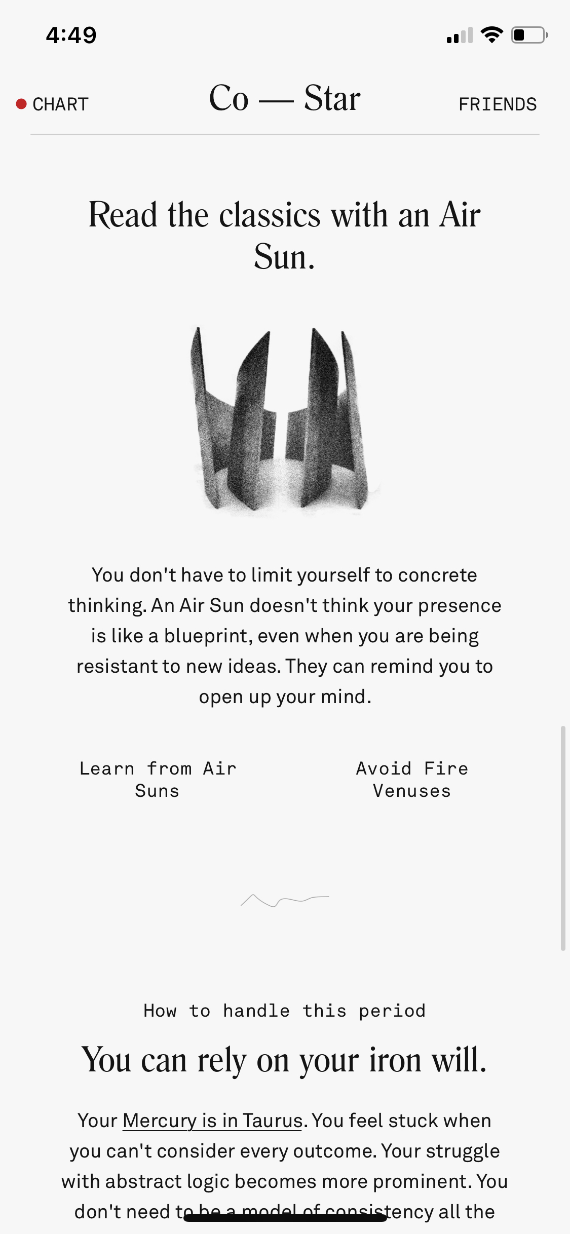
There is a lack of consistency throughout the home screen elements in the problems I have brought up. There is no clear typeface, weight, or color that highlights important information and less important information. I have talked a lot about the “Do” and “Don’t” section, but if the user scrolls down slightly further on the home screen, they will encounter new issues with the same visibility problems (ex. img.3 “Learn from sun airs”, “Avoid fire venuses”). The design of the app struggles to use spacing, punctuality, weight, and size to separate information, and it becomes confusing. I would suggest reevaluating these elements to create more space and proper legibility constraints on design to improve the visibility and consistency of the app. If colors, weights, spacing, etc. are more consistent to signifying specific information throughout the app, the consistency and visibility will be improved. Lastly, on the homepage I would suggest not centering every single bit of information on the screen— again, using a grid system will help with the organization and improve visibility. In the design’s defense, the centered text is one of the most consistent elements in the design of the home screen.
Chart
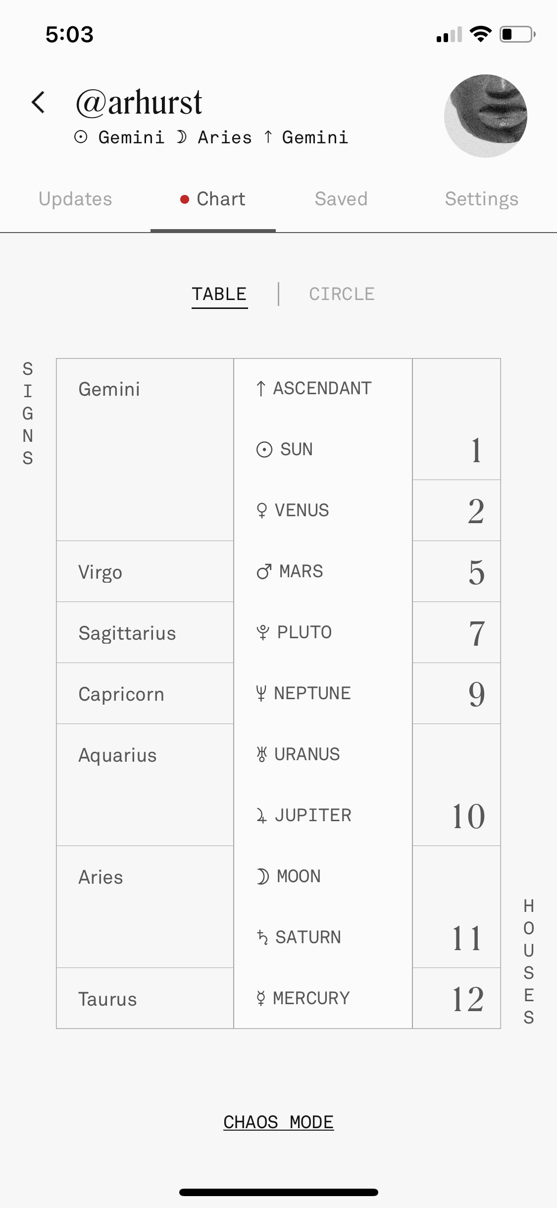
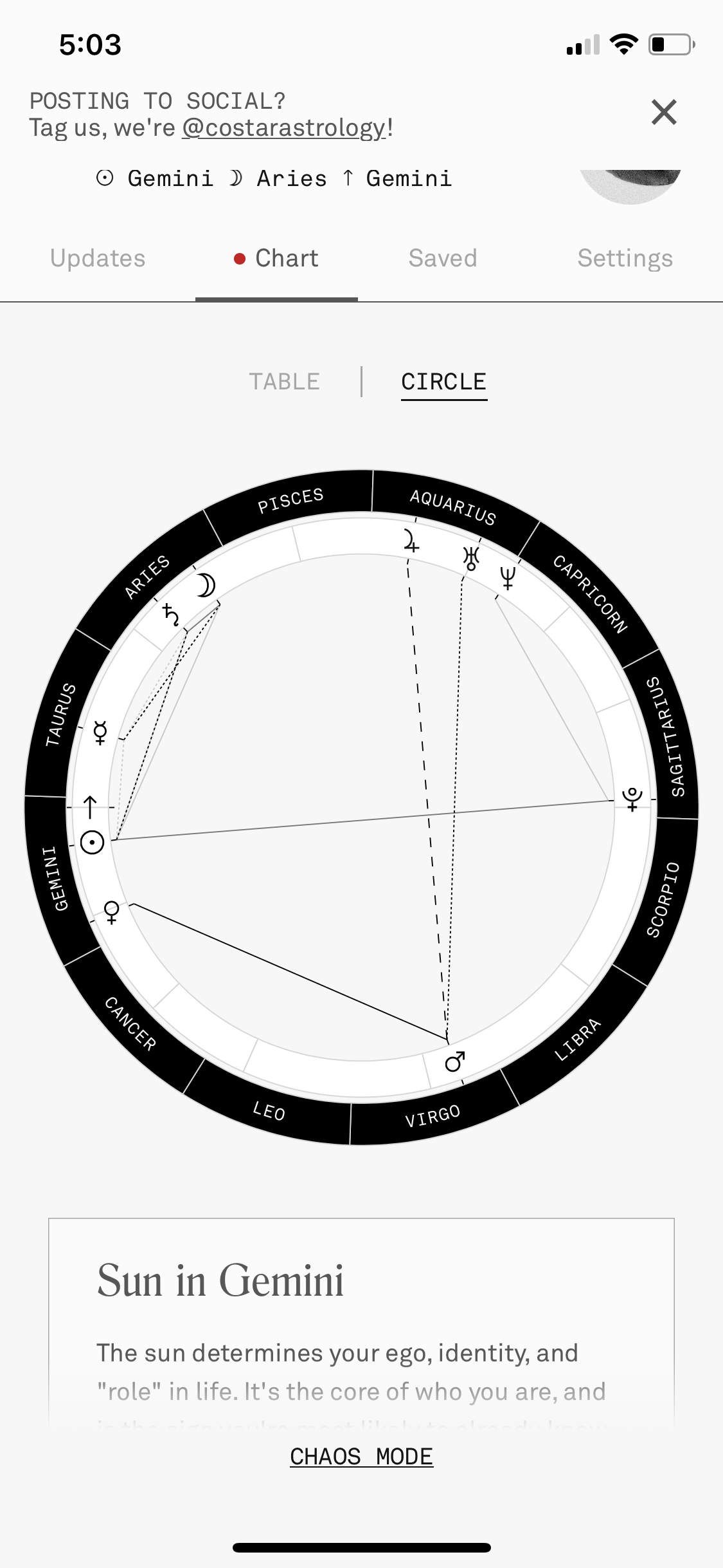
img. 4
There are two ways to view your own birth chart. Simply go to the top left of the screen and click on “Chart”. One positive element of this app is that all the links appear clickable, because they are underlined and therefore look like a link. Once the user accesses the chart, there is a viewing option link in the middle to look at the chart as a table, which might be easier for beginners in astrology, or the circle, which is the traditional way to view the chart and gives slightly more, advanced information. There are great constraints on this section of the app that create easy discoverability for the user; simply click on an element such as “Sun” or “Mars” and the app will automatically scroll the user down to the section that describes all basic information needed to understand the elements on the chart. The only issue is that the visibility that the elements within the chart do not appear clickable; so, I would suggest making the links more consistent with other links within the app to create more ease while using this table feature.
If the user would like to expand on the social aspect of the app, they can access a friends section to the top right of the app. Both the link for “Chart” and “Friends” do not necessarily look clickable or consistent within the app. I would suggest that the design be altered so that all links look the same and therefore the user knows the constraints on elements on the screen. Some links are underlined and some are just all caps, some are all caps and underlined. For ease of access and consistency in the app, which Co-Star lacks in, I would suggest making all links underlined and consider leaving out all caps from the design, since it is not a prominent feature— although the all caps does lend towards the visibility of the links in the top corners of the app.
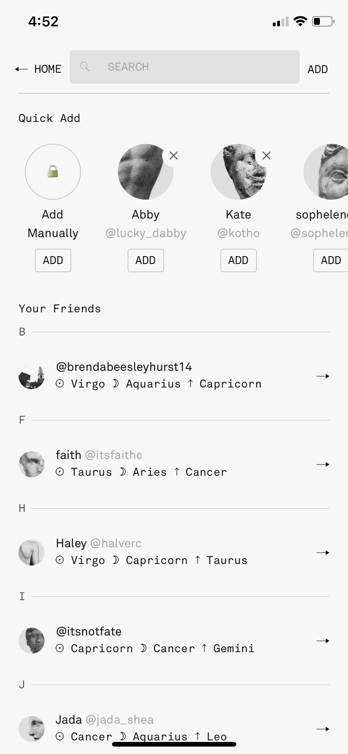
The constraints within the friends section are fairly good in that it is hard to make a mistake. Like other social media apps, a user can add other users not only based off of their contacts (img. 5 shown on the friends page)— which are very visible bubble suggestions at the top— but a user can also search manually. Then the user can easily access their friends’ pages and compare and contrast their personal chart to their friends. There isn’t much need for discoverability on a large scale, as the most useful element of the app is a storage space for your birth chart— people who are big into astrology don’t use it for much else because there is so much controversy about the promotion of negativity which is partially irrelevant to this review in terms of UX, but important in that discoverability isn’t as important because the app is highlighting that comparing to friends is not very important compared to your own information. The constraints on manually searching make sure to show you the most relevant options for your search so that a user can easily find friends.
In closing, I find Co-Star to be a successful app for entertainment usage and beginner information storage, but I think that there are some elements that could be improved in the design that would make the information more understandable. The app decided to follow a very modern, niche design that lacked organization and hierarchy, and therefore even though the app is popular and successful, it could improve.