
Co–Star is a mobile Astrology application that gained major adoption among the Gen Z population. In fact the company boasts that “25% of young women in the US (18-25) have downloaded Co–Star” in just four years. The primary functions of the app are to provide daily horoscopes and compatibility assessments among friends.
In this critique, I will be looking at a few features of the Co–Star (iOS version 3.58) application based on the principles from Don Norman’s The Design of Everyday Things.
Home Screen
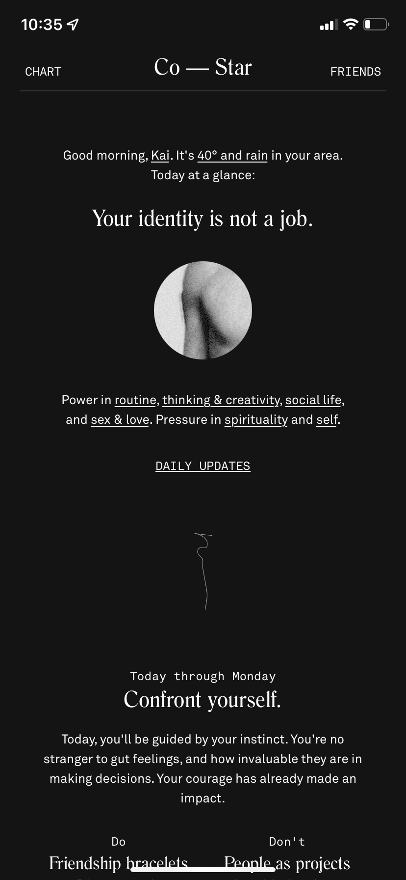
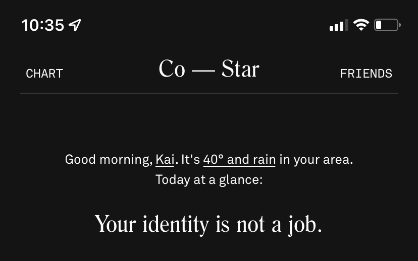
I am using the dark mode version of app, and I will start with the home screen. This screen primarily consists of text about describing various astrological guides, which does fit the conceptual model of horoscopes, being that historically horoscopes have been printed and read by those interested. While the spacing does break the text up into sections, the labels for these sections are rather small. Labels should be obvious and clear to help guide the user. So I suggest making the labels a bit larger or at least increasing the weight to increase understandability for each portion. One main goal of a user of this app is to read their horoscope, but due to the labeling problem a novice user might read the wrong section and interpret that as their horoscope which would be a mistake. This current structure relies on users learning and figuring out which section is actually the horoscope, taking up mental resources. A clear label would make is so that users could rely on knowledge in the world (or app in this case), without it users must arbitrarily learn over time which section pertains to their horoscope and remember that (aka. knowledge in the head).
The text on Co–Star’s home screen gets cut off at the bottom edge of the display making the rest of the areas on this screen discoverable. This cut-off text also signifies scrolling and in turns provides feedback with the use of the scrollbar on the right edge.
Navigation
Co–Star has a very simple navigation with two options: Chart and Friends. These options decrease the cognitive load on users and provides a constraint for what can be done in the Co-Star app from the home screen. This constraint guides the user to find the other features of the app a little at time. The navigation’s discoverability is decent since it is at the top of the display and stays at the top when scrolling. The text could be larger though as it feels a bit small. Once a user selects Chart or Friends on the navigation there is nice feedback when switching to the next screen, stating that it’s “Fetching NASA data” with an illustration of an eclipse acting as a loading icon.

Chart
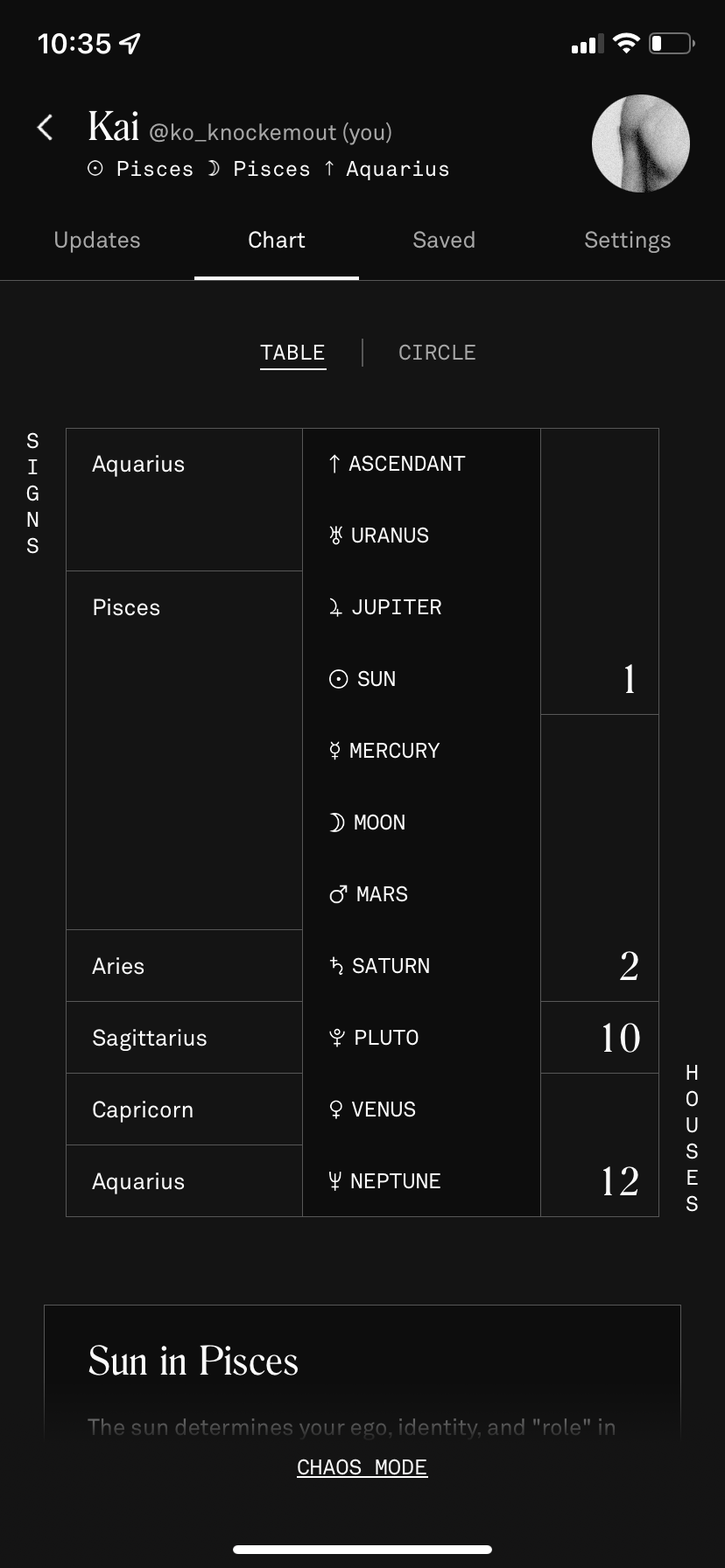

The Chart screen is probably one of the most complex screen on this app, so I will just discuss the main “Chart” tab. This page is supposed to match a user’s goal of learning more about their astrological placements and meanings. To execute this goal there are two ways: the table and circle option. Starting with the table option, Co–Star gives users an overview of their sign placements. When a user selects one of the options from the middle column of the table, that section is scrolled to below to provide more information about it. There are no signifiers for action except maybe that the middle column is slightly darker than the rest. And while the entire phone screen affords touch / selection, without proper signifiers or a descriptive label, there is no way of telling if this column or even non descriptive table is even useful to this screen. I suggest adding a chart description and underlining every option in the middle column as a signifier, which is a technique used extensively throughout the rest of this monochrome app.
The Circle tab is even worse in terms of signifiers because the little icons in the inner ring are clickable and will scroll down to the section the symbol represents. I believe this chart should have a legend and description that is clickable right underneath.
Both versions of the chart don’t provide users with the information to effectively complete the gulf of execution. The lack of signifiers doesn’t inform users about the ability to automatically scroll down to find more information about specific astrological aspects, which is the goal of this screen. Once it is known, due to knowledge in the head (after first discovering this feature), the feedback is immediate, and the user arrives at the selected portion of their astrological placement which completes the gulf of evaluation for this action.
One other positive thing about the Chart screen is that Co–Star once again cuts off the text at the bottom of the display to suggest more content and signify scrolling.
Friends
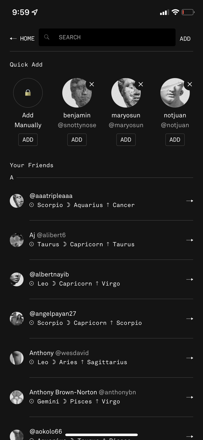
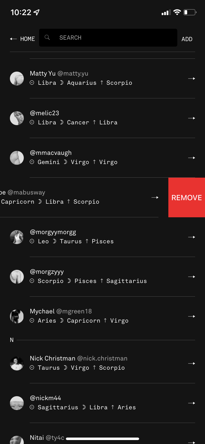
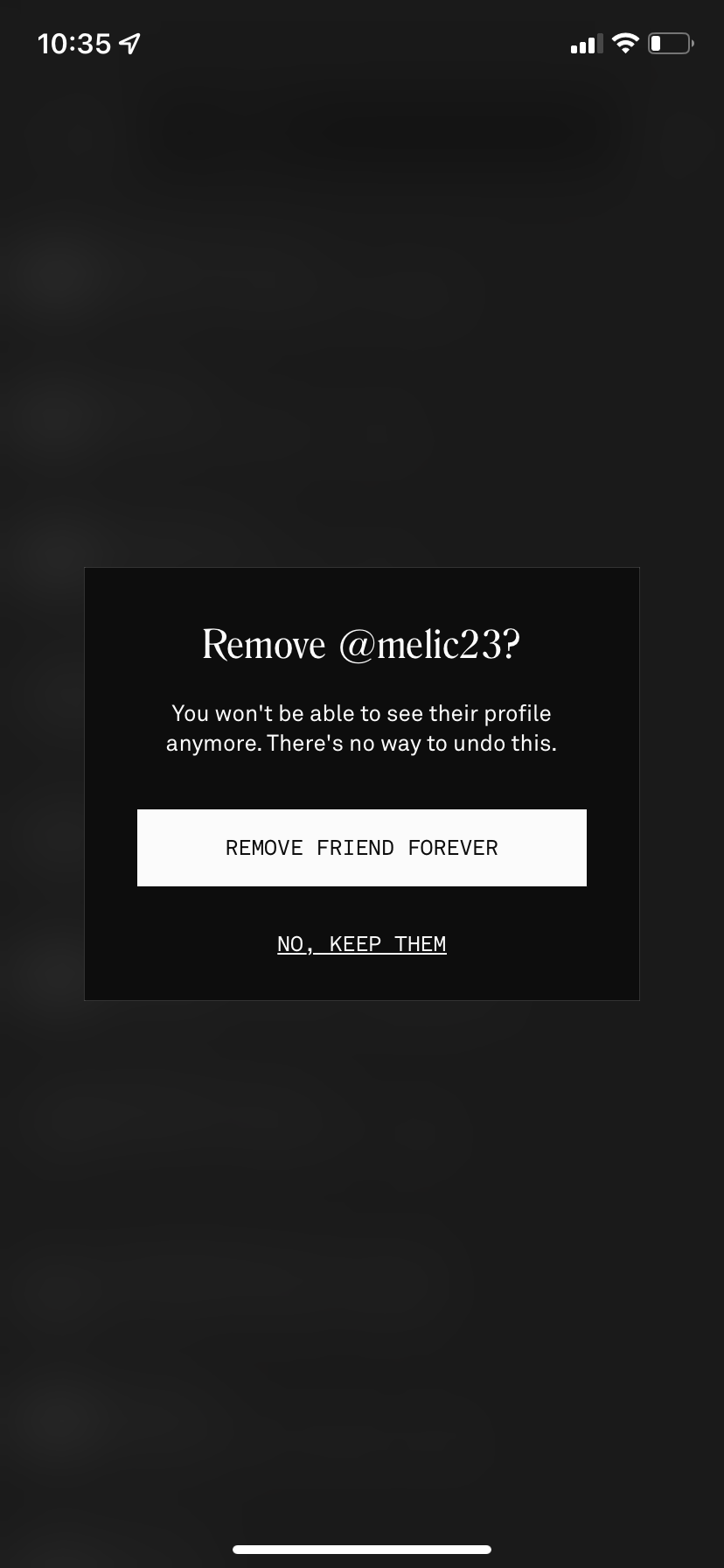
The Friends screen is pretty straightforward. In terms of discoverability the only actions are to search or add friends or to select one of your friends to learn more about their astrological placements and meanings. Where discoverability lacks is with the deleting friend option. A user must swipe one of their profiles towards the left of the screen to reveal a red tab labeled “REMOVE”. This is a direct impediment to the gulf of execution. Again if a user has no prior knowledge of this feature, the only way to figure it out is by trail and error (knowledge in the head). I do believe that arrows next to each friend are an attempt at hinting that the remove option is accessible by swiping from that side, but it might be confusing since it’s not a direct mapping of the swipe feature on mobile application. Mapping refers to the relationship between controls and features in the world, which should match. If the arrow was facing the other direction to indicate which way to swipe, I believe that would be a more effective mapping method, matching the signifier with swipe direction. Co–Star should show a preview or walkthrough of how to remove a friend when the user first goes to the friend screen. Beyond discoverability, the remove option provides a clear signifier since it’s red (one of the only features with color in the app). After selecting remove, the screen provides a useful confirmation message (gulf of evaluation) clearly asking if this wish to remove the selected action with a warning that “there’s no way to undo this.” This is very useful for minimizing accidental deletions of friends. One last minor complaint is the lack of organization to jump around the alphabetically sorted list of friends, the user has to scroll or search by name.

Overall, Co–Star is a very successful app that today’s youths handle and navigate rather expertly; however, there are various design elements that should be reworked to increase user understandability and potentially reach a larger audience.