Costco Wholesale Corporation is a popular American multinational corporation that operates a chain of membership-only big-box retail stores. They are known for their bulk-sales business model that primarily focuses on warehouse purchases instead of online product sales. Their e-commerce website allows members to purchase selected items for delivery. In this post, I will critique the functionality, aesthetics and usability of several tasks performed on the website using the terms and concepts learned in Don Norman’s DOET.
Looking for an item through the navigation bar:
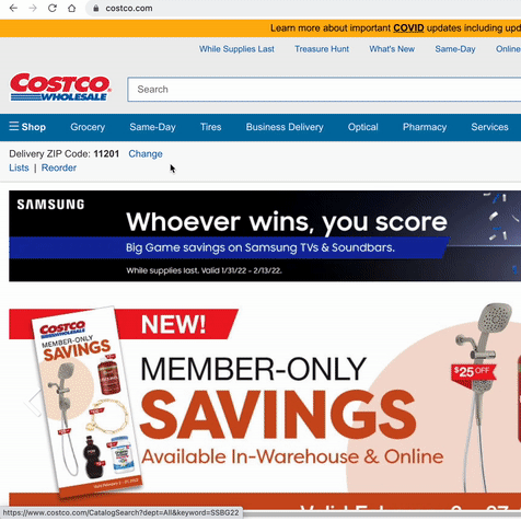
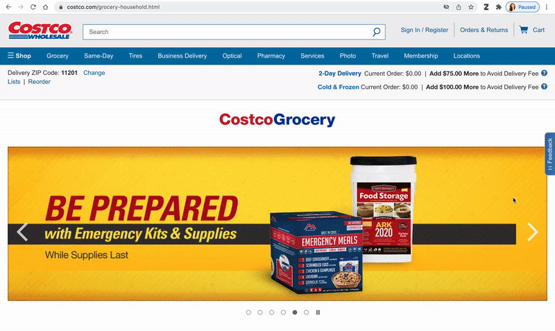
The navigation through the website is extremely complex, and the presence of two navigation bars makes them not easy to discover. The users may find it difficult to comprehend the conceptual model of the website’s information architecture due to the variety of menus and overlapping submenu items (see figure 1). The lack of hover interactions makes the elements of the navigation bar poor signifiers as well, and does not showcase their affordance to navigate to a new page (see figure 2).
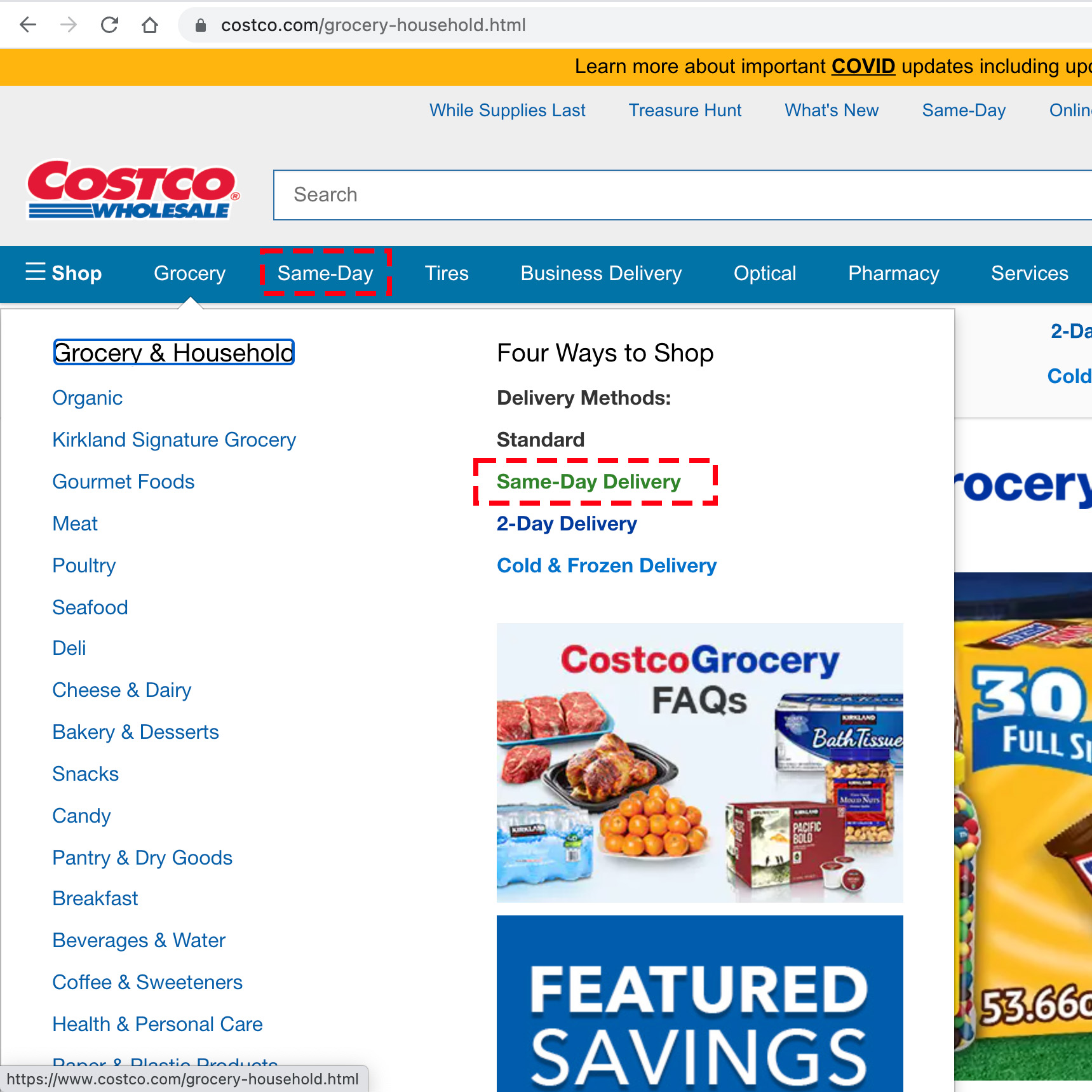
Looking for an item on the home page:
The lack of evident hover interactions or CTA buttons on the individual items makes them poor signifiers. Moreover, though the presence of visual hyperlinks and changes in pointer on hover indicate that clicking an item affords navigation to a new page, the user cannot determine what page the hyperlink would navigate to (see figure 3). Rather, the users use the knowledge in their head from their experiences with other e-commerce websites to determine that the page would lead to a product description page.
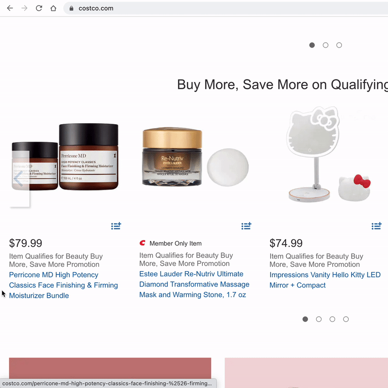
The arrows and the carousel dots indicate the presence of more items and provide well-designed signifiers and mapping that they would afford to scroll to the next item in the carousel when clicked. The arrows and the carousel dots let the user use the knowledge in their head from using such carousel elements earlier. However, the lack of hover interactions and change in pointer does not indicate that they are clickable, making them poor signifiers. When clicked, the scrolling interaction of the image provides good feedback that the action is complete. (see figure 4)
Adding an item to the cart:
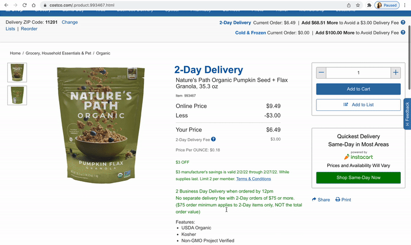
Though the product details, specifications, and shipping details tabs are easily discoverable, they do not signify their affordance of being clickable. Moreover, there is faulty feedback when these tabs are clicked as the movement of the cart details from the side panel to the top may lead the user to believe that an item has been added to the cart, whereas their expectation would be a change in the description text, according to the tab clicked. (see figure 5).
Furthermore, the lack of physical constraint on the ‘minus’ button on the ‘Add to Cart’ panel leads to it being a poor signifier, as it does not show the inability to reduce the count of the item. It rather relies on the feedback provided after the ‘minus’ button is clicked. (see figure 6).
However, the ‘Add to Cart’ CTA button is a well-designed signifier that shows the affordance of being clickable; and the pop-up that appears on-click thereafter provides good feedback of the action being completed successfully.
Deleting an item from the cart:
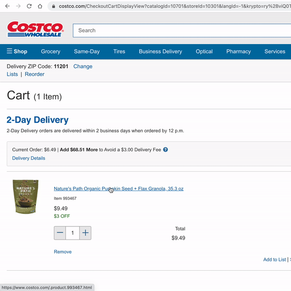
The ‘minus’ symbol reduces the number of items in the cart while the ‘plus’ symbol increases the number of items in the cart – indicating well-designed mapping. However, there is a perceived affordance of being able to reduce the number of items from ‘1’ to ‘0’ due to the lack of physical constraint, which could be introduced by greying out the ‘minus’ symbol.
Furthermore, there may be a perceived affordance of the item getting deleted from the cart automatically when the count becomes ‘0’. If a user wishes to delete and item from their cart they might attempt to do so by clicking on the minus sign as this action matches the knowledge in their head from interacting with other e-commerce websites. This interaction would result in a rule-based mistake. Moreover, since the discoverability of the ‘Remove button is low, and clicking on the minus sign also does not delete an item from the cart, the users might be unsure of how to perform the said action thus resulting in a Gulf of Execution.
Subsequently, an error message is displayed that provides feedback to the user that the action is not possible, without any indication on how to complete the task (deleting the item). This flawed feedback could further result in learned helplessness, with the user failing multiple times without understanding how to complete the task. (see figure 7)
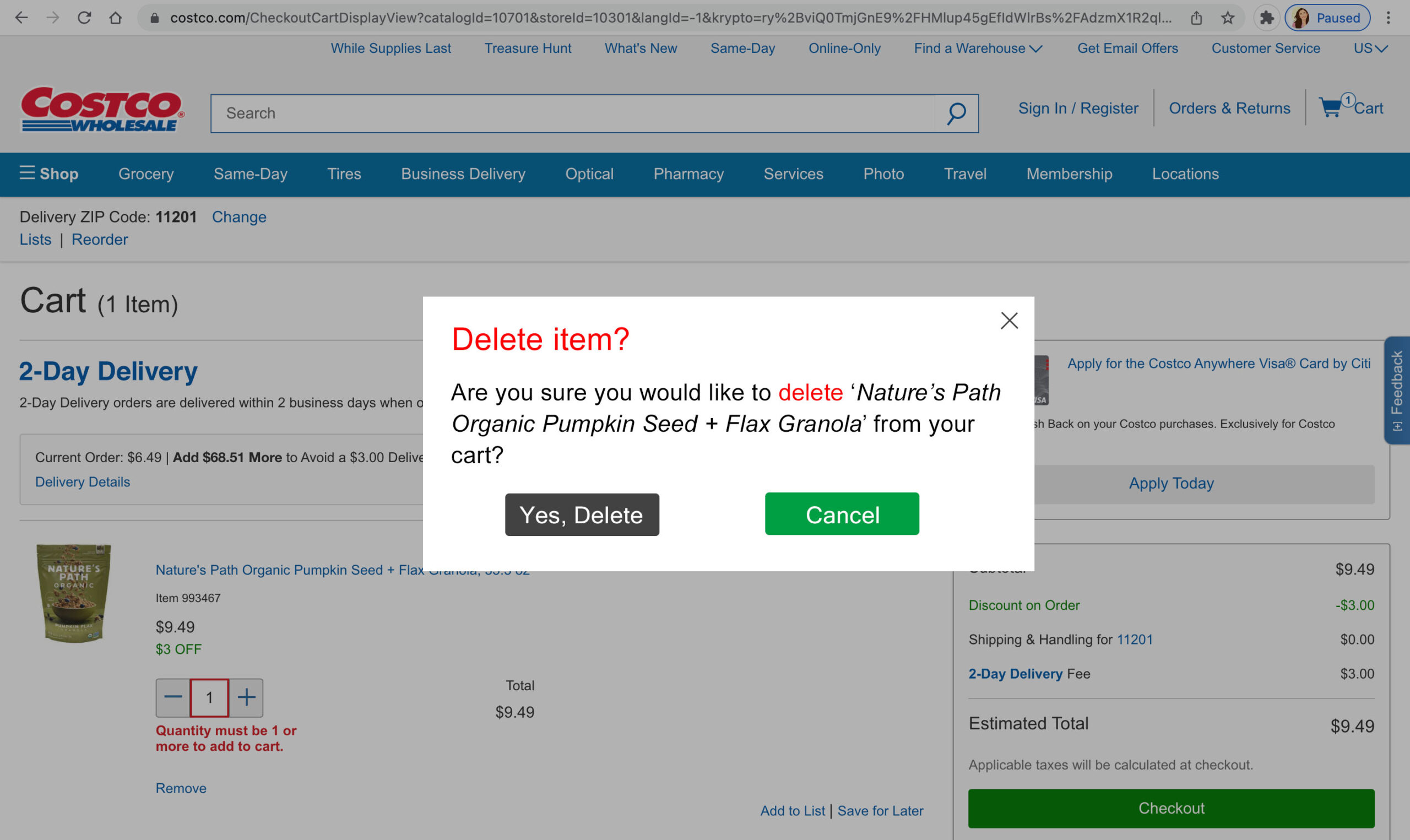
Instead, if the feedback were a confirmation message further asking the user for clarity on what action is required (For example, ‘Are you sure you would like to delete this item?’), there would be a clearer mental model of the deletion process (see figure 8).
Conclusion
Though I do understand that online shopping is not the primary focus of the company, I believe that the current visceral, behavioral, and reflective responses to the Costco website could be optimized. Better integration of human-centered design practices into the e-commerce website would help the website fair better in terms of usability and thereby attain better user engagement and traffic.