
Ebay.com is a US-based e-commerce company where sellers sell and buyers buy both new and used items, such as clothing, accessories, home decor, furniture, electronic equipment, cars, sporting goods, collectibles, and more. This critique will be from the viewpoint of a user shopping for women’s clothing.
The Main Homepage

The homepage (Figure 1) is loaded with clearly marked category titles for navigating the page, lending to easy discoverability. When the user arrives, they can easily see a large search bar at the top of the page, signifying the affordance of typing in the item they’d like to search for. There are also many categories to click on both above and below the search bar signifying the affordance of browsing through the website. It’s obvious that these categories are navigable because the arrow cursor turns into the hand selection cursor when hovering above clickable options. Additionally, the user can see caret-down icons on either side of the search bar which act as signifiers that the options labeled “Shop by category” and “All Categories” are both drop-down menus.
Women’s Clothing Main Page

The user is able to navigate to the Women’s Clothing main page (Figure 2) several different ways. Once there, down the left-hand side of the page are many subcategories of “Women’s Clothing.” Underneath that are “Special Sizes,” “Top Brands,” and “Sale & Events.” “Top Brands” is a particular constraint that limits the user’s ability to browse only via those specific companies. If that was a purposeful design choice made by Ebay to steer users to more likely purchase from those brands, then that constraint may work in Ebay’s favor. However, if the user is interested in certain brands that aren’t listed here, they may not know that the “All Filters” options will be available when they navigate further along into a specific subcategory so that they can view every single brand available.
For a user who’s interested in finding a specific brand that they don’t see listed, the inability to find a full list of brands right away may cause frustration. Concerning what Don Norman considers the behavioral level of human cognition and emotion, this may make them feel like they don’t have control, pushing the situation toward one of a bad user experience. Ebay could possibly add the “All Filters” option to this main page as part of the navigable categories down the left-hand side of the page, instead of users’ only being able to find it once they click on something else, as can be seen in this mock-up (Figure 3):

Using the Filters
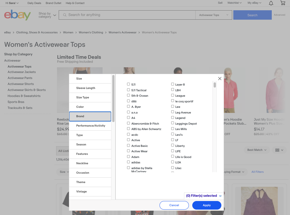
Once a user clicks into a Women’s Clothing subcategory, such as “Dresses,” they can either utilize the pre-loaded drop-down filters – such as “Size,” “Dress Length,” “Color,” etc – located above the product listings, or they can click on the “All Filters” option at the end of that row. If the user does the former, they receive good feedback that each new filter selection worked because the screen changes, returning only products that meet the new parameters. If the user does the latter and decides to click on “All Filters,” a pop-up screen appears (Figure 4) with every single type of filter listed down the left-hand side and all the possible options to choose from within each category on the right-hand side. Once the user goes through and selects their desired filter details and then clicks on the “Apply” button in the lower right-hand corner, the screen changes, giving good feedback that the products now being shown have been restricted to the user’s filtering choices.
Making An Offer

Some sellers who sell their items through a “Buy It Now” listing (rather than as an auction item) allow users to “make an offer” in which the user can offer up a purchase price lower than what the seller has listed. After the offer price is sent, the message from Figure 5 pops up on the user’s screen to “Give the seller a day to review your offer.” This may come off as an ambiguously worded amount of time or it may be referring literally to a 24-hour period, which hasn’t been made clear. And after the user clicks “Done,” the message disappears from the screen, and there is no feedback given about what will happen next. This can be viewed as a potential blip in the conceptual model because it is not obvious what is supposed to happen next. There is a lack of feeling of control here. Also, this situation specifically impedes on the fifth and sixth stages of the seven stages of action, “What happened?” and “What does it mean?” Is the user waiting for a message to be sent to them? Is it possible that the offer could be accepted sooner than “a day”? Or must the user wait 24 hours to see if the offer has been accepted or rejected? Therefore, this hiccup in the conceptual model impedes discoverability of follow-up steps in this instance. This an also an example of how the Gulf of Evaluation has not been bridged. The user would not necessarily know that in order to get more detailed information about the offer they’ve just made, that they can go to the “My eBay” drop-down menu and click into either “Summary,” “Bids/Offers,” or “Messages” to get much more detailed information.
A solution could be to add that message somewhere on the pop-up screen so that the user knows where to navigate in order to access all the related information, including the exact time the seller needs to respond by and more. This newly-added knowledge in the world would act as a signifier to the user as to where to go to keep an eye on their offer and can be seen in this mock-up in Figure 6: