
Getir is a delivery service app that promises to provide grocery items of necessity in minutes. Founded in Turkey in 2015, it expanded internationally within years, and recently it has launched in New York City. It has a clear and understandable layout that highlights the products.
Initial Login
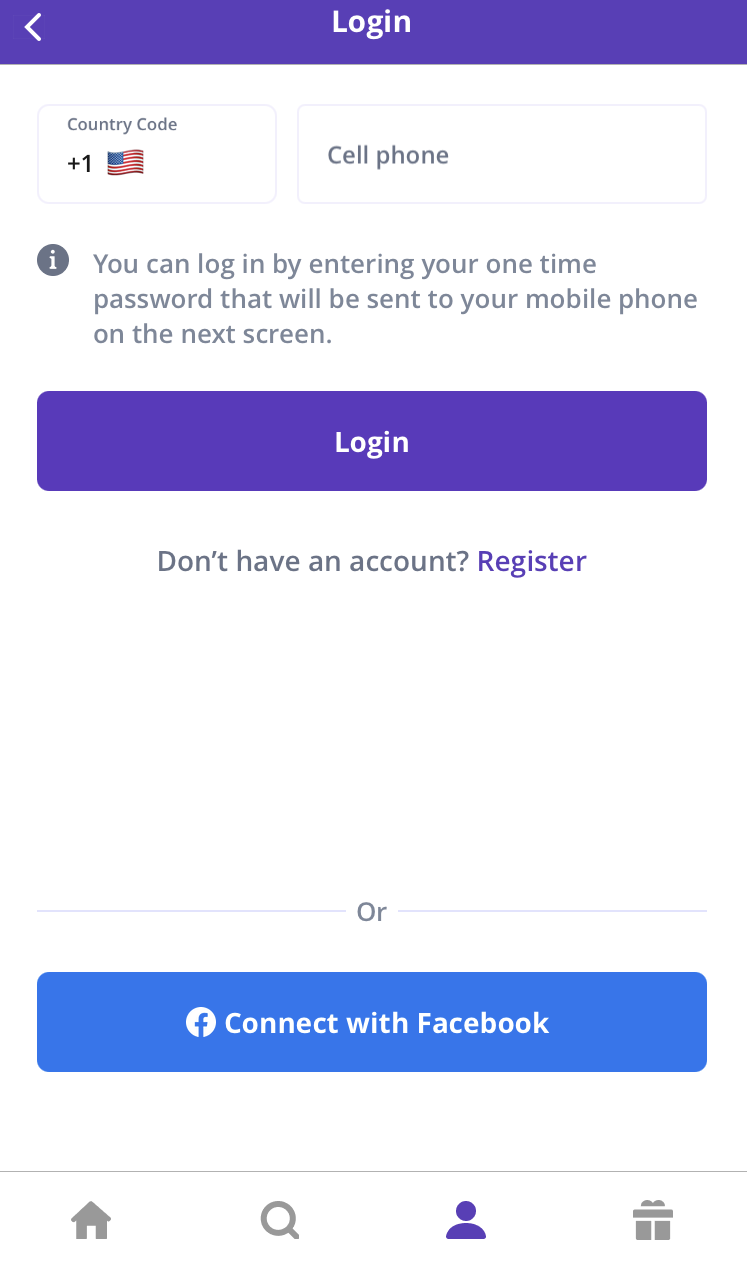
The application follows a very typical format during the login process. The concept of knowledge in the world allows users to fill out the required information. The “login” button operates as a signifier and lets users know that the application affords them to log in (Figure 1).
The Home Page
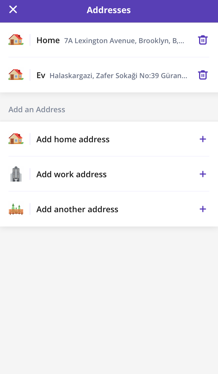
Once logged, the user is prompted to define an address or choose from already existing ones (Figure 2). The plus symbols provided at the end of each row “suggest” users add their address to the app’s system. This easily interpretable guidance saves users from effort as the artifact supports the discovery, which indicates a small gulf of evaluation. In his book ‘The Design of Everyday Things’ , Don Norman (2013) states, “The gulf is small when the system provides information about its state in a form that is easy to get, is easy to interpret, and matches the way the person thinks of the system” (p. 38).
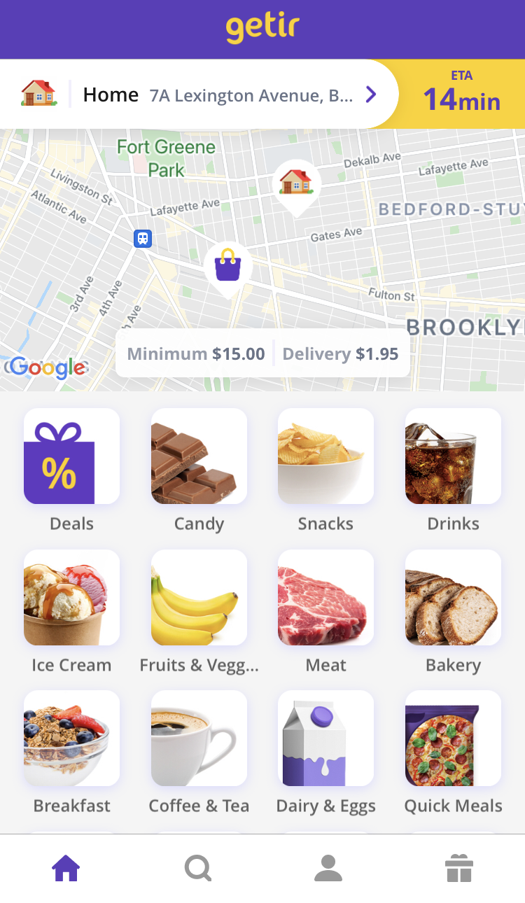
Later, the user can pick the product category from the body segment. Supporting the category titles with guiding pictures of the products helps users to take action faster and lowers the risk of human error (Figure 3). For example, if there were no pictures provided, a user who is observing the body segment to order coke might have made the mistake of clicking on the “Snacks” category rather than the “Drinks”, since it is earlier in the order of reading and some people count bottled beverages as snacks, too. However, once the pictures are supplied, the user is rather constrained to imagine chips and/or crackers as they come across with the “Snacks” section. Also, it further eliminates the problem of the gulf of execution, as there is no difference between the intention of the user and the way the system allows this action (Norman 2013).


The bottom navigation bar
builds upon the natural mapping notion. Once the user clicks on the icons, they can easily observe that pages are changing once they are activated. The feedback mechanism of the bar determines in which section the user takes place at the moment by coloring the related icon (Figure 4). The icons of the tabs clearly portray their intention, in line with the concept of knowledge of the world. Any user with previous knowledge of these symbols can easily deduct their stance as pages of the app.


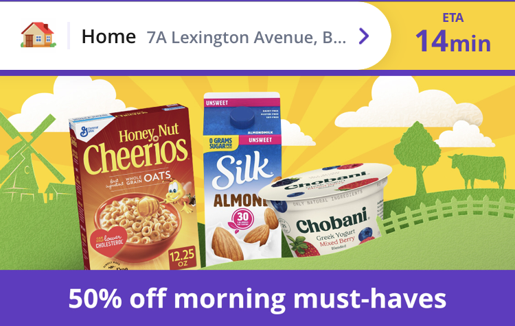

The header affords to indicate the location of delivery, minimum expense amount, and price of delivery, as well as to swipe between campaigns. Nevertheless, it lacks a signifier in a carousel design form to show how many campaigns are available to swipe through. Therefore, the user is left without feedback to understand their spot in the pile of images. Moreover, they could have worked as signifiers to cue which direction to follow to see the entire thread (Figure 5).
Searching for Products
The user can explore products either by clicking on the product category images, each affording a secondary page of various goods in that specific class or by clicking on the search icon in the lower navigation bar.
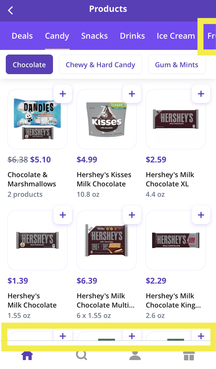
The Secondary Page

Differentiation between the home page and the secondary page indicates feedback to inform the users that progress is being made. The secondary page composes of two top navigation bars. One of them has a more straightforward navigation bar look. The other one has aligned buttons. They are designed and colored differently to highlight their diversification, as the former represents the product categories on the home page, and the latter stands for more specific varieties of each category. For the top navigation bar, the yellow line underscoring the corresponding category works as feedback to show where the user is. Similarly, the second navigation bar’s selected button is colored in purple to give feedback to the user about their action (Figure 6). In other words, through the small changes in design, hierarchical classification is depicted. By just observing these navigation bars, the user can expect to see a variety of products specific to chosen category type in the body segment of the page. This result of the conceptual model can be explained by the general-to-specific order of structure.
The continuity principle of design is successfully utilized as a signifier on both the header and the body segments of the secondary page. As soon as the user notices that some elements cannot be perceived since some parts are purposefully left off-screen, they would instinctively swipe or scroll (Figure 7). Repeating the same feature in several sections increases users’ familiarity with the system mechanism through practice and makes the app becomes more understandable which means good design in Norman’s terms.