Google Translate is a translation service website that was launched by Google in 2006. In 2010 and 2011 Android and iOS applications were launched respectively, and today the application is used by over 500 million people daily. The application inherits the conceptual model of the website, both digital products have similar designs and functionality. This post overviews the interface and usability of the iOS application using Don Norman’s design principles.
1. Launching
Once the application is downloaded and opened for the first time, it lands the user directly on the translation screen named “Home”. The bottom tab navigation has more tabs. “Saved” for quick access to selected translations. “Settings” for system changes, feedback, and help. This post focuses on the “Home” tab as it represents the most essential function of the Google Translate application – translation.
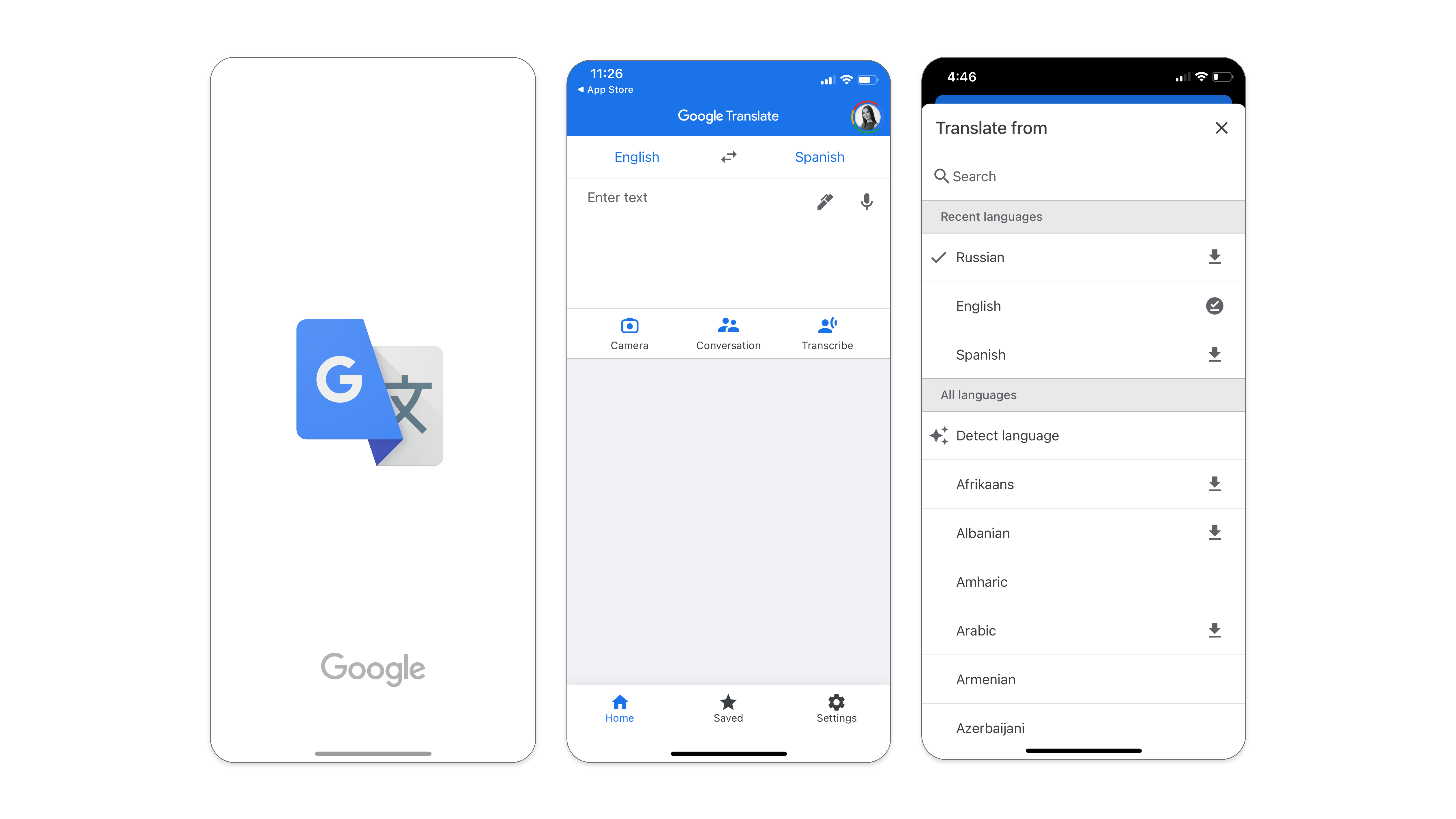
Given that Google Translate is an application for lingual translations, the mental model of a user has certain expectations from it, such as the ability to translate information from one language to another. The knowledge in the world suggests that there should be a variety of languages available for translation (to and from), there will be some space to type in and another space to showcase the results. Therefore, landing the user directly on the translating screen makes it easy to enter the Gulf of Execution in order to achieve the “translate” goal. It is also easy enough to discover where and what actions need to be performed in order to achieve that goal.
2. Translation via Typing
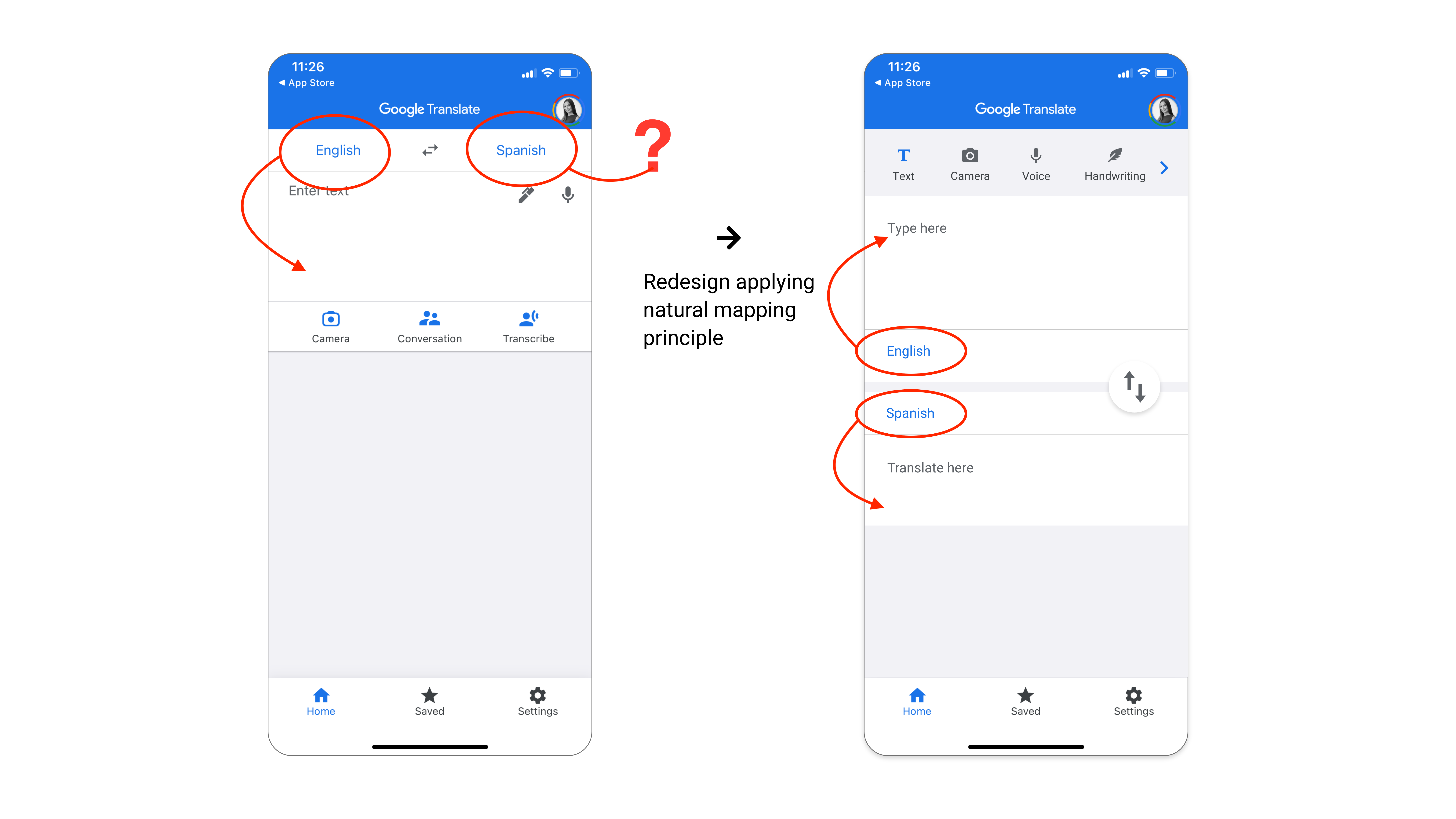
The top part of the Home screen displays languages in use. The design of the home screen could be improved with the natural mapping of the languages bar with the input/output forms they represent.
Underneath the languages bar, there is an input form that affords typing sentences and has an “Enter text” placeholder to signify it. However, the feedback is not straightforward: once the typing space is tapped, an additional input window pops up. It prevents the user to type in a form that initially suggested that it has an affordance to hold text. This extra step seems unnecessary and may create a slip error impression. The solution would be to remove the window pop-up and allow the user to type text into the input-form directly.
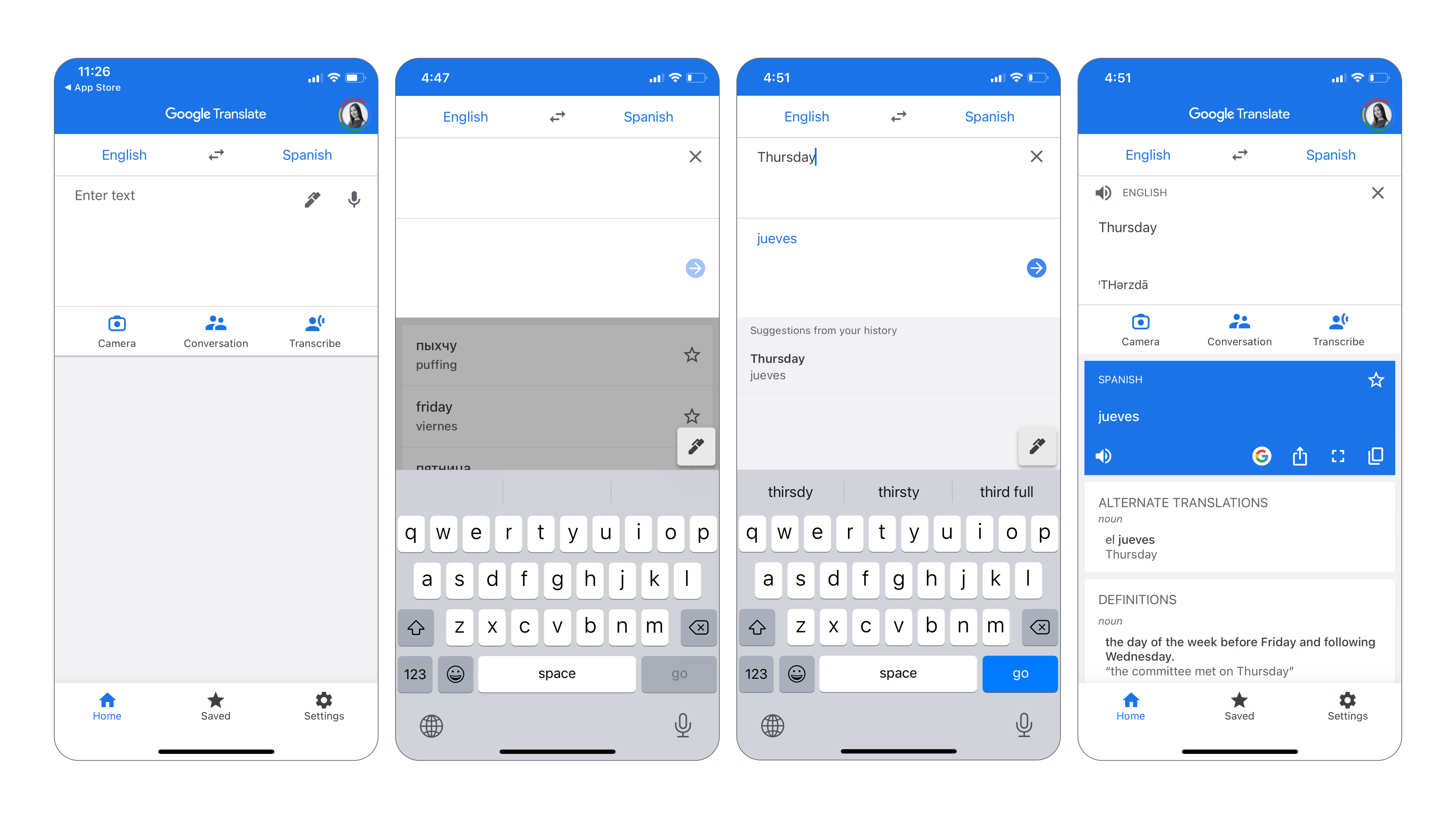
After hitting “enter/go” on a keyboard, the output of the translation appears below the input. The user enters the Gulf of Evaluation. Translated text appears in a separate form. It comes together with a new set of icons. The actions they represent are easy enough to guess, as they follow the principle of standardization. As such, a user can vocalize, search in Google, share, display full-screen, copy, or save the translation by hitting the star icon. Whether or not the user decides to proceed further, the output is there. Conceptually, this is all the user might need to achieve the goal. However, there are other translation features that a user might want to explore in this application. They would require a bit of learning to become the knowledge in the head.
3. Additional Translation Features
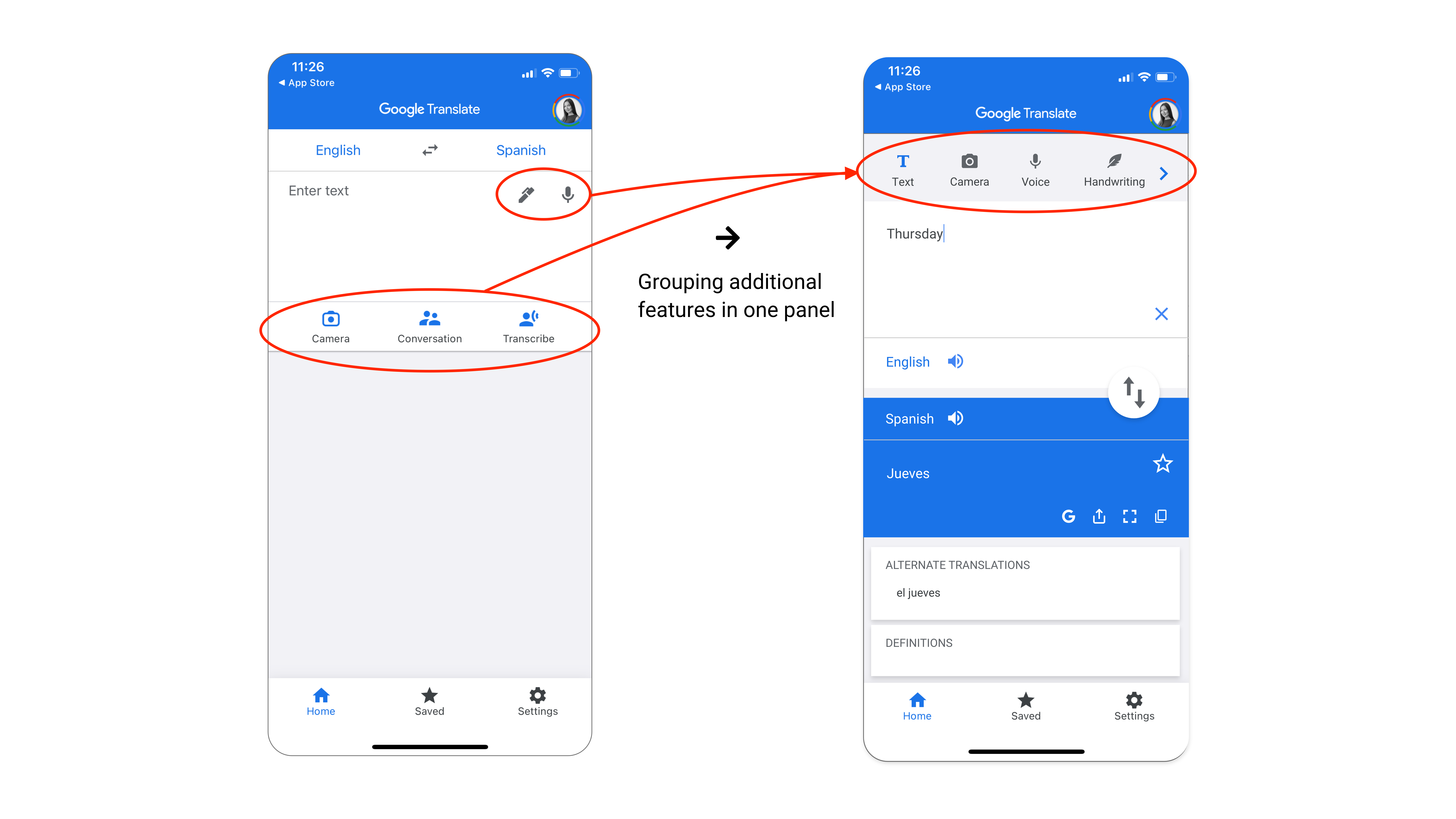
The pencil and microphone icons in the input form signify that input affords to translate from drawing and speech. The secondary tab menu displays even more extensive functionality of the application: Camera, Conversation, and Transcribe. All additional functions are easily discoverable. Some of them can be useful in different situations. However, it is not quite clear why they are visually categorized into two separate groups. Putting them in one group would keep the UI clear and minimize the cognitive load on a user that learns additional translation features of the application. It would be easier for a user to hold the knowledge in the head about these additional features if they were placed together. There is one “tab with additional translation features” if he/she ever needs to use them:
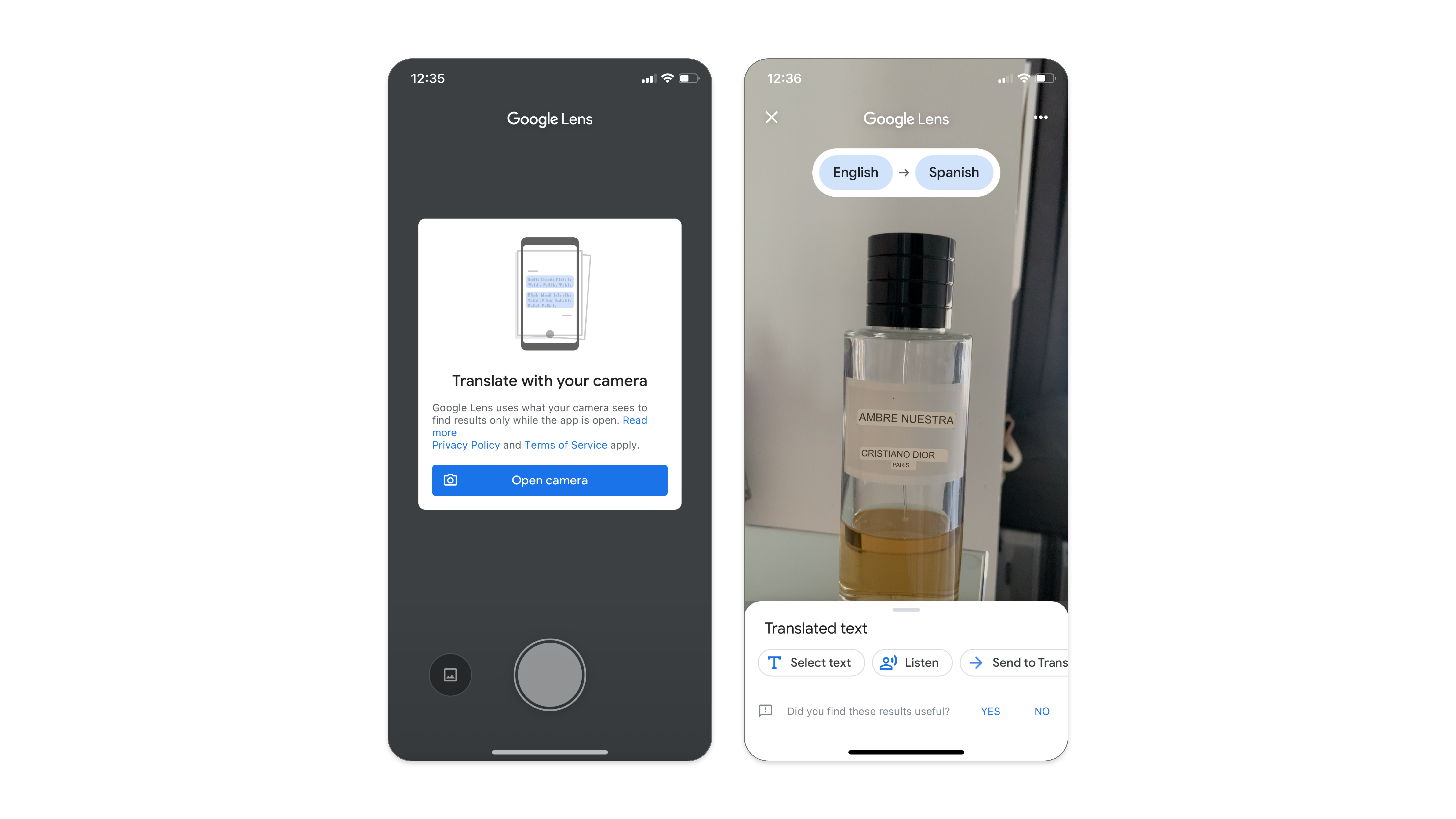
4. Translation via Camera
The application informs first-time users of this feature that it needs access to the device’s camera. Additionally, it requires the app to remain open in order to perform live translation. The actions are restricted to tapping the “Open camera” button, which is a logical constraint in order for this function to work. Once the button is tapped, the live translation starts rendering on the screen. Further actions are easily discoverable as buttons on the bottom signify exactly what actions they afford.
Translation via Camera – Logical Constraint
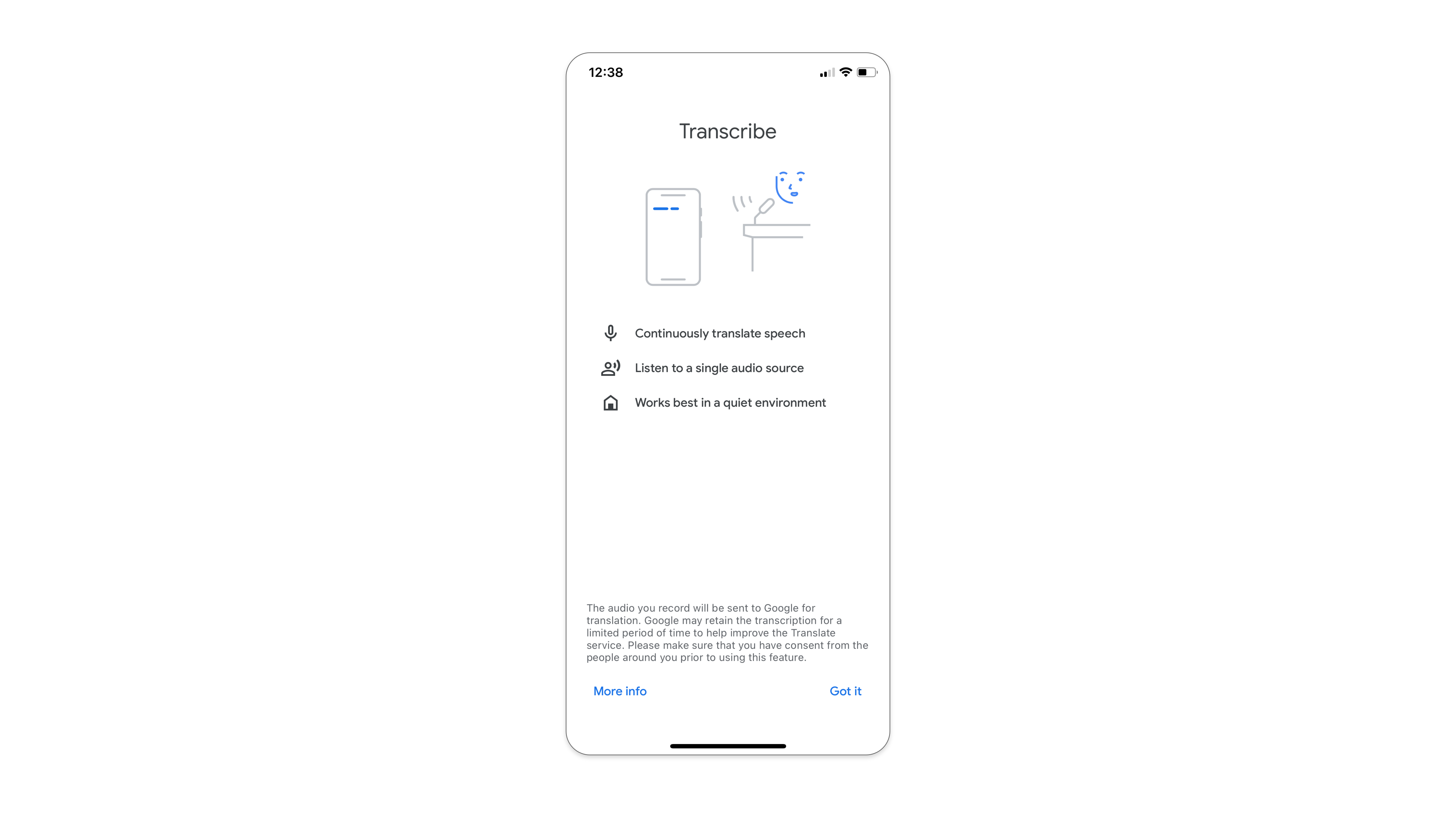
5. Translation via Transcribe
First-time transcribed translation users come across a boarding screen with short instructions on the effective use and performance of the feature. This is very helpful as it puts the system image in the user’s head before utilizing the new feature. It also helps to ensure the best possible experience for the user that uses transcribe translation feature for the first time.
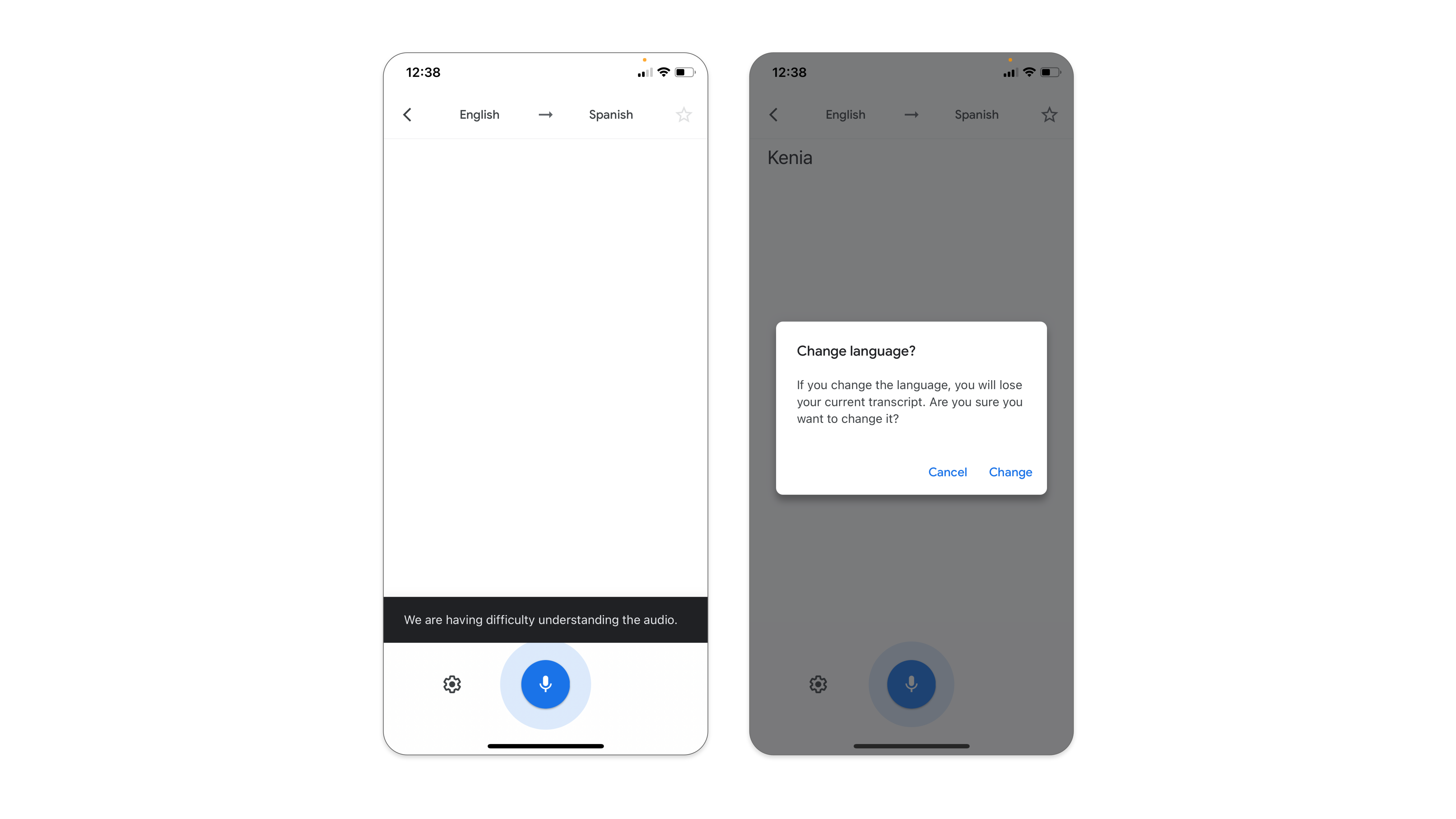
The UI is minimalistic and logical actions are easy to discover. The single button, the microphone, signifies the affordance to record the speech. There is clear feedback. In the case of a successful translation, the input displays transcribed text in both languages. In the case of a failure, the application notifies the user with a pop-up. Changing the transcribing languages can be done via tapping the languages bar at the top. However, this action causes a loss of the current transcript. Therefore, before destructive actions of the slip or mistake take place, the app prevents the error by warning constraint. The language can be changed only after confirming the action of losing previous content.
Conclusion
Although Google Translate could do a better job of applying Don Norman’s design principles, it’s a pleasant product to use overall. The main goal of this application – translation – is prioritized in UI/UX. This is reflected in the application’s simple, yet powerful interface. The advanced features are there if the user needs them. The first-time users are “equipped” with the boarding instructions and effective feedback. The learning curve of the interface is shallow, and it efficiently bridges the Gulf of Execution with the Gulf of Evaluation for a pleasant user experience on all three emotional levels: reflective, behavioral, and visceral.