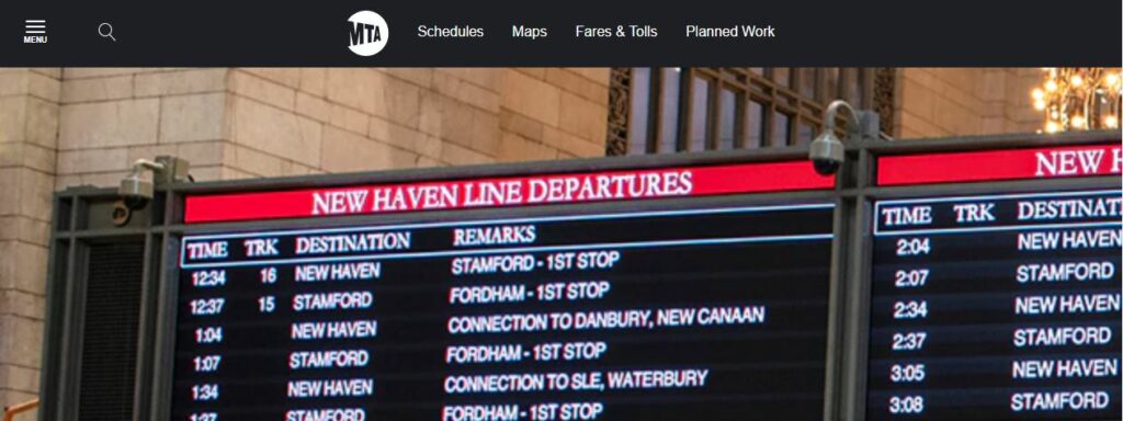
Metro-North Railroad, also known as MTA Metro-North, is a suburban commuter rail service run by the Metropolitan Transportation Authority, a public authority of the U.S. state of New York and under contract with the Connecticut Department of Transportation. Metro-North runs service between New York City and its northern suburbs in New York and Connecticut. It also provides local rail service within the New York City boroughs of Manhattan and the Bronx.
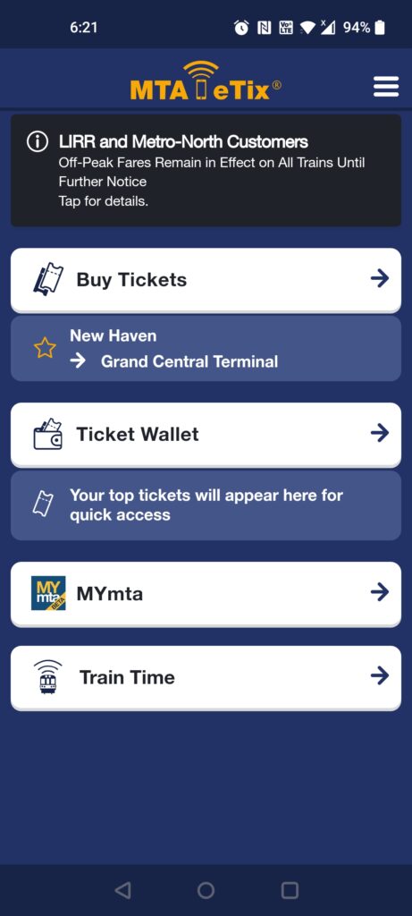
(Figure 1) 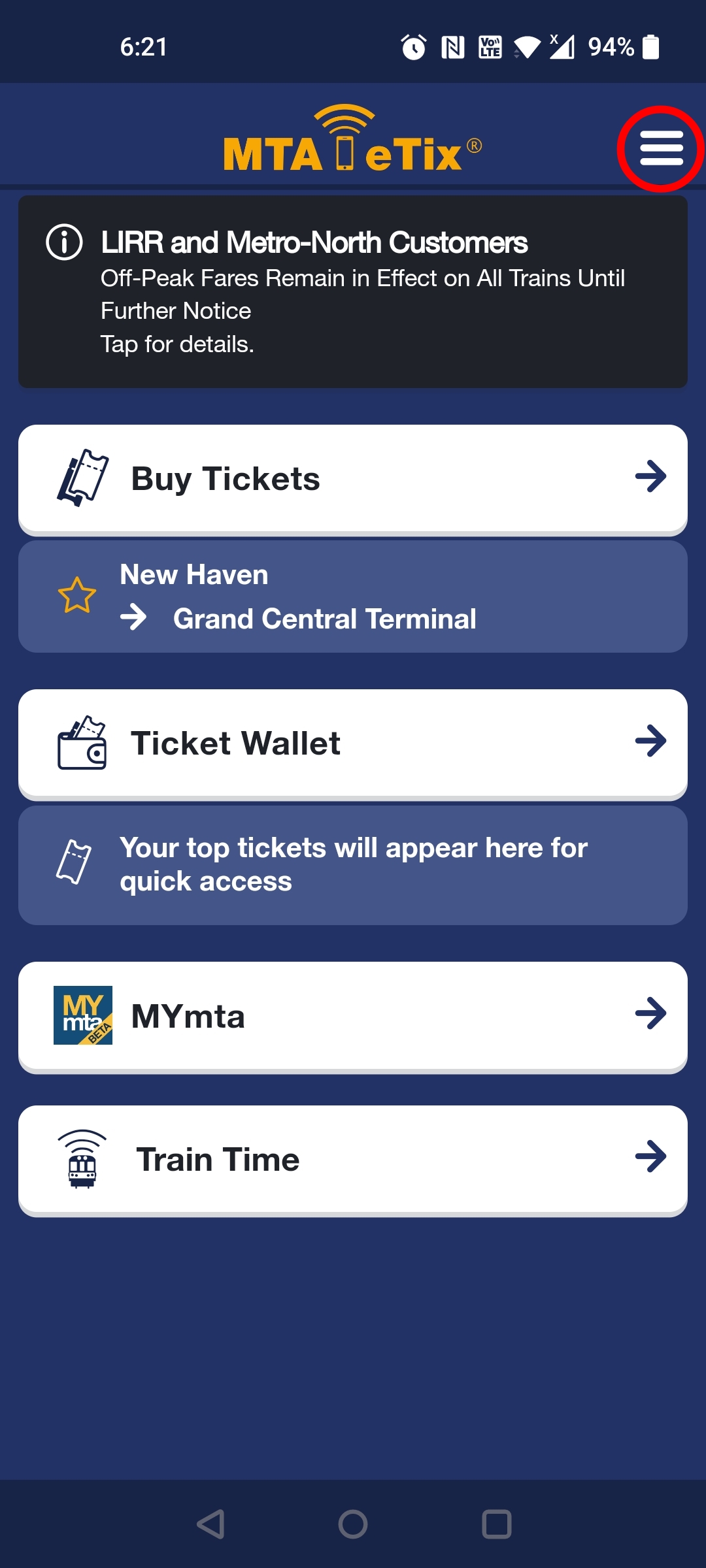
(Figure 2) 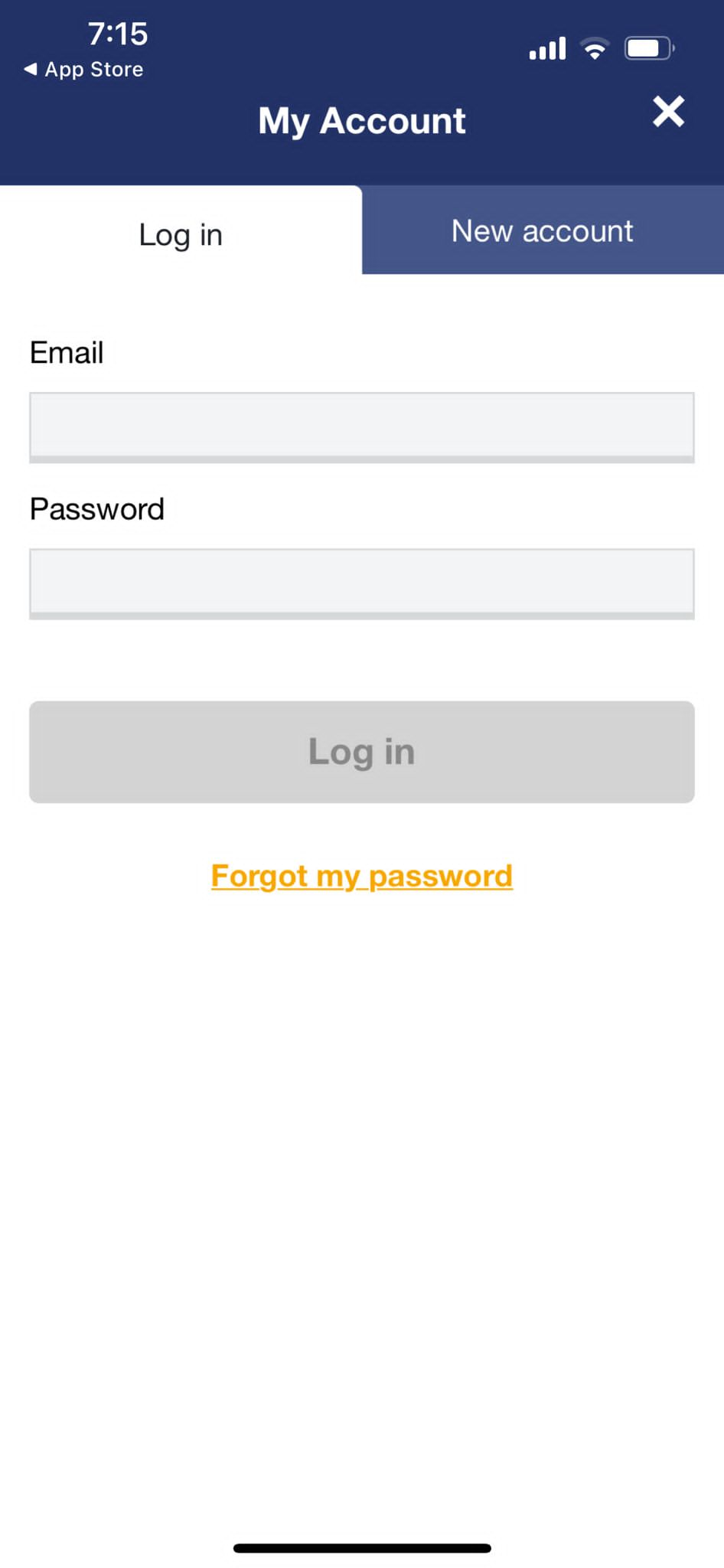
(Figure 3)
On the first page, the first thing the users sees are the four white buttons: Buy Tickets, Ticket Wallet, MYmta and Train Time. All these buttons have icons next to them, this showing high discoverability. The arrows on the side of each button act as a signifier to the user to click on the button to move to the next page.
Drawbacks
- The user often sees the four buttons in white first and does not notice the three lines on the top right corner (as shown in Figure 2). There is no clear signification that this is an important button or that it is a button at all. It took me a few tries to realize that by clicking this button, I would be directed to the login page (Figure 3) where I must make an account.
- The train Timings button is placed all the way at the bottom. Before booking tickets, the user must be able to know all the timings in order to make an informed decision. By placing this button at the bottom, it is not noticed as much by the User.
Suggestion
- My suggestion would be to make the first page of the app the login page. This would avoid a lot of confusion to the user.
- We could make the ‘Train Timing’ the first button on the page. Therefore, the user is first able to view all the timings then book the tickets.
(figure 4) 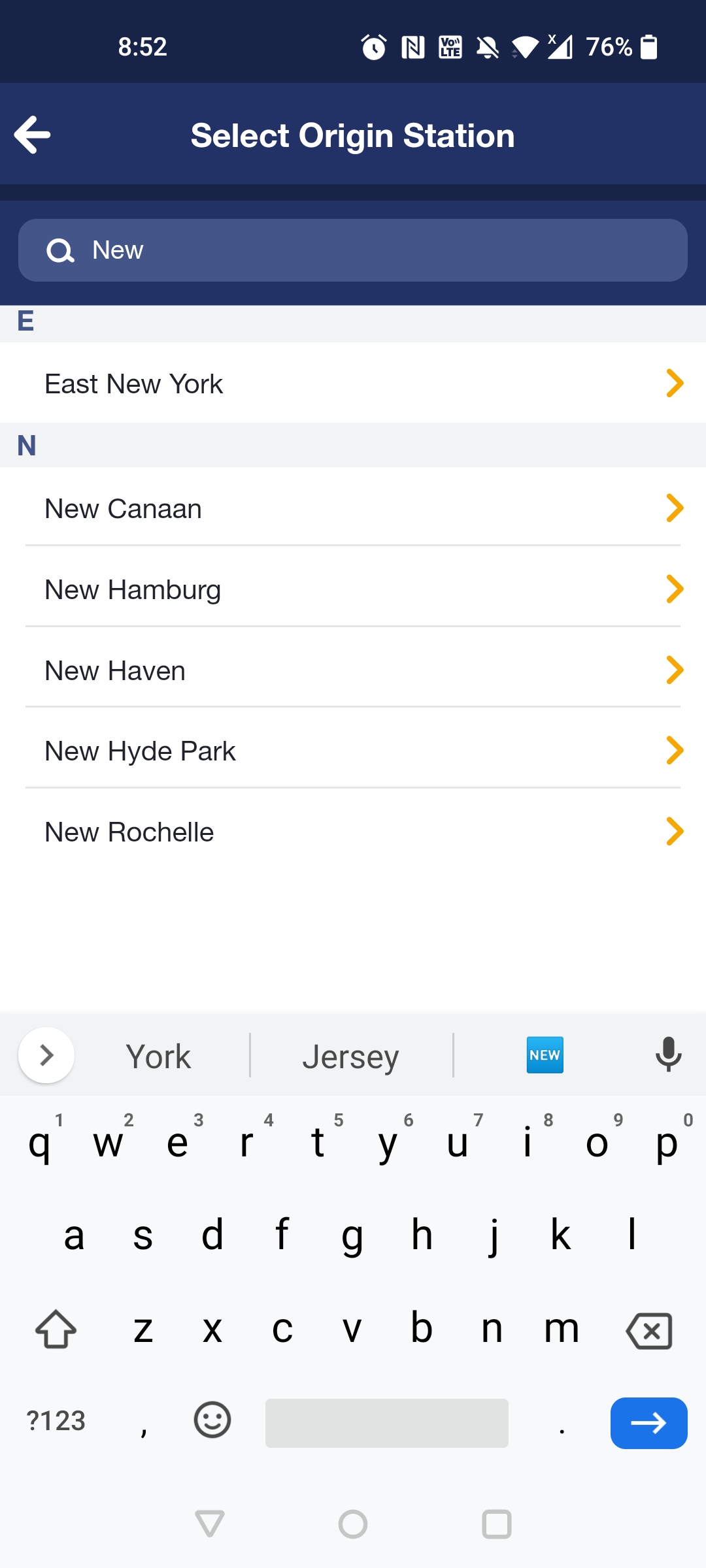
(Figure 5) 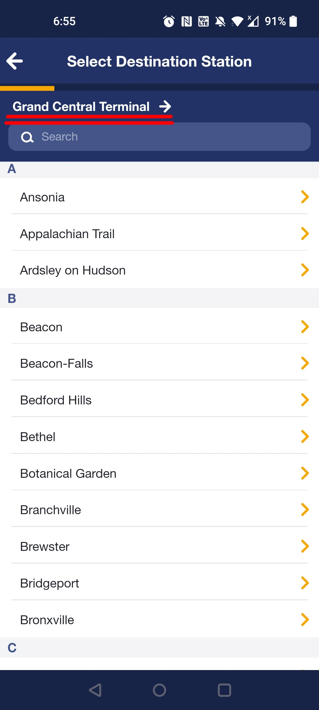
(Figure 6)
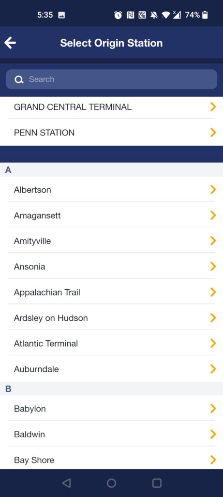
- By clicking on the “Buy Tickets” button, we are directed to the next page to select the Origin Station (Figure 4). We are able to see the search button right on top of the page. The search icon acts as a signifier to the user to type in their location or the station that they would want to start from.
- Furthermore, the names of the origin stations are in alphabetical order which is extremely useful to a new user. It is also useful to users who want to scroll through to find out all the accessible stations.
- If the user types in the first 2-3 letters of the origin station (as seen in Figure 5), they are directed to the list beginning with that particular letter. This improves usability for the user as it provides quick access to the station, instead of spending time scrolling through all the stations.
- We also see that ‘Grand central Terminal’ and ‘Penn Station’ are presented in capital right on top. As most people travel from these stations, it provides great discoverability to the user. This way the user does not spend time typing out the Name of the station or scrolling through.
- The orange arrows on the side of each station act as great signifiers showing the user that on clicking the button, they will be directed to the next page.
Similarly (in figure 6), the user is able to select the Destination Station. Right above the search button, we see the name of the origin station in bold. This gives a clear indication to the user as to which station they will be starting from and it avoids any confusion. The orange arrows also make sure that the user cannot go to the next page without selecting a destination Station.
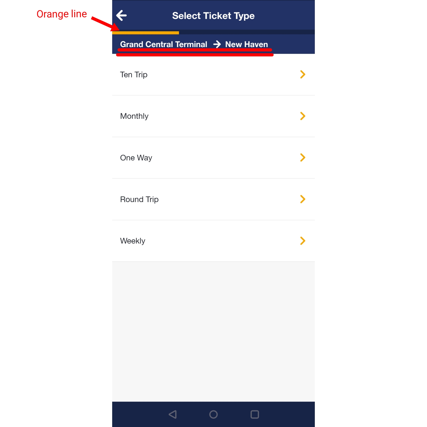
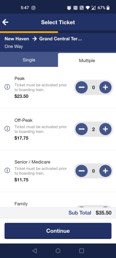
Once the user is finished selecting their destination station, they are directed to the next page to select ticket type (Figure 7). Here we are clearly able to see the Origin station and the destination station as it is white color in contrast to the dark blue background. The provides good discoverability to the user and makes sure there is no slip ups.
In addition, we see an orange line right below the heading. The length of the line increases with every step the user takes and hence shows the users how many more steps need to be completed on the app.
Drawbacks
However, it is unclear as to exactly how many steps must be completed.
Suggestions
Instead of just making the line increase in length, numbers could be added. This way the user knows exactly how many steps are left.
(Figure 8) 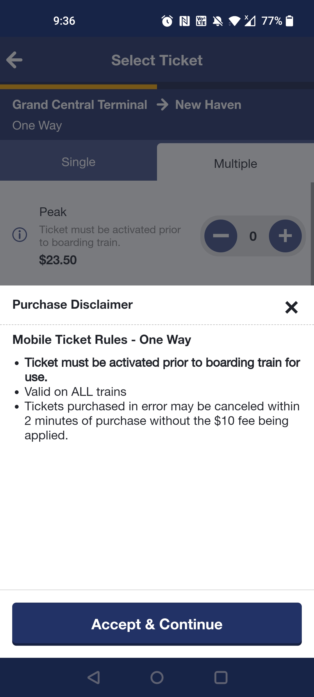
(figure 9) 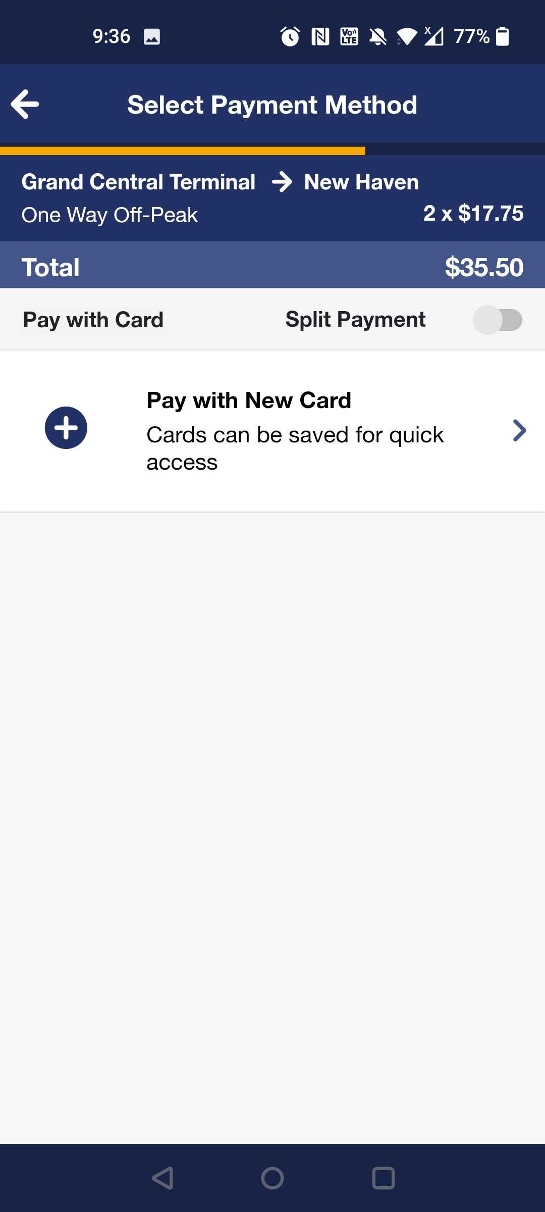
(Figure 10)
- In Figure 8 on clicking on the ‘+’ or ‘-‘ button the user receives feedback where the number either increases or decreases.
- Once continue is pressed (Figure 9), a pop up presents itself giving the user a few rules about how to use the ticket. The user can only go to the next page by clicking the Accept & Continue. If the close or the ‘X’ button is pressed the feedback would be to go back to the previous page.
Drawback
Although the first rule in the popup is in bold, many of the users, including myself made a mistake with it. This is because the statement itself is unclear.
Suggestion
The statement must be made clear to the user that the ticket must be activated only immediately once the user boards the train and not anytime prior.
The next page (Figure 10) goes directly to the payment option.
Drawback
This is a confusing step as the user is not shown the timings of the train. In order to find the timing, the user must go all the way back to the first page. By doing this, all the information that was put in by the user gets lost. This is a poor design. Moreover, once the ‘Train Timings’ button is pressed, the user is directed to the Play Store to download a separate app for only timings. This is extremely frustrating.
Suggestions
- I would suggest adding the train timings as a page before the user can book the tickets. This way they know exactly what the timings are before paying.
Conclusion
There is definitely scope for improvement in the Usability front of the app. The order of the pages is confusing and can frustrate the users causing them to give up on using the app. The whole app lacks a proper mapping system which definitely can be improved