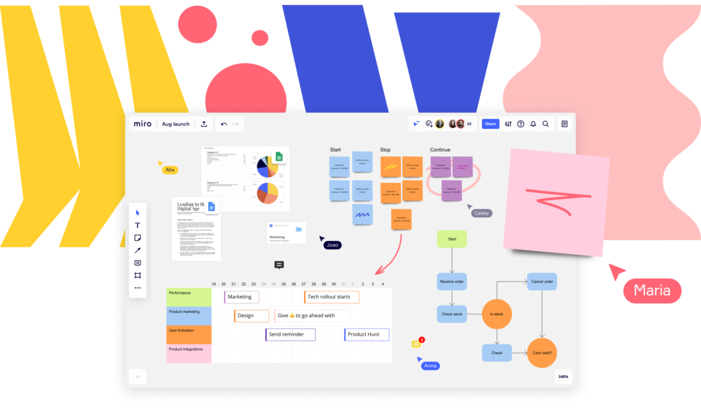
Miro is an online white-boarding tool that can be launched by signing up on the tool’s website. It is widely used to brainstorm ideas, take notes and visualize concepts in groups (Image source).
Signing Up
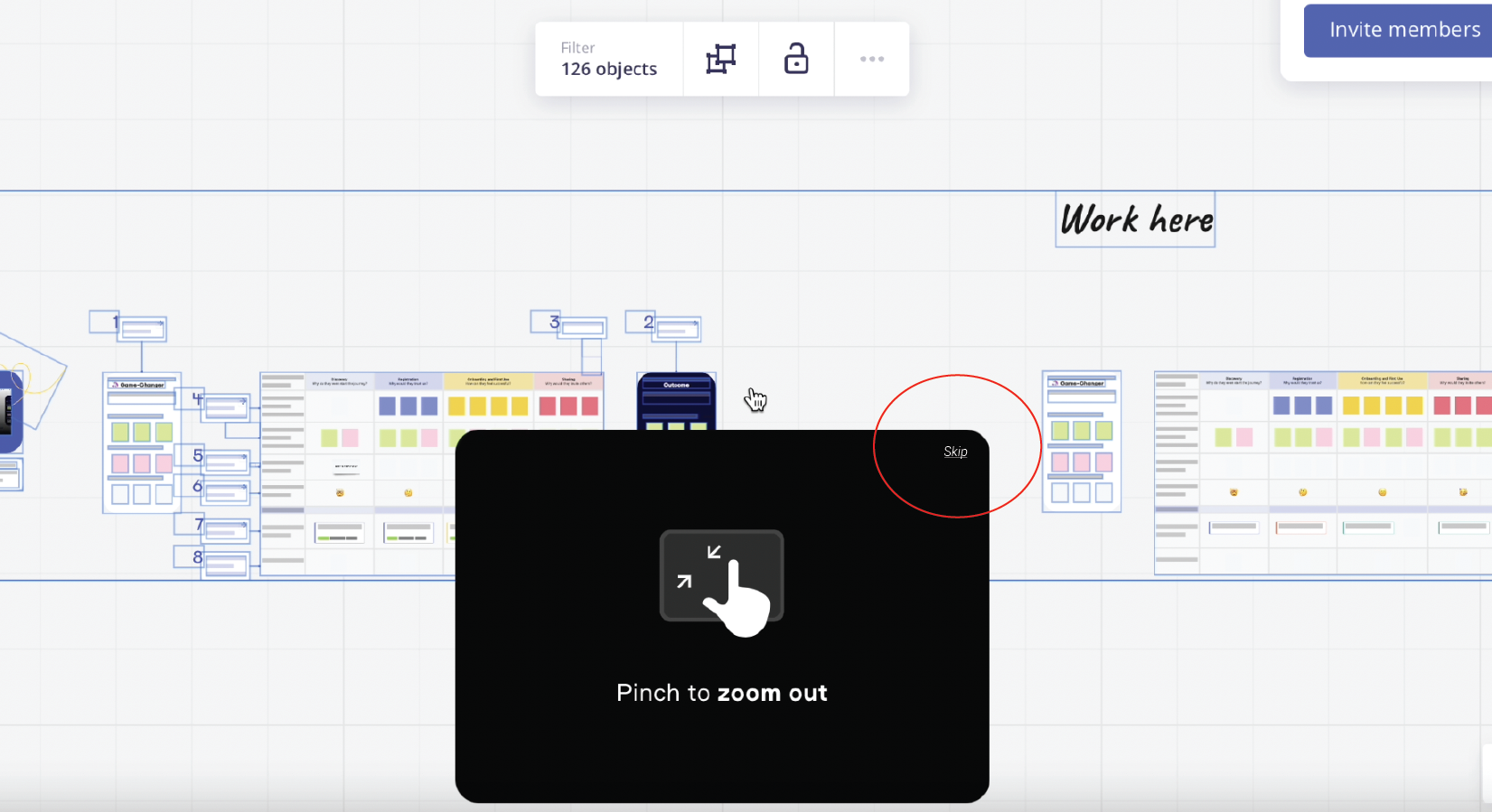
The tool follows a conventional format of the signing up process (refer video A). Thereby making good use of the sub-concept declarative knowledge, as explained under knowledge of the world. Using standard affordances and signifiers, the tool appears to have an easy-to-follow sign up process.
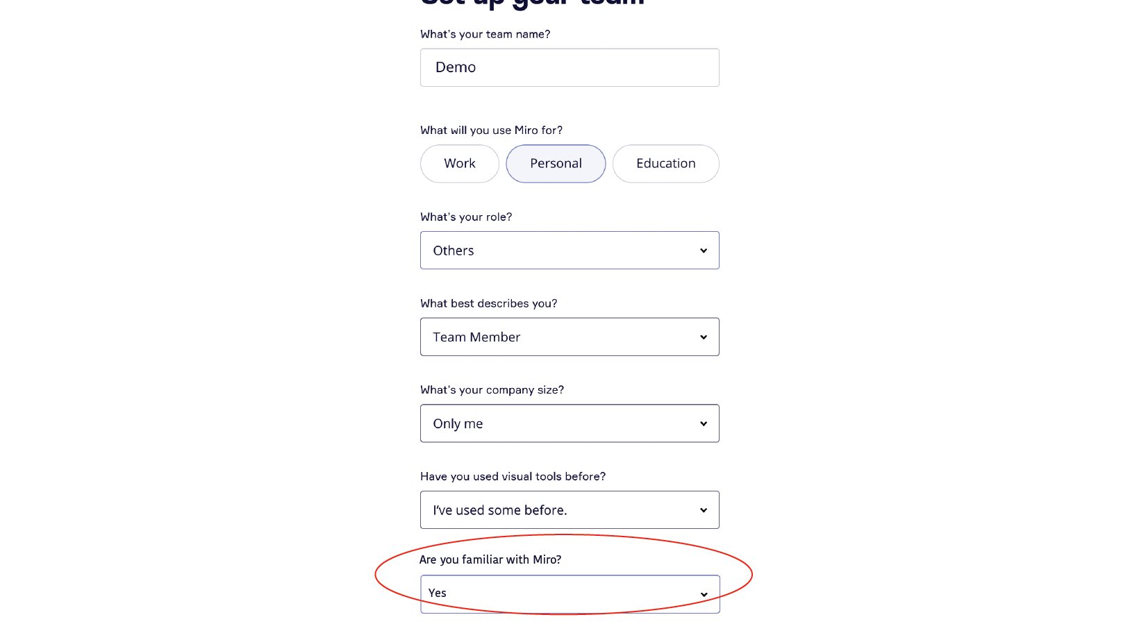
However, the step where users are asked to set up their team, the question “what’s your company size?” (0:14 in video A), can lead to knowledge-based mistakes in responses. For example, if a user wishes to use Miro for personal purposes, the question can be confused for “how many team members will be accessing boards on Miro?”. One solution to this can be to rephrase the question to – “if you’re a part of an organization/company, what’s their size?” Along with providing a “NA” or “not part of any organization” as an answer option.
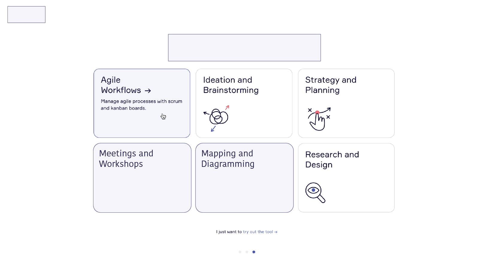
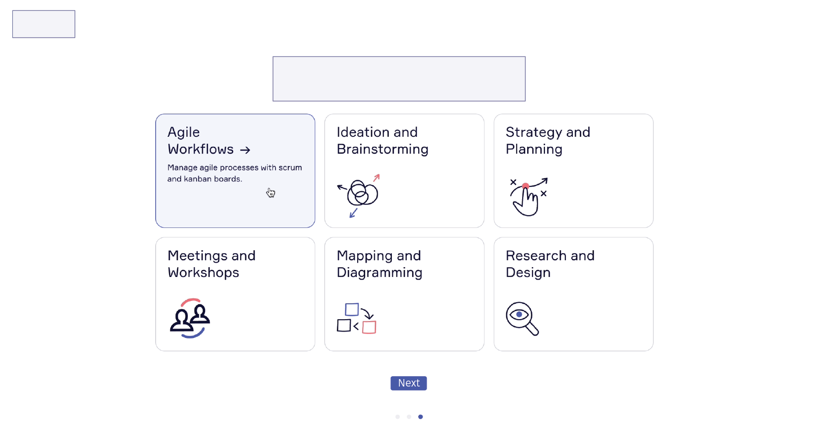
Further, the step to add what users want to do on Miro (0:29 in video A), can lead to slips because of knowledge in the head, wherein users can expect a multiple choice option in case they want to select more than one purpose, in contrast to the existing select-one-answer style. The following two design recommendations (Recommendation 1A & 1B) can avoid slips by making the user aware of the number of options they can choose.
Post Signing Up
After signing up, a user is directed to the Miro board and is given the option to first select a template to work with. In this stage, Miro takes great steps to ensure users have a smooth experience when they face the two gulfs of using the tool the first time – the gulf of execution and the gulf of evaluation, by embedding one-time navigation guides and a tutorial within the board. As seen in videos B and C, the guides that appear on the board explain some of the affordances, signifiers and constraints to the user. For example starting 0:42 in video B, text information are the affordances explaining the possibilities of actions, the hand icons act as signifiers and make users aware of the constraints. Moreover, they also provide feedback to acknowledge users correct understanding of what’s possible on the board using messages like “good job” in at 0:52 in the same clip.
Video B: Guides to use the tool
Video C: Tutorial embedded within the tool. Further, a “question icon” is persistently available to all users on the bottom right, which is the link to a learning center.
While the guide and the tutorial are great tools to directly address Norman’s first design principle – discoverability, they can be made optional for knowledgeable users of Miro to ensure having a positive reflective response. As currently, the steps to learn how to use Miro is compulsory even for users who might already be familiar with using the tool but signup using a different email ID. There are two ways to make it optional – adding a “skip” option on the guides or adding the question “are you familiar with Miro?” in the initial sign up process to eliminate this step (Recommendation 2A and 2B).
The Working Board
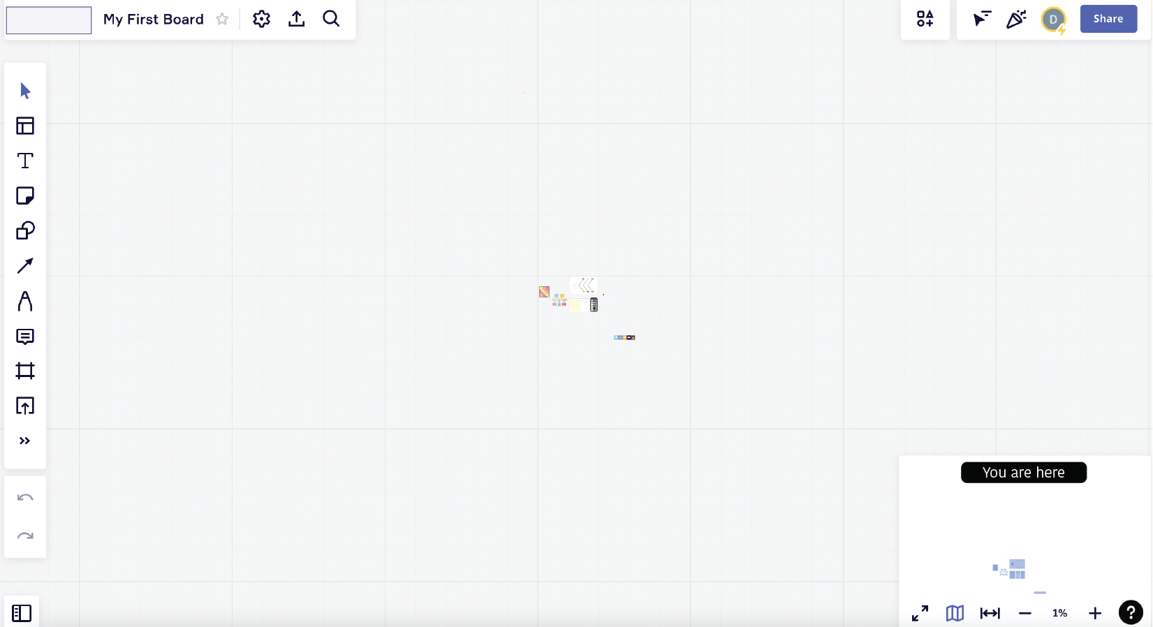
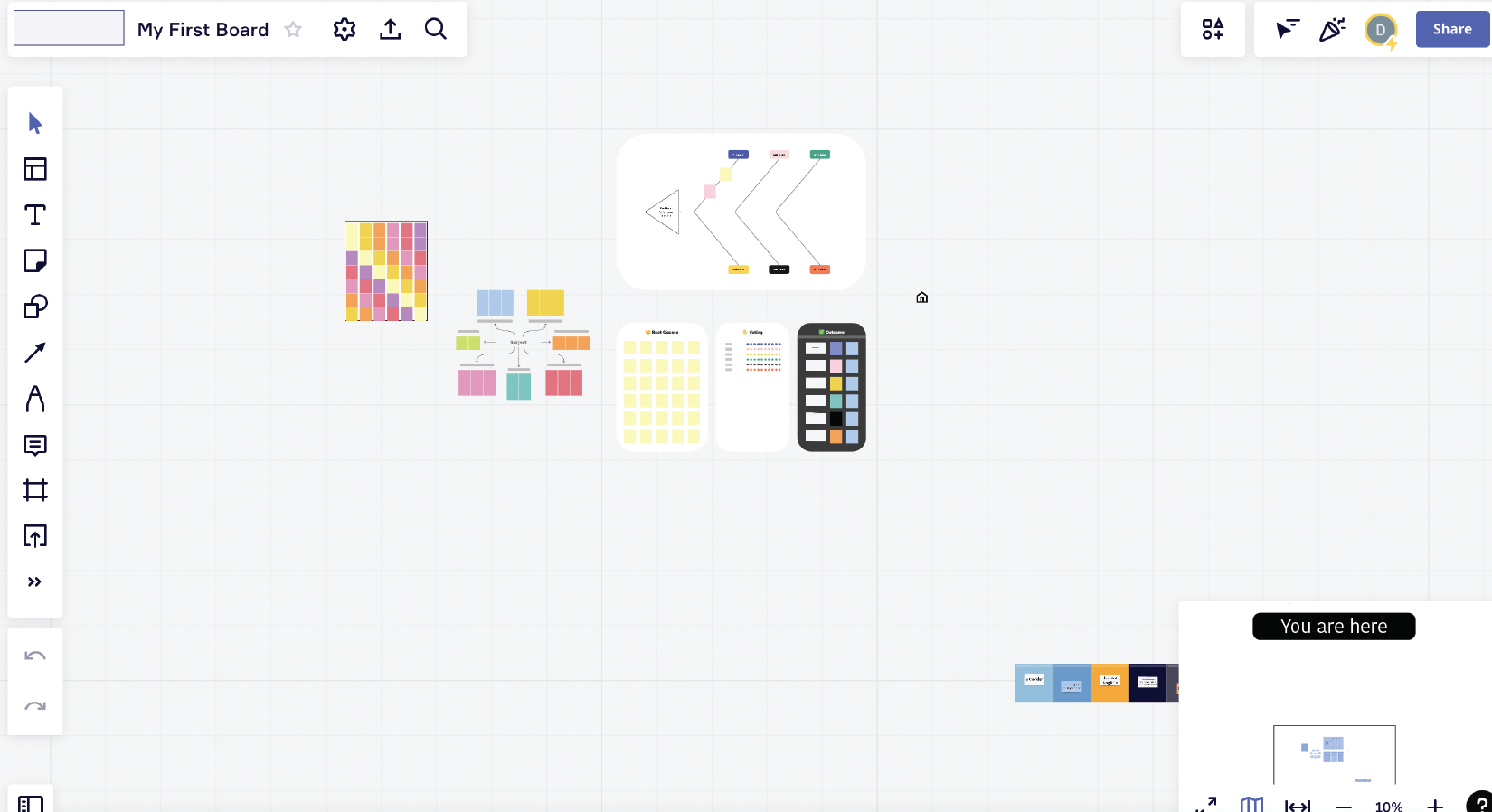
The main board makes use of a number of icons, provides details on hovering and shares continuous feedback, thereby keeping almost every design principle in check as seen in video D. The design of the tool provides ample amount of information needed to create a good conceptual model of the system leading to user understandability and them feeling in control.
I nevertheless believe there are some areas that can be refined further for a better experience. The current design allows users to land on the Miro board following the view they exit. Meaning, if a user exits at 1% view, it brings them back with the same view of the board. This can lead to a compromised discoverability and mapping experience, as users can take a while to understand how to locate their boards (this can be observed in video D from 0:04). A recommendation to address this is to land in such a way that the templates are always centrally aligned on the board and the map indicates their view/location. This will ensure standardized zoom-in and zoom-out actions are used to navigate the board (Recommendation 3A and 3B).
Next, in addition to redo and undo features on the bottom left of the toolbar, a facility to have a view into past activities/edits can be very helpful in tracking and managing content. For example, video D demonstrates difficultly in finding the icon added from 0:56 onwards. A brief view into their activity history can allow users have a positive experience in all three levels of processing – visceral, behavioral and reflective (Recommendation 4A and 4B). It’ll enable them in not getting frustrated, further leading to a positive affective response and expecting the same in the future.
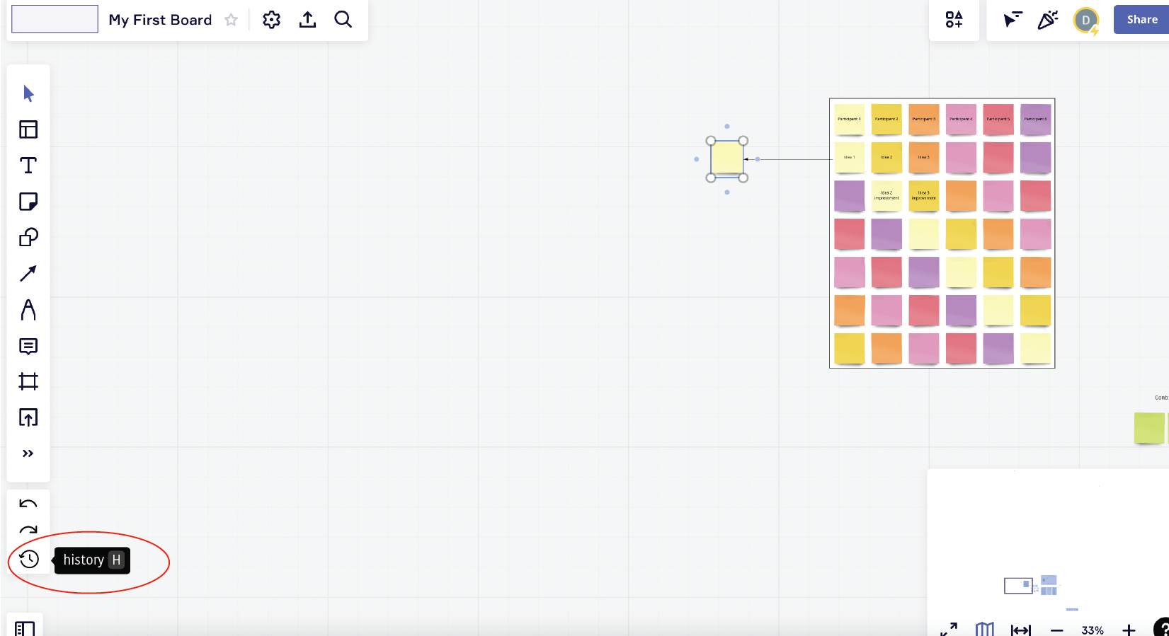
Recommendation 4A: View history button next to redo and undo options (highlighted in the red circle)
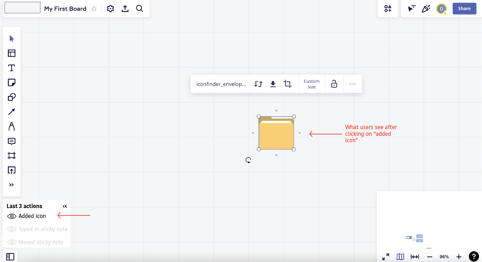
Recommendation 4B: Further clicking on a historic activity takes users to the associated location (follow arrows in red)
Conclusion
To conclude, Miro in my opinion is an extremely well designed tool that focuses on providing a good user experience. Despite having room for improvement, it can be said it is easy for a user to learn using Miro and get comfortable with its features.