The New York Times is an American daily newspaper based in New York City with a worldwide readership and founded in 1851. Frankly, I don’t read the news every day, but after a pandemic hits, I try to read the news quite often to distinguish reliable pandemic information. So, I downloaded the New York Times app to read pandemic and business news during lunchtime or break. Overall the app is well-designed, but there’s room for improvement on the usability front in some areas. This post overviews the interface and usability of the iOS application using Don Norman’s principles.
Initial page
New users would like to browse the newsfeed and some features of the NYT app when they first open the app. But, they will immediately find constraints (Figure1) that they couldn’t access any content without being a member of NYT. It may give new users the wrong/ forceful impression to join the app. In order to solve constraints, before getting on the homepage, there should be a sign-in page after onboarding page which educates the users about the functions and benefits of being a member.
Login page
The application has a generic log-in and joins process. Continue with Google/Facebook/Apple (Figure2) lets new users enter the app effortlessly, and it makes use of the concept of knowledge in the world. Logos of Facebook/GoogleApple act as signifiers that immediately inform new users to join.
Newsfeed
Once logged in, the user will scroll through the news feed to see the latest timeline and specific news section. However, a large amount of text content and inconsistent typeface are hard to read through. Thus it lacks discoverability(Figure3).To resolve the lack of discoverability, all the typefaces in the app should be consistent, and each news should be detached to discern the information. Instead of the line, a big margin would help to separate each news. When users tap a specific article, they can save and export it to the exterior. Save, and export iconographies act as good signifiers. The bottom navigation bar appears and disappears dynamically upon scoring (Figure4), making it discoverable.
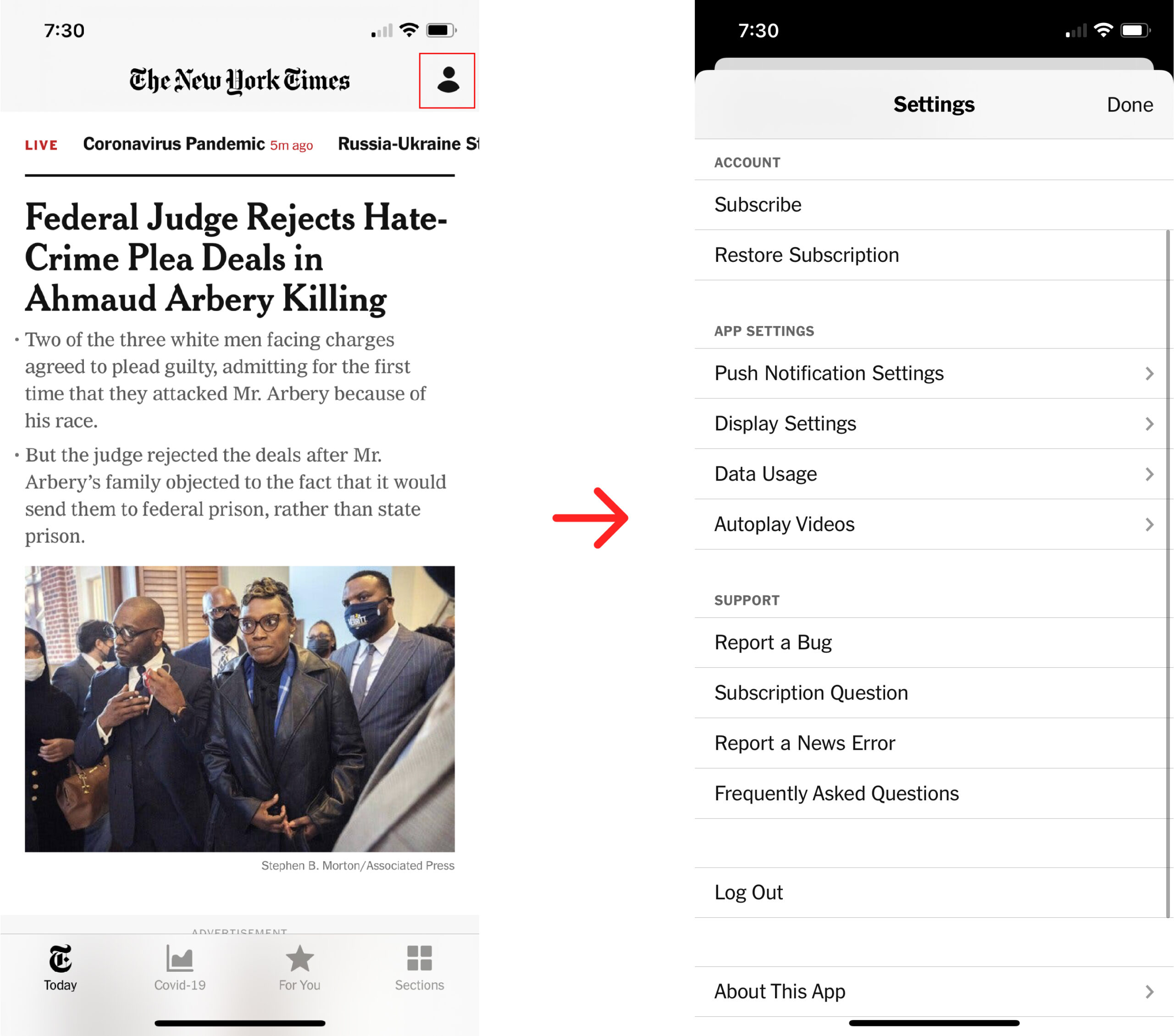
Mypage
User iconography in the right top corner act clear signifier and is also easily discoverable. (Figure5)However, there is no personal data nor reading history. Users would expect their reading lists or reading history to be in the “my page” section. It lacks a mapping system In the My page, membership, and payment information, something personal data should be in.
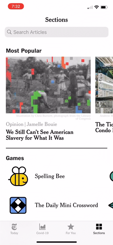
News category
when users want to read a specific variety of news, they would look for the category section. However, they have to scroll very down to see the news category, and it isn’t alphabetical order, so it’s hard to discover. The arrow icons next to categories signify that there’s another page when you click on it. To resolve this, the category should move up and be in alphabetical order for discoverability. Or users can choose news category they are interested in at the initial on-boarding page; that way, they can browse what they want to read on the newsfeed page.
Conclusion
NewYorkTimes app is a well-made application overall, but there’s room for improvement on the usability front in some areas. Web fonts are critical for the online user experience. The inconsistent typeface and font size disrupt user experience overall. NYT app may take into account detailed interface design for improvement.