Notion is an app that provides an all-in-one workspace for teams as well as individuals. This tool eliminates the struggle to juggle between different programs and tabs by providing an all-inclusive platform, it contains documents, notes, tasks, databases and more aiming to help the user manage workload efficiently.
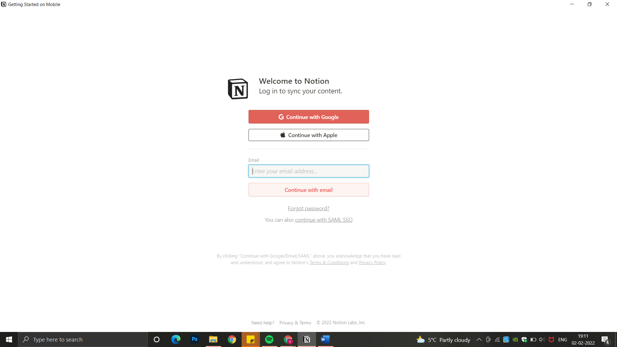
WELCOME TO NOTION
After downloading the app onto your computer, the first step is to Sign Up. Even though there are no written instructions about how the user is supposed to Login or Sign Up based on the Concept of Knowledge in the Head, the user intuitively can complete the task.
Notion amalgamates the traditional conceptual models of notes, documents, spreadsheets and databases, and transforms them into a skeuomorphic experience by creating a combined digital version of them.
GETTING STARTED
The first document provides tutorials and basic instructions about how to use the app. Some of the text in the instructions is highlighted signifying false affordances because as per a user’s mental model the highlighted text is normally clickable which is not the case here. Hover interactions are creatively used throughout the app. Once the user hovers over every line, the icons appear with a signifier mainly in form of a text that instructs the user the affordance of that icon.
NAVIGATION
A vertical sidebar effectively mapped on the left comprises of all the basic functions needed and provides easy access to the folders. The various functions are naturally mapped in the sidebar into three distinct sections that align with the user’s conceptual model. Notion encourages users to associate an icon or emoji with each project which enables good discoverability because every object would have its unique icon. Icons reinforced with the project title is an excellent signifier as it gets stored in the visceral system as long-term memory. Whenever a project is selected, the project name gets highlighted and the selected project is opened on the screen. This feedback affirms the users’ have bridged the gulf of evaluation, and that the desired goal is achieved.

instant feedback when the user hovers 
project name gets highlighted when selected 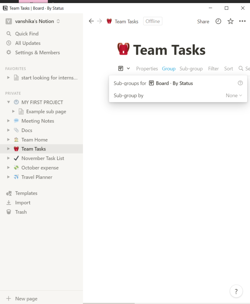
sub-group is selected but as the group text it gives a wrong feedback
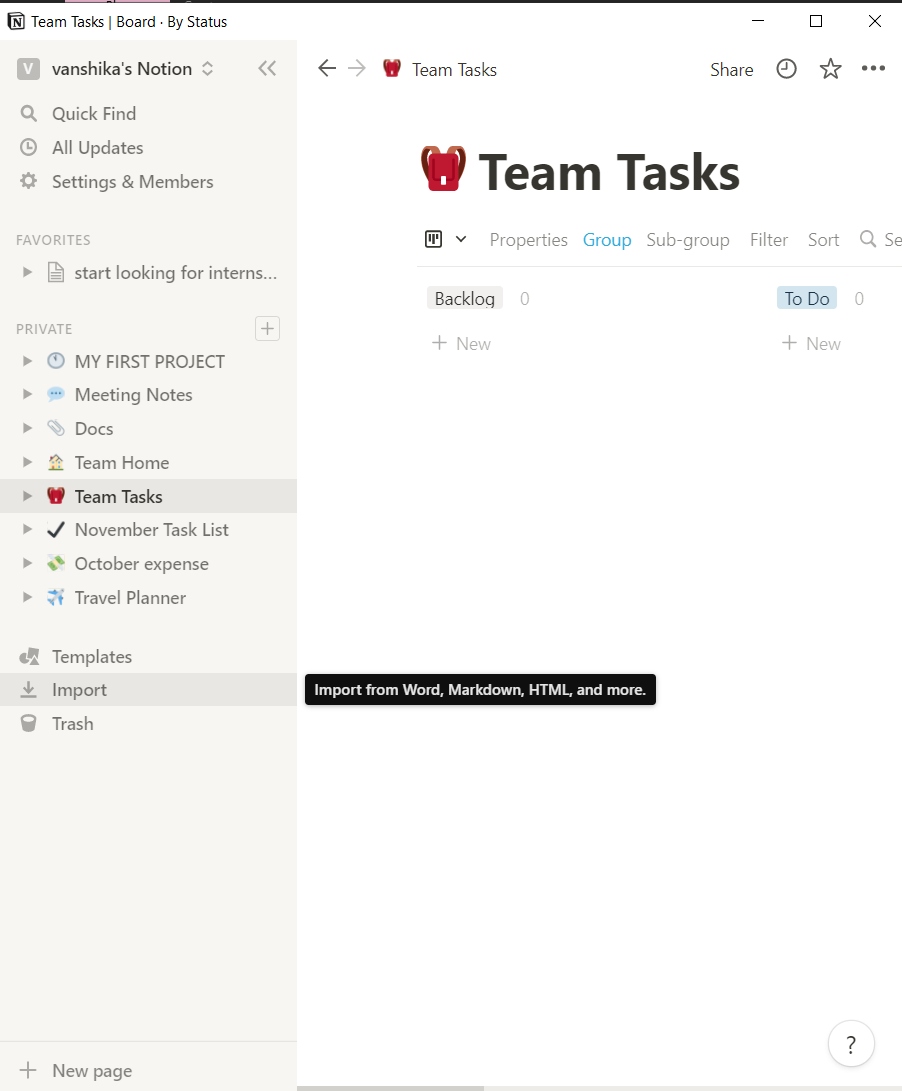
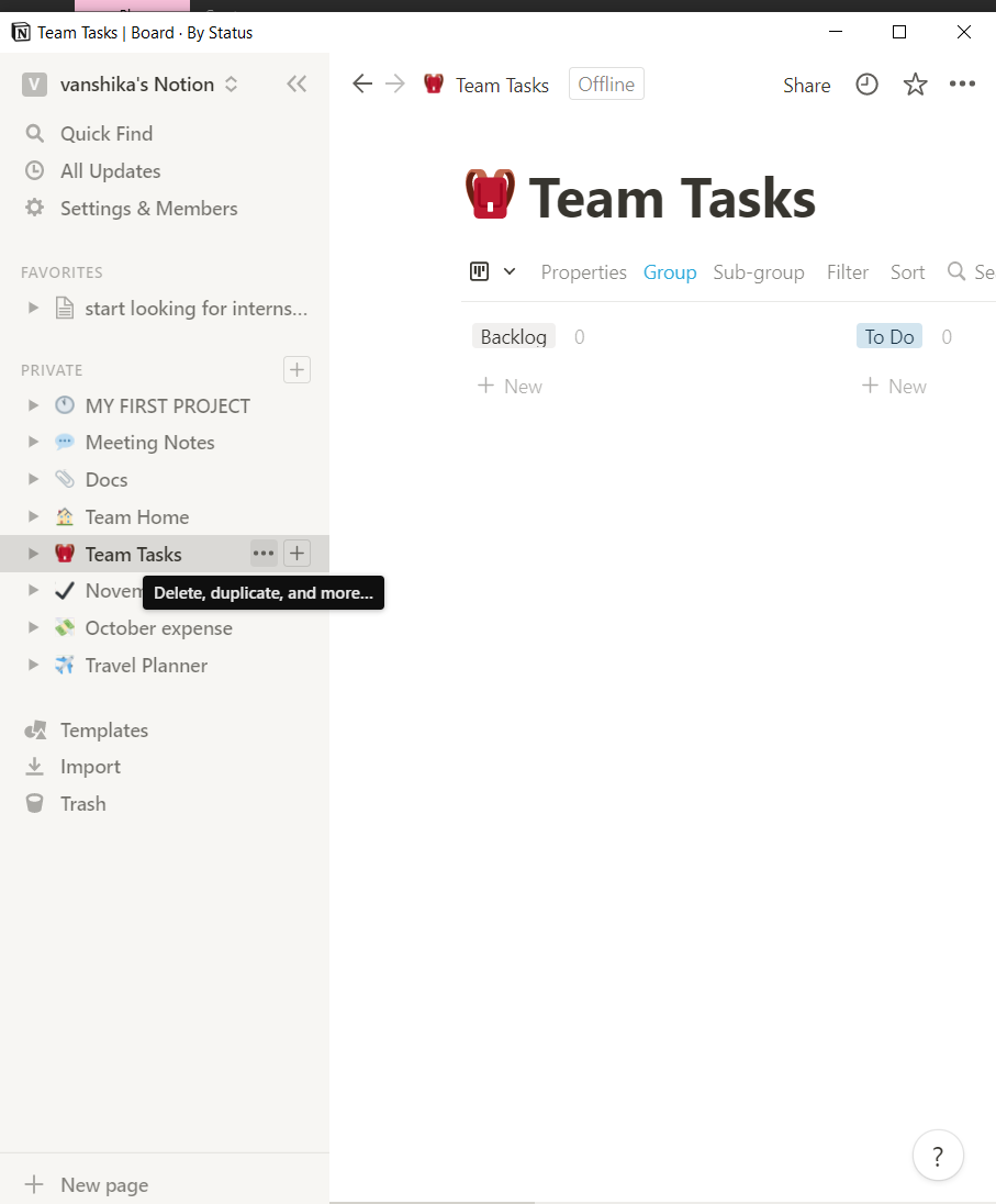

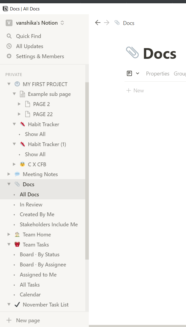
However, Notion allows large complex databases to be stored. Its structure starts to resemble to that of a ‘website’. A project can have multiple pages, sub-pages, sub-sub pages inside it too. As the subpages have indentations, the names get cut and multiple chevrons make the interface chaotic. This chaos can result in slips. Each project has its hierarchy displayed at two places- in the sidebar and on the top of the page in the form of breadcrumbs. When the number of subpages increase, the breadcrumbs have a drop-down menu disturbing the user’s system image.
TEMPLATES
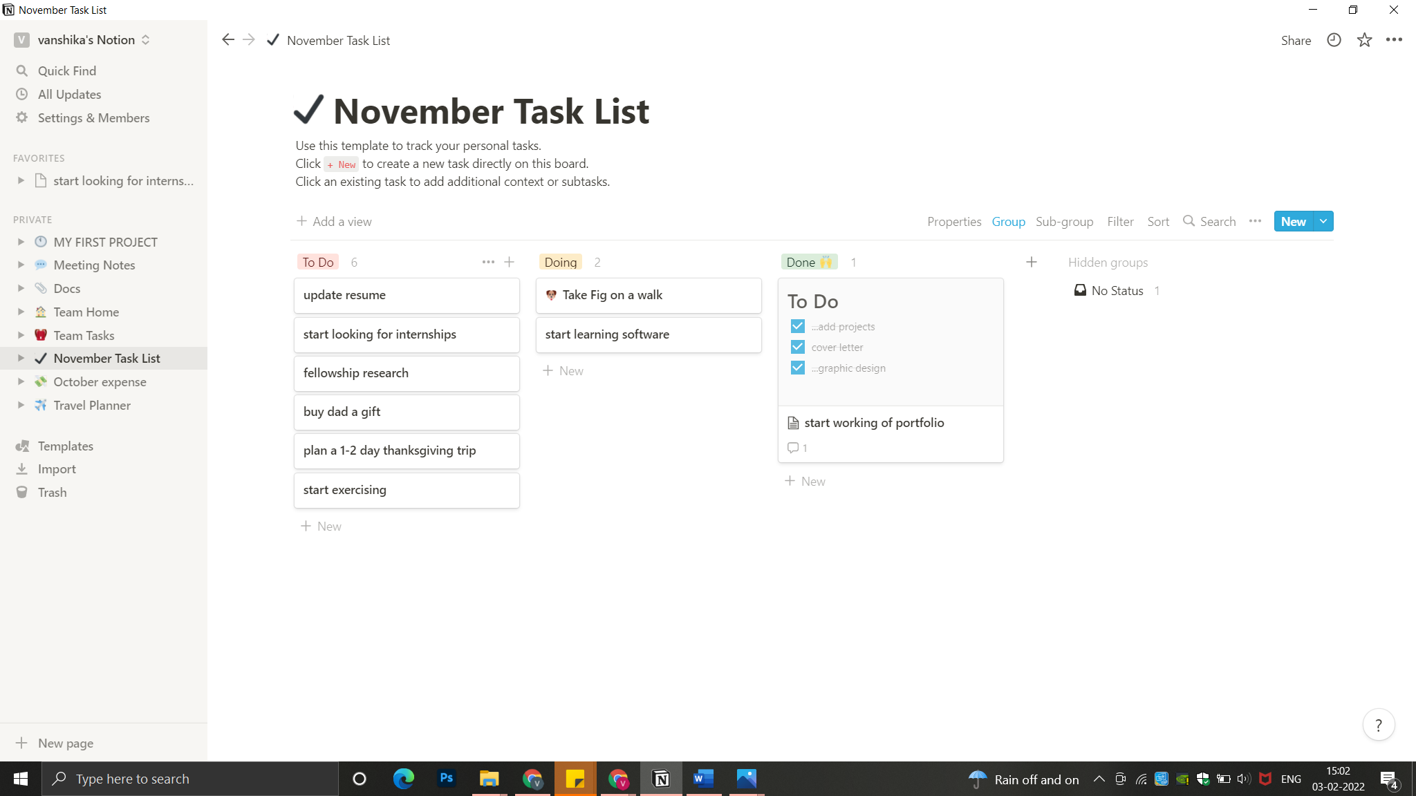
Notion offers a variety of templates to work with. The user can customize each template as per their preferences. The app aims to provide the user with a personalized experience, hence at the end, the user is able to develop a goal-driven mindset.
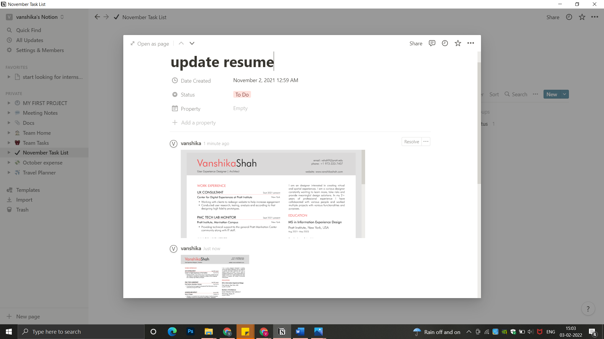
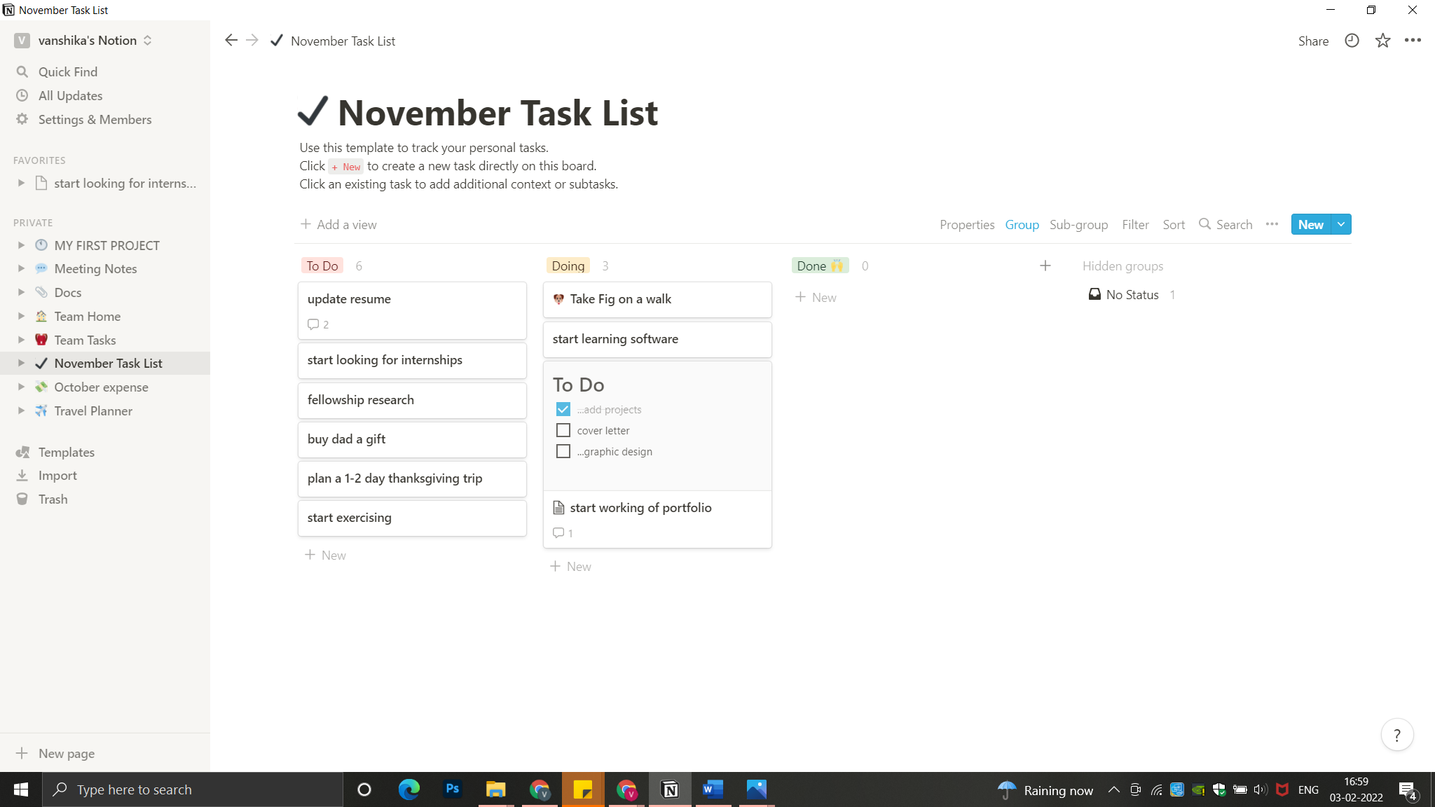
For example: When you start working on a to-do list. The template has three sections (To Do, Doing and Done). ‘To Do’ sections will let the user set goals. The user can plan that task by setting specific dates and embedding files. This helps the user compile all the data required to complete a task in one file. Once the user starts performing the task, it moves to the ‘Doing’ section. This would be perceived as a work in progress, motivating the users to reach its goal. Eventually allowing the user to interpret and compare if what the user has ‘Done’, is what it intended for. That eventually would answer the user’s gulf of evaluation. As it’s all on one page, it makes the action cycle more defined and simpler for the user to manage.
CONCLUSION
Notion is a game-changing app, once learnt correctly it makes organizing work and completing tasks much simpler. However, due to a complex folder system and extensive features that allow customization. It sometimes challenges the user’s mental model making the app’s learning curve slightly steep. The app has a minimalistic design with interesting interactive hovers but it feels like a feature creep making it overwhelming until the user doesn’t get a hang of it.