Opera has built web browsers since 1995, and continues to improve its products to foster compelling web experiences. I recently downloaded the Opera iOS Opera has built web browsers since 1995, and continues to improve its products to foster compelling web experiences. I recently downloaded the Opera iOS app to learn more about Opera’s advances, which won a Red Dot Award for its user interface. Let’s explore Opera’s interface through the lens of Don Norman’s book, The Design of Everyday Things.
Onboarding
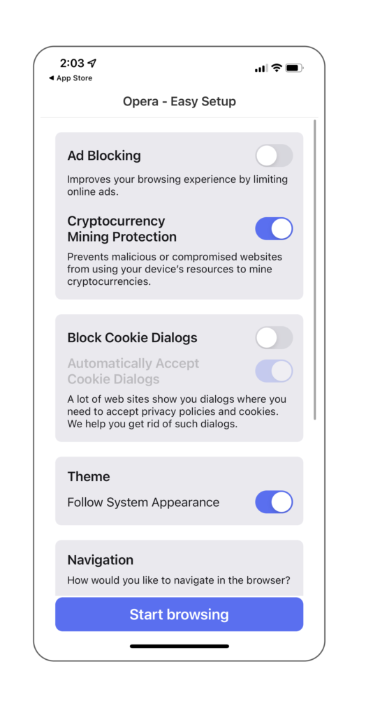
Beginning with the Opera iOS application is simple and informative. Figure 1.2 shows an important setup screen, which explains the affordances offered. By beginning with settings, a conceptual model of this web browser is forming, “leading to understanding and a feeling of control” (Norman 72).
As Opera’s “Easy Setup” communicates, some of the background affordances include ad blocking, cryptocurrency mining protection, and blocking cookie dialogs. These tools can fall under the umbrella of “feedforward” by communicating with the user what to expect when using Opera to browse the web. In essence, this documentation is giving us control over how we’d like to conduct our web presence, helping answer questions of execution (Norman 71).
Many people, myself included, are concerned with privacy and annoyed by pop-ups and advertisements. It is clear that the designers of this application are concerned with people’s real needs, and are fulfilling them (Norman 240).
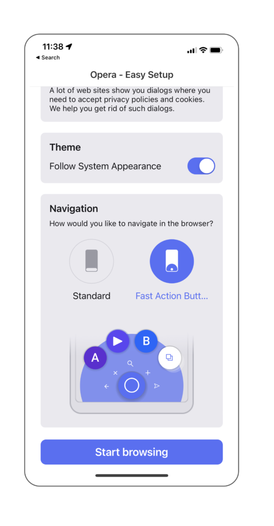
The next step is to choose a navigation method. The “Fast Action Button” is an alternative to legacy browser navigation. For some users, the legacy affordances are sufficient, allowing page back, page forward, view/toggle tabs, return home, and new search.
Then, there are people like me, who want to find better options, even if there is a Gulf of Execution I must overcome. As Norman explains, “we bridge the Gulf of Execution through the use of signifiers, constraints, mappings, and a conceptual model” (40). When selecting the Fast Action Button during onboarding, an animation begins to form my conceptual model of how the affordance will work. The next block of text will further discuss using this tool.
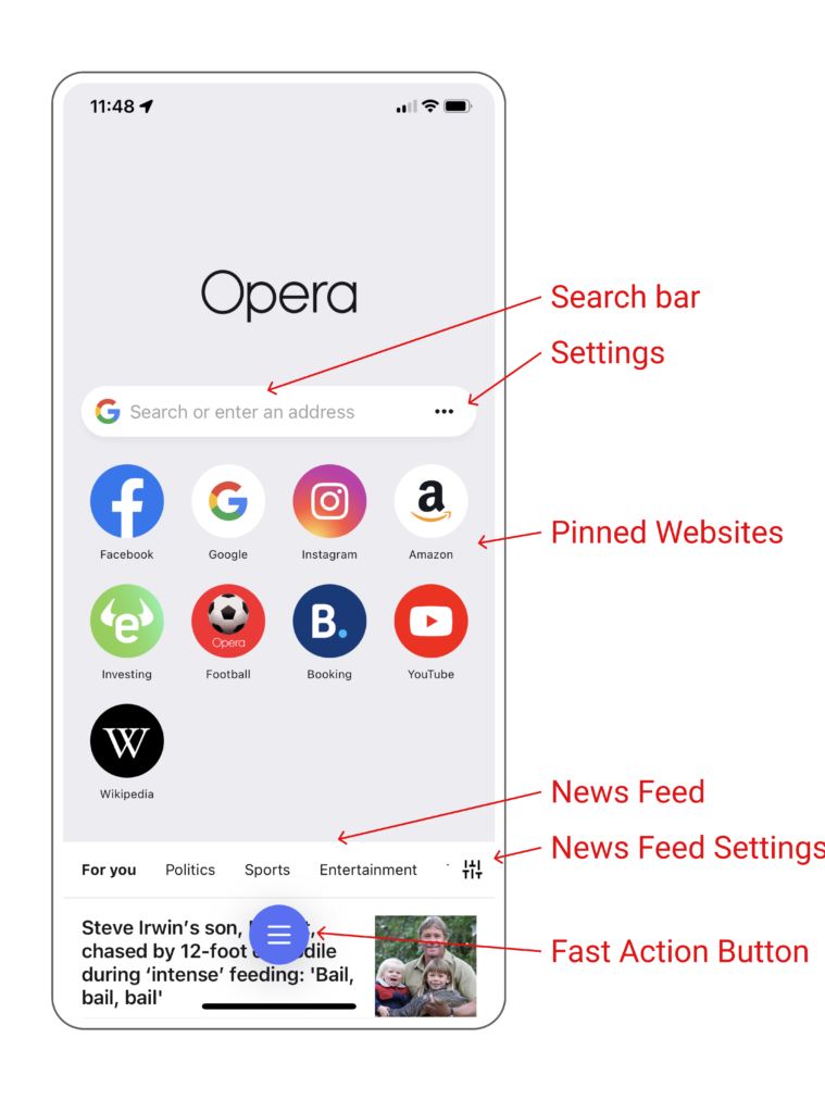
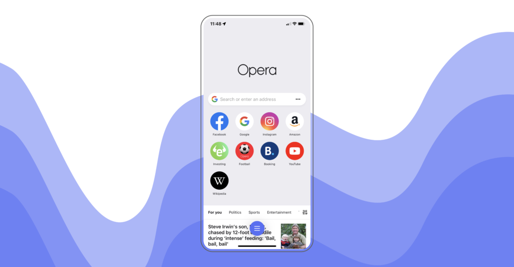
Homepage
The Opera homepage is a simple dashboard. At the top is a Search Bar, the primary affordance of any web browser. This one is perceivable, meaning it follows standard conventions so people know what to expect from the affordance (145). Settings are also included in the search bar, using three dots as a signifier for a menu.
Pinned Websites, and a News Feed. Pinned websites can be edited with a long press, something that is not signified but a learned gesture from using other iOS tools. Norman calls this arbitrary memory and warns against relying upon it (98). The placement of these pinned websites affords efficiency if the users customizes their most visited websites.
The news feed affords quick browsing of trending topics, and updating preferences is signified next to the filters. The designers show a relationship between these affordances through spatial layout, a great example of good mapping (72).
The Fast Action Button will be discussed in the next section.
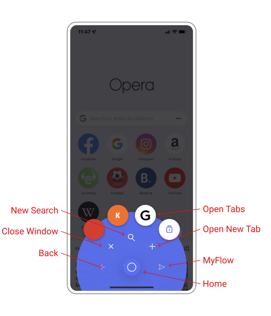
Fast Action Button
This Navigational Affordance uses strong mapping and signifiers to help the user create a conceptual model and thus bridge the Gulf of Execution (40). The mapping of such gestures does not require the user to learn this with rote learning (98), instead fostering continual practice, which over time can automate the action cycle (100). Opera follows Norman’s guidance to “put the knowledge required to operate the technology in the world” (216) by labeling affordances and giving previews on hover.
It should be noted that the placement of this button is at the bottom of the screen, following mobile ergonomic best practices.
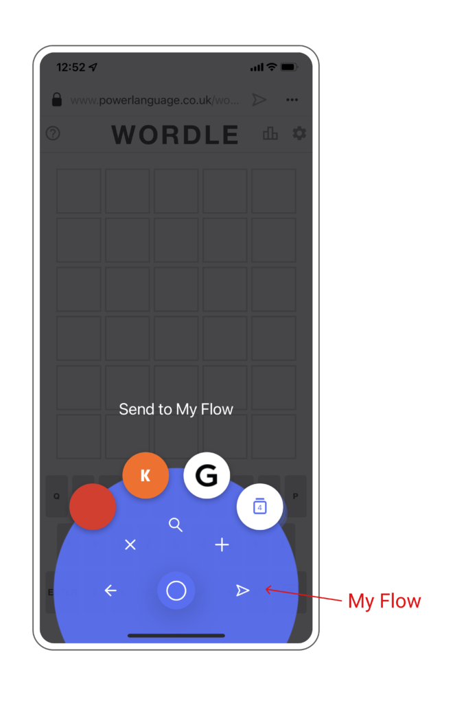
My Flow
To further explore the full functionality of this tool, I decided to try “MyFlow,” an affordance aiming to share webpages between desktop and mobile devices. From time to time, I want to revisit a website in a different browsing session, and perhaps on a different device. Many people, myself included, have workarounds like emailing themself to share information between two devices. Designers and researchers at Opera must have observed this behavior, and “figure[d] out how to … manage the interaction of technology and people” (Norman 239). This interaction between my devices was seamless, but I found that the feedback from initiating this affordance was lacking — I was unsure whether it was successful. Norman says that feedback must be informative (23) but not excessive (25). I would recommend a checkmark if My Flow successful shared a webpage to my desktop Opera app.
As I mentioned earlier, the primary affordance of any web browser is searching. Let’s use the Seven Stages of Action to determine whether Opera can help us achieve our informational goals.
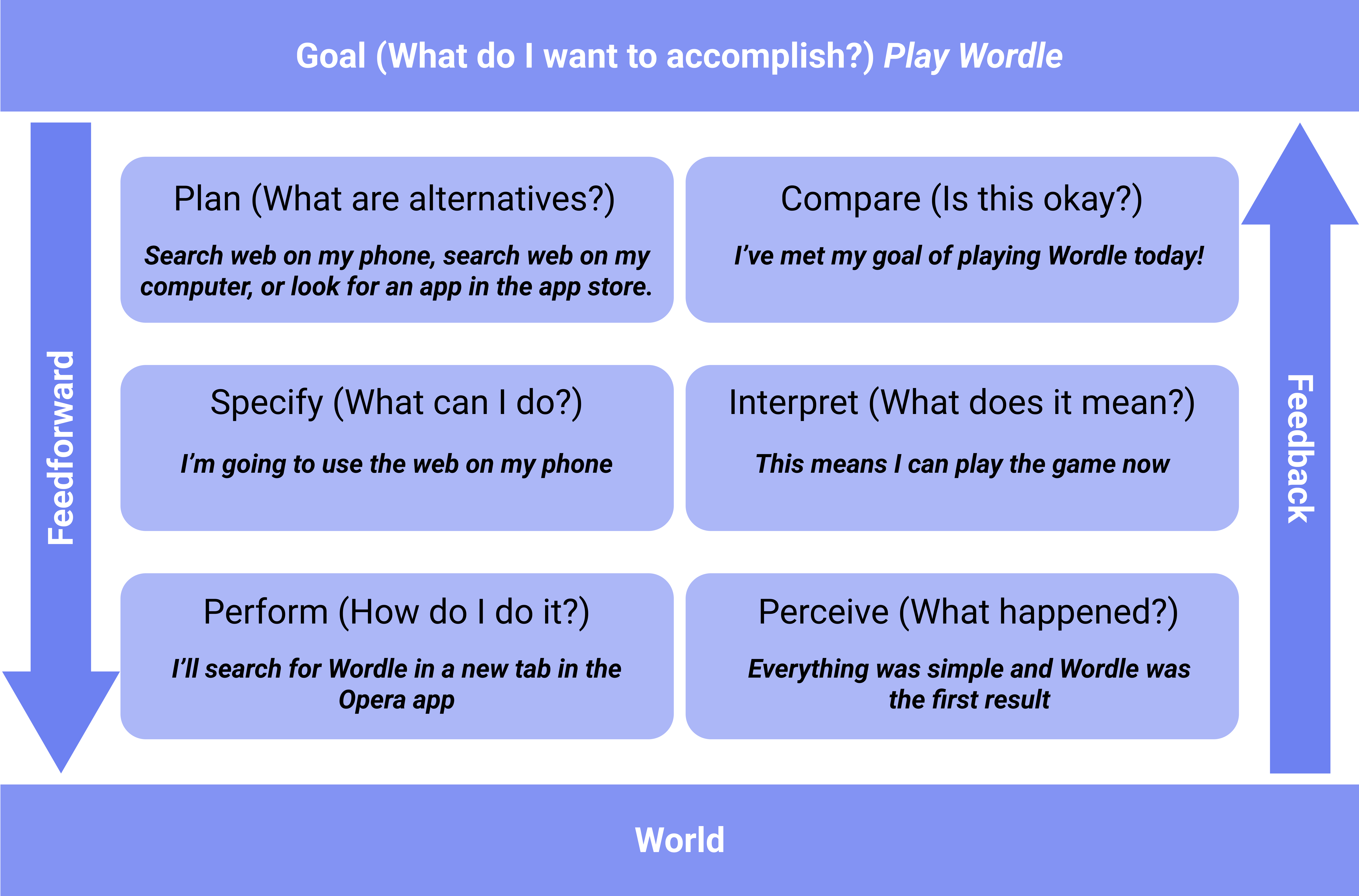
As you can see above, we were able to achieve our goals through Opera’s iOS application. Opera has built web browsers for 27 years and is still not widely known or used. As Norman discusses, even the best ideas can fail, or succeed under a different company, or take decades to succeed. (Norman 274). With growing demand for exceptional mobile web browsing, we will have to wait and see whether Opera can last another 27 years.
Sources:
Norman, D. (2013). The Design of Everyday Things: Revised & Expanded Edition. Basic Books.
Opera web browser: Faster, safer, smarter. Opera. (n.d.). Retrieved February 8, 2022, from https://www.opera.com/