
Peloton is a workout streaming platform that can be accessed by anyone who has a Peloton membership. The classes can be streamed live or saved for later. Classes include running, strength, biking, yoga, and more. The layout of the application is easy to use for a variety of people to interact with smoothly.
Logging In

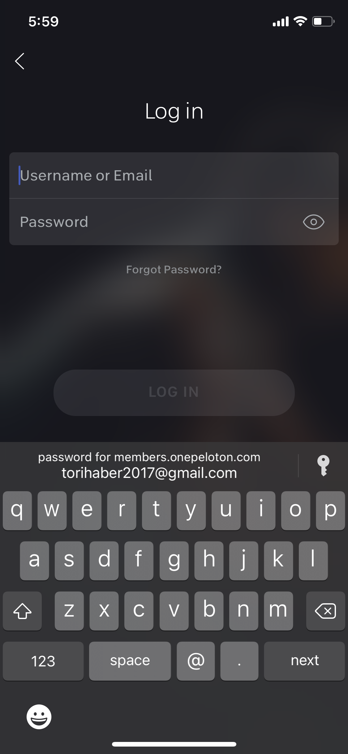
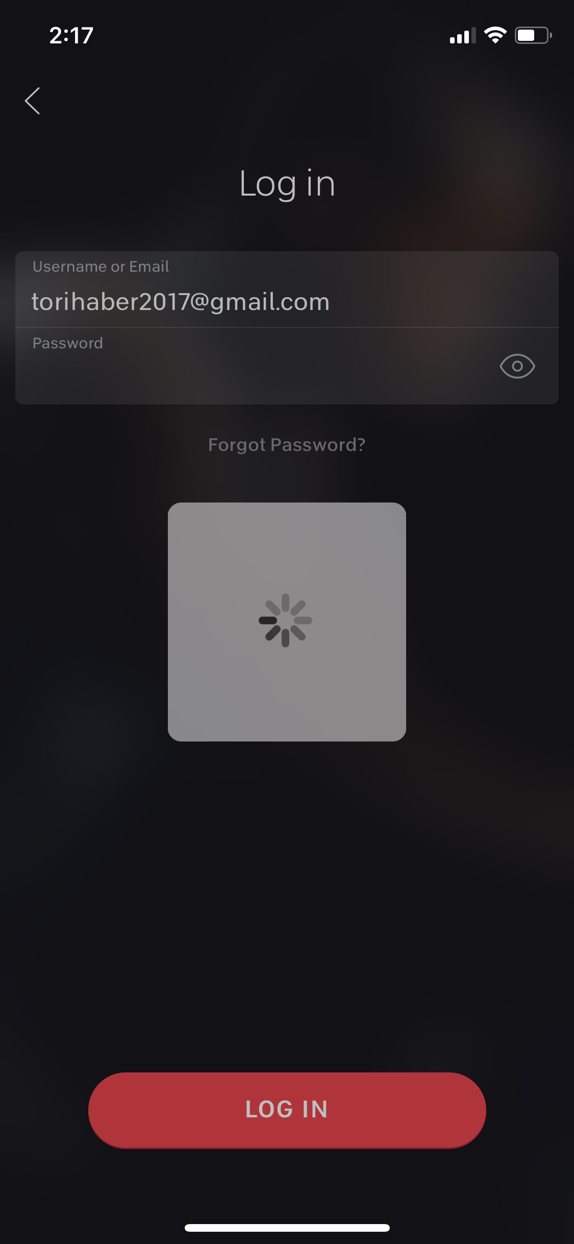
When opening up the Peloton application, a screen appears with a slogan as well as a video of people working out playing in the background. This login page has good communication because it is able to show what actions are possible. Once login is pressed it brings you to another page where you can enter your credentials. Once you press login, there is a gray square box with a loading sign in it giving good feedback to the user that the next page is loading.
The Homepage
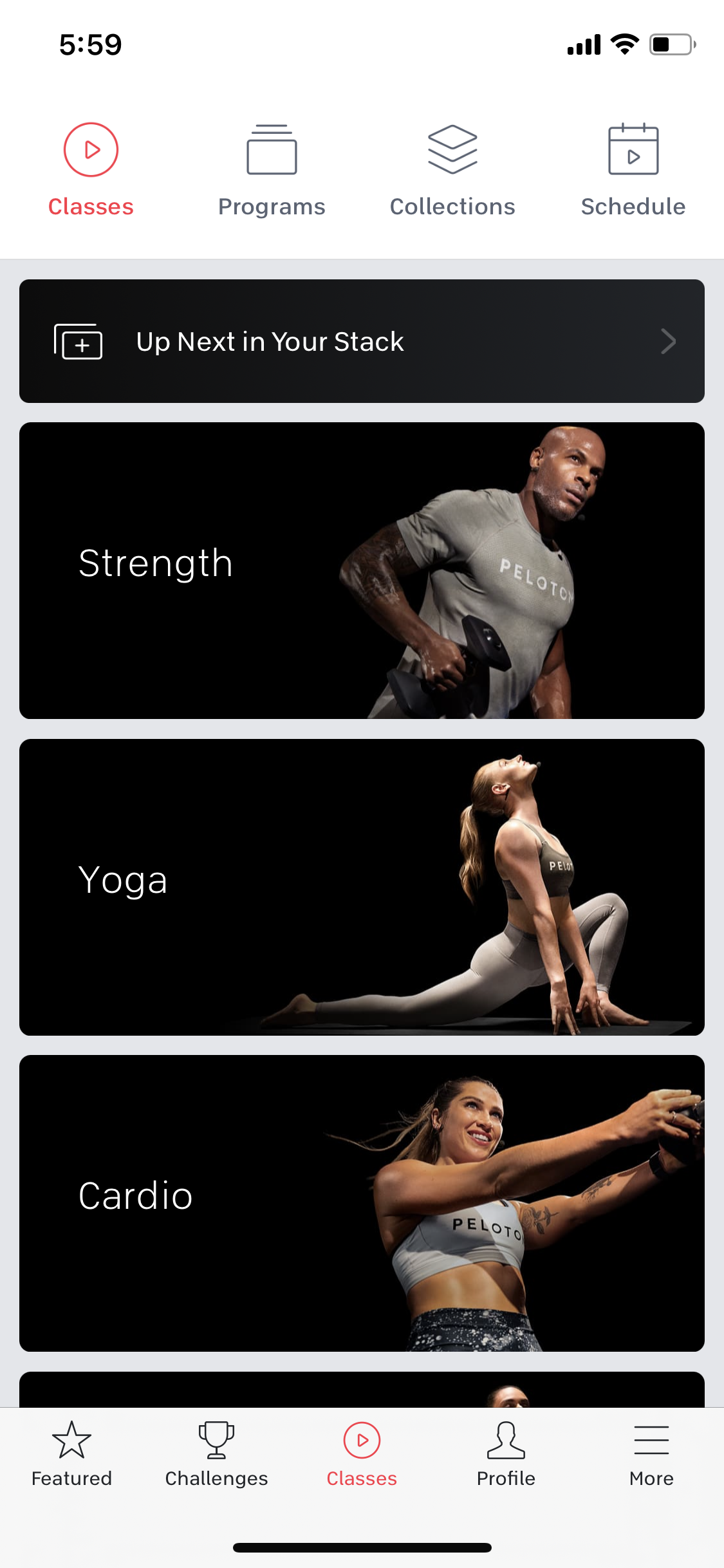
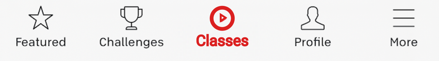
Once logged in, Peloton brings the user to the home page, which is where the user can discover what classes they can take. The boxes are clear and have good discoverability for the user to better understand what actions are possible. It is also labeled clearly with a picture with good contrast which makes it an accessible interface. It is easy to understand what page you are on because of the feedback of the red highlight on the icons. I would recommend bolding the icons as well as making them red so that people who have limited seeing can also easily discover what page they are on.
The Strength Page
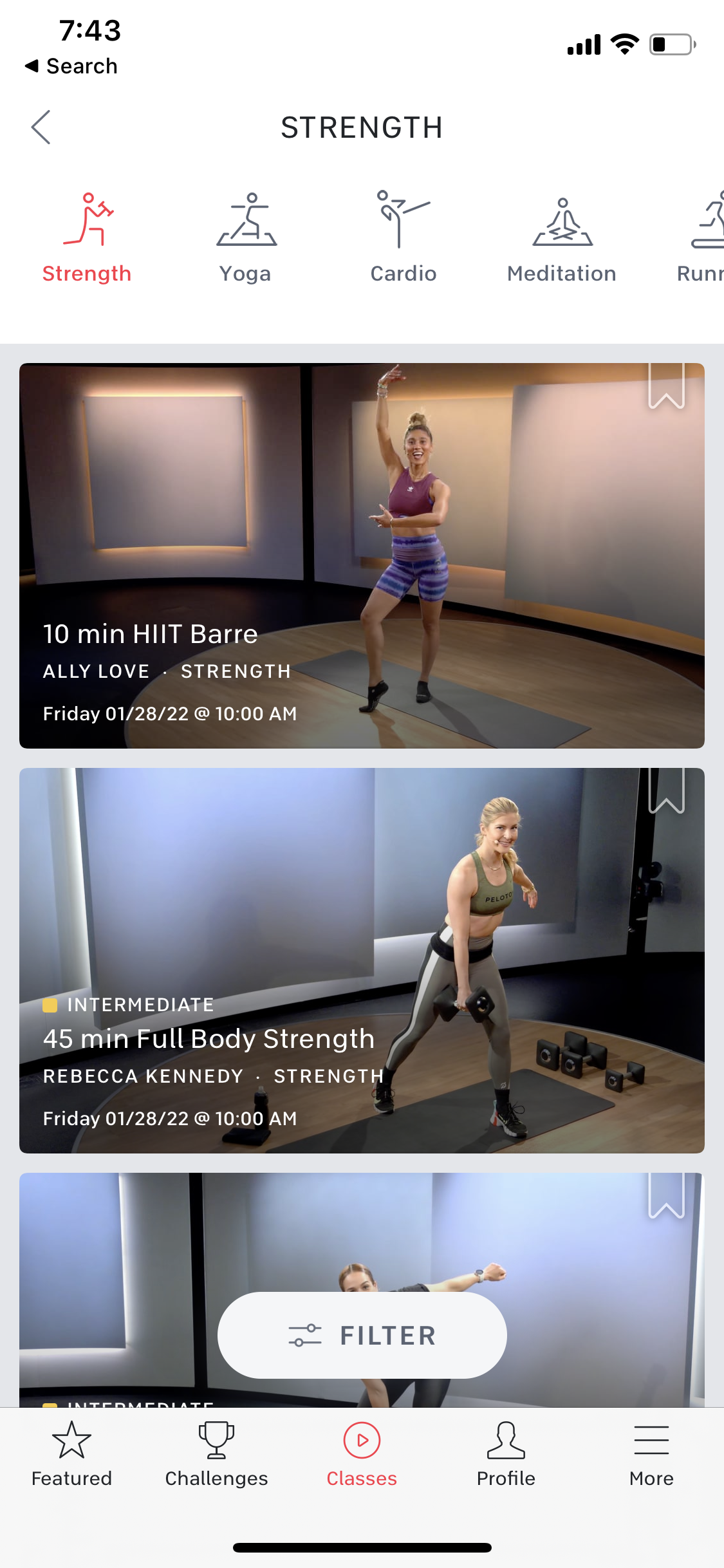
By clicking on the strength category, Peloton brings the user to a page that affords scrolling through different classes that one can take. This page signifies scrolling by cutting off the last class halfway to show you can scroll to see the rest of it. This page affords saving classes by tapping the save button on the upper right-hand corner of each class which provides by filling it in with white. This page also affords customization of the class options for the users which are signified with a large white filter button with an icon.
The Class Details Page
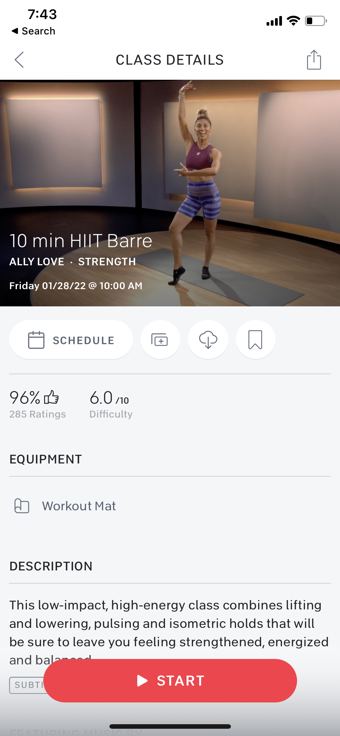
When choosing a class, Peloton’s app brings you to a class details page. The plus icon button affords to add a class to your stack and the save button affords to save a class. I recommend making it clear to the user the difference between adding a class to your stack versus saving a class because the conceptual model of how each of them works remains unclear. The signifying icons reflect knowledge in the world because the icons give a clear understanding of what each one would do. When each icon is tapped there is feedback by either a pop-up displayed on the app or the icon becomes filled in. When the user is ready to start the class, they can press the large start button that affords them to take a workout class and provides clear discoverability of what to do with this page.
Taking A Workout Class
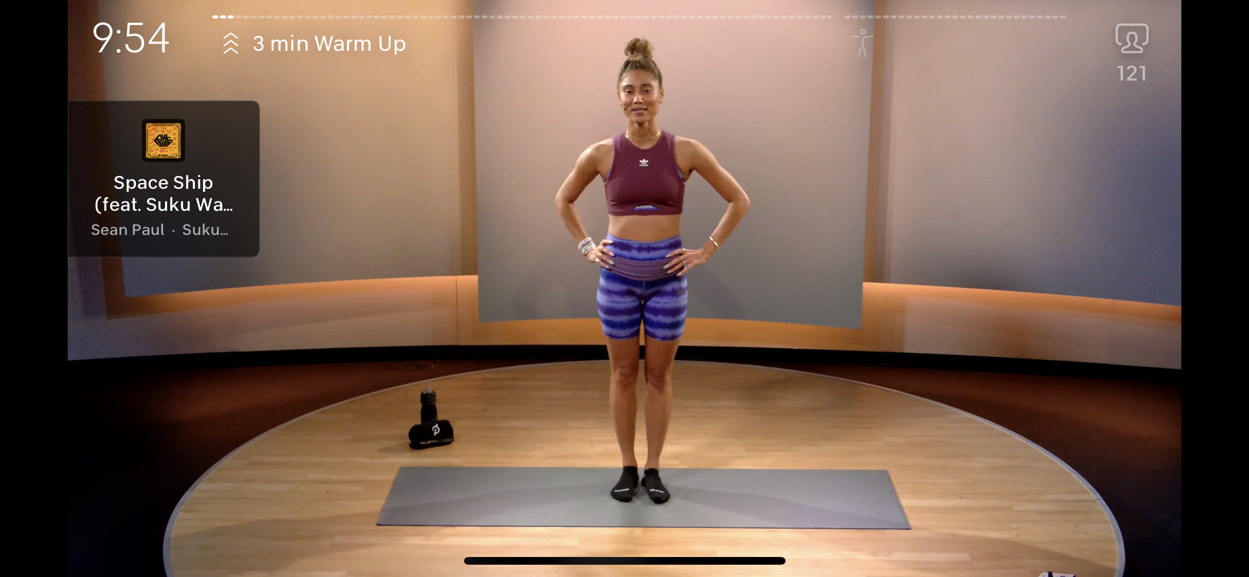
After pressing start on the previous page, a page loads providing feedback by showing a loading gif before the class is loaded and can begin. When the class begins the user sees a bar at the top that acts as feedback of how showing much exercising is left and how much is completed. There is also a timer that shows another visualization of the time left in the class which also acts as feedback. Depending on where the user is from, the bar on the top could be a cultural constraint because of some cultures that read right to left.
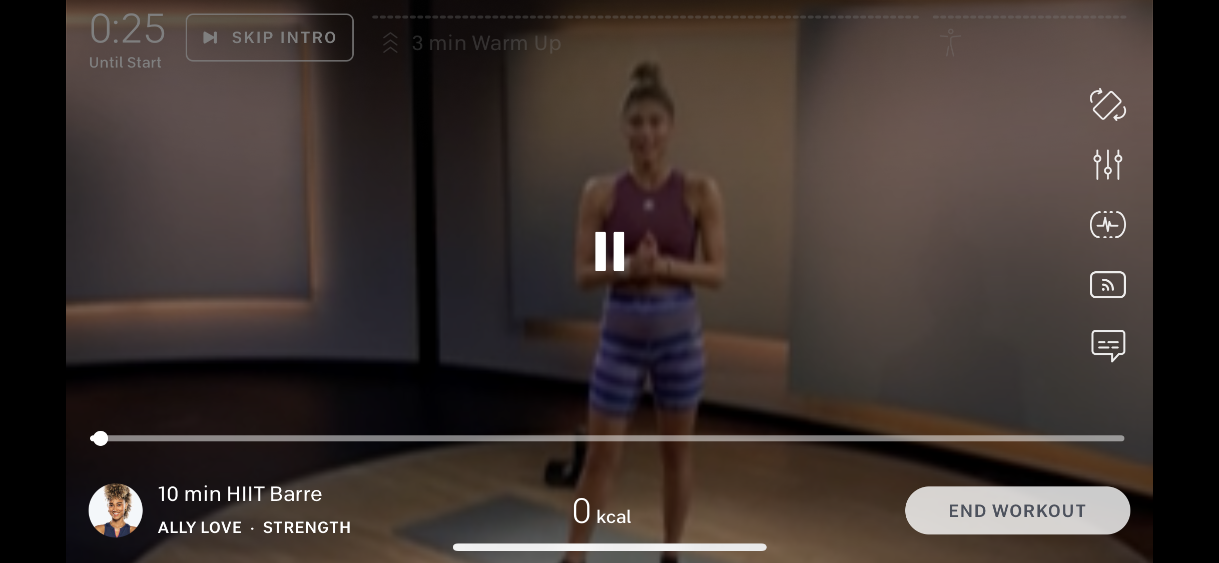
If the user chooses to pause the class they can tap on the screen and a pause icon appears. This is the only option when tapping the screen which is a constraint of not being able to fast forward or rewind easily. This may be because it is a workout class and Peloton does not want the user to accidentally skip through it. The bar at the bottom that appears does afford to skip through the workout by using your finger and moving the timeline around. When tapping the pause button on the screen it provides feedback by the icon turning into a play button and vice versa.
Conclusion
Pelotons iPhone app is fairly easy to use and is visually pleasing. The interface could provide a bit more instruction on what each feature is used for since there are a lot of moving parts within it. There could also be better feedback to tell the user what page they are on especially for users that have a harder time seeing. That being said, the basic actions are well designed and user-friendly.