Pocket Casts is a podcast application designed for discovering, managing, and listening to podcasts. It is available on multiple platforms, but this design critique will focus on the iOS app.
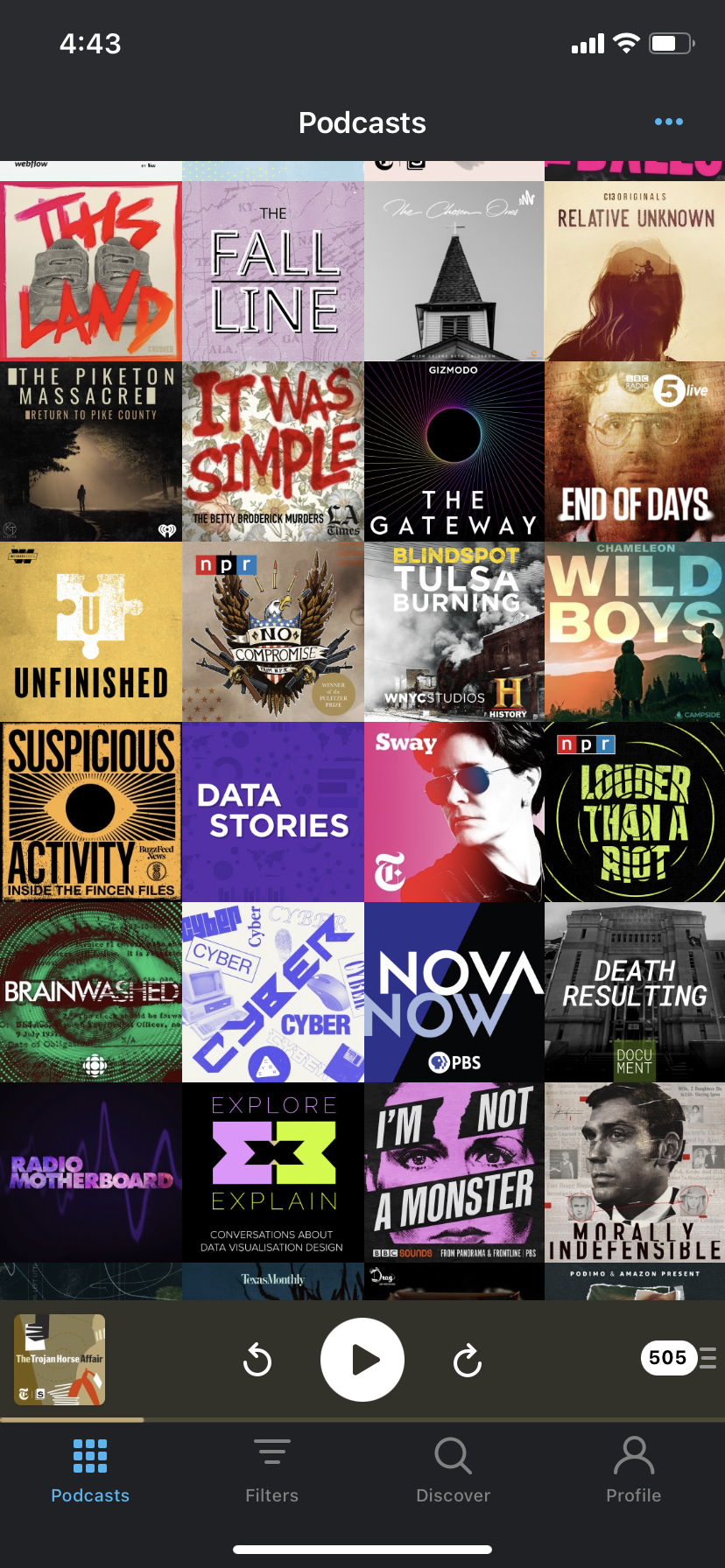
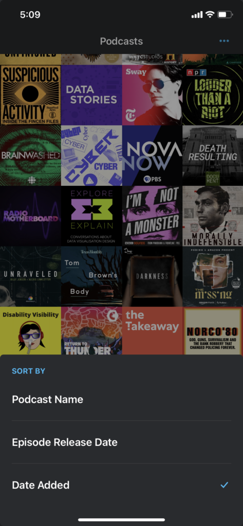
When opening the Pocket Casts app, the default view is of the user’s podcast subscriptions. The 3 dots in the upper right corner provide the user options to customize the view and sort (by name, episode release date, date added). The app provides clear feedback of which current settings are selected by using blue checkmarks.

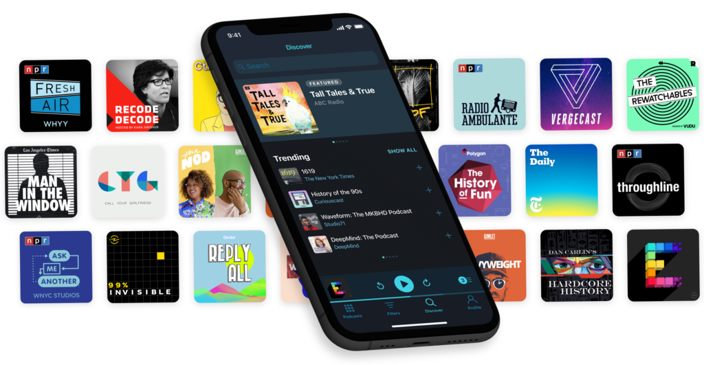
The user can navigate to different features of the app using the tabs at the bottom. The icons and labels provide clear signifiers of what options are available. In particular, the Discover tab uses the word ‘discover’ and a magnifying glass to signify that the user can both browse and search for podcast content when they select this option.
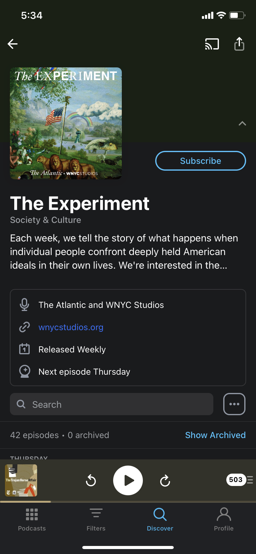

When a user navigates to a podcast’s page, from the Discover tab or anywhere else in the app, they will see a list of podcast episodes and various ways to interact with the podcast. There are 2 separate views for subscribers and non-subscribers. The non-subscriber view prominently displays a subscribe button. This button is transparent and this affords selecting it to subscribe to the podcast, with the expectation that it will become opaque with color when one does touch the button.
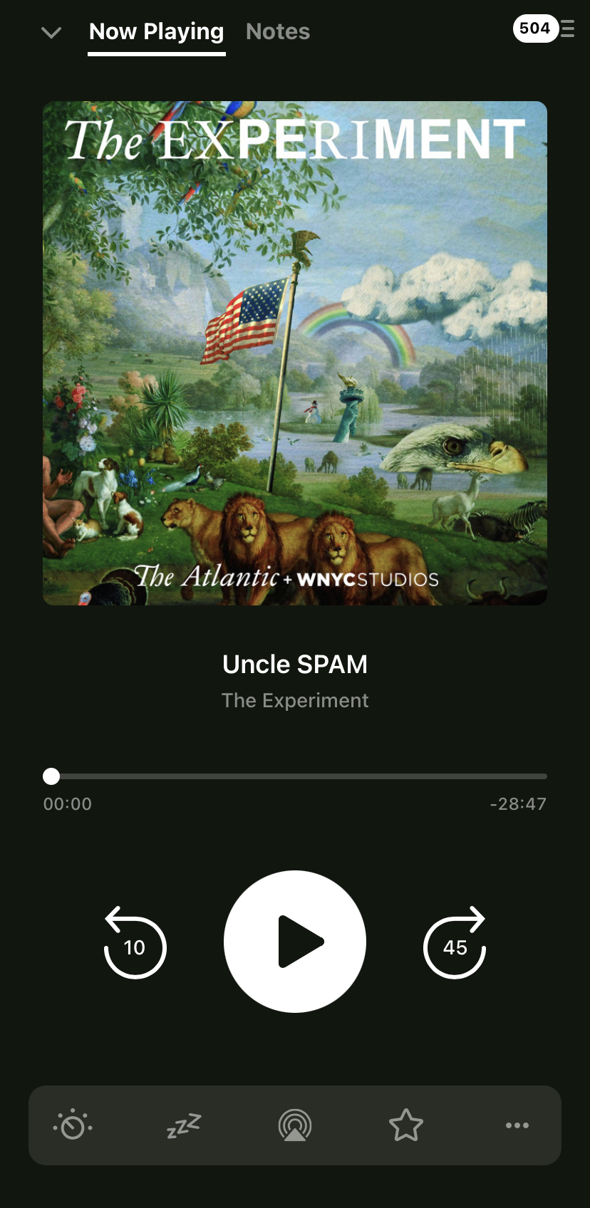
The podcast player is consistently displayed at the bottom of the screen throughout the app and the user is able to access the basic player controls at all times. The expanded player view provides more controls and uses natural mapping to represent the familiar conventions of audio player controls (play/pause button in the center, horizontal scrobbling bar).