banner image credit: https://adsider.com/the-front-page-of-the-internet-reddit-profile/
Reddit is a social media and news aggregator website. Users can join and create communities called “subreddits” that focus on topics, cultures, geographies, fandom or any other area of interest. Engagement takes the form of liking and disliking (“upvoting” and “downvoting”) as well as commenting on, sharing and creating posts. “Subreddits” can vary from small, niche communities to enormous communities.
Homepage
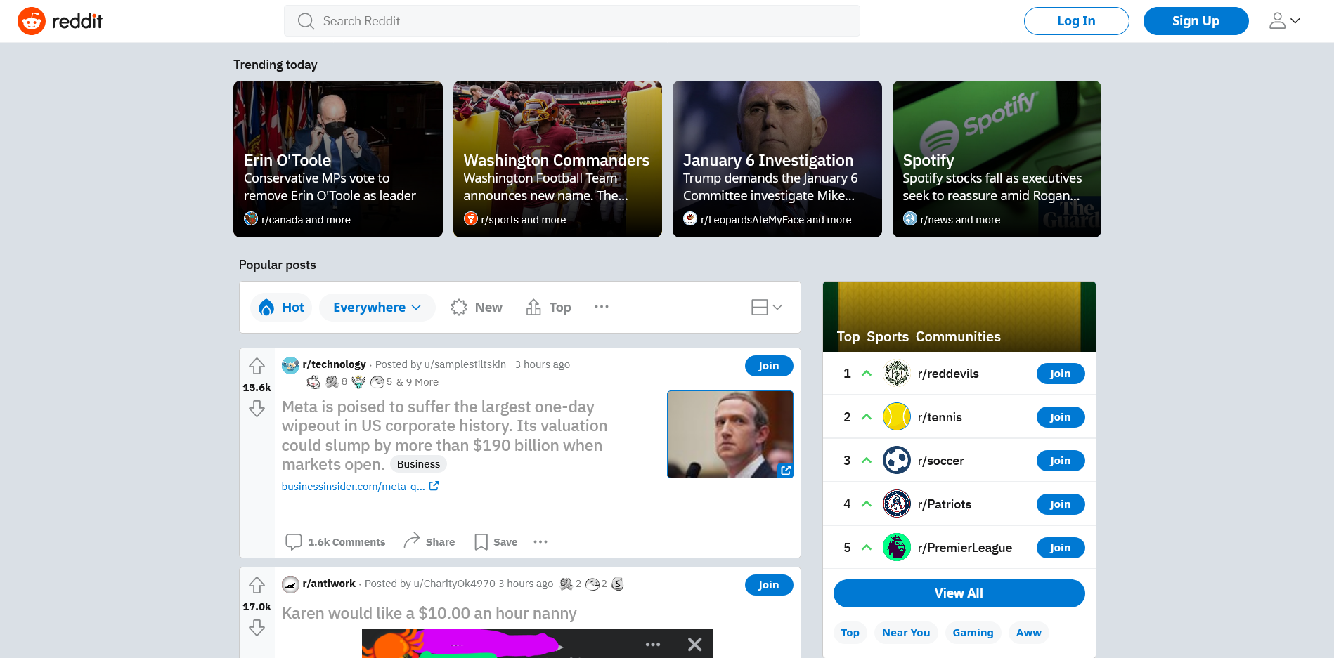
The Reddit homepage is cluttered and creates a poor conceptual model. Specifically, there are issues in the gulf of evaluation – too many competing elements make it difficult to asses how you work the website and what it can do. For example, the posts in “Trending today” and in “Popular posts” all appear to be individual posts because they share key elements like titles, thumbnails and authors. However clicking them leads to completely different outcomes. This can lead to a mode-error slip due to similar controls having different meaning. It may be helpful to re-phrase “Trending today” as “Trending topics” to communicate the section as a pathway to an aggregate of posts.
There is also a lack of logical constraints for the logged out user. For example, in the “Top Sports Communities” component, the blue “Join” buttons are misleading – logged out users cannot join subreddits and should not be presented with a signifier for an action they cannot complete. This leads to a dis-satisfactory feedback mechanism wherein you falsely blame yourself for an error.
Logging In

Logging in follows a standard template that takes advantage of knowledge in the world. The “Sign Up” button is highlighted in blue, attracting the eye and providing good discoverability for registration by signifying that Reddit affords new member sign up.
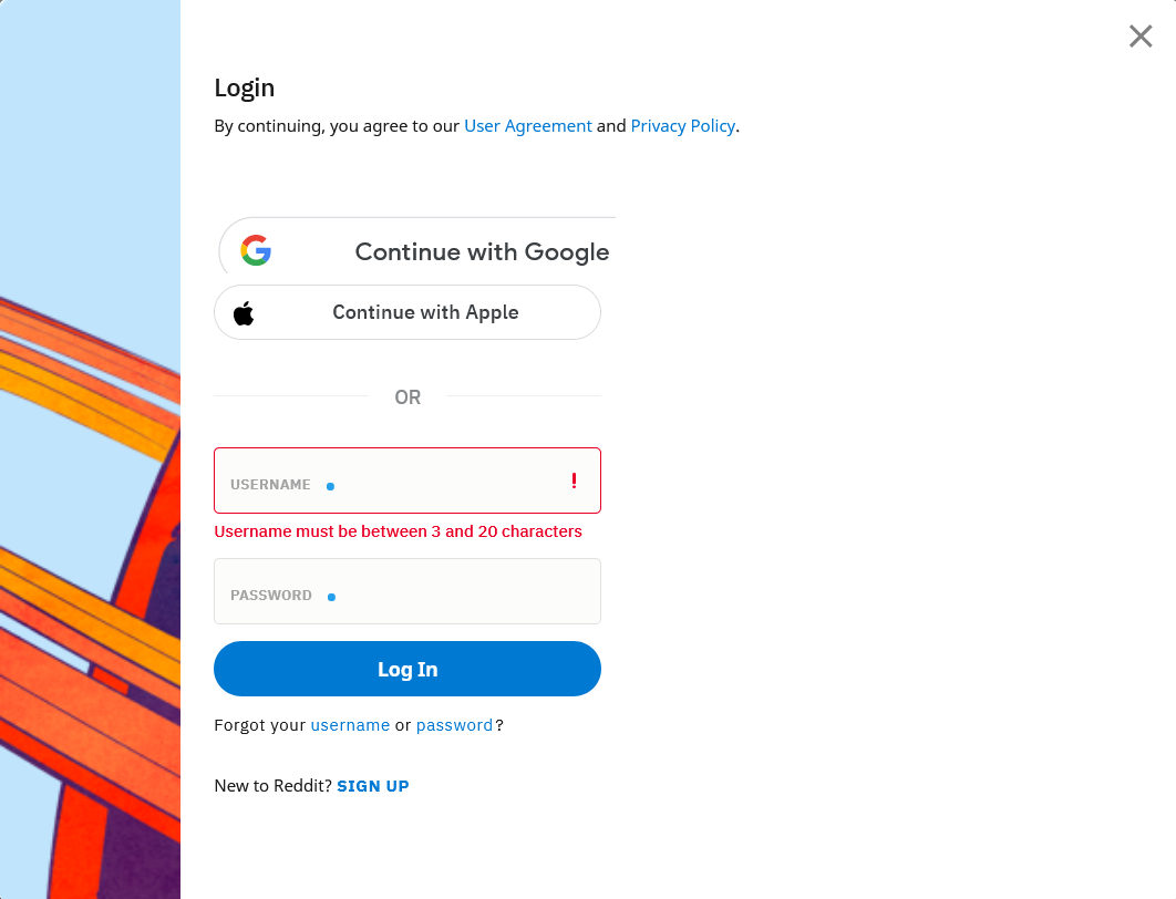
The login form itself has good feedback for the requirements of a username and password.
Engaging With Posts
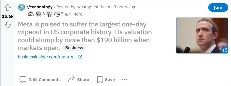
The spatial layout of posts as self contained entries creates a sense of cohesion and understanding that actions will affect a particular post. Discoverability here is also good, there are strong signifiers for what engaging with a post affords. Reddit uses a combination of iconographic and textual signifiers (up/down arrows, Comments, Share, Save) to visually and verbally communicate that a post affords discussion, sharing and saving as well as positive or negative reactions. All of these factors combine to create a logical mapping where form ties into function and actions have predictable outcomes. Additionally, if you are not a member of the “subreddit” from which the post came from, the blue “Join” button is a signifier that posts afford subscription and reinforces the conceptual model that “subreddits” can be joined.

The voting arrows provide immediate feedback – upvotes turn orange and (warm colors have positive emotional valence) and downvotes turn blue (cool colors have negative emotional valence) to reinforce your action has been recorded. The colors evoke a visceral response and are a good example of emotional design.
One area where discoverability falls short is engaging with the post itself. It is not immediately clear that clicking on the post title will open the discussion thread, while clicking on the link underneath the post title will open the article or page that it references. This inconsistency can lead to description-similarity slips because there is not enough difference between the displays of two different actions.
Conclusion
Reddit attempts to corral the vastness of the internet into a single, manageable interface and is mostly successful once you register and gain access to all the features. The site does a poor job handling logged out users because the same signifiers are present for logged out and logged in users even though the affordances are not the same.