Roomi is a website and application that assists people in finding roommates or sublets all over the world. The application and website assist users in finding anything from month-to-month to full-year leases. Members set up profiles with their housing preferences, chat with possible roommates and organize bookings or viewings. The platform focuses on simplifying finding accommodation, security, and renting safely.
For this Design Critique, I will be discussing Roomi using principles from Don Norman’s publication ‘The Design of Everyday Things’ and focusing on the application’s use in New York City through a free account.
Onboarding
The Roomi platform works by users setting up profiles with specific preferences when renting a room or apartment. The first step shows the user the location options available with a dropdown menu that provides feedforward. The user is encouraged to include photos with ‘+’ symbols signifying the option to upload a selection of images. The application emphasizes personalizing the user’s profile with living preferences regarding budget, pets, and cleaning. These options are not easily discoverable and are in the ‘more’ section of the UI.
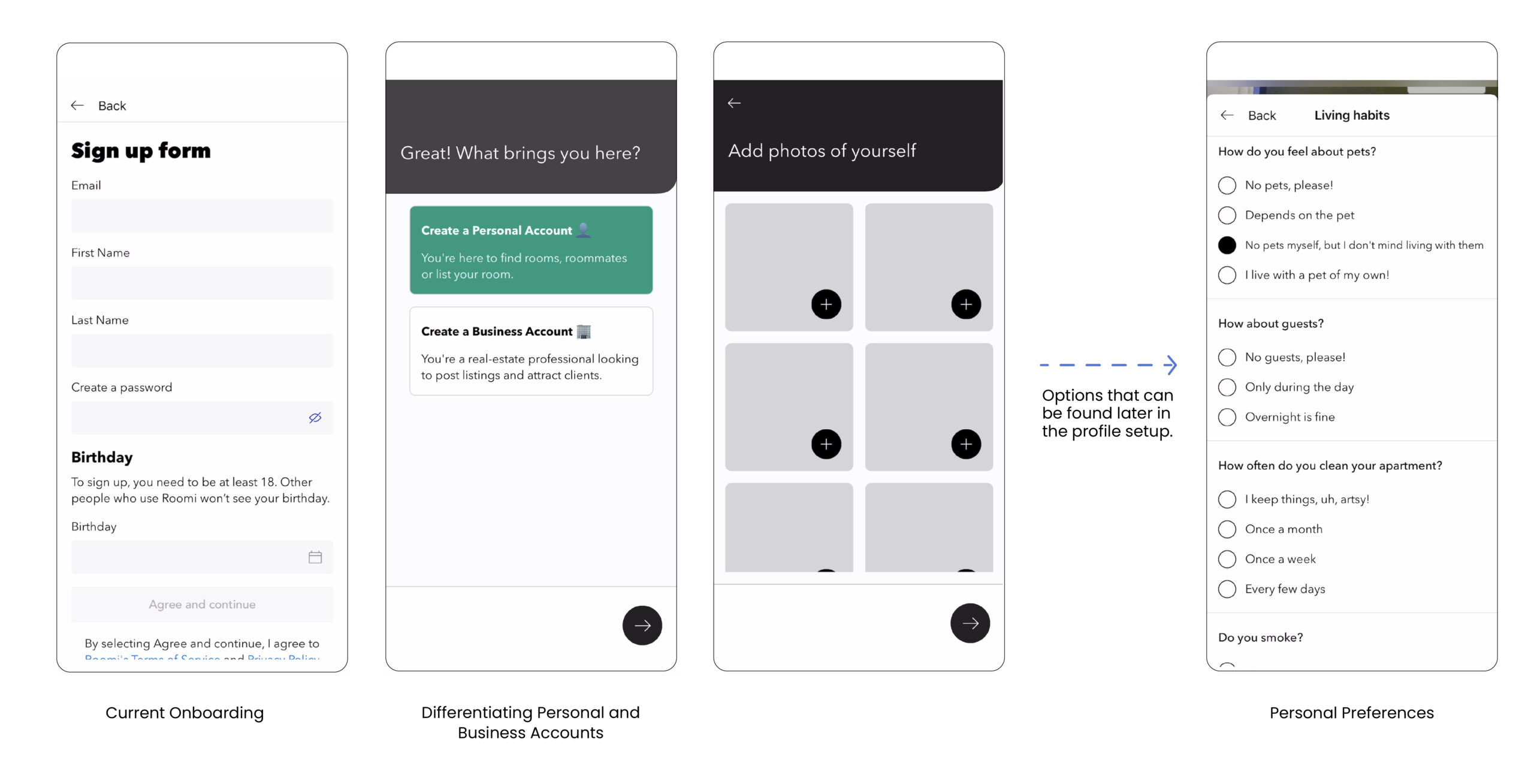
Recommendation:
I recommend including pagination through the onboarding to improve the gulf of execution as the current onboarding feedback is minimal. An exit and skip button would prevent mistakes and provide the user with the option of completing profile steps later. I also recommend including housing preference steps in the initial setup to improve the consistency of user profiles.
Filtering for rentals
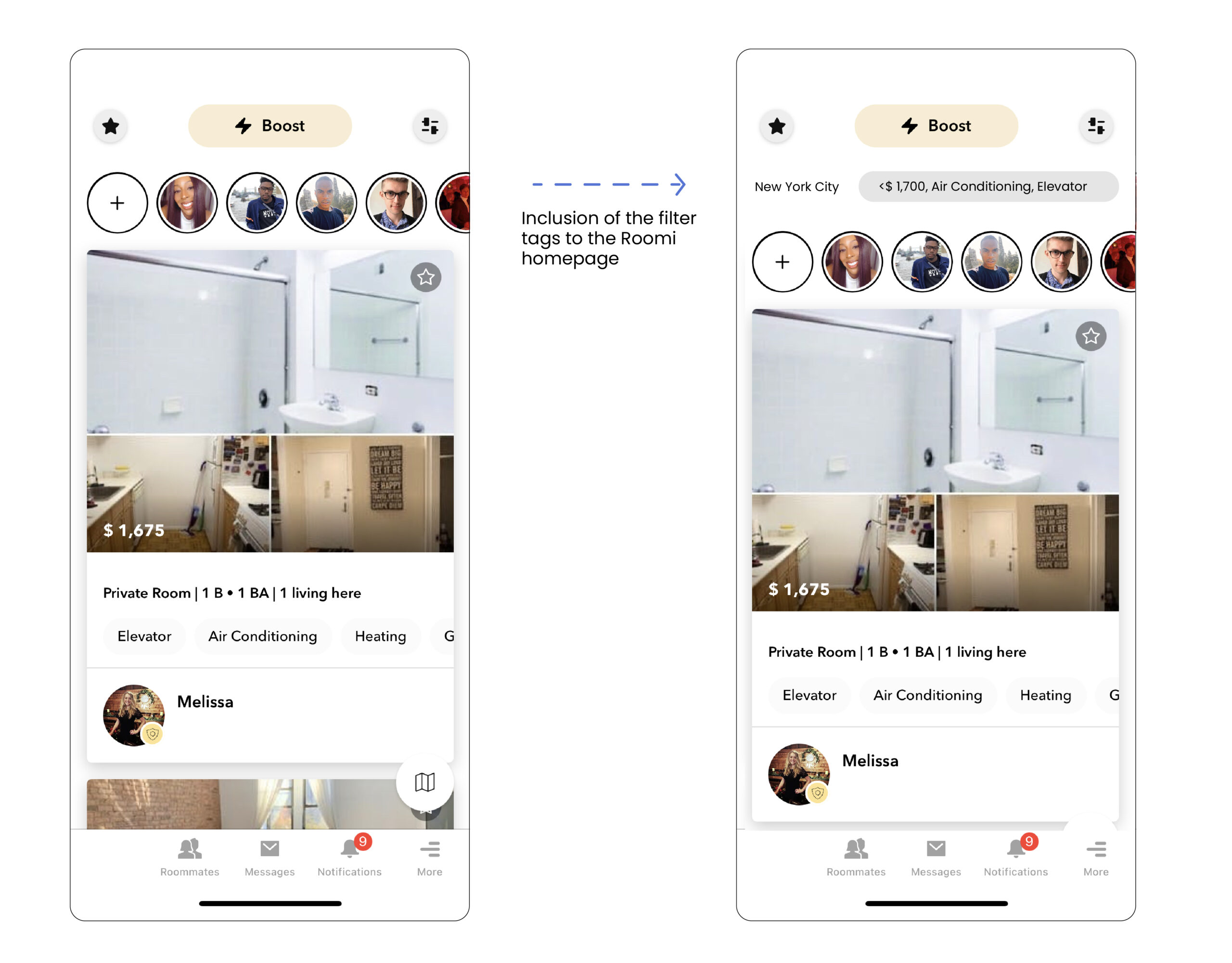
The filter icon button on the top right corner expands into a menu of accommodation preference options for the user, which fits into the mental model of filtering the search for an apartment. Selecting filters provide feedback in darkened buttons, checked boxes, and motion. These visceral responses help the gulf of execution between looking through and confirming filter options. On returning to the Homepage, the chosen search filters are not presented to the user. A lack of feedback can lead to confusion and affect the gulf of evaluation.
Recommendation
After the filters are applied and the user returns to the listing page, I recommend including the filter tags on the listings page as feedback. The inclusion of a search history would avoid the user having to recall their decision and instead recognize the filters and types of posts they are viewing.
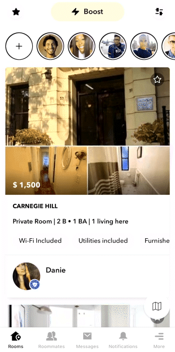
Interacting with the listings
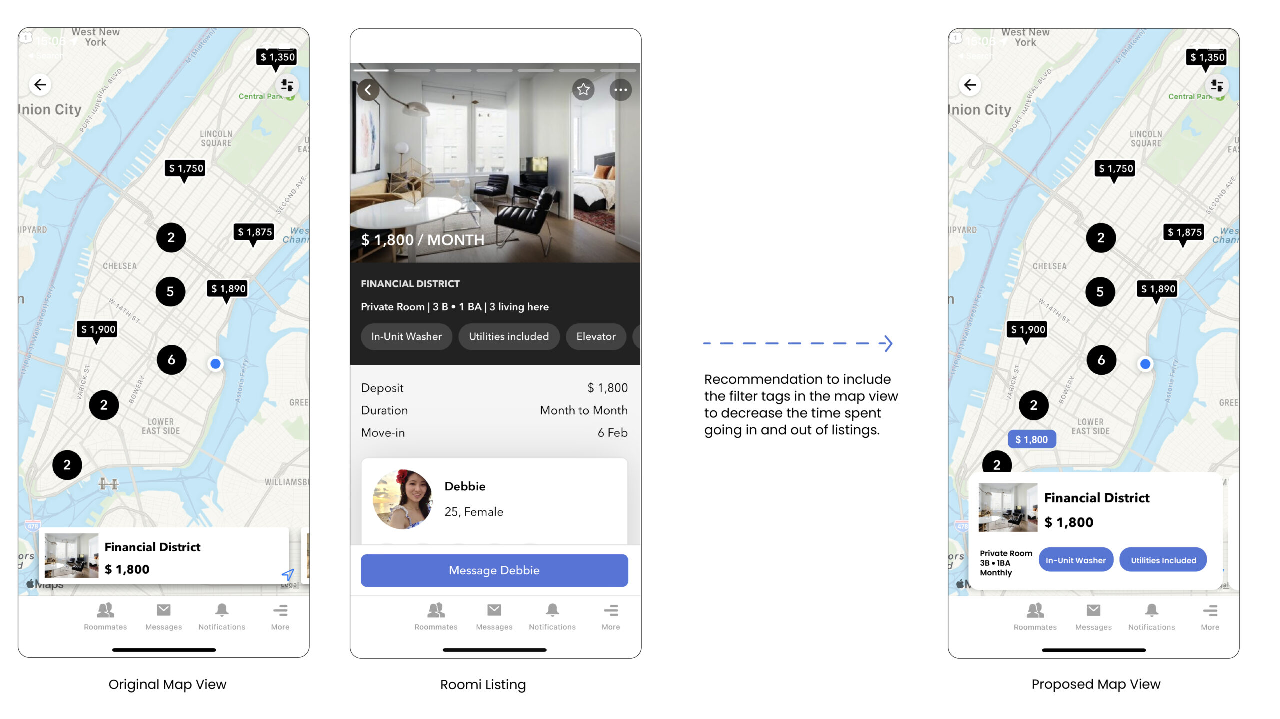
There are two routes to interacting with Roomi listings; the available rooms can be viewed by neighborhood or the map feature. The map listings cannot be individually selected from the map view even though the visual design signifies interaction through darkened circles showing the number of listings in the area. The discoverability of the map listings is low as the user swipes the panel at the bottom of the screen to access each listing. The panel listing at the bottom of the screen does not include any tags seen in the alternate list view. (see image)
The Roomi listing itself is informative, with the visceral design being straightforward and clear. The listing provides the user with concise information about the available room and the people living there. The user can start a conversation immediately with the original poster. The “Message Debbie” button affords this action. The button signifies that the user will be talking to the person renting the room, which humanizes finding housing.
Recommendation:
To include the tags from the user’s chosen filters, for example, amenities, number of people living there, and availability. This recommendation saves time on their interaction as they avoid viewing listings that do not match their preferences. This recommendation also provides user feedback that aligns with the list viewport and aids the gulf of evaluation.
Navigation
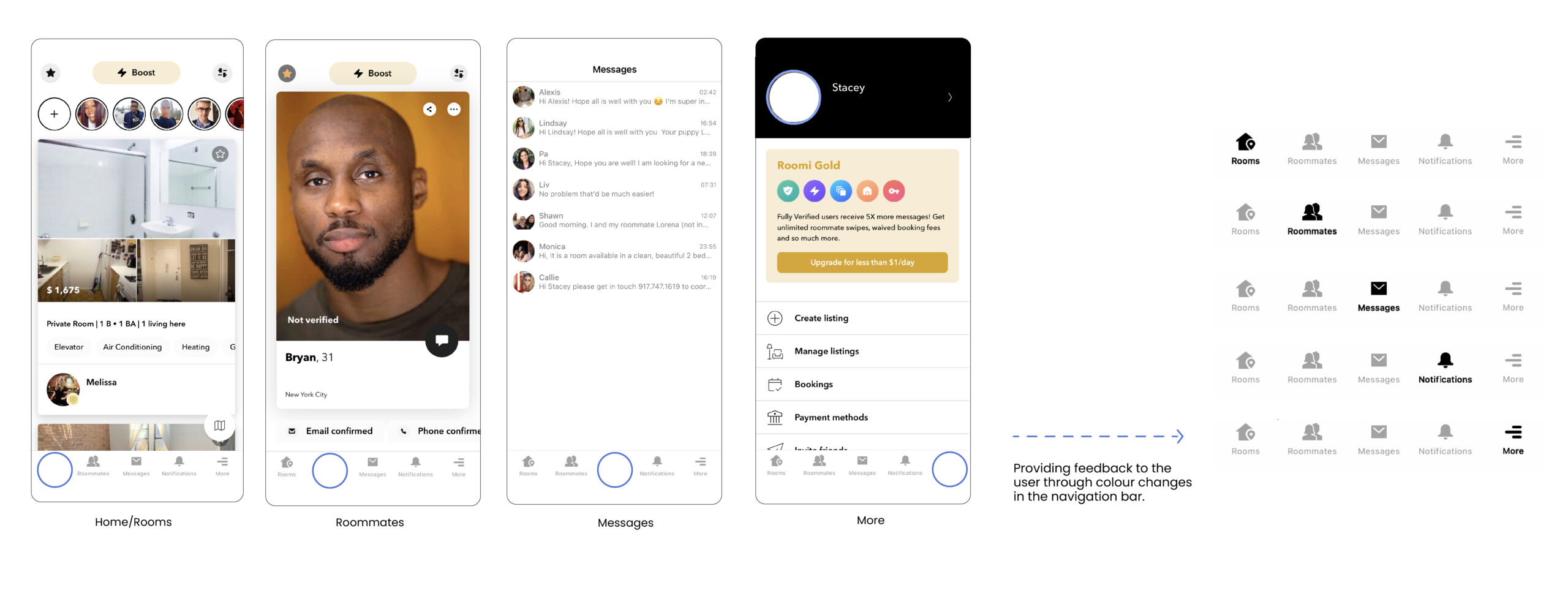
The current navigation is at the bottom of the screen with the option to view rooms, roommates, messages, notifications, and more. The icons signify how the application sections are separated. However, they disappear from the user’s view when pressed. The mapping between navigation options and where the user is located in the application are correct as the page content changes. However, the user cannot recognize where they are located by looking at the navigation bar, leading to slips.
Recommendation:
Adjusting the navigation bar to show the user their current place on the application to affirm the user’s mental model and overall location.
Conclusion
Overall, Roomi improves the experience of finding roommates and accommodation by connecting people with like-minded ways of living, preferences, and budgets. Norman’s concept of Human-centered design is definitely at the center of the platform as it showcases the importance of personality and living preferences when finding a successful housing solution. The application creates a clear space to view the options that often get lost through Facebook groups and housing boards.