Shazam is a music discovery app that allows users to identify recorded audio in mere seconds. In addition to surfacing song titles, artist information, time-synced lyrics, and music videos, Shazam offers Spotify and Apple Music integrations so that identified tracks can be saved to playlists.
American rapper, entrepreneur, and music producer Pharrell Williams once hailed Shazam as a “gift” and a “game changer.” By most accounts, he wasn’t wrong. The app’s ability to “name any song in seconds” can feel like magic, while its interface design provides a fluid, intuitive experience buoyed by supreme discoverability and feedback.
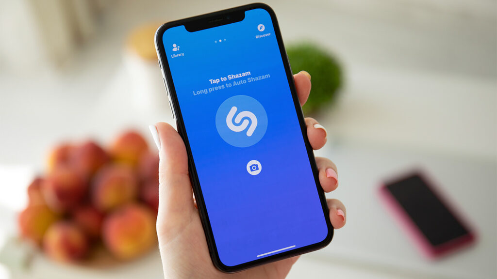
Push to Start
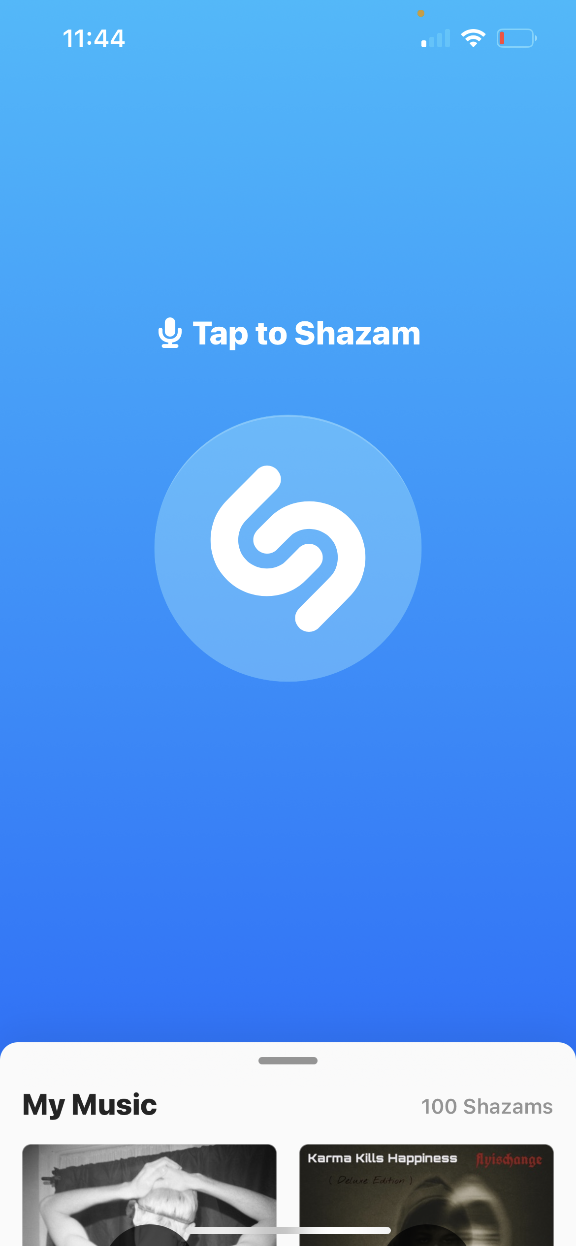
On launch, users are immediately guided by strong constraints and signifiers. A minimalist UI utilizes more than 75% of available screen real-estate to highlight a single affordance. Physical constraints limit touch controls such that there are only two paths forward: “Tap to Shazam,” or drag the ‘My Music’ tab up from the bottom, where it peeks out just enough to signify its availability. Given that both of these options are extremely visible and straightforward, discoverability and understanding are supported in such a way that the initial gulf of execution is virtually eliminated.
What to Expect When You’re Expecting
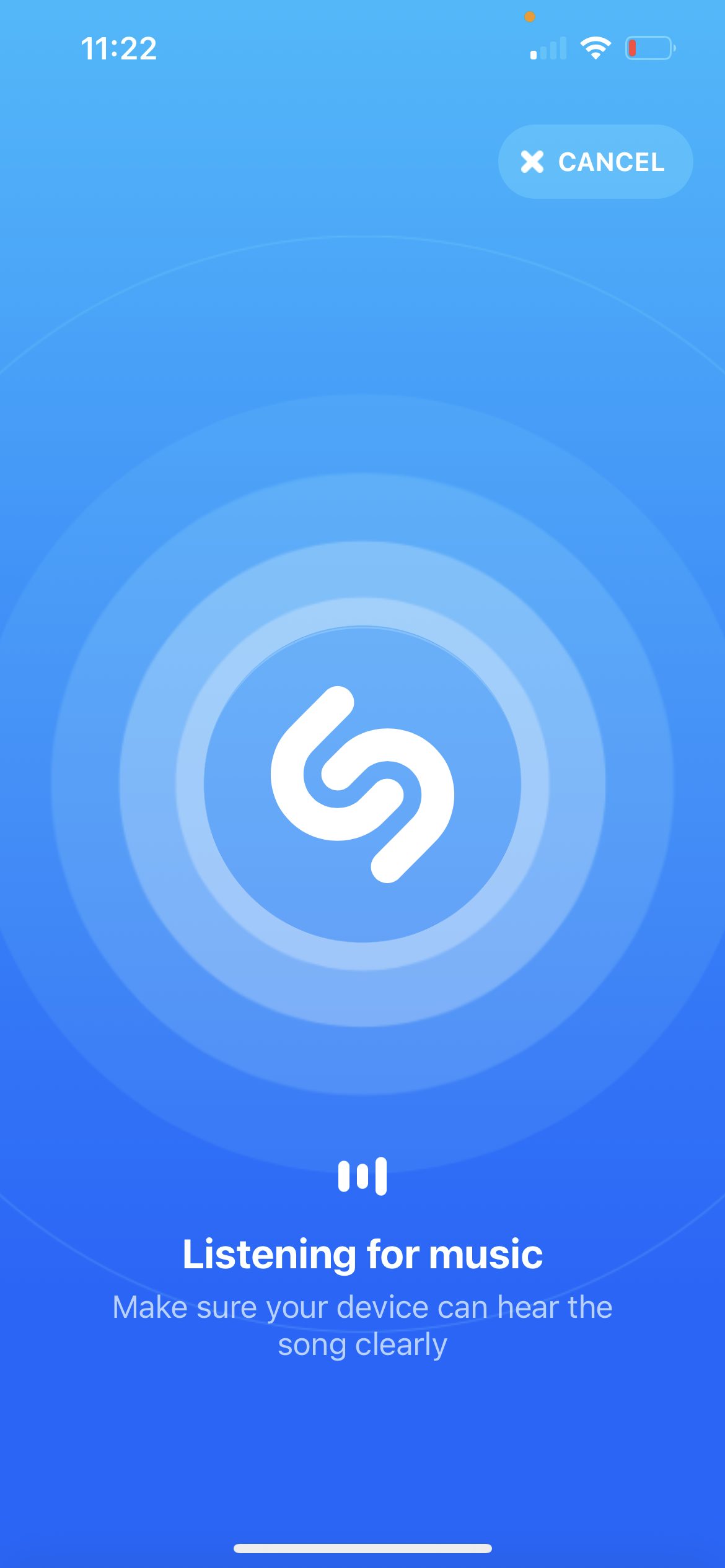
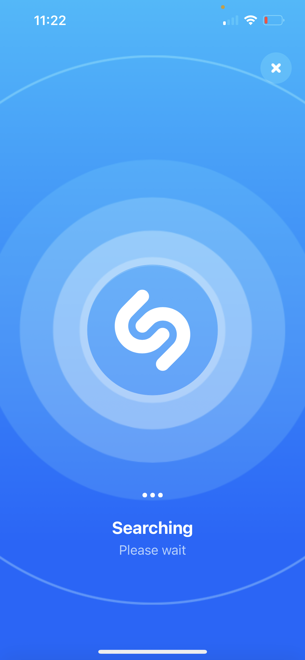
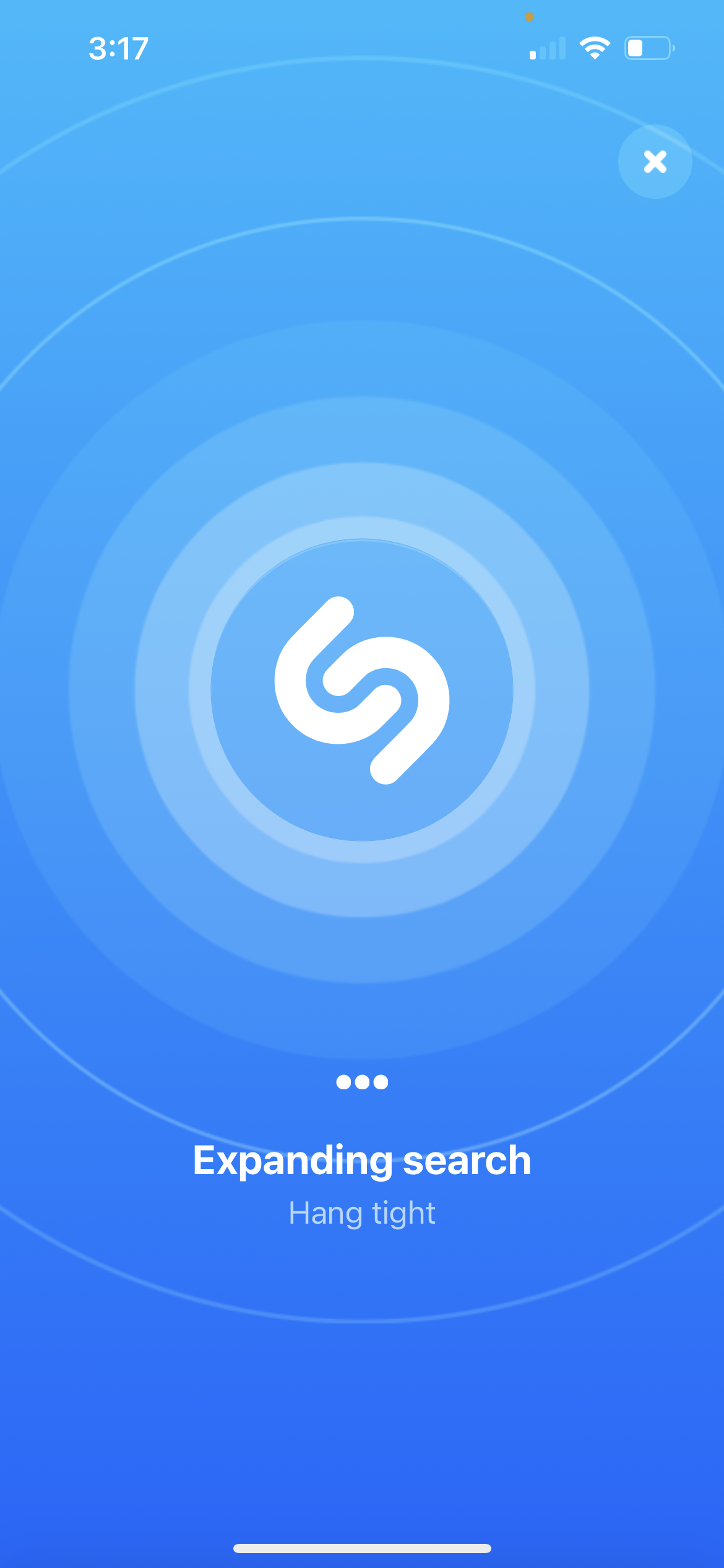
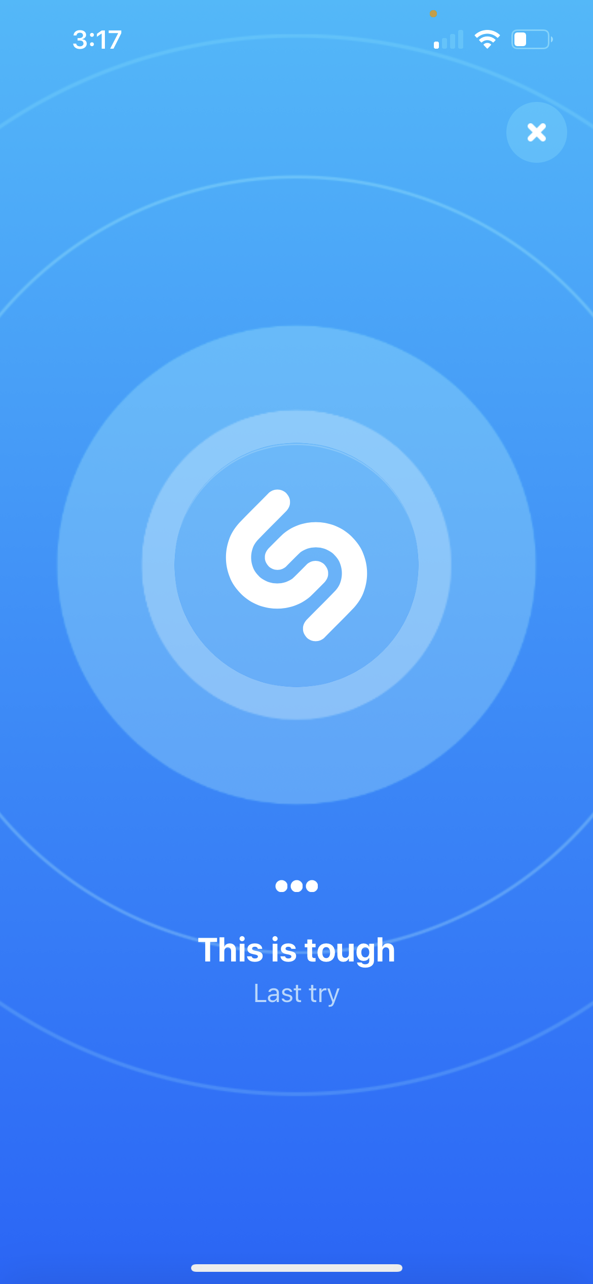
Once initiated, Shazam provides several types of feedback to assist users in evaluating system status. While the logo button animates in place, surfaced UX copy provides continuous updates: “listening for music,” “searching,” “expanding search,” and finally, “this is tough, last try.” In doing so, the design cleverly utilizes narrative cues in order to educate users on its processes, providing just enough transparency to enhance their conceptual models of the system at work.
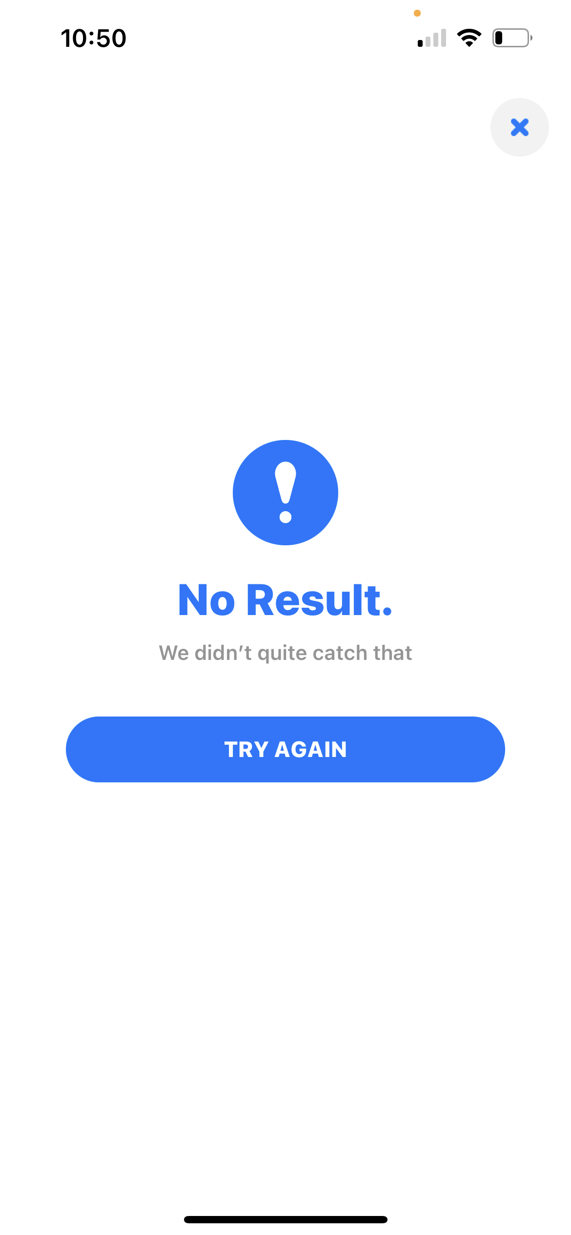
While often accurate, Shazam is not perfect, and users may occasionally encounter the dreaded “No Result” outcome, and can even be served incorrect information.
In the former scenario, Shazam misses an opportunity to provide feedback addressing common knowledge-based mistakes. For example, the app struggles to identify audio when it’s too quiet or too loud, when other noises overlay the subject, when the user’s device is too far from the speaker, and when the music is being performed live.
By designing for more than one error message, the app could reduce the possibility of inducing learned helplessness through successive failures. Perhaps the developers could implement specific copy depending on the reason for the “No Result” outcome. For example, specifying whether there was truly no match in the database versus poor audio quality. Surfacing this ‘knowledge in the world,’ could work as a form of resilience engineering, ultimately granting users the agency to take corrective action and execute on their desired goals.
Think Before You Speak
In the latter scenario, Shazam incorrectly identifies the source audio, or falls victim to the machine-equivalent of a description-similarity slip. In testing, this outcome was most prevalent when attempting to identify a track that samples another type of audio, as is common in modern pop, hip-hop, and rap music.
While Shazam isn’t necessarily wrong when it captures a sample rather than an overarching composition, the user’s conceptual model may not account for this outcome. Fast forward to the point where said user becomes aware of this discrepancy, and the user’s innate sense of trust is now at stake. Depending on the context of their usage, this may come to effect the overall system image as they understand it.
All of that said, testing also relayed reduced accuracy when results were instantaneous—thereby illustrating a trade-off between speed and exactitude. Thus, the scenario described above could be addressed in part through the code-equivalent of a force function; essentially requiring the app to “listen” for a longer stint, and presenting results only after audio is both identified and confirmed.
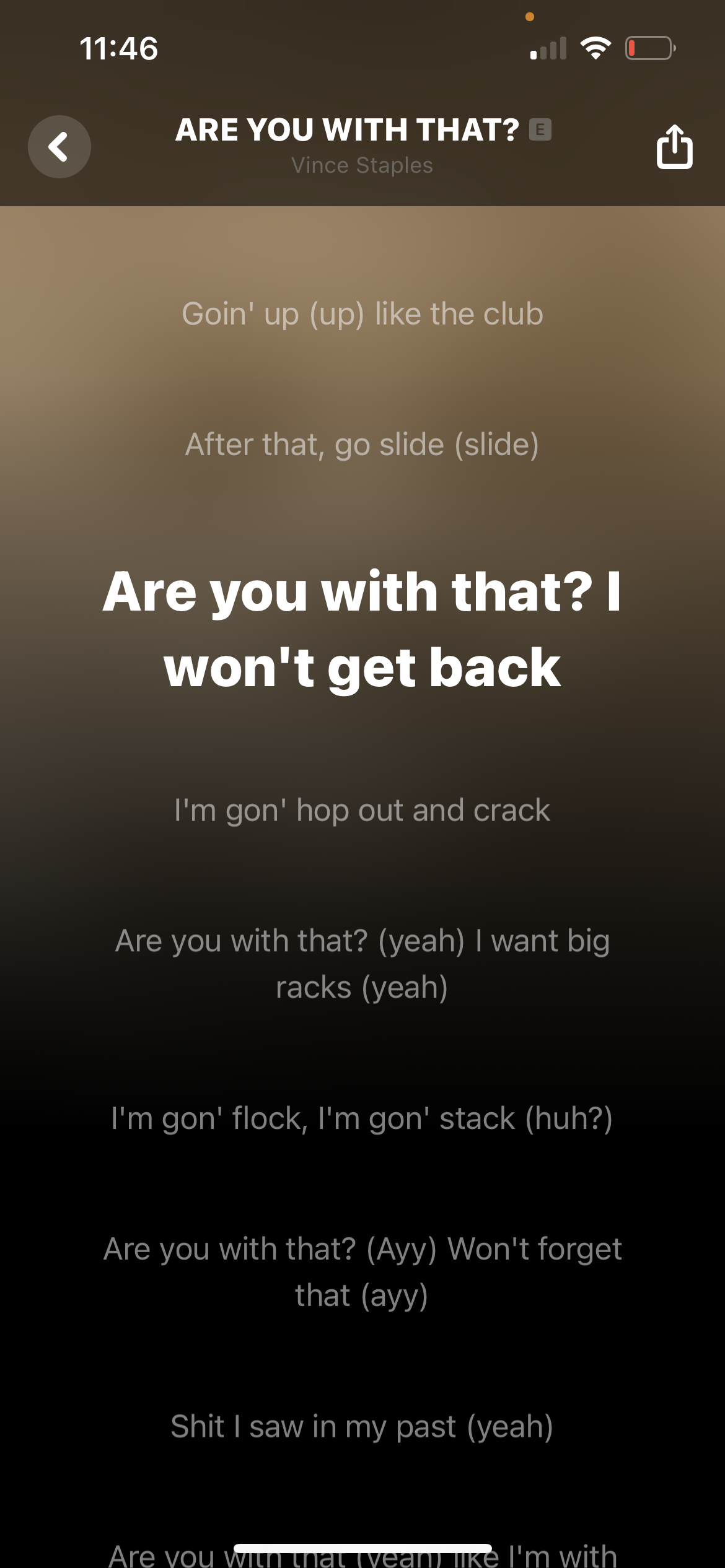
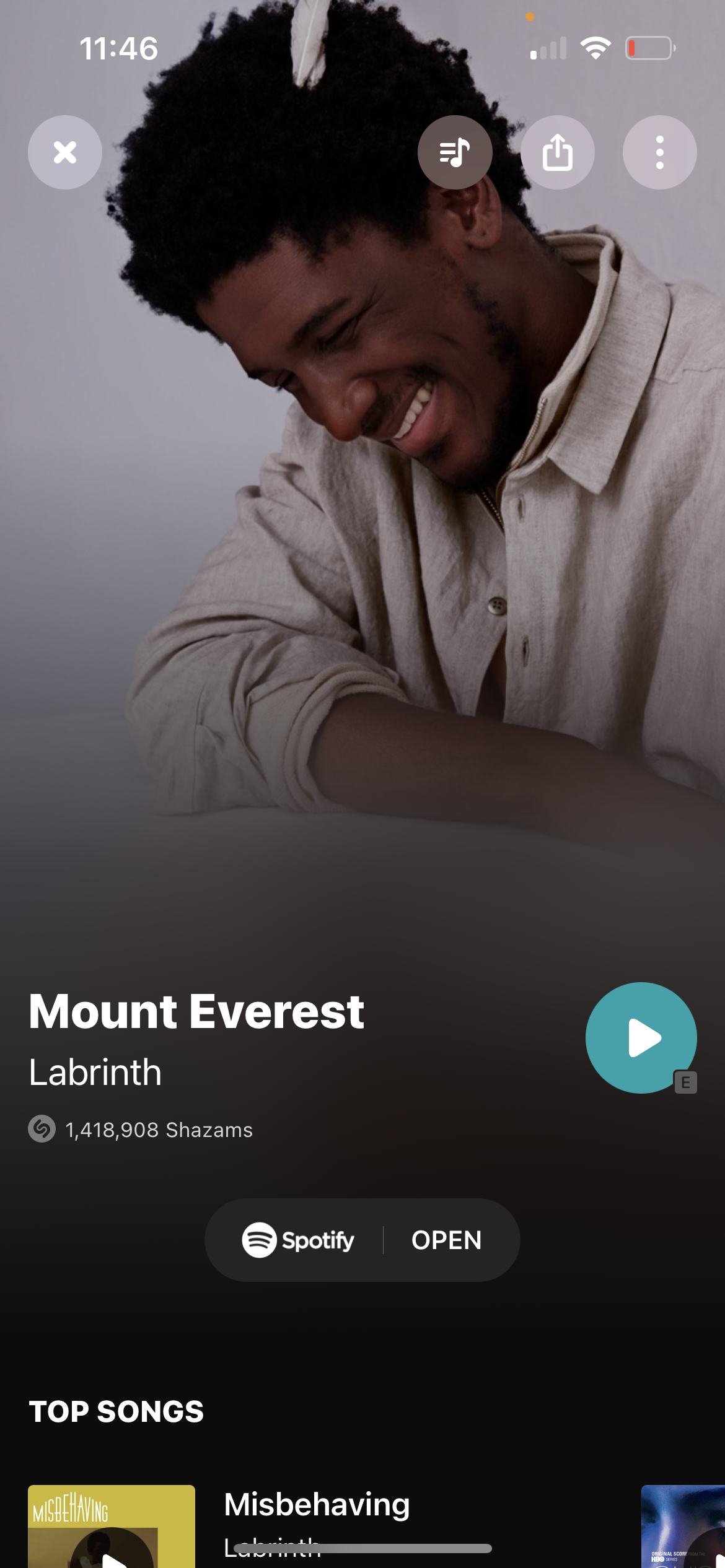
Despite these hiccups, Shazam is generally both accurate and highly efficient. Results are often served within two seconds, as displayed on an aesthetic page replete with helpful signifiers and affordances. The gulf of evaluation has been crossed, and to that point, affordances including playing the song, opening it in Spotify or Apple Music, learning more about the artist, watching the music video (if available), and social sharing are both standardized for context (touch screen, iOS) and near-unmissable thanks to strong typographic hierarchy and communication design.


Self-Awareness
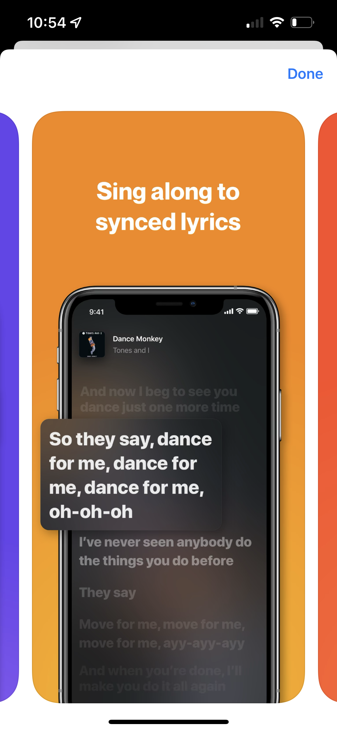
Of all the features accessible from this page, the option to view lyrics is perhaps the least discoverable, as the chosen icon is often used to signify ‘Playlists’ in other contexts. This is surprising, given that the vast majority of the app is flawlessly mapped to Apple’s Human Interface Guidelines, the default (and sometimes requisite) interface template for iOS.
While this breach in standardization (a cultural constraint) is worth noting, Shazam’s developers are clearly aware of it, as they’ve implemented an animated signifier to aid in discovery and understanding. When users first reach the results page, the icon is briefly accompanied with the label “Lyrics,” after which the label collapses back into the button itself. Due to its short duration, users may initially miss this animation. However, it continues to surface through repeated searches and sessions, such that obtaining this procedural knowledge becomes inevitable.
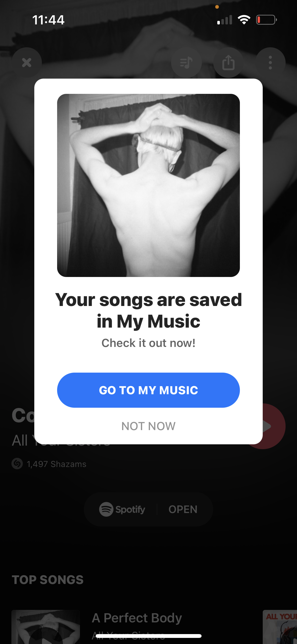
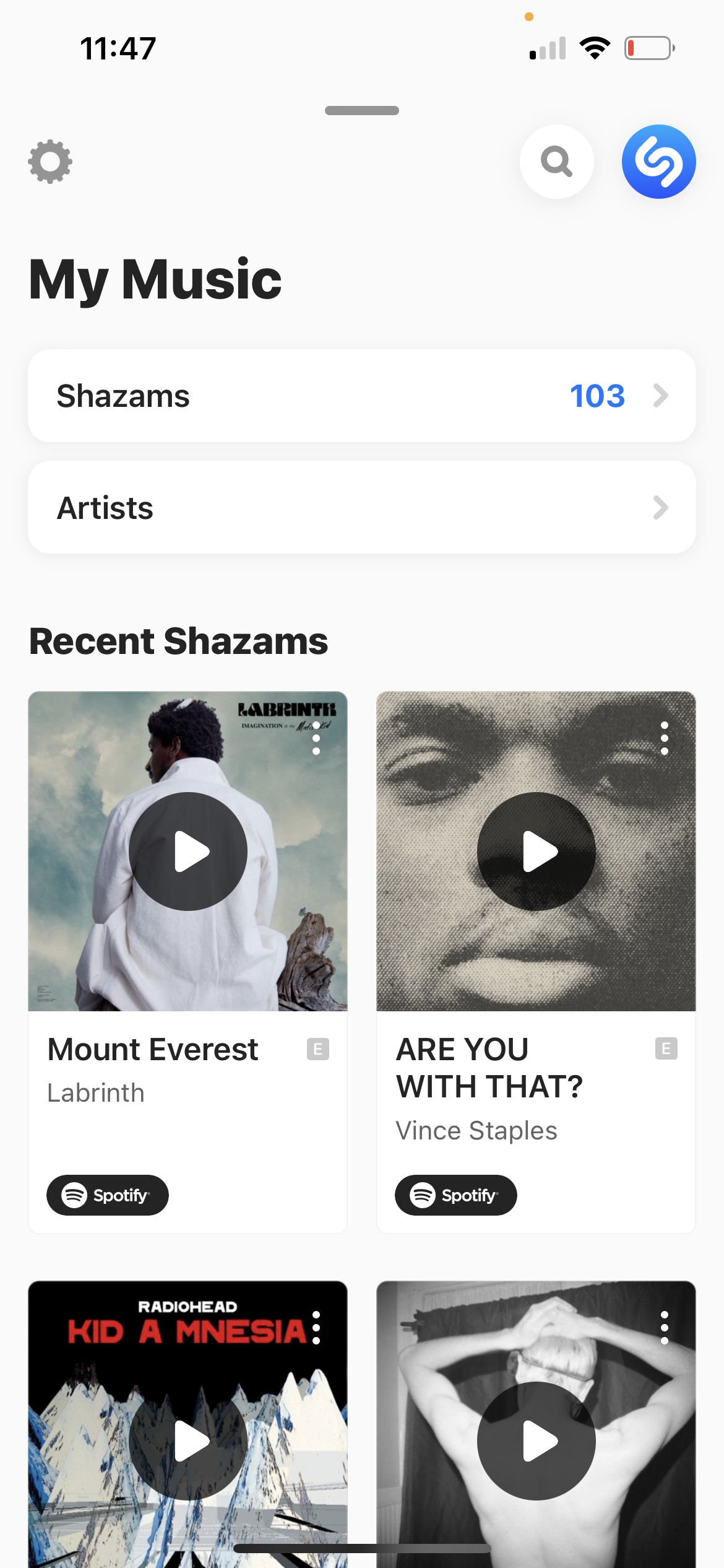
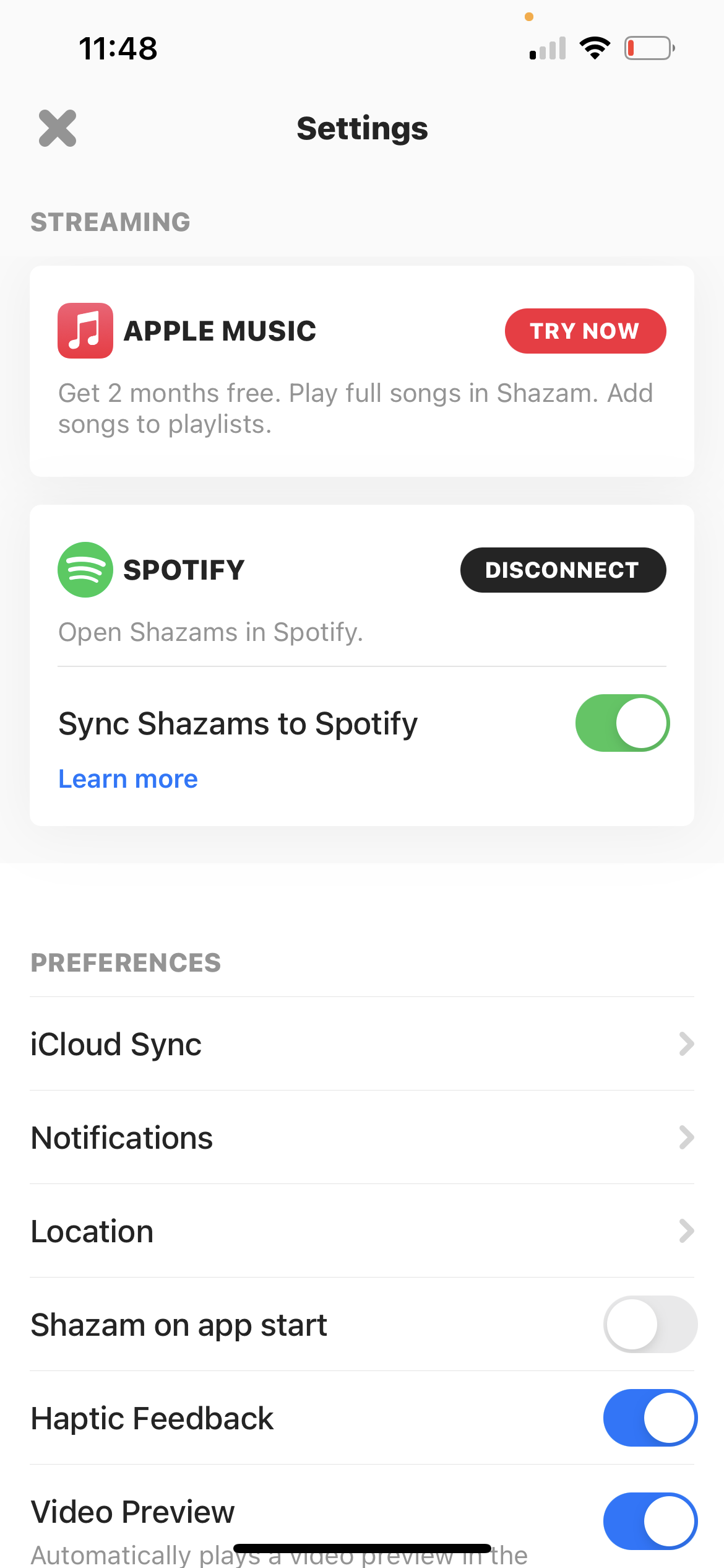
When a user eventually leaves the page or closes the app, the information they accessed is stored in short-term memory and easily forgotten. However, this ‘knowledge in the head,’ is also saved in-app, where it becomes accessible in the ‘My Music’ tab previously described in relation to the home page. If a Spotify or Apple Music account has been connected, each track is also saved in a specialized playlist. Performing this integration initially might prove challenging for novice users if not for Shazam’s thorough, yet flexible onboarding (an especially resilient response to The Paradox of the Active User). Additionally, in-app signifiers continue to guide users, often with similar methods to the ‘Lyrics’ affordance described above. Some are especially impressive, such as when taking a screenshot of my results prompted an interstitial with a direct link to ‘My Music.’

In other words, Shazam is constantly finding subtle ways to educate its users and improve their conceptual models of the system. While there’s even more to explore in-app, the product’s core functionality is so polished and intuitive that’s it’s easy to understand how Shazam maintained a 4.9 star App Store rating after over 6.4 million reviews. Pharrell was right—this app is a gift: beautifully wrapped, instantaneously delivered, and a joy to use and own.