Shazam is a very popular free music discovery app which can search for music, videos, playlists & artists, either by using a short sample of the music or the text search feature in the app. Although this app is available across several platforms, this design critique is based on the iOS app (version 15.3).
Background
Shazam was initially released in 2002 by Shazam Entertainment Ltd. Since 2018 it has been owned by Apple Inc. The application is available on several operating systems and platforms including iOS, Android, macOS & google chrome extensions.
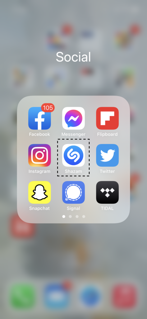
Home screen & app icon
App Icon
Home Screen
The Shazam logo on the app icon as shown in the image (captioned App Icon) in the left is consistent throughout the application interface and is used on buttons which perform the primary task of listening to music samples and executing search.
The home screen is minimalistic with focus on the primary function of the app. When the app is launched the home screen appears with a big Shazam logo in the center as demonstrated in the video (captioned as Home Screen) on the left.
Users are not required to login or create an account in order to use the app. The app is linked with the Apple iCloud. The Shazam logo acts as knowledge in the world and is a very useful signifier throughout the app. This creates a natural mapping for search function as well as simplifies the process for users to conceptualize a model for this process.
Searching for music (Shazaming!)
Shazam 1
Shazam 2
All the features described above for the Shazam button paired with the descriptive text on the home screen above the button makes it an excellent signifier.

The swipe up gesture and the search button are both commonly used features across several apps on iPhones. This consistency is a good example of the combination of knowledge in the world and knowledge in the head. This makes memory unnecessary for using these features.
1. Using the Shazam button on home screen:

When the Shazam button is tapped the app starts to listen to the music being played and gives its results in a few seconds. The central location and the beating animation makes the Shazam button apparently discoverable. This provides valuable insight to the user.

Additionally, after the button press, the screen starts a ripple like animation and a text label appears at the bottom saying that the app is listening to music. This acts as a good feedback to let the user know that the app is working.

When the search is done the app displays its result on the screen. This process is shown in the video (captioned Shazam 1) on the left.
2. Using the text search feature:

Swiping up on the home screen brings the My Music page which has a search button on the top similar to one used by many other apps. When this button is tapped it opens a text bar to enter a search query.

When the user starts entering the search query, the results are displayed incrementally along with the query in a dropdown menu. When the query is entered and search is executed all relevant results are displayed.

This process is shown in the video (captioned Shazam 2) on the left.
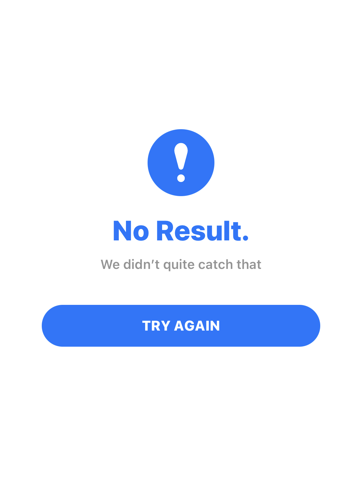
Search failure
Search Fail 1
Search Fail 2
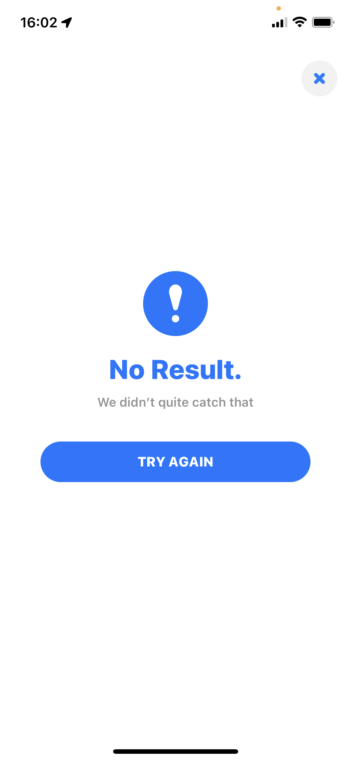
If the Shazam button is used when there is no music playing or when the app is unable to find the music being played, a screen appears which has a big exclamation mark with a text label of No Result below it. Additionally, a button to try the search again is provided on the screen. This page is shown on the image (captioned Search Fail 1) on the left.
If the user uses the text search tool and the app is unable to find the music, the app displays unrelated search results. This can cause confusion for a new user and in-turn distort the conceptual model in his head. This process is demonstrated in the video (captioned Search Fail 2) on the left.
This design flaw can have many simple solutions ranging from simply prompting the same No Result page from when the app doesn't recognize/find the music being played, to just displaying a text message on the same page saying No Results Found.
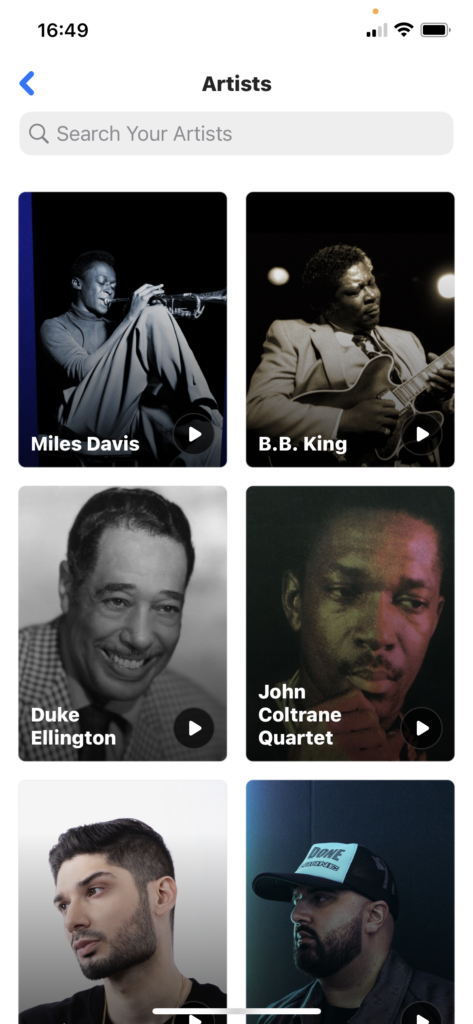
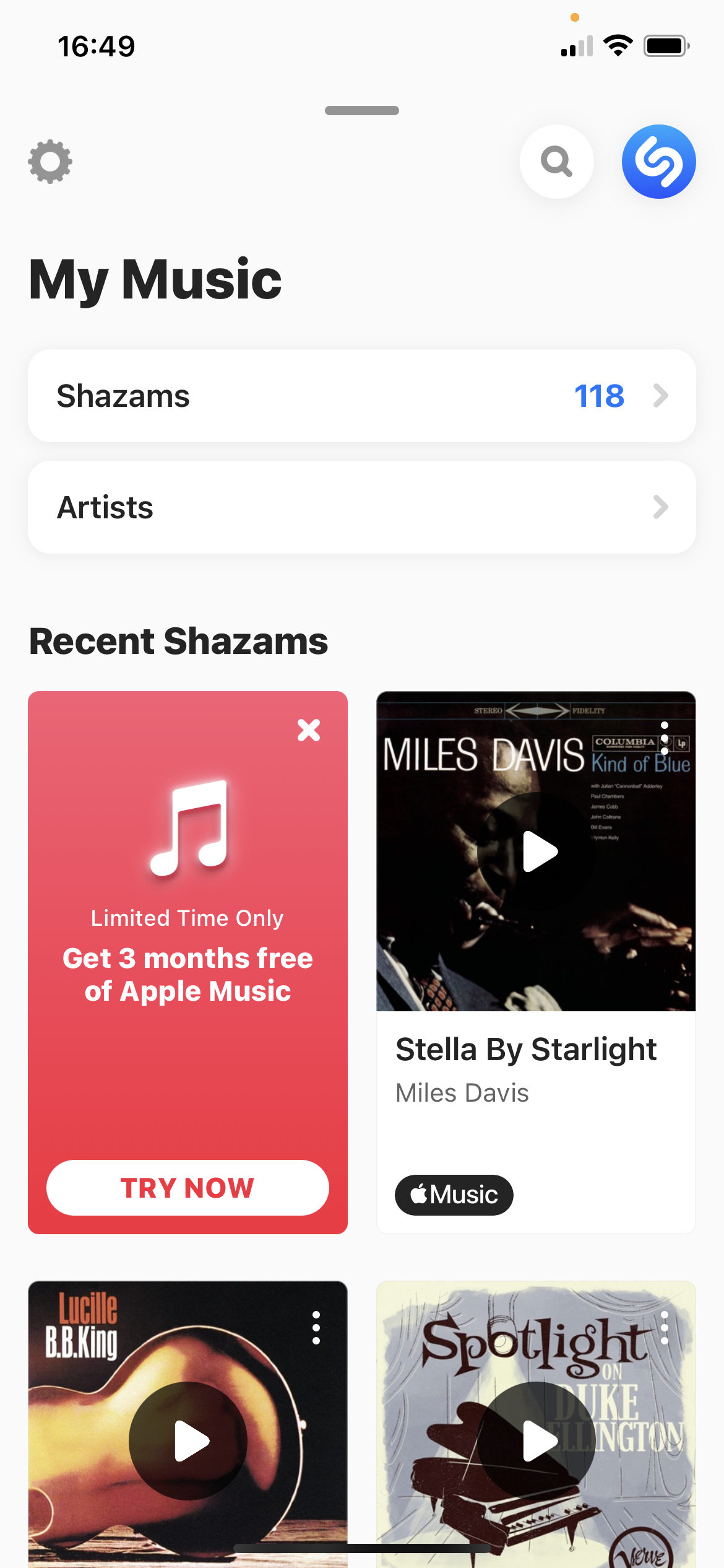
My Music page
My Music
Shazams
Artists
Recent Shazams
The user can swipe up on the home screen to open the My Music page (the same page where the text search button is located). This page has several affordances which are clearly mapped using clickable buttons with texts signifying their purpose. This page is shown in the image (captioned My Music) above.
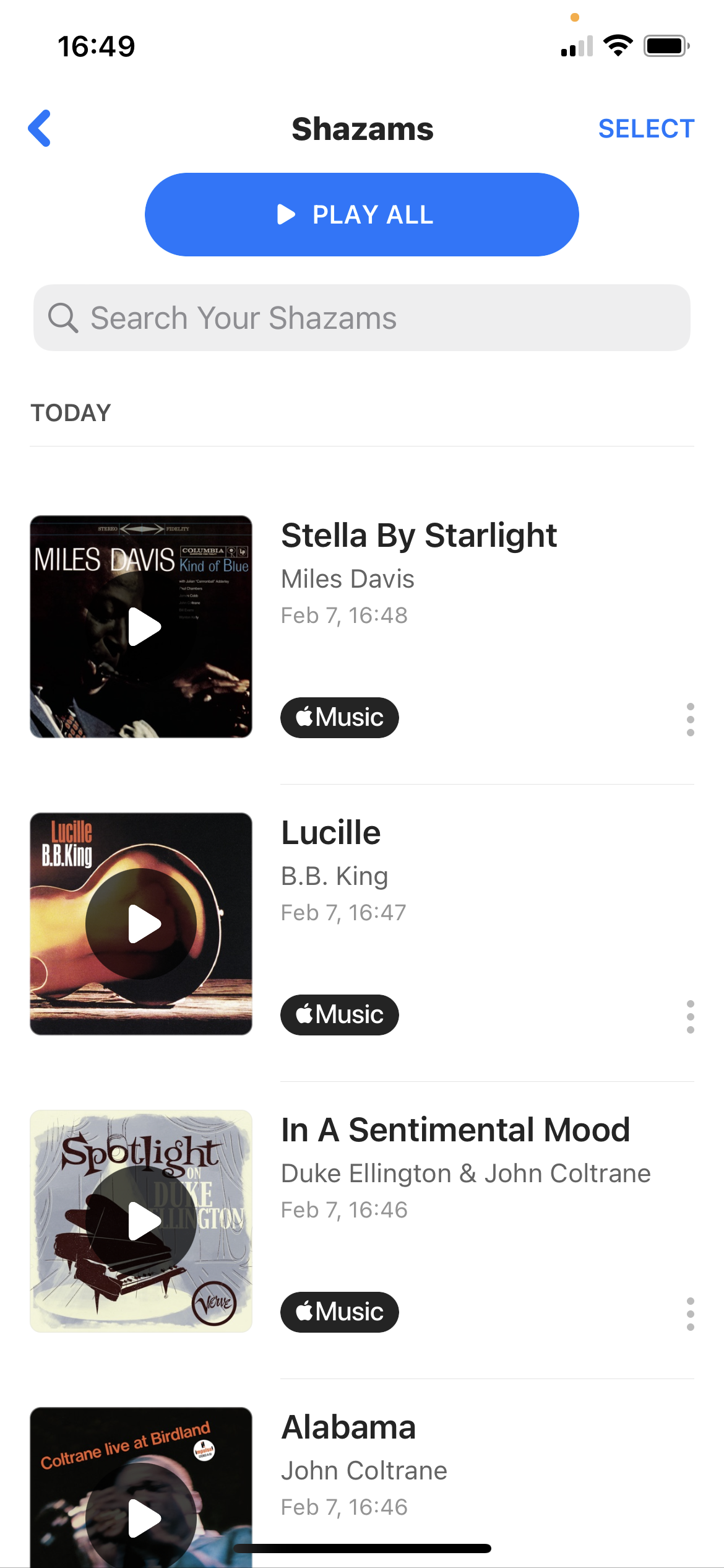
If the user taps the Shazams button a new page opens where all the previous Shazams (searched songs using the Shazam button) are stored. This page is essentially an interactive list of all the previous Shazams with functionality to play previews of the songs. Additionally, it also gives info about the artist and when the song was searched. This again is a good example of putting information in the world which takes out the burden of memorization from the user. This page is shown in the image (captioned Shazams) above.
The Artists button takes you to a page where all the artist’s from your Shazams are stored. The user can then search for any of those artists using the search bar at the top or just scroll down the feed. Furthermore, The user can also explore other music done by an artist by clicking on the picture button of the artist. This feature also provides the user with the same affordances as those done by the Shazams button mentioned in the previous paragraph. This page is shown in the image (captioned Artists) above.
On the My Music page the user can also scroll down to take a look at his recent Shazams. This page is also interactive and the user can directly preview the songs from this list and even play the full songs if the user has an Apple Music subscription. This page is shown in the video (captioned Recent Shazams) above.
Control center shortcut
Control Center Shortcut
Shazam Control Center
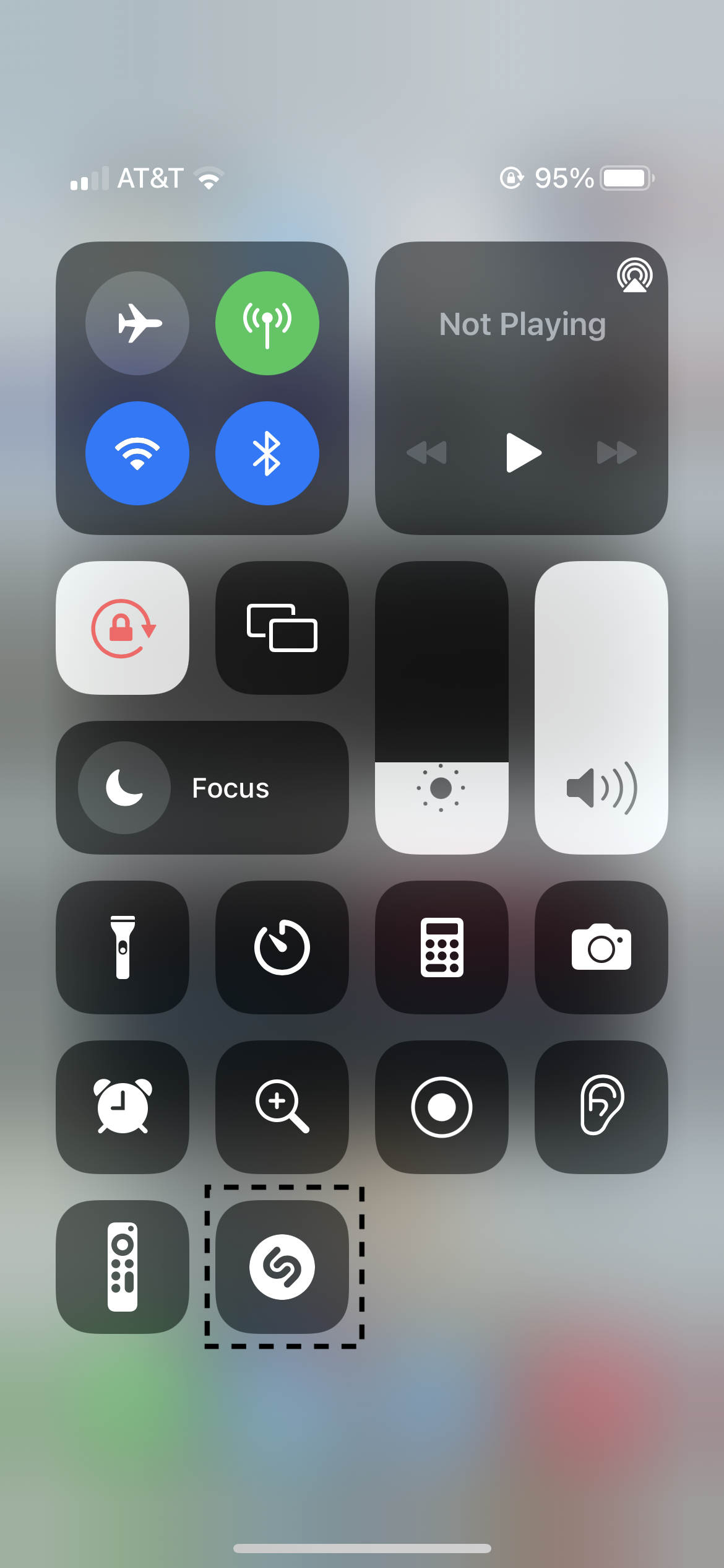
The app also provides support to the iOS control center, where a user may add the Shazam button in the control center. This is shown in the image (captioned Control Center Shortcut) to the left. Here again, the button logo remains the same, maintaining conformity and thereby acts as a good signifier.
One design flaw, when a user uses the shortcut from control center, is that the song found is not added to the Shazamslist mentioned earlier in this article. This problem can potentially confuse new users as well as non frequent users, who may take the song saving affordance of this app for granted. Only to find out later that the song was not saved. This problem is demonstrated in the video (captioned Shazam Control Center) on the left.
The solution to this problem is simple one, wherein the songs found using the shortcut also get added to the Shazam list.
Conclusion
Shazam is a well designed app which, according to me, is designed using an activity centered approach. The design revolves around the activity of searching for songs & listening to them in the future. While the primary affordance of this app is to search for music using a small sample, the app also provides other features which are built around the search function.

Several of the design principles that are explained in The Design of Everyday Things are applied seamlessly in the design of this app. The use of good signifiers which maintain conformity and have intuitive mappings, the feedback mechanism for search function & the discoverability of its signifiers and affordances are few of the features that make this app well designed.

The app also puts information in the world on several instances which makes it easier for the user to understand the app, so the user can develop a simple conceptual model in his mind which resembles the actual working of the app. Furthermore, this app also makes memorization of its features as well as its outputs unnecessary which, according to me, is a mark of a good design framework. There is little learning involved in using this app, so even a new user can readily and intuitively start using the app with ease.

Even though the app has been designed very well, it does have a few flaws which are highlighted in this critique along with possible solutions. To conclude, this app has high usability and serves a particular need of people - searching for unknown music.