Spotify, the worlds’ most popular and widely used music platform, is a digital music and podcast streaming service that gives its users access to a multitude of songs and podcast content from all over the world. In this post, I will critique the functionality, aesthetics and usability of several pages and utilities of the Spotify web app using the terms and concepts learned in Don Norman’s DOET.
The Homepage
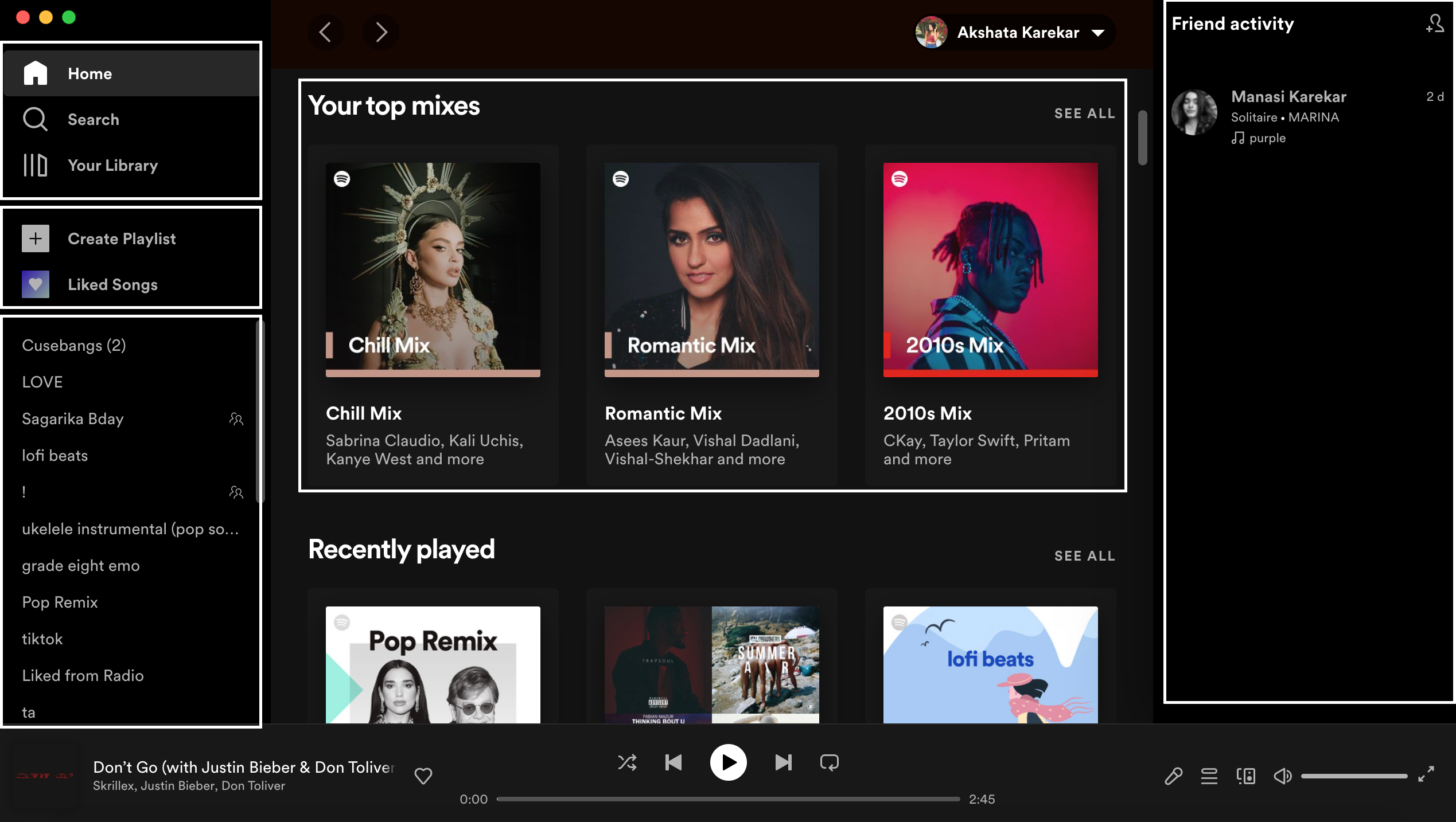
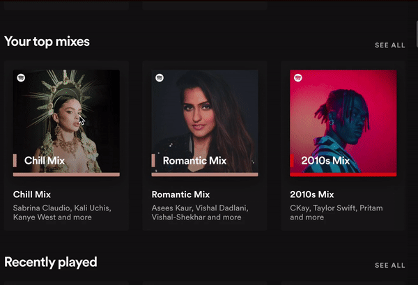
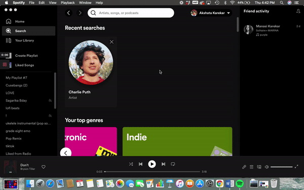
The landing or homepage is the first page users land on after launching the app. Being signed in, the information architecture of the page makes each feature of the app easy to understand and very discoverable. The page includes a list of playlists on the left, a combination of liked songs, playlists, and recommendations accompanied by a title image in the middle section and a friend activity section on the right. The construction of this page aligns with the mission of the brand which is discovering new music and is constantly updating based on listening data and algorithms.
Media Control Symbols
The bottom of the page consists of the media control symbols along with the most recently played track. The conceptual model that already exists in the user’s minds about how the media control symbols are supposed to be used pans out nicely for the sticky play bar because every symbol such as play, pause, previous, or next track is universally recognized. The mapping of this page is very effective because the controls and their feedback are purposefully placed.

An example of a lack of feedback that does not serve the visceral processing of our brain is that there is very little indication that a song is playing on Spotify when the user is away from its playlist. A better way to indicate that would be a color difference in the media control bar.
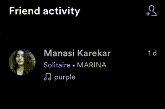
Every element on the page holds a visual signifier that links to another page, or performs an action. The text changes color on hover, the images have hover filters, with the play option present almost everywhere on the screen. An effective example of this is in the friend activity section that enables each user to view what song their friend is listening to. The micro-animation of the play icon over the profile picture on the hover immediately signifies that the song your friend is listening to will now play. This micro-animation is an excellent method of song discovery.
Browsing Songs
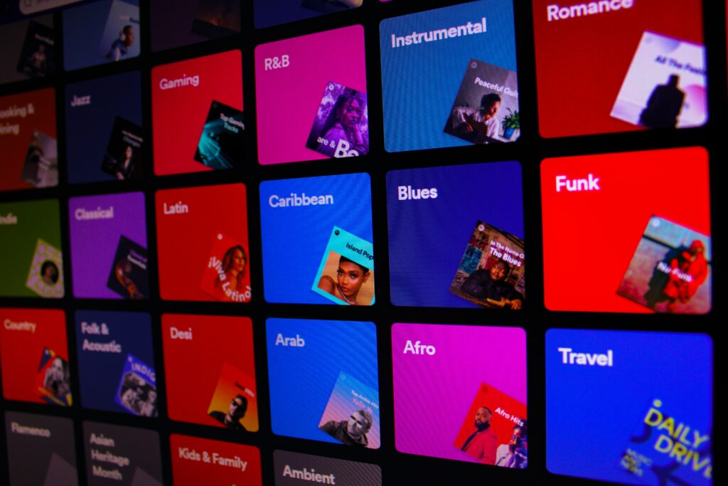
Search, which is a piece of basic knowledge in the world for most users is placed in a very similar location making it easier for users to start using the functionality right away. Users are already aware that hitting the search icon, typing a song name, receiving recommendations as you type, and then hitting enter to land on the results page has become a basic function. Spotify mappings on their search page not only facilitate typing up a song name but also show recently searched songs and recommend a preferred genre of music in big well-defined colorful sections with titles and imagery. If in a state of confusion about what to listen to, the user can scroll down and select a genre to reveal popular playlists and new releases.
Editing and Creating Playlists
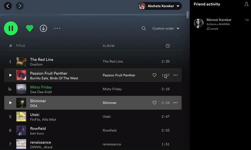
Creating a playlist is very intuitive on the app, with a constant section dedicated to just creating a playlist on all screens of the app allowing it to be very discoverable. Inside a playlist, however, clicking on the title of a song highlights the section, signifying that an action will take place after it has been clicked on, however, there is no feedback and no sign of action which makes it difficult to bridge the gap between the gulf of execution and the gulf of evaluation. Playing the song as feedback to that action would help solve this problem.
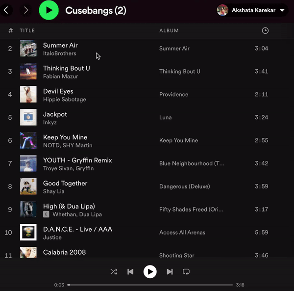
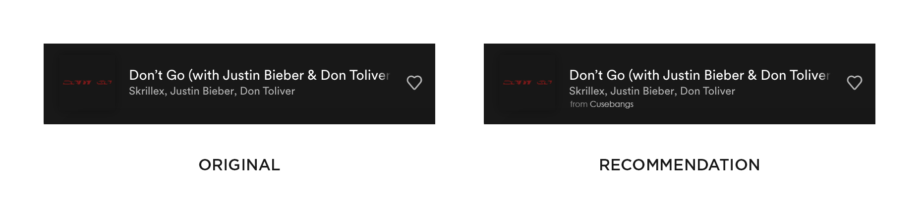
If a user wants to play a song from a playlist and happens to navigate away from the page, it is impossible to know which playlist the current song resides in. There is no signifier that the song belongs to one or multiple playlists making it difficult to find it again. A method to solve this would be to add a text signifier of which playlist was the song discovered from.
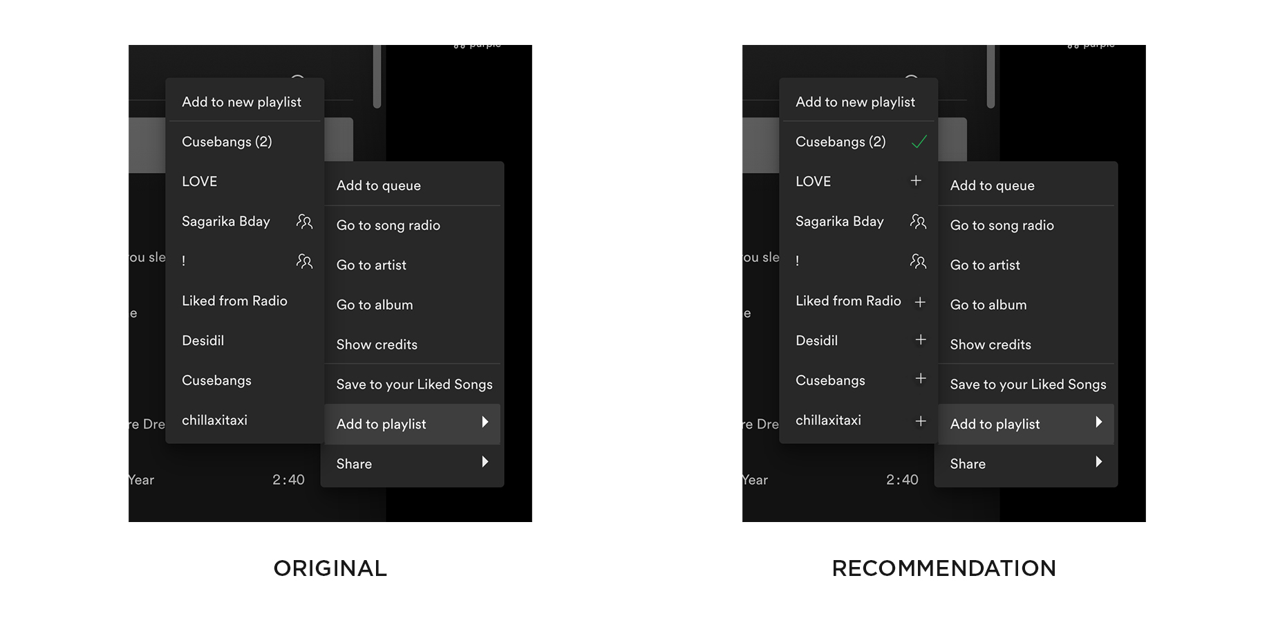
A constrain that users come across is the inability to add one song to two or more different playlists at the same time. Now this qualifies as a constrain if Spotify did not want their users to add one song to multiple playlists and to preserve variety however if the user has to repeat the same process as many times as the number of playlists the song needs to be added in, it leads to frustration. A solution to this would be for the dropdown menu to afford to select multiple playlists using the plus sign and signifying addition through the use of check marks.
Spotify is a very simplistic, usable user interface that highlights the most important functions of the app. With a few basic modifications in the user flow, Spotify can become an effective and influential tool for its users.