Twitch is a popular live streaming service and application that allows people to interact with each other through chats and video broadcasts. This streaming platform offers a large variety of topics (music, cooking, lifestyle, etc.), with video games currently being the dominant subject.
Twitch is available on their website, iOS, Android, Mac, Windows, consoles (PS4, Xbox One), Chromecast and Apple TV. Specifically, I will be critiquing the iOS application through the following attributes:
1. Navigating the ‘Following’ tab.
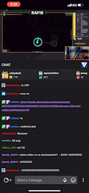
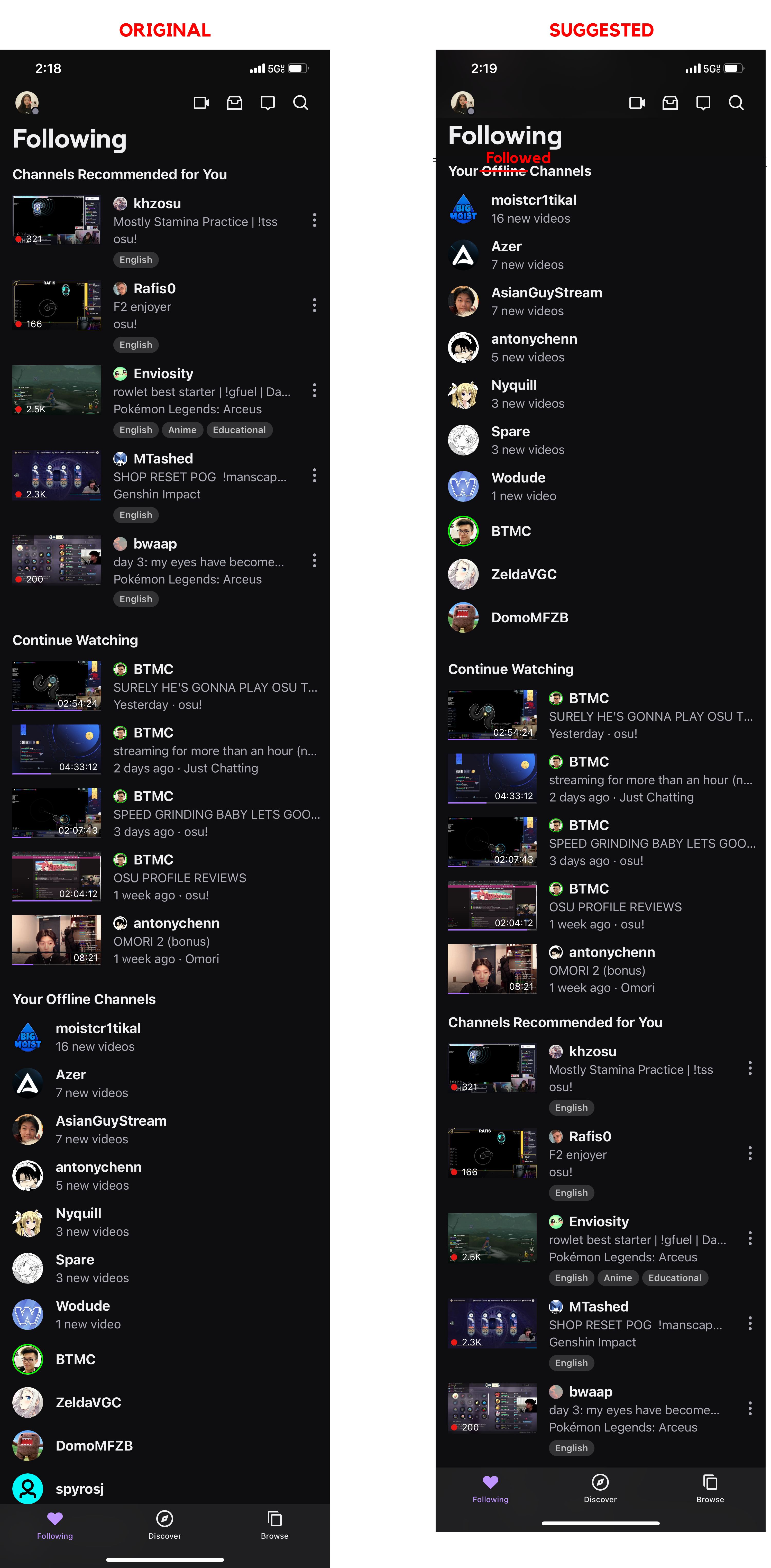
First, there is too much scrolling required to access the list of streamers you follow. In other words, there is no immediate feedback when selecting the Following tab, as the first thing the user will see is a “Recommended for you” section and not a list of streamers they follow (which is what they would expect). My suggestion would be to swap the “Offline Channels” and “Recommended for you” sections – this will allow the user to discover who they follow immediately (Figure 1.1). Also, renaming “Off Channels” to “Followed Channels” will improve the understandability of the section’s intended purpose.
2. Exploring between the ‘Discover’ and ‘Browse’ tab.
While accessibility is a good concept to incorporate into the app, the ‘Discover’ and ‘Browse’ tab sections particularly on Twitch’s app can appear redundant for several reasons:
- Main categories and sub-categories consistently appear in both tabs.
- Channel and video recommendations appear in both tabs.
- Similar levels of content hierarchy in both tabs.
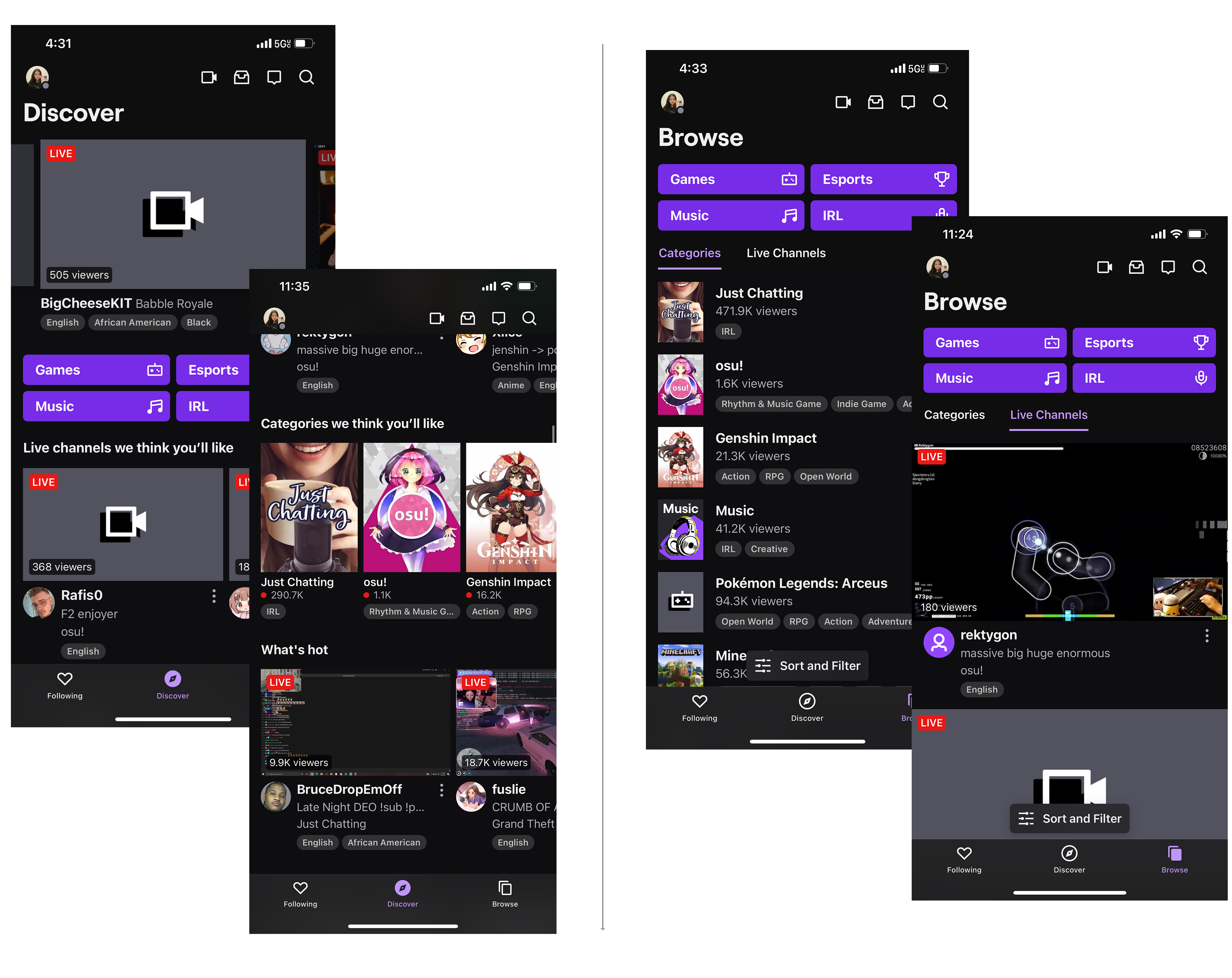
Understanding how to interact back and forth with the two tabs may consume much of a user’s cognitive load. Personally, I see that both tabs have the same elements, and are just organized in different ways. A simple solution would simply be to consolidate the two sections into one, and the name of this new tab can be ‘Discover’ or ‘Explore’.
Additionally, the design of content hierarchy could be improved. For example, in the ‘Discover’ tab, the video display sizes below the main categories can scaled to smaller sizes, so that the videos at the top of the interface appear more “featured”.
3. Starting a livestream.
Streaming is the most important aspect of Twitch, but the feature itself on the general interface appears minor. There are currently several ways to start broadcasting, but it is not easily discoverable. Therefore, the ease of use at first encounter may start off low for broadcasters in particular, which also means that knowledge of the head would be used to fluently stream in this app. The button to start a stream on the top menu is a small, unlabeled icon (Figure 3.1). This can be improved by moving the icon button to the bottom navigation menu and including the text “Go Live” under the icon. This suggestion makes live streaming more discoverable, and indicates the obvious affordance of being able to stream, for broadcasters.
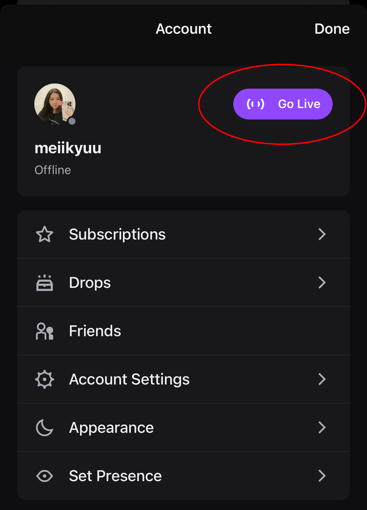
In Figure 3.2, a user can also start a livestream after accessing the Account window through clicking the profile icon at the top left corner of the screen. The call-to-action is better and more noticeable here because of its large, emphasized purple button, making it more discoverable and a more obvious signifier.
4. Viewing a livestream.
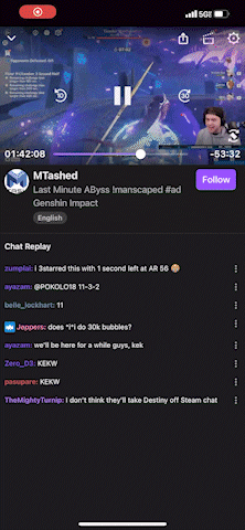
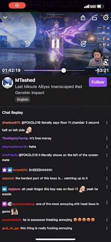
One interesting and unique feature of the app is the ability to continue watching a livestream video without staying on the app (Figure 4.1). This breaks the traditional physical constraints a typical online video has, where the video would normally cease playing upon exiting the window it is situated in. Being able to move the video block freely around the phone screen with a finger (Figure 4.2) is not only an unexpected, but also a pleasant, convenient feature that considers the user’s behavioral expectations.
Furthermore, the user is able to easily change the orientation of the screen with a clearly shown icon on the corner of the video screen. The orientation setting is locked in until the same icon is clicked on again. Twitch makes sure that all elements of the interface will successfully adapt after switching to a horizontal view (Figure 4.3). Overall, I think that viewing a livestream is an example of good design.