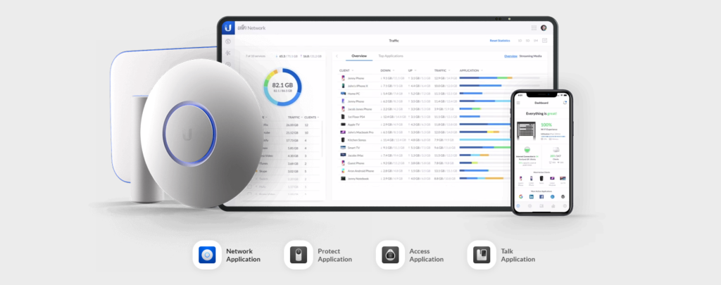
Ubiquiti Inc.’s UniFi OS is an all-in-one network device managing software. UniFi OS allows users to set up connected Ubiquti devices such as network routers, switches and wireless access points. Users can also monitor network traffics and client devices, while having advance features such as port forwarding and network isolations for a robust network setup.
Sign in
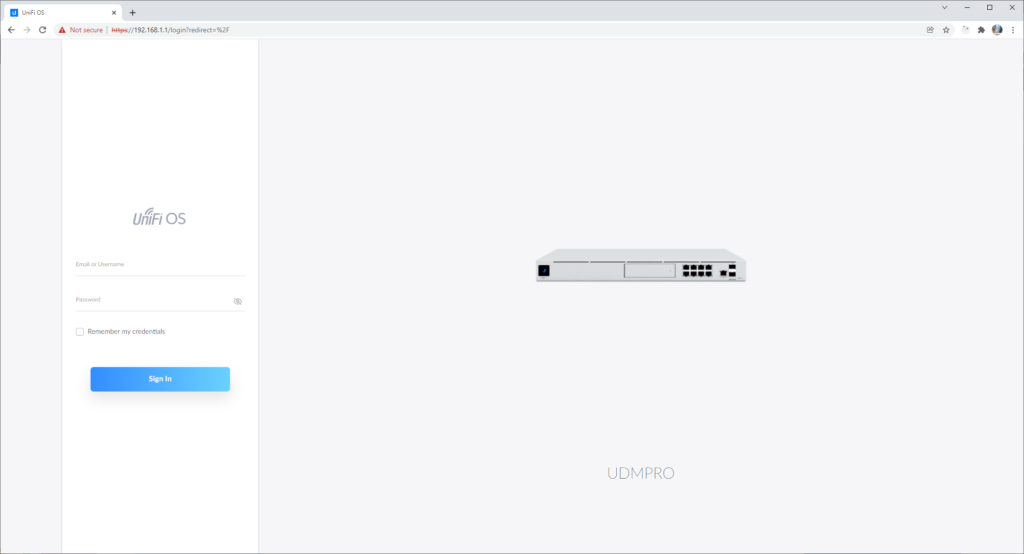
Figure 1A 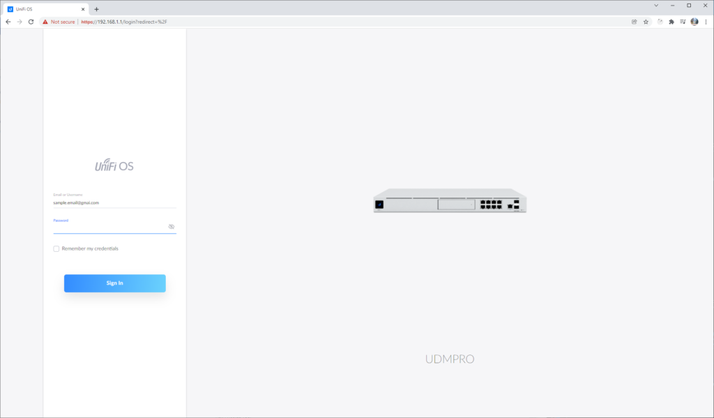
Figure 1B
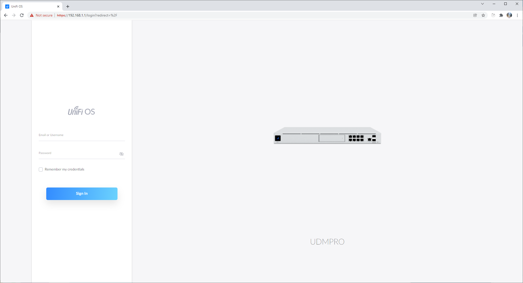
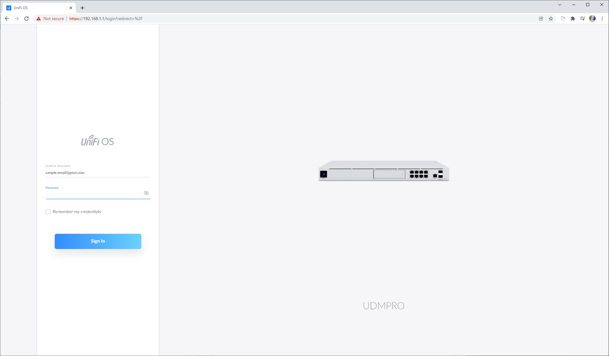
Once users have connected their UniFi Dream Machine Pro (UDM Pro) to their internet service provider’s gateway and connected a laptop/PC to the UDM Pro, they can access 192.168.1.1 on their browser to get to the log in page. Users will be greeted with a very discoverable login interface on the left. The input box color will change to blue when the user clicks on a the input box (Figure 1B), providing a proper feedback for the user to see where they are currently typing. An obvious signifier is present for the sign in button as it is the only blue button on the entire page.
Dashboard

Figure 2a 
Figure 2b
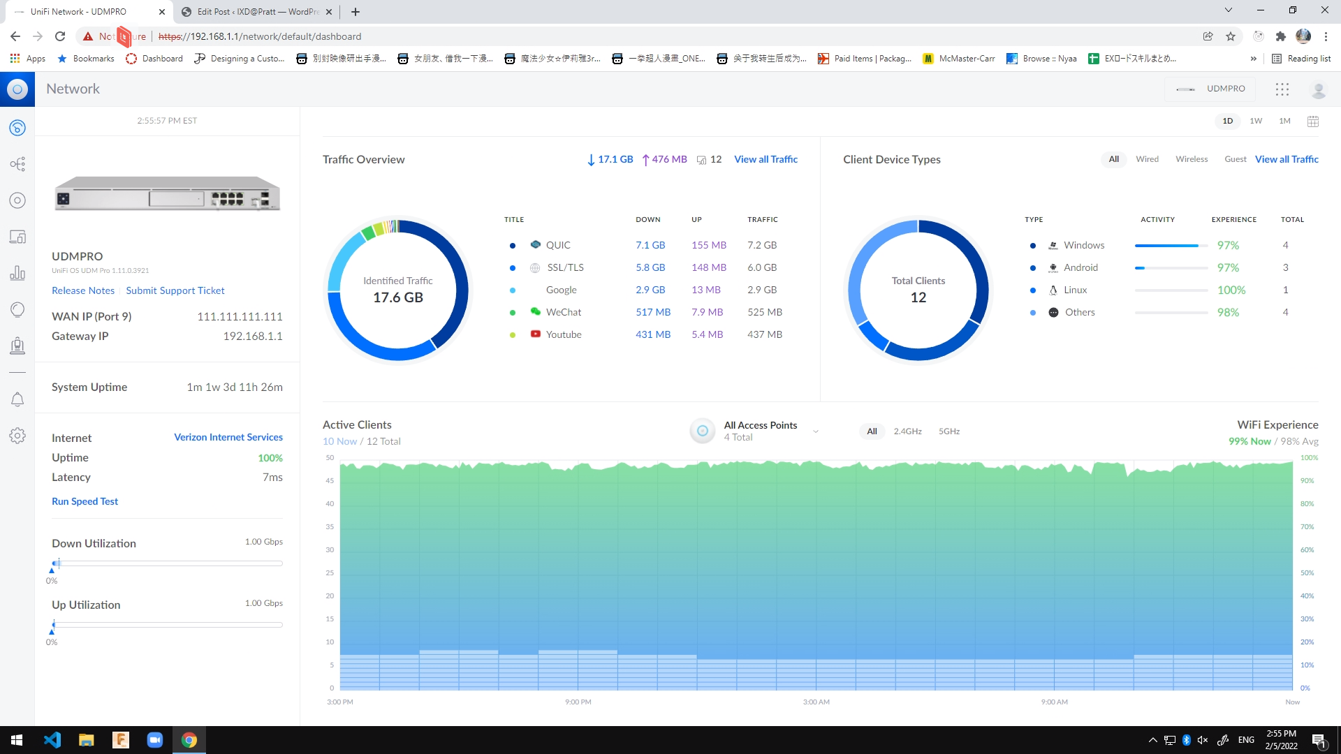
After the user has logged in with their credentials, the user can see the dashboard of their own network (Figure 2a). It provides some basic details like the WAN IP address and the current gateway address on the left side on the page. The part that takes up the most space on this page is the statistics of this network. Users can see an overview of their network traffic (how much data is being transferred using what app) and the client device types (what devices are the users mainly using under this network). At the bottom, the user can see a summary chart of the WiFi experiences of all the devices (how good the WiFi connections are).
Now here comes the problem. Most users logging into UniFi OS probably has some kind of actions or changes they want to do on their network. In other words, this landing page filled with statistics that are not very useful to most people. A good system image should be able to communicate to the user how the interface can be operated, but this page makes the experience confusing and users would have trouble knowing what to do next. In order to make perform other task using this interface, users would have to use the navigations are on the left, which only shows icons until the users hover on the icons to see what the icons are meant for (Figure 2b). Although the gulf of execution could be big for users spending time how to navigate to the page they want, these icons do have a good mapping. Once the users see the label of the icons, they will understand where to go from there.
Solution:
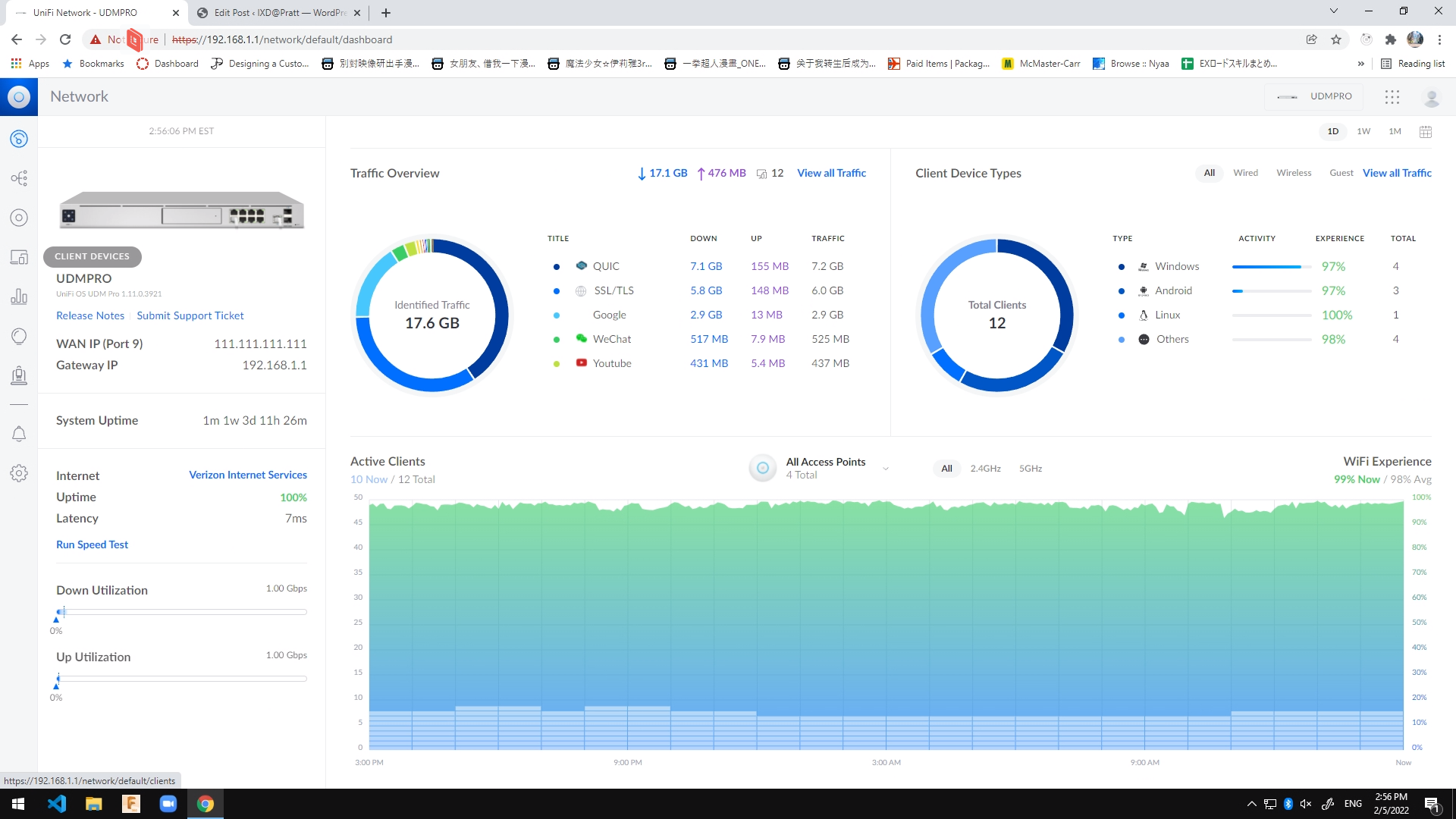
A quick simple solution to the navigation problem would be showing the icon labels right under (Figure 3) or to the right side of the icons, providing good signifiers for the users to know where they can go next.
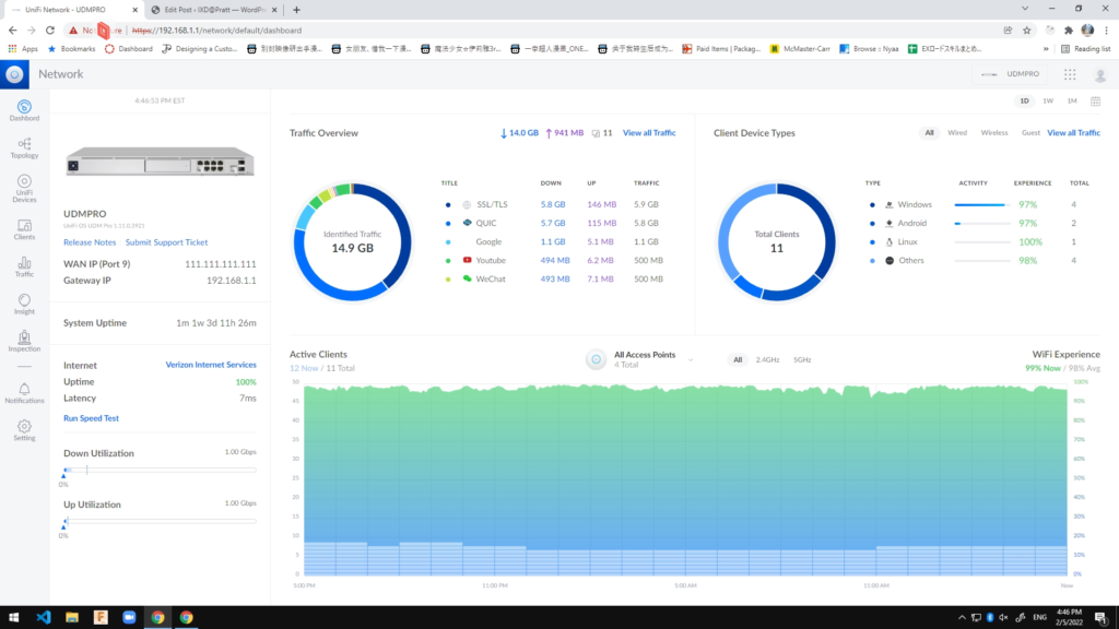
Figure 3
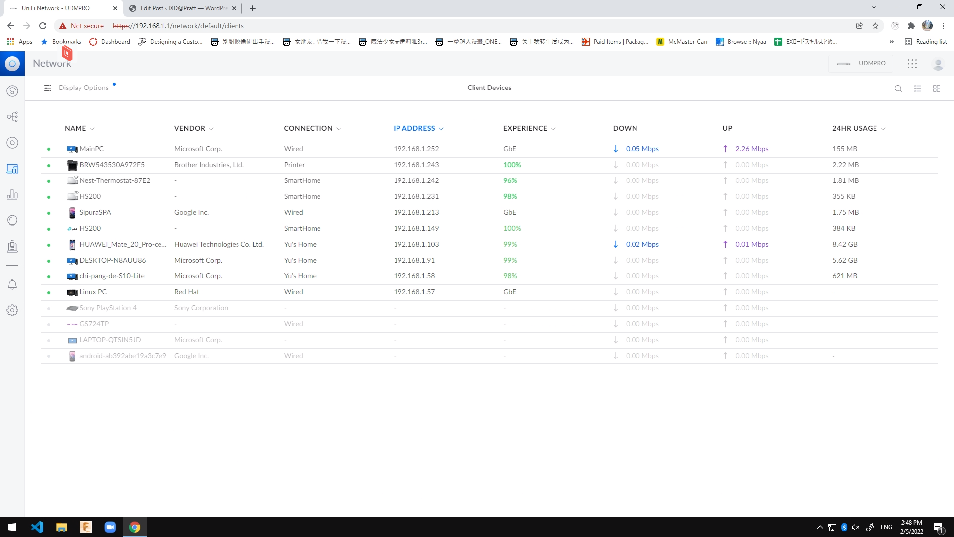
Client Devices
Finally, when we click on Clients icon on the left, we would be redirected to the page that contains a list of devices that are connected to the network (Figure 4). Users can use this page to check what devices are currently connected and perform different tasks on these devices such as assigning static IP address, checking what the current IP address is or kick/disconnected certain devices from the network. This page is just a very typical table list with sorting and filter functions. Users with pervious experiences could probably create a conceptual model in their minds on what they can do when they see a table on a page.
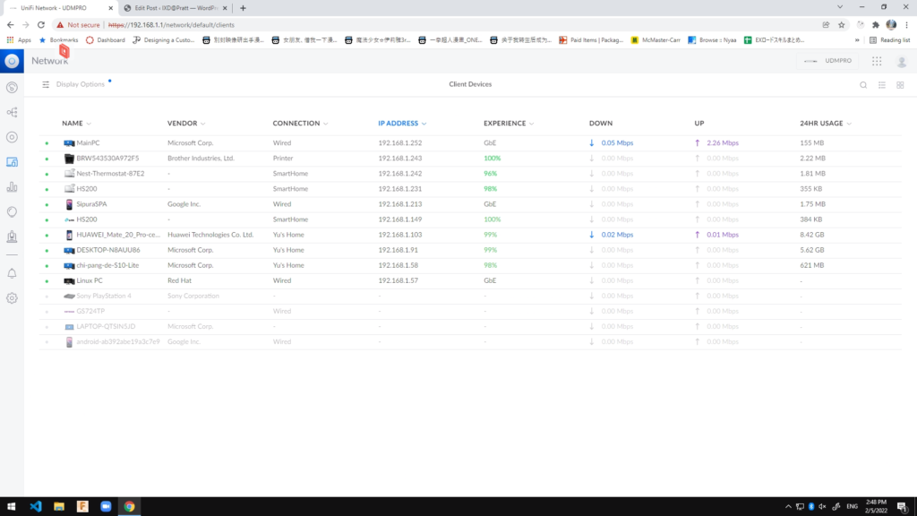
Figure 4
When the user click on a row on this table, a panel will slide open from the right, showing the details of that client device (Figure 5). The page does again provide a suitable feedback showing the panel quickly responding to the action, but this panel is rather too small. Everything else take up too much space and the users only have about 20% of the screen to work with.
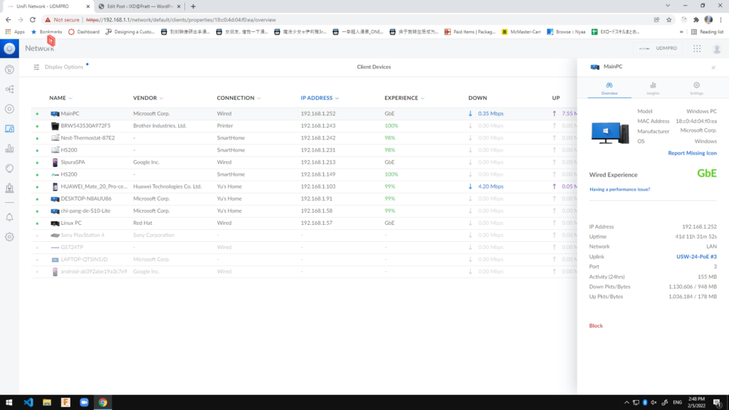
Figure 5
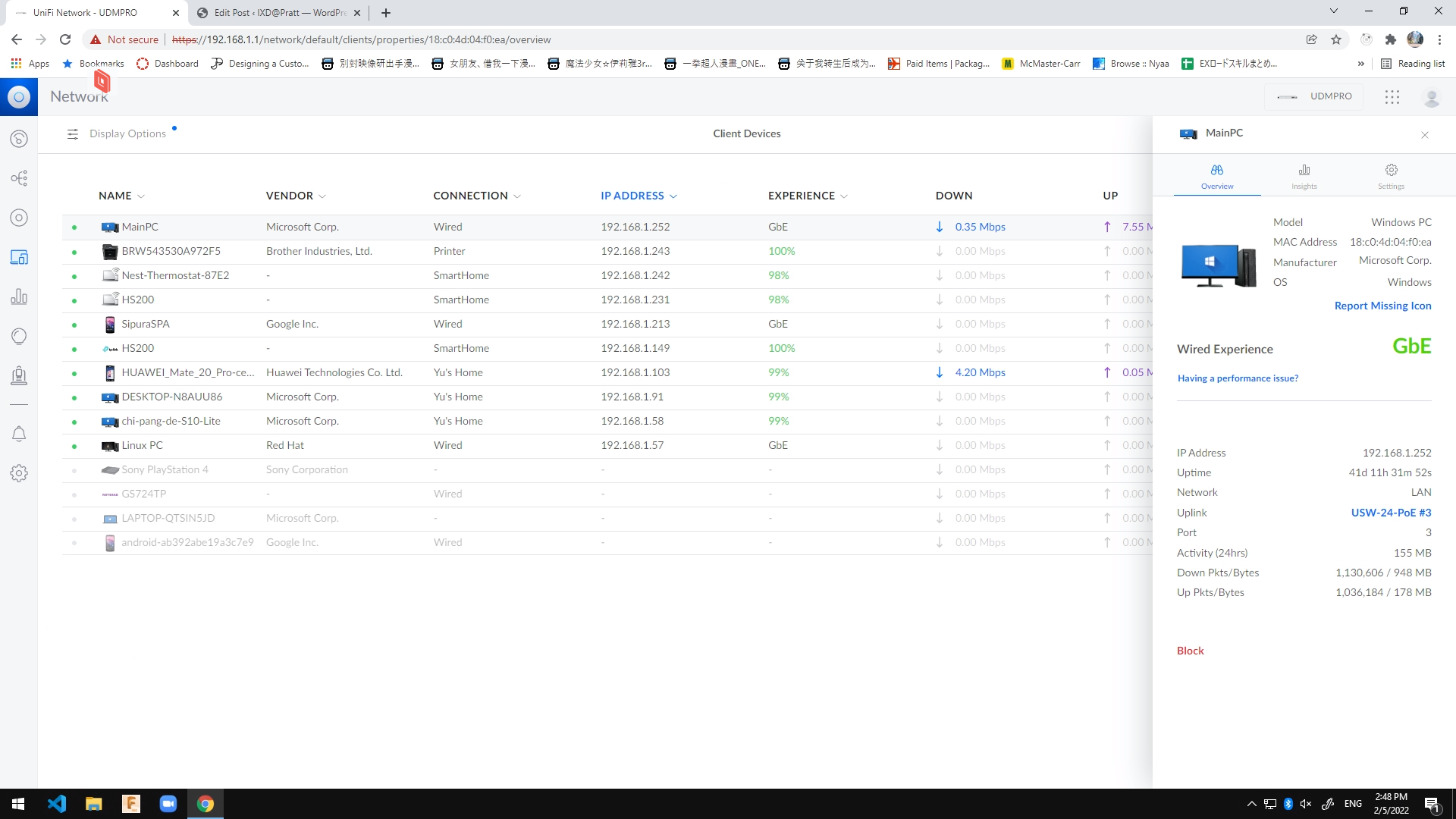
Solution:
A quick solution for this is to change the way of displaying the panel, or simply just increase the size of the panel to almost the middle of the page, and maybe even rearrange the content to use up more space (Figure 5).
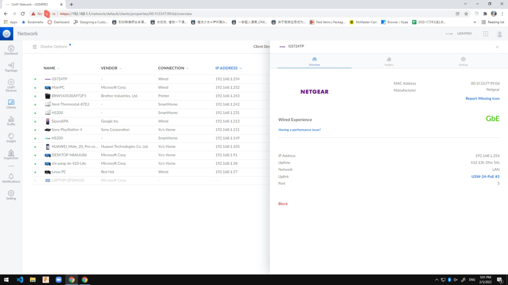
Figure 6