Overview
USA Rugby is the national governing body of the sport in America. With over 3000 clubs active in all 50 states, USA Rugby’s website is the front door for people of any age or location accessing information related to events, matches, membership, and more. The non-profit organization hoped to gather behavioral insights as the first phase of their digital transformation. With an interest in better understanding how their users are accessing and navigating their site, our team took part in improving navigation architecture, re-organizing the events-related pages, and improving signifiers to ultimately improve the usability of the site.
Methods:
Quantitative analysis
Our team:
3 other UX Consultants from the Center for Digital Experiences:
- Fariah Qasim
- Hao Ni
- Yifan Wang
Tools:
Hotjar + Google Analytics
Deliverables:
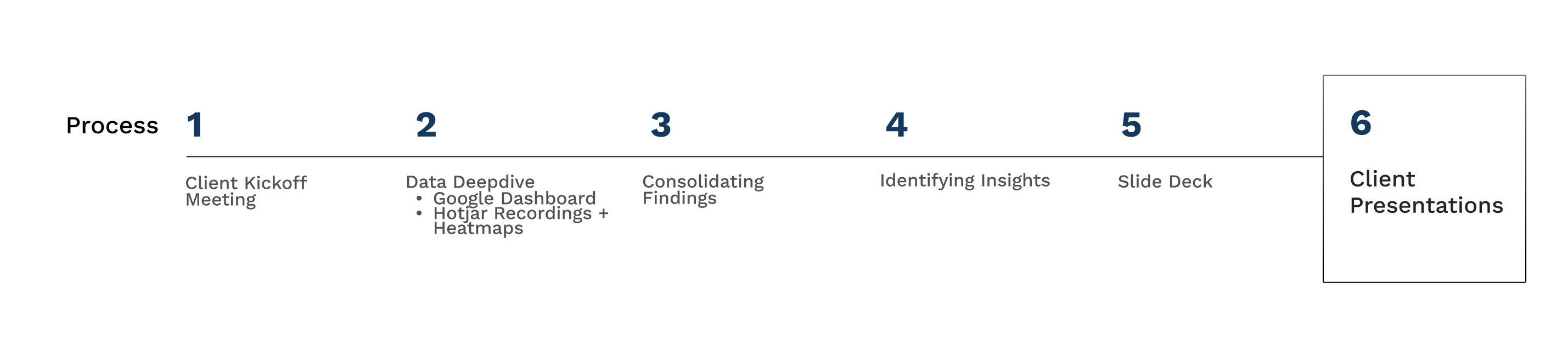
We crafted 3 total deliverables:
- Slide deck of findings and recommendations
- A/B testing plan
- High-level single page summary
My role:
As UX Researcher, I was responsible for developing the research plan, collecting and analyzing Hotjar and Google Analytics data, consolidating Hotjar findings, slide deck writing, and collectively presenting to the client.
USA Rugby’s stakeholders want to better understand their users
To approach this project, we initially met with 2 stakeholders of USA Rugby; the stakeholders recognized that the site was a work in progress. They acknowledged that there were multiple ways to access the same information, links were occasionally broken, and there was an abundant amount of information overall. As they were Rugby fans themselves, their attitudes acted as a proxy to users; instead, the organization was looking to better understand how user behave to understand which sections of the site they should funnel their resources into when moving into their redesign phase.
In-person event attendance is a vital metric to the organization
Through our stakeholder interviews we learned that attendance at National events is one of USA Rugby’s major growth metrics. As the pandemic shifted, the organization expected there to be an increase in frequency of events. Therefore, our interests quickly tuned in to focus on optimizing the upcoming showcase of events-related pages specifically.
Objective
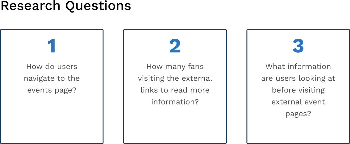
Through our research we hoped to identify how users of USA Rugby navigate past and upcoming events to understand current user interaction with the information architecture and content so that we may increase event exposure and participation to bring together fans of USA Rugby.
We then developed the following research questions to achieve this objective –
We sought to better understand user behavior using quantitative methods
As our research questions were focused on user behavior (the what), we chose quantitative methods to address them. In order to focus on the behavior and natural use of the product, we applied the following Field methods:
Web Analytics – Google Analytics
Heatmaps and recordings – Hotjar
Field methods were key to start deepdiving into the data immediately, as no participant recruitment was necessary. Data is collected simply through users organically browsing the site with cookies enabled.
Using these two tools, we would dig deeper into Google Analytic’s Dashboard as well as Hotjar’s heatmap and scrollmap tools. USA Rugby provided us with access to their platform in order to get a better picture of what their users are doing.
ANALYTICS
Web Analytics is the collection, analysis and reporting of website data (audience, traffic sources, content, conversions) with the purpose of making business decisions.
Specifically, Pageviews and Avg. Time on Page are critical tools for making initial insights.
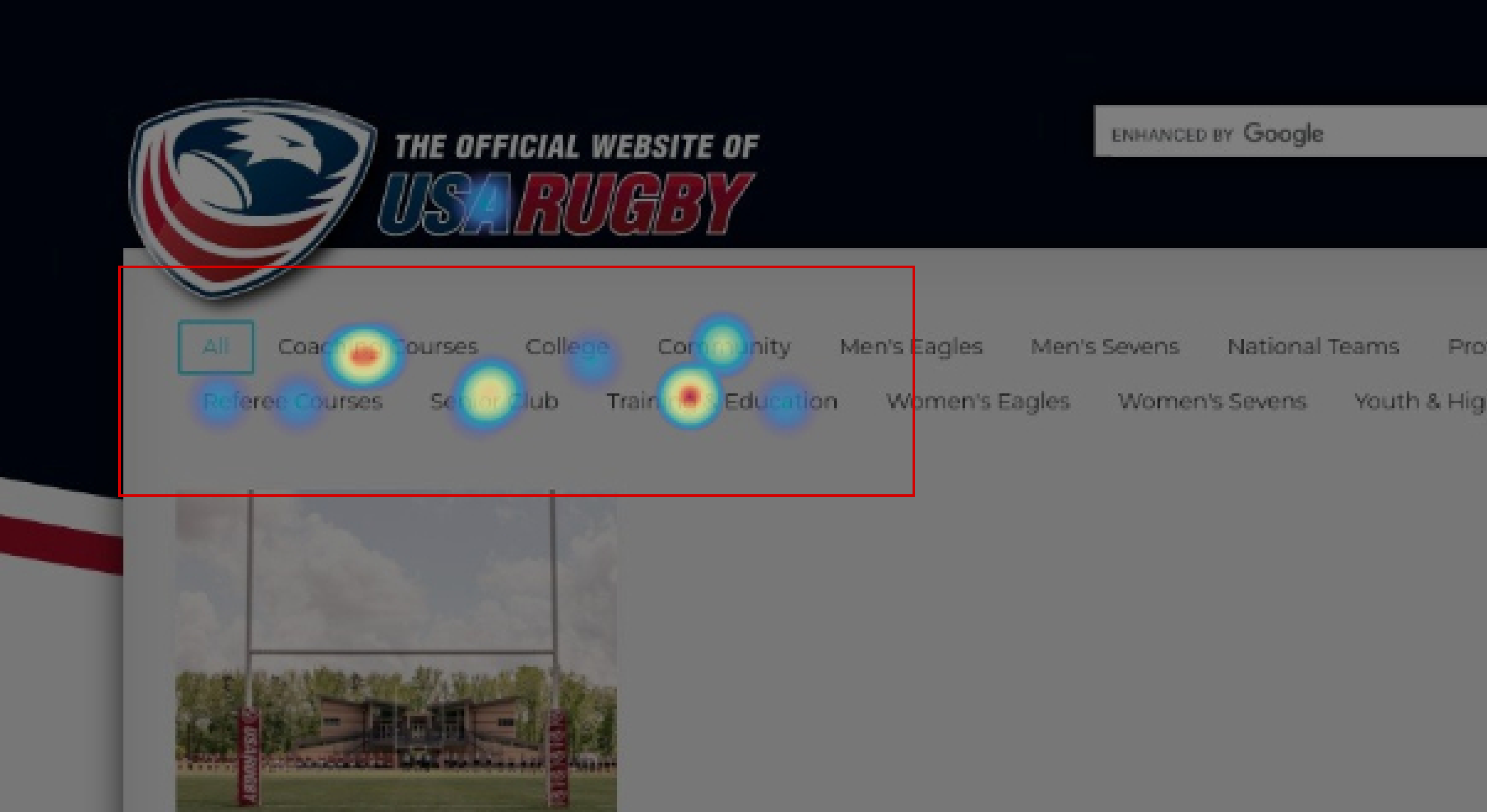
MAPPING
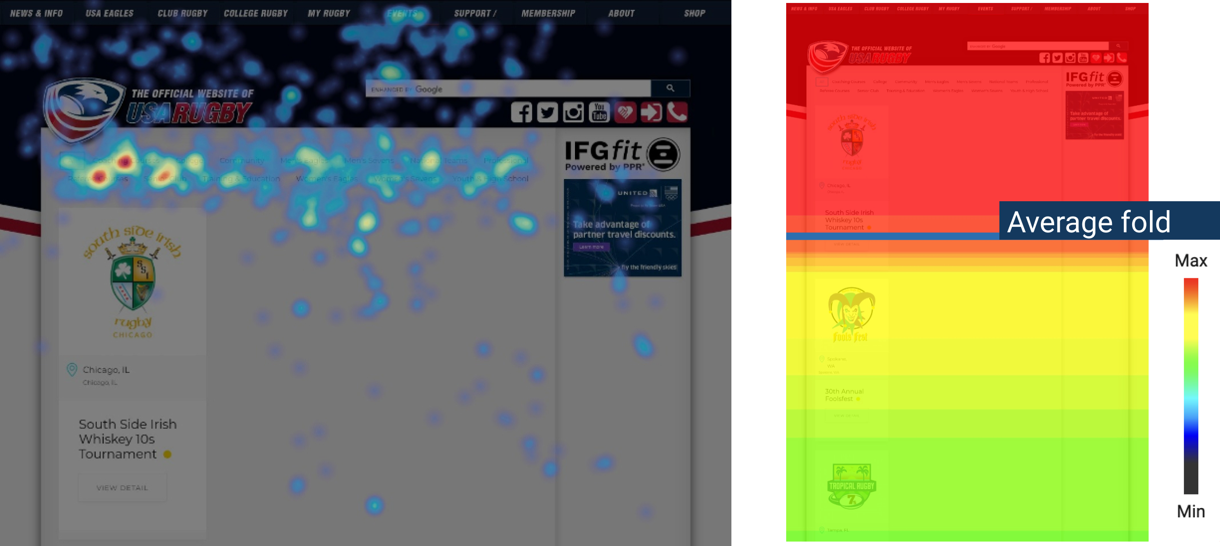
Heatmaps visualize the volume of clicks or mouse movements. The brighter the area, the more popular it is (shown left).
Scrollmaps visualize how far most users are scrolling down a page. The most viewed parts of a page are presented in hot colors and the least popular parts in cold colors (shown right).
INITIAL EXPLORATION
1. There are 3 conflicting ways to access events
Initial impressions of the site were eye-opening as our team was unfamiliar to sports’ digital landscape. From what we learned from the stakeholder interview, we expected to see a complexity of information held within the site. As the site is a place for both fans and members, it offers nearly every resource available at the user’s disposal.
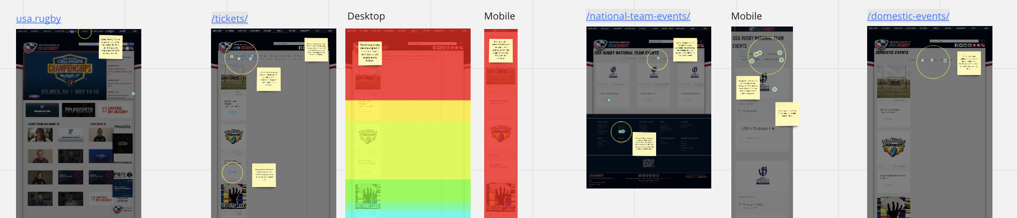
We quickly discovered that the current architecture provides three different ways to explore events.
- Within the top navigation, if a user clicks directly on Events, they are brought to the Tickets page, shown on the right. This Tickets page includes all types of events across the board.

- If the user hovers over Events instead of clicking into it on the top navigation, they’re presented with this submenu that forks events into a National Events page or a Community Calendar page. Therefore, overall there are 2 ways to discover domestic and national events. Either by clicking directly into Events, or using the submenu.
All 3 of these pages include Event cards. Each Event card depicts individual event information such as event title, location, and a link to view more details.
A limitation to note was that the Event cards link to external pages associated with specific events. These pages are not associated with USA Rugby. Therefore, we were not able to track user behavior after users were taken to the external page.
2. The event pages seemed to be mobile-optimized despite device usage
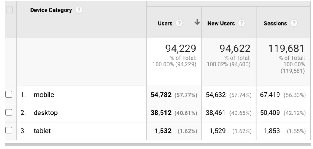
While mobile has more users than Desktop in the past year, we chose to focus on Desktop only as some Desktop pages appeared to be only mobile-optimized – meaning arranged in a single column. This was low hanging fruit for our team.
3. Analytics and Heatmapping provided a more complete browsing story
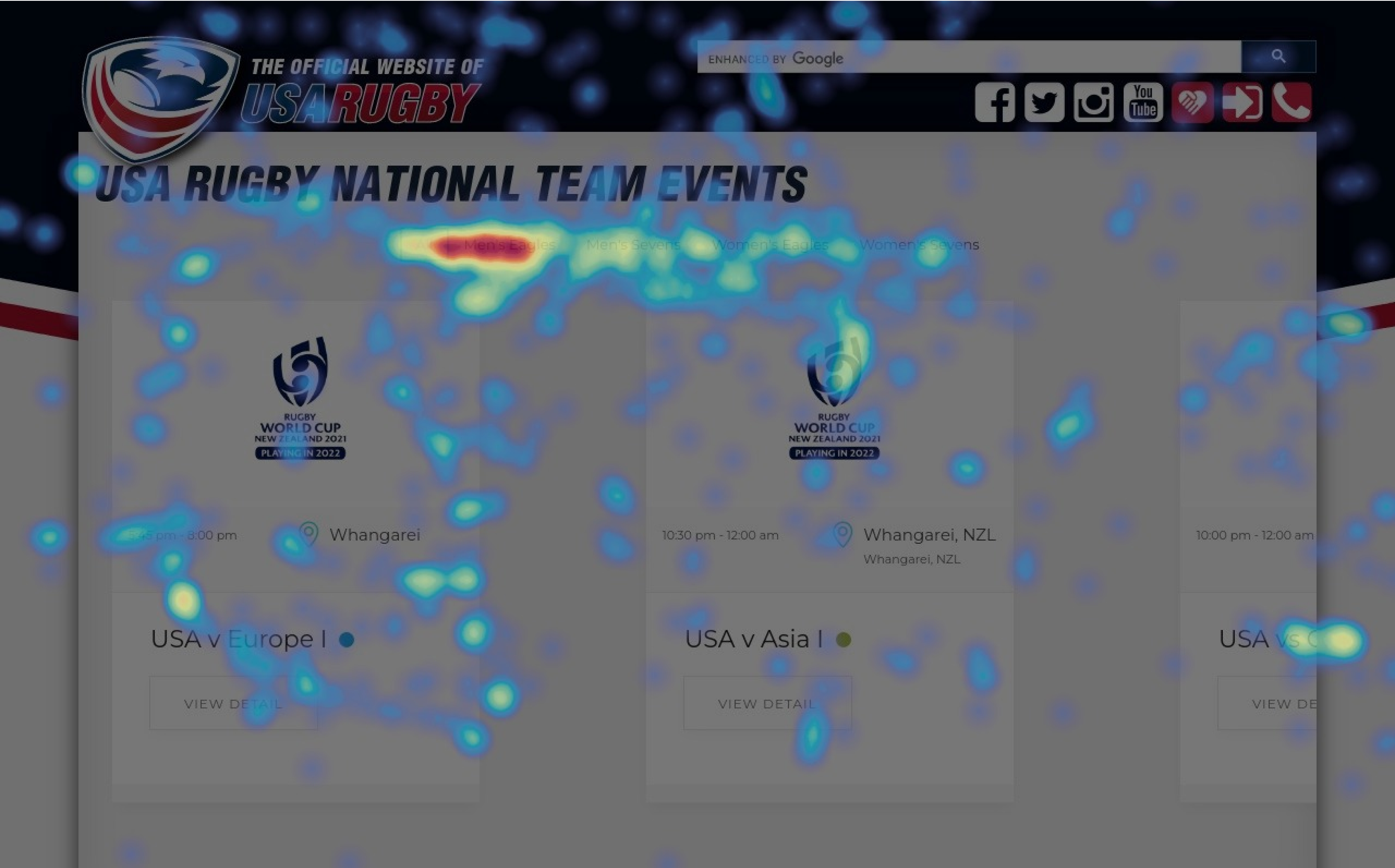
Our Hotjar findings helped us to identify aggregated behaviors across devices. We reviewed Heatmaps and Scrollmaps for the following event-related pages and I aggregated hot spot findings for them –
- https://www.usa.rugby/tickets/
- https://internal.usarugby.org/national-team-events/
- https://internal.usarugby.org/domestic-events/
While we were interested in the Recordings feature that showed participants cursor activity live, we were not able to identify any meaningful findings within them.
Within Google Analytics, a collection of screenshots were used to address each research question. By combining our findings from the two tools, we developed 3 insights and recommendations for improvement.
Through this exploration, we became very interested in figuring out a way to streamline all of the event-related information for better understandability and discoverability.
We deemed it most important to help users navigate community and national event pages by figuring out how to create unity while still allowing users to understand the different types of events, aspirationally increasing long-term event participation. The following sections highlight our top three findings and complimentary recommendations. These were chosen based on what we deemed to have the most severe implications on user behaviors.
Main findings & Recommendations
What we found:
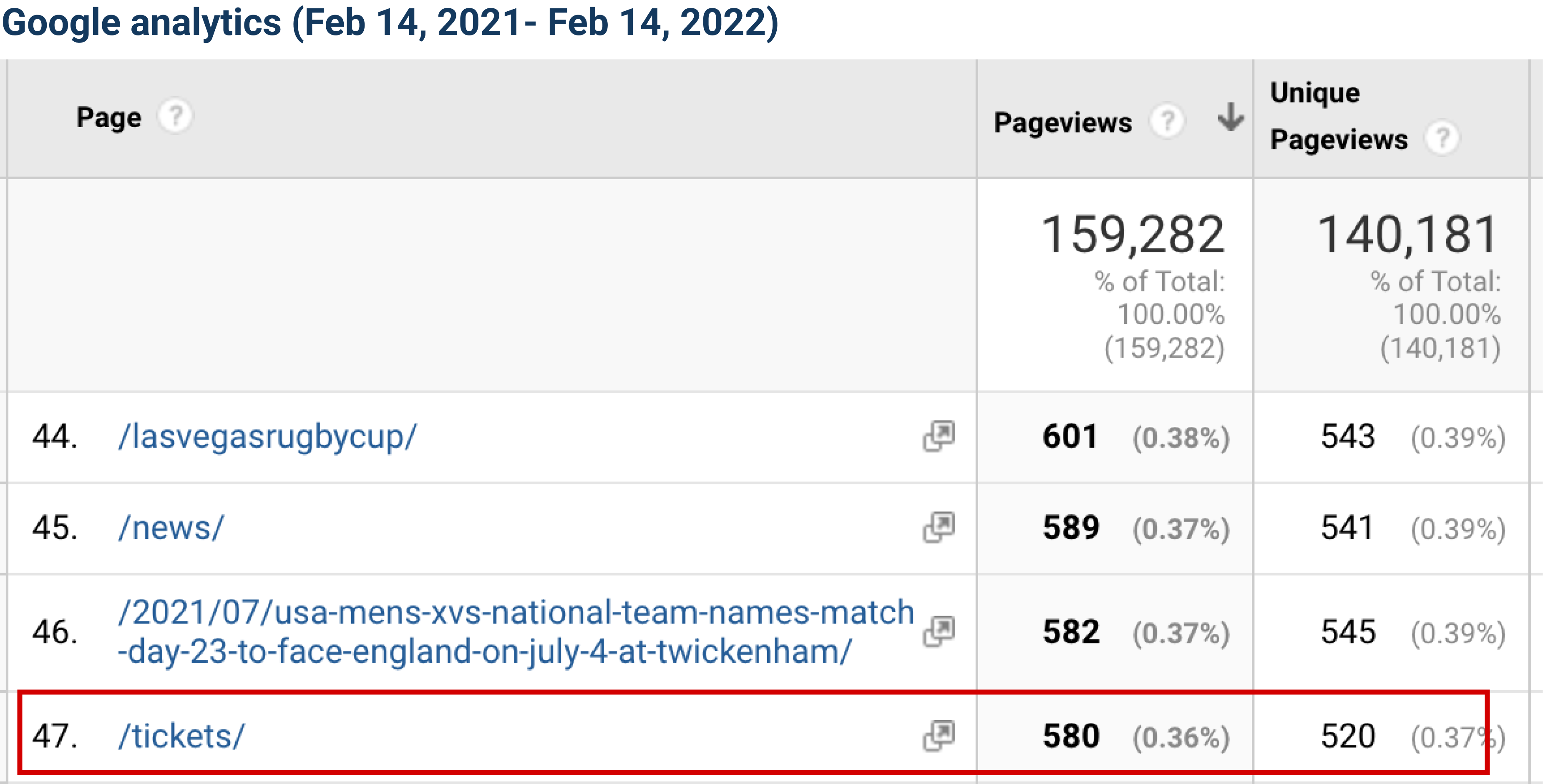
1. A missed opportunity to explore all events in one place
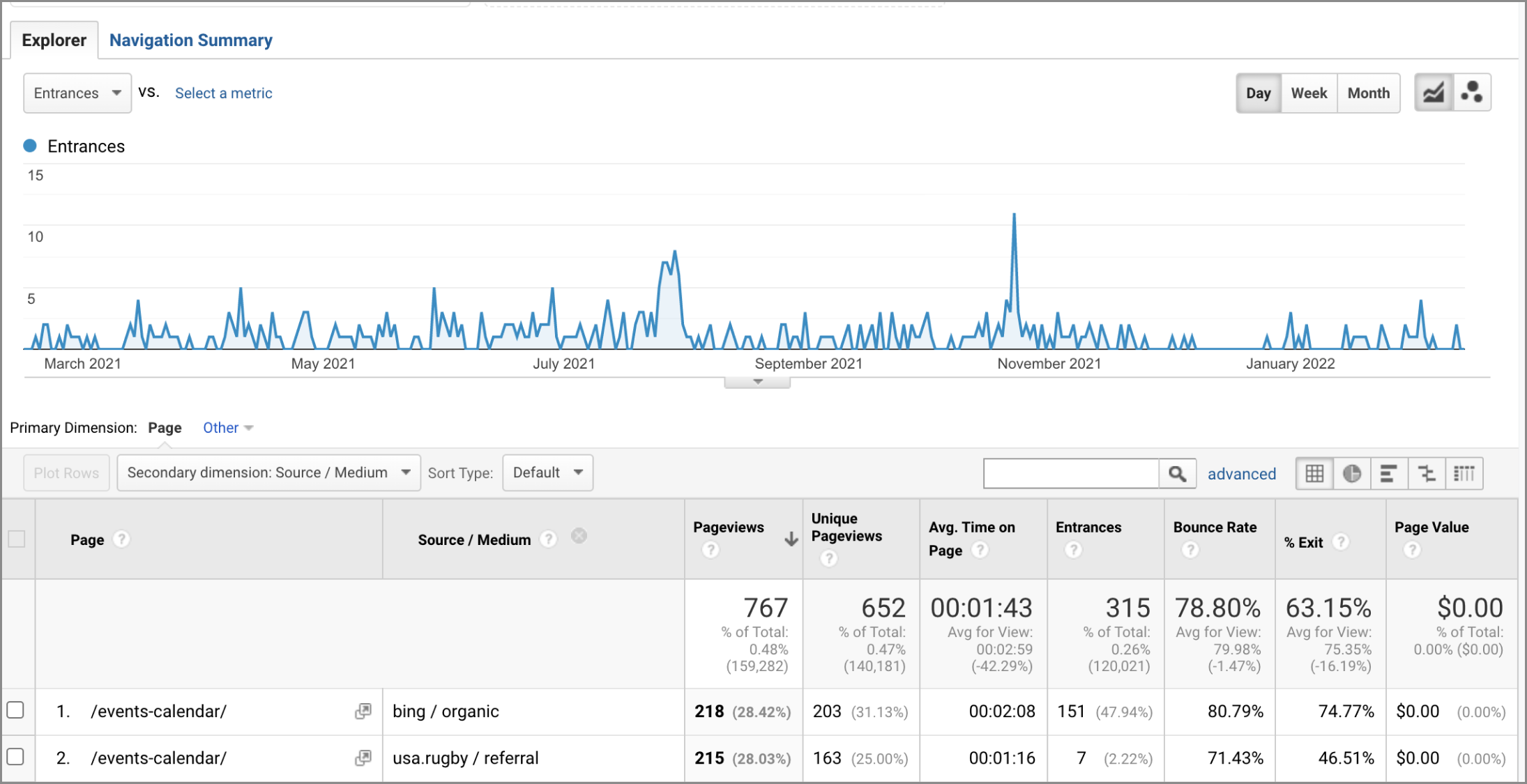
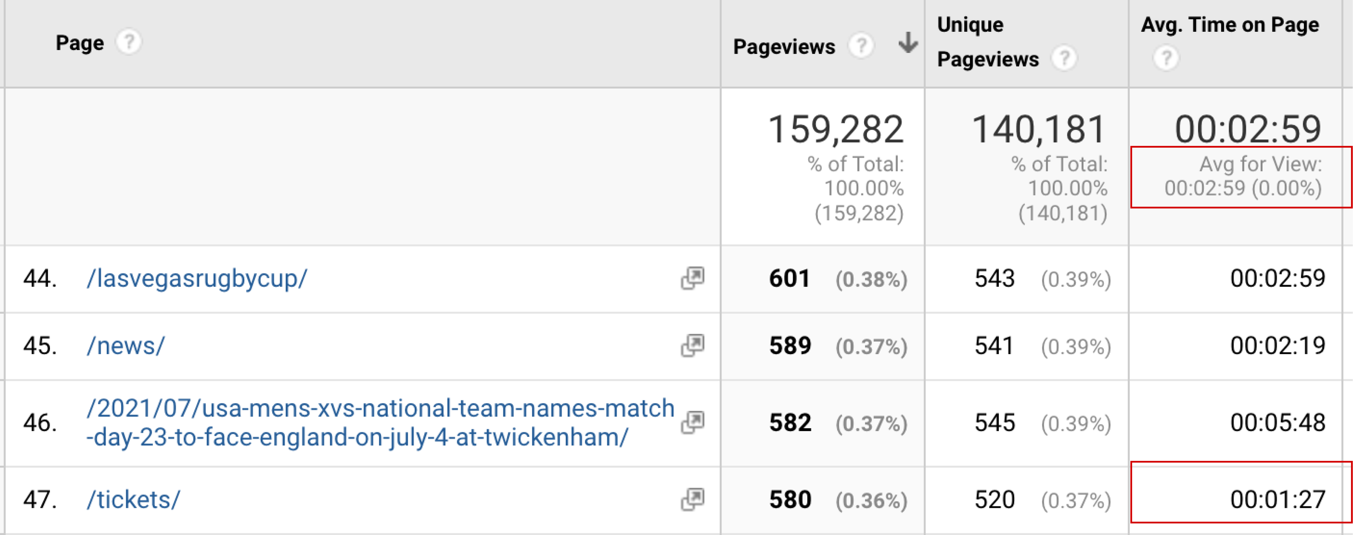
The Ticket page provides important National and Domestic event-related information. However, it lacks pageviews and ranks just #47 among all pages on the site.
Additionally, nearly half of users visit directly, while 30% are from an Instagram referral. Overall, we found the session duration to be much lower than average.
Conducting initial user interviews may have provided a better picture for determining user interest in ticketing and events. However, our research scope was focused on how users are navigating through the site to provide data-driven quick-fixes to help the organization understand what information users are viewing vs. ignoring.
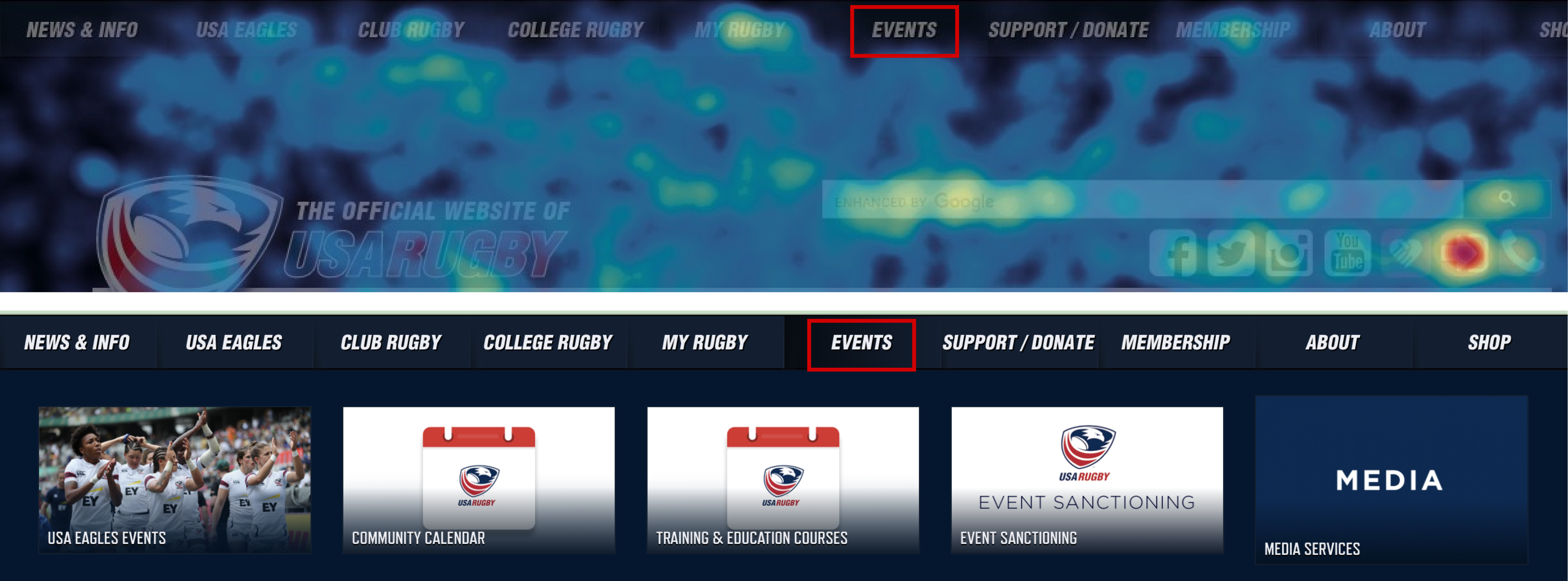
The Hotjar heatmaps reinforced our analytics findings, as we noticed users tend to not directly click into Events within the top nav. Therefore, they are missing the opportunity to see the Tickets page, which combines both Domestic and National events at a glance.
The specific National event page (titles USA Eagles Events in the sub-menu) ranked #5 among all pages on the site, while Community (Community Calendar in the sub-menu) ranked #23. This insight led us to the solution of leveraging the high number of Pageviews of National events to help increase exposure of Community events for all users.
Our recommendation
Create a one stop shop for Events
We suggested combining the three event pages into one to improve exposure across all event types. Therefore, revising the navigation bar to combine the “Events”, “Domestic Events” (Community-level) , and “National Events” into one page.
This will provide a more comprehensive calendar-like experience as the existing calendar feature photo indicates.
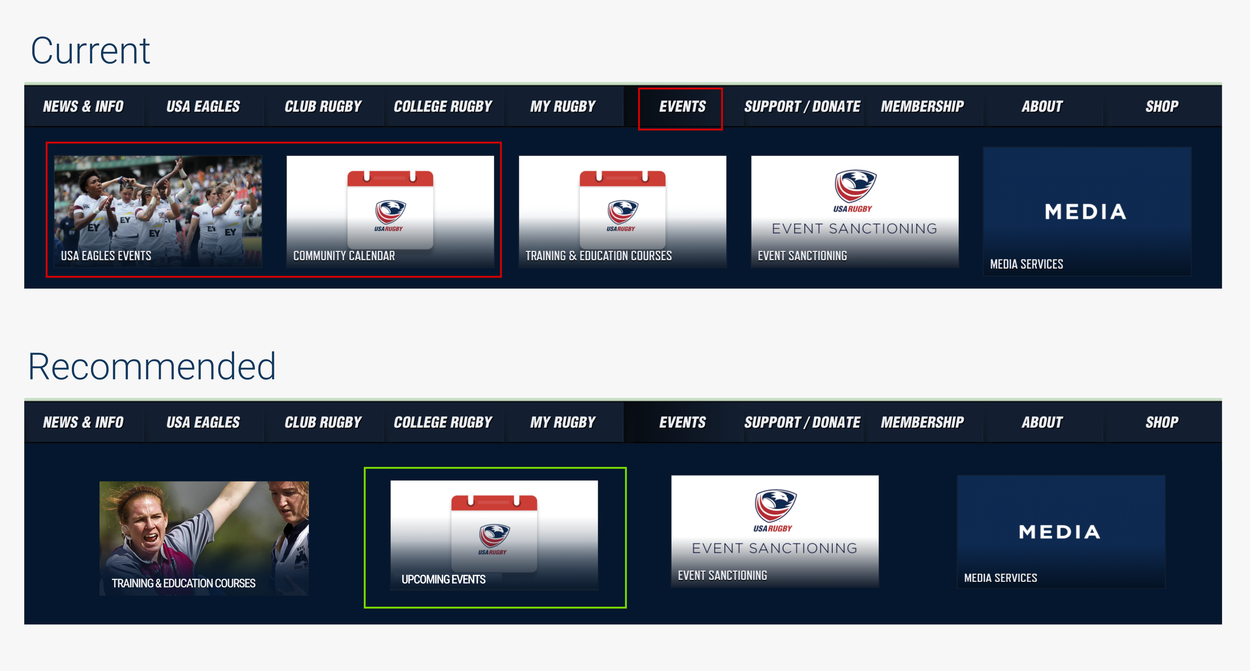
We also recommended the new page titled ‘Upcoming Events’ in the navigation to be more consistent with the current page title.
What we found
2. An overuse of filters
Click maps revealed that users are attempting to click on the event filters within Tickets. However, many of the metadata filters contain no results. It appeared that users were exploring the filters on the left side of the screen, and not proceeding to further explore on the right as we can assume they were discouraged by the lack of results/feedback when clicking.
Additionally, users spend 50% below site-average time exploring this Tickets page.
Scroll maps of the Tickets page show that users are not scrolling to the bottom, therefore missing an opportunity to discover all of the events.
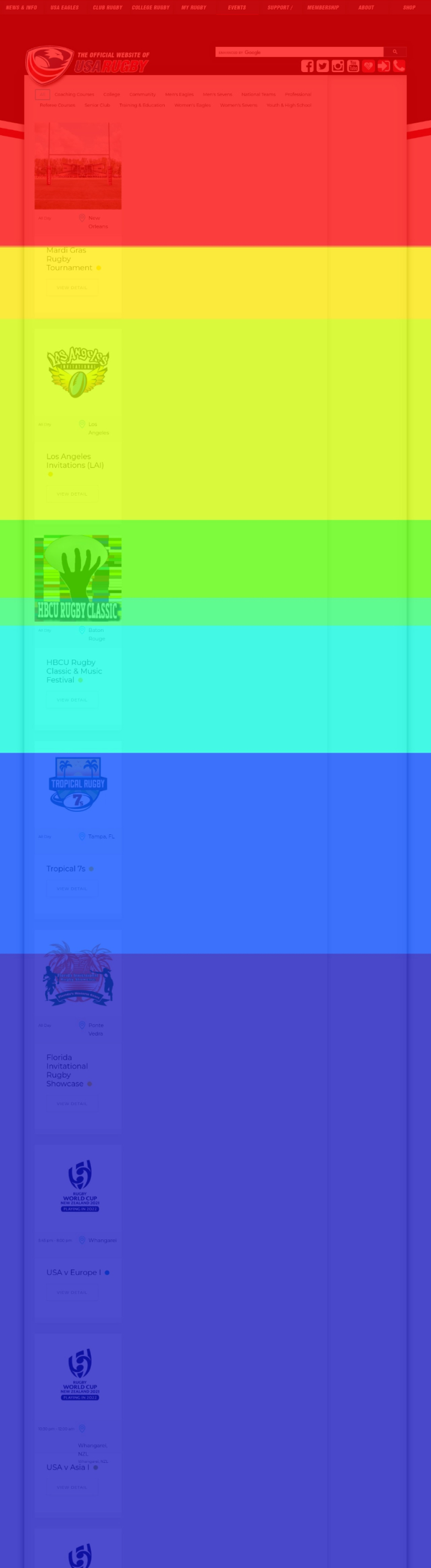
The Tickets page presents events in a single column when accessed via desktop, therefore requiring additional time and effort to scroll down.

Our recommendation
A better way to house 3 segments
We recommend using filter tabs on Upcoming Events page to help users better understand the available segments Filter tabs will allow users to sort between National and Community events, as pictured below.
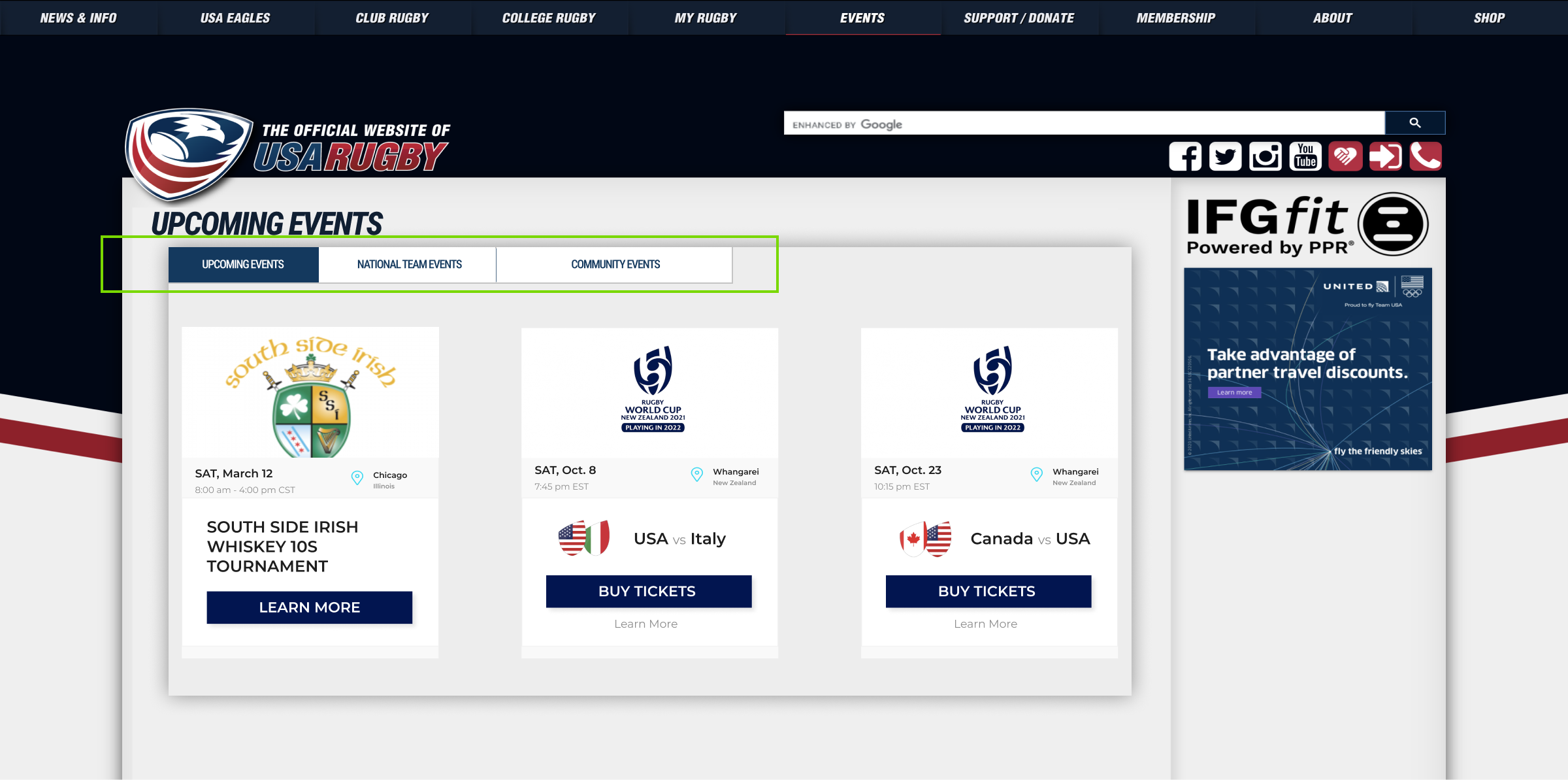
Providing an option to differentiate the 2 levels of events rather than the 12+ current metadata filters provides more efficient segmentation. There are only 15 total events, therefore filtering by metadata within the existing site requires more effort than simply browsing.
What we found
3. The most relevant details are not obvious
Move Map results show that users are viewing the information on the event cards. However, when they click the ‘View Detail’ button, it takes them to a page full of text.
On the View Detail page, we found that users are indeed browsing through the text. However many of them are missing the link that will take them to the tickets purchase page. The link that takes tickets to the external link to purchase tickets appears to be buried at the bottom of the page. We assumed this placement made it less discoverable and actionable.
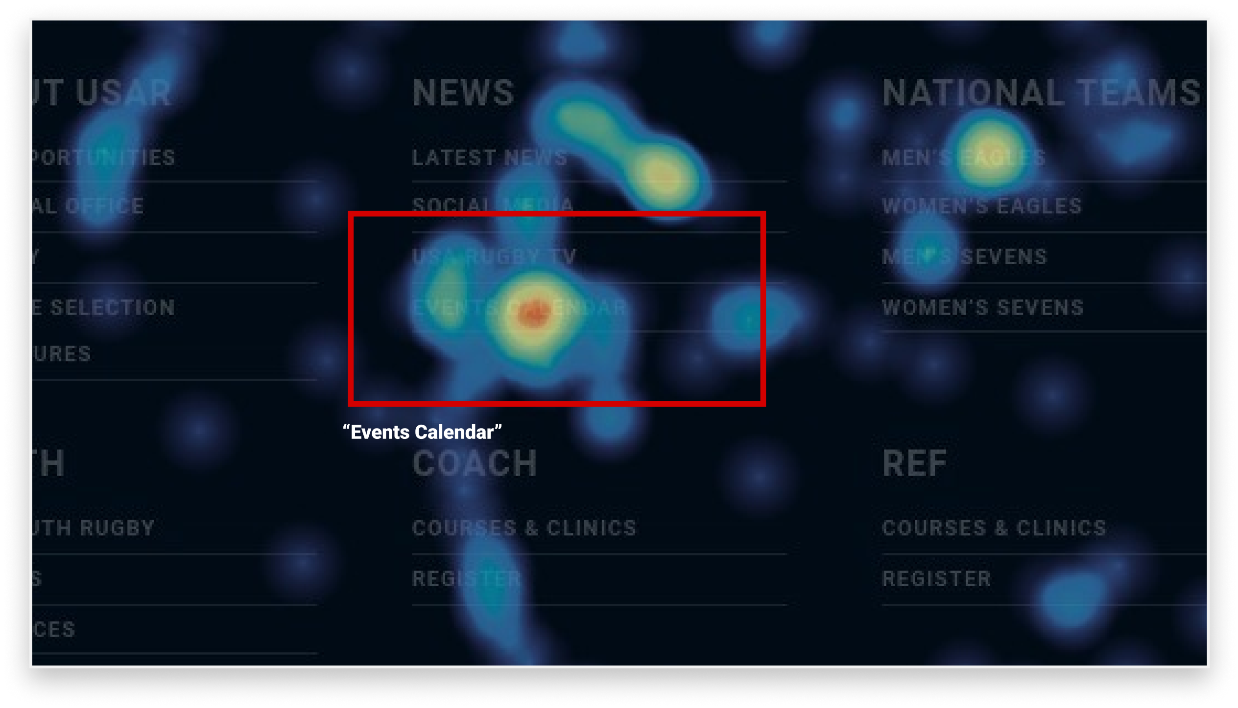
Users often accessed the Events Calendar link from the footer when they are on national events page and domestic events page – however this link is broken. We imagined this would cause frustration, acting as a barrier to fan participation.
Our recommendation
Provide users details up-front for decision making
We recommend that USA Rugby redesigns the Event card to prevent users from unnecessarily browsing for important information. The new Event card design should include the date and ticket purchase options:
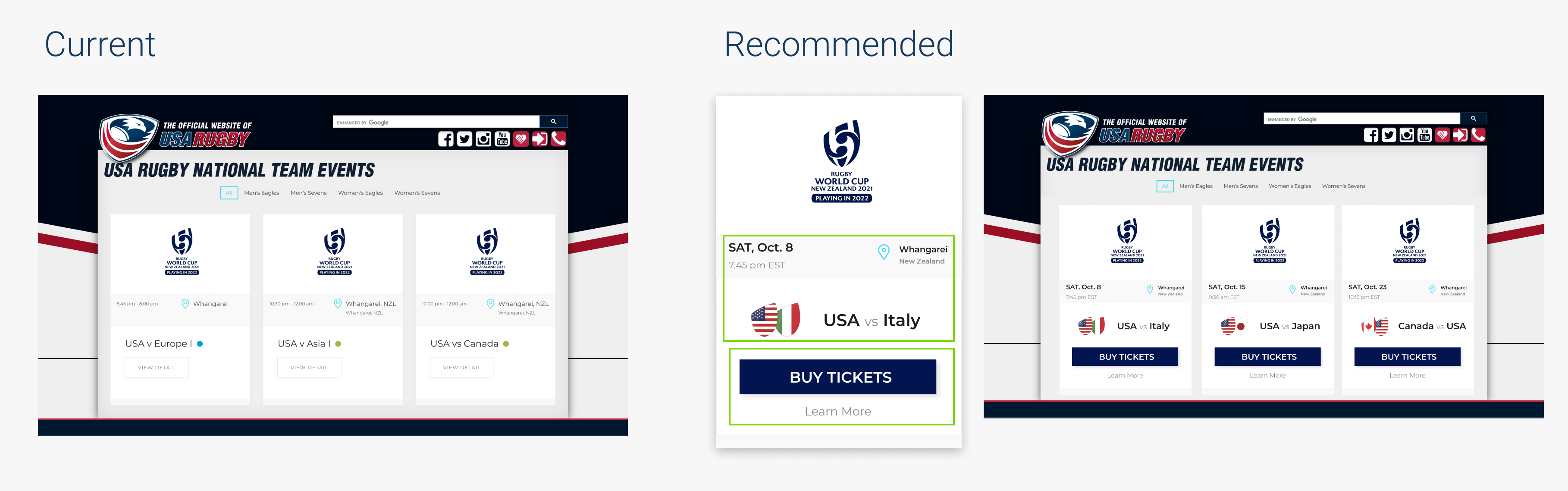
Providing specific information related to the events will improve users’ experience while browse through the events. Having a highlighted ‘Buy Tickets’ button is likely to increase the number of users finding the ticket purchase page, and thus increasing event attendance.
Overall, a more streamlined site will improve understandability
Our recommendations are meant to be holistically or individually applied. Ideally, if all three solutions were implemented, the site would appear as below –

In the end, we accomplished the following goals:
- Identify user behavior with the current information architecture and content to increase event exposure and bring together fans of USA Rugby.
- Understand the navigation patterns of USA Rugby users within Events-related pages.
- Emphasize the differences between the multiple event pages to improve understandability.
The client felt they better understood how users were behaving

At the conclusion of our research timeline, our team presented our slide deck to three stakeholders at USA Rugby. Overall, they were impressed with how we gathered our findings and insights without a previous understanding of the sport of Rugby itself. We had a short Q/A to help them better understand the navigation updates we proposed in the first recommendation to unite National and Domestic events into one page. This was important to clarify, as our A/B testing plan revolved around a universal navigation bar update.
NEXT STEPS
The A/B Test Plan we created using Recommendation #1 is set to be implemented over the course of the next few weeks. We aim to improve the discoverability of the Events/Tickets page to increase exposure to upcoming events. By making this change, the Events/Tickets page should experience increased page views. Data on Google Analytics will be collected to measure the effect on the count of Pageviews of the Events/Tickets page and confirm or refute our hypothesis.
Please see below to further explore the slide deck, overview, or A/B test plan –