Project Summary
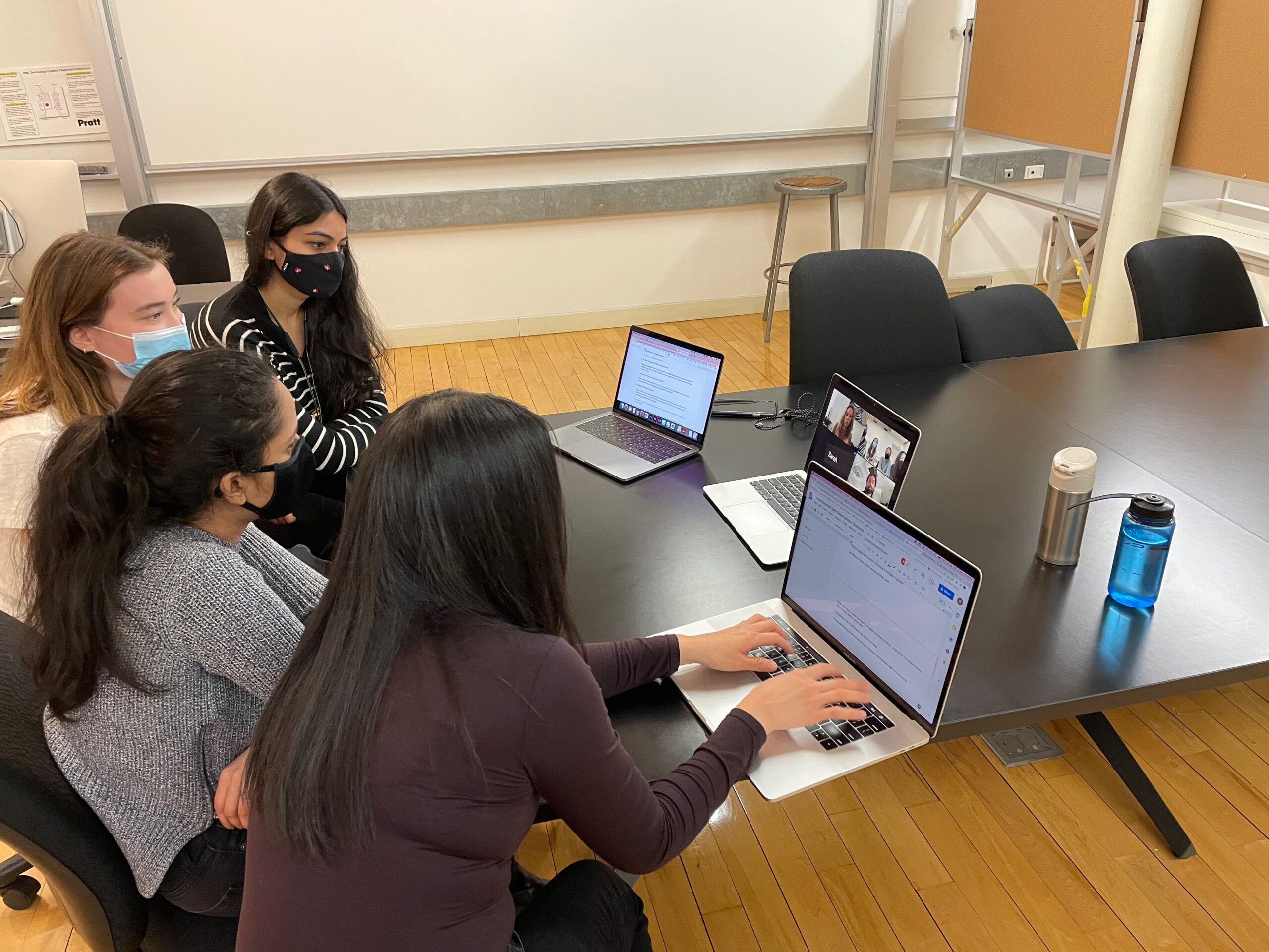
Packitgourmet.com is a family-owned, boutique e-commerce company based in Austin, Texas, that sells shelf-stable camp meals, cooking ingredients, and related tools and gear. For this project, our four-person usability team consisted of Anamika, Hayley, and Sagarika, who are all Pratt IXD graduate students, and myself, a Pratt Data Analytics and Visualization graduate student. We worked together to utilize the moderated remote user testing method – in which relevant participants are recruited and asked to use the “think aloud” method as they perform tasks on the platform set by the usability experts – to identify usability problems on the packitgourmet.com mobile website and provide potential solutions.
Throughout this project, I moderated two user tests, took notes during several user tests, created data visualizations for the report, and helped write the report and presentation.
Carrying Out a Moderated Remote User Test in Four Steps
The project was completed in four steps: Prepare, Test, Analyze and Report.
Step 1: Prepare
To prepare, the each usability team member first navigated packitgourmet.com. I browsed through every section on the site, tried using all the filters, and typed items into their search bar. I also went as far as I could through the checkout process short of paying for the items in my cart. Then, I shared my list of observations and potential usability issues with my teammates, and we consolidated our thoughts before meeting with our clients.
defining the problem via the client kick-off meeting
Then, we had the client kick-off meeting with the Packit Gourmet team (Fig. 1) over Zoom during which we learned they’d launched in 2008 and have continued to grow steadily since then. They told us they were curious to learn about their users’ whole customer journey from beginning to checkout and, specifically, wanted to know about the effectiveness of their product pages, the calls to action, and how easy the site was to navigate in general. We also learned about their customer personas, their website’s data, and the issues they suspected their users might be encountering while shopping on their website. Most of their transactions take place on desktop, but they still have a significant amount of mobile transactions, and, therefore, they were interested in carrying out the usability test on both mobile and desktop devices.
deciding on whether to do a mobile and/or desktop usability STUDY
After the meeting, the usability team analyzed the Packit Gourmet team’s data while keeping in mind our team’s own observations. However, after some analysis and a conversation with Prof. MacDonald, it was deemed too technologically complicated, time-consuming, and taxing on the participants if we were to have all eight do both mobile and desktop tests. The two feasible options we were left with were to either a) have four carry out a mobile test and the other four carry out a desktop test, which would provide us with less thorough feedback, or b) have all eight participants do either all mobile or all desktop tests. After some deliberation, the Packit Gourmet team decided they would like all eight usability tests carried out only on mobile devices.
Four Tasks to Evaluate Navigation and Checkout
Then, the usability team came up with four tasks that we would have our usability participants navigate through.
Each participant was given the following scenario to keep in mind while carrying out each task: “You plan to go on a hike for several days with your friends. The hike is in a remote area, and you need to take some food with you. You decide to buy some camping food from packitgourmet.com.”
The first three tasks were randomized in order to avoid biased results:
- Task 1: “You are shopping for a friend who has an intolerance to gluten. Add one of the best-selling gluten-free items to your cart.”
- Task 2: “Find a vegetarian breakfast item that appeals to you. Add enough to feed three people.”
- Task 3: “You want to cook some beans. Find the ingredients and gear that will help you do that, and add them to the cart.”
- Task 4: “Purchase the items in your cart.”
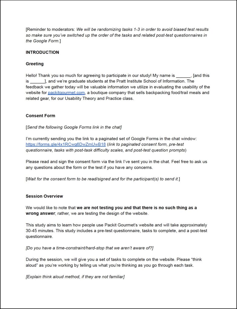
WRITING THE MODERATOR SCRIPT
We also wrote a moderator script (Fig. 2) which each moderator would read from while administering the usability test and in which the tasks were embedded.
pilot testing
– understanding zoom’s nuances
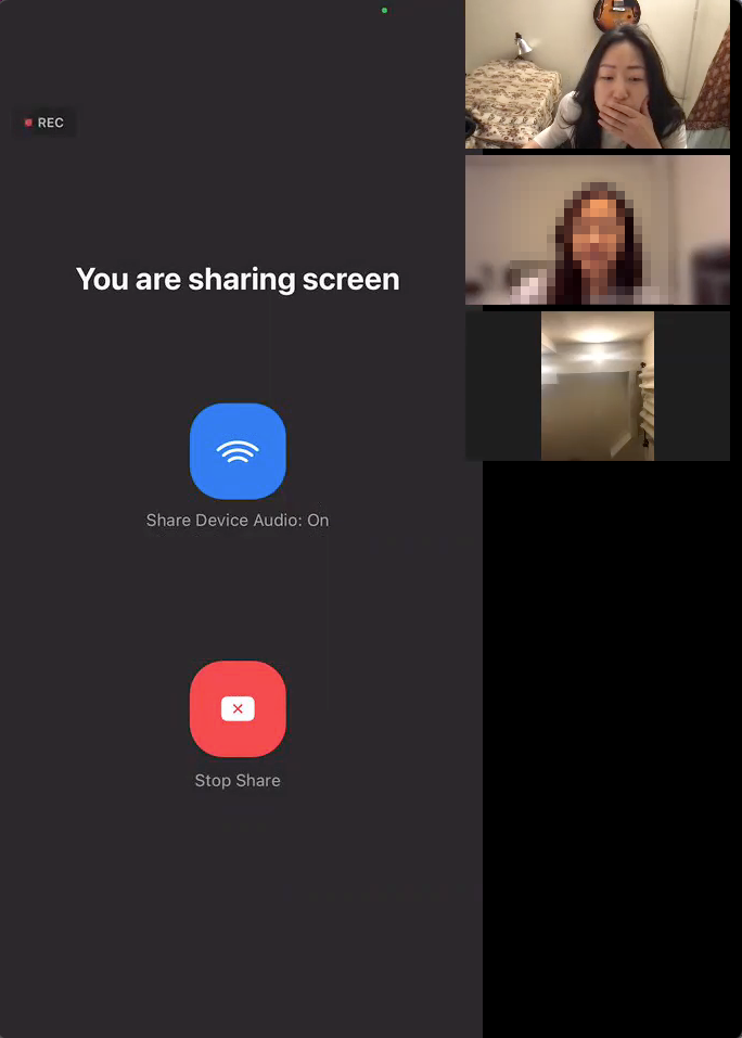
Before starting the actual testing phase, we each first performed a pilot test, which I carried out with a participant over Zoom and which was invaluable. During this mock test, there were a few technological nuances with Zoom that I had to learn and remember, such as how to pin the mobile screen and then make it the focal point of my screen (Fig. 3). This alone took me about 15 minutes to figure out how to deal with; if I hadn’t done the pilot test at all, the repercussions would have been wasting my first participant’s valuable time in addition to coming off as unprofessional.
– dealing with audio feedback
I also realized that even though we’d written into our script to tell the participant to mute their mobile device, that this would actually have to be dealt with on a case-by-case basis. This was because my pilot tester experienced much worse audio feedback when she did this and, therefore, muted her desktop device instead.
– when to stop recording
Additionally, I realized that we hadn’t written into the script when we would stop recording the participant’s screen.
– TELLING PARTICIPANTS TO SUBMIT THEIR GOOGLE FORM AT THE END OF THE TEST
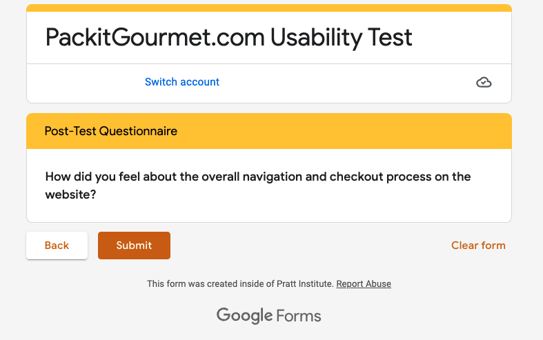
Also, we realized that we needed to explicitly tell each participant to click “Submit” (Fig. 4) at the very end of the test session when they got to the very last page of their Google Form. Otherwise, we would not receive the form results.
Our team updated our moderator script after encountering these and various other issues in our pilot tests.
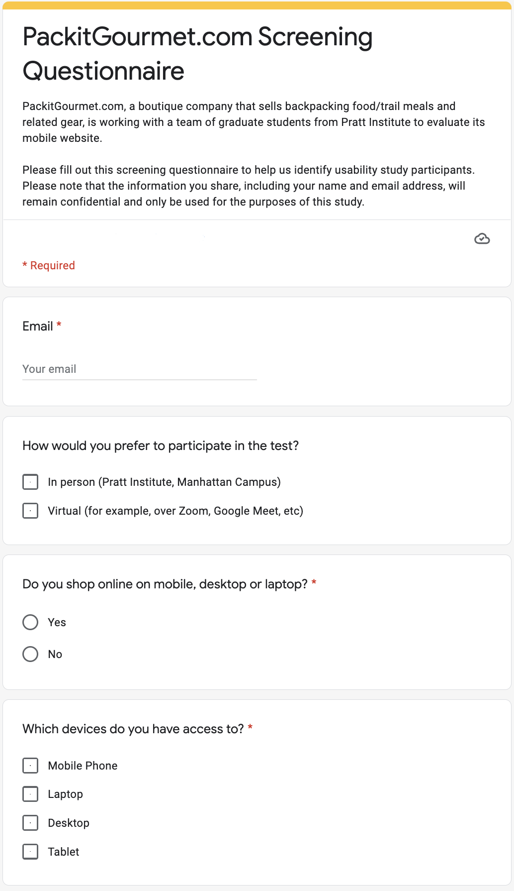
recruiting participants resembling packit gourmet’s target users
During the client meeting, it had been made clear that it was not necessary to get too specific when trying to find usability test participants. We would not have to impose such requirements as a particular income range, gender, age, education level, or occupation. However, due to a significant difference in conversion rates between new and returning users, we felt it would be necessary to test both groups. We decided we would find our new users by sending a mass email to the Pratt Institute School of Information listserv while the Packit Gourmet team was able to connect us with the returning users.
– USER REQUIREMENTS: MOBILE SHOPPERS WHO ALSO HAVE DESKTOP ACCESS
The only requirements were for the participants to have experience purchasing goods on the internet via mobile, and they would also need to simultaneously have access to a desktop/laptop device due to the planned structure of our remote usability test. (They would use their desktop/laptop device to read/fill out our usability study documents while carrying out the actual test on their mobile device.)
– USER PREFERENCES: SMALL BUSINESS SUPPORTERS WHO ARE INTERESTED IN HIKING/CAMPING
We also had a preference for supporters of small business who also had an interest in hiking/camping since these characteristics were reflective of the Packit Gourmet user persona.
After coming up with our screening questionnaire (Fig. 5), we sent it out to the Pratt Institute School of Information listserv noting in the subject line the $10 Amazon gift card as compensation. We very quickly received 13 responses. We ended up scheduling usability tests with four of these users and three returning users. The fourth returning user did not respond to several emails we sent, and as time started to become more constrained as the days passed, we finally just contacted a fifth person from the list of 13 Pratt students we’d collected for our final usability test.
– worries about the representativeness of our sample
At one point, I was a little worried after we had recruited all female participants, which didn’t reflect Packit Gourmet’s user base of approximately 46% female and 55% male. So I approached my teammates and asked whether this may be an issue, but it was decided that since the website sells products that are irrelevant to gender – compared to, say, if we were testing a men’s or women’s clothing site, etc – that it was not an issue.
– our participants’ demographics
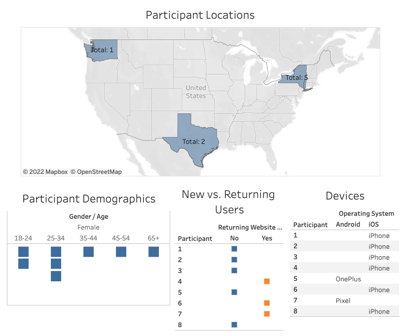
As seen in Fig. 6, five of our participants were located in New York, two in Texas, and one in Washington State. Six were on iPhone while two were on Android (one Google Pixel and a OnePlus). Two participants were 18-24 years old, three were 25-34, one was 35-44, one was 45-54, and one was 65 years and up. Our participants’ devices and ages generally matched the makeup of Packit Gourmet’s users.
Step 2: Test
Beginning with our very first real test session, we continued to make tweaks to the user test workflow and, therefore, the moderator script when we encountered issues that needed to be reworked.
tweaks made during TESTING
– CHANGING WHEN THE PARTICIPANT LOGS IN
Initially, we had planned for the moderator to wait until task four to tell the participant to log in using the packitgourmet.com dummy account. However, for some reason, when the participant tried to use the search bar, it kept asking them to sign into their account. Therefore, we decided that we would have each participant thereafter sign in at the very beginning of the test.
– carefully randomizing task prompts and related post-task questions in the google form
Our team had also decided that we would mix up the first three tasks in order to avoid biased test results, and we realized that this also required moving each related post-task question along with them in the Google Form, which had to be done carefully, otherwise the answers would be logged incorrectly.
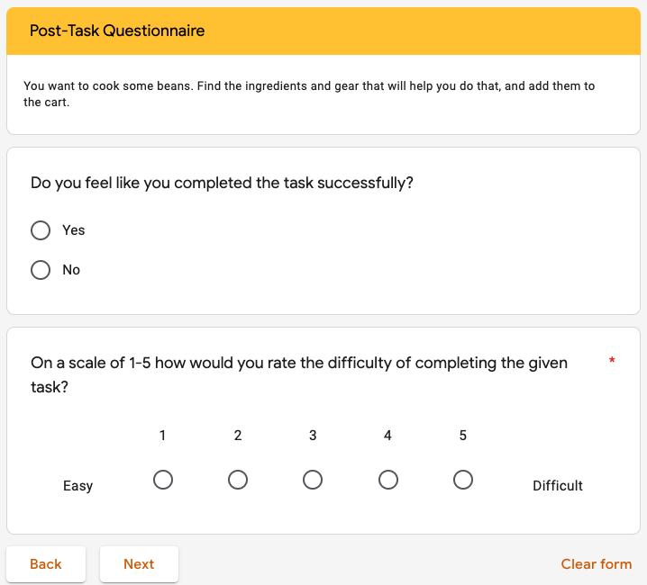
– VERBALLY PROMPTING PARTICIPANTS TO THINK ALOUD WHILE ANSWERING POST-TASK QUESTIONS
Also, we decided that we needed to verbally prompt our participants to tell us their thoughts as they filled out the post-task questions on the Google Form (Fig. 7). Otherwise, we would not receive nuanced information from them.
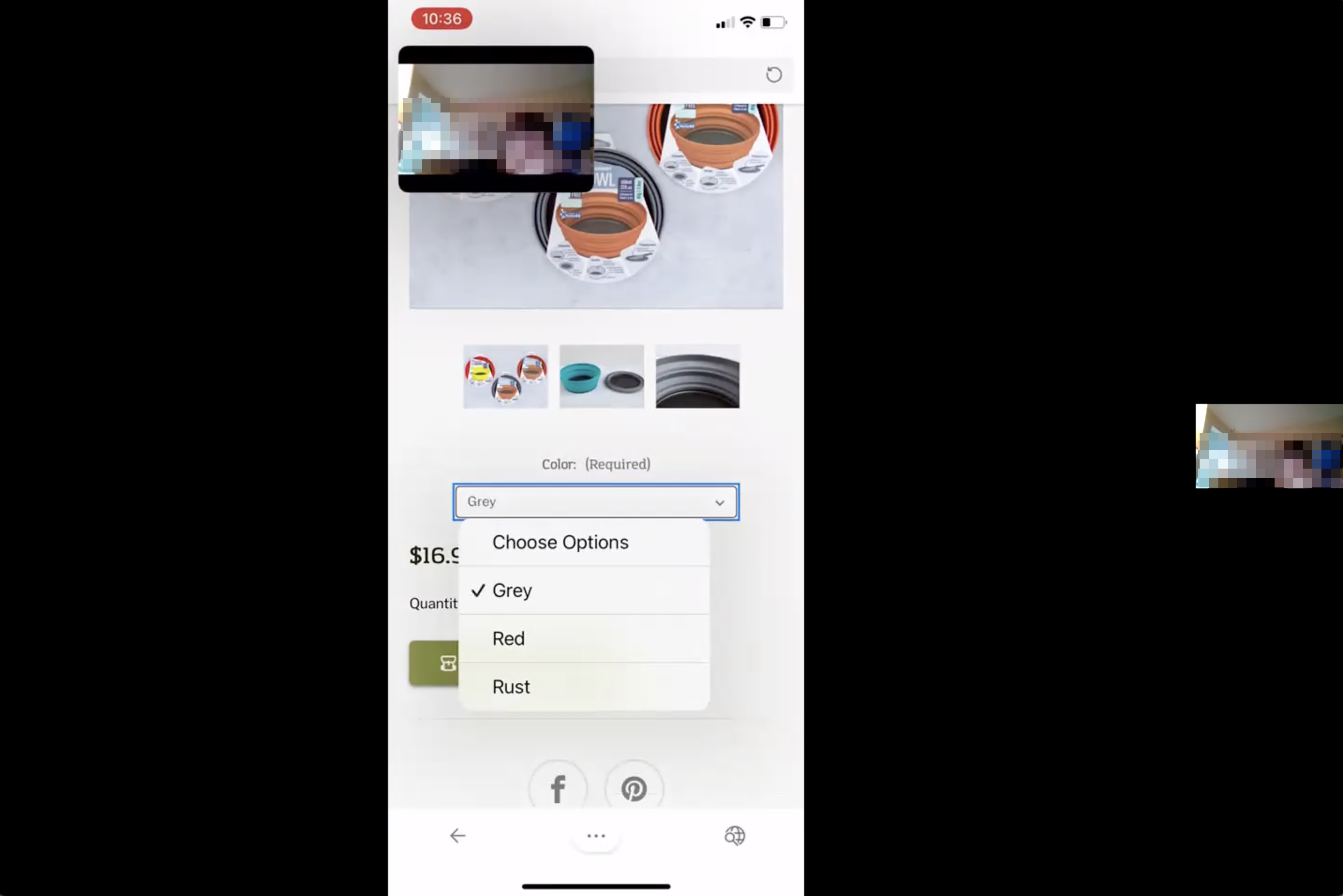
– DEALING WITH THE “PICTURE IN PICTURE” FUNCTION ON A CASE-BY-CASE BASIS
During two of the user testing sessions for which I took notes, the participants still had their “picture in picture” Zoom function enabled (Fig. 8) despite our detailed instructions in a pre-test email asking them to please turn the function off. This made their desktop connection screen (showing their face) float on top of their shared mobile device screen. In both of these instances, the moderator and I decided that asking our participants to turn the function off might cause undue stress. And because we could still see what they were doing on their mobile screens, we decided it was not an issue and let them continue their tests with the function enabled.
As we encountered these issues, we edited our moderator script to reflect these changes.
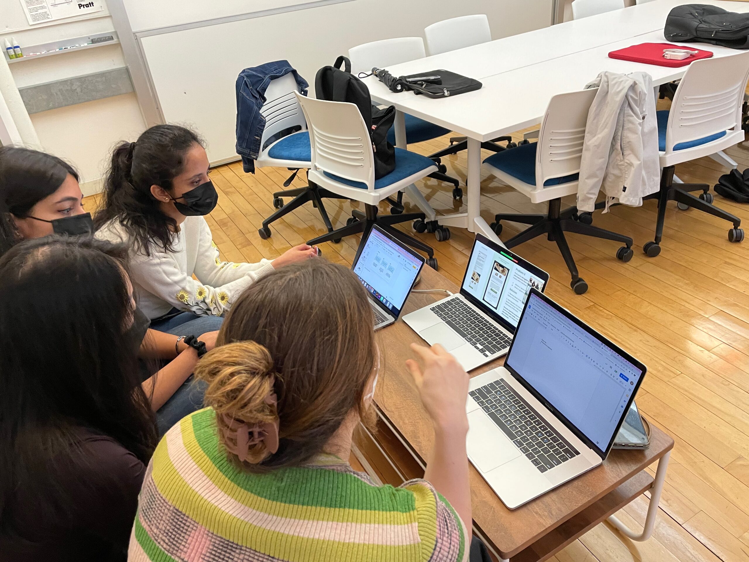
Step 3: Analyze
After all eight sessions were concluded, the usability team came together and recorded every issue encountered by the participants as well as their observations in a Miro board (left side of Fig. 9). Then, we consolidated the problems into a list of seven recurring ones and color-coded them by severity (right side of Fig. 9).
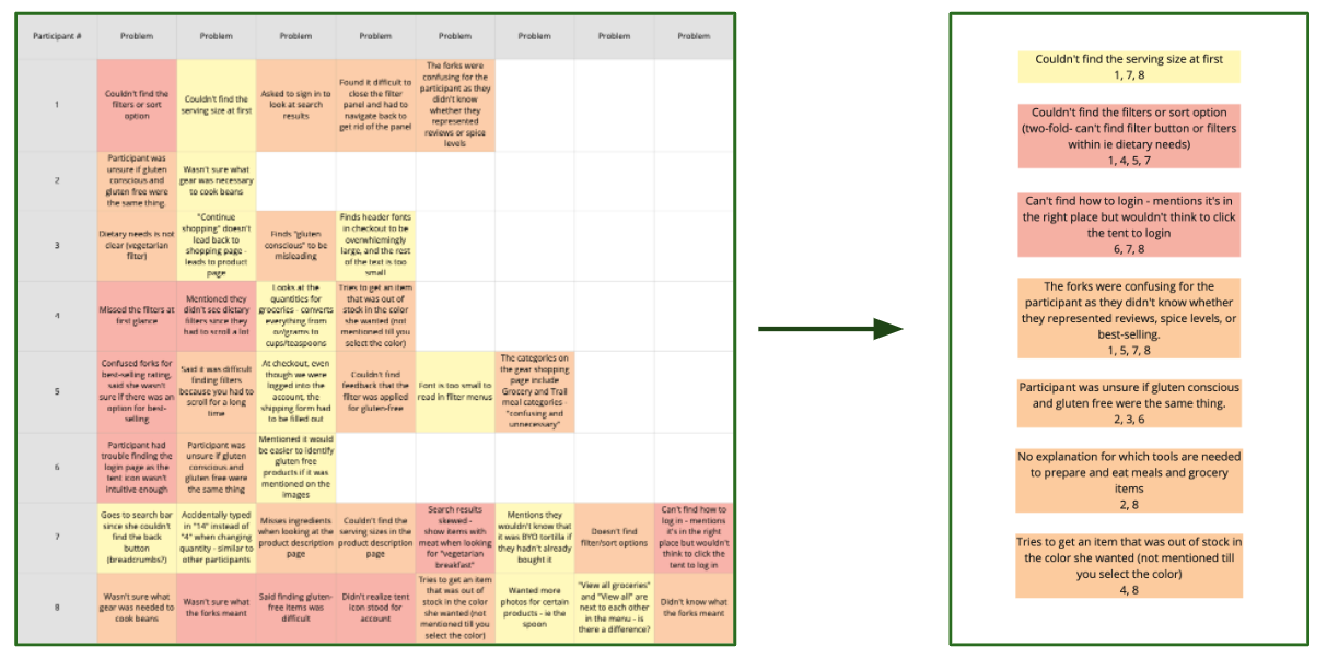
We honed in on three key issues that were a combination of the most severe and the easiest to fix on the site (Fig. X), about which I go into detail in the next section.
Results: Smooth checkout process, but other navigation issues were encountered
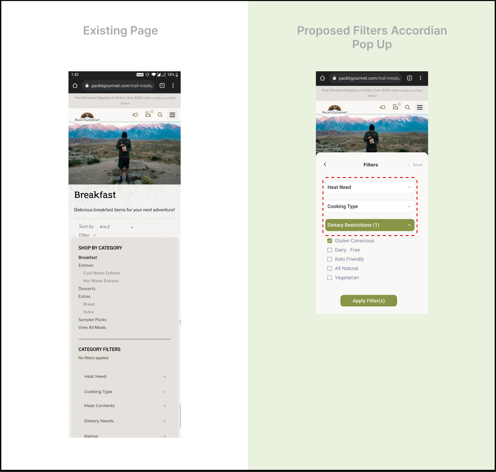
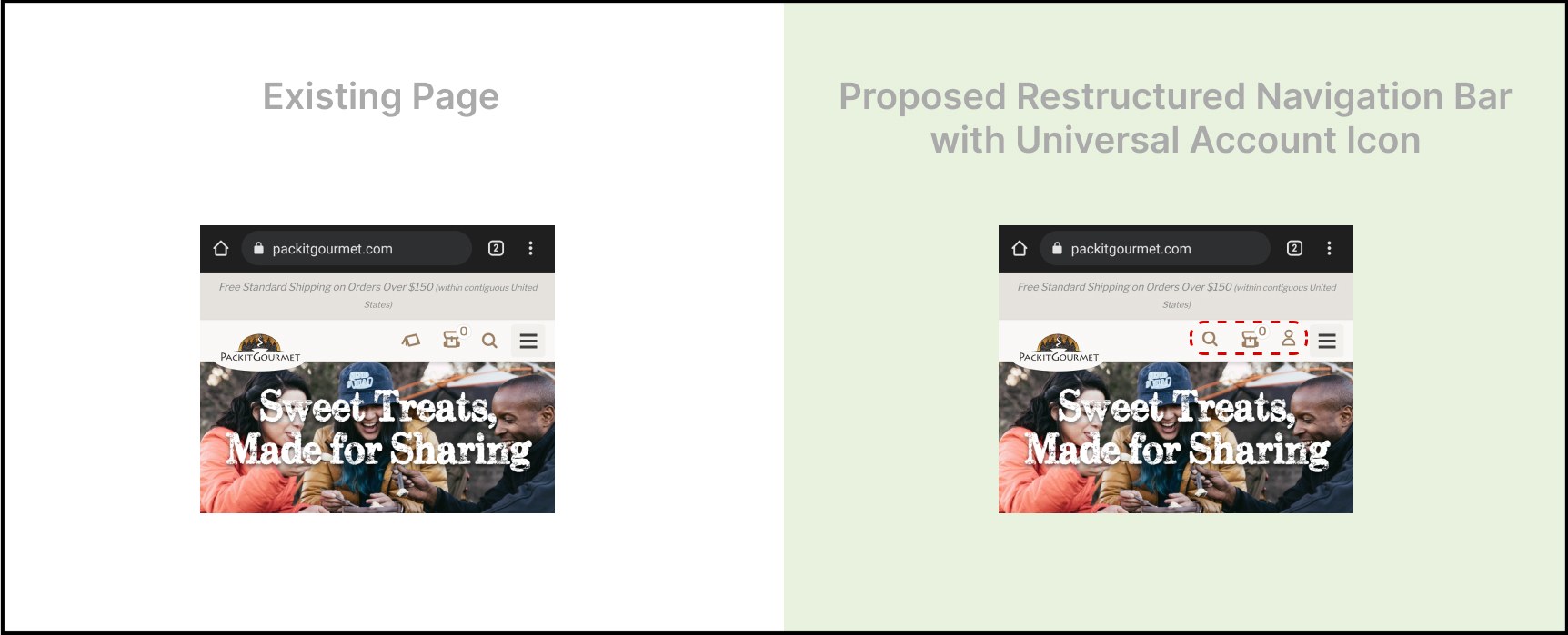
To summarize, through moderated usability testing of packitgourmet.com‘s mobile website, our team came to find three key usability problems: 1) The filters and sort options are difficult to find and use, 2) The login icon is difficult to identify, and 3) Important information is buried in the product pages. Our recommendations for these issues (Fig. X), respectively, were: 1) Make the “Sort by” and “Filter” options clear call-to-action buttons and create an accordion-style filter popup, 2) Replace the tent icon with an account icon that matches industry standards and is familiar to users, and 3) List out top-line item information near the top of the product page, and include a pop-up info icon next to words or phrases needing explanation.
Key finding 1: The filters and sort options are difficult to find and use
While attempting to carry out two of our tasks – “Find a vegetarian breakfast item that appeals to you. Add enough to feed 3 people,” and “You’re shopping for a friend who has an intolerance to gluten. Add one of the best-selling gluten-free items to your cart,” four users missed the “Filter” and “Sort by” options due to their poor discoverability and text-like appearance, which can be seen on the left-hand side in Fig. 10.
Concerning completing the gluten-related task, one participant said, “[It] wasn’t that easy. It took a really long time to scroll to the filters before I found the section I needed.” Another said, “I had a little bit of a hard time finding the dietary restrictions, but I finally did find it. I hadn’t scrolled down enough to see the dietary restrictions.”
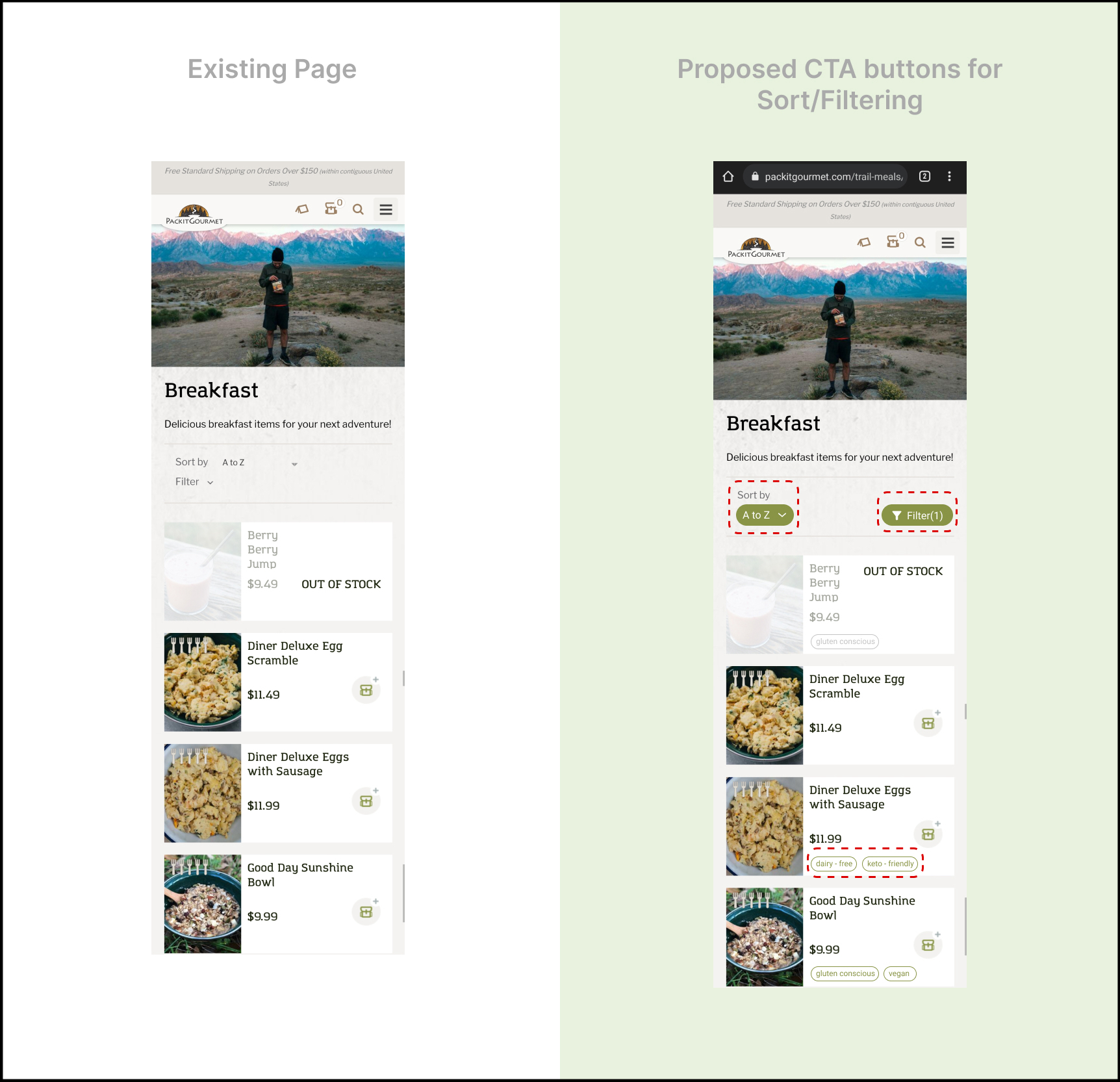
– recommendation 1: make the “sort by” and “filter” options clear call-to-action buttons, and create an accordion-style popup
Our proposed recommendation was to make the “Sort by” and “Filter” options clear call-to-action buttons (Fig. 10), and create an accordion-style filter popup (Fig. 11). The new accordion-style filter design is especially important because with the current page design, when a user clicks on “Filter,” for some reason all the menu options from the hamburger menu appear in the upper half of the filter section, and the actual filters don’t show up until closer to the bottom of the page.
key finding 2: The login icon is difficult to identify
Three participants found it difficult to log in to their accounts as they failed to accurately identify the “tent” icon (seen on the left-hand side of Fig. 12) as a signifier for account access. Since the tent icon currently found on the website did not align with the universal user account icons that the participants were used to seeing on other websites – differing from their mental models – they overlooked it on a majority of occasions.
One particular participant mentioned, “The icon is in the right place, but I wouldn’t think to click the tent to log in.” Another said, “I’m looking for the login. I clicked on the hamburger menu, but I didn’t see a login.” After scrolling down the page and then back up to the top, she finally clicked on the tent icon and said, “Ok, I found the login.”
– recommendation 2: replace the tent icon with an account icon that matches industry standards
Our proposed recommendation was to replace the existing tent icon with an industry-standard icon signifying account login to ensure discoverability (right-hand side of Fig. 12). This will reduce the intellectual load on the users and facilitate faster completion of fundamental tasks.
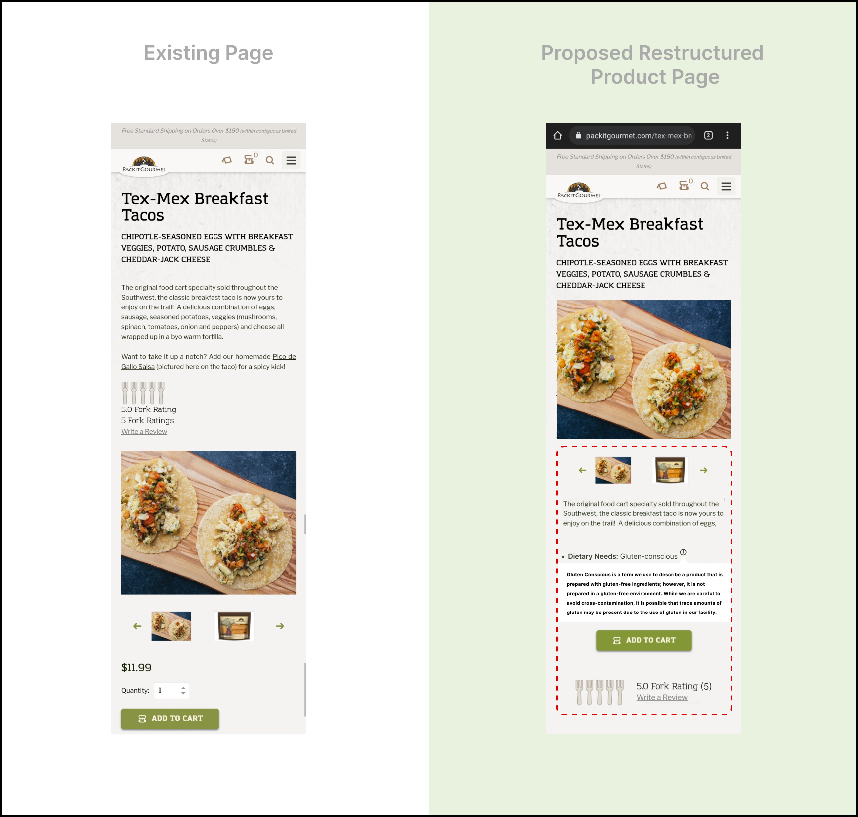
key finding 3: Important information is buried in the product pages
On individual product pages, participants struggled to find important information pertaining to their tasks (add 3 servings, add a gluten-free item, etc.). Some searched for awhile to confirm that the item was gluten-free, while others weren’t sure what all came included with the item. Additionally, the paragraphs to introduce the items at the top of the page were either skimmed or skipped.
– Recommendation 3: List out topline item information near the top of the product page, and include a pop-up info icon next to words or phrases needing explanation
Our proposed recommendation (Fig. 13) was to list out topline item information near the top of the product page (dietary needs, parts not included, product pairings), and include a pop-up info icon next to words or phrases that need explanation (i.e., “gluten-conscious”).
Step 4: Report
We compiled all of our findings into a 26-page report for the client (Fig. 14).
We also communicated our findings via a Google Slides presentation (Fig. 15) in one last client meeting over Zoom.

Conclusion
client: “This is super helpful information that makes sense.”
After presenting our findings (Fig. 16), the Packit Gourmet team told us they were impressed by our presentation and found our results to be helpful. They told us, “This is all super helpful information…that all absolutely makes sense. And you can see how those things would be confusing for people.” They were also happy to hear that the new users had positive things to say about their website, including one participant’s comments that, “The checkout process was pretty smooth and easy to use,” and another who said, “These actually look like good trail meals!” The team even told us that they wish we could now do a test on the desktop version of the website.
If we were to continue working on the project, it would be good to not only focus on testing the desktop version, but also to think about how to present information on both the mobile and desktop versions of the site simultaneously. I think this would require thinking about design tradeoffs in order to come to a good middle ground so that one version does not become compromised over the other.
takeaways
Some important takeaways for myself was seeing how even with the best planning, random things can and do change suddenly, such as schedules, technical issues, really anything.
– do a pilot test
With that said, for me, doing a pilot test helped bring illumination to the mysteries of what could potentially go wrong, and it also helped with any anxiety I had about carrying out future moderated user tests. I truly believe that carrying out this step in the overall process is of utmost importance.
– four heads is better than one
Also, working with a group was great in that if scheduling issues occurred, there was always someone who could cover to make sure the research process could continue along. (Two of our participants suddenly couldn’t make it for their originally scheduled sessions, and it was nice that at least two of us could still meet with each of them the following days.) It was also helpful to have multiple eyes on everything and to be able to bounce observations, concerns, and any confusion off of each other. In this way, we were always able to come to a consensus and continue to move along.