THE PROBLEM
- Our client: Nat Roe (executive director @ Flux Factory)
- Who we are: a group of 5 graduate students attending an usability course at Pratt Institute.
- Problem: choosing which area of Flux Factory’s website to test out.
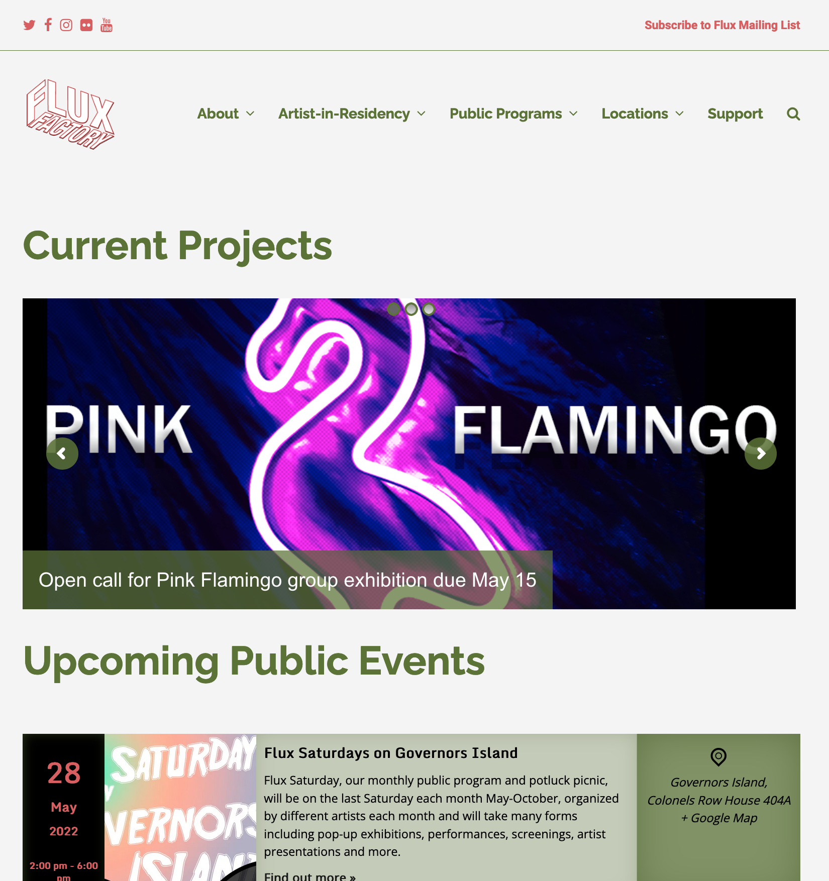
Flux Factory is a mainly not-for-profit arts organization (see Figure 1) aimed at providing emerging artists with opportunities for growth and exposure, and the public with free art events and exhibitions. They were founded in 1994 in Long Island City, and are now active both in New York City and Denmark. They have a range of programs, including artist residencies, public programs, group exhibitions, etc.
The main issue we found with Flux Factory’s website from the very beginning was its overall navigational structure. The same category of content was dispersed throughout different sections of the website, making it very hard for the users to find the actual information they needed. Besides, the website also needed work in styling – especially in consistency. Due to the fact that these issues could be identified almost everywhere on the website, we were initially overwhelmed and had to narrow our focus down to the most pressing problems. We achieved this by identifying key functionalities of the website. Since Mr. Roe told us the website existed to point people to the location of an event, to receive donations, and as a platform for artists to apply for their programs, we decided to adapt these into our four tasks.
THE PROCESS
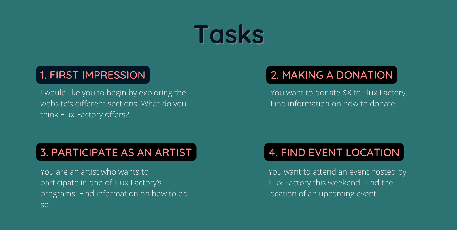
From there, we started to devise the tasks (Figure 2) and all the necessary testing materials. I created a Google Doc, and each of us had a role in adding the content – including the pre- and post-task questions, recruitment email, consent form, etc. In the end, I proofread and edited all the materials to make sure everything flowed nicely and what each group member wrote remained consistent in tone.
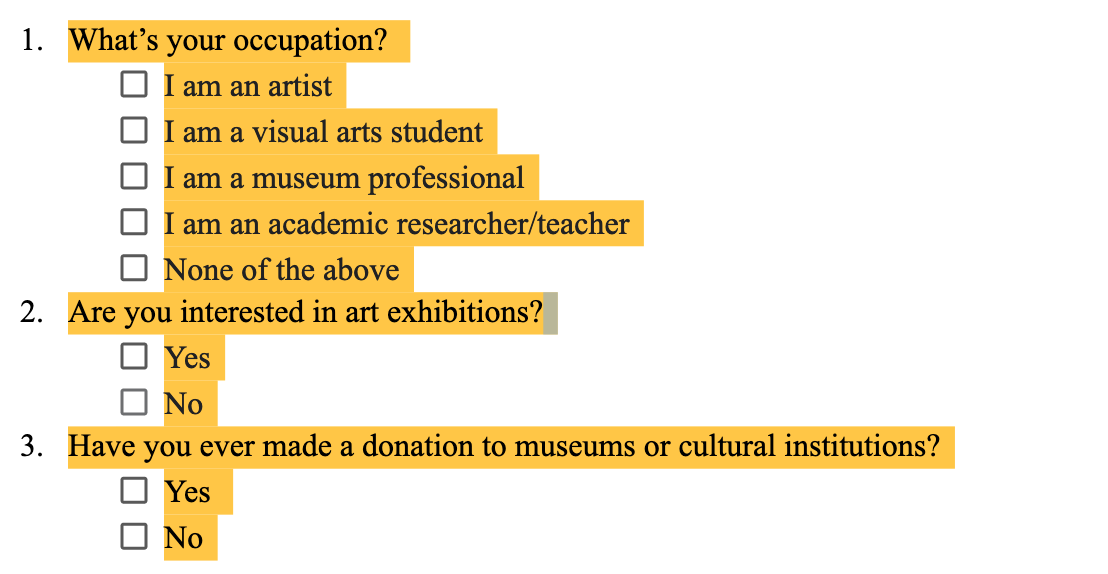
In the meantime, we started to send out recruitment emails for participants among the Pratt faculty and students. Although the website was also intended for the general public, we decided to narrow the focus and recruit only people who are interested in art or in attending art-related activities. Besides this, our screening questions (Figure 3) also contained inquiries about the participant’s profession and whether or not they have made a donation to cultural institutions in the past. These criteria could help us flesh out our user personas more and provide more context to our findings.
While preparing for the user testings, we worked on Google Docs for compilation of materials used in user testing and Miro board for internally used information of importance, including the project timeline, personal information of group members needed in the report, the different times of user testing sessions, and other notes. During the period that we waited for responses, we also conducted a pilot user testing session with our classmate in another group. Due to the fact that most of our group couldn’t make it, I conducted the pilot session as the main moderator.
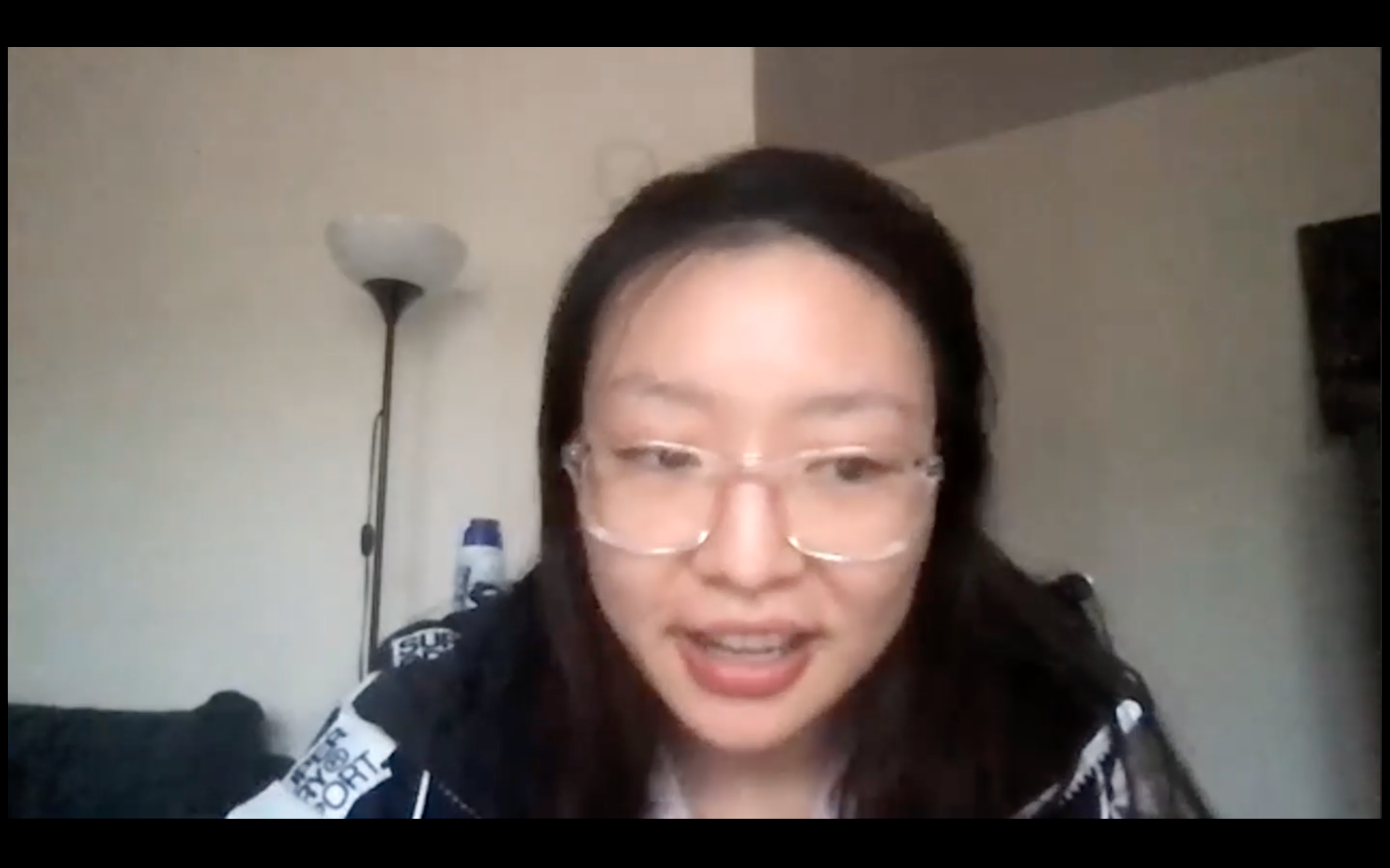
After patiently waiting for a week and half or so, we received the responses of 12 interested participants. We divided them among the group members, with each acting as the main moderator for 2-3 participants and secondary moderator for 2 or 3 more sessions conducted by other group members. However, when we reached out for a second time with the intention to proceed, more than half of the respondents did not reply. This was particularly the case for me: out of the 3 respondents I emailed, nobody replied. In the end, I had to ask the help of my friends – one was a grad-level students, another was a young professional, but both are interested in attending art-related activities – and schedule sessions last minute. During this process, the hardest thing was making everybody’s schedules meet: including the participant’s schedule, mine, and the second moderator’s. In the end, we did carry them out successfully (Figure 4) and my two participant friends provided me with extensive and very valuable feedback.
THE RESULTS
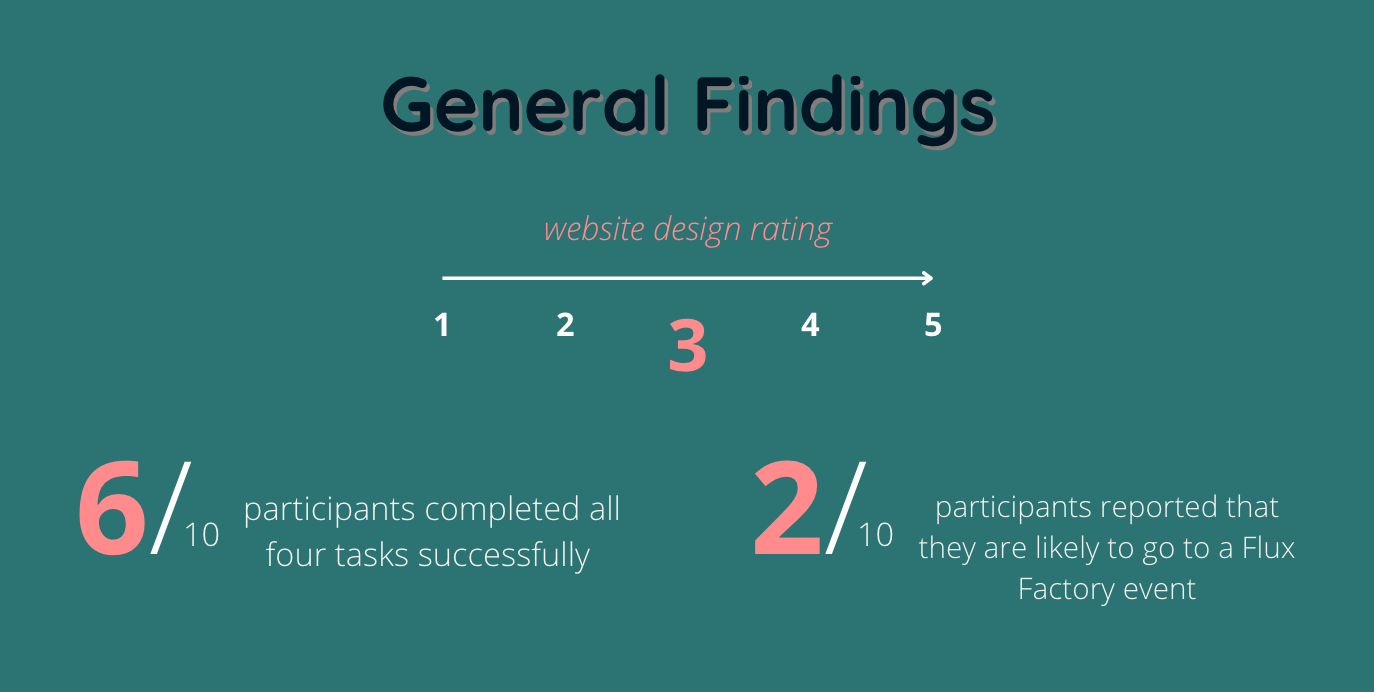
Through our pre-test, post-task, and post-test questions, the collective rating users gave for Flux Factory’s website design was 3 out of 5 – an average. The reason for this score was that all the information about Flux Factory was available through the website, but the user interface wasn’t clean and well-organized, rendering these information undiscoverable. 2 out of 10 participants reported that they were likely to attend a Flux Factory event, although the reason for the other 8 participants’ unwillingness was not necessarily related to the website design, but the participants’ own disinterest in Flux Factory’s art style. (Figure 5)
Overall, Flux Factory’s website performed decently. Participants either rated the tasks as very easy or very difficult, with no great difference between participants’ technological prowess. Participants who reported they were likely to go to a Flux Factory event or who have donated to cultural institutions before professed a greater familiarity with the functionalities of art organizations like Flux Factory and thus had an easier time with the website; participants who lacked these experiences generally found it harder to understand what the organization was about and to complete the tasks. Since the objective of Flux Factory was also to attract some parts of the general public (and not to experienced art aficionados only), it’s recommended to make the user interface more streamlined and intuitive for first-time users.
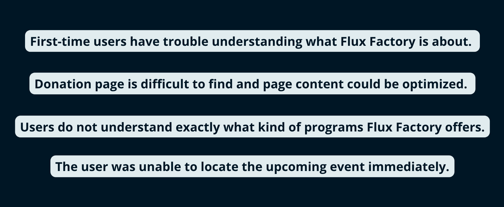
In general, the key usability problem the website suffered from was having too much text and not enough structure, layout, or other user-guiding elements. For example, proper text formatting techniques (highlighting, consistent font size) were not used very well, which caused a lot of confusion from the users in trying to understand the relation between different sections. The content of the website could also be grouped better (eg. There should be no difference between “Upcoming Public Events” and “Current Projects”). This could reduce user confusion in finding the same category of content across two different web pages. Another example is to group all artist applications under the same page. Thirdly, website elements should not use industry-specific or company-specific terminology. New users don’t understand what are “Satellite Projects” or “The Rhizome Project”.
CONCLUSION
In the end, we presented our findings in front of the class to Mr. Roe. I was in charge of the presentation design and half of the presenting itself. In the Q&A session with the client, Mr. Roe responded very positively to our findings and thought they were very valuable in helping him improve upon the website. Due to the fact the Flux Factory website is still “rough around the edges”, meaning that there are still a lot of fundamental issues with the website (eg. inconsistent font size, broken links, spelling errors), we spent our time talking over sections of the website that weren’t necessarily covered in our tasks and giving him ideas and suggestions on how to redesign it for better usability. Overall, the impression that I got was that since Mr. Roe isn’t a web design expert, a lot of the bigger issues with the website’s layout and design couldn’t be easily fixed. That being said, a lot of the website’s usability issues came from little details, which could be fixed and would definitely improve the user experience.