Project Summary
Pratt Institute Libraries website supports the education mission of Pratt Institute by providing digital resources and assistance for the Pratt community. For evaluating the usability of the Pratt Institute Libraries website, we gathered as three Pratt Institute Information Faculty students. Our team included Priyanka, who is a Data Visualization and Analysis graduate student, and Kyle and I as the Information Experience Design graduate students to work together on conducting moderated user tests. This is a method that requires participants to think aloud during the assessment on a platform moderated by the user experts. It allows the identifying usability problems on the lib-dev.pratt.edu website and provides solutions for possible problems.
During the seven weeks of this project, I moderated three user tests which I also took notes of and helped write the report and create the presentation.
Before The Interviews
Client Meeting
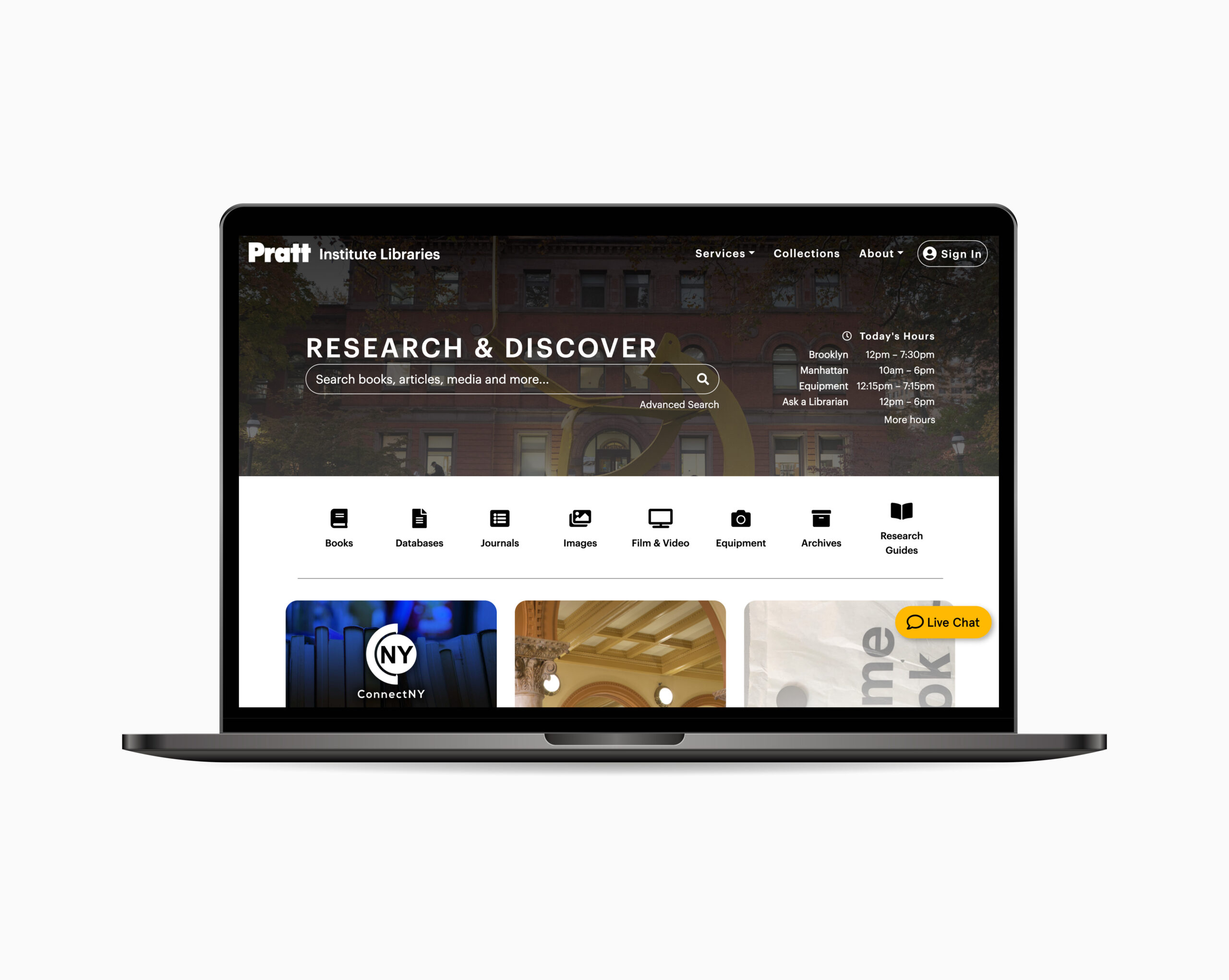
We had the client kick-off meeting with the Pratt Institute’s former Information Faculty Student and present liaison Nicholas (Nick) Dease over Zoom. Nick introduced us to the new website of the Pratt Institute Libraries which he was working on. He told us he is specifically curious about three features: the mega “Services” menu, “Ask a Librarian” chat widget, and the working hours section of the library. We also learned how he can help us recruit participants from the Pratt community and the issues he is suspecting of users to encounter as they try navigating the new platform.
User Profıles
We categorized Pratt Library users into two broad groups – students and faculty. Since individual needs, behavioral patterns and technological backgrounds may vary, we created two participant profiles.
PRATT STUDENTS: Current student, utilize the website for research purposes, utilize the website on desktop format
PRATT FACULTY MEMBERS: Current faculty member, utilize the website for research purposes and building course content, utilize the website on desktop format
Preparing Screening Questions
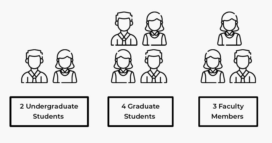
Based on these user profiles, 9 participants were recruited to constitute the participant pool.
comıng up wıth tasks
Since our two user profiles differentiated according to their website usage patterns depending on their needs and desires, we prepared two different lists of tasks.
TASKS THAT WERE GIVEN TO FACULTY MEMBERS
Task 1: You want to add a library resources section on canvas for your upcoming course. Browse the library website to find instructions on this.
Task 2: You want to assign the book “The Design of Everyday Things” for your class but you are not sure how many printed copies are available at Pratt Institute Library. How would you get assistance from a librarian on this?
Task 3: You want to visit the Manhattan library in-person at 4:30 pm on a Thursday. Check if it is open.
TASKS THAT WERE GIVEN TO STUDENTS
Task 1: You want to learn how to use Zotero to organize your research for an upcoming project. Browse the library website to find instructions on this application.
Task 2: You have an upcoming research project on Cubism. There are an overwhelming amount of resources available on Pratt Institute Library’s website and you don’t know where to start. Search for assistance.
Task 3: You want to visit the Manhattan library in-person at 4:30 pm on a Thursday. Check if it is open.
Conductıng Pılot Tests
CHANGING THE WORDING OF TASKS
Before initiating actual testings, we did pilot testings over Zoom. Each of us moderated a test to try whether it is possible to moderate and take notes at the same time. Pilot tests were also useful to get feedback on our wording of tasks. As a result, we have made minor nuances in the tasks to make them more clear, understandable, and to the point.
REQUIRING TO RE-CLICK THE LINK IN EACH TASK
Since the lib-dev.pratt.edu website was still in the process of construction, not every page was renewed. As participants were completing the tasks and navigating through the website, they were sometimes landing on the old pages. If the participant would try to continue doing the new task from those pages, it would have affected the outcome of the test. Therefore, we realized that we need to warn participants to click on the web link each time they are about the practice a new task so that they start from the homepage.
The Interviews
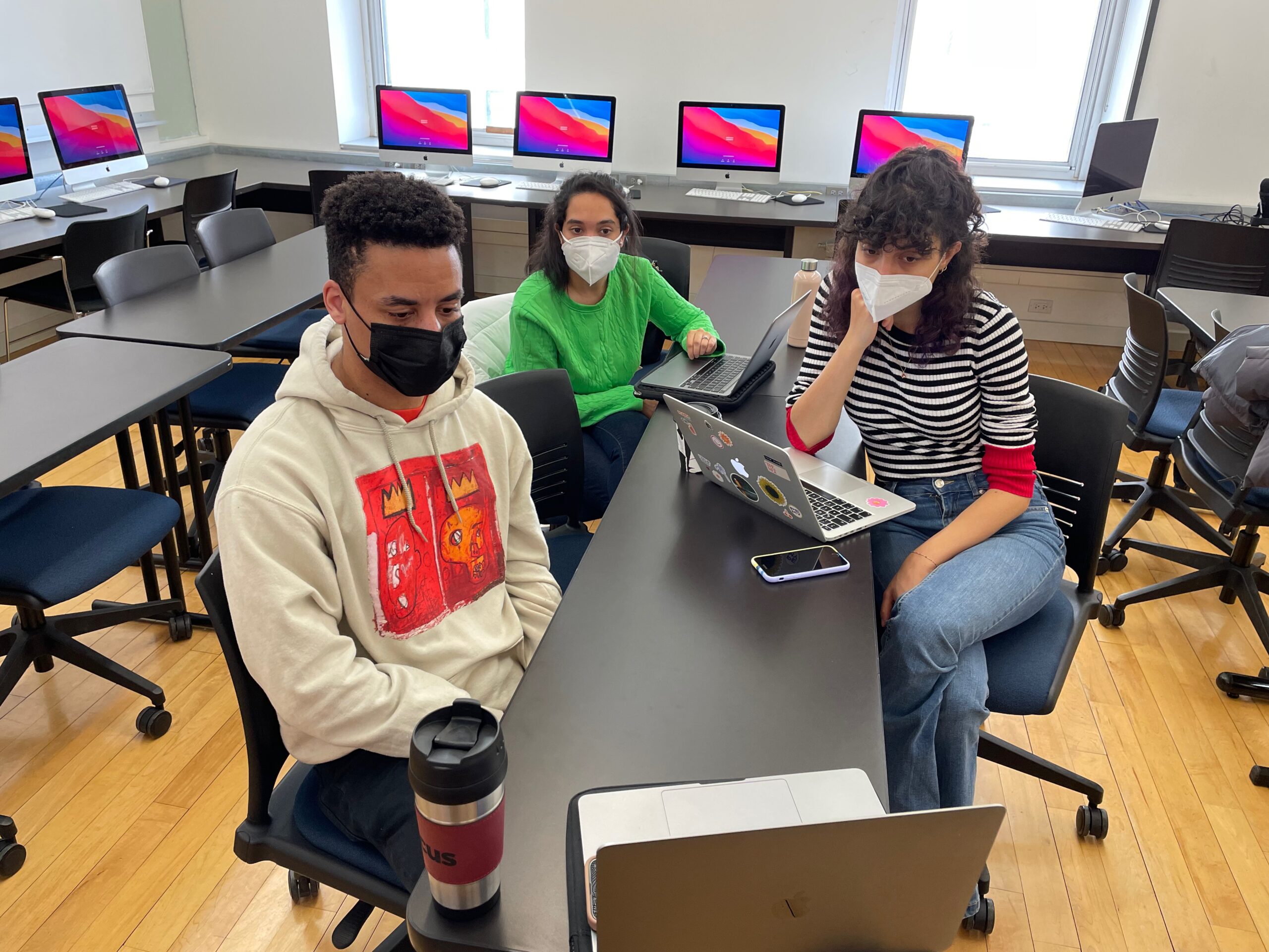
After the pilot study, we started with our actual interviews. During interviews, we made use of further in-session observations that were recorded on an excel sheet by the team for future reference. This helped us in gathering a mix of quantitative and qualitative insights. Further, screen recordings were captured using Zoom record. I advised to recordings once the interviews completed to add details to my fast notes I jotted down as insights while moderating.
new websıte desıgn and structure receıvıng lots of complıments
I was surprised to see how participants were intuitively sharing their opinions even they were not related with the tasks they were asked to practice. Most of them stated how much they liked the new design, thinking it seemed more simple and modern compared to the previous one. Some of the participants quotes are provided below:
I think the new design for the website makes it easier to follow, with the pop-out menus and the clear labeling etc.”
“Calling these research guides is great! Lib guide – you need to know the term, it’s nonsensical, so I appreciate that it’s called research guides here.”
“Even though I might not be the target audience for Nick’s videos, the availability of his videos is awesome.”
After the Interviews
analyzıng Data
We created our own observation sheet to note participant quotes and on-screen behaviors for analysis. Post conducting individual interviews, we brainstormed as a team to further analyze challenges and form study recommendations.
INTERPRETING RESULTS:
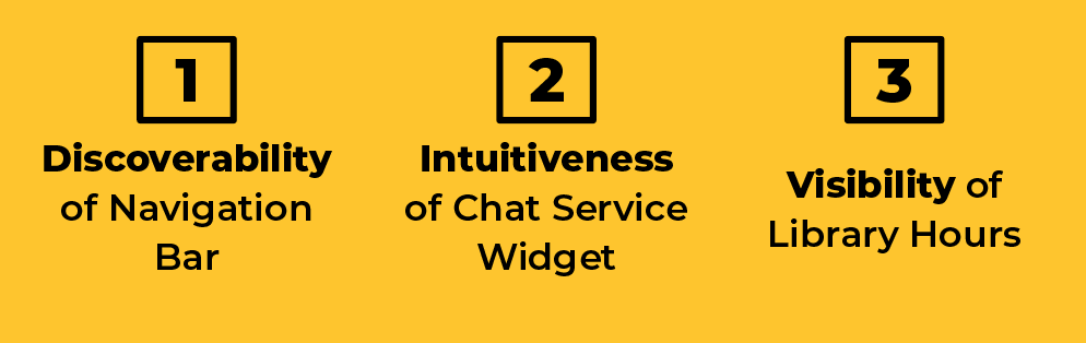
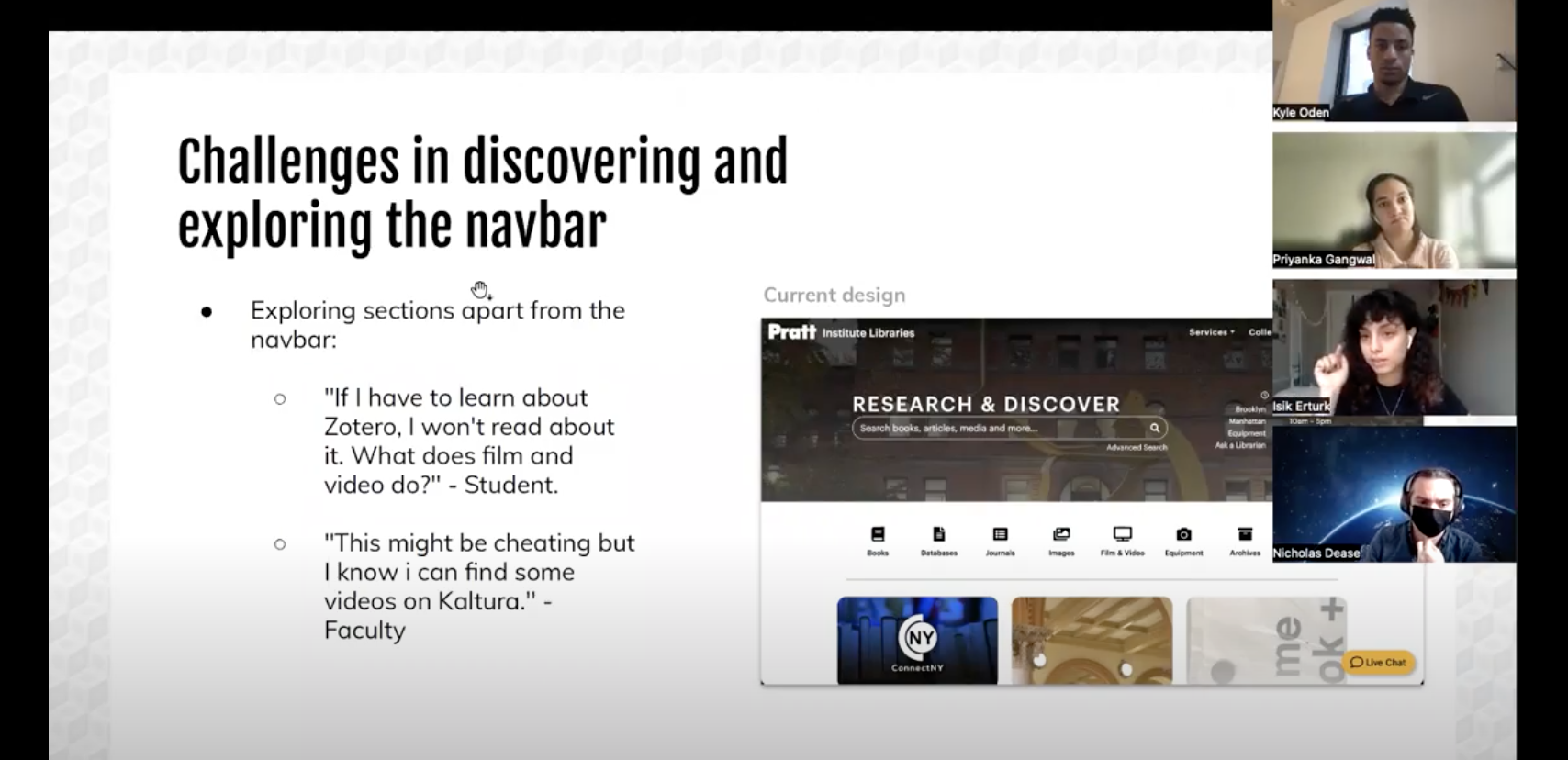
key fındıng 1: dıffıculty assocıatıng “servıces” sub-menus wıth task
The task dedicated to evaluate the usability of “Services” menu was found the hardest one to complete. We realized that participants with prior conceptual knowledge could somehow navigate better but overall succession rate of the task was 28%. The results made us feel concerned since it was a clear indication that the current design was not working and we could not decide which actions to take to suggest as a solution because participants did not consider discovering “Services” section when they were asked to find relevant video tutorials.
FIRST ATTEMPT: CHANGING THE WORDING OF THE MENU
First, we thought of changing the wording of the menu to “Support”. Nevertheless, since it included many submenu elements, we could not be sure whether this new wording would be sufficient to reflect every item which are provided underneath. Moreover, our collected data was not enough to justify the prospected efficiency of this recommendation.
SECOND ATTEMPT: INTERFERING WITH INFORMATION ARCHITECTURE
Later on, we have considered getting rid of some of the sub-menu items and proposing them to be presented in landing pages. By this way, we we hoped to make the rest of the items left in the sub-menu section become more evident. Nevertheless, this would be a very bold move as it means interfering with the information architecture which is a different project direction that requires whole different user tests. Whereas, the recommendations proposed at the end of usability evaluation projects are required to be simple edits that could be realized with minimum level of effort. Therefore, this attempt, too, was unsuccessful.
At last, we accepted the fact that this problem could not be solved with a simple recommendation we would make. At least, we decided to make the navigation bar and the submenus more prominent and differentiable, thinking that increased visibility might encourage users to encourage discovering these features more.
recommendatıon 1.1: ımprove navıgatıon bar’s dıscoverabılıty
To increase the visibility of the navigation bar, it is proposed to add a colored background and make it sticky. Black background supports the contrast and also creates harmonical consistency with other pages of the website. The sticky navigation bar quality would help it get noticed easily.
recommendatıon 1.2: makıng the sub-headers more promınent
Intention is to make the subcategory items more visible and differentiable from the titles.
key fındıng 2: dıffıculty notıcıng the “lıve chat” wıdget
5 out of 9 participants didn’t immediately see the live chat widget on the Pratt Libraries homepage, and 3 of our participants didn’t locate the widget at all and found with alternative solutions to seek help or complete the task. The live chat widget is meant to be immediately noticed when landing on the Libraries website, but the fact that some participants never found the widget during the study speaks to a potential issue when seeking help from the library.
We also realized that participants with prior experience with the website was familiar with the widget of “Ask a Librarian”,
recommendatıon 2: makıng the chat wıdget promınent and understandable
Since one participant stated that they “didn’t see that live chat option immediately … on the first homepage.”, we hypothesized that the widget might be blending in too with the rest of the styling on the page. Therefore, we recommended adding a red notification symbol when a user first loads the page. This would provide contrast and will visually catch a user’s attention, letting them know that help is available right through this widget.
We recommended returning to the wording of “Ask a Librarian” instead of adopting the new “Live Chat” button to be consistent and directly reference what the widget does.
key fındıng 3: dıffıculty fındıng the “open hours” sectıon
This task was rated the easiest to complete by a large majority of the participants and was completed in about 2 mouse clicks and in a few seconds by almost every participant. A student said “This was easy because the Information was right in front of me and also the ‘see more’ option was right there below and even the library calendar was easy to understand!”, and a faculty member said “this task was easy because the hours were right there on the splash page”. This suggests that having open hours details on the homepage at the top makes the section very easy to find.
However, while participants were on the task of finding whether the Pratt Libraries is open on Thursdays at 4:30 pm, many overlooked the “More Hours” link that was provided in the header of the homepage and assumed that the hours provided on the homepage to be common hours through the week. The reason for this could’ve been not reading “today’s hours” or assuming those hours would be the same on Thursdays.
recommendatıon 3.1: makıng the “open hours” sectıon more vısıble to prevent overlookıng
One of the students said “The link that said ‘more hours’ could be made to look more clickable before hovering over the link.” Communicating the name of the day and indicating that “more hours” is clickable can eliminate the chances of overlooking the link and/or the day.
recommendatıon 3.2: provıdıng “open hours” ınformatıon also on “vısıt us” page
One of the faculty members said “I would think that visit us would have the hours but looks like it’s not there”. On the basis of this quote, adding time details on the “Visit Us” page is recommended as many participants visited that page to look for timing details.
sharıng our work
We shared our work with our client in different formats.
presentıng to our clıent
Our data, findings, ways of thinking and ideas were communicated through a Google Slides presentation during our final meeting with our client via Zoom.
wrıtıng a report
We gathered our data collection and analysis along with recommendation and mock-ups in a 31-page report for the client.
Conclusion
After presenting our findings, our client Nick thanked and told us how useful he found the research we came up with. He was very interested in seeing more about our data, which we gladly shared as participants gave permission to share their data with our client to be used in the further development of Pratt Institute Libraries’ website. He was also glad to hear that overall responses were positive about the new design and structure of the website.
what to do next?
If we could continue working on this project, it would be very beneficial to make some user tests to gain insights about how to provide information in a more discoverable way, especially to be able the edit the information architecture of the navigation bar. As this is a new website taking bold structural decisions that are quite different from users’ previous experience, such as removing almost every tab of navigation bar and gathering them under one mega menu, the effiency of this new version needs to be further studied.
lessons learnt
Doing an hands-on moderated user testing was very different from learning about it in class. There were many details to think and foresee, such as scheduling interviews with participants and facing with unpredictable technical issues.
IN-PERSON INTERVIEWS CAN BE HARDER TO MODERATE THAN VIRTUALS
I realized that doing in-person usability tests that are evaluating digital products is hard. The platform of Zoom makes recording, sharing links and information through screen a lot easier and we are accustomed to these technological developments that it requires additional effort going back to the old-school way.
ORGANIZATION IS CRUTIAL
During the process of this project, we have prepared many documents, communication scripts and shared sheets with each other which we noted our insights. Going through all of them became very hard as their numbers increased. Therefore, at one point, I created an organized shared file in Google Drive, so that research time of desired files could be lowered to increase our efficiency.
TEAM MAKES THINGS EASIER
It was very fun and nourishing to work with my team as they were very supportive, understanding and creative. The more we worked together and communicated, faster we progressed.